

Sherwin Williams Silver Strand: Undertones, Best Uses, & Real Home Images
By Kylie
January 27, 2023
THE BEST BLUE-GREEN BLEND: Sherwin Williams Silver Strand
When it comes to calming and relaxing paint colors, it’s hard to beat the look of Sherwin William Silver Strand. With its soft blend of colors, Silver Strand is a great way to NOD towards color on your walls, without 100% commitment. However, it’s a bit of a ninja…

IS SILVER STRAND BLUE, GREEN, OR GRAY?
While some see Silver Strand as neutral compared to more COLORFUL shades, Silver Strand has more chroma than a typical neutral, making it a legit COLOR. And with its beautiful mix of hues, Silver Strand is a blue-green blend…with some gray in it.
WHAT’S THE LRV OF SILVER STRAND?
Silver Strand has an LRV of 59, which makes it a light – but not necessarily the lightest and freshest color choice. My magical LRV number is 62, and Silver Strands falls about 25% shy of that. Compared to an LRV of 62, Silver Strand has just a wink more contrast with white trim and is slightly darker as an overall wall color, especially when compared to a soft, cool gray like Benjamin Moore’s Gray Owl or the gentle warmth of Benjamin Moore Collingwood.
The Ultimate Guide to Choosing Paint Color with LRV
DOES SILVER STRAND HAVE UNDERTONES?
You’ll hear from some experts that color is NOT subjective. And they’re right; the color itself is NOT subjective – it is what it is. However, how it LOOKS is hugely subjective based on who’s looking at it and the room/environment it’s in!
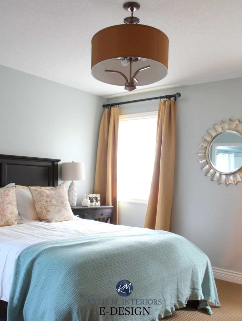
For example, I had Silver Strand in our last primary bedroom. My Mom walked in and said, ‘Oooh, what a beautiful gray-green.’ I asked Tim what color HE thought it was (you guys KNOW what a chatter-box he is), and he said, ‘blue-green.’ Thanks for comin’ out, Tim. When I walked in, I saw a gray-blue with a wee wink o’ green – so really, the OPPOSITE of my Mom. As I said, it’s a ninja.
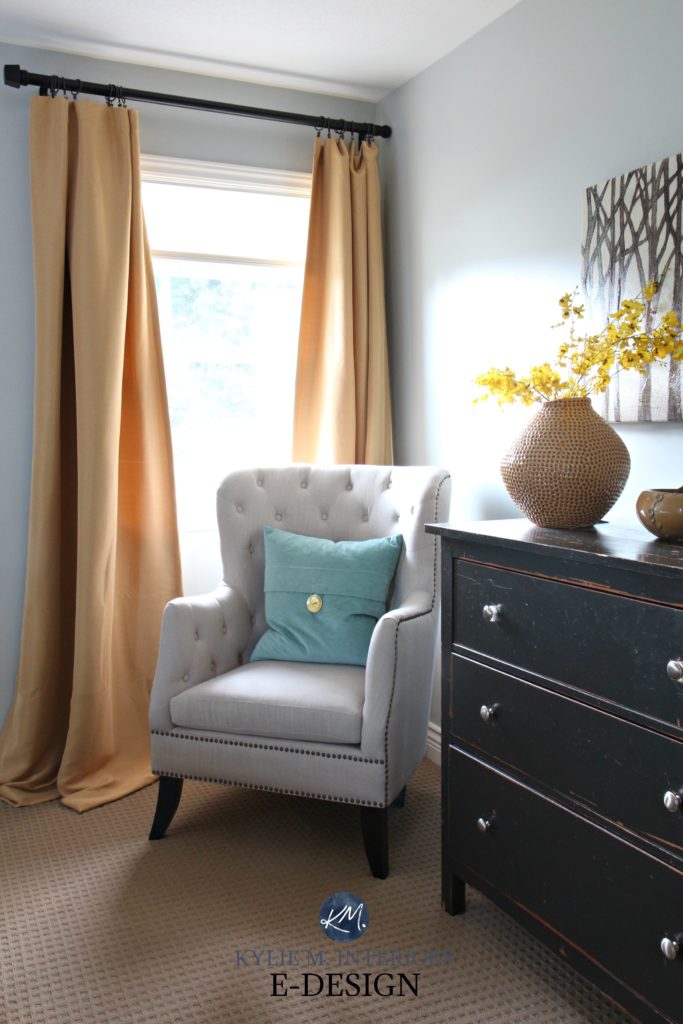
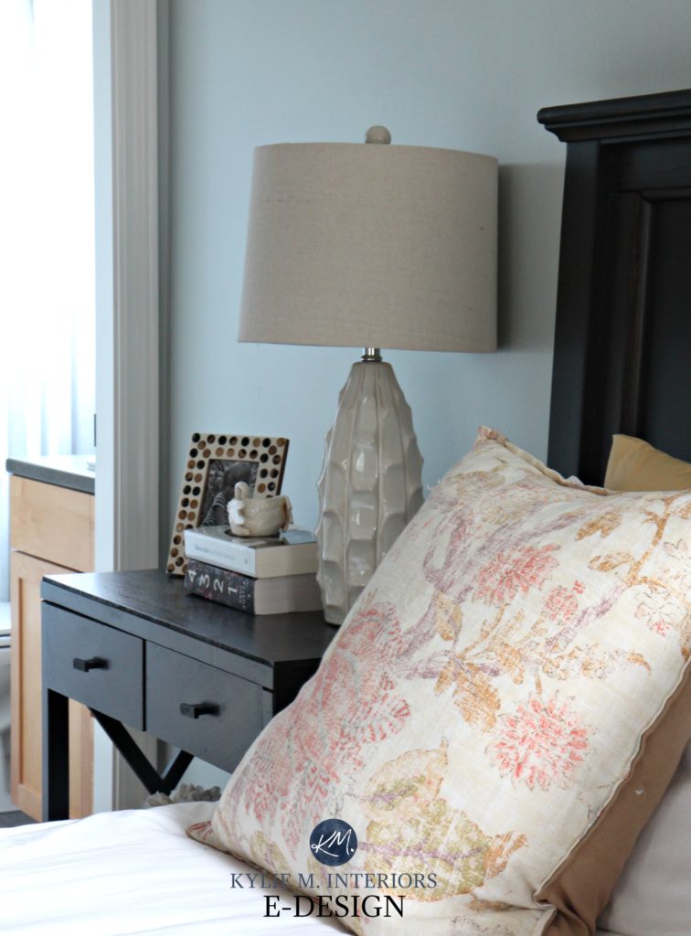
You can also expect a big shift depending on your exposure, the time of day, furnishings, AND the interior lighting.
Check out Silver Strand in this photo; the color comes to the surface considerably with the gray dropping back – and hardly a wink of green in sight!
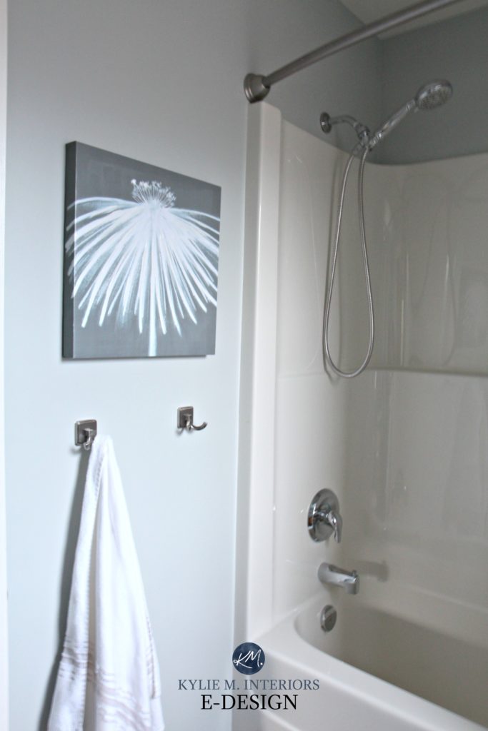
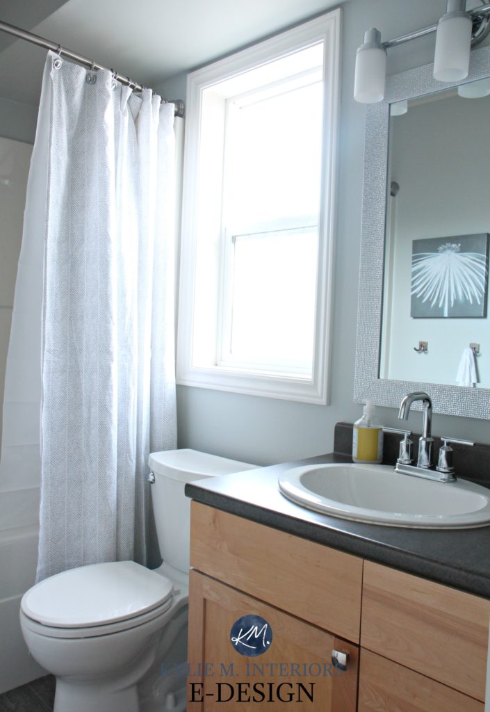
In the ensuite bathroom (which happens to be east-facing), notice how it grayed out…
And on a sunny morning, look at the reflection in the mirror – GREEN! Stuff like this excites me to no end (I’m easily excitable, though…).
Undoubtedly, you’ll be heading out in the near future to grab paint samples – stop right there! I want you to check out SAMPLIZE.
- Samples arrive ON YOUR DOORSTEP in 1-3 business days, depending on the location.
- they’re more affordable than the sample pots/rollers/foam boards needed for traditional paint sampling.
- If you keep the samples on their white paper, you can move them around the room.
Now, back to Silver Strand…
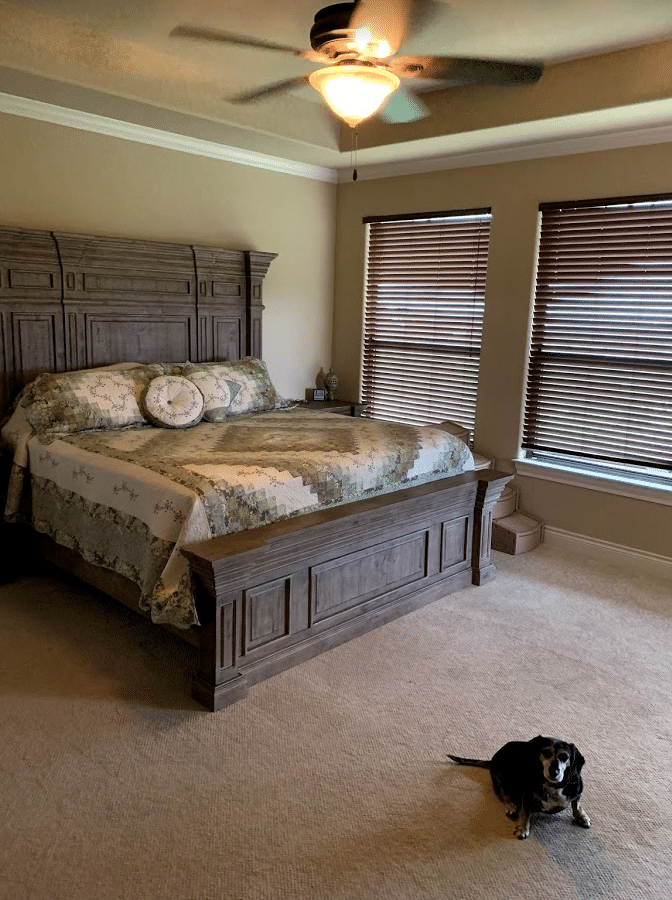
One of my Online Color Consulting clients used Silver Strand in her bedroom, which turned out GORGEOUS!
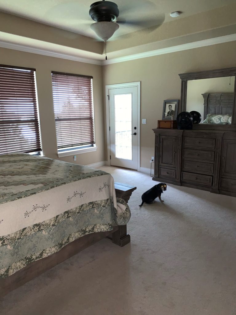
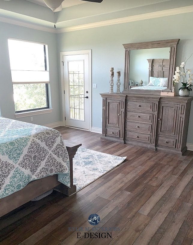
Whereas my bedroom was south-facing, hers is north/northeast, showing how it can shift depending on a room’s exposure.
North, East, South, West: Which Paint Color is the Best?
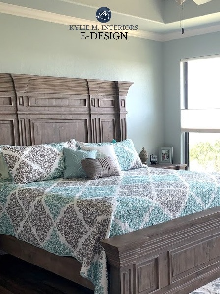
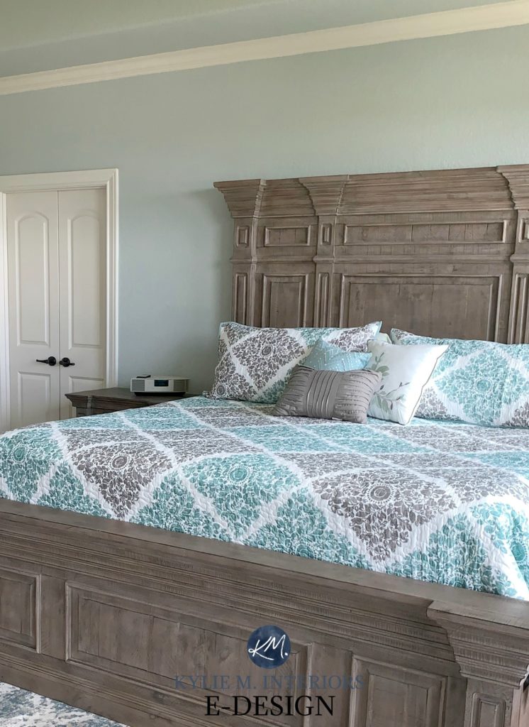
To sum it all up, when it comes to Silver Strand, it’s safe to say that it will look like a gray-blue-green blend (because it is). A lot of grays do this because of the type of black that’s used in their recipe, which can lean slightly to the blue side. But let’s put a finer point on things so that should you choose Silver Strand, you aren’t disappointed with the results…
- If you don’t like blue-green blends, you probably won’t like this color.
- If you prefer blue-green blends that cater to blue over green, this is USUALLY a winner.
- For flexibility, Silver Strand has more moves than a 12-year-old gymnast.
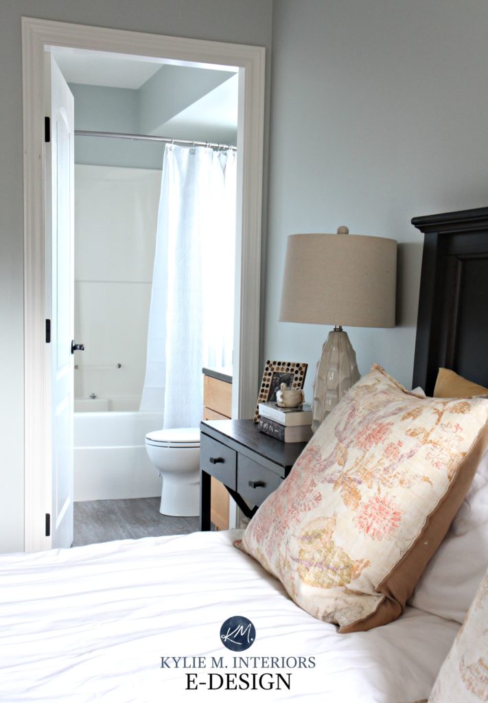
WHAT COLORS GO WITH SILVER STRAND?
Because of its depth and color blend, Silver Strand is a popular color partner and goes with some of the following…
- SUBTLE warm off-white paint colors
- lighter grays with a subtle warm violet undertone
- darker blue-gray blends (with green in them)
- warm and bright whites, as well as cool ones (there’s not many Silver Strand doesn’t love, so long as they aren’t TOO yellow)
The 5 Types of White Paint Colors
WHAT’S THE BEST WHITE TRIM OR CABINET COLOR WITH SILVER STRAND?
As mentioned above, Silver Strand is pretty easy to please regarding whites. But if I were to choose my FAVES…
- Benjamin Moore Chantilly Lace
- Sherwin Williams Pure White
- Sherwin Williams Extra White
SILVER STRAND vs. OTHER POPULAR SHADES
Comparing paint colors is the BEST WAY to find your room’s best color – especially when you have Samplize Peel & Stick to help you.
SILVER STRAND vs. SEA SALT
Silver Strand and Sea Salt are often mentioned in my Online Paint Color Consulting. Why? Both shades are popular for a spa or beach-vibe space, adding a calming vibe. However, there are a few key differences between these two colors.
- Sea Salt has more CHROMA (color), which means it has less gray in it. However, both are still reasonably muted paint colors.
- Sea Salt is more likely to lean into green compared to Silver Strand.
- Silver Strand has a stormier, moodier look, whereas Sea Salt looks more fresh and hip.
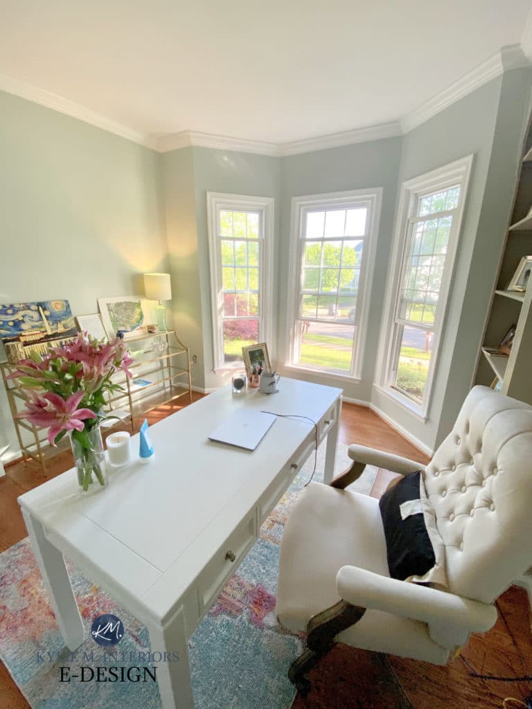
Sherwin Williams Sea Salt Paint Color Review
SILVER STRAND vs. SILVERPOINTE
- Silver Strand and Silverpointe have a few things in common, but not enough to make them really SIMILAR.
- Silver Strand’s LRV of 59 makes it darker than Silverpointe’s LRV of 64. This makes Silverpointe the lighter, fresher option.
- Whereas Silver Strand is more of a ‘blue-green with gray in it’, Silverpointe is the opposite – a ‘gray with blue-green undertones.’ This means the gray is stronger in Silverpointe.
- Silverpointe’s undertones are reasonably subtle, whereas the blue-green of Silver Strand is noticeable.
SILVER STRAND vs. AGREEABLE GRAY
I’m not sure why so many people are comparing these two shades when they’re going in different directions! Comparison is best kept to similar colors. Sure, these two have a similar depth, but that’s about it.
- Silver Strand is a COLOR with gray in it. Agreeable Gray is a neutral (greige-taupe) with a minimal undertone.
- Agreeable Gray is a subtly warm neutral. Silver Strand is a cool paint color.
- Both colors are in the light range. Agreeable Gray’s LRV is 60, which is DANG CLOSE to Silver Strand’s 59.
- Silver Strand and Agreeable Gray go with each other in a palette, but I wouldn’t use them in the same room (i.e., one on the main walls and one as an accent wall).
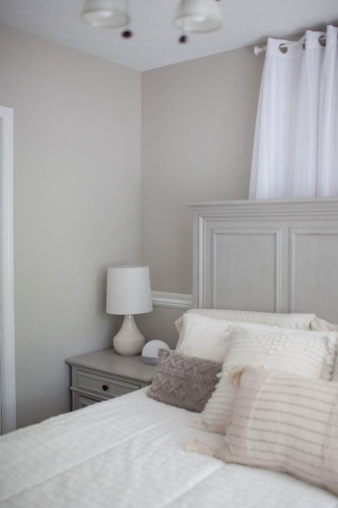
Paint Color Review: Sherwin Williams Agreeable Gray
The same goes for Repose Gray. For those of you comparing Silver Strand and Repose Gray, there’s even LESS of a comparison to be had. Repose Gray is a neutral paint color that’s a smidge darker than Agreeable Gray.
While Repose Gray and Silver Strand go well in a palette together, again, I wouldn’t use them in the same room (neither is great as the other’s accent color).
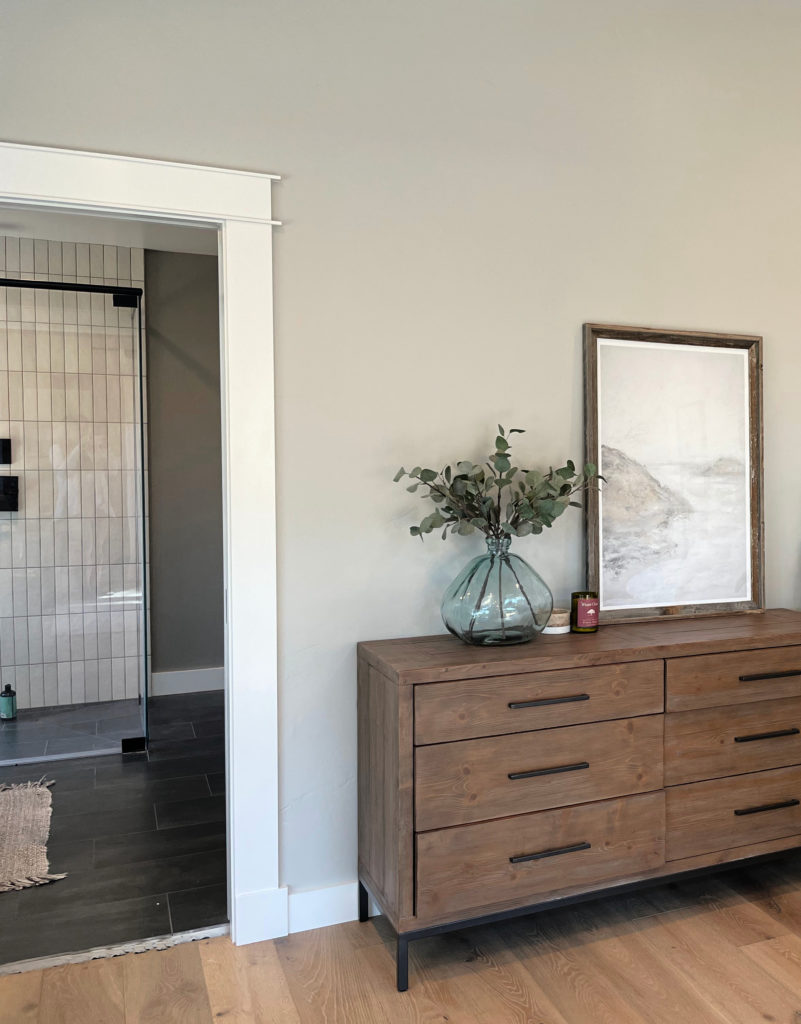
Paint Color Review: Sherwin Williams Repose Gray
So there you have it, Silver Strand. Hopefully, these tips helped you determine if it’s the best gray paint color for you!
READ MORE
Benjamin Moore Quiet Moments Paint Color Review
Paint Color Review: Benjamin Moore Gray Owl
The 3 Undertones of Cool Gray Paint Colors
The 8 Best Blue-Green Paint Colors
Need HELP?
Check out my E-Design and Online Paint Color Consulting packages!

Chat soon,

ORIGINALLY WRITTEN IN 2018, UPDATED IN 2023
Share this!

Tagged with:

Meet Kylie
Do you need help, but aren’t quite sure what ‘help’ looks like? Are you drowning in paint samples and decision fatigue?
Does every color you like at the paint store look terrible in your lighting or pick up a funky undertone? I’d love to help.

Hi, I’m Kylie
For over 24 years I’ve helped 12,000+ homeowners and renters make more confident decisions on paint colors and affordable home updates using real home examples and practical, experience-based advice. My goal is simple: help you love the home you have.
Do-it-yourself, the smart way
Grab one of Kylie’s guides
Affordable, downloadable shortcuts to the colors and combos I’d pick for you. Yours to keep, forever.

Homeowner’s Guide: White Kitchen Cabinets
This isn’t another ’10 Best Cabinet Colors’ list, because there is no SINGLE best white for every home and every kitchen.
Learn how to choose a white cabinet paint color that works with your countertops, backsplash, flooring, trim, lighting, and home—so you can rule out the wrong whites, sample fewer colors, and choose with confidence.
158-page PDF – Instant Download
$34.95Accent Colors – And How to Use Them
This isn’t about plastering your home in the ‘Color of the Year’ or following the latest trends (unless you really want to).
It’s about finding accent colors that work with YOUR home, YOUR style, and YOUR comfort level.
Because the best accent color isn’t one you love on a paint chip, it’s one that makes everything around it look better.
118-Page PDF – Instant Download
$34.95
Homeowner’s Guide: Exterior Paint Colors
Painting your home’s exterior is a BIG investment and choosing a color based on a tiny paint chip, a trend or the house down the street can be an expensive mistake.
Learn how to look at YOUR roof, YOUR windows, YOUR brick (or stone) and YOUR home as a whole so you can understand what colors make sense.
The goal? Less guessing, fewer samples and a lot more confidence before gallons of paint go on your home.
206-page PDF – Digital Download
$44.95Exterior Trim Paint Colors
This isn’t a list of ‘the best trim colors’, although you’ll get a ton of links to great shades!
You’ll learn how to look at your home and understand whether it needs contrast, repetition, connection, or a little visual peacekeeping to pull it all together.
Because trim might seem like a small detail…but spread it around all four sides of your home on multiple surfaces and it suddenly has a pretty big job.
118-page PDF – Instant Download
$24.95




Comments
-

I am looking forward to my color consult!
-
I’m looking forward to it too – I’m liking the look of that stone fireplace of yours!
-
-
Hope you talk about SW Silvermist sometime. Not very good looking on the color sheet but is a super chameleon on the wall. Silver Strand on steroids! Thanks as always for the post.
-
You are SO right, Silvermist IS like Silver Strand – just totally jacked up! Mad love for it…
-
-
In my northwest facing dining room it looked purple-ish so i went a completely different direction. You have opened my eyes to undertones and how the direction a room faces can make or break a paint color. I will use this color in my SE facing bedroom and it’ll be perfect!
-
I suggested this color to a friend about a year ago for her entire main floor. It looks fantastic in all the rooms, looking more blue gray than green. We also used it in one of the showrooms where I work and it looks perfect there as well. We used a lot of galvanized, wood and black accents. Again, it leans more gray blue than green. It also changes as the daylight wanes. Much richer as the sunlight fades. A beautiful color. It definitely is a color. It has been well received by most. I really wasn’t sure exactly how it would present, but it definitely did not disappoint. Most people find it soothing. Again, ilike you stated, if you’re not into the blue-green gray deal then keep looking lol. Thanks for another informative post. Best of luck on the move!
-
I can’t help but notice how your rearranged the furniture. You used to have the bed in between the windows, but then moved it to the way the previous owners had it. Any particular reason?
-
That color looks great in there! I love the way that you used the gold accents with it. Very soothing space.
-
You recommend Silver Strand three years ago for our master bedroom and I still love it every time I walk into the room!
-
Hey Holly! It is so pretty isn’t it! And like I said, it’s not really ‘ma jam’ as I’m not so much into the cooler lighter end of things, but I have to say it’s TOTALLY growing on me!
-
-
Hi Kylie, I wanted to say how much I love your blog. It is so informative and entertaining. I have learned so much from it.
Thank you for sharing your knowledge.-
Thank you Meredith! I’m glad you’re enjoying it 😉
-
-
This could just be the one for our MBR as well. Love how it pairs with the gold-beige rug, which we have too. I’ve been wanting to find a grey that will work with that tone and was willing to go a little bluer in the MBR. Thanks Kylie!
-
Where did you find the round silver framed mirror, it’s beautiful? I like how you kept the same curtains and it goes well with the brown toned carpeting.
-
Thank you Mark! I’ve actually had that mirror for a few years no, I’m SURE it would have been Home Sense (as that’s really the only place to shop in Nanaimo!).
-
-
Hi Kylie!
I did my living room in Magnetic Gray (one shade darker than Silver Strand). My living room windows that face the north and east. It looks totally blue at all times of day (no hint of green, and I don’t see any gray – even at night). Lighting is so bizarre!
Your bedroom looks great! Curious, with all the different paint colors you have (and had in your home), do you change the ceiling color and trim color? Do you have the same ceiling color and trim throughout your home? Which one(s) did you use?
Also, I can’t tell from the pictures, do you have some sort of blinds on your bedroom/bathroom windows?
Can’t wait to see what you do with you next home – is flipping homes your thing?
Christy
-
Hey Christy! Ooo, I do love Magnetic Gray and that doesn’t surprise me as it’s basically like a slightly darker version of Silver Strand – they are ninjas!
And yes, it’s like a revolving door or colours around here with paint colour and there are actually 3 things I rarely change – trim, ceilings and closets! I would die if I did. Now when we bought our house, all of the closets were crazy colours – so I’ve had them all painted neutral at some point and now, I just leave the closets when I do the rooms. All the trims were painted (a few years ago now) BM Cloud White, so that I didn’t have to mess around when I changed wall colour as Cloud White is so versatile and seemed a decent match to the ceiling (which I’ll never know the colour of as it’s original). The EXCEPTIONS are the girls rooms and my office, where I did ‘white’ trim so that everything was super clean and crisp looking, as their wall colours are a bit different from the main part of the house.
So long story short, generally no – I don’t change the trim 🙂
As for the bedroom, we have some pleated blinds on the bedroom windows that offer privacy and nothing on the bathroom, it’s a textured glass.
And you know, it seems that Tim and I have a 4 year expiry date. We’ve had all of our homes for approx 4 years – and then I’m ready for something new and fun! So no, not flipping. Our intention is always to stay, which is why we make choices that are maybe a bit nicer/personalized, but then lo n’ behold – we get antsy and want to move!
Chat soon 🙂~Kylie
-
-
I loved the chocolate brown room!! I have been wanting to do that in our master and am trying to get hubby on board. What color was that brown?
-
Hi Kylie,
I love love LOVE your blog! We’re in the process of building a new house and I have found so many helpful tips here for picking colors. Thank You! I do have one question though… Is there a BM gray that would be darker than Gray Owl, but still coordinate? We are using Gray Owl in our kitchen and dining room, but I was looking for something a little bit darker for our living room. It is all open, so you will see both at the same time. Any ideas?
Thanks-
Hi Kaitlyn! Gray Owl is a tricky one as it’s a bit of a chameleon. It can look gray, it can look blue, it can look green, it can look like all of those things! If you choose a gray that doesn’t have that same flexibility, you can risk the undertones clashing. The safest bet would be to play around by darkening it by 50%. Yes, this can change how the undertones rise up/settle down, but you are still working off of a comparable base colour. You can also look at BM Sea Haze, which is the next down in the colour sequence, but I do find the green comes up a touch more.
-
-
Loved working with Kylie! I highly recommend her! Silver Strand definitely changes color! Kylie recommended I try Silver Strand along with some other updates she was helping me with. I’ve been amazed at how it can look so different depending on the lighting. Mine turned a bit more green than I had hoped, due to the lack of natural light in my living room. It makes it hard to decorate around Silver Strand at times–due to the changing color in different areas. But it does look pretty next to certain oak finishes in my house. I have a love/hate relationship with this color:-).
-
I love your carpet and color. Can you tell me where you got it?
-
Hi Stacey, unfortunately it was original to the house when we moved in, so I don’t know – sorry!
-
-
Love your blog!
I have sliver strand in my open plan, north/east/south – east facing, family room and creamy in other half kitchen/breakfast nook area. I love different tones of Silver Strand through out the day.
I am planning to use it for my master bedroom, facing north ( a long narrow window) and east (2 windows), room is just above the family room. I am thinking of lighting it 25%, as I find the color little towards darker shade. Two walls in the Bedroom are 16’ feet high, what do you suggest, 25% lighter will work?
I am planning to get the sample and try in the room but I had read in one of your blogs that higher walls make color lighter in a room, so my concern. Waiting for your response.
Thank you,
NIdhi-
I painted two walls of the room with Sherwin Williams Pearl Gray and rest of the walls SW creamy.
Pearl gray has more green accent but not screaming green color.
I tried Silver Strand at 75% strength but did not like it.
-
-
Thanks for your blog!! It’s helped me so much. If not Silver Strand, what do you think about SW window pane or rain washed. Maybe not so popular colors as silver strand but I’m looking for a pale mint blue that doesn’t come out bright green like a mint chocolate chip.
-
I wanted a blue green grey but this post scares me that silver strand would wash out in our south facing master bedroom. I went with SW Silverpointe and love it! I’m thinking of painting it in other parts of the house. Have you used this color much? Thanks!
-
painted my whole inside with Silver Strand, love it!!
-
Hi Kylie, your blog has taught me a ton, because I stress over making the wrong decorating choices! My powder room is Silver Strand and we are updating the vanity. Would you go with white or navy vanity with carrara top? The navy appeals to me, because of the soft brass handles. I attached my plea for help on Houzz, because I posted pics. It seems the navy would limit my wall colors, but it’s pretty. And the white vanity would be a classic… What’s your vote, Kylie? Thank you!
https://www.houzz.com/discussions/5886425/please-powder-room-31-vanity-for-more-space-or-37-wider-counter


Leave a Reply