
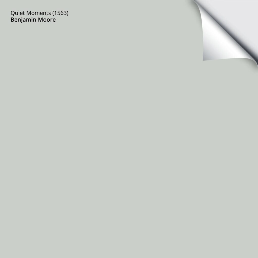
BENJAMIN MOORE QUIET MOMENTS 1563 / CC-700: Paint Color Review
QUIET MOMENTS, A TRANQUIL GREEN-GRAY-BLUE BLEND THAT CAN SOOTHE YOUR SOUL
Quiet Moments (also known as Smoky Green) is a STUNNING color that creates a serene and calming atmosphere in any room. But is this blue hue the right one for you? Let’s see what it can do…
BEFORE WE GET STARTED…
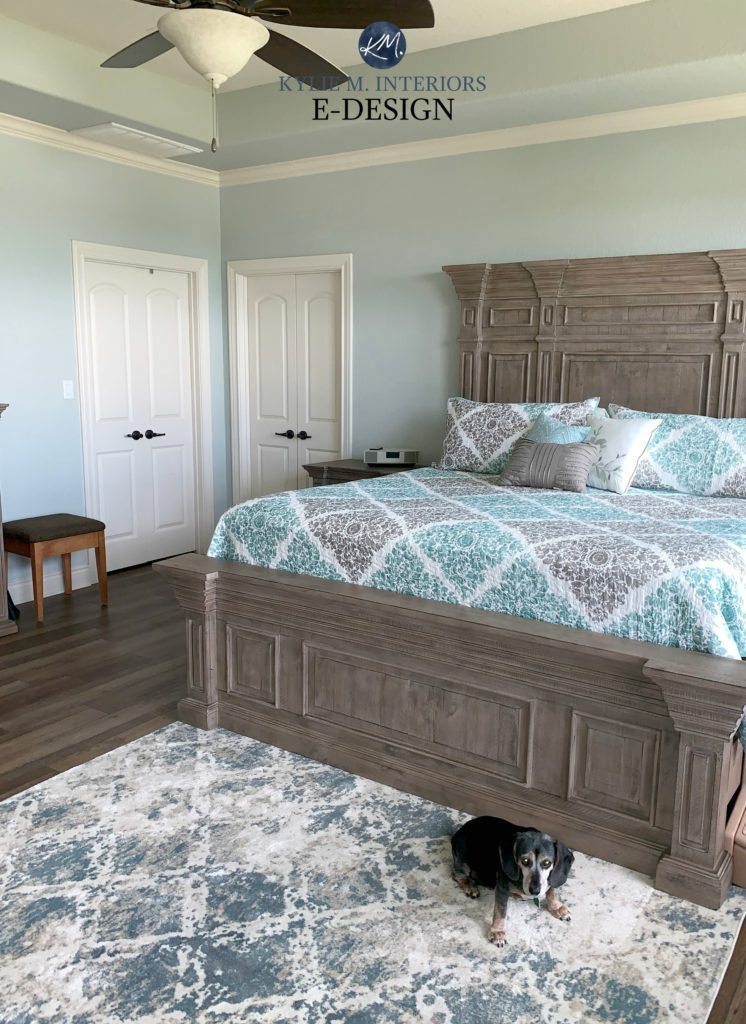
To show you RELATEABLE & REAL homes, I ONLY use photos from my Online Color Consulting clients. This means I don’t always have the quality photos I need or the RIGHT photos, but DEFINITELY have some SUPER helpful info to help you on your way!
IS QUIET MOMENTS A WARM OR COOL PAINT COLOR?
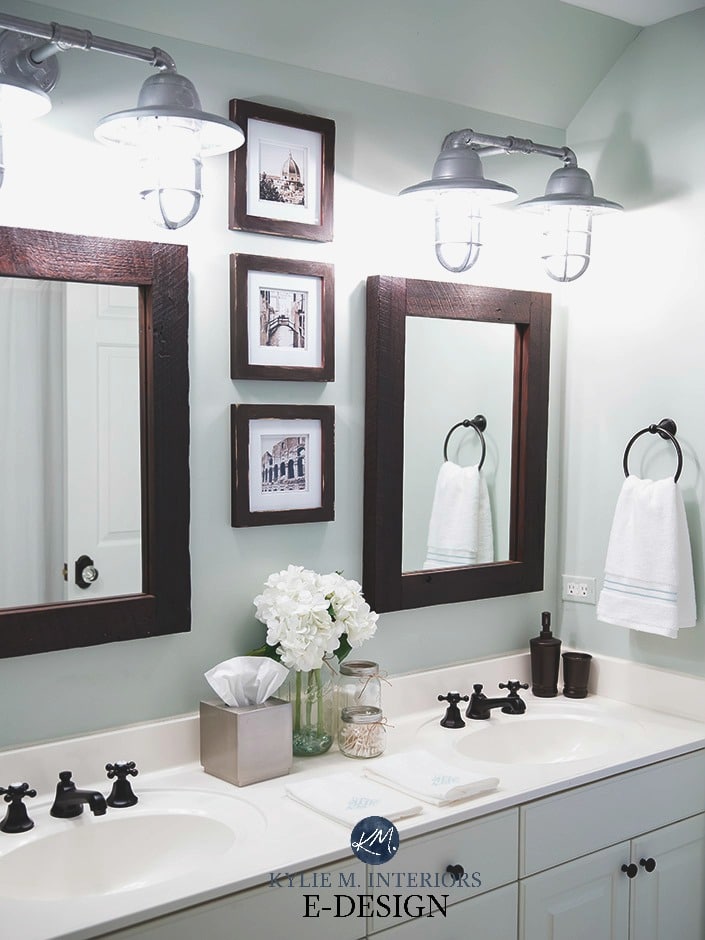
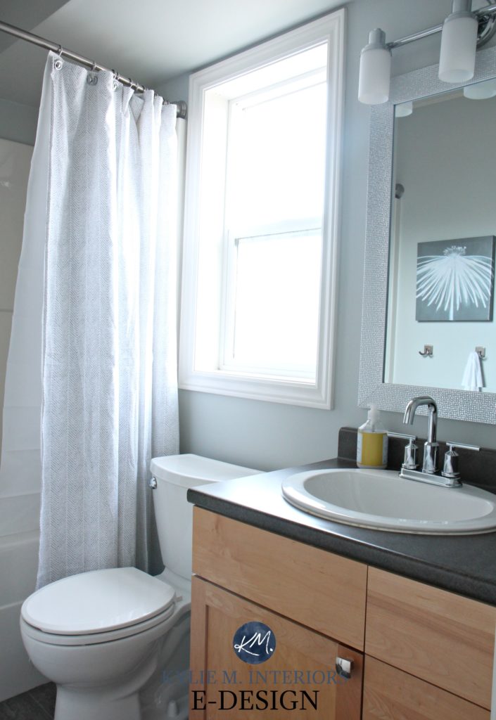
Quiet Moments is a cool-toned color mix of blue and green. However, it’s the subtle gray that makes Quiet Moments such a great shade for creating a calming and relaxing mood in almost any room.
North, East, South, West – Which Paint Color is the Best?
WHAT IS QUIET MOMENTS’ LRV?
Quiet Moments has an LRV of 60.73, which can help a room feel lighter and brighter as it will reflect artificial and natural light into the space. And while it will wash out in intense natural light, come evening, it settles back down with the perfect amount of contrast with white trim. In fact, it’s DARN CLOSE to my fave LRV number for the average room!
Not sure what LRV is? It could save your paint-lovin’ life – read all about it HERE.
The Best Paint NUMBER for Your Home – 62
The Best LIGHT Paint Colors for a DARK room
WHAT UNDERTONES DOES QUIET MOMENTS HAVE?
Quiet Moments is a blue-green at heart with GRAY undertones. However, most colors cater more to one color or another. In Quiet Moments’ case, it tends to cater towards blue OVER green; however, this can shift depending on your room’s exposure, interior lighting, and the other colors used in the space. For example, if you like warm light bulbs with lower KELVINS (i.e., 2800), you might see Quiet Moments favoring green over blue.
- In certain south-facing rooms, Quiet Moments may lean a wink into its green side.
- In north-facing rooms, it may go a bit more blue with just a hint of green popping up.
- In a room with varying exposures (common in open layouts), Quiet Moments will likely vary and shift throughout the day. Sometimes being greener and sometimes leaning into the blue. It’s one that you FOR SURE want to sample and test in the room’s exposures throughout the day to see how it sits.
With that said, you’ve gotta sample this one carefully to make sure it gives the look you’re going for.
The Ultimate Guide to Paint Colors & Undertones
SAMPLING QUIET MOMENTS WITH PEEL & STICK
I want you to check out SAMPLIZE Peel & Stick paint samples.
- samples arrive ON YOUR DOORSTEP in 1 DAY, depending on the location
- they’re MORE AFFORDABLE than the samples pots/rollers/foam boards that are needed for traditional paint sampling
- if you keep the samples on their white paper, you can move them around the room
Get your Samplize PEEL & STICK SAMPLE
WHAT WHITE TRIM COLORS GO WITH QUIET MOMENTS?
When it comes to pairing white trim with Quiet Moments, you have a few options. A brighter white like Chantilly Lace will create a beautiful contrast with the cool blue-green hue of Quiet Moments. Alternatively, you could choose a softer, warmer white to create a more subtle transition between the walls and trim, like Benjamin Moore White Dove; the warm-cool partnership can be very pretty and even a bit beachy-looking.
The ULTIMATE GUIDE to White Paint Colors
3 Steps to Picking the Best White Paint Color
IS QUIET MOMENTS A GOOD COLOR FOR THE EXTERIOR OF A HOME?
Quiet Moments could be a great choice for the exterior of homes as it creates a serene and coastal look. HOWEVER, if you get a lot of natural light, it will wash out…a lot. For this reason, I would lean into a color with a bit more depth (personally). If you fall in love with Quiet Moments, make sure you have clean white trim along the lines of Sherwin Williams High Reflective White, just to get a clean, crisp contrast.
5 Tips for Choosing an Exterior Paint Color
Does Your Exposure REALLY MATTER When Choosing EXTERIOR Paint Colors?
IS QUIET MOMENTS A GOOD COLOR FOR KITCHEN CABINETS?
Quiet Moments could be good for cabinets; however, with its LRV, I worry about it looking washed out and losing some of its intended beauty. The sheen of cabinet paint can make a color look a bit lighter than expected, especially in kitchens with good lighting. For this reason, I’m usually inclined towards blue greens with more depth.
How to Choose the Best White Paint Color for Your Kitchen Cabinets
Should You Paint Your Kitchen Cabinets or Keep Them Stained? A QUESTIONNAIRE!
WHAT OTHER COLORS ARE SIMILAR TO QUIET MOMENTS?
Comparison is the KEY to choosing the best paint color for your home. Samplize Peel & Stick makes it easy to explore other colors to see how undertones, temperatures, and LRVs shift…
If you’re looking for a color similar to Quiet Moments, you could consider…
- Benjamin Moore Smoke 2122-40
- Benjamin Moore Beach Glass 1564
- Sherwin Williams Silver Strand
- Benjamin Moore Arctic Gray 1577
- Sherwin Williams Sea Salt SW 6204
QUIET MOMENTS vs. SIMILAR COLORS
Some of you want more DIRECT comparisons to help you decide which shade is best for your home. This is why I’ve chosen a handful of the most POPULAR blue-green blends and compared them to Quiet Moments…
QUIET MOMENTS vs. SHERWIN WILLIAMS SEA SALT
If you can’t decide between these two beautiful blue greens, I don’t blame you. The only NOTICEABLE difference is that Sea Salt is a touch greener than Quiet Moments, making QM the bluer of the two. So, if you’re looking for a color more likely to cater to blue, Quiet Moments is a slightly safer bet, although both colors are known to shift their allegiance!
- Sea Salt is more popular than Quiet Moments in general. I can’t even tell you why – maybe we love the name!
- Both colors are commonly found in bedrooms and bathrooms, but being that bit more colorful, are less likely to be ‘whole home‘ paint colors.
- Neither color is particular popular on cabinets, front doors, or exteriors, probably because of their depth (the risk of them looking washed out in brighter light).
Sherwin Williams Sea Salt Paint Color Review
QUIET MOMENTS vs. BEACH GLASS
Quiet Moments and Beach Glass are similar in their general color makeup; both are blue-greens with a good shot of gray in them. The noticeable difference is that Beach Glass has a lower LRV of 49.7 than Quiet Moments’ LRV of 60. This makes Beach Glass a darker color that can stand up to bright light without washing out as much as Quiet Moments. However, this increased depth isn’t as fresh and clean looking as Quiet Moments, so it depends on the look you’re going for.
- Quiet Moments is more popular on walls.
- While Beach Glass is also popular on walls (especially bedrooms), it’s often on coastal or beach-style front doors, exteriors, and cabinets.
QUIET MOMENTS vs. SHERWIN WILLIAMS SILVER STRAND
These two can definitely fight for the same color slot. With VERY similar LRVs (depth), they offer the same contrast with white trim. The big difference between these two colors is that Silver Strand is a bit grayer and smokier than Quiet Moments. If you’re worried that Quiet Moments has a BIT too much color in it, Silver Strand could hit the spot. And while it can look a weeee bit greener at times, its flexibility is pretty darn similar to Quiet Moments.
- Both colors are super popular for bedrooms and bathrooms.
- Both colors suit a muted, calm, spa vibe and are popular for counseling offices.
- Neither color is popular for exteriors or cabinets. Not saying they can’t work, but they can look a bit washed out.
Sherwin Williams Silver Strand Paint Color Review
QUIET MOMENTS vs. PALLADIAN BLUE
If you can’t decide between these gorgeous shades of blue-green, consider the overall LOOK you’re going for.
Both colors have a blue-green-gray blend. However, Palladian Blue has less gray in it, making it more cheerful and colorful looking. And whereas both colors can be calming (depending on your perception), the increased gray of Quiet Moments makes it a popular choice for soothing, calming, spa-inspired rooms.
- Palladian Blue is popular for a more cheerful, beachy vibe. It’s also a good choice for kids’ rooms.
- Quiet Moments has a slightly more spa-inspired look/more casual coastal approach.
WHICH PAINT COLORS GO WITH QUIET MOMENTS?
Quiet Moments pairs well with other soft and subtle colors, such as Benjamin Moore White Dove OC-17 or Sherwin Williams Agreeable Gray SW 7029. OR, if you want a more vibrant look, it could look gorgeous with bold accents like yellow, coral, or navy.
Let’s look at a few more color groups suited to Quiet Moments…
- grays that are lighter than Quiet Moments, especially those in the off-white range
- a wide range of warm whites, as well as brighter whites
- subtle creams that are LIGHTER than Quiet Moments, such as Sherwin Williams Creamy
READ MORE
Benjamin Moore Gray Owl OC-52: Paint Color Review
Paint Color Review: Sherwin Williams Silver Strand
Sherwin Williams Sea Salt, Undertones & More: Paint Color Review
The 3 Undertones of Cool Gray Paint Colors
The 8 Best Blue-Green Paint Colors
Not sure which paint color is best for YOUR home?
Check out my Online Paint Color Consulting – I’d love to help!
Chat soon,


Ah! This is where she’s been hiding! I’ve been hoping you would review BM’s Smoky Green, never knowing it had another name.
Obsessed with the colour and really want to consider it for an open layout LV/DR with am SE/pm NW exposure.
I’ve read through so many of your posts and know a colour consult with you is needed because gosh darn I just can’t pick.
Thank you for sharing so much of your knowledge. This nerd is lapping it up!
Wahooo, thanks for loving my info!! So, from the SOUNDS of it, Quiet Moments coudl be super pretty, as your exposure has SO many variations!