Benjamin Moore Natural Cream Review: Is it Cream, Greige, or Beige?
While there are a few that beat it, Natural Cream is one of the most popular paint colors for 2026. It’s risen dramatically in the ranks, outpacing popular shades like Ballet White, Classic Gray, and more.
But WHY is Natural Cream so popular right now? There’s one main reason, and it isn’t because it’s a great choice for walls (it often isn’t) – it’s thanks to kitchen cabinet trends.
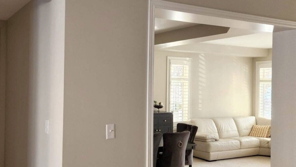
Non-white cabinets are hot, especially since a few influencers chose Natural Cream for their cabinets. It’s officially an ‘it’ color.
As a paint color expert, what do I think of this ‘hot’ neutral? I’m skeptical. So, let’s find out what makes this color tick, and why you may…or may not, choose it for your home.
WHAT TYPE OF COLOR IS NATURAL CREAM OC-14?
First off, if you’re wondering if Natural Cream and Nature’s Essentials are the same color, they are. THANK YOU, BENJAMIN, FOR CONFUSING EVERYONE!
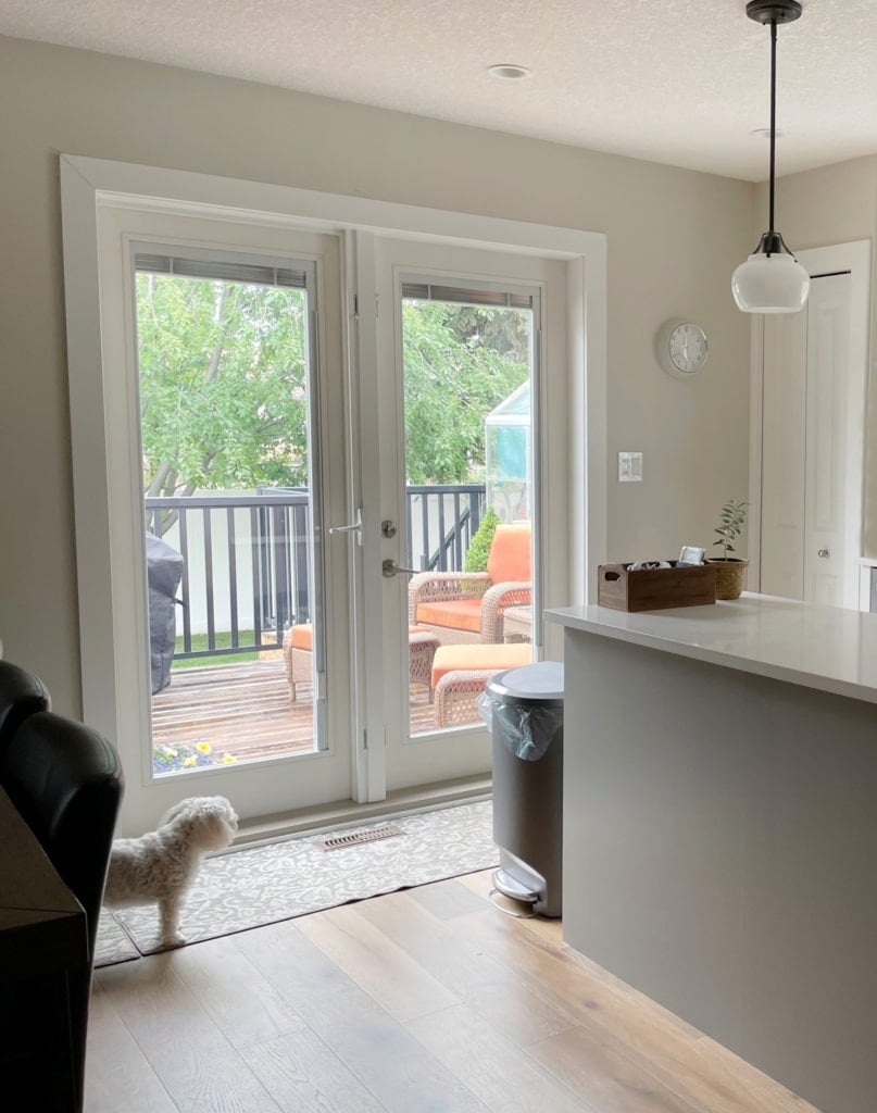
IS NATURAL CREAM…CREAM? In some lighting conditions, yes, it can appear to have a cream warmth – one that’s considerably grayed out and muted. However, if you love cream and expect a certain level of warmth, it likely isn’t enough to hit your happy place.
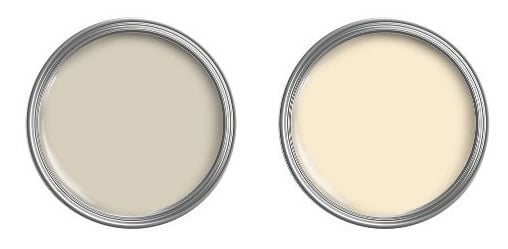
To see the difference, compare it to Benjamin Moore Navajo White (above right).
IS NATURAL CREAM A BEIGE PAINT COLOR? No, just as with it looking cream, Natural Cream can pick up a beige look in some lighting conditions, but it’s not beige at heart.
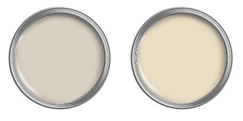
To see the difference, compare it to Benjamin Moore Muslin (above right).
NATURAL CREAM IS A TAUPE-GREIGE PAINT COLOR
Part of its appeal is its ability to wink at a range of color groups without a ton of commitment. It’s like a Tinder date rather than marriage.
Being a taupe-greige, Natural Cream has a solid, organic, earthy, warm base, calming it – emphasis on warm. Many taupe-greiges lean more gray – not this one – you can usually expect a noticeable warmth.
Some might even call it a creamy greige – you do you, boo.
But what makes it a taupe-greige? You’ll find it soon in the undertone section!
NATURAL CREAM’S LRV (DEPTH)
Natural Cream has an LRV of 64.78, putting it smack dab in the middle of the light range. If, as the Benjamin Moore website suggests, you’re expecting a subtle off-white, you’re looking at the wrong color.
This LRV gives a color a good grounded look – not so light that it easily washes out; not so dark that it weighs down the average room. However, let’s talk about how it might look in a range of lighting conditions…
HOW NATURAL CREAM LOOKS IN DIFFERENT EXPOSURES
There’s no way to predict how a paint color will react to its surroundings – there are far too many variables. That said, with careful research (I’m glad you’re here with me) and proper paint color sampling, you can see how it settles in your space.
Check it out in my client’s home below. What do you think?
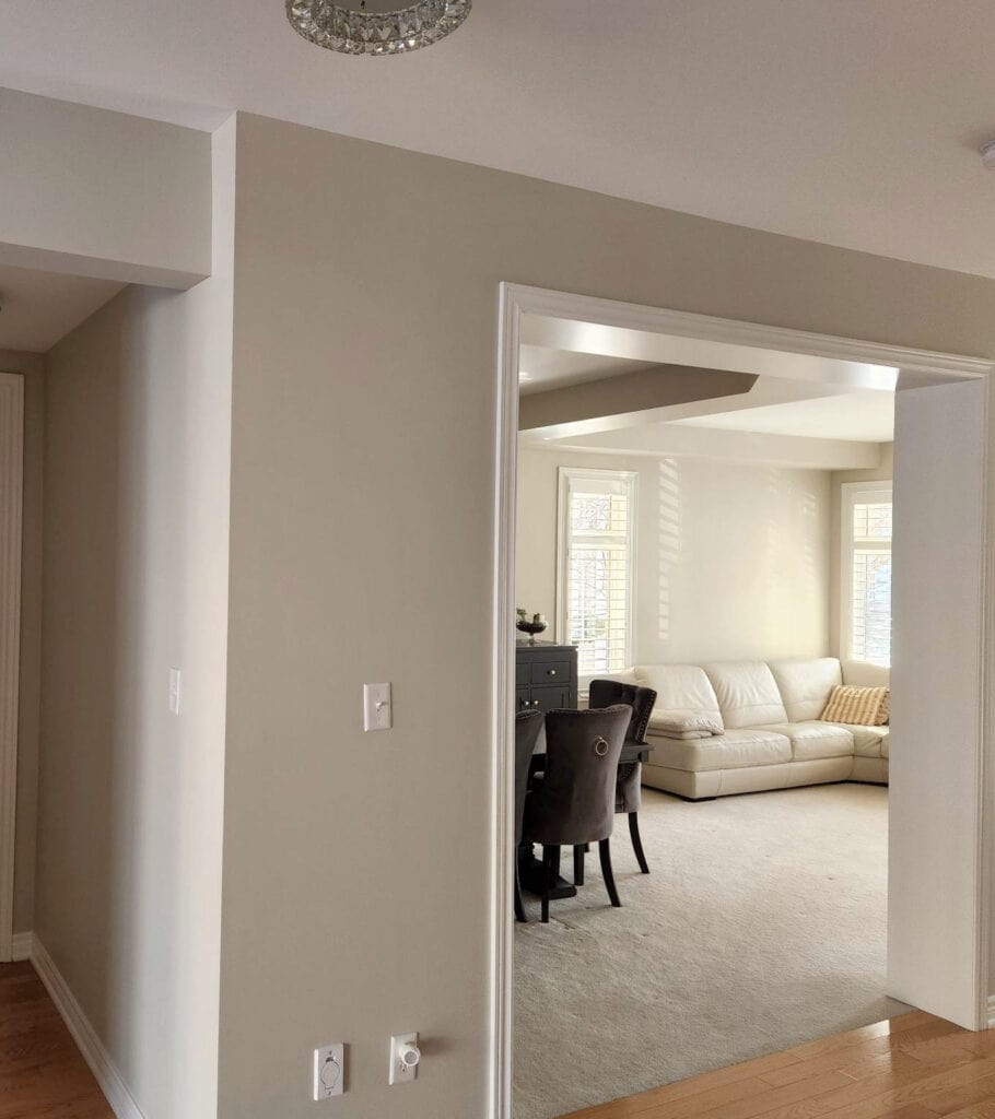
- It’s easy to see that it appears creamier in the furthest room – notice how it settles with the cream leather sofa.
- Notice how that creamy potential dies off in the front room, as it picks up a more greige-taupe vibe (with a wink o’ green for sharts n’ giggles).
- Both rooms are receiving a reasonable amount of natural light.
Now, let’s find out the exposures of these 2 rooms…
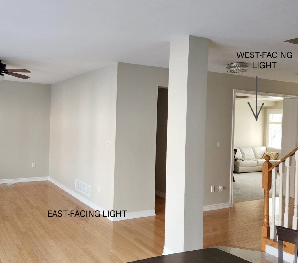
BOOOOOOM – mic drop. That’s exposure in action.
- The front rooms flatter afternoon light isn’t doing any wonders for the walls. You might get a similar look in a reasonably well-lit north-facing room. I bet that back room looks dang flat in the western morning.
- The back room’s warm afternoon western sun brings out the creamy potential of Natural Cream, but I’m still not buyin’ it. You might get a similar look from a south-facing room lit similarly.
North, East, South, West, Which Paint Color is The Best?
Neither room has interior lighting turned on, and neither room turns ME on. This isn’t the right color for these spaces (I get hired to fix rooms like this daily). While it coordinates okay with the sofa, that room’s carpet and the front room’s wood flooring aren’t happy.
In most cases, you need to choose the best paint color for your room’s HARD FINISHES first, and then see how the soft (easier to replace) finishes sit.
Here’s your Peel & Stick paint sample of Natural Cream…
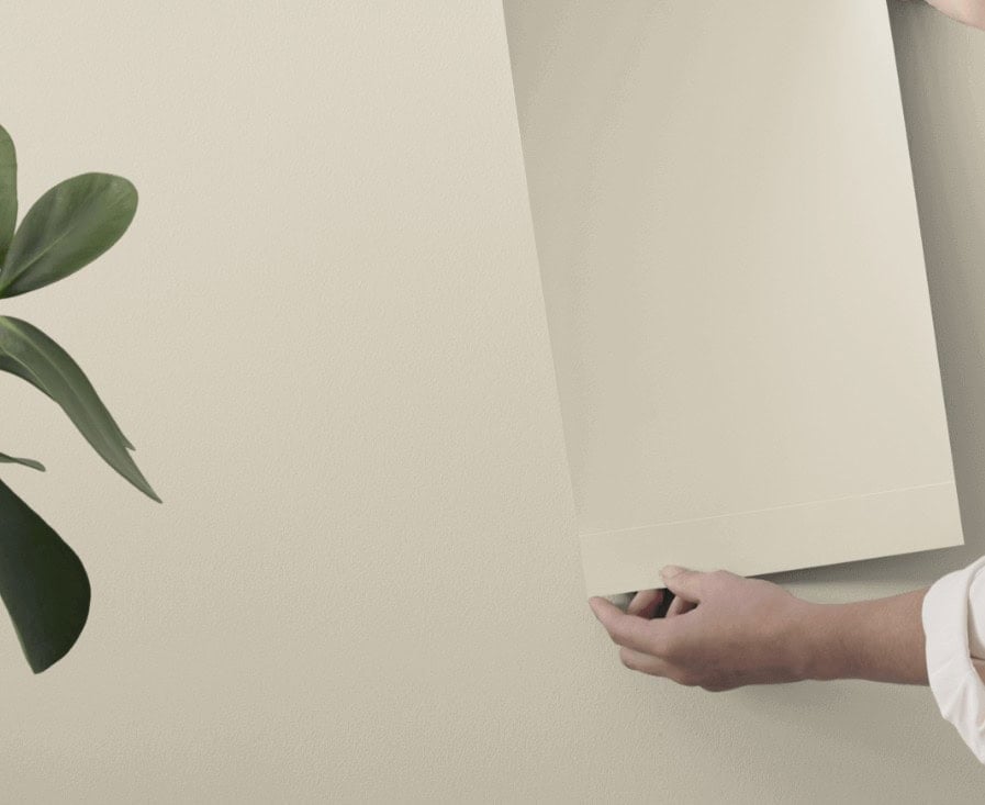
Image from the actual Samplize site.
NATURAL CREAM ISN’T GREAT FOR A DARK ROOM
When my clients have a dark room, I rarely suggest colors like this (the very odd exception). Because it’s a muddier, dingier, organic hue, it can fall a bit flat and murky in low light – it’s too dark and neutral for these types of spaces.
That said, this same muddy, organic look can be soft, nature-inspired, and gorgeous in a room with adequate or even better-than-adequate natural or interior lighting.
WHAT UNDERTONES MIGHT NATURAL CREAM HAVE?
At its heart, it’s a considerably warm taupe-greige paint color. These colors most commonly lean into green or purple-pink undertones. In my work and studies with Natural Cream, the challenge is that it’s not that committed to any particular hue.
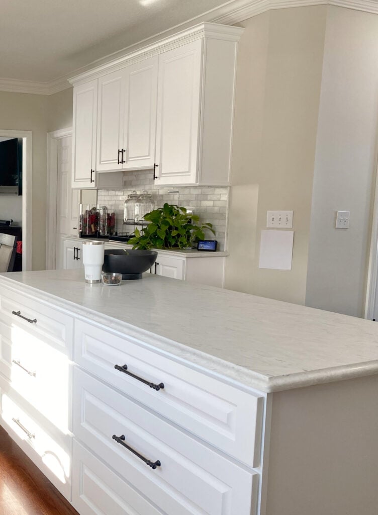
Look at Natural Cream and how it changes on each wall space – she’s a wild one!
99.5% of the photos in my blog are of REAL HOMES from my Online Color Consulting clients, readers, and friends. While not always magazine-perfect, they’re packed with ideas and proven color choices to help you create a home you’ll love.
Sure, it’s warm, but it’s close to the green line. Being so close, it easily leans into a green undertone in the right (or wrong) conditions. Yet in others, it holds a more muddy taupe hue quite nicely.
This variability is also what makes Natural Cream popular, as homeowners and renters seem to love its flexibility. Personally, it makes me too nervous – it’s more unpredictable than my IBS, which says a lot.
Here’s that same kitchen from a different direction. If you think Natural Cream can’t appear green, this could change your mind…
I DIDN’T CHOOSE THIS COLOR (obviously). It’s off-whack with the marble backsplash (the biggest issue), the chair fabric and the lighting shade…
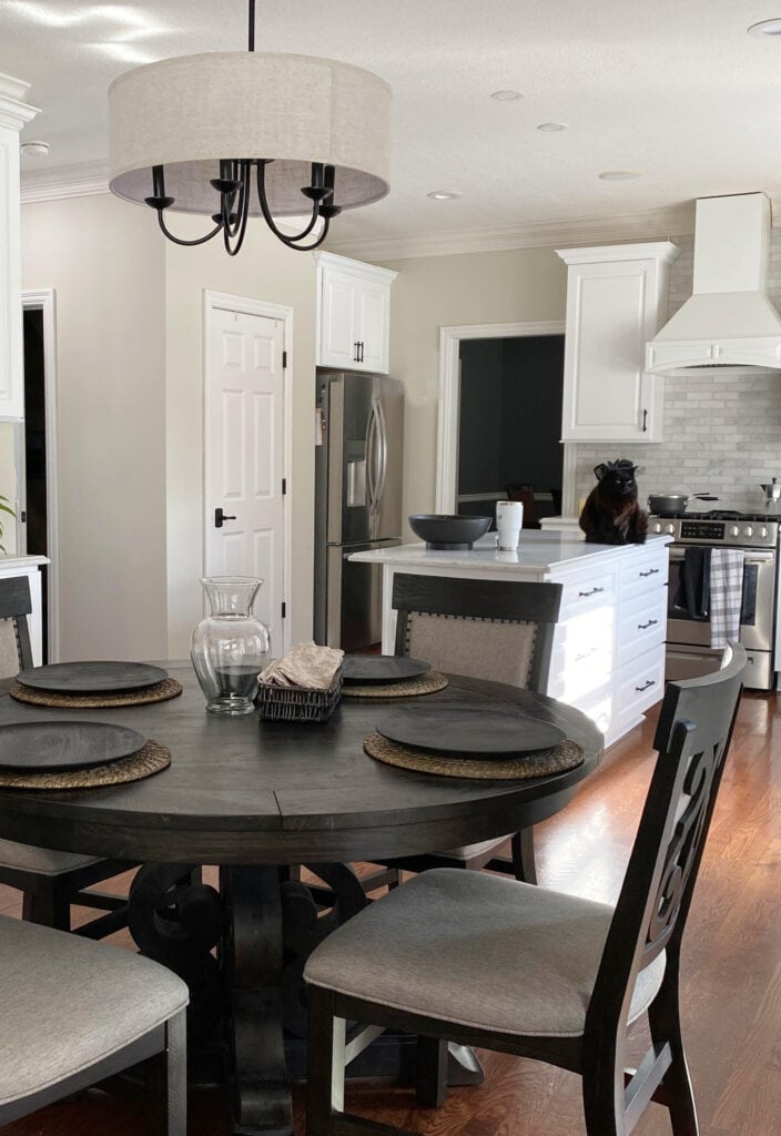
This doesn’t mean it WILL look green in your home, but it shows that it has potential with the right exposure and surrounding finishes.
WHICH WHITE TRIM COLORS GO WITH IT?
Natural Cream is reasonably fussy. While it can humor bright, true whites, those aren’t its wheelhouse. Instead, focus on softer, warmer whites, so long as they aren’t heavy on cream-yellow.
- Benjamin Moore White Dove is one of my favorite suggestions for trim and cabinets
- Sherwin Williams Pure White works if your room’s other finishes need a bit less warmth
- Even Benjamin Moore Simply White can be interesting. Sample a range of whites, and see how you feel about its approach to warmth/white and the contrast it offers. Personally, not my jam, but others love it (and it’s not about me ALLLL the time).
Here it is with a trim color similar to Sherwin Williams Alabaster…

OTHER REVIEWS: BM Revere Pewter | SW Accessible Beige | SW White Duck
WHERE NATURAL CREAM WORKS BEST, & WHERE IT DOESN’T
Just because a color is having its day in the sun (unlike my pasty white legs), doesn’t mean it’s an instant win. And just because Designers and influencers rave about it, doesn’t mean it’s the best color for YOU and your home. Here’s a shortlist of where it does its best work, and then we’ll hit some of the big ones.
- Many of my clients are excited to use Natural Cream on their cabinets (kitchen/bathroom/laundry). It can be absolutely gorgeous with the right surrounding finishes and lighting.
- Wainscoting or board n’ batten
Wow. That was a short list. Now, let’s get down n’ dirty…
IS IT A GOOD CABINET COLOR?
Heck yes. With cabinet trends still in the ‘organic, non-white range’, and again, with colors like this and Creamy White showing up in kitchens of influencers, it’s hot. BUT (Kardashian-sized, so expect some padding)…
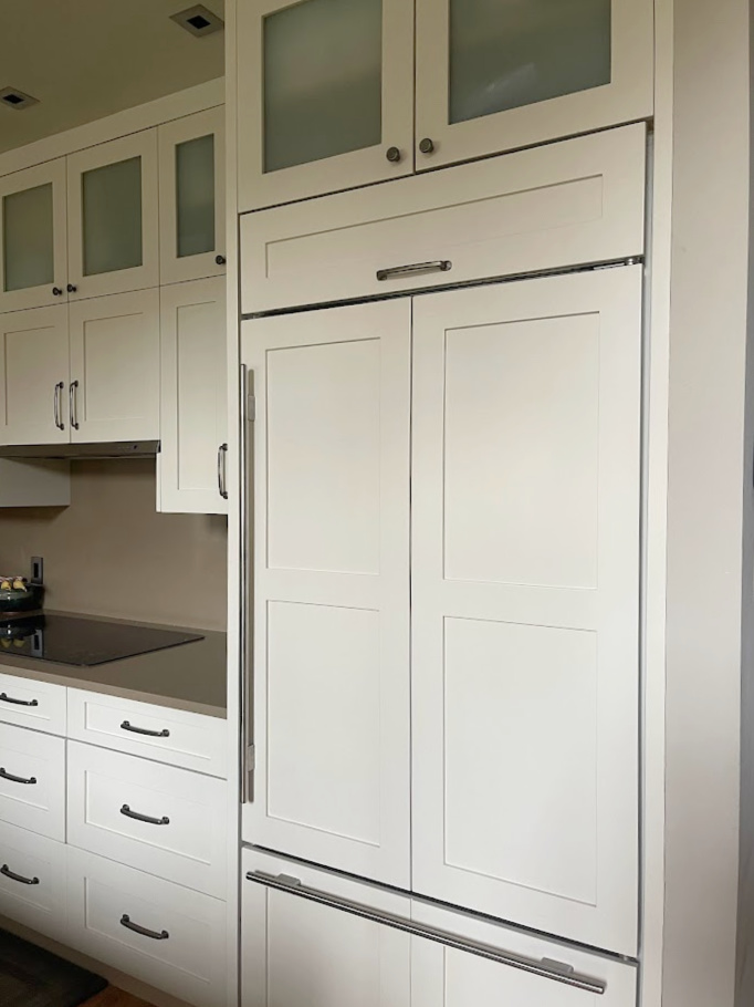
- You must get a cabinet door prepainted in the same finish/sheen. See how it looks. Do you see too much cream, green, or taupe? Or does it settle JUST how you want it to?
- Does it suit your countertop and backsplash and their undertone needs?
- Have you found a great coordinating wall color? Good luck. Colors in this light range are harder to coordinate with, short of warm whites or DARKER neutrals.
- Just because it’s a good cabinet color right now doesn’t mean it’s a timeless one.
- Natural Cream cabinets look amazeballs with antique brass hardware.
Natural Cream cabinets go with some warm white wall paint colors, but don’t expect much flexibility beyond those.
Could you use it on the cabinets and walls?
I wouldn’t. Most homes don’t suit this type of color-drenching in the kitchen. At most, you could try a darkened or lightened version of Natural Cream and see how that looks. Just remember, you’re technically creating a new color, and the undertones can easily shift.
DOES IT GO WITH CREAM CABINETS & TRIM?
My best advice is ‘generally speaking, no’. However, maaaybe you have the lightest, most grounded, neutralized shade of cream with no glazing on your cabinet doors. Then maybe it works. Don’t bank on it, baby.
Instead, focus on colors that have a way better chance of suiting your cream cabinets and trim – maybe even updating them (if you’re dealing with early 2000s ones).
IS IT A GOOD WHOLE HOME OR OPEN-CONCEPT COLOR?
If you’re looking for a color for your entire home or multiple rooms, this ain’t it. It doesn’t have the undertones or the depth to suit a wide range of finishes. If you need to clad a whole home in one paint color, that’s a buttload of tiles, countertops, exposures, and fabrics a color needs to humor.
Are there exceptions? Always, but don’t expect your home to be one of them (said with love).
DOES IT GO WITH WHITE QUARTZ OR QUARTZITE?
That’s one thing I can say about Natural Cream – there’s a reasonable amount of warm white and off-white quartz countertops that coordinate with it.

Previous trends graced us with white quartz on a brighter white backdrop with gray veining. Today’s more popular quartz countertops often have veins that pick up a bit of what Natural Cream’s throwin’ down.
DOES IT GO WITH OAK CABINETS, TRIM, OR OTHER WOOD FINISHES?
Natural Cream can be pretty with some wood finishes. While I might hesitate a bit with more yellow-toned woods or overly red ones, overall, it’s worth sampling, especially with more golden, orange-toned oak and maple finishes.
WHAT COLORS ARE SIMILAR TO NATURAL CREAM?
While there are quite a few similar shades and alternatives, you’ll never find an exact match (e.g., the same color in Sherwin Williams). However, sampling and comparing is the BEST way to find your perfect paint color.
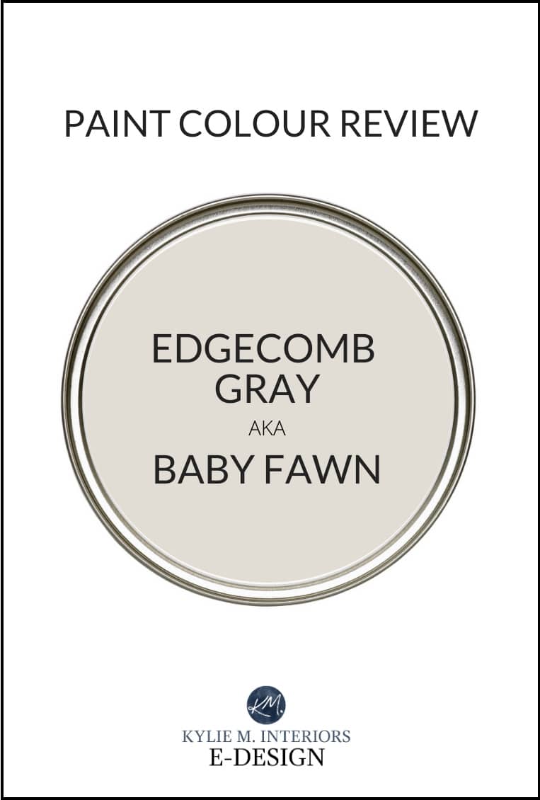
NATURAL CREAM VS BENJAMIN MOORE EDGECOMB GRAY
If you’re worried that Natural Cream won’t have enough taupe (or worried that green will show up at the party), compare it with Edgecomb Gray.

Edgecomb Gray is by far more popular, but that’s because it’s not just used on kitchen cabinets; it’s also used in whole homes, open-concept spaces, exteriors, and more.
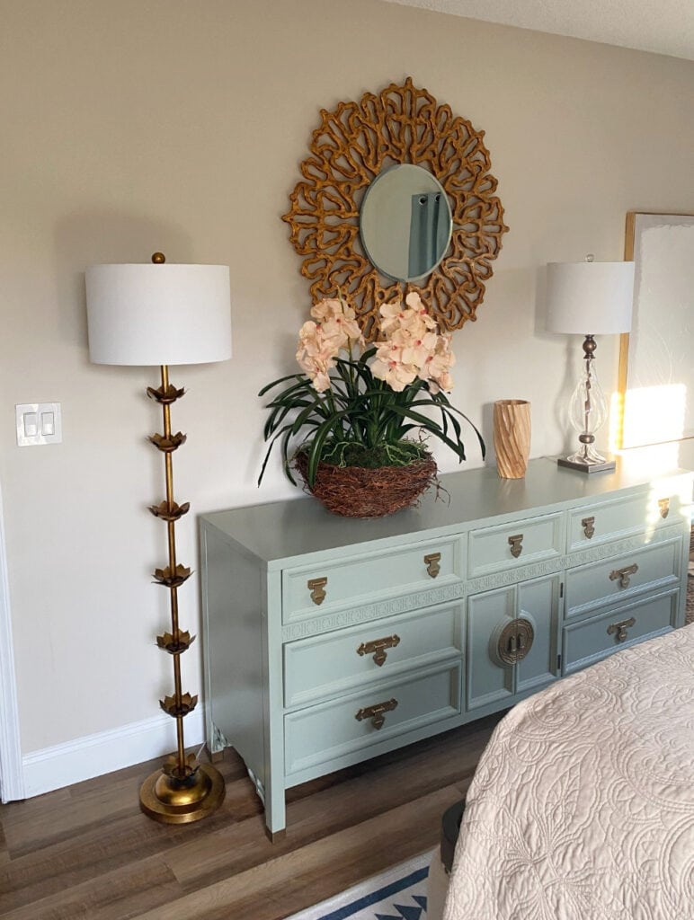
Depth-wise, Edgecomb Gray has an LRV of 63.09, so it’s a bit darker – that’s the most noticeable difference. As for potential undertones, it’s LESS likely to pick up a green undertone (and a touch more warmth). So, if even a CHANCE of green is a worry for you, it could be the better choice. Heck, I’ve lightened Edgecomb Gray 25% and 50%, and it’s still amazeballs.
Benjamin Moore Edgecomb Gray Paint Color Review
BM NATURAL CREAM VS. SHERWIN WILLIAMS NATURAL TAN
These 2 colors are good to compare. Depth-wise, Natural Tan’s LRV of 65 makes it pretty damn similar. Where I see a greater shift is in potential undertones. Of the 2, Natural Tan is slightly more inclined toward green, AND it’s a bit warmer. This makes it appear more tan.
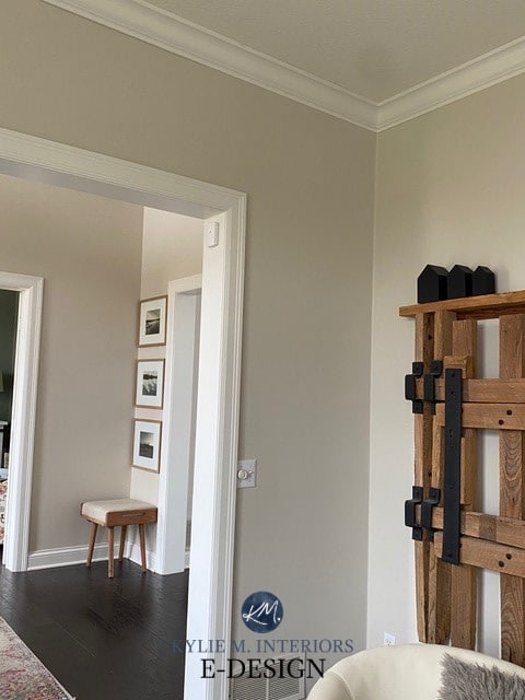
If I were to choose one or the other for my cabinets, I’d probably land on Natural Cream – less chance of green and a touch less warmth. For my walls? I like Natural Tan’s warmth.
Sherwin Williams Natural Tan Paint Color Review
A FEW MORE ALTERNATIVES…
- If you want a bit less warmth than Natural Cream, check out Sherwin Williams Modern Gray (I’ve got mad love for this bad boy).
- Benjamin Moore Cedar Key has more taupe and is a gorgeous, flexible shade.
- While many of my clients mention Natural Linen and Pale Oak, they’re really coming at things too differently – one ‘should’ be the clear winner. Pale Oak is lighter, less warm, and more taupe (more of a tendency to lean purple-pink).

REVIEWS: BM Wind’s Breath | SW Modern Gray | SW White Duck | BM Ballet White
The Best Off-White & Light Cabinet Colors
WHAT COLORS GO WITH NATURAL CREAM?
Of course, the best color pairings depend on what you’re painting – kitchen cabinets, an adjoining room, an accent wall? Regardless, here are some colors I often suggest for my clients’ color palettes…
- MUTED, WARM OFF-WHITES: While they’re not all an instant win, sample carefully to a) see how Natural Cream appears in your space, and b) how a range of warm off-whites look, to see which ones connect/flow best. Some off-whites work well enough in adjoining rooms, but not necessarily in the SAME room as Natural Cream.
- MEDIUM DEPTH GREIGES: Many greige paint colors are great partners, so long as they show off a bit of green undertone and are approx. 20-40 in LRV.
- DARK GREIGE PAINT COLORS: If you’re looking for a beautiful accent color, dark greige paint colors are pretty badass.
- MEDIUM OR DARKER GRAY-BLUES: Stormy, slate-inspired gray-blues can be pretty, though Natural Cream is often happier with gray-greens.
- WARMER LIGHTISH GREENS: While you can’t choose too light a shade, light-medium to medium organic, muted greens can be pretty partners.
- DARKER GREENS: Darker muted greens can be pretty accents.
- SAGE GREENS: There are a ton of gorgeous sage greens you can pair up with.
COLORS TO AVOID
Natural Cream can be fussy. Here are some color groups I recommend avoiding…
- Off-whites that are cooler and lighter than Natural Cream.
- Most cream paint colors
- Overly creamy, yellow whites
- Colors with too much chroma (e.g., stronger greens and blues)
- Most light gray, unless they’re a similar depth or darker and not in the same room.
SUMMARY: PROS, CONS, & CONSIDERATIONS
- Natural Cream is a light, warm, greige-taupe paint color with an LRV of 64.78.
- Popular color for kitchen cabinets, in particular.
- Some worry about its tendency to flash a green undertone, although it doesn’t always do this.
- Suits a wide range of warm whites, including White Dove.
- Can be beautiful with oak cabinets, trims, and flooring.
READ MORE
The Best Taupe & Greige Paint Colors
The Most Timeless Kitchen Cabinet Colors