
Sherwin Williams Quietude SW 6212: Undertones, Best Uses, & More
When it comes to the colorful end of things, blue and green are definitely the popular kids on the block. And when they’re blended together? Pure magic. This is why today we’re spending time with one of my favorite blends – Quietude.
WHAT TYPE OF COLOR IS QUIETUDE – IS IT GREEN OR BLUE?
That’s the funny thing about color – often, it’s hard to tell. And sometimes what science suggests a color is (and it is), is not how it appears in real homes with real lighting.
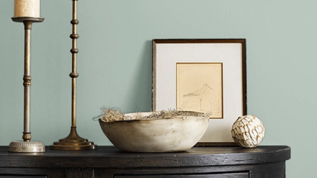
Image via Sherwin Williams
Believe it or not, but its DNA says Quietude is a warm green paint color. That’s right, warm. However, as I teach through my Kylie M Color System, a color’s DNA doesn’t always predict what will show up on your walls.
So many things affect how a paint color appears – lighting, exposure, surrounding finishes, and much more. These combined make Quietude appear green-blue in the average room – not warm at all. In fact, I’ve never seen Quietude look remotely ‘warm’.
Quietude most often looks like a green-blue paint color in the average room. However, you must sample it in your space to see how it settles!
Yes, I am a bossy lil’ thang.
WHAT ARE QUIETUDE’S UNDERTONES?
Undertones tell you the way a color might appear in your home. Quietude is a green paint color that easily picks up a blue hue. In fact, it can pick up so much blue that it appears as a BLUE paint color with a green undertone…

The 10 Best Calming & Soothing Blue-Gray Blend Paint Colors
But we’re not done yet! Quietude also has a gray undertone, which calms it, making for a more subtle approach to the colorful end of things. However, this gray is reasonably subtle, leaving you with more color on your walls to enjoy.
THE LRV OF QUIETUDE
Quietude has an LRV of 48, making it a light-medium depth paint color. Now, some neutrals in this range would fall flat or muddy in a dark room. Not this one. Thanks to the amount of color (chroma) in Quietude, it’ll still show up at the party.
If you have a super bright room, Quietude’s slightly lower LRV helps it wash out less than the lighter look of Rainwashed, which we’ll look at shortly.
Not sure what LRV is? It could save your paint-lovin’ life – learn the magic of LRV!
The Best LIGHT Paint Colors for a DARK room
WHAT’S THE BEST WHITE TRIM COLOR WITH QUIETUDE?
If your walls are painted Quietude, you’ll have no shortage of amazeballs white paint colors to choose from. If you need the perfect white trim or cabinet color, I often suggest…
- Sherwin Williams Pure White for a softer, simpler contrast
- Sherwin Williams Alabaster’s warmth plays well with Quietude’s cooler vibe
- I also love Benjamin Moore White Dove, which hugs the ample bosom between the above 2 shades.
The Ultimate GUIDE to White Paint Colors
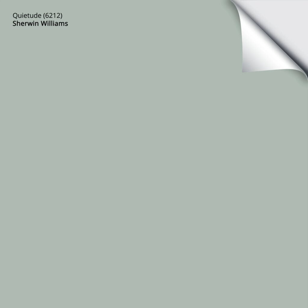
Here’s your Peel & Stick paint sample of Quietude…
WHERE QUIETUDE DOES (& DOESN’T) WORK BEST
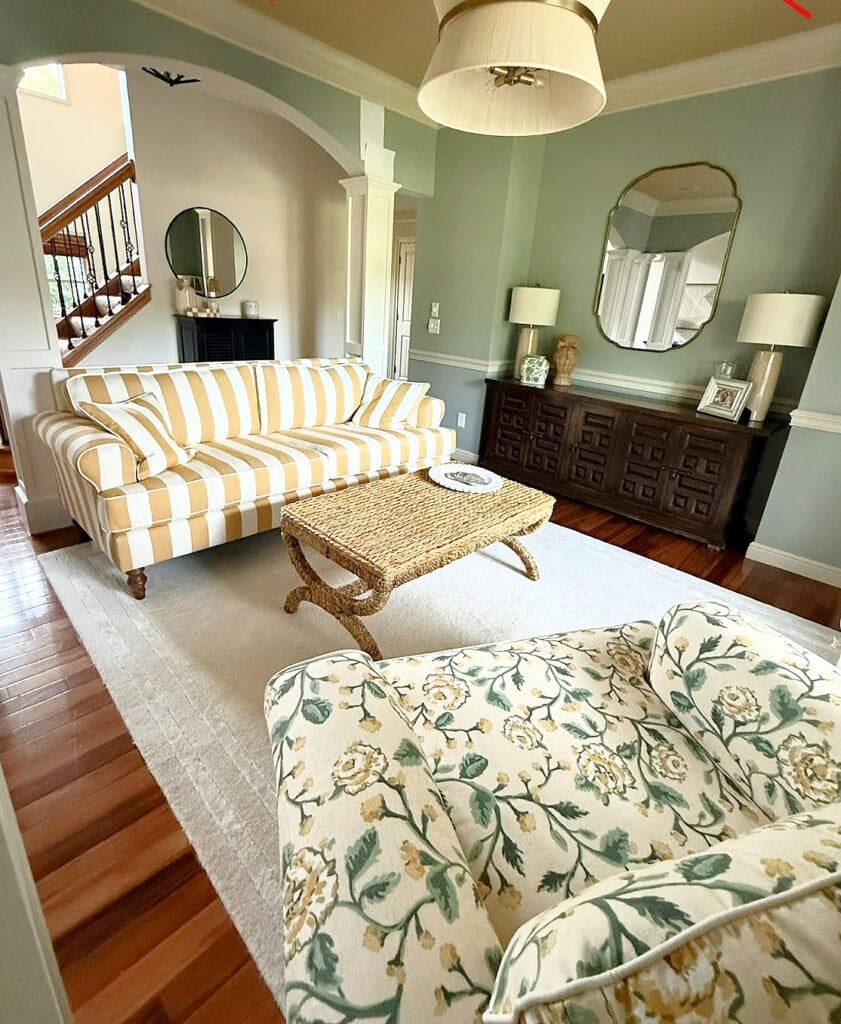
While it can be gorgeous for any number of finishes, it’s not cut out for every paint job. Let’s look at a shortlist, and then explore a few of the big topics. Here’s where it works best…
- Exteriors
- Single rooms
- With many wood tones and stains, the contrast can be wicked pretty
IS QUIETUDE A GOOD EXTERIOR PAINT COLOR?
Quietude can be a gorgeous exterior paint color. Whether you want a cottage look, a traditional vibe, or a beachy hue, it covers a lot of bases.
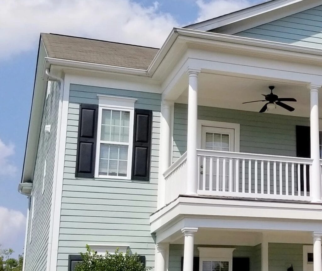
Just make sure it fits and complements any brick, and doesn’t clash (which easily happens). For this reason, it often does its best work on homes with stone accents or no brick/stone.
5 Tips for Choosing an Exterior Paint Color
IS IT A GOOD CABINET PAINT COLOR?
When it comes to shades of blue and green for cabinets, Quietude is a bit brighter than most of my Online Paint Color Consulting clients want. However, this doesn’t mean it won’t work for you. Just remember, the subtle sheen of cabinet paint (satin) can make Quietude look a bit lighter than expected if your room is reasonably well-lit.
Some people look at Quietude when wanting a sage green paint color for their cabinets. In my experience, most want a more defined green – even if it’s mixed with gray, and less chance of blue. For example, Sherwin Williams Evergreen Fog is a far more popular color for cabinets…

WHERE QUIETUDE DOESN’T WORK AS WELL
While there are always exceptions, here are the places it doesn’t always make the cut…
- Often, the degree of color (chroma) can be a bit too much to update cream cabinets or trim.
- In open-concept spaces, it’s usually too strong and dark.
- For a calming, spa-like look, many find it a touch too strong (but it’s all about perception).
WHAT COLORS ARE SIMILAR TO QUIETUDE?
Oh, it’s got some serious competition, as there’s no end to the amount of badass, beautiful, green-blue colors available.

SW QUIETUDE VS. SHERWIN WILLIAMS RAINWASHED
Oooo, this is quite the comparison. At the end of the day, it comes down to what you need.
- Do you need a color with some meat on its bones and serious contrast with white trim? Quietude’s LRV of 48 makes it darker than Rainwashed’s 59. This makes it the stronger option.
- Does your best green hue have a soft, muted look? Rainwashed is the more muted, calmer of the 2 and a touch less green-inclined.
- For a calming, spa-like color, Rainwashed is by far the more popular of the 2 thanks to its depth and subtlety.
- Rainwashed is more popular for single-room use or even open-concept spaces. Some find Quietude a bit too dark.
SW QUIETUDE VS. SHERWIN WILLIAMS OYSTER BAY & COMFORT GRAY
We’re comparing these 3 because Quietude’s depth (LRV 48) sits between Comfort Gray (54) and Oyster Bay (44). Of the 32, Comfort Gray is the lightest and most subtle.
Oyster Bay is warmer than the other 2, but again, we’re in that tricky area of greens that are ‘technically’ warm greens, but are most likely to appear cool (green-blue) on your walls.
Sherwin Williams Comfort Gray Color Review
Both Oyster Bay and Comfort Gray are grayer, making them more calming and relaxing (though that’s open to perception).
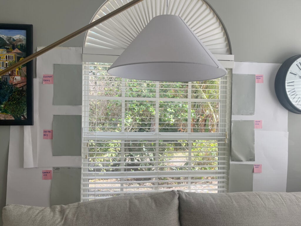
Comfort Gray, top left. Oyster Bay middle left.
In my experience, Rainwashed (previously discussed) is the most popular, followed by Oyster Bay, Quietude, and then Comfort Gray.
And please, compare Quietude with Sherwin Williams Silvermist – a highly underrated alternative.

The 8 Best Blue-Green Paint Color Blends
And if you’re thinking of color-matching between brands (i.e., getting Benjamin Moore to make a Sherwin-Williams color), I’d rethink that.
BENJAMIN MOORE ALTERNATIVES FOR QUIETUDE
Because you rarely want to color-match, Benjamin Moore offers some similar shades to play with and compare…
- Benjamin Moore Wythe Blue is strangely similar – brands don’t usually get things this close.
- The lighter look of Benjamin Moore Palladian Blue is popular.
Here’s Wythe Blue on my client’s front door…

QUIETUDE IN DIFFERENT EXPOSURES
A color like Quietude performs well across a range of exposures. For example, while some blue hues can appear too icy cold in north-facing rooms, Quietude’s green-centric look adds a gentle, beach-inspired look.
If you have a room with warm south-facing or hot afternoon western sunshine, Quietude offers a nice respite from the heat, helping to balance what can seem like an overly warm room.
North, East, South, West – Which Paint Color is the Best?
WHAT COLORS GO WITH QUIETUDE?
Quietude is very flexible thanks to its LRV, saturation, and particular blend!
- LIGHT GRAY: Many light gray paint colors with a range of undertones
- CREAM: Cream paint colors can be beautiful complements to Quietude’s look
- OFF-WHITE: You’ll find no shortage of coordinating off-white paint colors
- WHITE: Almost ANY white paint color!
- MEDIUM TO DARK GREENS: Pairing Quietude with a darker green can create a dynamic combo.
SUMMARY: PROS, CONS, & CONSIDERATIONS
- Sherwin Williams Quietude is a warm green paint color, but almost always appears as a cool green and easily leans green-blue.
- It’s in the light-medium range with an LRV of 48.
- While people love it for exteriors and single rooms, it can be too much for larger interior areas.
- It suits a wide range of wood finishes and white paint colors.
READ MORE
Paint Color Review of Sherwin Williams Sea Salt
The Best Light Green Paint Colors
Get the best paint color advice with Kylie M’s Online Paint Color Consulting – I’d love to help!

Updated in 2026 with new content and images





Thanks so much for this article. It helped when deciding which color to paint our master bedroom. It looks great and we love it.
You’re most welcome, Pat!
This article helped me choose Quietude for my kitchen and I LOVE it. One question, I’m looking for a blue-green-gray color to paint my already painted wood floors on the upper floor of my Victorian. I’m leaning this way. The trim is white. I imagine beautiful natural fiber area rugs & runners with this color in a semi-gloss finish peaking out around the perimeters. Can you see it being used this way?
I’m intrigued! The one thing to remember is that light reflects different off vertical surfaces (walls) vs horizontal ones (floors). Expect your flooring (if you get reasonable natural light) to look LIGHTER than you expect :).
Would Quietude go with Honey Oak Kitchen Cabinets? Love the color, but Rrainwashed which I love also is to light for my taste.
Keep your videos coming. Love them!
Oh, it could be beautiful for that play on warm and cool!