

The Kylie M Color System: Undertones, LRV, Real Homes, & More
By Kylie
May 29, 2026
Let’s be honest: the world of paint colors, design, and decorating is intimidating. If you agree, you’re in the right place. At Kylie M Interiors, these topics are easy to understand, using real home examples and the Kylie M Color System – a homeowner-focused color way to learn.
Learn what you can expect from Kylie M (yes, I do talk in 3rd person), including her Kylie M. blog and ecosystem (Kylie M. YouTube channel and Instagram). You’ll also discover that she’s a spicy lil’ Ginger with a very small filter, which makes learning even MORE fun.

HOW DID KYLIE CREATE THE KYLIE M. COLOR SYSTEM?
The Kylie M. Color System is an approach developed to help homeowners not just see beautiful colors, but also learn about them and understand which ones could be best for their homes.
The Kylie M. Color System is built on a foundation of real homes and many years of extensive experience and color research.
- 24+ years of professional experience and study
- 600+ published articles on paint colors (interior and exterior), color theory, and home updates
- 12,000+ completed paint color and home update consultations – in-home and virtually (online)
- Clients throughout Canada, the United States, and Internationally, including the UK, Europe, and beyond
- Ongoing (and never-ending, as she’s OCD) independent studies in a range of color systems and theories, including the leading-edge color science of NCS and CIELAB color space
The Kylie M. Color System bridges the gap between complex color science and real-world, real-home color decisions, helping homeowners make confident color choices.

WHAT’S INVOLVED IN THE KYLIE M. COLOR SYSTEM?
Along with a lot of fun, there’s a focus on viewable and/or measurable factors, including…
1, THE BEST PAINT COLORS
While there’s undeniably a world of underused paint colors out there, there’s a smaller, manageable world of usable, beautiful paint colors just waiting to be rolled on your walls. You’ll learn about these colors in an easy-to-digest way, and wonder where they’ve been all your life.
2. UNDERSTANDING UNDERTONES
You’ll learn about each color’s undertones and how they might be affected by lighting, exposures, surrounding finishes, and more.
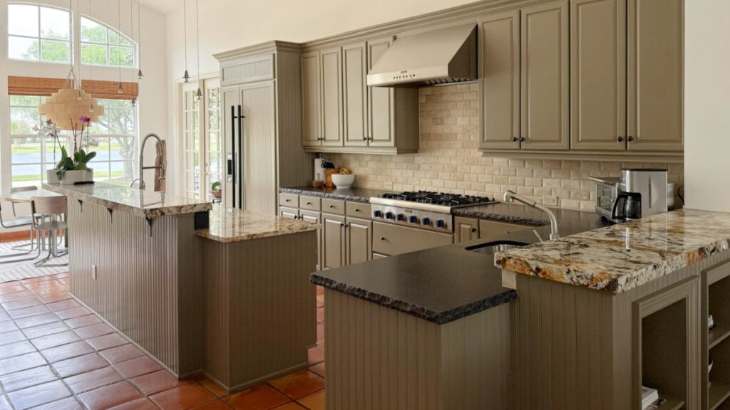
While some don’t subscribe to the term ‘undertones’, the Kylie M Color System recognizes it as a foundational, ‘DIY-friendly’ word for understanding how colors might look in your home.
By the way, that’s backed up by an understanding of color science (CIELAB and NCS) – it’s not just me spouting off my opinion (although sometimes it is – this girl loves to talk).
3. A LOT OF LRV…
This underutilized number applies to every paint color. While TECHNICALLY, it refers to how much light a paint color reflects, Kylie M’s Color System uses it to help you understand how light or dark a color might appear on your walls. I talk about this a lot, along with Ryan Reynolds in a Speedo, white wine, and Chili Lime Cornuts.

4. EXPOSURE & PAINT COLORS
When you read about exposure in my blog posts, understand that the advice is given ‘lightly’. Why? Well, there are a ton of factors that can change how much your exposure really matters to your wall color and the overall feeling of your room.
- How big or small are your windows? How many are there?
- Are your windows blocked by anything, including landscaping, trees, a building, or a fence?
- Where in the world do you live – how close to the equator do you live?
- What season is it?
- Do you have a UV filter on your windows?
- Is your room bright or dark (interior lighting situation)
And that’s just the start.
When considering how your room’s exposure might affect your paint color, don’t worry too much on a small, wall-to-wall, up-close basis. Consider how your room FEELS as a whole. Stand in an adjacent room throughout the day, and look at the room you need to paint – does it LOOK and feel warm or cool? Flat or bright? From there, you might consider the best paint colors to suit/fix that.
5. AFFORDABLE HOME UPDATE IDEAS
The Kylie M Color System isn’t just about paint color. It will also help you update your wood cabinets and make your granite look more modern. It’ll also help you coordinate with your oak trims or update your cream cabinets. I’m all for working with what you’ve got.
But hey, if you want new, I’ve got you covered there, too.
6. REAL HOMES
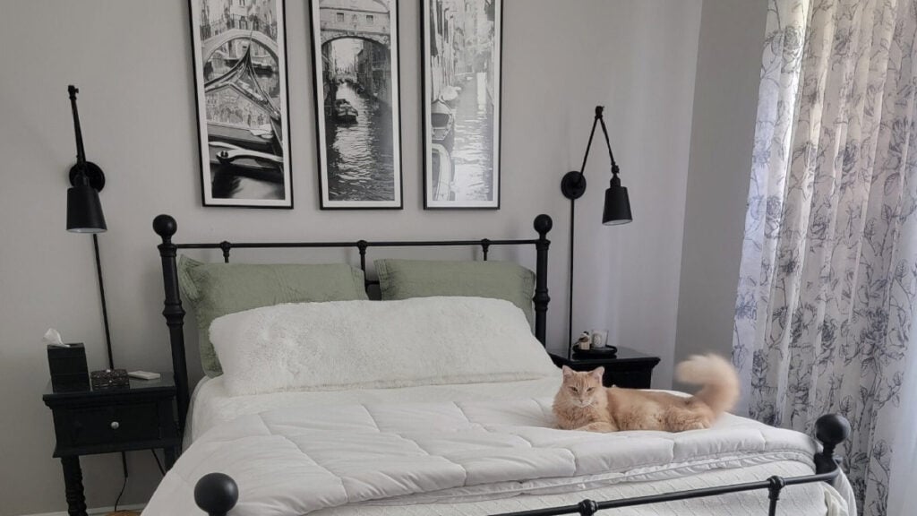
99.5% of my images feature homes that belong to one of my over 12,000 Online Color Consulting clients, followers, friends, and family (11,990 of those are friends…for sure). You won’t find any AI-generated interiors on this blog – just real homes, real lighting, questionable editing, and real friggin’ life.
7. REAL BUDGETS
While you’ll see some fancy homes, for sure, most of my projects involve homeowners and renters with modest budgets. You’ll see images full of real homes, laundry, dishes, and decor.
HOW TO CHOOSE PAINT COLORS USING THE KYLIE M. COLOR SYSTEM
While there can be small variations depending on your situation, this is the proven, best way to choose paint colors. Reduce your stress, keep it simple, and get that paint roller rollin’.
- CONSIDER YOUR SPACE: Consider your room’s finishes (or exterior). Figure out which ones are the boss, and think about which colors might suit them.
- STAY POPULAR: While random colors can work, many of today’s best, most popular paint colors are that way because they’ve been proven to work across a range of lighting conditions and finishes. Branch out only if you need to (it’s harder to find info and images on outliers).
- RESEARCH: Research the color range you’re interested in – narrow it down to your top 6 contenders (give or take). My blog is the best place to start (use my SEARCH).
- SAMPLE: Order peel-and-stick samples of the colors you want or sample pots. Sample pots are often easier for exterior surfaces.
- HANG THEM: Hang your samples next to all relevant finishes, including tile, trim, countertops, etc. Make sure there’s white paper next to your samples (there are reasons) (learn more sampling tips).
- MOVE THEM: Move them around throughout the day. Notice how they change in different lighting, including day vs. night.
- COMPARE THEM: Compare them to your finishes and each other. Notice how one might be warmer or cooler, more colorful or more neutral, lighter or darker. Make notes on each one – write down what you do/don’t like.
- ELIMINATE: As a color becomes obviously wrong. Remove it. Don’t leave it on the wall or your table. This process can be overwhelming enough – get down to the contenders.
- IF THAT DOESN’T WORK: If you haven’t found your color, a) your undertones aren’t coordinating between your finishes/colors, b) you’re in the wrong color family for what goes with your room’s finishes, c) your room wants a lighter or darker color (LRV change), or c) it could be your bulbs! There are other factors, but those are the main culprits.
Of course, you might have the best paint color right in front of you, but you might be overthinking it. In this case: How to Choose Paint Colors Without Second-Guessing Yourself.
MORE RELATED BLOG POSTS

Share this!

Tagged with:

Meet Kylie
Do you need help, but aren’t quite sure what ‘help’ looks like? Are you drowning in paint samples and decision fatigue?
Does every color you like at the paint store look terrible in your lighting or pick up a funky undertone? I’d love to help.

Hi, I’m Kylie
For over 24 years I’ve helped 12,000+ homeowners and renters make more confident decisions on paint colors and affordable home updates using real home examples and practical, experience-based advice. My goal is simple: help you love the home you have.
Do-it-yourself, the smart way
Grab one of Kylie’s guides
Affordable, downloadable shortcuts to the colors and combos I’d pick for you. Yours to keep, forever.

Homeowner’s Guide: White Kitchen Cabinets
This isn’t another ’10 Best Cabinet Colors’ list, because there is no SINGLE best white for every home and every kitchen.
Learn how to choose a white cabinet paint color that works with your countertops, backsplash, flooring, trim, lighting, and home—so you can rule out the wrong whites, sample fewer colors, and choose with confidence.
158-page PDF – Instant Download
$34.95Accent Colors – And How to Use Them
This isn’t about plastering your home in the ‘Color of the Year’ or following the latest trends (unless you really want to).
It’s about finding accent colors that work with YOUR home, YOUR style, and YOUR comfort level.
Because the best accent color isn’t one you love on a paint chip, it’s one that makes everything around it look better.
118-Page PDF – Instant Download
$34.95
Homeowner’s Guide: Exterior Paint Colors
Painting your home’s exterior is a BIG investment and choosing a color based on a tiny paint chip, a trend or the house down the street can be an expensive mistake.
Learn how to look at YOUR roof, YOUR windows, YOUR brick (or stone) and YOUR home as a whole so you can understand what colors make sense.
The goal? Less guessing, fewer samples and a lot more confidence before gallons of paint go on your home.
206-page PDF – Digital Download
$44.95Exterior Trim Paint Colors
This isn’t a list of ‘the best trim colors’, although you’ll get a ton of links to great shades!
You’ll learn how to look at your home and understand whether it needs contrast, repetition, connection, or a little visual peacekeeping to pull it all together.
Because trim might seem like a small detail…but spread it around all four sides of your home on multiple surfaces and it suddenly has a pretty big job.
118-page PDF – Instant Download
$24.95




Leave a Reply