
Sherwin Williams Aesthetic White 7035: Undertones, LRV, & Lighting
Have you been looking for a beige with benefits? The perfect, soft, off-white paint color that isn’t gray? You’ve come to the right place. And while Aesthetic White isn’t necessarily the most popular beige, it’s found its way into many homes, on walls, exteriors, cabinets, and more.
So, let’s find out what makes this bad boy tick…
*Updated content for 2026 with the best paint colors, timeless design, and home update ideas for today’s homeowner.
IS AESTHETIC WHITE A WARM OR COOL PAINT COLOR?
Sherwin Williams Aesthetic White might look like a simple off-white, but it’s a beige paint color with a feather-dusting of gray.
With this gray undercurrent, it doesn’t have the typical golden look that many beige paint colors have (the ones that often scare people) and lacks strong undertones. This makes it an interesting option for the beige-phobic folks, while still offering a wink of warmth for those who, come heck or high water, are beige-bound.
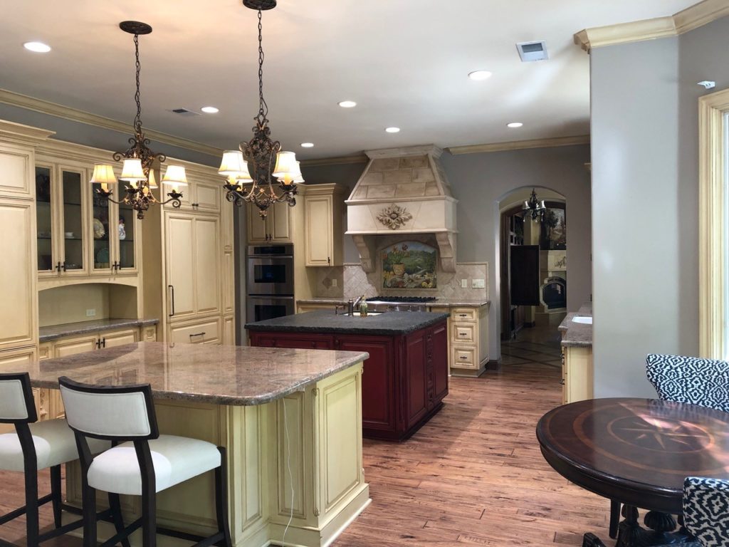
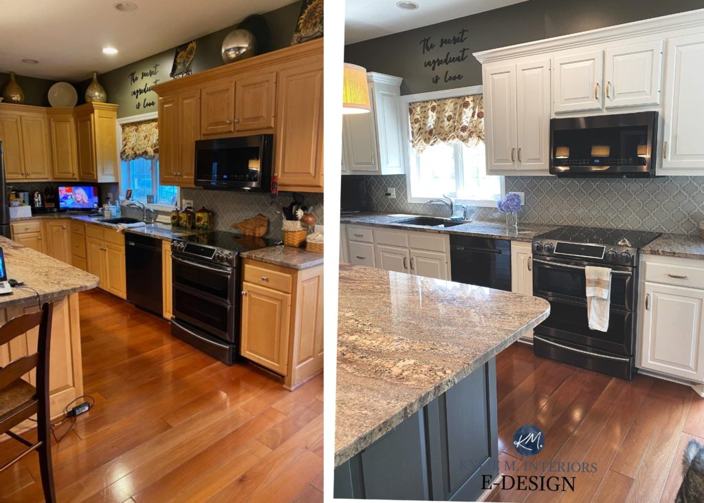
This next photo shows a HOT MESS of a kitchen (said with love) with a wide variety of finishes and undertones – none very well-coordinated…
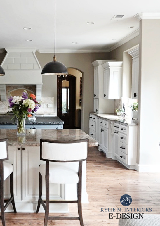
With a few coats of Aesthetic White, it’s like a brand-new space; we didn’t even touch the countertops or backsplash…
In a room with north-facing light, you might see Aesthetic White lean a touch toward the grayish end. Even though it might look grayer than usual, it will still retain a passive warmth, as it’s a warm color at heart.
99.5% of the photos in my blog are of REAL HOMES from my Online Color Consulting clients, readers, and friends. While not always magazine-perfect, they’re packed with ideas and proven color choices to help you create a home you’ll love.
However, Aesthetic White will be in its glory in south-facing or afternoon western light. Unlike golden beiges that can look downright toasty, Aesthetic White keeps things calm.
North, East, South, West – Paint Colors for Exposures
THE LRV OF SHERWIN WILLIAMS AESTHETIC WHITE
Aesthetic White has an LRV of almost 73. This number (Light Reflectance Value) means it’s an off-white paint color on the hairy crack of the light range (so it’s not as close to the white range as some off-whites).

If you have a bright room, Aesthetic White can appear like a much brighter off-white and will seriously wash out. However, if you have a dark room, it could look flat and dingy (learn more HERE).
Aesthetic White does its best work in a room with ‘average natural light (give or take) – nothing too extreme one way or the other’.
- Would I still use Aesthetic White in a dark room? Maybe, but I’d improve my interior lighting and use the right Kelvins.
- Would I use it in a super bright room? It depends. If I’m using it on the walls and trims, probably, as it would create a soft, seamless look.

Not sure what LRV is? It could save your paint-lovin’ life – read all about it HERE.
In this next photo, look at how the soft off-white of Aesthetic White works with the older-style granite countertop and beige tile floor…
Case Studies: Update Your 2000s Kitchen
While the above finishes might prefer a beige paint color with a bit more orange-pink undertone, Aesthetic White has a slightly more modern, moderate look.
WHAT ARE AESTHETIC WHITE’S UNDERTONES?
Generally, Aesthetic White doesn’t grab any obvious undertones in the average room. While I’ve seen it flex slightly pink, purple, and green, these hues are modest…at best. It’s L*a*b* readings show no green; however, it also doesn’t have a ton of red (pink), which is why it can move around a lot, and appear purple at times.
While Sherwin Williams website says that Aesthetic White is a cool white with a purple undertone, it’s pretty far from cool OR white.

BM Ballet White | SW Alabaster | SW Zurich White | SW Greek Villa
This is because, like most white and off-white paint colors (thanks to their higher LRVs), Aesthetic White can pick up cues and reflections from its environment. Therefore, please pay attention to your exposure and any strong interior or exterior colors/finishes (e.g., green grass or a red feature wall) that could affect how it looks!
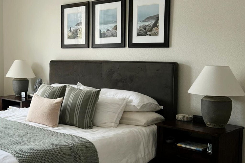
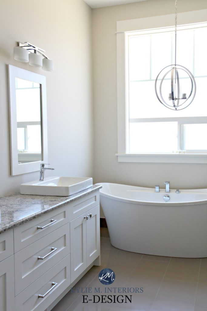
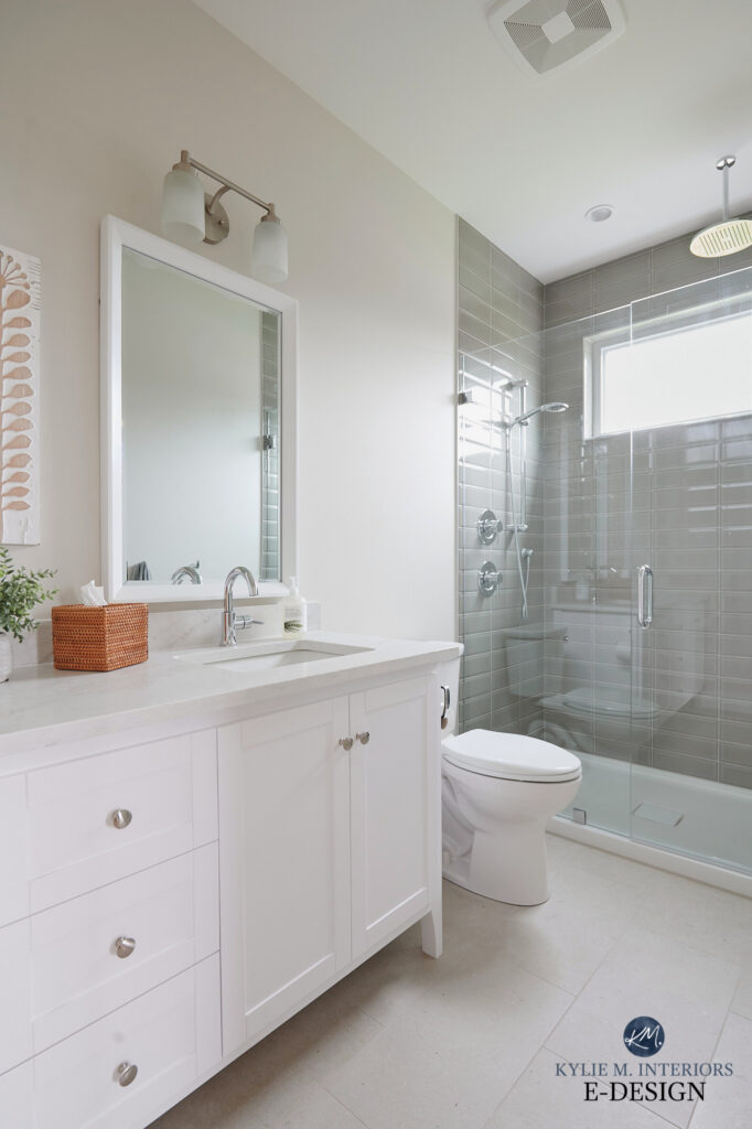
Here’s Aesthetic White looking a bit more typical (this is the bathroom at our lake home, which faces east)…
Here’s your Peel & Stick sample of Aesthetic White…
WHAT WHITE COLOR GOES WITH AESTHETIC WHITE WALLS?
Being a soft beige, Aesthetic White can be very fussy with whites that are too warm (yellow/creamy). The best white paint colors for Aesthetic White include…
- Sherwin Williams Pure White
- Sherwin Williams Extra White
- Benjamin Moore White Dove, although I recommend lightening White Dove by 25% (this is what I did in my home).
While Extra White might not normally be a great match, its trim and cabinet paint formulation makes it look warmer than expected (but I still prefer Pure White and White Dove).
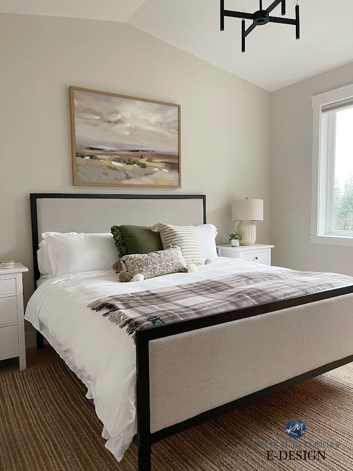
Here’s the bedroom at our lake home, with Aesthetic White walls and White Dove 25% lighter on the ceilings and trims…
The 4 Best White Paint Colors from Sherwin Williams
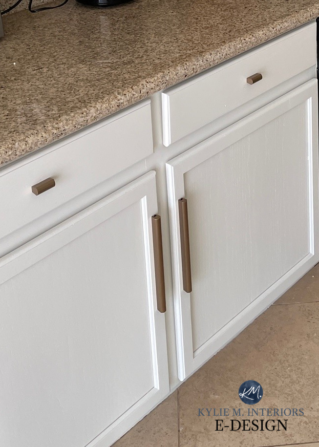
IS AESTHETIC WHITE A GOOD COLOR FOR KITCHEN CABINETS?
HELLLLLLS YEAH! Aesthetic White is a great option if you don’t want white cabinets but are nervous about having overly creamy cabinets.
Here’s another great before-and-after shot of Aesthetic White on kitchen cabinets…
Keep in mind that while Aesthetic White can work, some finishes, especially from the Tuscan-style early 2000s, need more of an orange (orange-pink) undertone (sample and compare to see which colors settle in best!)
See a CURATED BUNDLE of my FAVORITE OFF-WHITE BEIGE PAINT COLORS!
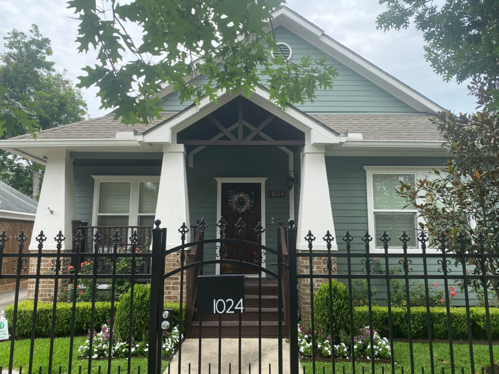
IS AESTHETIC WHITE A GOOD EXTERIOR PAINT COLOR?
Aesthetic White can be a soft alternative to white for many homes with warmer stone and brick colors. It can also be a great exterior trim color. However, if your home has a lot of beige brick or stone, Aesthetic White might not have enough orange undertone to do the trick – sample and compare!

Aesthetic White is in the areas labeled #2.
5 Tips for Choosing an Exterior Paint Color
COLORS THAT ARE SIMILAR TO AESTHETIC WHITE
Every color has its particular nuances, and it’s these shifts in undertone, depth, and temperature that make one color a better choice than another!
AESTHETIC WHITE vs. WHITE DUCK & SHOJI WHITE
With trends leaning warmer, all three of these warm neutrals are getting more attention. However, there’s one main difference between these colors: undertone. White Duck and Shoji White have a bit more of a creamy backdrop (yellow undertone) mixed up with a neutral base to calm it down. Aesthetic White favors an orange undertone, although it’s similarly muted.
FULL Paint Color Review of Sherwin Williams White Duck
Shoji White trim with Sherwin Williams Retreat siding / FULL Paint Color Review of Shoji White
What they have in common is that they all approach their undertones in a super passive way—some people don’t see White Duck and Shoji White as being cream at all, while others find Aesthetic White too gray. And this is their glory for those who want a minimal commitment to color!
As for undertones, of the 3, Shoji White is the most likely to grab a wink o’ pink, which means it’s the least likely to grab green.
AESTHETIC WHITE vs. ACCESSIBLE BEIGE
Comparing these two is smart as they’re closely related! Sherwin Williams Accessible Beige has an LRV of 58, so it’s darker than Aesthetic White at 73 (while still in the light range). If you want to use one of these colors for your walls/cabinets/trims in one or trims, there’s enough contrast that these two colors miiiight work together; however…

Accessible Beige is on the cabinets, Aesthetic White is on the walls, and it works.
With Aesthetic White’s tendency to dip into gray (more so than Accessible Beige), it’s hit-or-miss. Sometimes, Aesthetic White settles a bit too cool in a room’s natural lighting to be a good partner.

Aesthetic White (walls) doesn’t read quite as warm on this side of the room and barely makes the cut. I do wonder if lightening it by 25% could shift it a bit – I’ll have to try!
FULL Paint Color Review of Sherwin Williams Accessible Beige

With its increased LRV and touch more warmth, Accessible Beige has more color and body compared to the slightly more grayed-out look of Aesthetic White; however, both approach beige with similar, muted intentions.
Ideas to Update Your 2000s Home – 6-PART SERIES!
AESTHETIC WHITE VS SHERWIN WILLIAMS SHOJI WHITE
You’re smart to compare these two, as they’re two popular warm, neutral paint colors – with different approaches to warmth.
While Aesthetic White sits on a subtle beige base, Shoji White sits on a cream base (so subtle, it’s a stretch to call it cream). Of the two, Shoji White is more likely to pick up a very vague pink undertone. This next image is a great example of the main difference…

REVIEWS: SW Heron Plume | SW Pure White | SW Pearly White | SW White Heron | SW Origami White
As for depth, they’re kissin’ cousins, as Shoji White’s LRV of 74 is one point above Aesthetic White’s 73.
WHAT BENJAMIN MOORE COLORS ARE SIMILAR?
While you’ll never find a perfect match (or color match), I always recommend sampling a range of alternatives. Sometimes, that wee tweak makes one color perfect over another!
- Benjamin Moore Sea Pearl (also known as China White) is a great alternative to Aesthetic White, especially if you want something a bit lighter.
- Benjamin Moore Maritime White isn’t remotely overpowering (it’s quite fabulous) and comes at beige with more undertone and purpose, including a more noticeable beige base and a touch more depth than Aesthetic White.
Here’s a quick peek at Sea Pearl…
And here’s Maritime White in action…
WHAT COLORS LOOK GOOD WITH AESTHETIC WHITE?
Being a light, warm neutral with muted undertones, Aesthetic White is pretty darn flexible and relatively easy to create a beautiful color palette around, depending on your needs…
- A wide range of greige paint colors, especially those with LRVs of 60 or darker, including Amazing Gray.
- Muted stormy shades of gray with blue-green undertones like Sherwin Williams Argos.
- Medium to dark green paint colors can look gorgeous with Aesthetic White’s organic base.
- Aesthetic White doesn’t want to be paired with many other similar depth off-white paint colors.
SUMMARY OF AESTHETIC WHITE
If you’re looking for the Cole’s notes…
- Aesthetic White is an off-white paint color with an LRV of 73.
- It has flexible undertones and easily picks up cues from its environment.
- It’s a warm color and does best with simpler white trim colors like Sherwin Williams Pure White or brighter, not overly yellow whites.
- It’s popular for walls, open-concepts, and whole homes, but also shows up on cabinets and exteriors.
READ MORE
The 14 Best Trendy Beige & Tan Paint Colors
Why I love Sherwin Williams Aesthetic White
The 11 Best Off-White Paint Colors
Get the best paint color advice…
Check out my Online Paint Color Consulting – I’d love to help!
Originally written in 2020, updated for you in 2026!


Hi! I am trying to decide on a whole house color for my one floor ranch. I am looking for a soft off white to paint the entire interior of my home. The big challenge I am running into is that I have white appliances throughout my kitchen and need to find something that won’t clash in the kitchen. So far I have really liked aesthetic white although it is a bit darker than I want so I tried lightening it by 25%. I’ve also been considering Shoji White and Alabaster. Shoji white seems to pick up a little peach or a little green depending on the room.
I’m thinking I’d like to paint the walls and ceiling the same color with potentially matching trim or something lighter on the trim/doors such as pure white or extra white
Any advice would be greatly appreciated! Thank you!
Thanks for all your great posts, you helped us understand our home has orange-based furnishings and that’s why the heavier grays just weren’t working out.
I think natural linen is a great option for us. I’m struggling to figure out coordinating colors for cabinets, if anybody has some ideas!
Hey Brianna! Well, I see you’re looking at Aesthetic White, but I wouldn’t do that, it will be too dark/grayed-out. For cabinets, it’s tough as it depends MORE on the backsplash/countertop than the walls – although the walls DO matter. What I might do is pick the hardest thing first (the cabinets) and then work out from there as you may (or may not) need to adjust Natural Linen to suit the cabinets. Off the top of my head, take a look at SW Pure White and BM White Dove (if you’re thinking of white cabinets and they suit your countertop/backsplash). If you’re thinking NON-WHITE, hmmmm. Take a look at something like SW Moderate White, but try lightening it by 25% and 50% to see if one of these depths works with Natural Linen and gives a soft contrast but not too much white.
If you’re thinking even darker, you’d likely need to head into the greige range, at least LRV of 40 or lower (ish). Greiges can look GORGEOUS with orange-toned woods (like SW Felted Wool/Porpoise/Urbane Bronze).
Hopefully these very general ideas will get you in the right direction??? If not, I should be opening up my packages very soon and even the Standard Consult for cabinets could get you pointed in the right direction!
If the packages don’t open up (my hubby manages them for me based on my upcoming workload) send me an email and I’ll see if I can squeeze you in :). https://www.kylieminteriors.ca/hire-kylie/
Hey Kylie – love the review. I’m doing a full reno and was planning to paint most of my house with Aesthetic White, yet after painting three bedrooms upstairs I’m second guessing the colour choice. It’s a 1984 split level and I completely opened up the main floor to have an amazing open concept kitchen. The cabinets will be a more modern handle-less design in, I’m installing 3/4″ natural hickory hardwoord, and I painted the ceilings SW Pure White based on your advice in another column as a versatile white. I’m concerned Aesthetic White is too warm at least for the bright main floor kitchen area (it looks warm in sunlight), and am leaning towards BM Decorators White since it’s a little cooler and brighter (or something a little darker yet still on the cool side). Do you agree AW may not be the best colour for the cabinets and hardwood? What are your thoughts on BM Decorator’s White? Can I keep the bedrooms AW or will that look bad with Decorator’s White in other parts of the house? Thanks for your advice!
Hi Kylie, have been following you for years-thank you! My problem…Every time I pick a color for my bedroom ( White Duck, Aesthetic White ,etc) you say it falls flat in a dark room. And my bedroom is dark! What doesn’t fall flat along those lines of colors (off white, extremely light beige- south/east exposure). My bedroom hasn’t been painted in 25 years & it will be another 25 before it’s probably going to be painted again so I’ve got to get it right lol. Thank you so much!
Hey Kimberley! If you’re looking at those, but need a bit more LIFE, how about BM Maritime White or SW Moderate White???
Why do I feel like it come off too creamy? I love the color and lived it when I put my samplized peel and stick on it but with the furniture I just don’t know if it looks right. Have you ever seen it come off more creamy/yellow?
Hmmmm, I’ve yet to see it flash creamy – interesting. Maybe it’s just in comparison to the furniture/finishes around it? Or some form of natural light/interior light tweaking it? As long as it was made by SW it shoooouldn’t really grab yellow :).
Would Aesthetic White look good with BM Collingwood (Collingwood being the accent wall)?
Nope, Collingwood is too gray-purple!
Love all your content! For a room that won’t have much at all on the walls, would you steer away from Aesthetic White and go toward something with a lower LRV? Maybe Neutral Ground, Natural Tan, Gossamer Veil? It’s a south/southeast facing room with a few medium sized windows on one side and no windows on the other. Solid artificial light and decent natural light. Thanks!
Hmmm. Ya, with decent natural light I might lower the LRV a bit and do a color on the wall with a bit more meat on its bones. Natural Tan, in particular, is a beauty!
Have gray LVP floors, some rooms painted shoji white. Love it some times, other times of the day it’s too pink. Thoughts on painting the other rooms aesthetic white? Will it look nice with the gray floors or be too much gray on gray?
I’m thinking of pairing Aesthetic White walls with Agreeable Gray cabinets. Is this a combo that you’ve seen work together?
It makes me a bit nervous!
I’d love your thoughts on Aesthetic White on cabinets and Accessible Beige on walls in a bright, SE facing kitchen/family room. I’m thinking they both might read lighter due to so much natural light. Have medium brown walnut floors.
Hubby thinks we should go Accessible Beige on cabinets and Urban Jungle on walls.
Hello! Always love your posts, content and humour:)
Our bedroom furniture is mahogany. It’s in dire need of a paint refresh and update. Would aesthetic white work with this? PS it’s north facing!
Hiya! It’s hard to say. Aesthetic White can be soft and warm, but in some lights it CAAAN lean that bit grayer. Sample it and move it around the room to see how it settles for you.
Hi Kylie,
Have a large ranch style home w/ Med Brown beams, cabinets and floors. Needs a refresh and I’m thinking of Aesthetic White.
Thank you
Well, from the SOUNDS of it, it could work!
Hello Kylie,
I’ve always enjoyed your comments and have shared your links multiple times with friends who are ‘paint puzzled’!
My current puzzle is a paint refresh in our primary bathroom. It’s large but chopped up with doors and a partial 12 foot ceiling. It has good artificial light but only a high small south facing transom window. Currently it’s painted Nomadic Desert which complements the tile color nicely. The tile is a mix of Emperador light and dark – 80% light. The goal is to lighten the walls considerably to an off-white. My dilemma is that I’m committed/stuck with Oragami White as my trim paint – seemed like a good idea 15 years ago to hide natural pine doors and baseboards….. but coordinating with white now is a problem.
I’m leaning towards Aesthetic White. Possibly darkening the Aesthetic White by 50% – like you showed in your outside shingles project – to create a better contrast with the trim. I could also darken Origami White but I’m concerned about introducing too much ‘grey’ in bouncing reflections. (I have the same bouncing reflections concern with Divine White – too much peach even though that tone works with my stone.)Thoughts please?
Thanks in advance for your response! I look forward to reading more from you on paint colors!
Oooo, that IS tricky. There are places you could go without Origami White, but with that there, that’s TOUGH.
I haven’t seen your space, but if I were to imagine it, ideally, it might handle something like SW Natural Linen (light beige), SW MOderate White, Divine White, BM Maritime White – colors like that. I bet Aesthetic White is CLOSE, but maybe a abit grayish in areas.
Anyway, it’s the coordinating with Origami White. Hmmm. Yes, Aesthetic White might be your best bet. To try and get a bit more warmth from it, you coudl get a sample made up 25% darker and see how that goes!
Let me know :).
Hi Kylie,
Well…. despite our best efforts plus 3 ladders the finished product is not perfect but it’s less than ‘half bad. 🙂
Matching the Origami White was not my biggest issue. Rather, you were correct the SW Aesthetic White leans too gray/stark white until noon-ish then it morphs into a fantastic warm beige for the rest of the day and night – which we love! The dramatic color shift is simply unbelievable!
In my first post I mentioned that we had only a single window in the room. I forgot about our giant skylight…
I used AE at 125%. It darkened the paint for sure – unsure if it warmed it up.
My next step is to change towels from white to a warm medium brown.
My question now. If I painted an accent wall i.e. SW Bungalow Beige, do you think that that would introduce a beneficial reflection and cut down on the early morning ‘too stark white’ phenomenon?
While I really dont want to wear out my welcome here 🙂 I’m punching outside of my weight on subjects like ‘accent walls’ and ‘paint reflections’!
Hopefully you can share a thought!
Thanks in advance!
Nancy