
Sherwin Williams Aesthetic White & Why It’s Hot for 2026
Off-whites are back in style, starting with this color…
It can be hard to keep up with trends (for those so inclined). This means that when choosing a paint color, you should consider not just what’s trendy, but also what’s versatile.
What does this mean?
Well, the more versatile and flexible a paint color is, the better it will adapt to future trends. It’s like me at 47—the more flexible I am now, the easier it will be to transition into my 50s. I figure my diet of white wine, Filet o’ Fish, and Cornuts is also helping with that.
Anyway.

*Updated with fresh content and images for 2026
Now, if you’re been drinkin’ the Ginger-flavored Koolaid for a while, you know I’m a sucker for flexible neutrals like Benjamin Moore Edgecomb Gray, Ballet White, and Sherwin Williams White Duck, which is why I’m MORE than happy to welcome another up-and-comer to the paint color world – Aesthetic White.
Now, if you’re like my hubby, you might assume that this paint color is white, based on its name. Never judge a color by its name.
If I judged & chose a color by its name, my walls would be painted Nacho Cheese & Red Red Wine.
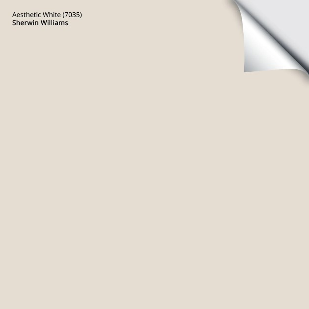
Aesthetic White is an off-white paint color – not white at all – its LRV of 73 told me so.
The Best Non-White Trim Colors
LRV is that magical number that EVERY COLOR HAS that tells you how light or dark it is (from white to black) on a scale of 0-100. I’d get into the nitty-gritty of Aesthetic White, but I have a full review at the end of this blog post.
Color Ideas to Update Your 2000s Home
First off…
ARE OFF-WHITE PAINT COLORS TRENDY FOR 2026?
HECK YES. Large-scale design trends based on Milan’s runways state that darker, warmer neutrals are popular (in certain circles). My Online Paint Color Consulting projects (11,000 and counting – I’ve seen a lot) show me a different shift in tastes…
- The gray trend is long gone, replaced by beige and tan paint colors.
- While greige and taupe are still kickin’ it hard, warm off-whites are back in style in a big way.
- White paint colors still show up, but they’re softer and warmer.
WHAT TYPE OF COLOR IS AESTHETIC WHITE?
Aesthetic White is a beige at heart, but with a heavy dusting of gray. This means, unlike the 2000s beiges, it’s not remotely golden or even obviously warm.
While some refer to it as a warm gray, it’s not, but it can have grayish tendencies.
Even with today’s warmer trends, not everyone is ready to commit to a REAL BEIGE again, not after that trauma incurred from the early 2000s. Aesthetic White is a great way to get a passive warmth on your walls without 100% commitment.
WHAT MAKES AESTHETIC WHITE SO VERSATILE?
Any color that nods at various neutrals without 100% commitment (gray/beige/greige/cream) or undertone (blue/green/pink) is a winner in my books. Sherwin Williams Aesthetic White satisfies this, along with a flexible depth (LRV 73).
WHAT COLORS ARE SIMILAR TO AESTHETIC WHITE?
While a few shades give Aesthetic White a run for its money (which we’ll look at shortly), Aesthetic White is my favorite of the bunch.
BUT…because it’s not all about me (not all the time, anyway), let’s check out a few…
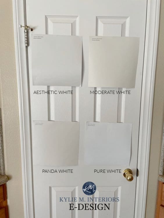
SW Moderate White | Panda White | Pure White
BENJAMIN MOORE MARITIME WHITE
Seriously, while I love Aesthetic White (I’m currently painting my home with it), Maritime White is pretty darn gorgeous.
The BIG difference is that Maritime White offers more commitment to beige, while still being reasonably subtle and light.
Color Review of Benjamin Moore Maritime White
SHERWIN WILLIAMS MODERATE WHITE
Moderate White picks up where Maritime White left us, with a bit MORE color and a more focused commitment to beige. If you find Aesthetic White too gray and muted, colors like Maritime White and Moderate White can be great alternatives.
Sherwin Williams Moderate White Color Review
While I could list a whack more, let’s look at a comparison photo instead…
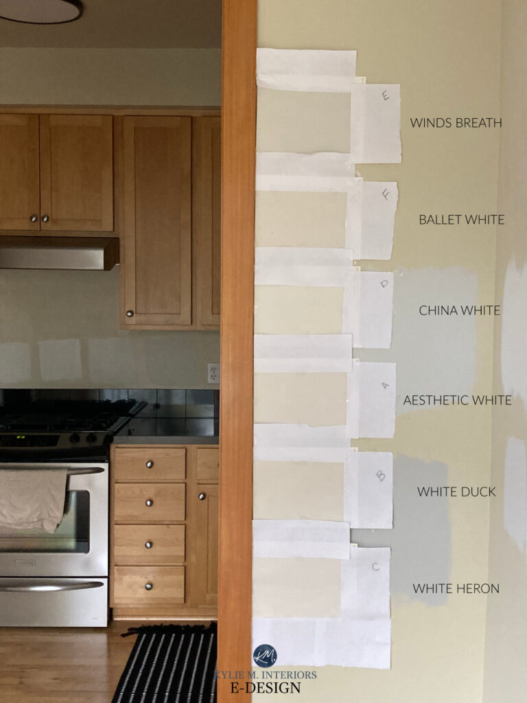
COLOR REVIEWS: Wind’s Breath | Ballet White | White Duck | White Heron
Some of the above neutrals are pretty darn similar, for sure. The most significant shift is between Aesthetic White and Benjamin Moore Wind’s Breath. If you don’t know which neutral best suits your home, sampling a range is a great way to get started.
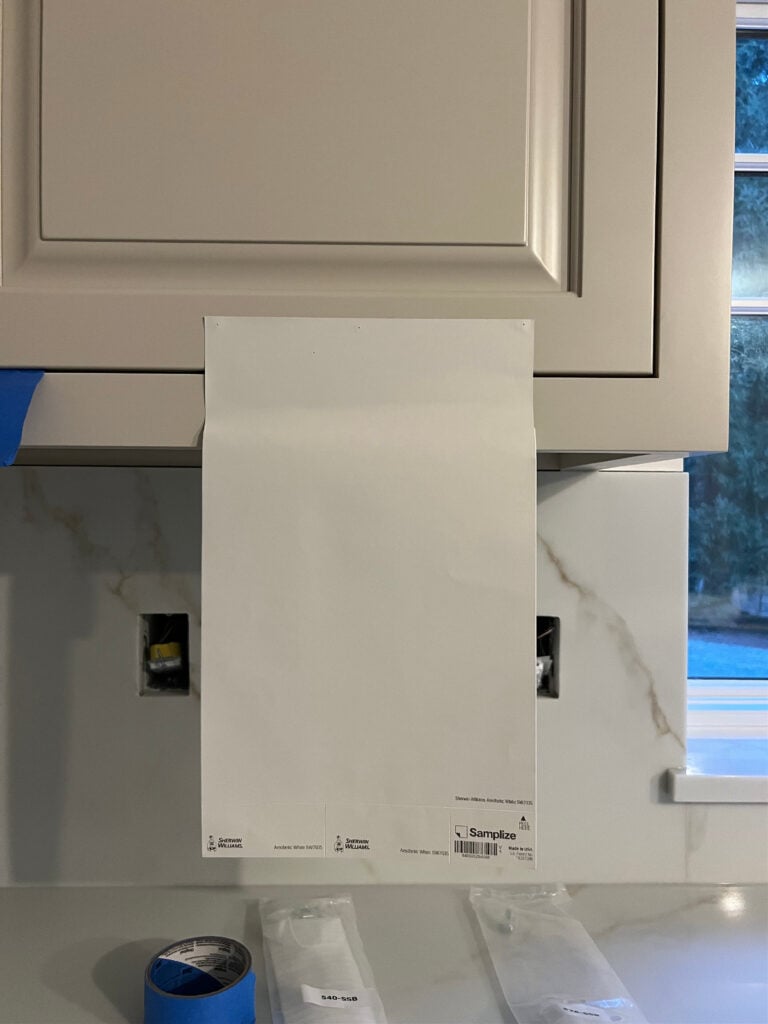
Why is the white paper there?
It’s not for labeling. If we put these samples on the existing yellow-hued paint color, most would look pinkish ‘in comparison.’ It’s important to separate old and new (I do the same with my boyfriends – don’t tell Tim). It’s equally important to use white paper when you have wood trim, as it helps you understand the color’s depth (whereas white trim shows the contrast).
Learn how to sample paint colors HERE
IS IT FOOL-PROOF?
HECK, no—no paint color is foolproof; there will always be situations where it won’t work. As it relates to Aesthetic White, here are its limitations.

- In a dark room, Aesthetic White can look a bit dingy and drab (improve your interior lighting!)
- In an OVERLY bright room, Aesthetic White will wash out, but so will ANY PAINT COLOR in and around this LRV range.
- While it’s not as common (as shown by most of these example photos), Aesthetic White can pick up a vague gray-purple undertone.
- Aesthetic White doesn’t want to be partnered with off-white/cream trim; it needs a whiter approach.
- Aesthetic White isn’t always warm/beige enough for the beige/Tuscan tones from the early 2000s (this fab and popular neutral is often better)
Sherwin Williams Divine White, Aesthetic White, Egret White
AESTHETIC WHITE IN A ROOM
Aesthetic White looks awesome on a ton of surfaces, but it needs to coordinate well with the surrounding finishes. So, assuming things are lookin’ good on your end, let’s break it on down (no twerking, though—yes, Mom, I’m talking to you).

- Aesthetic White is a soft, subtle color that often complements a room with various interior finishes containing different neutrals (e.g., tiles, countertops, and multi-toned carpets).
- It’s versatile enough to be used as a whole home paint color
- With its higher LRV, Aesthetic White is a great way to lighten and brighten a room, especially for those who want to do so without going all-white.
- If your room is dark, Aesthetic White could look a bit dingy – improve your interior lighting and choose the right Kelvins for the look and feel you want!
- It can be pretty on non-white interior trim (although I don’t personally recommend it for the average home)
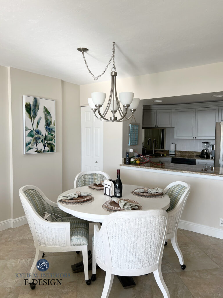
Look at how subtle Aesthetic White looks in this next bathroom with muted natural light. While it has a passive warmth, it’s not nearly as warm as some other popular shades of off-white.
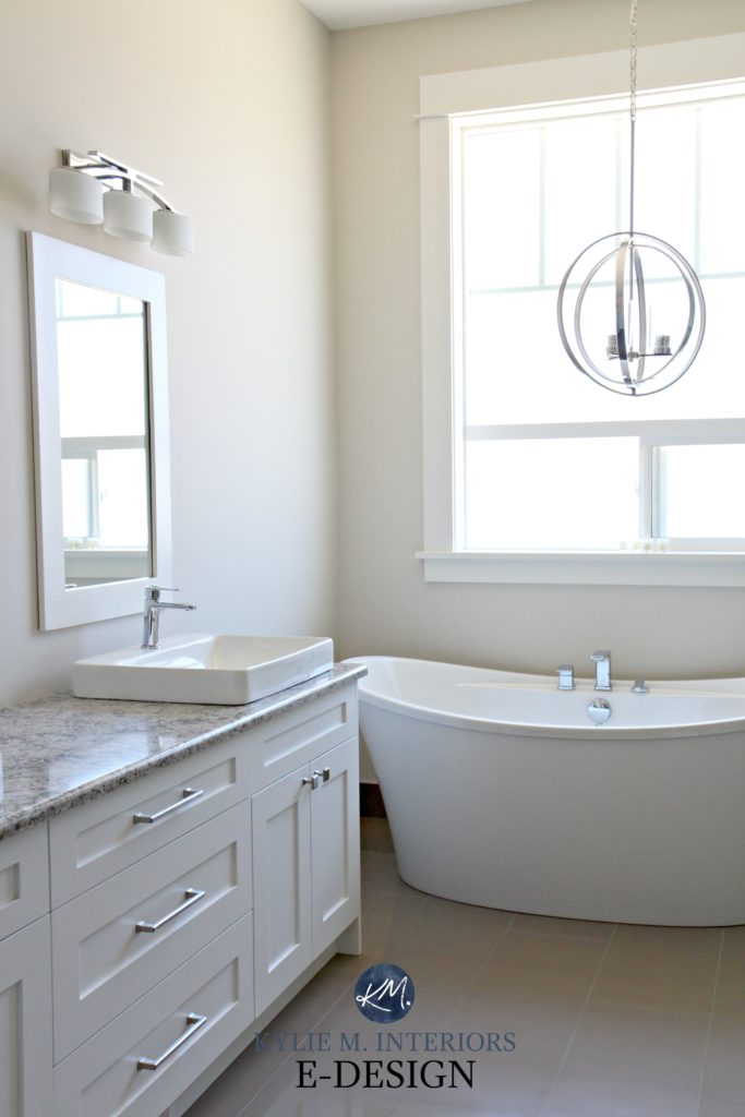
Also, notice how well it coordinates with the 2000s laminate countertop! While this bathroom has Benjamin Moore Cloud White on the trim and vanity, I prefer a slightly less yellow-hued shade with Aesthetic White (i.e., Sherwin Williams Pure White).
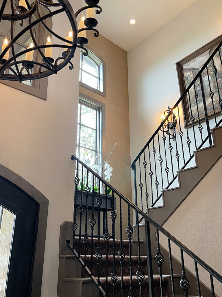
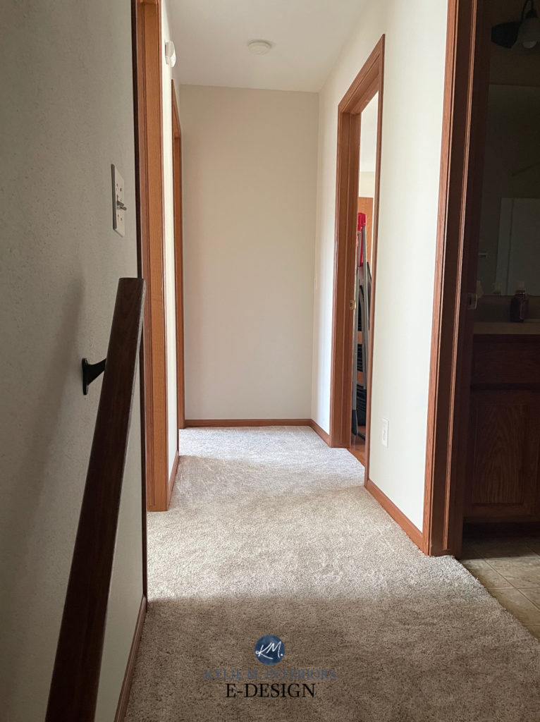
In this hallway with beige/taupe carpet and orange-toned stained wood trim, the warmth of Aesthetic White shows up to the party much more…
The Best Colors With Wood Trim
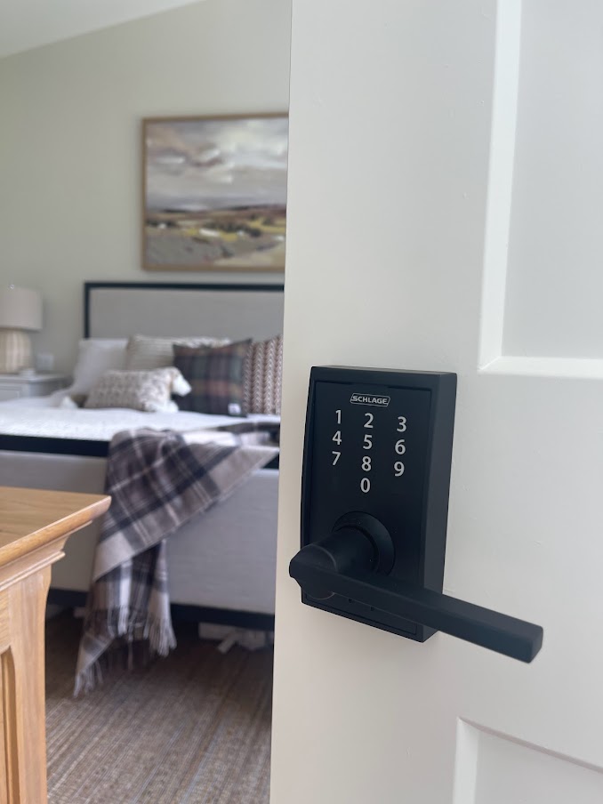
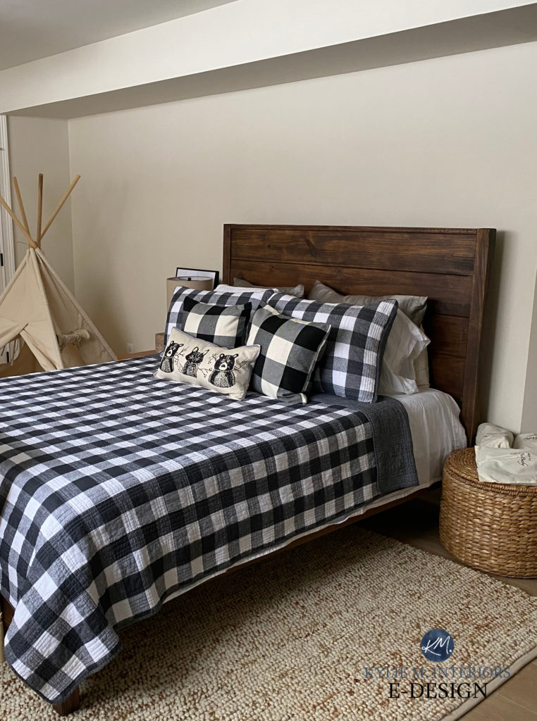
Aesthetic White looks stunning in this next bedroom with Benjamin Moore White Dove trims and ceiling in this bedroom (White Dove is lightened by 25%)…
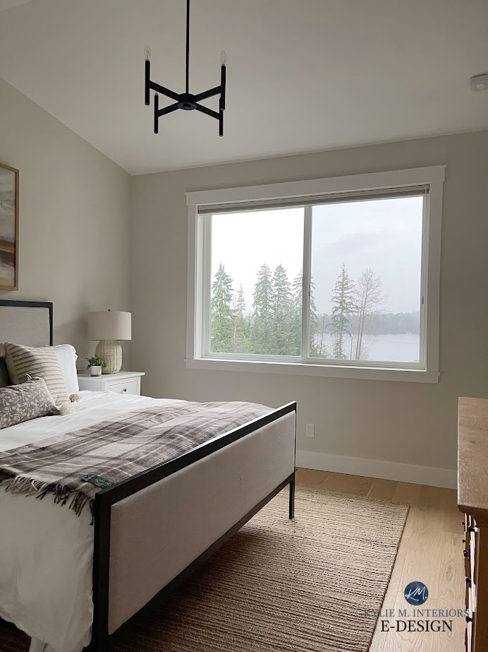
While Aesthetic White isn’t known for strong undertones, some see a wink of pink in their room; others see green undertones. The above room shows a flash of green more than any of the other images in this blog post.
Here’s your Peel & Stick sample of Aesthetic White…
At your door – tomorrow!
AESTHETIC WHITE ON PAINTED KITCHEN CABINETS
- Aesthetic White and its warm undertones can be a great choice for kitchens that don’t suit white cabinets (more common than you’d think – especially kitchens with granite countertops from the early 2000s).
- Thanks to its higher LRV and the extra sheen of cabinet paint (satin or pearl), Aesthetic White can lighten the look of a previously dark kitchen without going too white/bright.
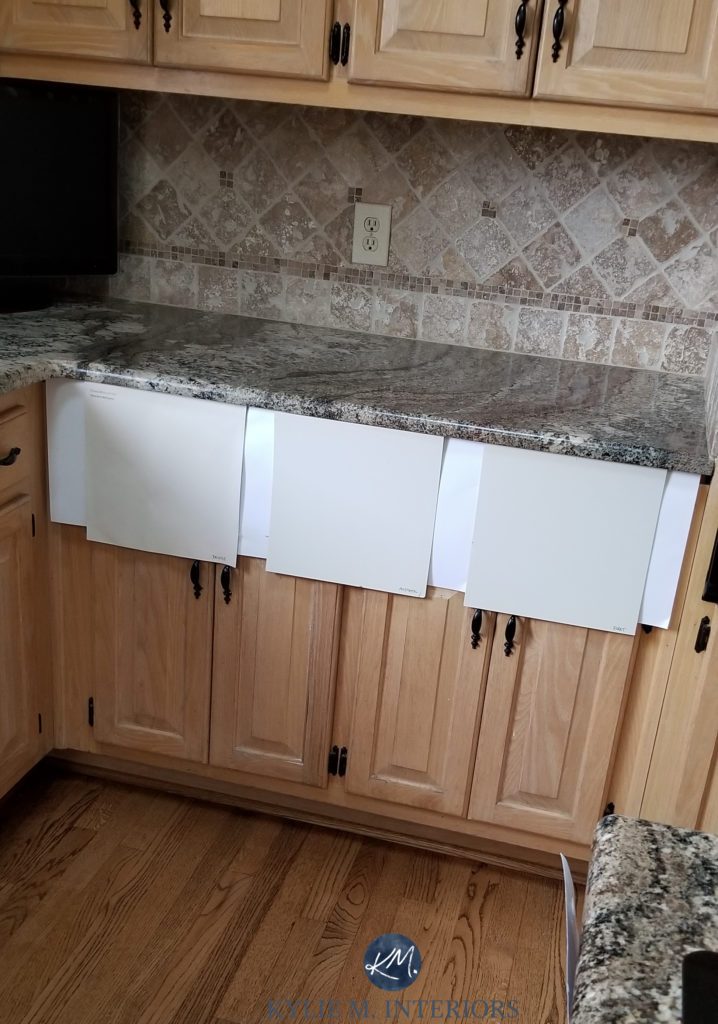
- If you want a bit more depth, check out Sherwin Williams Accessible Beige.
Here’s a sample of Aesthetic White compared to the darker, more beige look of Sherwin Williams Accessible Beige…
This 2000s Tuscan-style kitchen with an outdated granite countertop is pretty darn happy with Aesthetic White cabinets…
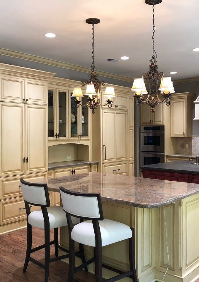
It hardly looks like the same kitchen…
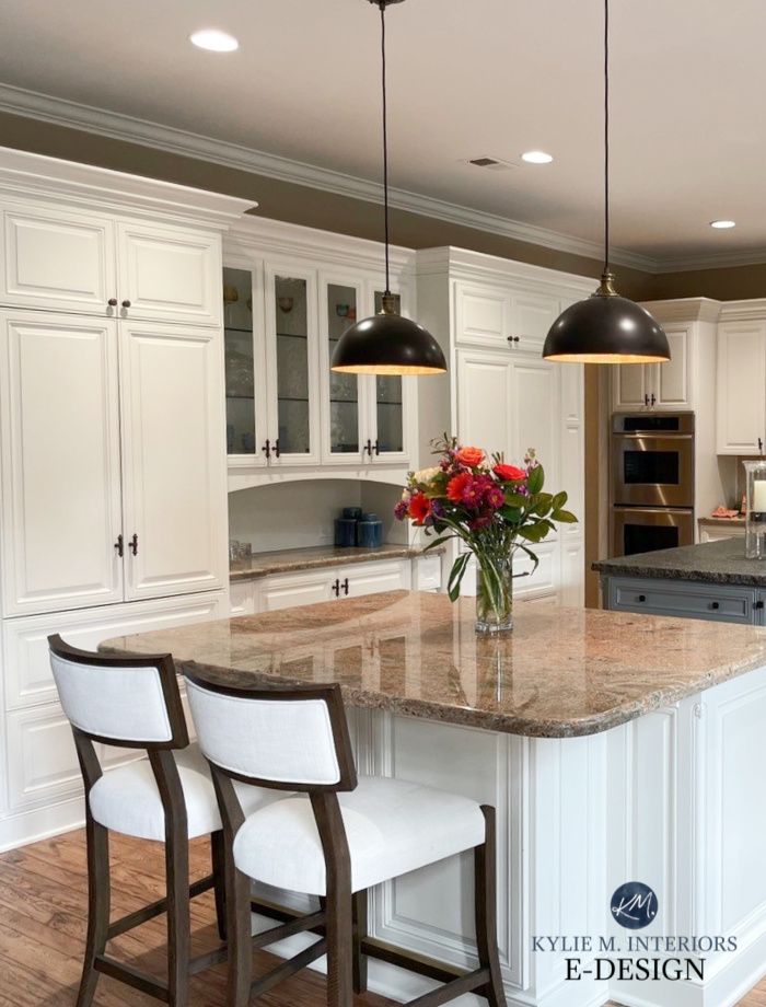
The Best Warm Off-White Colors
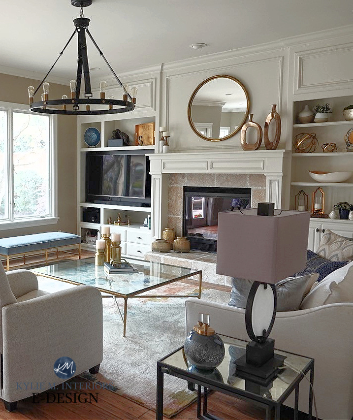
The built-ins in the open-concept family room (attached to the above kitchen) also love this warm off-white…
AESTHETIC WHITE AS AN EXTERIOR COLOR
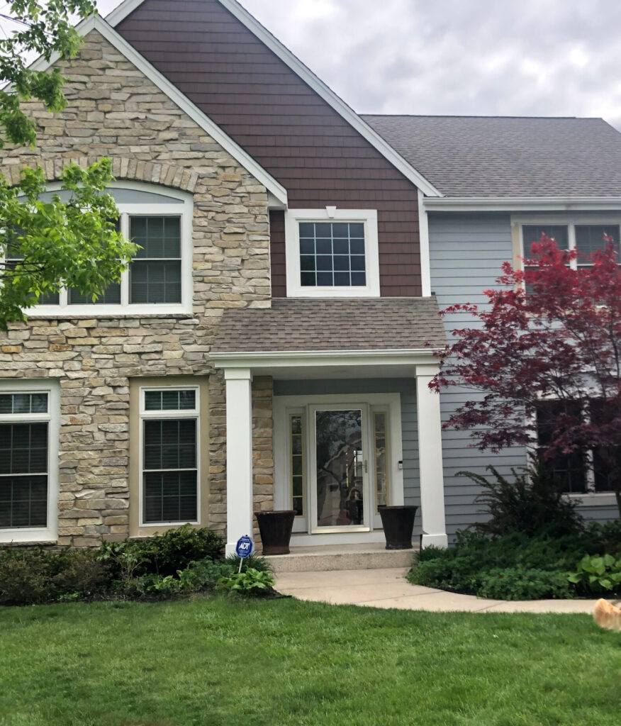
Aesthetic White can be gorgeous as an exterior color, whether for siding or trim…
- On exterior trim (above), Aesthetic White is a bright but not WHITE look – not all homes suit white trim, yet going cream/yellow or gray can be risky.
- As an exterior siding/main color, Aesthetic White offers a bright look without the same starkness of white.
- The flexible neutrals in Aesthetic White often humor a wide range of stone, brick, and roof colors.
- Thanks to its depth and muted undertones, Aesthetic White is gorgeous on an exterior (especially with black windows) when you want the siding and trim painted the same color.
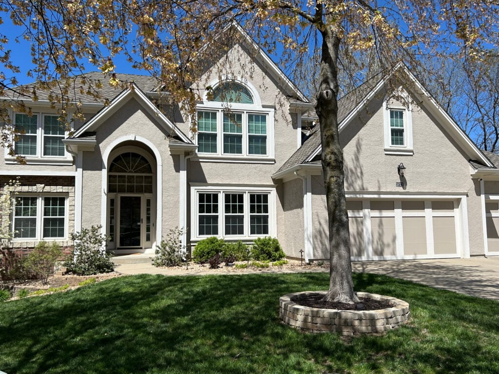
My next client painted their exterior (before hiring me) and, understandably, wasn’t happy with the results…
The dark brown was too harsh for their home—it had to go. However, they wanted to keep the trim color and gray-blue siding, so they hired me to fix their home by suggesting a new shade for the brown shakes without changing anything else!
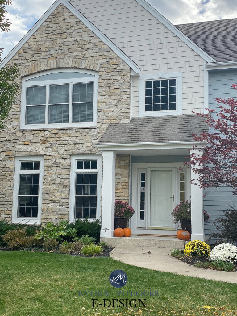
Aesthetic White is 50% darker
Aesthetic White to the rescue! While we tweaked it a bit to hit the right spot, it looks like a whole new home.

Sherwin Williams Aesthetic White is #2.
Your Home’s Best Exterior Color: Does Exposure REALLY Matter?
If Aesthetic White doesn’t do the trick, you know I’ve got more—check out the links listed below.
READ MORE
The Best Off-White Paint Colors
The Top 11 Warm Neutral Paint Colors That AREN’T BEIGE!
Full Color Review of Sherwin Williams Aesthetic White
6 Budget-Friendly Home Update Ideas
Get the best paint color advice


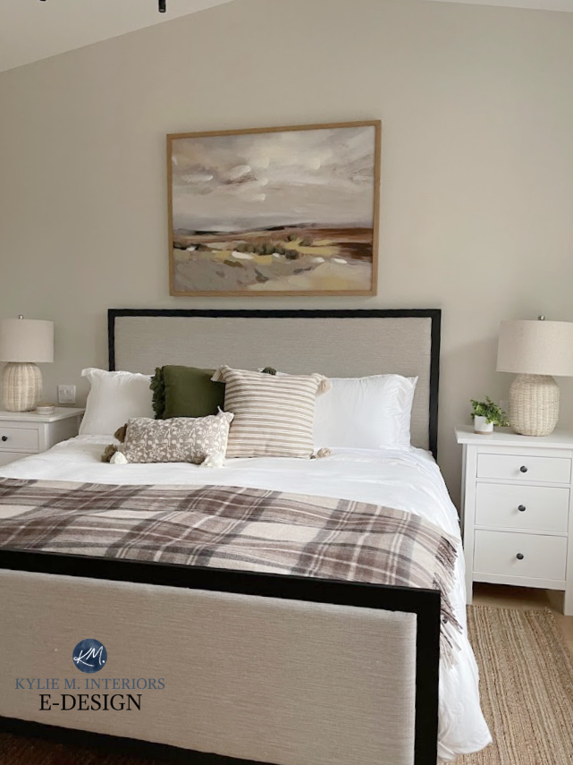
Wow, what a pleasant and total surprise to see a picture of my house (the hallway) as I was reading this article. I’m glad it wasn’t used as an example of what NOT to do! Haha
I have a house that was built early 2000s and nothing had been updated since it was built so it has very golden warm finishes/ orangey wood trim/ brown floor/ etc. I painted my whole house this color and I mostly like it, but can’t say I would choose the same color if I could go back in time. It’s not quite warm enough against some of the countertops and flooring and looks a bit “off” at times. When I first painted my house, I remember thinking it looked so gray and couldn’t image how this color could be described as a beige. Then again, I was comparing AW to a very golden yellowish color that was there before. In certain lighting and times of day, I love the way it looks. I like this color for my home and it suits it decently , but I wouldn’t say I LOVE it. I might choose Moderate White or, more likely, Natural Linen if I ever repainted again. Hope that helps someone!
Any pictures you could post? Your house, before being painted AW, sounds like mine (golden yellow walls, golden/orangey oak hardwood floors). Was thinking about AW with my existing SW Extra White trim.
I really like this colour! Definitely similar to the Ballet White I have throughout my main floor (which I discovered on your lovely blog and still love several years later – Thank YOU!!!)
YES YES YES! These versatile warm neutrals warm my heart! They’re not into the gray trend OR the warm beige trend, but snugged perfectly in the middle.
Aesthetic white is what you recommended for our vaulted living room ceiling with Anew gray walls. Still love it!!
WAHOOOOO, I’m glad you love it :).
Do you think Aesthetic White would be an appropriate trim color on a mountain home exterior with Rockport gray as the main color?
I’m cautiously optimistic :). I say this because most times Rockport shows a pretty kind of muddy green undertone – Aesthetic loves this. But once in a while it leans a touch violet. I can’t say that would be BAD with Aesthetic, but not quite as pretty.
Hi!
Hoping you can help me!
I have BM White Dove on my walls and want to paint one cabinet stack and bead board in a mudroom. It does not get any natural light. I want a warm light color. I have oak floors. I did Revere Pewter and it’s wayyyy to dark and grey. Looking for a beige/tan updated color.
Ooooo, what about something like SW Accessible Beige?
I used it in my kitchen with super dark gray/brown cabinets, marble counters, bleached oak floors and handmade “white” wall tile. It was the closest color to match the tile. Used it flat on walls & ceiling and semi-gloss for trim. It’s so beautifully changeable with the light but always looks right. As you say- bright white trim doesn’t sit well with it but changing the sheen/same color made it look lighter and brighter than the walls and the perfect trim color. I’m definitely off the gray train. Going with Westhighland white next in my living room and just painted the dining room Black Fox which I love for the brown undertone in it.
Ahhhhh Lori, I LOVE the sounds of your palette! And I’m so glad you love Aesthetic White with your finishes (I also LOVE Black Fox and it’s brown undertones – gorgeous!)
This sounds like my proposed palette, can you share any pictures?
I love all your ideas so much and find this site so helpful! I am currently renovating our lakehouse and am trying to find a very light and bright neutral color to paint the whole house. I have lots of light with southern exposure in our great room. I have pure white kitchen cabinets and pure white trim and doors throughout. I am really struggling with finding a wall color. I like alabaster, moderne white and aesthetic white. I don’t want it to look too beige and am a little worried about aesthetic white! Help!!
I’m not sure what help I can give without seeing your space and its finishes!
Kylie, is there a wink of a green undertone or am I incorrect with that? I like the transition to warmer colors that is happening but I would probably make a bigger commitment than this color seems to make.
You know, it’s a tough one. For every person who sees a tiny wink of green, someone sees a vague pink (which is the opposite)! It’s pretty responsive to its environment. OVERALL, between the 2 undertones, it’s a touch more likely to grab green, but it would be vague at very best (and still, could be there due to the surrounding trim/exposure/lighting/etc…
Interesting and thank you for the response!
This color was recommended to me by the SW color consultant. I got a sample pot and liked it on the wall. I used it in my dining room and with accessible bridge underneath the chair rail. Trim is Vaslapr ultra white, floors are a mahaghony. Room faces west with natural light from the door to the backyard. It opens into our kitchen which is super warm with cherry cabinets and dark grainate counter tops.
I must say- I may be regretting this ! The color looks too cool for me and there is not enough warmth in there for me. I was afraid of a yellow undertone, but maybe that is what I needed. :/ not sure what to do but live with it until I get regain the engery (and pocket money ) to paint again It looks better when all the lights are on and when it’s sunny, but on a drab day like today, it looks gray and flat. Overall I like the two tone contrast with accessible beige but I think the undertones may not be ideal.
Hi Kylie,
Great website! What is the name of the blue-gray on the home in the before-after photos where the brown was changed to Aesthetic White?
Thank you.
Hey! I believe that’s SW Mineral Deposit. Check it out, along with SW GRay Clouds and Gris to see which one settles best for you, they’re great comparisons :).
This is one of our top contenders for our whole house color, along with Etiquette, City Loft and Pale Oak! We are building our forever Mountain Modern dream home on the side of a mountain, with mostly west views (designed the floor plan around the slope/view!). We don’t want something too warm in the western sunset, but not too cold in the morning. We will have Hale Navy as the main accent color (including kitchen cabinets), but throw in a Cinnamon Slate/Wet Concrete (haven’t settled just which yet), and Cushing Green accents in some rooms. And of course we will have (on the lighter end of) medium, neutral toned wood floors and accents everywhere, and a lighter tan/beige stone fireplace to the vaulted ceiling. Any help narrowing that whole house color down, or a better suggestion would be SO appreciated!
Hey Angela! Of ALL of those, it would be Aesthetic White for me, and NOT just because I love it :). Of them all, I find it pretty darn flexible – warm without being OVERLY warm thanks to its grayish backdrop. It also steps away from the pink undertones the others have, which can be VERY prety, but maybe a bit limiting in the longrun :).
Is aesthetic white good for a whole home open concept? And does it pair better with white dove or pure white for cabinets and trim? Thanks!
Oooo, great question, Erin! YES, in fact, I just painted my open concept areas Aesthetic White (I just darkened it). The reason I darkened it a bit is that I have White Dove trim/ceilings. Aesthetic White works ‘as-is’ with Pure White trims/cabinets, but does better wtih either 25% or 50% darker with White Dove :).
Hello and help,
Will this color work well with my redding, orangish, yellowish 1965 cedar tongue and groove ceiling in the living area? IT seems good but I think I’m going color blind with decision fatigue!
I have a more chill flooring and light from the east, mostly west and some north, with a tad coming in from an adjoining south room. Liked some similar neutrality with sunbleached.
I can’t tell you how many of your videos I have watched, thank you!!
Thank you for any word!
Oh boy, it’s so hard to say. My FIRST thought was more along the lines of SW Natural Linen, Moderate White and BM Maritime White – check those out and compare them with Aesthetic White. They’re a bit warmer. I’m sure you don’t want MORE choices, but sometimes once you see the right color, and it IS the right color, it’s done! I feel like your color is in that bunch (from the sounds of your room).
Kylie, hi!
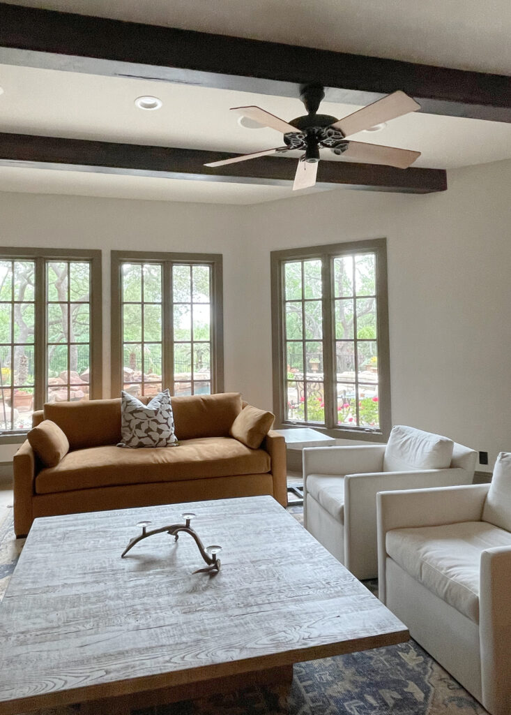
Thank you for this. The photo above the link for “the best non white trim” of the living room with the wooden beams and GORGEOUS not white trim and white walls: can you share the color of the walls and trim there? I went to the other post (non white trims) but don’t see details for that room. Would love to know if you do know those!
Thanks for the help,
Sheena
Ahhh, thank you for asking, Sheena! The walls are SW Aesthetic White (maaad love) and the trims are Benjamin Moore Texas Leather! Hope this helps 🙂