
Benjamin Moore Ballet White OC-9: Paint Color Review
IS IT CREAM, IS IT OFF-WHITE? LET’S FIND OUT…
Are you looking for a warm neutral with a creamy backdrop but nervous about yellow undertones? Have you looked at colors like Navajo White, White Duck, and
Creamy, but none have hit the spot? Let me save you some time and stress by introducing you to one of my favorite warm neutral paint colors, Benjamin Moore’s Ballet White.
Ballet White has been popular for about a decade and is still going strong, thanks to its flexibility on cabinets, walls, and exteriors. But are its undertones the best for any space? Is it really a good cabinet color for your home? Let’s find out.
WHAT TYPE OF COLOR IS BALLET WHITE?
While some think Ballet White is white (via its name), in the depths of its heart, Ballet White is a cream paint color – but it’s not quite that simple.
Cream is a yellow paint color with a neutral foundation to calm it down, and Ballet White is quite neutral, making it what I fondly call a dirty cream paint color—and dirt has never looked so good.
By the way, did you know that Ballet White is also known as Benjamin Moore Muskoka Trail 974?
Clean colors have less gray or brown; dirty colors have more. If we took some of the ‘dirt’ out of Ballet White, we’d have more of a yellow.
However, Ballet White isn’t just subtle in its earth-toned approach; it’s even dirtier than my mind, giving it more flexibility for the average home.

All the photos in my blog are from my Online Color Consulting clients, readers, & friends— because real homes deserve to be celebrated (dirty laundry & all!) While not magazine-perfect, they’re packed with ideas & proven color choices to help you create a home you’ll love.
WHAT’S THE LRV OF BALLET WHITE?
The LRV of Ballet White is 72 (71.97), which means it’s a light color but darn close to the off-white range. If you’re not well-versed in LRV, I highly recommend you read the ultimate guide to LRV and paint colors, as it’s a game-changer.
This LRV means that while Ballet White is reasonably light, it still offers a nice, soft contrast with white trim while keeping things low-key and muted.
WHAT ARE BALLET WHITE’S UNDERTONES?
A typical cream paint color starts as yellow and then has a neutral base to calm it down. From there, it can sometimes grab a wink of orange, red (pink), or green.

Ballet White is an interesting neutral as it’s passive in its overall approach to cream and undertones. While its main undertone is yellow, the odd time it can pick up a flash of green, but it’s more situational, as its color science (L*a*b*) doesn’t actually contain green.
If the term ‘undertone’ is new to you, it’s the way Kylie M’s Color System describes a color’s natural bias or its built-in tendency to lean towards one color or another.

There’s hardly any yellow to be found on these walls!
If you love creams that show a purposeful yellow, Ballet White might not be for you, as its neutral base takes a good chunk of its color away. However, you’ll still get a passive warmth, even in a room with north-facing light. If you need more warmth, I’ve got some comparisons listed below.
Get your Samplize Peel & Stick sample of Ballet White HERE
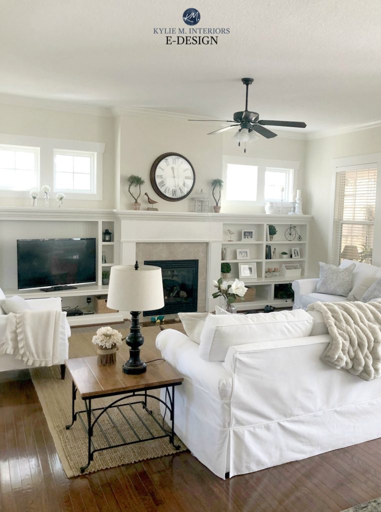
In this next photo, the warmth shows up a bit, but it’s still very subtle.
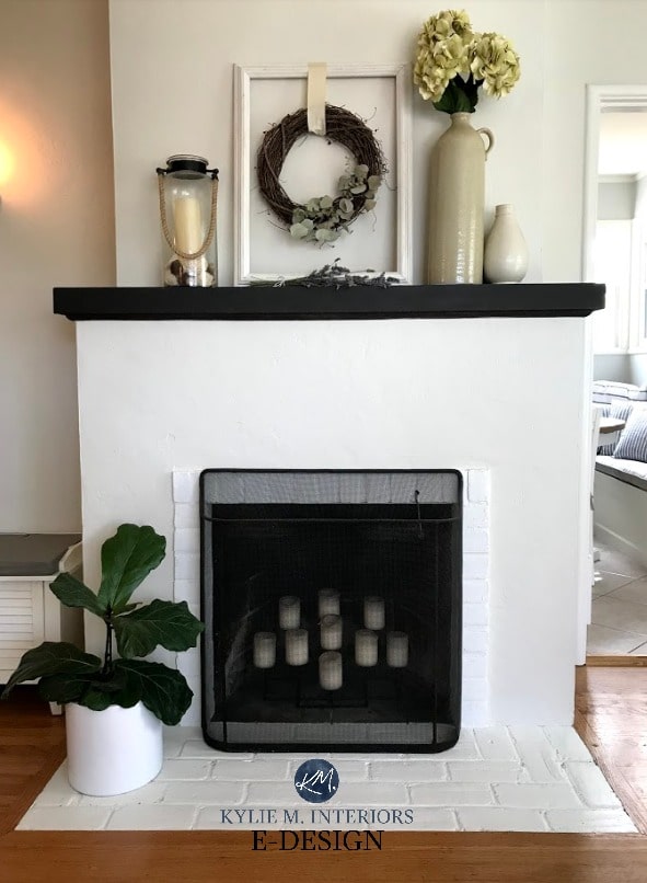
Ballet White in the foreground, Benjamin Moore Gray Cashmere in the background
On the other hand, if you love cream but are nervous about too much yellow, Ballet White could hit the spot.
IS IT GOOD WITH WOOD CABINETS & TRIMS?
Heck to the YES—Ballet White is one of those paint colors that looks amazing with a wide range of wood finishes, thanks to its passive approach to undertones.
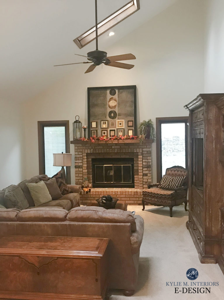
Are Wood Trims Outdated or Trendy?

DOES IT GO WITH CREAM CABINETS & TRIMS?
You know what? It’s worth a try. A lot of the time, we don’t know exactly what color our cream cabinets and trims are – and sometimes they ARE…Ballet White, or darn close.
If Ballet White matches your cabinets, awesome. If it’s a bit darker but still jibes (doesn’t look dingy compared to your cabinets), give ‘er a go.
This next image shows a very rare combo, whereas Ballet White (walls) works with a creamier trim…MIRACLES DO HAPPEN!

Cream trim color is unknown
In this case, because the trim isn’t too dense or intense, Ballet White sits grayer and more muted on the walls, but not glaringly so. While it’s not ideal, sometimes that’s okay when working with tricky finishes.
The Best Paint Colors to Update Cream Cabinets & Trim
But sample carefully, as if your cabinets and trims are ‘legit’ cream, Ballet White will be too dirty and light.
IS BALLET WHITE GOOD FOR A HOME’S EXTERIOR?
Ballet White is a great choice for an exterior, assuming it suits your brick, stone, roof, landscaping, etc. Natural light can make Ballet White look much lighter and more like an off-white than it does on interior walls, so having white trim to contrast with it is important (if you want to see your siding color a bit more).
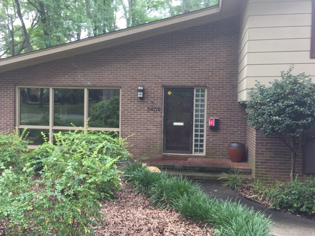
Before Ballet White…
And after Ballet White…
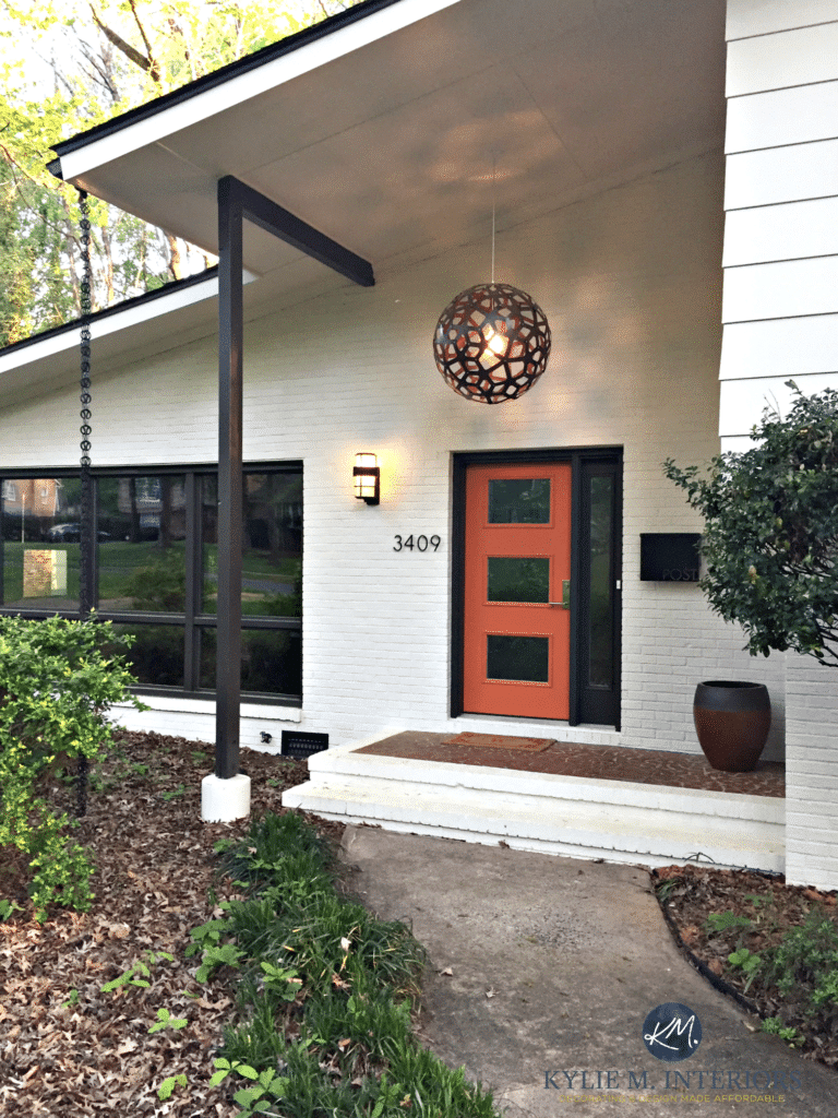
A Stunning Exterior Makeover – Painted Brick and More
If you prefer a super subtle approach, you can paint your siding and trim the same color, as shown on this Colonial style exterior with dark blue-black shutters…

If your home is north-facing, Ballet White might not look as light as it could in other exposures.
If you’ve read my post re: picking exterior paint colors, you’ll know that exterior colors tend to come up lighter than you think they will, when given good natural light. Ballet White proves this point nicely without looking white or stark.
WHAT’S THE BEST WHITE TRIM OR CABINET COLOR WITH BALLET WHITE WALLS?
Ballet White is more flexible than a 10-year-old ballerina and humors a wide range of beautiful whites…
- Benjamin Moore Cloud White
- Benjamin Moore White Dove
- Sherwin Williams Pure White
- Benjamin Moore Simply White
Benjamin Moore’s 8 Best White Paint Colors
WHAT PAINT COLORS ARE SIMILAR?
Several paint colors are worth comparing with Ballet White; colors with similar intentions but adjustments in depth/temperature/undertones, etc.
BALLET WHITE vs. WHITE SAND
Due to their close placement in the fan deck, comparing these two shades can seem like a good idea. But while they’re both warm neutrals, they have different intentions. Ballet White is more like a dirty, muted shade of cream.
White Sand, with its increased depth (LRV 66.95), is a tan paint color, so its yellow/cream base isn’t as obvious. White Sand is a more typical ‘light depth,’ whereas Ballet White is on the high end of the range, winking politely at the off-white world.

BALLET WHITE vs. SHERWIN WILLIAMS SHOJI WHITE & WHITE DUCK
These are great comparables with White Duck. Shoji White and White Duck have LRVs of 74, so they’re in the off-white world and lighter than Ballet White’s LRV of 72. By a LOT? Heck no, but these subtle shifts can make or break a color!

Sherwin Williams White Duck on exterior siding
In comparing the three shades, you’ll also see that Ballet White has a bit more color/undertone/warmth compared to the slightly more muted look of White Duck and Shoji White.
While Ballet White and White Duck have a VAGUE green undertone in common (whereas Shoji White is a wink inclined toward pink), Ballet White has a stronger warmth.
Paint Color Review of Sherwin Williams Shoji White
Paint Color Review of Sherwin Williams White Duck
Some people ask what the difference is between Ballet White and Natural Cream. I didn’t want to go too deep, as I’m not a huge fan of Natural Cream (I don’t even have a review of it)—like a fart while wearing white shorts – I just don’t trust it.

The meat n’ potatoes is that Ballet White has more of a cream foundation and Natural Cream has a bit more taupe – BUT, like Ballet White, it can also pick up a wink of green!
As for depth, Natural Cream’s LRV of 64.78 means it’s a good dose darker – in the middle of the light range rather than off-white.
WHAT COLORS GO WITH BALLET WHITE?
If you’re creating a color palette with Ballet White, there’s no shortage of awesome options. While it depends on whether you need a coordinating cabinet or island color, accent wall, or a color for an adjoining room, here are some to get you started…
- Ballet White looks badass and beautiful with smokey gray-blue-greens, particularly those in the light-medium to medium range.
- I’d also check out green-gray paint colors for a soft, organic look. Lighter shades can look nice in adjoining rooms, medium to darker shades make for great accent partners.
- As far as warm neutrals go, Ballet White suits tan paint colors (yellow undertones) more than beige paint colors (orange undertones).
- I LOVE it with greige paint colors, both light shades and darker greiges when I need an accent color.
- Check out a range of navy blues with Ballet White, especially those that have a blue-gray base calming them.
- Dark green paint colors are gorgeous accents to Ballet White.
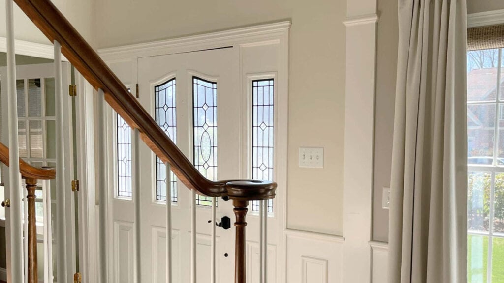
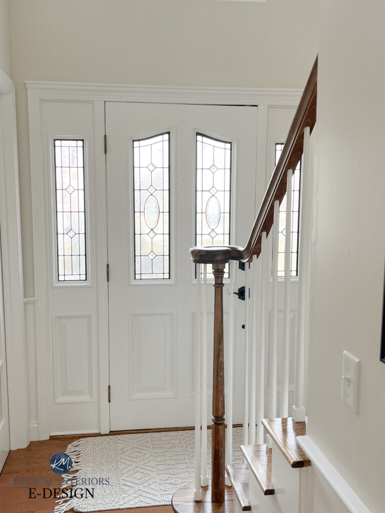
In this next photo, Ballet White is in the foyer (left) with Sherwin Williams Worldly Gray on the right. These are partnered with Benjamin Moore White Dove on the trim, ceilings, front door, and wainscoting…

A BIT MORE ABOUT BALLET WHITE
- If you’re looking for a warm color, but with LESS warmth than Ballet, check out Benjamin Moore Edgecomb Gray instead. Benjamin Moore Wind’s Breath is great, too.
- Ballet White has a reasonable grayish backdrop, which calms the yellow down, so if you don’t love this ‘dirtier’ look and prefer a more noticeable cream/yellow, check out Benjamin Moore Gentle Cream, Sherwin Williams Casa Blanca, or Benjamin Moore Navajo White.
- Direct natural light will wash Ballet White out because of its higher LRV.
- Ballet White is a great ‘whole home’ color as it is light enough for hallways and interesting enough for larger rooms.
- Ballet White can be a great kitchen cabinet color if you want a more modern approach to cream cabinets without too much yellow. It’s a more modern choice vs traditional cream cabinet colors.

READ MORE
Benjamin Moore’s Best Cream Paint Colors
The Best Warm, Off-White Paint Colors
Paint Review of Benjamin Moore White Down
Paint Color Review of Benjamin Moore Linen White
Color Review of Sherwin Williams Shoji White
NEED HELP?
Check out my Online Color Consulting Services; I’d love to help!

ORIGINALLY WRITTEN IN 2018, AWESOMELY UPDATED IN 2024


First I want to say that I love your website. We are renovating a 1940’s house to sale. We
are not touching everything as we need to do this quickly and not put in too much resources. The cabinets are a rich amber pine and the whole house has rich medium reddish orange trim. I am looking at Ballet White for the whole house because we want to buy a 5 gallon paint bucket. I’m trying to keep a more contemporary feel (new subway tile and countertops in kitchen) yet have the bones , details, and character of this 1940’s house.
Do you think Ballet White would be appropiate? Also looking at Natural linen and Shoji White. Thanks, Diane
I love the sounds of this Diane and would have Shoji White has my next fave choice, for a slightly brighter look.