
The 5 Most Popular Cream Paint Colors: Benjamin Moore
The Top Shades of Cream
While gray-based neutrals have been the ‘big thing’ in the decorating world in the last few years (besides me, wink wink), many of us have a soft spot for cream (especially when the word ‘ice’ is in front of it). I love how it gives a neutral backdrop that’s subtle, warm, and inviting – without being remotely colorful or overbearing.
However, cream is a sneaky little bugger and can be surprisingly tricky.
Why?
Well, many of my Online Color Consulting clients say that they ‘love cream, but don’t like yellow‘. At that point, there’s an awkward silence until I say, ‘Ermmm, cream IS yellow.’
That’s right, cream is a yellow paint color with a neutral added to calm it down.
This means that if you like cream, you DO like yellow. Some like more yellow, others like less – but yellow is the common denominator.
From there, the key is to pick the right type of cream that speaks to your tastes and interior finishes. However, whereas most other neutrals are reasonably flexible and suit a range of finishes, cream is fussy. This is because not as many interior finishes have real cream/yellow in them. When a finish doesn’t contain a color, it can be harder to use this color on your walls successfully.

This is why cream is often found in living rooms and bedrooms. These rooms tend to have fewer hard finishes (countertops and tiles)—the ones that are less likely to have cream in them. They might have white or off-white, but that doesn’t mean they are yellow.
Cream can also get punchy quickly. These lighter, yellow-infused colors can reflect a lot more light compared to cooler neutrals. This means the cream that looked ‘reasonably warm and yellow’ on your small sample could look OVERWHELMINGLY warm on a large scale. Sample carefully!
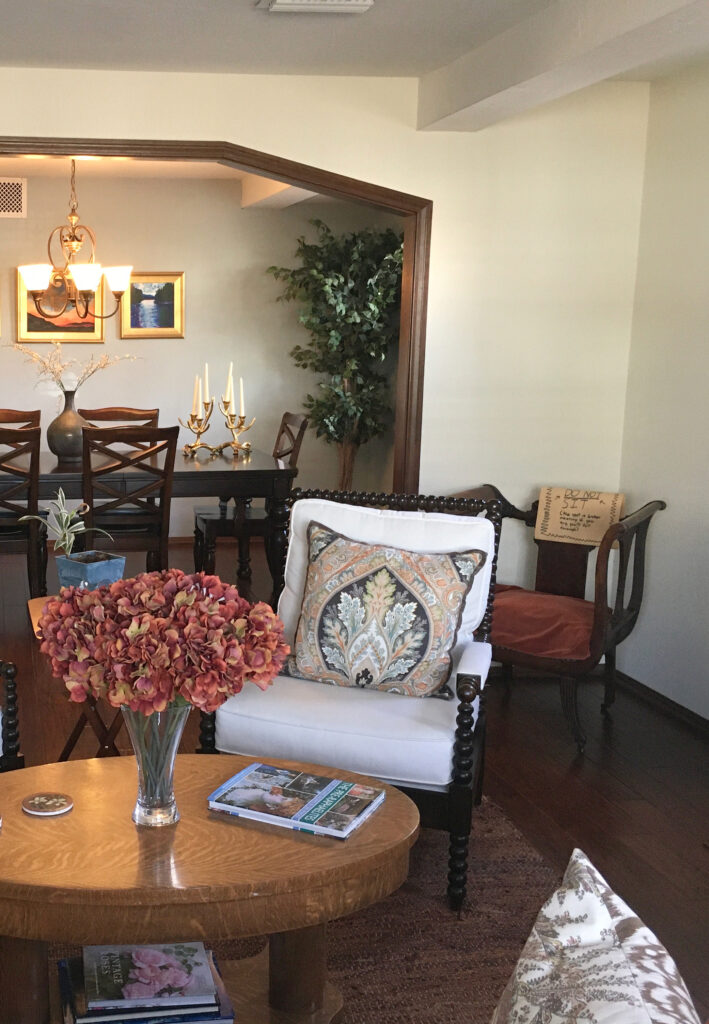
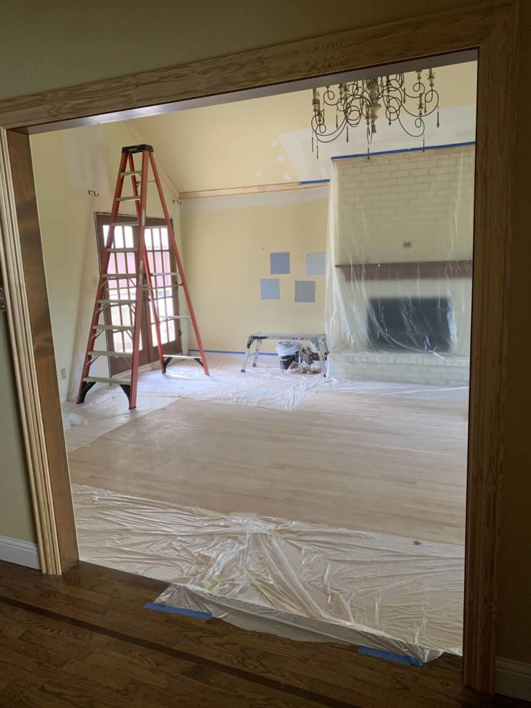
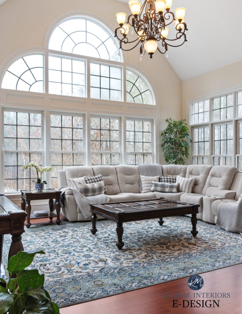
Before, this room was a creamy yellow, which was a bit much for the owner…
After, the room looks warm, welcoming, and inviting without looking glow-in-the-dark…
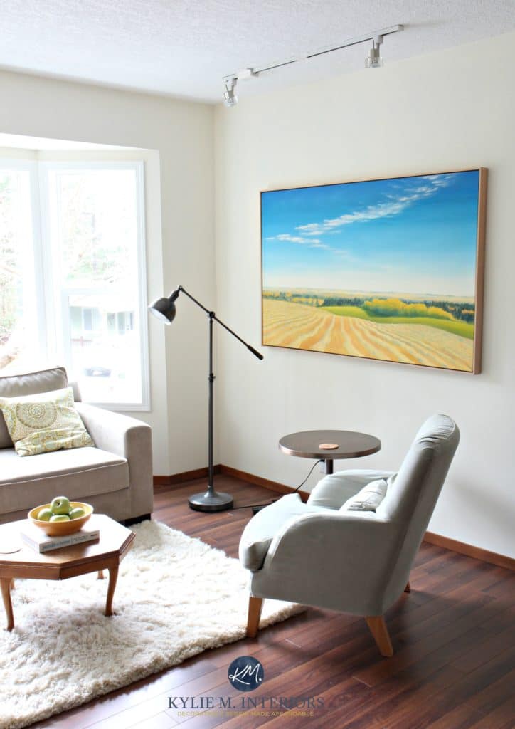
Shown above, Benjamin Moore Winter Wheat, a beautiful cream paint color
And lucky you – there are hundreds of beautiful cream colors to choose from—that should make it easy, right? Wrong. The more the merrier is not always the case when it comes to picking paint colors, and it’s easy to get overwhelmed when trying to find ‘just’ the right cream for your room.
So, how do you find the one that’s just right for you? Well, you don’t. Okay, let me rephrase that…YOU don’t. I do. And I’m damn good at it!
1. BENJAMIN MOORE NAVAJO WHITE OC 96
Navajo White is a light cream that blends yellow and orange and has a neutral base to calm things down. This color is fresh and warm without having any ‘weight’ to it, making it a contender for almost any room!
Navajo White’s LRV is 78, meaning it will reflect a lot of light back into a room, making it feel bigger and brighter!
And I apologize for the slightly blurry photos. I rely 99.9% on photos from my E-Design clients, so I do my best with what I have.

MORE ABOUT NAVAJO WHITE
- It’s great if you’re looking for a light and warm palette close to ‘off-white’ but with a bit more depth.
- Navajo White is a tiny bit more colorful than a traditional shade of cream but nowhere near the more muted tan end of things.
- It’s a great complement to stronger feature walls or accent walls.
- It can work in both north and south-facing rooms. It’s soft enough to look warm but not so yellow that it’s overpowering.
Using LRV to Pick a Paint Color
IF YOU LOVE NAVAJO WHITE, YOU MIGHT ALSO LIKE…
- Benjamin Moore Indian White picks up what Navajo White throws down but has a bit more meat on its bones.
- Benjamin Moore Albescent is a slightly more grounded take on Navajo White.
- Sherwin Williams Casa Blanca is just a wink more cheerful-looking!
Casa Blanca and 12 Other Popular Cream Paint Colors
2. BENJAMIN MOORE GENTLE CREAM OC 96
Gentle Cream is a heavy cream with similar undertones to Navajo White, making it warm and inviting with a subtle, neutral base. It’s a great color to pair with earth tones and neutrals (like chocolate brown and charcoal) and in dark hallways when you want a warm but not white look.
Gentle Cream’s LRV is 71, so while it reflects less light than Navajo White, it will still add a warm, inviting vibe to your room.

Paint Color Review of Benjamin Moore Gentle Cream
MORE ABOUT GENTLE CREAM
-
A great whole home paint color or for a single room
-
A lower contrast pairing to an accent or feature wall than Navajo White, with enough weight to play nicely
-
Beautiful as an exterior trim color
- Warm enough to add visual warmth to a north-facing room, yet not so yellow that it’s too strong for an already ‘warm’ south-facing room
Get your PEEL & STICK sample of Gentle Cream!
IF YOU LOVE GENTLE CREAM, YOU MIGHT ALSO LIKE…
- Benjamin Moore Natural Wicker (also known as Bone White) for a similar but more muted, grounded approach.
- Sherwin Williams Eaglet Beige can look a bit creamier as it has a bit less orange.

My Paint Color Review of Benjamin Moore Natural Wicker
3. BENJAMIN MOORE SPANISH WHITE OC-35
Spanish White is a beautiful, subtle shade of cream. It lacks the orange of Navajo White and Gentle Cream, which makes it a bit more susceptible to grabbing a slight yellow-green, but not by much.
Spanish White also has a grayish backdrop, slowing down the degree of yellow on your walls. Compared to the cheerful approach of Navajo White, Spanish White has an almost old-world feel.
MORE ABOUT SPANISH WHITE
- Spanish White could be your shade if you like a super muted, not ‘golden’ approach to cream.
- It will act like a warm but not overly colorful neutral. It has much more warmth/color than Ballet White (coming up shortly), but it is still quite passive as far as popular cream paint colors go.
IF YOU LIKE SPANISH WHITE, CHECK OUT…
- Benjamin Moore Marble White for a similar but lighter look.
- Sherwin Williams Polar Bear for a bit more depth and commitment.
4. BENJAMIN MOORE TIMID WHITE OC 39
This is one of my fave creams when I want a whisper of warmth. Timid White has that yellow-creamy base that ALL creams have and a wink of gray to tap it down while still leaving a good amount of warmth on the table (or on the wall would be more the point).
MORE ABOUT TIMID WHITE
- It has an LRV of 84, so it’s pretty darned light! On a wall with tons of natural lighting, it will lighten up THAT much more but will come back as the sun shifts.
- While there could be a very (very) small amount of green in it, it’s so vague I’ve never seen it show up at the party.
IF YOU LIKE TIMID WHITE, CHECK OUT…
- Benjamin Moore Acadia White is an awesome comparable for a slightly brighter hit of cream.
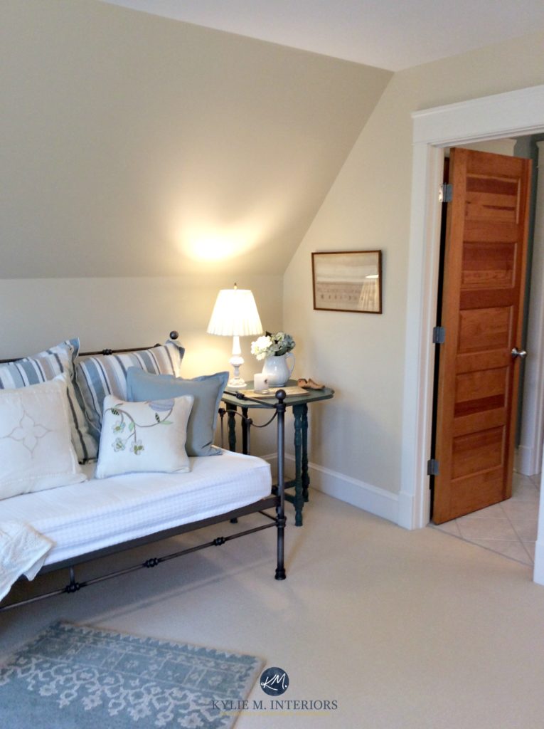
- Benjamin Moore Linen White is similar and offers a touch more golden warmth.

Linen White trim
5. BENJAMIN MOORE BALLET WHITE OC 9
Ballet White is a fabulous neutral. It’s the least creamy of the bunch, as a strong tan-gray blend grounds its yellow-cream base. So, if you find some of the above colors too warm for you, this might hit the spot! Its neutral base calms things down and is almost greige compared to the above colors, giving it a warm but more neutral look.

The Best Paint Colors for INSIDE Your Front Door!
Paint Color Review of Benjamin Moore Ballet White
MORE ABOUT BALLET WHITE
-
It’s a great ‘whole home’ paint color (see more Whole Home Warm Neutrals).
- It suits homes with southern or northern exposures.
-
It’s not as good for low-light/shadowed rooms, as it can get a bit flat.
IF YOU LIKE BALLET WHITE, CHECK OUT…
- Sherwin Williams White Duck is similar in its intentions but more muted and less warm.
- Benjamin Moore Sail Cloth is SUPER similar and great to sample and compare.
My Paint Color Review of Sherwin Williams White Duck
GET A CREAMY LOOK WITH WHITE PAINT COLORS
Did you know you can get a creamy look from a soft, warm white? While it depends on your room, finishes, and exposure, a warm, creamy shade of white can create a soft look with minimal color commitment.

READ MORE
The 13 Best Cream Paint Colors: Sherwin Williams & Benjamin Moore
The Best Off-White Neutral Paint Colors
The Best Warm Neutrals with NO YELLOW UNDERTONE!
Paint Color Review: Sherwin Williams Creamy
Not sure which color is best for you?
Check out my Online Color Consulting and E-Decorating Services

ORIGINALLY WRITTEN IN 2019, UPDATED IN 2024


Hi! Love your site and the advice you give.
I was wondering if you could help me make a decision for the exterior of my home.
My roof color is a light and medium shade of griege and I painted the body BM Sailcloth which picks up the lighter shade on the roof. I am happy with this, plus the windows are white. Now here comes the hard part for me. There are 50 million shades of “Navy” for my shutters. I was thinking BM Hale Navy because of the grey tone to it. BUT is it going to be so dark
that it looks black. I was also thinking of just going a darker shade of greige for the shutters, but what color for the door????
God this is hard. HELP please. ( PS. The house is a cape cod style.)
Hi Anamae! Thank you for asking! There’s actually more to consider such as roof, stone, brick, exposures, landscaping – sadly it’s hard for me to throw something out there without knowing, I’d be 100% guessing! I do have E-design services for this exact thing though and can help you pull some beautiful palettes together. I’ll be able to look at photos of your home and a questionnaire to come up with some ideas for you 😉 https://www.kylieminteriors.ca/online-decorating-design-services/
~Kylie
Thank you for being so generous with your talent. I read your blog regularly and enjoy the banter as well as the information.
Teresa
Well Teresa, thank you, that’s just what I needed to hear today 🙂
~Kylie
HI Kylie,
We are building a ski-chalet inspired house by Red Mountain resort n Rossland. We will have Douglas fir cabinets, windows, and trim. I’m wondering if you can suggest a cream colour that goes well with Douglas fir. We will have natural maple floors and lots of windows! Our fireplace stone is a mix of greys, blues, and browns. I’d like white or cream quartz countertops as well. (we have a open floorplan with a. large rake window wall)
Any thoughts?
Thank you in advance!
Does the BM-Muslin show pink undertones with colors other than yellow? Our trim and ceilings are BM-Sail Cloth with Walnut stained floors.
Hi Carlin, yes, once in a while it can grab a wink of that 🙂
HELP!!!! Have walls in Benjamin Moore “Everlasting “ and off-white/cream cabinets. Can you suggest an accent color for a small wall??? Thank you so much!
What shade of white would you select for trim alongside walls in Timid White? Thanks!
I have this question also! Did you find a shade?
Hello, I am having the exterior of my house painted hale naby… However I am drowning in white/off white/light cream paint samples for the trim! 😭 Do you have any suggestions? I’ve read to be careful about painting outside trim stark white because it ends up looking to “harsh”. I also usually lean toward “warmer” colors, yet I do want it to really pop. I have not liked the cooler whites as much as the neutral and warmer whites up next to the navy. I want it to really pop but for the blue to come off a rich warm navy. Thank you in advance – Rebecca
Hi Rebecca, what about something like SW Pure White or BM White Dove, so you have a SOFT look, but not a stark/crisp look. I mean, they WILL more or less act like white, but not as sharp as some others. Just keep in mind that the blu in Hale Navy can slightly enhance the warmth (yellow) of a warm white.
OMG! Your head must be spinning – even in your sleep! We’ve just finished a whole house redo as result of a major storm. It was brutal making so many decisions. Love reading your posts but no wonder you reference “wine” often.
Not just one house but THOUSANDS of thoughts & decisions you make for us hapless
others. Bless you for your talent & personality.
Kylie, I adore your website and blog! I wonder if you could do a colour breakdown of Shenandoah Taupe? I love the colour and am thinking of using it for a basement bathroom which would have no natural lighting and playing bone/cream fixtures against it. And in the future is on my wish list for the breezeway which would have tons of natural light east/south/west exposure. Either way, I understand it will behave differently, but would like to hear how you have used the colour!
Hi Kylie!!! I’ve read your posts for ever. So I am trying to coordinate some colors. So maybe you can give me some input. This for a small studio salon I have. I want to to update. Right now I have revere pewter. Which I love but doesn’t give me a huge pop as well as my window faces east slash south east so I get sun in morning but then as day goes on I get light but not sunshine light if that makes sense. I’m looking at doing Kendall charcoal as accent wall( before that van deusen blue) and was leaning to mascarpone walls for the rest. I’m kind of a boring neutral beige girl and like to add pops of color but not be commited. So then I was thinking mascarpone would still be too white. So then I saw white vanilla and then saw your post of gentle cream. I think I want my walls to have a hint of depth but not much and some warmth so I don’t look like I have a neutral to cool room. Plus I have differ wood tones for retail shelves and such so I want the colors to compliment the wood. Thanks I’m advance. Hopefully this makes sense.
Hi Nikki, I might be careful with the creams re: skin tones. I would lean MORE into something like BM Balboa Mist with Kendall which could be STUNNING and should be pretty with woods too1
My trim and doors are somewhere close to BM Navajo White. (They are Kelly Moore Soft White that isn’t made anymore). We are thinking of painting the walls BM Navajo White so all is the same, because we are not painting trim/doors, and we have that 2000s St. Cecilia granite. Does Navajo white work for all surfaces (trim, doors, walls; matchy-matchy)? We have contrast in wood floors, butcher block island, and decor.
Hi Kylie,
My home lives in the mid eighties. Complete with orange wood trim and popcorn ceilings. My family room is an area of mass confusion. It has a vaulted beamed ceiling with the same orange wood, a floor to ceiling corner fireplace made of Florida rubble stone and warm beige carpet. Last but not least a narrow window with northern exposure and a slider that’s west facing but has an enclosed patio outside it.
In the past I’ve embraced my little cave and painted Audubon Russet ( made the fireplace stand out nicely).
Now, I’d like something light and airy that I might even incorporate through the rest of the house.
I’m intrigued by Edgecomb Gray. In the distant future I’d love to replace the trim but for now I’m stuck with orange wood ( can you tell it’s not my favorite?). Thanks for any ideas.
Hey Linda, it’s SO hard to say without seeing your home and exact fireplace, carpet, furniture, etc…I would SAY that the modern beiges are probably a bit better than the cream world??!
What are the lightest modern beiges that are warm enough for low light/northern exposures? Would soft chamois have enough depth or hue?
This is so helpful- thank you!