
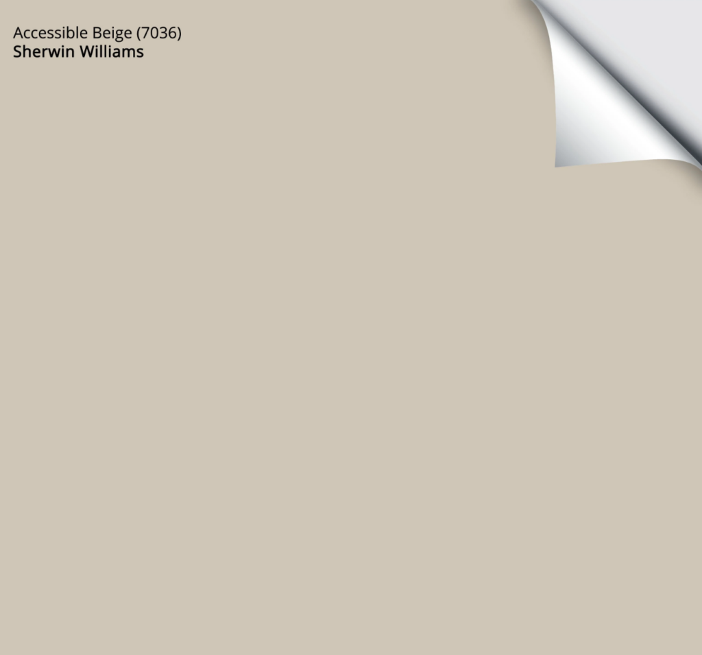
Sherwin Williams Accessible Beige (7036): Undertones, LRV, & Best Uses
Sherwin Williams Accessible Beige is a light, warm, neutral beige paint color. And with beige being today’s hot color, you’d think it would be right up there in the ranks…and it is.
However, just because a color’s name gets thrown around a lot doesn’t mean it’s the best color for your home. Sure, it can look good on interior walls, especially in open-concept spaces or whole homes, as well as on trims and cabinets, but that doesn’t mean it’s YOUR best color.
As with any paint color, interior finishes, light bulbs, and exposure can directly affect how a color appears on a surface. This is why learning about a color and sampling it carefully is the best way to find your perfect shade.
So, without further ado, let’s find out if Accessible Beige is the hue for you…

WHAT TYPE OF COLOR IS SW ACCESSIBLE BEIGE?
Accessible Beige is a neutral beige paint color. With its unique blend of undertones and LRV (which we’ll hit shortly), it’s also one of the more popular beige paint colors on the market, beating top shades from its own line and Benjamin Moore’s, too.

However, beige has a bad rap thanks to the beige-on-beige-on-beige trends of the early 2000s.
Does Accessible Beige fall into that category of colors?
HECK NO—it’s not that kinda beige; instead, it’s bodacious, beautiful, and begging to be on your walls (and more…but we’ll get into that shortly).
When I have E-Design clients who like warm gray/greige paint colors, this one comes up quite often—even though it’s beige.
Why?
Well, if a client has a north-facing room, they sometimes find Accessible Beige grays out just enough to hit their comfort zone without falling cold and flat as some greige or gray paint colors can.
That said, Accessible Beige is rarely an ‘easy win’.
IS ACCESSIBLE BEIGE WARM OR COOL?
While Accessible Beige is a warm neutral paint color, it’s not nearly as warm as more traditional shades of beige. This bodes well if you have south-facing light, as rooms with that don’t necessarily need much more warmth.
However, if you’re looking for a somewhat timeless approach to temperature, Accessible Beige is a bit too cool.

CAN ACCESSIBLE BEIGE LOOK TOO GRAY?
It depends on your personal tastes and how it pairs with your finishes, but yes, sometimes Accessible Beige can look too gray. This doesn’t mean it IS a gray paint color – it’s not – but it can lean that way in some lighting situations.
In some lights, Accessible Beige can look more grayish, but one person’s ‘too gray’ is another’s ‘just perfect’!
If anything, Accessible Beige is likely to look a bit more greige-taupe than beige (greige and taupe are between gray and beige). To demonstrate that, look at how Accessible Beige compares to Benjamin Moore’s Revere Pewter (a warm gray-greige paint color)…

See how Accessible Beige is warmer but still picks up some gray? Keep in mind that while it can look grayish, it more often looks warmer.
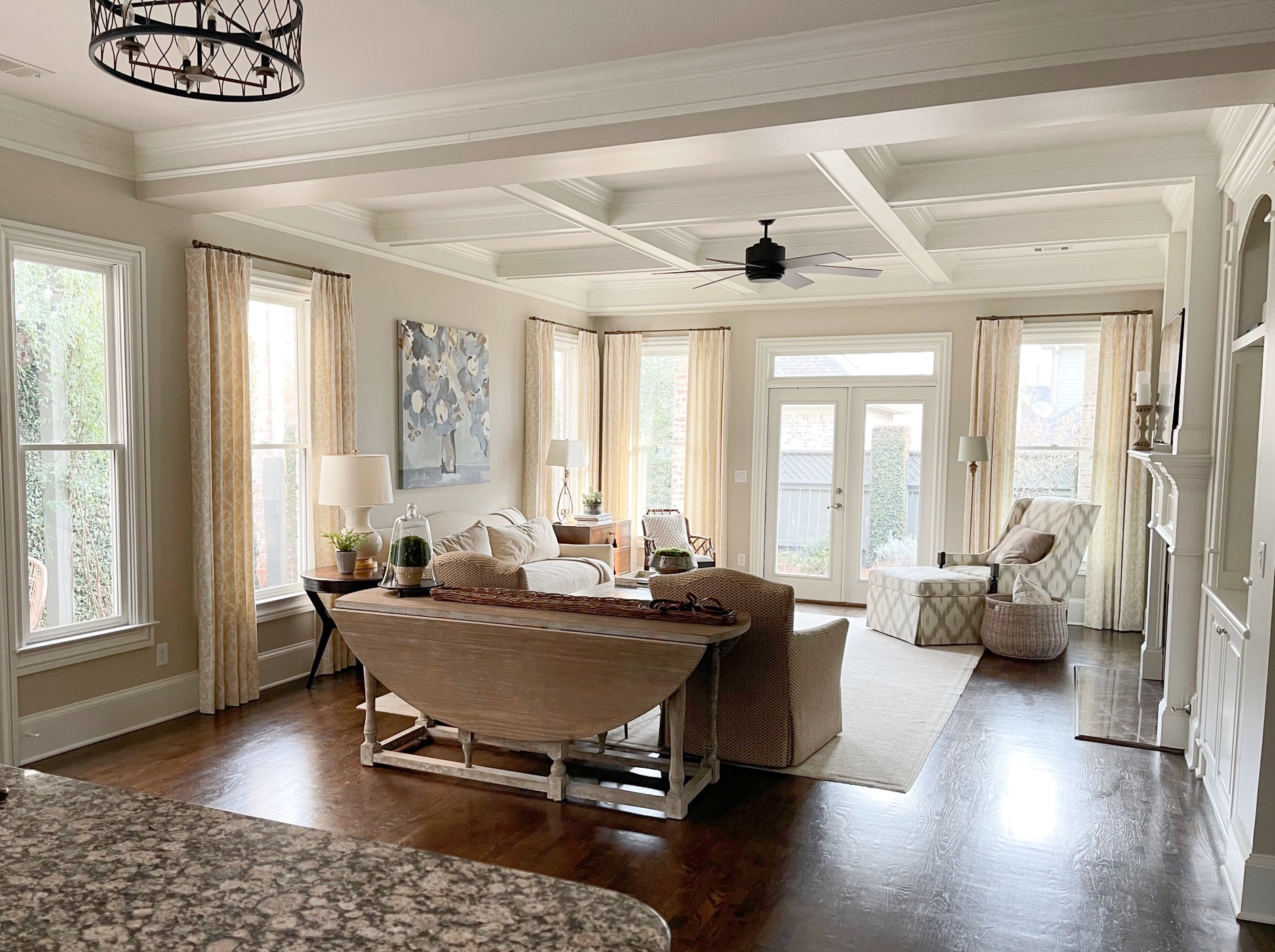
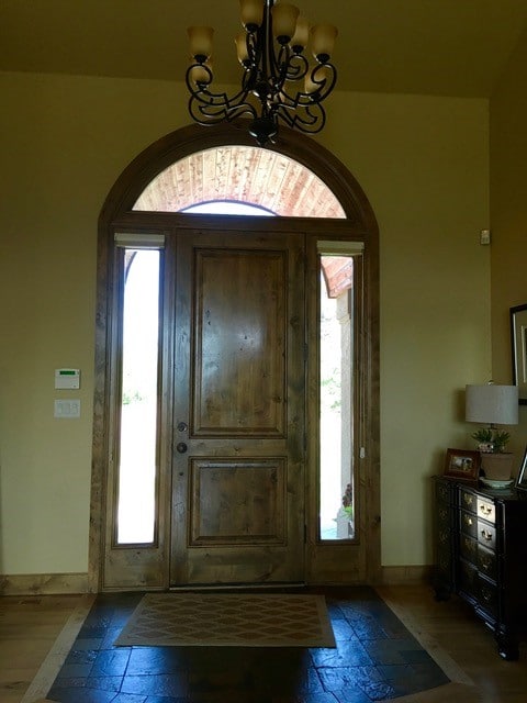
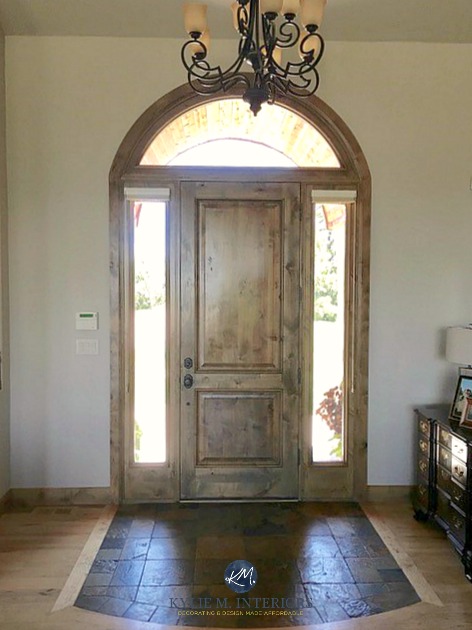
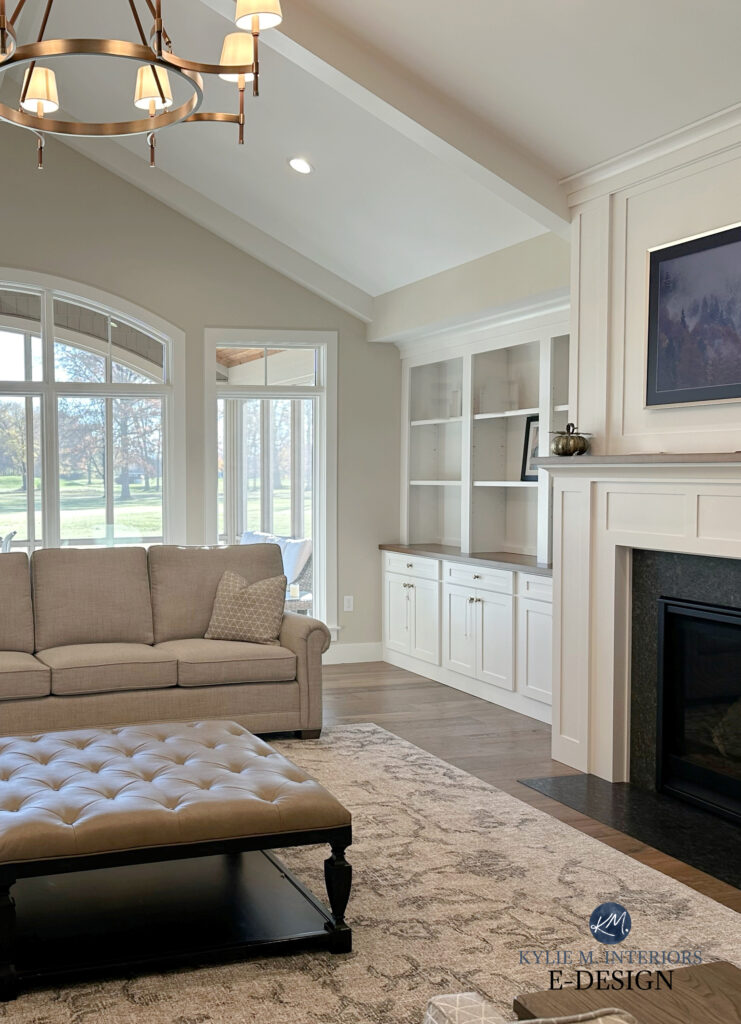
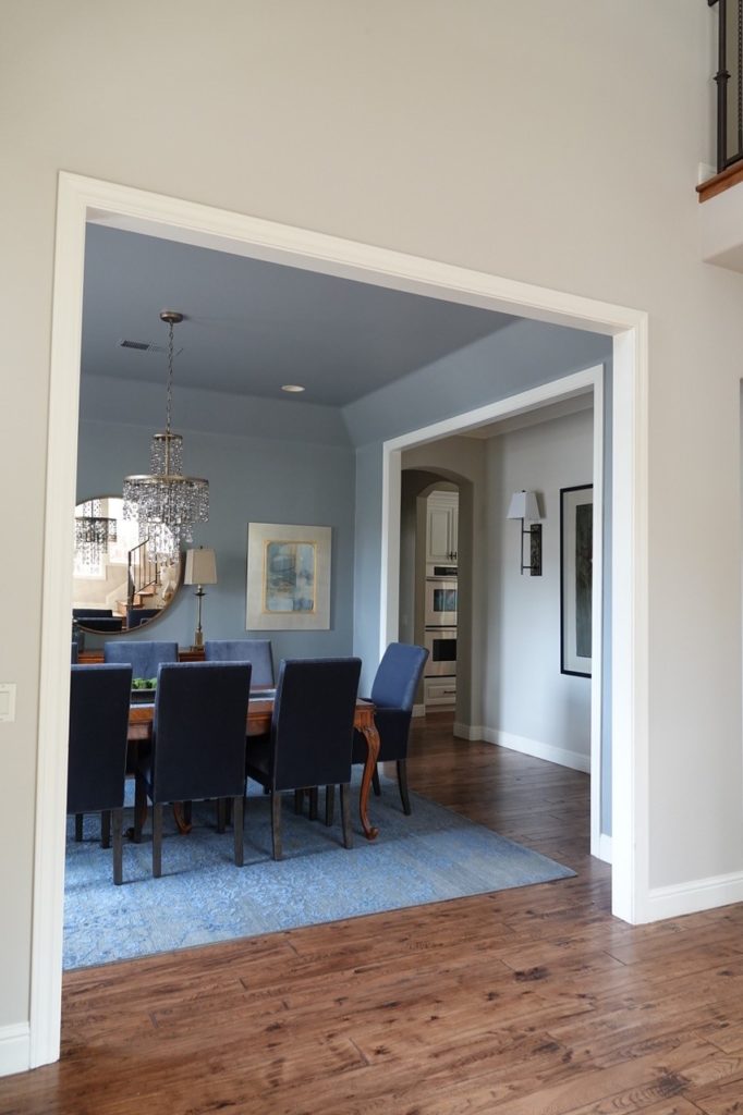
99.5% of the photos in my blog are of REAL HOMES from my Online Color Consulting clients, readers, and friends. While not always magazine-perfect, they’re packed with ideas and proven color choices to help you create a home you’ll love.
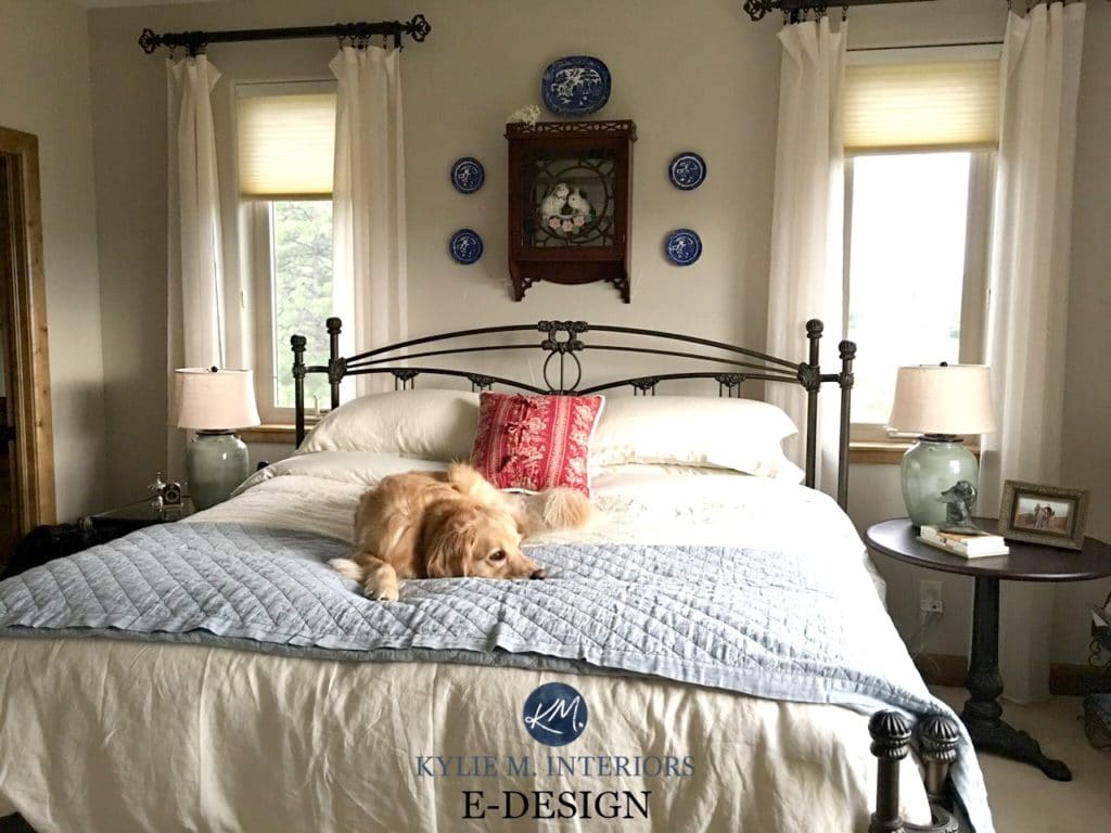
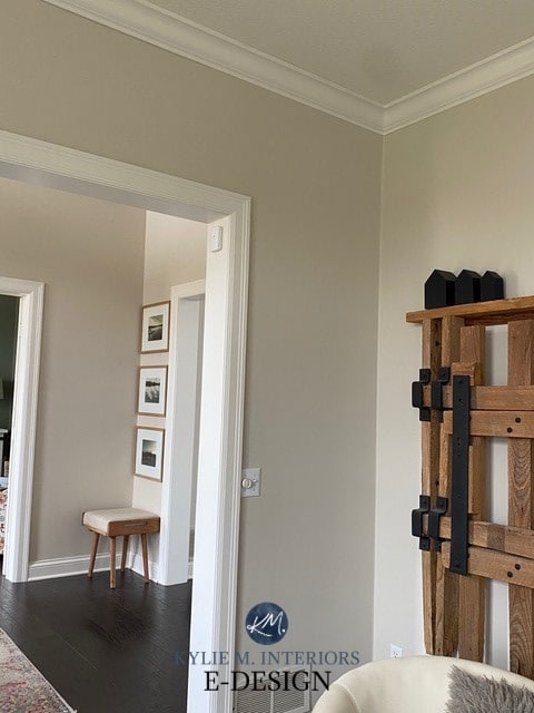
As shown in the next image, Accessible Beige looks as cool as I’ve ever seen it. It also shows how much a color can change in one room depending on the light it receives…
THE UNDERTONES OF ACCESSIBLE BEIGE
When you look at Accessible Beige, you’re really looking at a beige with a gray base – a reasonably strong base, at that. A lot of the more old-school beige paint colors can flash quite yellow or orange—not this bad boy. Accessible Beige is softer, subtler, and neutral, leaning slightly toward the gray side.
If you aren’t really sure what undertones are, in Kylie M’s Color System, it’s a term that helps describe how a color may lean. Keep in mind that this will change in different lighting conditions.
CAN IT LOOK GREENISH OR PINKISH?
As for ‘other’ undertones, Accessible Beige can pick up a tiny wink of pink or green; it’s subtle (and not common), but if you have an aversion to either, sample it carefully and compare it to similar shades (which we’ll do shortly) to see which settles best with your finishes.
While it doesn’t ‘contain’ green, Accessible Beige can be encouraged that way in different lighting conditions and when paired with more orange-pink surfaces.
Why pink or green? Well, while its readings suggest that it favors pink (red), it’s SO MINOR that with just a touch of encouragement, it can look green. This is common with neutrals that don’t commit HARD to one undertone or another – they can flex!
What does ‘encouragement’ involve?
- The quality/color of the light coming in your windows, including any green grass/landscaping.
- The Kelvins and quality of your light bulbs, for sure.
- Comparison. For example, if you put it next to a finish that caters hard to pink, it can seem a bit greenish in comparison. It’s just not that committed.

These green countertops are being replaced with new quartz.
BM White Dove | SW Anew Gray | SW Balanced Beige | SW Amazing Gray | SW Loggia
My favorite light bulb Kelvins with Accessible Beige are around 3000K for the average room.
Here’s your Peel & Stick sample of Accessible Beige…
Delivered to your front door – TOMORROW!
THE LRV & DEPTH OF ACCESSIBLE BEIGE
According to Sherwin Williams, Accessible Beige has an LRV of 58, so it’s not quite in my magical range, but it’s getting there.
Not sure what LRV is? You get three slaps with a wet noodle and should probably read this blog post—it might just save your paint-lovin’ life!
The Ultimate Guide to Choosing Paint Colors with LRV
This LRV means that Accessible Beige is a light paint color, but on the slightly lower end of the range – it’s not a ‘bright, fresh shade’. This means that even though it’s in the light range, it can fall flat in darker or low-light rooms due to its combo of depth and neutral look.
Colors need LIGHT to come to LIFE – especially neutrals like this.
On the other hand, if your room gets reasonable light, Accessible Beige is an awesome depth. The same goes if your room gets more light than average, but know it will wash out to a degree, as any color will.

WHERE ACCESSIBLE BEIGE DOES (& DOESN’T) WORK
Accessible Beige does well on a wide range of paintable surfaces (even your toenails, if you’re so inclined). Let’s shortlist the most popular ones along with a few duds, then get into more details after.
- It works just as well in single rooms as in open-concept spaces and even in whole homes.
- While it can be a gorgeous exterior paint color, make sure it coordinates with your roof, stone, brick, etc.
- Be careful in dark rooms, as Accessible Beige can look overly muddy or dingy without sufficient light.
- Accessible Beige is a great, light neutral cabinet color, but it will limit your wall color options.
- Rarely works with pink-toned woods, but can be fabulous with others.
- While it’s currently popular as a trim and interior door color, unless you have a Heritage home/committed Modern Farmhouse, this is a trend that will pass – unless you love repainting ALL YOUR TRIMS AND DOORS every few years (wooooof).
Now, let’s get into the nitty-gritty…
IS ACCESSIBLE BEIGE GOOD FOR KITCHEN CABINETS?
Accessible Beige is one of my favorite beige paint colors for painted kitchen cabinets. This said, beige cabinets generally don’t rank high on my list, as they’re only a trend – it’s just my fave of the OPTIONS available.
Here’s Accessible Beige compared to a sample of Sherwin Williams Mindful Gray…

The thing to watch for with Accessible Beige on cabinets is its depth. The lighter a color is, the harder it can be to find wall colors that go with it – your options are very…very limited.
Here it is looking RIDONKULOUSLY pretty on these painted cabinets…

IS ACCESSIBLE BEIGE A GOOD EXTERIOR PAINT COLOR?
That’s definitely a loaded question. It all comes down to the color preferences of your roof, stonework, brick, and even your driveway, which can call the shots! However, with its passive warmth and moderate depth, Accessible Beige has found its way onto many exteriors, including siding and trim.
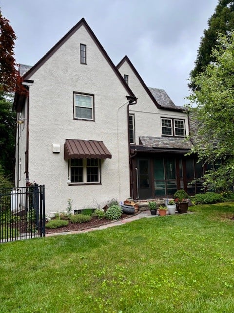
This lovely Tudor exterior is happy with Accessible beige and its dark brown accents
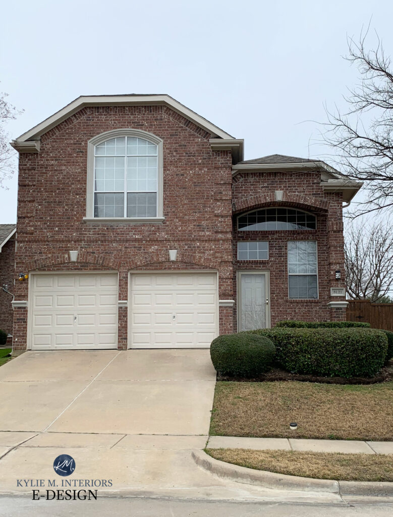
As shown on the exterior of this next home, Accessible Beige looks great on the trim and garage door, as it coordinates with the brick…
Here it is compared to a few other popular neutrals. We’ll be looking more closely at a few of these shortly in the ‘Colors That Are Similar’ section…
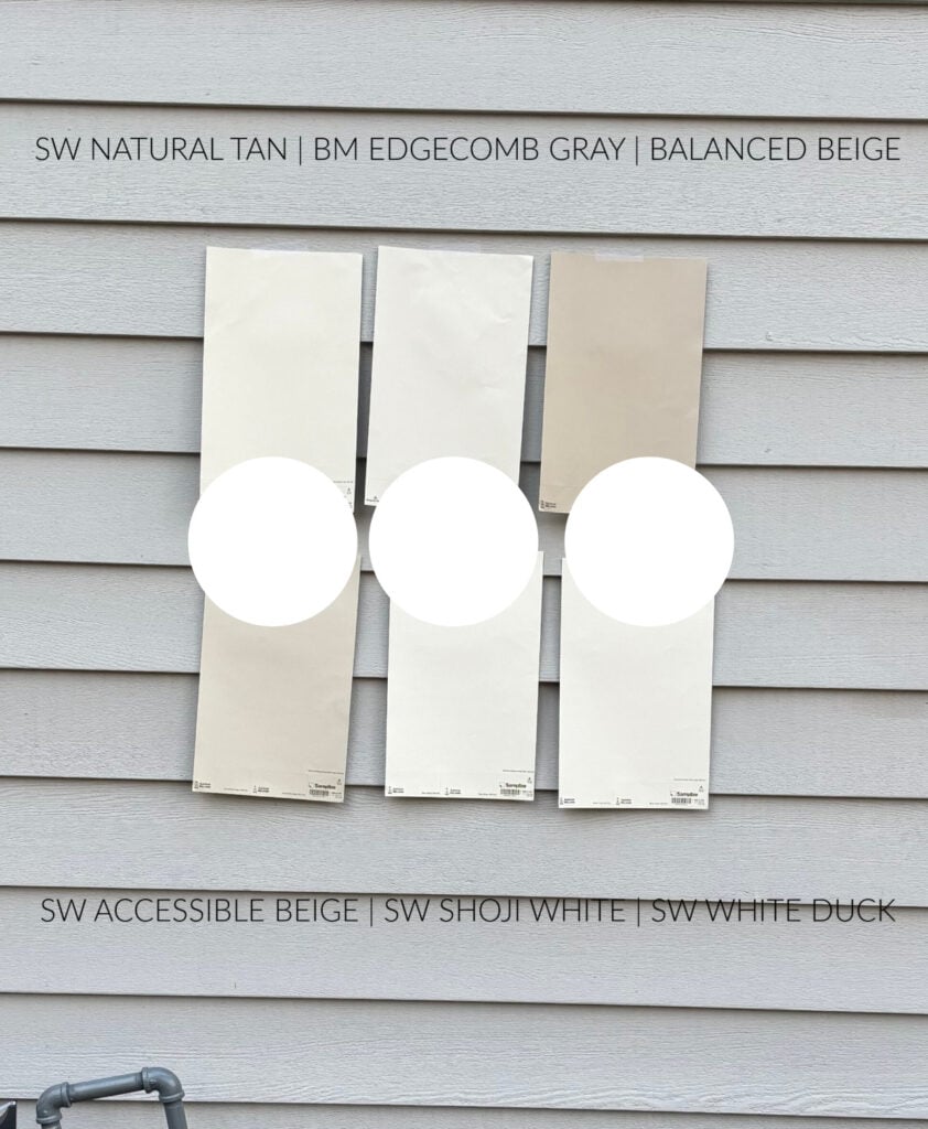
REVIEWS: SW Natural Tan | BM Edgecomb Gray | SW Balanced Beige | SW Shoji White | SW White Duck
DOES ACCESSIBLE BEIGE GO WITH CREAM CABINETS & TRIMS?
With the very rare exception based on lighting conditions and other surroundings, it’s a no from this color cowgirl.
But I bet you want to see that exception…
Here’s a bedroom with low natural light, Sherwin Williams Casa Blanca trim, and Accessible Beige walls…

Why does this work when most other situations don’t?
- The room is low-light, so Accessible Beige looks darker than it would in a well-lit space.
- The dark wood floor helps ground the rooms
- The trims are narrow, whereas big slabs of creamy cabinet doors or wide trims could overwhelm Accessible Beige a bit more.
Accessible Beige is too light and off-kilter to look good with the degree of yellow in cream cabinets and trims. I know you’re probably spinning your wheels trying to find a good combo—cream is tough. You might want to read this blog post about the best paint colors for cream cabinets and trims.
DOES ACCESSIBLE BEIGE GO WITH OAK WOOD CABINETS & WOOD TRIMS?
In the words of the Great Stone Cold Steve Austin (I was a teen in the 90s), CAN I GET A HELL YEAH?!! I mean, it’s not a one-size-fits-all situation, but if you have wood trims, cabinets, flooring, or furniture, Accessible Beige is a great color to start your sampling adventures with.

Before, this Tuscan-style entryway was heavy and murky with its yellow-green paint color…
After, see how Accessible Beige picks up a subtle gray cast (considering this area doesn’t get much natural light) without becoming greige or flattening out. It also looks beautiful with the wood trim…
Where you need to be cautious is with overly red-stained woods, as they don’t always love the muddy nature of Accessible Beige.
The Best Paint Colors with Red Oak
SAMPLE CAREFULLY & COMPARE SIMILAR SHADES!
THE BEST WHITE TRIM/CABINET COLOR WITH ACCESSIBLE BEIGE
Accessible Beige is reasonably flexible towards a range of white paint colors, but it draws the line at overly creamy ones.
Here are the three best shades…
- Sherwin Williams Pure White, for a simple, classic look without too much shocking whiteness (unlike my pasty Ginger legs, which are shockingly white).
- Benjamin Moore White Dove, for a slightly more subtle warmth.
- Sherwin Williams Alabaster is about as warm as I would go.
Of the three, Alabaster is the tip of the iceberg; anything more yellow is TOO yellow for Accessible Beige.

Sherwin Williams Accessible Beige and Alabaster cabinets/trim
Subscribe to my Kylie M YOUTUBE channel for more great Kylie M. content!
WHAT COLORS ARE SIMILAR TO ACCESSIBLE BEIGE?
This is the fun part (wait, isn’t it all fun?) You never want to pick a paint color based on how it looks alone. COMPARE COMPARE COMPARE. Often, you end up with a totally different color than the one you thought you wanted!
ACCESSIBLE BEIGE COMPARED TO AGREEABLE GRAY
When it comes to popular warm neutrals from Sherwin Williams, these two are near the top of the list. However, they rarely vie for the same spot on your walls as they do different things.

Accessible Beige is a beige; Sherwin Williams Agreeable Gray is a warm gray-greige-taupe (based on perception). Agreeable Gray is more ‘gray-centric’ than Accessible Beige’s ‘beige-centric’ look. Agreeable Gray is also a smidge lighter than Accessible Beige, with an LRV of 60.
Really, unless your finishes happen to accommodate both of these colors (which isn’t common), there should be a clear winner between the two.
FULL Paint Color Review of Sherwin Williams Agreeable Gray
ACCESSIBLE BEIGE COMPARED TO NATURAL TAN
With trends leaning warmer, it’s no surprise that colors like Accessible Beige and Sherwin Williams Natural Tan pop up on our Instagram feeds (follow me HERE!).
Accessible Beige left / Natural Tan right.
Natural Tan has an LRV of 65, so it’s a good chunk lighter than Accessible Beige’s 58—in fact, it’s smack-dab in my favorite place. If you have a darker room and worry that Accessible Beige is too dark, Natural Tan could be a good option to check out (even though it can struggle too, depending on conditions).
Color Review of Sherwin Williams Natural Tan
There are also shifts in undertones. While Natural Tan doesn’t grab a ton of green compared to Accessible Beige, it’s a wee wink more inclined this way. It’s also a bit more COLORFUL than Accessible Beige, meaning its warmth is more noticeable/less gray (but still quite passive compared to the usual bunch).
SHERWIN WILLIAMS ACCESSIBLE BEIGE COMPARED TO SHIITAKE
While Accessible Beige gets a lot of attention, something must be said for the comparable Shiitake.
Here’s your Peel & Stick sample of Shiitake…

Depth-wise, Accessible Beige’s LRV falls within the light range at 58, whereas Shiitake’s LRV is in the light-medium range at 51. This lower number means Shiitake is a light-medium depth paint color.
When you compare these with white trim or cabinets, you’ll see Shiitake offers a bit more contrast.
Where they’re most similar is in their approach to beige. Like Accessible Beige, Shiitake picks up a soft gray backdrop, which calms its color, at least compared to the usual bunch of popular warm beiges. Sure, it can pick up a TOUCH more pink than Accessible Beige, but neither shade is overly inclined.
DOES BENJAMIN MOORE HAVE A MATCH?
There are ALWAYS alternatives, but nothing exactly the same. And while getting Accessible Beige color matched into Benjamin Moore paint might be as close as you can get, know that it won’t be a 100% match (no matter what they tell you).
Instead, I’d rather you sample a few similar colors…
ACCESSIBLE BEIGE COMPARED TO EDGECOMB GRAY
I love comparing these two popular shades. Starting with LRV/depth, Accessible Beige sits at 58 (on the lower end of the light range), whereas Benjamin Moore’s Edgecomb Gray has an LRV of 63.09, making it the lighter option by a noticeable jump.
Where these two really hit each other head-on is in their general warmth, which is why they’re so fun to compare.
Of the two, Accessible Beige is warmer and more beige; Edgecomb Gray is a greige-taupe, so it sits that touch cooler than Accessible Beige, but not by a ton.

If you’re looking at Edgecomb Gray and worry it’s too cool, Accessible Beige can be a great alternative to sample. Likewise, if Accessible Beige comes up too warm/beige, Edgecomb Gray could be just the tweak you need!
By the way, of the two, Edgecomb Gray tends to be more flexible for a range of interior finishes, but don’t tell AB I said that.
FULL Paint Color Review of Benjamin Moore Edgecomb Gray
WHAT COLORS GO WITH ACCESSIBLE BEIGE?
Tim can only wish I were as flexible as Accessible Beige. Oh, honey, if you only knew me 20 years ago—toes to nose, baby! Being neutral with minimal undertones, Accessible Beige is pretty darn accommodating.
While it depends on whether you need a coordinating color for an accent wall, cabinets, or adjoining room (or otherwise), here are some to check out…
- DARKER BEIGE PAINT COLORS: Darker beiges with similar undertone profiles can be great in adjoining rooms.
- GREIGE PAINT COLORS: Some greige paint colors are amazeballs with Accessible Beige, as long as they’re darker than it. In particular, I love medium to dark greiges as accent colors, islands, or feature doors.
- DARK BLUE-GRAY: Darker blues can work with Accessible Beige, but be careful that they aren’t too colorful – more muted blue hues (blue paint colors with a bit of gray) are better.
- EARTH-TONES: Light-medium or darker depth earth-toned paint colors can look wicked pretty.
- GREEN PAINT COLORS: Greens are some of my favorite partners to Accessible Beige; not just lighter shades, but darker greens, too.
- GREEN-GRAYS: I love it with light-medium to darker shades of green, especially those with a warm gray/beige base to calm them down. Check out colors like SW Cast Iron and Grizzle Gray—they’re great places to start.
- OFF-WHITES: It can handle some of the popular off-whites as long as they aren’t too yellow, and more so in adjoining rooms.
And much more!
PROS & CONS: A QUICK SUMMARY OF ACCESSIBLE BEIGE
- Sherwin Williams Accessible Beige is a light, warm beige paint color with a gray base.
- Its undertones are non-committal. If it flashes overly green or pink, it could be due to situational/environmental factors. If you have a finish that NEEDS one of these undertones, AB might not be the color for you.
- While it thrives in well-lit rooms, it can be a bit drab in dark rooms or hallways.
- It works best in spaces with reasonable (or more) natural lighting and coordinates with a wide range of wood stains.
- Its best use is on walls, both single rooms and whole homes. It’s also a great exterior color.
- It has a warm look, but not an overly ‘fresh’ one due to its LRV and the amount of gray/reduced chroma. This creates an organic, calming look in many spaces.

FUN FACT: Read about the 20 most popular Sherwin Williams’ paint colors and see which color is NUMBER 1!
READ MORE
The 14 Best Beige Paint Colors for The MODERN HOME
The Best Slightly Darker Beige Paint Colors
The Best Warm Neutrals That AREN’T YELLOW!
Want 3 colors CUSTOM-PICKED for your room?
Check out my E-Design and Online Color Consulting packages! 
Updated with fresh content and images for 2026


Hi Kylie, I’ve learned so much from you! You’re my first stop on any painting decision, to be sure. I was wondering what you thought of Accessible Beige with BM’s Swiss Coffee. I need a white for my upper cabinets that won’t wash out with a huge amount of light (room faces south). All the warm whites I’ve tried are too stark for me (Alabaster, Cloud White, White Dove, others). Any help you can give would be appreciated!
Hey Stephanie! If Alabaster is too stark, then you don’t actually like any whites, as it’s the darkest shade of white before you dip into the off-white world! Maybe you’re looking for something more like SW AEsthetic White!
Exterior: Could I use ACCESSIBLE BEIGE,(that’s a cut and paste, lazy) on the window trim with SW Natural Choice on the body of the house?
My wife wants a beige for the trim.
I wanted Revere Pewter, or Edgecomb Grey. We’re not fighting, just looking for resolution.
Thanks very much, Wes
Loads of info. Greatly appreciate it.
Wellll, I would lean into Revere Pewter over Accessible Beige and Edgecomb Gray 🙂
A note to tack to that:
We are settled on the body of the house being SW Natural Choice.
Thanks again, Wes
Hi Kylie – your blogs are so helpful however I am still struggling. I have a fairly open floor plan with an all white kitchen (except island is an espresso brown/black and Balboa Mist on the walls. My main windows face north and south with not a huge amount of sunlight. Balboa Mist comes off as a very cool grey, especially with my light grey sofas. Looking for a warmer colour but not sure if Accessible Beige is too beige
Hey Dawn, it would be hard for me to say for sure without seeing your home. I can say, though, that I don’t love Balboa Mist and Accessible Beige together, so for that reason alone – I wouldn’t do it. I do have online consulting if you want some specifics! https://www.kylieminteriors.ca/hire-kylie/
I have accessible beige walls and my ceilings have cigarette smoke damage, my painter is suggesting Behr Vintage Linen on the ceilings. I worry the undertones are going to clash, any suggestions?
Oooof, I’m not sure about Vintage Linen. I would keep it simple with SW Pure White and make sure he uses a primer that’s intended to block smells and stains first!
We want to change our inside wall color (very open floor plan w/20 ft. ceilings)….All the inside trim/doors/built-ins are painted SW Millet & the plantation shutters too….so we don’t want to repaint all of that! Currently my walls are a dark khaki color & we want to totally lighten it all up! I am looking for a light neutral paint color for the walls that leans more beige tones & not gray. I don’t want the trim to appear too yellow. I’ve tried SW Alabaster, Shoji White & they almost look grey/blue in my home against the Millet trim color. HELP!
Hey Julie, that can be a bit more complicated and I’d need to see other features in the room! You might want to check out my consulting! https://www.kylieminteriors.ca/hire-kylie/
We are getting Taj Mahal countertops and have espresso colored wood floors. We are thinking of doing accessible beige cabinets for our north-facing kitchen. Do you think this would look nice? Also, if so – what color hardware would you recommend? Thank you so much!
Love all your content here, YouTube, and elsewhere!
Do you have any experience with Accessible Beige 25% lighter (or some other % lighter)? I love both Accessible Beige and Aesthetic White but one may be too dark and the other too light for my space.
Hi Kylie, I love your blog. It has helped me learn so much about paint colors. I’m building a modern craftsman home and I’m trying to decide on paint for the kitchen, it faces South. Do you think these colors would look good together?
Trim & Doors: SW Pure White
Walls: SW Shoji White
Perimeter Cabinets: SW Accessible Beige
Island: Cyberspace
Thank you!
Hi Kylie! Need HELP! Would you say that SW Shoji White is comparable to Accessible Beige Lightened 50%? 75? I have Accessible Beige doors in my entry and want the walls and trim to be a lighter shade of AB to create a monocromatic aesthetic.
Oh gosh, it’s hard to say – I’d definitely need to see them side-by-side to get an eyeball on things!
is pewter green a good accessory color to Accessible Beige?
You betcha!
Hi Kylie! LOVE your blog and videos. Super helpful and informative. My question for you: have you ever had a SW store not be able to match their own sample and translate to larger quantities? The accessible beige sample they provided was perfect, after trying out BM and SW options (actual paint and Samplize) and they cannot match their own color in gallons! I’ve been there three times and planning to take the painted sample elsewhere to color match at a BM or Home Depot store. So frustrating! I have never experienced this with BM or Home Depot. Only SW. Crazy and so very time consuming!