
Can I Paint My North Facing Room a Gray Paint Colour?
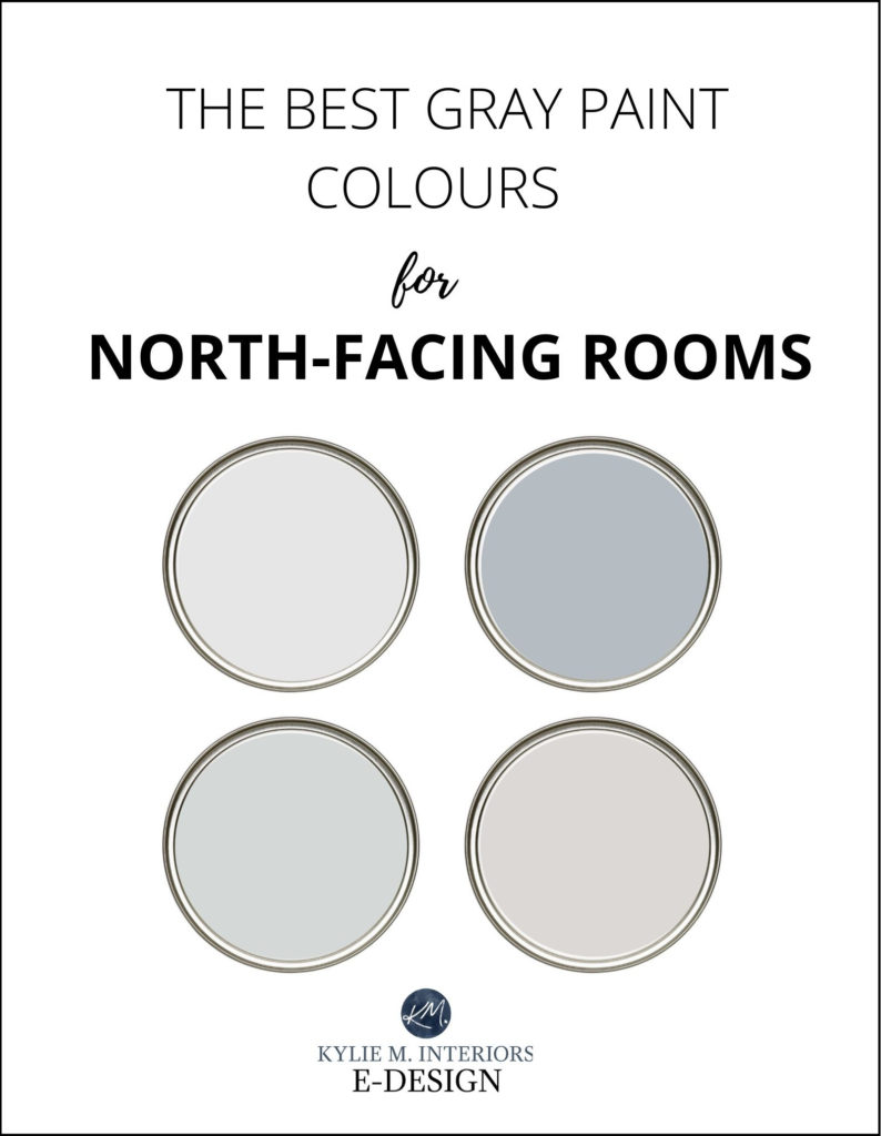
The Best Gray Paint Colours for Rooms with Northern Exposure
‘I have a north-facing room, can I paint it gray or will it look too cold? Really, you can do anything but what it comes down to is if you SHOULD. It’s also about knowing what look you’re trying to achieve and what visual temperature you’re comfortable living in.
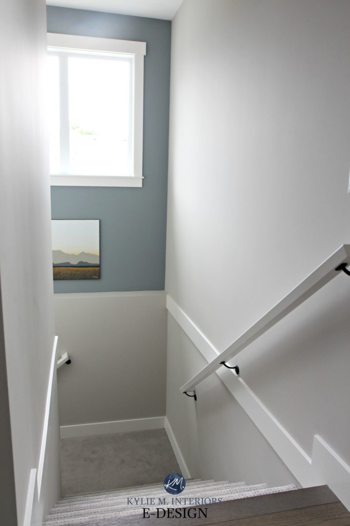
Let’s start with the basics. North-facing rooms have a gray light coming in the windows with a slightly blue hue which means northern light is COLD. It’s also known to enhance cool colours or neutrals with cool undertones. When you partner a cold space with a cold colour, what do you get? A pretty darn cold-looking room.
Sherwin Williams Silver Strand
Some people don’t mind a cooler vibe, that’s why I can’t definitively say ‘no, don’t paint your north-facing room gray’. When we moved into one of our previous homes, it was painted a soft gray (Sherwin Williams Crushed Ice). Partnered with our DOMINANT northern exposure, the space felt too cold for me. However, we had friends come over who liked the paint colour. Heck, I liked the colour, however, I didn’t like it in our north-facing home.
Benjamin Moore Stonington Gray
Long story short, if you LIKE cold colours and you paint your room gray (knowing that all of the popular gray paint colours have cool undertones), you can expect these subtle undertones to be enhanced. Again, if you like cool colours then this might be a GOOD thing, just remember, your room will LOOK cold and won’t have a traditional ‘inviting and cosy look’. You will have to do a lot of interior work with lighting, texture and accent colours to add balance to your room.
If you paint a north-facing room a cool paint colour, you will have need lighting, texture and accent colours to create balance – moi
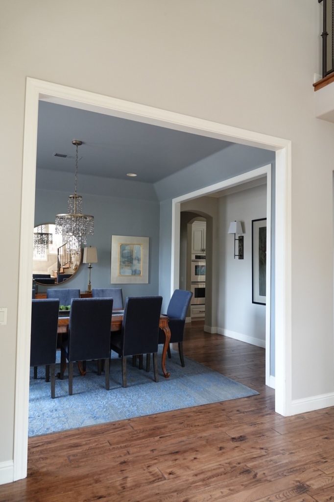
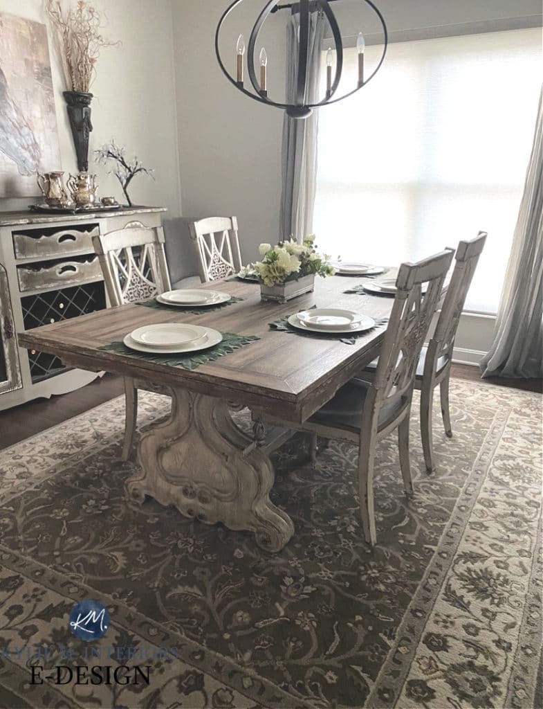
See the whole open layout here
On the other hand, if you like gray, but don’t particularly like a cold look, this is where things get trickier. Why? Well, you have to find a happy medium between your cold northern light and the ‘natural cool tendencies of gray’ – and that’s where I come in handy with these upcoming paint colours. And don’t get yer knickers in a knot when I say that not ALL of these photos show north-facing rooms. I rely 110% on my E-Design client’s photos, so sometimes I just have to use what I have (but most are north).
Benjamin Moore Storm & Sherwin Williams Accessible Beige
There are a few different ways to get a grayish look in your north-facing room without it looking OVERLY cold. However, keep in mind that if you don’t have large enough windows or a good interior lighting plan, there is not a gray paint colour that will save you…I’m just going to say that one more time (because I like to hear myself talk)…
If you don’t have adequate natural light or interior lighting, there is no gray paint colour that will save you.
Why is this so important? Because if you have a north-facing room AND it doesn’t have adequate lighting, a gray paint colour could look dingy, on top of cold and uninviting.
The 4 Best TYPES of Paint Gray Paint Colours for North-Facing Rooms
While you STILL need to supplement your room with warmer interior lighting, texture and visual interest, some grays are better at managing northern exposure than others…
1. WARM GRAY PAINT COLOURS
2. GRAY PAINT COLOURS WITH MORE UNDERTONE
3. GREIGE PAINT COLOURS…so basically, NOT grays
4. TAUPE PAINT COLOURS #againnotgraybutclose
1. THE BEST WARM GRAY PAINT COLOURS FOR NORTH-FACING ROOMS
Warm-toned grays are basically grays with a wee nugget (or more) of brown in them. This bit of brown softens the gray, cuts back the cool hue and adds some subtle warmth…emphasis on the word subtle. Why? Because your north-facing room WILL counteract that brown and try to pull it back to the cool side. Which really, isn’t a bad thing if you really want a gray paint colour!
As it relates to warm grays, you’ll find violet and green undertones, although some grays can pick up a touch of blue with the encouragement of northern exposure. And while some of these will still give you a coolish looking room, it won’t look ICY cold like some of the really cold grays would.
SHERWIN WILLIAMS REPOSE GRAY SW 7015
Repose Gray is a great example of a warm gray. It has a VERY subtle warmth and a wide range of undertones which ALSO makes it a bit unpredictable!
I would ONLY put Repose Gray in a WELL-LIT room with northern exposure as it WILL fall too flat in a lower light space, as shown below…
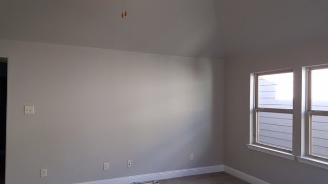
FULL PAINT COLOUR REVIEW of Sherwin Williams Repose Gray
BENJAMIN MOORE COLLINGWOOD OC-28
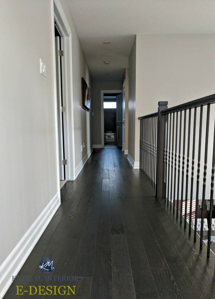
Collingwood has a SOFTER approach compared to Repose Gray along with being lighter and warmer. It also favours a violet undertone, which is THERE, but not overwhelming.
Collingwood will also hold up a bit better in a dark room, but as shown in this next hallway, NO colour will come to life without light!
FULL Paint Colour Review of Benjamin Moore Collingwood
SHERWIN WILLIAMS COLONNADE GRAY SW 7641
I LOVE Colonnade Gray. And while it won’t save the cold vibe of a north-facing room, it’s WAY better than traditionally cool gray paint colours.
FULL Paint Colour Review of Sherwin Williams Colonnade Gray
SHERWIN WILLIAMS GOSSAMER VEIL SW 9165
Gossamer Veil is as gentle and pretty as it sounds! Being a warm gray with a soft green undertone, it can add interest and subtle warmth to a room without taking you anywhere near the beige end of things.
FULL Paint Colour Review of Sherwin Williams Gossamer Veil
A few more warm grays to explore for your north-facing room…
- Benjamin Moore Nimbus
- Sherwin Williams Alpaca
- Benjamin Moore Balboa Mist
The 4 Best Warm-ish Gray Paint Colours
2. THE BEST ‘GRAYS WITH BENEFITS’ FOR NORTH-FACING ROOMS
This is a tricky one to explain and it’s early – WHERE’S MY WINE COFFEE (sip-sip). Okay, so if gray is a cold colour and you add more undertone to it (ie. blue/green/violet) you’d think it would look even colder, right? Well, kind of. The thing is, colour adds interest and emotion, so adding more colour into a gray can give it some personality which can help to balance out the risk of creating an ‘uninviting look’ in a room with northern exposure.
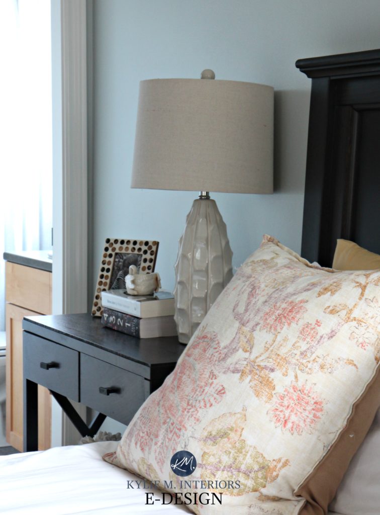
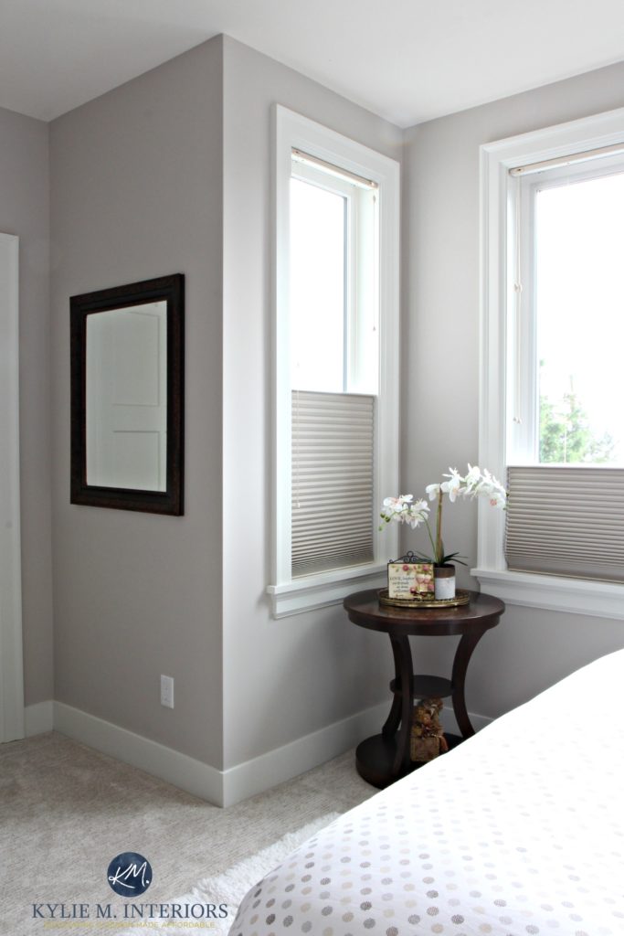
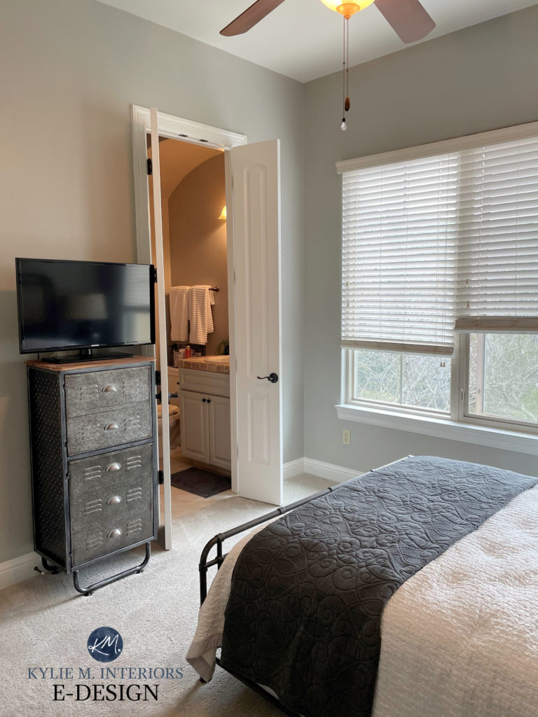
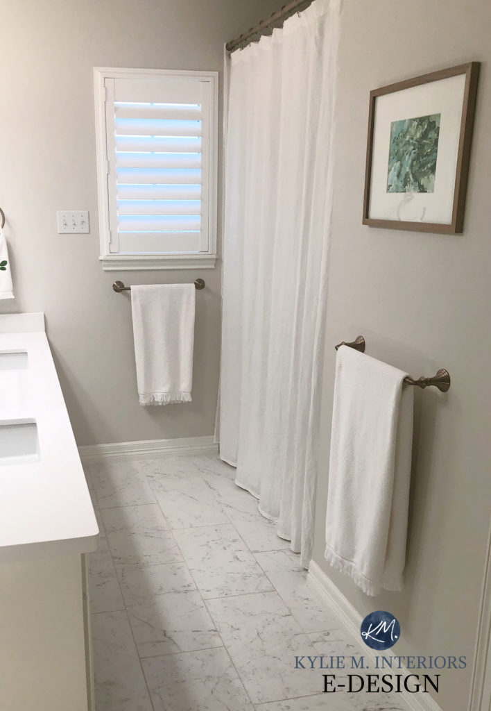
SHERWIN WILLIAMS SILVER STRAND SW 7057
Some people find Silver Strand to be a gray with green-blue undertones, others see it as a blue-green with a strong gray undertone. Either way, it’s an interesting choice for a north-facing room as its increased COLOUR/hue can help add balance and interest to the flatness of some northern light.
This next photo shows how muted Silver Strand can look…
While this next one shows how STRONG it can be (not a north-facing room)…
FULL Paint Colour Review of Sherwin Williams Silver Strand
SHERWIN WILLIAMS NETWORK GRAY SW 7073
Network Gray is a bit darker compared to the other popular grays, but in a north-facing room that’s WELL-LIT, its increased undertone can offer interest, especially with clean white trim or cabinets…
Sherwin Williams Network Gray Colour Review
As shown above, Network Gray is a great example of a gray with a bit more undertone/colour to it than other gray paint colours. You might also like the softer approach of the slightly lighter, Online or Gray Screen.
FULL Paint Colour Review of Sherwin Williams Network Gray
Remember, what we’re trying to do is add warmth to the cool light of a north-facing room and the even COOLER approach of many of the popular gray paint colours!
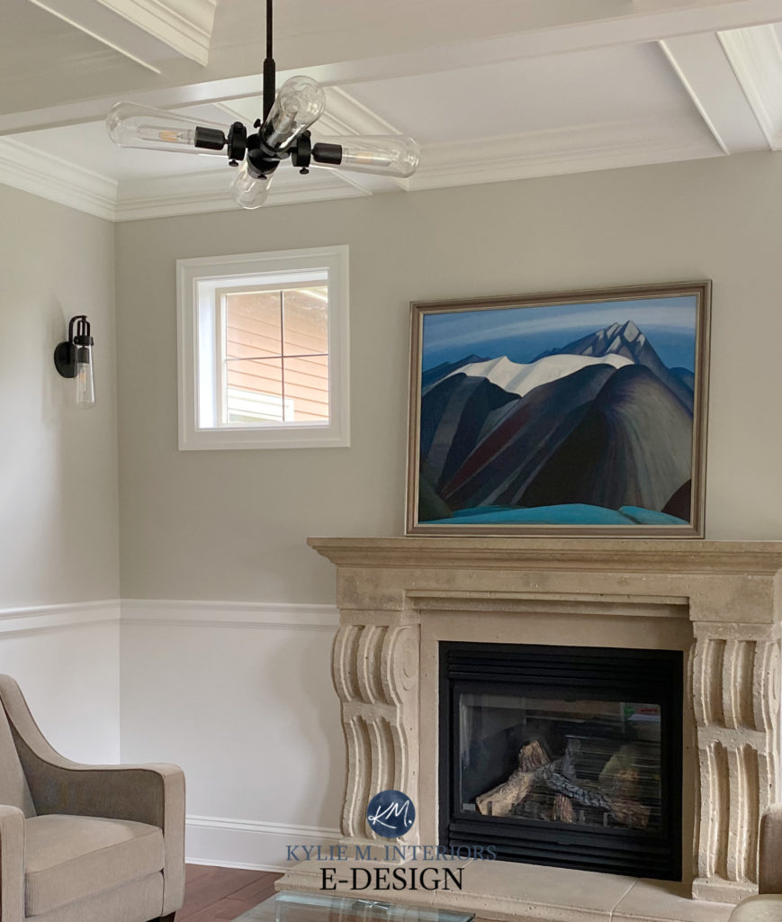
Add even more colour (below), and you’re looking at something like Benjamin Moore Gibraltar Cliffs which has considerably more colour while still having a soft, subtle approach. Again, this is not going to save the DAY in a north-facing room – but it will certainly help if you’re hell-bent on a cool colour.
FULL Paint Colour Review of Benjamin Moore Gibraltar Cliffs
SHERWIN WILLIAMS ARGOS SW 7065
I love Argos, but with its slightly lower LRV/increased depth, it does best in a WELL-LIT north-facing room. Either way, what you’ll see is a gray with a BEAUTIFUL green-blue undertone…

FULL Paint Colour Review of Sherwin Williams Argos
Let’s take a quick break to talk about paint samples…
Undoubtedly, you’ll be heading out in the near future to grab paint samples – stop right there! I want you to check out SAMPLIZE. Samplize offers peel and stick paint samples that are more AFFORDABLE, EASIER and more ENVIRONMENTALLY FRIENDLY than traditional paint pots. Here are just a FEW reasons why I recommend Samplize to my clients…
- samples arrive ON YOUR DOORSTEP in 1-3 business days, depending on location
- they’re more affordable than the samples pots/rollers/foam boards that are needed for traditional paint sampling
- if you keep the samples on their white paper, you can move them around the room
Visit the SAMPLIZE website HERE
3. THE BEST GREIGE PAINT COLOURS FOR NORTH-FACING ROOMS
Once we leave the gray world, if you want to stay neutral without going into beige, tan or cream, it’s about nodding politely at gray without a full commitment. And if you ask me, this is a FABULOUS solution!
But remember, while gray has its own set of undertones, greige does too, in fact, it favours ONE undertone – green. And while violet and blue can both show up, they aren’t NEARLY as common as green.
The PERFECT example of this is…
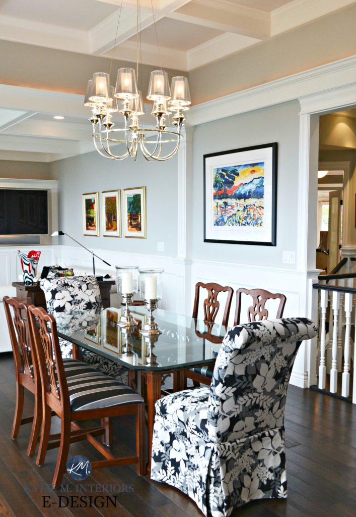
SHERWIN WILLIAMS AGREEABLE GRAY SW 7029
Agreeable Gray is a friggin’ NINJA. It is a warm gray/greige that MILDLY favours green. However, put it in a north-facing room and DAMN if it doesn’t look gray/blue! Check out this next photo – BOOM, mind blown.
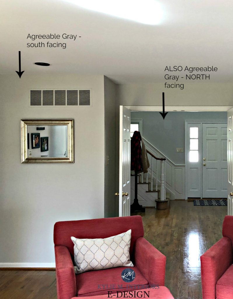
See more of Agreeable Gray here
Painting your north-facing room a warm gray or greige can help to balance out the cool light coming in, but don’t expect any miracles. The northern light will tweak a warm gray or greige paint colour and make it look cooler than it would in a south-facing room.
The key is in knowing what to expect and not being surprised by the results
BENJAMIN MOORE EDGECOMB GRAY HC-173
For those who are REALLY pining for gray, Edgecomb Gray, also known as Baby Fawn, may seem over-the-top warm and borderline BEIGE. But humour ye ole Ginger as Edgecomb Gray offers a GREAT balanced look to a north-facing space.
In this next room, we used Edgecomb Gray which would have fallen flat in a north-facing room with low light…

Paint Colour Review of Benjamin Moore Edgecomb Gray/Baby Fawn
Edgecomb Gray is a light greige that is really well-balanced, with an almost creamy looking backdrop, as shown in this next photo…
FULL Paint Colour Review of Benjamin Moore Edgecomb Gray
Is it gray? HECK no, but it sure is pretty.
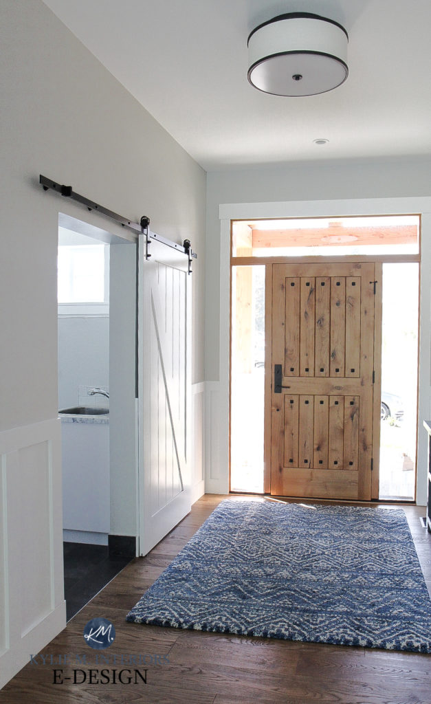
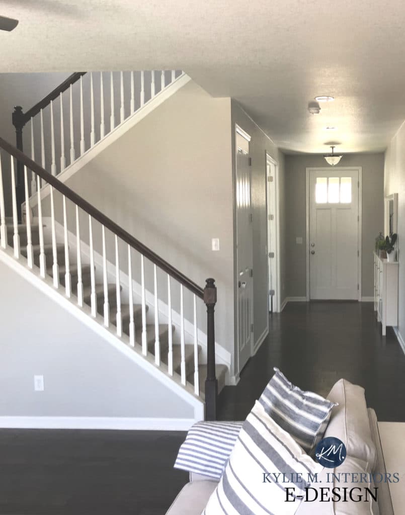
SHERWIN WILLIAMS ANEW GRAY SW 7030
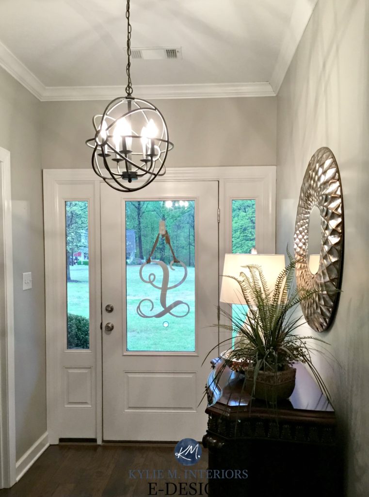
This next entryway shows Anew Gray, which would have felt drab and boring without the beautiful light cast by the chandelier. This goes to show, whether it’s exterior or interior, the AMOUNT of light you have makes all the difference if you want to use gray (or greige, which would be more the point for this section).
FULL Paint Colour Review of Sherwin Williams Anew Gray
4. THE BEST TAUPE PAINT COLOURS FOR NORTH-FACING ROOMS
Whereas taupe and greige are both WARMER than warm grays, unlike greige which favours a green undertone, taupe favours a VIOLET undertone. And just like greige, given the right surroundings, it can pick up a tiny flash of green or blue.
SHERWIN WILLIAMS EGRET WHITE SW 7570
I have MAD love for Egret White and with trends leaning warmer, I won’t be surprised to see more of this colour in the future.
SHERWIN WILLIAMS POPULAR GRAY
Sherwin Williams Popular Gray IS popular because while its name may have ‘gray’ in it, it’s warmer than your typical gray and has a beautiful violet undertone. Also, check out the slightly darker Versatile Gray.
FULL Paint Colour Review of Sherwin Williams Popular Gray
BENJAMIN MOORE PALE OAK OC-20
If you love pink undertones, you might just fall in love with Pale Oak. While the pink is subtle and mixed nicely with violet, Pale Oak is a popular choice for north-facing rooms when a softer, warmer approach is wanted.
FULL Paint Colour Review of Benjamin Moore Pale Oak
There you have it. So, to answer your question – CAN you paint your north-facing room gray…or greige or taupe? It’s up to you, just don’t be surprised if it’s not as warm and inviting as you were expecting!
READ MORE
The Best Paint Colours for a North Facing Room
Can I Paint My North-Facing Room WHITE?
The 10 Best Sherwin Williams Gray and Greige Paint Colours
The 9 Best Benjamin Moore Gray and Greige Paint Colours
The 8 Best Blue-Green Paint Colours
NEED HELP?
Check out my affordable and fun E-Design packages!
Chat soon,

ORIGINALLY WRITTEN JULY 2018, FULLY UPDATED IN 2021


This is super interesting! Our house in mainly north facing but have double exposure in most rooms. We just painted Rockport Gray in our mainly North facing (with one west facing window) and we love it! It changes throughout the day but gives the look we were after and doesn’t feel remotely cool at any point, but that is probably due to the fact that it’s not really a fresh and crisp looking gray!
This information is SO important. Sometimes I forget to consider the type of light. You have been very helpful!
Our home actually faces east however we have a lot of trees and all of the windows on the back of our home have solar screens which really darken the home (Texas necessity!) My home is very open and currently painted SW latte. I really want a more light and bright modern farmhouse feel. I love Repose, Agreeable and Worldly Grays however when I put them on my walls to test today, they all pull blue and don’t look as beautiful as when I see them in photos. Am I going for the wrong colors?!
Hi Katie, it sounds like you are and that your eastern light is pulling them into the more gray-blue range, which isn’t uncommon for those types of grays. Sounds like you might want to warm things up a bit to balance that off, go to the warmer greiges or beiges that lean a bit gray!
~Kylie
Thank you very much Kylie! I’m also wondering if it is because I painted over my Latte walls so that my indecisive self could see the real deal before I pulled the trigger. I did 2 coats (I took your recommendations and painted on white boards first and the colors don’t pull as blue as the wall samples when they’re in the same location ) have you heard that primer helps the true color display?
Any warmer griege/beige that lean gray that are your favorites? Thanks again, LOVE your blogs!!
Hi Kylie,
You are the color guru, wow a lot of great info here! Are you familiar with BM hazy skies? What is the LRV of this color? Iam contemplating this color for a southwest room and wonder what you think of this colors LRV?I Started with gray mirage but figured this would be a safer bet! Would love to know the LRV’s of these two colors and if you are familiar with them in a bright space and how they reflect? Thanks Kylie, I love your videos, very resourceful!
Carole B from , NB
Hi Kylie,
I’m trying to pick a gray for my open kitchen/family room. The kitchen gets more light than the family room. Both rooms face northeast (all I’m reading are rooms that face 1 direction).
Anyhow, I bought several samples and painted them on the walls in both rooms (I figured this way I’d have to paint & quit putting it off). I thought I wanted Repose but it looked white on my already light tan walls. Then I tried Dorian but it was too dark on the walls that don’t get much light. I moved on to Requisite & Mindfu,l & Requisite has a slight purplish tone to it I think. I always thought I might like Silvermist for an accent wall in the kitchen but it looks blue on the already mustard yellow walls.
After I all this, I read somewhere to try painting poster boards and moving them around for different light effects. When I put these colors on the boards, the Silvermist magically looks more green like I was expecting it to and the grays appear more neutral & colored (Repose no longer looks white). I asked the guy at SW and he said the paint sample on the wall should be true to color. I hadn’t tried the poster board at that point. Then I read that your eyes can pull colors from adjacent colors (existing wall color) and that using a poster board with the white around the edges will separate that for you.
I am soooooo confused right now! Are the poster boards more accurate or the samples painted on the wall more accurate? I’m scared to death I’m going to go with the wrong color and end up wasting thousands having my whole house painted. Please help!!!!
Hi Kylie,
I love your information! I love the Collingwood paint that you talk about by BM, but I don’t have a dealer near me, would Behr paint be a match ( I know you have said before the sheens are different) I’m looking for my kitchen and family room. I feel I have learned so much about paint from you!
Hi Kim! Unfortunately, I don’t deal much with Behr, they don’t have quite the range that SW and BM have. Taking a quick look at my deck that I have, Burnished Clay is similar, albeit a bit softer (and I can’t really speak to its undertones on a large scale as I’m just not familiar with it). I would say it has a wink more gray/purple in it, so it’s not quite a warm as Collingwood. MOth Gray has way too much pink/purple in it. So yes, I’d say Burnished Clay would be the closest. That being SAID, ask Home Depot (assuming that’s your Behr dealer) if they have BM Collingwood in their computer system. If they do, they can mix it up for you!
Oh my goodness. Finally, I have answers. My upstairs bath faces north. Every single gray I have ever attempted to use in there (and there have been several!!!) pull cool and look blue or purple. Now I know it’s the north light doing this to me!! I want a ‘warm’ gray in there. I’ve tried repose, Anew, agreeable, Dorian. Any color suggestions for a warm/non purple/non blue gray for this space?
Thank you!!
Hi Stephanie! Well, that would only leave you with one option – green undertone (as you have to pick one). And even then, with northern light, ANY gray can flash any of the undertones. Take a look at SW Collonade Gray, Worldly Gray, and BM Revere Pewter, see if they feel any better 🙂
Spot on and so important to understand when choosing a paint color! Back before I was aware of this, I used Agreeable Gray in two rooms of the same house…the living room with southern exposure, and the kitchen with northern exposure.
The living room is the Agreeable Gray as we “expected” it. Very welcoming and flexing from soft gray to beige throughout the day. The kitchen is darn near blue! My own husband (who was with me when I bought the paint I might add) literally would not believe me when I insisted they were the same color!
Hi Kylie ,
First of all i think you are doing a great job out there so keep going.
The thing is i have a small open space home with adequate north west lighting and i don’t know how should i paint it.Dulux’s Polished Pebble was about fine most of the day but it catched a slight lilac hue to it during the night and Farrow and Ball’s Ammonite had a slight sepia hue to it during the day but changed to a truest gray in the night.
What do you think i should go for?Any recommendations?My sofa is a deep cool gray,my whole kitchen and kitchen table(Saarinen) are glossy white and the cabinets too.
My bedroom is south facing however I have tinted windows. Do you think having the tinted windows i need to treat is as north facing?
I don’t really comment on blogs, but I had to leave my thanks and appreciation! Not only is the information you provided full and in depth with excellent *real life* examples, your writing style and humor is playfully and addicting! Thank you so much. Because of this post I decided to pass on Agreeable gray and opt for Benjamin Moore’s Collingwood instead! (My bedroom is a north facing downstairs bedroom with the added delight of windows set into a shallow but covered porch — AND TREES just beyond!) Thankfully I have enough interior lighting to keep things cozyish but I believe the higher LRV and warmer undertones will help, without painting my room “white”. So thank you again, for your wonderful, wonderful post!
Wow, Maya, this comment was so nice to read, you’ve made my week! I’m glad you found the info helpful 🙂 THANK YOUUUU!
We love agreeable gray in our open living room/dining room, it looks great with our gray couches and cherry floors in the west facing space. However there is our E/NE facing entryway that feeds into our living space and agreeable gray looks terrible and just sad. Edgecomb gray and pale oak look much better in that cool flat lighting but pink and too warm in our living space where we spend our time with the kids. Could we pull off the lighter pale oak meeting agreeable gray at the corners of the hallway and our open living space?