
Posted on June 29, 2019 by KylieMawdsley
One of the BEST Greige Paint Colours…
Out of the THOUSANDS of online colour consultations I’ve done, there are ALWAYS a handful of faves – there’d be two handfuls, but a girl has to hold a glass of wine ya know.
This post may contain affiliate links. If you make a purchase through links on our site, we may earn a commission.
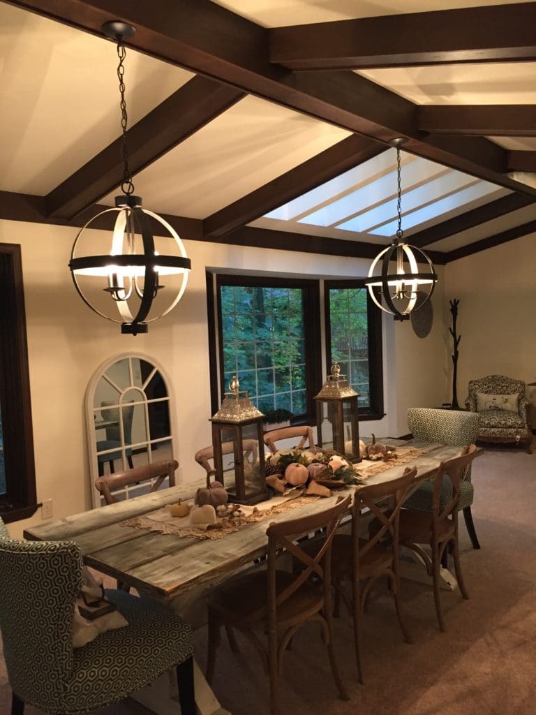
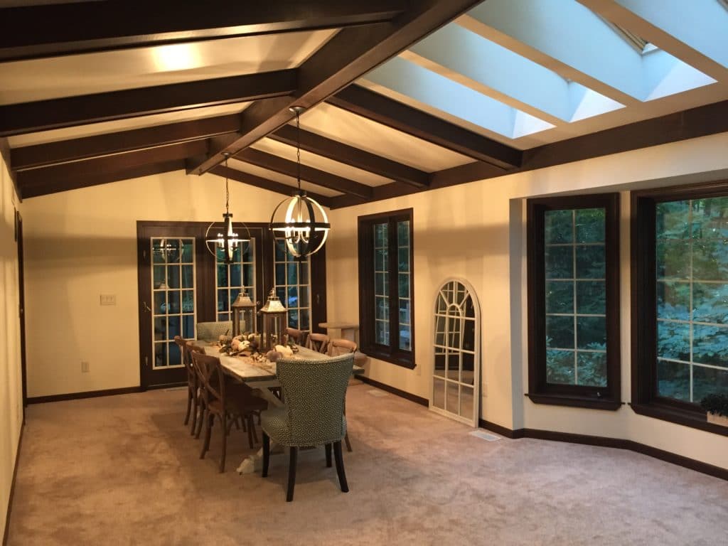
And this dining room is DEFINITELY one of those faves BECAUSE it has dark wood trim – AHHH, THE DREADED DARK WOOD TRIM (ye shall dread no more)! With Pinterest and Houzz jam-packed with white painted wood, I was excited to work with this room, to help it look modern and beautiful – rather than dated and drab…consider it DONE!
Before, this room had the right BONES, but the warm paint colour wasn’t doing any justice to the dark wood or the room itself – it looked a bit suffocating.
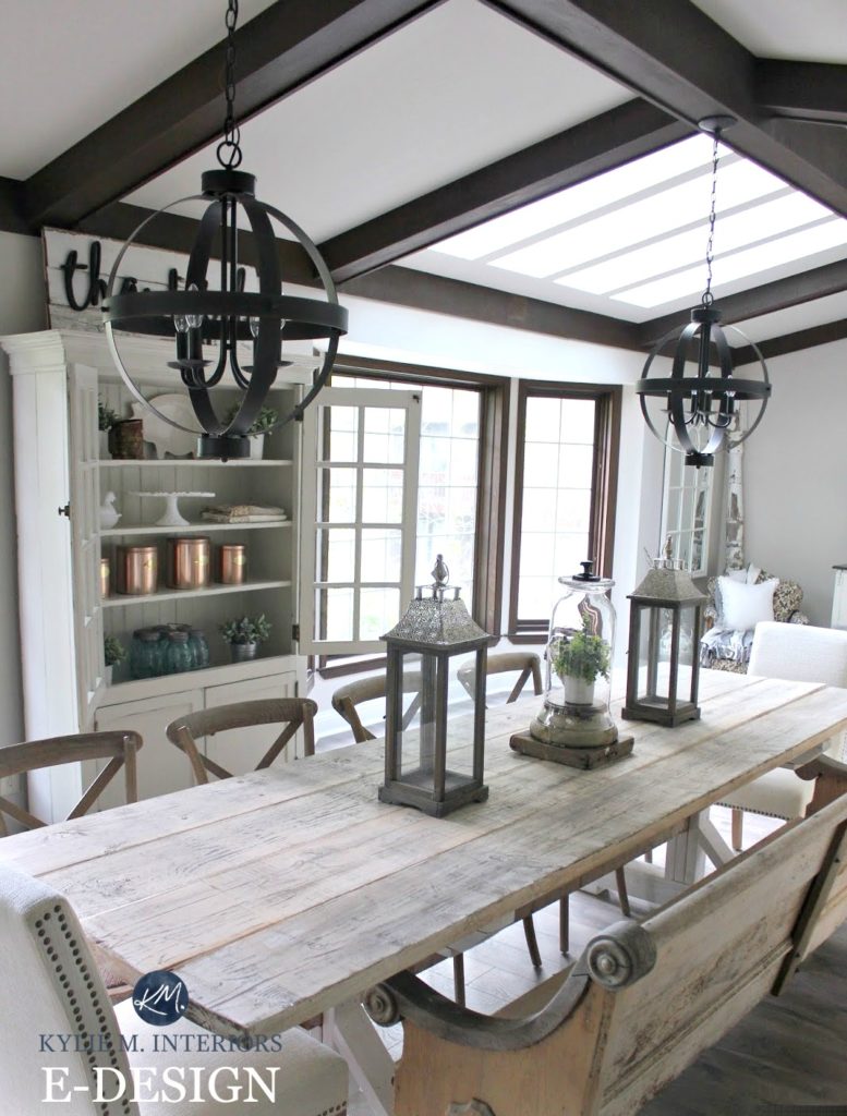
After, with the PERFECT new paint colour and flooring, this room looks COMPLETELY different…
That church pew SLAYS me. I had a church pew in our last home and loved it, however, Tim was NOT such a big fan and since I ALWAYS listen to Tim (said nobody ever) so I sold it.
The styling was okay the first time around, but the SECOND time around she TOTALLY nailed it!
Click HERE or on the above image to see available packages
And who is ‘she’? She is Rachel from Gingham and Grace, who’s just a lovely soul with a great sense of style! If you love this dining room, you’ll LOOOOVE her blog (and she’s a cutie-patootie).
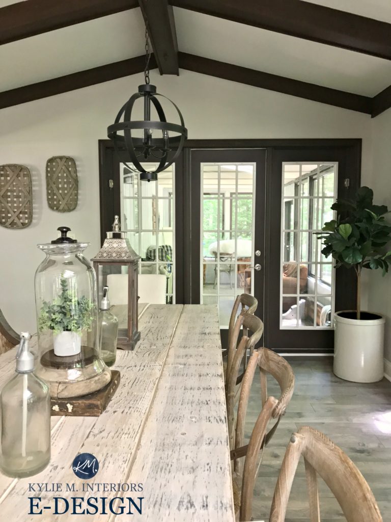
In Rachel’s E-Design consultation, I suggested several colours for her to choose from (along with some explanations and chit-chat) and was pumped when she decided on Sherwin Williams Agreeable Gray. Agreeable is a light warm gray-greige. With an LRV of 60, Agreeable Gray was the perfect choice for this space AND the perfect colour.
Let’s take a quick break to talk about paint samples…
Undoubtedly, you’ll be heading out in the near future to grab paint samples – stop right there! I want you to check out SAMPLIZE. Samplize offers peel and stick paint samples that are more AFFORDABLE, EASIER and more ENVIRONMENTALLY FRIENDLY than traditional paint pots. Here are just a FEW reasons why I recommend Samplize to my clients…
- Samples arrive ON YOUR DOORSTEP in 1-3 business days, depending on location
- At $6.99, they’re more affordable than the samples pots/rollers/foam boards that are needing for traditional paint sampling
- If you keep the samples on their white paper, you can move them around the room
Visit the SAMPLIZE website HERE
Do you have dark wood trim? Read more: The Best Paint Colours for Dark Wood Trim

I also have a colour review on Agreeable Gray if you want more info on this fab colour where you’ll learn about LRV, undertones and more! Paint Colour Review: Sherwin Williams Agreeable Gray
Need paint colour ideas for your room?
Check out my affordable E-Design and E-Decor Packages!

READ MORE
Paint Colour Review of Sherwin Williams Repose Gray
The 12 Best ‘WHOLE HOME’ Gray and Greige Paint Colours
The 8 Best Warm Neutral ‘WHOLE HOME’ Paint Colours
KYLIE M INTERIORS E-DESIGN, ONLINE PAINT COLOUR CONSULTING AND E-DECOR SPECIALIZING IN DIY DECORATING IDEAS FOR THE HOME AND BENJAMIN MOORE AND SHERWIN WILLIAMS PAINT COLOURS
Originally written in 2017, updated in 2019
Comments
Leave a Reply
More Posts

The 5 Best Creamy White or Off-White Paint Colors
THE ELUSIVE ‘CREAMY WHITE NEUTRAL’ When it comes to light, warm neutrals, it’s all in the undertones. And other than pink and green, yellow is the undertone many of my
Read More

The 8 Best Warm Neutral Paint Colors With NO Yellow Undertones!
The Top Light Depth, Warm Colors That Aren’t Cream! When choosing the best warm neutral paint color for your home, whether creamy white, beige, taupe, or greige, your choices are
Read More

The 12 Best Farmhouse Sinks of 2024
FIND YOUR DREAM SINK HERE… While traditional farmhouse design was all the rage in previous years, the embers have definitely cooled. As for MODERN farmhouse, it’s still kickin’ its cowgirl
Read More


WOW. This transformations is just incredible!! Unreal that you can achieved these amazing results with photos of clients!! Can’t wait to get your amazing talent to work for out place !! Again, beautifully done ????
And here is my dilemma. I saw a home with Agreeable Gray in it and loved the lightness/tone BUT I want a warmer greige. Gray really isn’t “my” color. So, I have been looking for months to find something light – but the warmer tones that Revere Pewter has. Is there such a perfect combination?
Author
Hi Katie! Check out SW Accessible Beige, which is a beige with some gray in it, I’ve seen it settle really nicely, particularly in north facing rooms. I also LOOOVE Edgecomb Gray. If you go into the search area on my site OR the colour review section you’ll see blog posts on both of those colours!
~Kylie
Beautiful. Do you have any other recommendations for colors that go with dark wood/walnut colored trim? I’m looking at grays such as SW Passive but can’t decide. I have Walnut wood floors and walnut baseboards and walnut triple crown moldings throughout the home. Trying to lighten up the space but Nothing seems to go with wood trim just right.
Author
Hi Ben, thank you for asking, I DO have a blog post just for that! https://www.kylieminteriors.ca/update-dark-wood-trim-with-the-right-paint-colour/
Hope it helps 🙂
~Kylie
Would aesthetic white cabinets look good with agreeable gray walls in the kitchen? I got a sample of incredible white and didn’t like it. I don’t want a bright white. Counters and backsplash are being redone also. Thanks for all you do!
Hi Kylie,
I’m changing my countertops to eternal statuario and my kitchen cabinets are a light maple probably more towards a honey tone. Also putting in a white glass backsplash. I’m repainting my kitchen and family room which faces east but get’s little light due to the large building behind me. I’d like to lighten up the space. Do you think “Agreeable Gray” would work well in this space. I want to move away from the tan/yellow that I have now. Would like it to look more modern.
Thanks,
Louise
I want to paint my walls agreeable gray. Do you think I should have a white ceiling too or go with agreeable gray on both? My painter says people do both.
Author
Hi! It can depend on how much natural light you have and if your ceiling is flat or textured. MOST of the time I recommend white, but if you have a non-textured well-lit room and ceiling, you could consider doing it the same!
Pingback: Your Favorite Posts of 2019 - The Turquoise Home
Kinda hard to make a meaningful comparison between the before and after when they’re shot under drastically different lighting conditions like this. The before pics look to have been shot late in the evening with warm electric lights dominating, while in the after pics the lights are turned off and the scene is dominated by natural sunlight.
Author
Fair enough, Alan. I supply this info for free to my readers, just to try and help. My photos are supplied by my clients as I don’t borrow from other sites! I do the best I can with what I have :). If you would like better quality, there are always magazines!