
The Best Burgundy Paint Colors
Is burgundy (or maroon) a trendy paint color again?
It seems like burgundy is back in style. Does this make me happy? No comment (just joking; I LOVE to hear myself talk). Sure, it’s a gorgeous color, but when it comes to the more colorful end of things (non-neutrals), most of my clients request dark greens and gray-blues. In fact…
Out of 10,000+ clients, I’ve had about ten ask for burgundy (and only on their front doors)
Shouldn’t this be exciting? To see a new (old) color breakthrough? For some, maybe. Here’s what this lil’ Ginger thinks…

- It’s just now hitting the interior design scene – a relatively new (old) trend, which accounts for why few of my clients have asked for it. However, whereas blue and green have the potential to be timeless, there’s a good reason burgundy disappeared for 20 years.
- It won’t suit every home. Unlike green and blue, which often integrate seamlessly into a home, this dominant color doesn’t suit the average home (blue and green being reasonably timeless accents).
- Many of my clients want a timeless look for their home—not a trendy one, and burgundy is anything but timeless (unless you have an old house that can handle a riot of colors and never looks out of style).
- The only burgundy I’ll ever love in my home is the one in the bottle (just joking; I prefer white).
Online influencers & the design world are driving this trend- not the average homeowner.

Why does this matter?
Many trends are driven and fully and wholeheartedly supported by homeowners (e.g., dark green, navy blue, black, dark gray)—they become popular because the average homeowner jumps on board. Burgundy isn’t going to suit the average home. Sure, it will have its moment in some homes, but I’ll be surprised if it becomes super mainstream (even though some paint brands are already rolling out their burgundy ‘colors of the year’ – wooooof.)
In fact, I asked my Instagram followers what they thought of the burgundy trend, and the response was overwhelming—NO THANK YOU!

Some colors are great for ‘high design’ or ‘the odd home,’ but my blog is about appealing to the average homeowner, and I’m not so sure burgundy does that.
Long story short, I’m not sure if it’s here for a good time or a long time…or either, but regardless, if YOU LOVE BURGUNDY, ignore the crazy Ginger, as I’ve got some gorgeous shades to share with you.

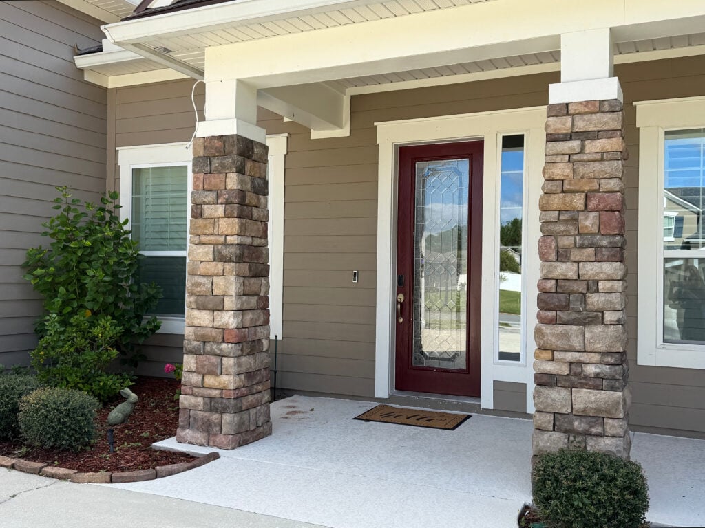
Burgundy can be badass and beautiful on a front door – inside or out!
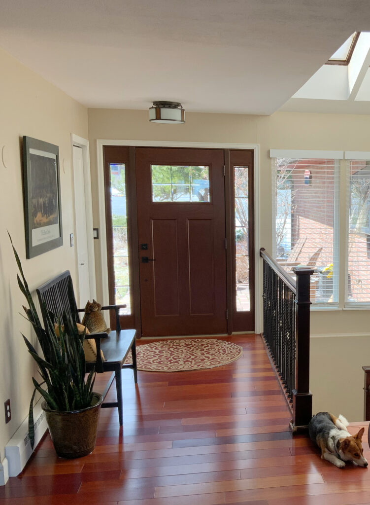
The Best Paint Colors for the INSIDE of Your Front Door
But first…
WHAT IS BURGUNDY?
Burgundy is often confused with maroon; however, they’re two different colors. Burgundy is a mix of red and purple (with a bit of brown or gray). How much of each is up to you.
- You might like a burgundy that leans more RED than purple (I’ve got them listed below).
- Or maybe you want a more noticeable shade of PURPLE with red as the secondary color (I’ve got these, too!)
While maroon can have a hint of purple, it’s more often a red-brown mix. This said, a lot of this can be open to perception, and some of the colors below could be called burgundy or maroon, depending on who you’re talking to!
Most burgundy lovers want to see it on a front door, but it’s also showing up on cabinets and in color-drenched rooms.
So, without further ado, let’s check out this gorgeous on-trend hue…

1. BENJAMIN MOORE NEW LONDON BURGUNDY HC-61
When it comes to classic, traditional shades of burgundy, it’s hard to beat New London Burgundy. This shade was hot in the 90s but has even older roots. As for the balance between purple and red, New London Burgundy favors purple.

Get your Peel & Stick sample of New London Burgundy HERE!
Are today’s burgundy trends as soft as New London Burgundy? They’re close. I’d say the average project leans a bit more saturated and maybe even a bit darker, but NLB is a great place to start.
With an LRV of 9.82, New London Burgundy is dark but holds its color well at this depth.
Learn How to Choose Paint Colors Using LRV
2. BENJAMIN MOORE DARK WALNUT
Dark Walnut is a great color if you love burgundy with a more violet hue. That’s right, this amazeballs burgundy is head over heels for purple with only a wink of red-pink for balance.

Get your Peel & Stick sample of Dark Walnut HERE!
With a dusky, romantic edge, Dark Walnut has a moody vibe compared to the degree of color in New London Burgundy – even though they have almost the same LRV! (Dark Walnut sits at 9.56 / New London Burgundy at 9.82 – the difference between these two shades is peanuts).
3. BENJAMIN MOORE RUBY DUSK 1267
Ruby Dusk isn’t just a great name for a red wine; it’s a great option for your burgundy or maroon-inspired walls. As its name suggests, Ruby Dusk has more red than Dark Walnut. In fact, it’s kind of like a more SATURATED (rich) version of New London Burgundy while still having a dash of dusky brown to calm it down. I’m sure Tim wishes I’d have a dash of dusky brown in my coffee every morning…

Get your Peel & Stick sample of Ruby Dusk HERE!
If you bump one shade lighter to Benjamin Moore’s Love Affair, you’ll find a burgundy that picks up slightly rosy vibes (way too pinky for this color cowgirl). As for LRV (depth), Ruby Dusk is 8.61, which is a wink darker than the previous two shades but still comparable.
4. SHERWIN WILLIAMS CARNELIAN 7580
Carnelian is a lovely beast of a burgundy and one of my favorite shades on this page (and one of the darkest!). And Carnelian is not messing around, as it favors purple with a whisper of brown, grounded warmth to slow it down.
This shade (and many of the others, admittedly) is gorgeous for cabinets, walls, or even your front door. I’m just playing favorites, as it and Sommelier (coming up shortly) are two of my top choices. That’s right, I don’t have to love a color for myself to appreciate it for YOU!

Get your Peel & Stick sample of Carnelian HERE!
As for its depth, Carnelian has a whoppingly low LRV of 6, putting it well into the dark range. Again, a beautiful burgundy base holds this baddy up, stopping it from falling flat or black.
6. SHERWIN WILLIAMS MAROONED 6020
The rich, luscious purple in Sherwin Williams Marooned makes even this burgundy-phobe girl swoon. With a sultry richness and saturation stronger than many other options, Marooned is a beauty for those ready to dive deep into the burgundy world.

Get your Peel & Stick sample of Marooned HERE!
Compare Marooned to Carnelian, and what will you see? They both favor purple, but Marooned is more saturated – richer and bountiful in its burgundy approach. In comparison, Carnelian seems just a bit grayed out/neutral.
6. SHERWIN WILLIAMS SOMMELIER 7595
Like Ruby Dusk, Sommelier is a gorgeous shade of burgundy/maroon for those who love a more noticeable red hue. If I were choosing between the two, Sommelier would have my heart (it can’t have my soul, as Ginger’s don’t have those). Ruby Dusk is great for those who want a slightly more modest approach to burgundy and maroon, but I love Sommelier’s richness.
Get your Peel & Stick sample of Sommelier HERE!
As for depth, Sommelier comes in at a skookum 5. FIVE! That’s pretty darn dark for a ‘color’, but its level of chroma (color) has it holding its own (which you’re not supposed to do in public, but it gets away with it).
7. BENJAMIN MOORE TOWNSEND HARBOR BROWN HC-64
If you’re looking for a grounded, moody shade of burgundy, Townsend Harbor Brown might float your boat (get it?). And don’t get turned away by the degree of brown you see in this sample; Townsend Harbor Brown is a gorgeous approach to burgundy in real life.

Get your Peel & Stick sample of Towsend Harbor Brown HERE!
With its LRV of 8.22, Townsend Harbor Brown is similarly dark to the other shades on this page – still in the dark range, but with a bit more softness than the previous few shades.
8. FARROW & BALL PREFERENCE RED 297
Farrow & Ball is one of the more elusive brands. They’re not forthcoming with their LRVs (for no apparent reason) and are not available in every city; for these reasons, I don’t dabble in it much. But holy heck, is Preference Red beautiful. Jeez Louise.

Get your Peel & Stick sample of Preference Red HERE!
Looking at the above swatch, it’s easy to see how Preference Red was Chris Loves Julia’s favorite choice. They used Preference Red in their laundry/mudroom makeover.
As mentioned above, I’d love to tell you the LRV of Preference Red, but apparently, that’s top secret. Although a random online site tells me it’s 7, which makes sense to look at it.
Paint sampling just got a WHOLE LOT EASIER (and more fun, too!)
 Kylie M’s recommended colors in ONE EASY PEEL & STICK BUNDLE
WHAT ABOUT BENJAMIN MOORE CLASSIC BURGUNDY?
Classic Burgundy doesn’t seem very classically burgundy, at least not for this blog post’s purpose. This is because it’s a red-centric color with a bare burgundy backdrop. If this is your idea of burgundy, fill your little red boots; however, be prepared for a commitment to red!

Get your Peel & Stick sample of Benjamin Moore’s Classic Burgundy HERE
READ MORE
The Best Oxblood, Dark Red Paint Colors
Red & Burgundy Paint Colors for Front Doors
The Best Dark Brown Paint Colors
Get the best paint color advice…
Check out my Online Paint Color Consulting


*Updated with fresh, new content and images for 2026


Have you used BM Peatmoss? It’s what we chose for the rear wall color in our basement home theater, due to its camouflaging qualities for the brick fireplace in the midsection of the room.
The fireplace really dominates, so causing it to melt more into the walls helps it feel like less of an afterthought. We discovered this was most likely the case, due to the obvious change of a steel I-beam, which we discovered during the remodel.
Peatmoss also elevates the space from its vintage rec room days. The hue has an art deco vibe to it, so I can picture it working well for those with a house older than our 1960’s ranch style.