
Sherwin Williams Pearly White SW 7009: Undertones, Lighting, & More
Pearly White is a warm, off-white paint color that often runs under the radar. Great for single rooms and open-concept spaces, this color doesn’t get as much attention as it should, which means it’s time for me to review it.
While I’ve got tons of off-white paint color reviews, not all are cut out for every home project—you have to be careful with undertones and intentions. This is why today, we’re taking an up-close and personal look at a super underrated, off-white paint color – Sherwin Williams Pearly White.
IS PEARLY WHITE A WARM OR COOL PAINT COLOR?
Pearly White is a warm, off-white paint color. It winks at the cream world without as much commitment as colors like Sherwin Williams Creamy and Dover White. It’s a great way to get a passive warmth on your walls, cabinets, or siding.

Being a warm neutral, it’s a nice way to balance out the look of a cool, north-facing room. I mean, don’t expect any wonders from it, but if you’re nervous about warm colors, it’s a good starting place.
As for warmer-looking rooms, it’s not so warm that it makes a room look overheated due to its gray backdrop.
North, East, South, & West: Which Paint Color is the Best?
WHAT’S PEARLY WHITE’S LRV?
The most popular off-white paint colors are at the lower end of the range the off-white range (73-81). With its LRV of 77, Pearly White is brighter than the average shade while still offering a contrast with a well-chosen white trim color (more on this shortly).
Now, with such a high LRV, it will wash out a TON if your room gets a lot of natural light. As for dark rooms, because Pearly White has a low chroma (not a ton of color/undertone), it can look a bit dingy. You really should improve your lighting situation and/or choose a color that has more life.

Not sure what LRV is? It could save your paint-lovin’ life – read all about it HERE.
How to Make a Dark Room Look Brighter – and it ain’t with paint!
WHAT UNDERTONES DOES PEARLY WHITE HAVE?
The main body of Pearly White is cream, which means it has some yellow undertone. However, unlike traditional shades of cream, it has a buttload of gray (it’s a technical term, for sure), taking the edge off. While not many colors can be called this, Pearly White is the EPITOME of a ‘creamy-gray.’

Could Pearly White pick up a touch of pink or green in its travels? You bet it can, in particular green. This color can be very responsive to its environment. Sample it carefully to see how it settles for you. Notice if it picks up on nearby reflecting colors (e.g., green grass outside or your neighbor’s red siding).
The Ultimate Guide to Paint Colors & Undertones
WHAT WHITE TRIM COLOR GOES WITH PEARLY WHITE?
Pearly White is fussy with its white trim and cabinet colors. Being a soft, subtle shade, it can tolerate some whites but prefers ones that are pretty darn simple. Here are my recommendations…
- Sherwin Williams White Snow
- Benjamin Moore Chantilly Lace
- The softest and warmest I’d try is Benjamin Moore White Dove
As for warmer, creamier whites, because Pearly White is a bit ‘dirty,’ many of these whites are too yellow and will make Pearly White look dingy in comparison.
3 Steps to Picking the Best White Paint Color
Arrives ON YOUR DOORSTEP in 1 DAY

Get your Samplize PEEL & STICK sample of Pearly White
WHERE PEARLY WHITE WORKS BEST (& WHERE IT DOESN’T)
While some off-whites are easy to please, with their mild bias to a green undertone, Pearly White isn’t as straightforward as others.
AS AN EXTERIOR PAINT COLOR
With exterior paint color trends shifting away from the white farmhouse exterior, we’re seeing a lot more off-whites pop up on siding and stucco. Choosing your exterior color is all about finding the one that speaks to your home’s finishes, e.g., roof, stonework, brick, landscaping, etc.
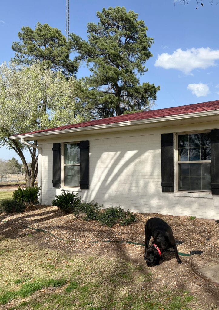
Pearly White is an interesting option as it’s not as yellow as many of the popular shades popping up (Sherwin Williams Creamy) and not as bright as the warm whites we’ve seen a lot of.
However, its yellow hue can still be a force to be reckoned with. For this next exterior, my client hired me to fix the siding color. She chose Pearly White, but as you can see, its subtle creamy warmth is too yellow-toned for the brick fireplace…

(I can’t wait to see the AFTER photos!)
While the cream can appear a bit softer on interior walls, it often shows up at the party more on exteriors.
5 Tips for Choosing an Exterior Paint Color
Does Your Exposure REALLY MATTER When Choosing EXTERIOR Paint Colors?
IS PEARLY WHITE A GOOD PAINT COLOR FOR KITCHEN CABINETS?
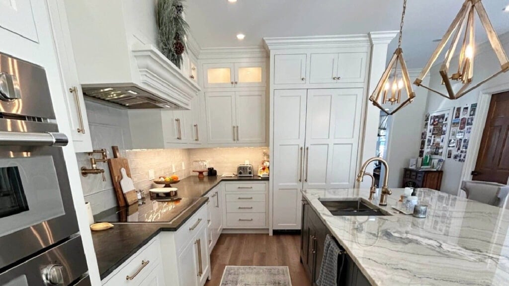
Pearly White can be beautiful for kitchen cabinets, especially given recent off-white cabinet trends. Make sure your countertop and backsplash suit Pearly White’s depth and undertones before slappin’ paint on those cabinets.
In my client’s kitchen (below), Pearly White is on the cabinets, walls, and trims for a seamless, color-drenched look…


The Pros and Cons of Off-White & Light-Depth Kitchen Cabinets (PART 1)
While it will definitely be too creamy-gray for the average 2000s kitchen, many of the newer quartzites are into a color like this.
The Best Off-White & Light Depth Cabinet Colors (PART 2)
DOES IT GO WITH CREAM CABINETS & TRIM?
For the love of everything beautiful and sane, no. Pearly White is too muted and grayed to pair with any cream cabinet or trim color, unless they’re also painted Pearly White. Trust the wee Ginger on this one.
DOES IT GO WITH WOOD CABINETS, TRIMS, & FLOORS?
Yes, Pearly White is gorgeous with a wide range of wood tones and finishes. While it’s way up on the walls in this next home (with Benjamin Moore White Dove on the cabinets), it’s easy to see how beautiful it is…damn, I have some amazing clients.

The Best Paint Colors With Golden or Honey Oak
While I might be careful when using it with pink or purple wood tones (common with white oak, as well as white and gray washed woods), it can be fab with most others.
WHAT COLORS ARE SIMILAR TO PEARLY WHITE?
Pearly White is a color unto itself, but it’s important to sample and compare similar shades. You might find something even better suited to your home and its finishes!
SHERWIN WILIAMS PEARLY WHITE vs. AESTHETIC WHITE
I love the comparison between Pearly White and Aesthetic White—they’re like two sides of a coin! Both are soft, subtle, warm neutrals. Both have an awesome gray undertone that calms them down—that’s where they’re similar.
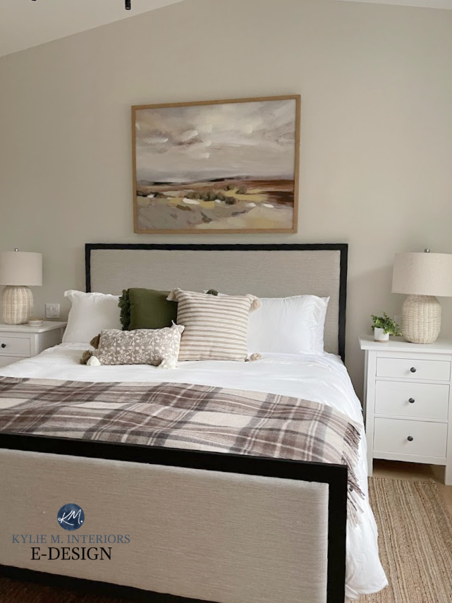
Here’s Aesthetic White in our old home on a cloudy, south-facing day
Compare the two, and you’ll see how Pearly White sits on its muted cream base, while Aesthetic White has a muted beige look.
As for depth, there’s a difference, too: Aesthetic White’s LRV is 73, making it a bit darker.
Color Review of Sherwin Williams Aesthetic White
SHERWIN WILLIAMS PEARLY WHITE vs. CREAMY
Another great comparison (if I do say so myself). Both of these colors have yellow in common. However, while Creamy is considered a reasonably ‘muted’ shade of cream (compared to others), Pearly White takes it to another level. With Pearly White, the yellow falls WAY back, and the gray comes forward, creating a beautiful blend of both. Creamy is more ‘yellow-centric.’
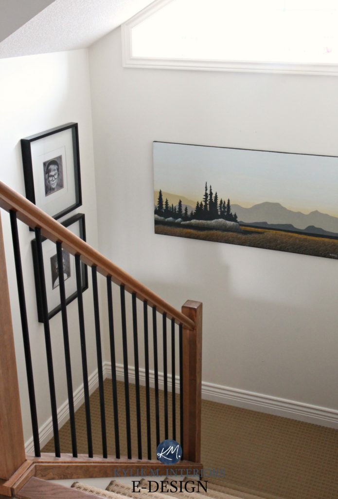
As for depth, Creamy is the lighter of the two, with its LRV of 81. This means it’s closer to the white world (winking at it with a ‘come-hither’ glance), while Pearly White is a definite off-white.
Color Review of Sherwin Williams Creamy
PEARLY WHITE VS. WHITE DUCK
These are awesome, and I’m glad you’re considering both.
White Duck is an off-white, warm neutral that’s like a cream dipped in gray… sound familiar? It should.
Before, this home was bathing in its pink brick glory…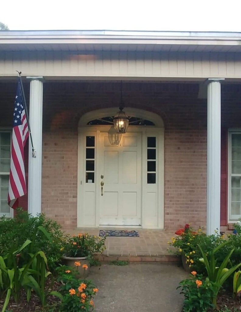
After, it looks gorgeous in White Duck…
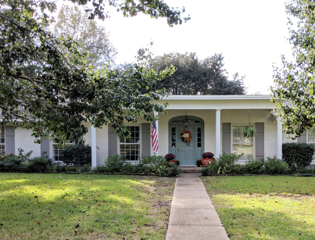
Depth-wise, White Duck’s LRV is 74, so it’s a tone lighter than Pearly White. It also has a similar approach to cream and gray, although it’s a bit warmer and sliiiightly less likely to grab green.
Sherwin Williams White Duck Color Review
SHERWIN WILLIAMS PEARLY WHITE vs. GREEK VILLA
Greek Villa is a white paint color (a soft white) with a reasonable yellow undertone. Pearly white is an OFF-WHITE with a subtle yellow undertone. Sure, they share yellow, but they’re not in the same ballpark, really.
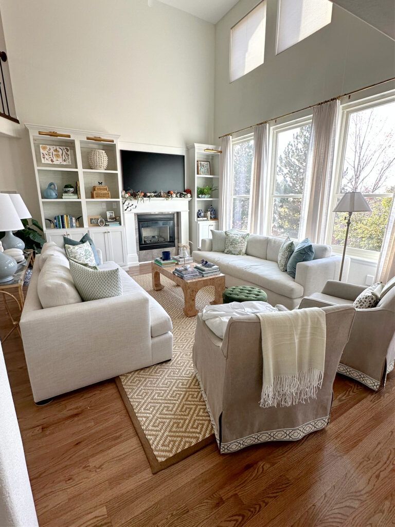
Greek Villa walls, Benjamin Moore Chantilly Lace cabinets and trim.
Greek Villa’s LRV is 84, which is in the white world. In comparison to Pearly White (77), Greek Villa looks brighter and cleaner, making Pearly White look a bit dingy and dirty.
In doing my research, these 2 came up as being ‘often compared’. I imagine this is more about using Greek Villa as a trim color with Pearly White walls, as they’re in a different world in that way. As for that, I wouldn’t – Greek Villa is too clean.
Color Review of Sherwin Williams Greek Villa
PEARLY WHITE VS. SHERWIN WILLIAMS PURE WHITE
This is another example where I’m assuming people research these two together as potential wall-trim color pairings.
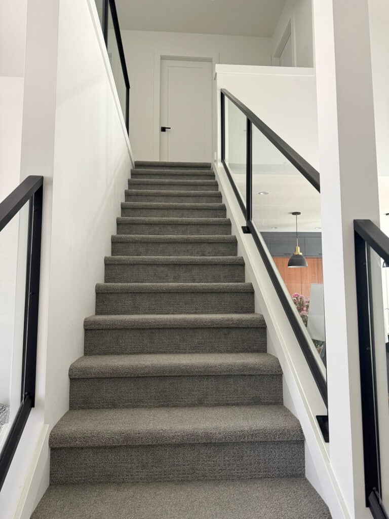
This is allllll Pure White
While I prefer Chantilly Lace or White Snow, Pure White is doable as a trim color with Pearly White. As for how they differ, Pure White has an LRV of 84, so it’s a white, not an off-white. It’s also much less warm and not creamy like Pearly White. In this way, they’re not really comparable in the way that Aesthetic White and White Duck are.
Sherwin Williams Pure White Color Review
DOES BENJAMIN MOORE HAVE ALTERNATIVES OR SIMILAR SHADES?
While they don’t have an exact match (nor can the color-match it), I’d definitely sample and compare…
- Benjamin Moore Dove Wing for a different approach to warmth
- Or, make your sampling a heck of a lot easier with a CURATED COLOR BUNDLE—and add Pearly White to the mix!
WHICH PAINT COLORS GO WITH PEARLY WHITE?
With such subtle undertones and a reasonably high LRV, Pearly White has many colorful friends, including…
- GREIGE PAINT COLORS: Light-depth shades of greige are amazeballs in the same palette, as are medium to darker shades.
- SHADES OF GRAY-BLUE: Gray-blue blends can be beautiful with Pearly White (both light AND dark!)
- MEDIUM TO DARK GREEN: If you need an accent wall with Pearly White, darker shades of green are a great choice, especially muted, organic ones.
- WARM GRAYS: Warm grays, especially those with a green undercurrent.
- AVOID: Beige paint colors and creams that have more yellow than PW does.
SUMMARY
- Pearly White has an LRV of 77. While it’s an off-white paint color, it’s on the higher end of the range.
- It has a cream base with a lot of gray toning it down. It can pick up a very slight green undertone, so sample carefully.
- It does best with white paint colors that aren’t overly creamy/yellow.
- It can look dingy in dark rooms and wash out in bright rooms. For this reason, it’s best for a room with an ‘average’ amount of light.
READ MORE
The 10 Best Warm, Neutral, Off-White Paint Colors
The Best Warm Neutral Paint Colors That AREN’T BEIGE!
Get the best color advice with Kylie M’s Online Paint Color Consulting – I’d love to help!

UPDATED WITH NEW CONTENT AND IMAGES FOR 2026




Is Pearly White a good trim/garage door color with SW Rare Gray on exterior stucco that faces southwest? There is no brick or stone on the house. Full sun in the afternoon. Or is Greek Villa or Creamy better?
Hey Susan, it could look quite pretty as it is muted! Check out SW Aesthetic White, too.
how do you think Pearly white would look in a west facing room. I have a large amount of dark cherry color desk furniture in the room and have Brazilian cherry floors. I also will be putting a Pottery Barn seafoam blue and off white rug in the room to finish it. Thank you so much! I appreciate your design expertise!
Hmmmm, with the red tones of your furniture/furniture/flooring, I would worry about it looking a bit dingy and lacking the subtle pink that these woods often prefer…
Hi! Do you think Pearly White in my living room (which is southwest facing) could pair well with Agreeable Gray in my dining room (northwest + southwest lighting)? Both rooms are visible from one another, in a somewhat open floor layout. There is decent natural lighting in both rooms and foliage that surrounds the windows.
Hello:)! Question.. i have extra white and pure white both in satin finish.. which one of yhese would look best with Pearly White walls? Thank you
Oooo, that’s tough. Extra White comes up a bit warmer in trim paint, but I would probably choose Pure White if I were starting from scratch 🙂
I have west, east, and south exposures in a great room with very large black windows and a 12′ sliding door. Cabinets are stained onyx oak with light quartz counters. Ceilings are 20′. Sofas are warm white. I am considering Accessible Beige on the walls with aesthetic white or pearly white trim. What do you think? Floors are medium brown hickory. Thank you.
Hey Connie, I would be 100% guessing, as with all of these finishes and potential undertones, there are likely a range that could work. Your countertop will have undertones (even if it’s white), and the warm white of your sofa, could skew yellow or slightly pink! If you’d like me to take a look, I do have consulting! https://www.kylieminteriors.ca/hire-kylie/
If you had to pick a SW brand white trim color to pair with pearly white walls, would pure white be good or would you choose another one? We are limited to SW with our new build unfortunately.
Yeah, I’d probably go to Pure White 🙂
Planning on painting my kitchen cupboards either SW White Heron (designer suggested) or SW Pearly White. I am working with a warm white quartz ( MSI Calacatta Miragio Gold) and as per your advice, I picked out a backsplash with the same tones of warm white. From the looks of things, there is not much difference between each paint colour. Is one warmer than the other? Thank you for all the work you put into this site. It helped me and many others I’m sure.
Hey Karen! You’ll find a DECENT difference between these two colors, for sure! Pearly White is kind of a muted off-white with a wink of cream and gray. The odd time it picks up a vague green, but rarely. as for White Heron, it’s main challenge is that while it can pick up a lovely creamy warmth, it has PINK in it. Also, if your painter uses alkyd, enamel paint, it can increase the warmth of colors, so I’d ask to have a sample door painted in the exact paint they use – 2 coats.
Personally, from what I rememmber of Miraggio Gold, I’m not sure either color is great. Have you considered a softer white, like maybe BM White Dove or SW Pure White???
After taking FOREVER to decide on a wall color for our foyer/living room/kitchen (open flow/concept), I decided on Pearly White and I LOVE it! The old color living room was assessible beige (too dark) and kitchen was creamy but came off VERY yellow because it’s south facing. My kitchen cabinets are currently brown wood with a reddish undertone. I am also working with the 2000’s average granite that has browns, off whites and gray/black. My contractor uses SW paint for cabinets. Do I use pure white? Or is something closer to Chantilly Lace going to look better with the lighting, granite, pearly white combo??
Hey Erica, I would look at Pure White for a bit of softness or SW White Snow for a bit more brightness! I would LOVE to see how it all turns out! kylie@kylieMinteriors.ca