
A Warm Gray (Greige) Tudor Kitchen Remodel
Benjamin Moore Revere Pewter, White Dove & More…
When my client hired me to help her with the remodel of their lovely Tudor home, I knew something beautiful was about to happen.
When I do my Online Paint Color Consultations, sometimes old finishes are in place and need to be accommodated, whereas other times, we have a FRESH new slate to work with. We were starting from scratch with this one—new finishes, new flooring, new husba…wait, the husband was staying.
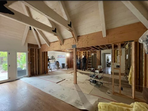
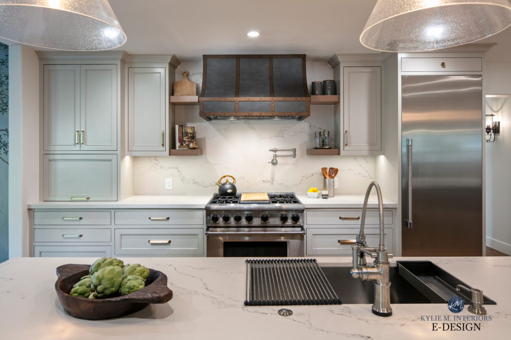
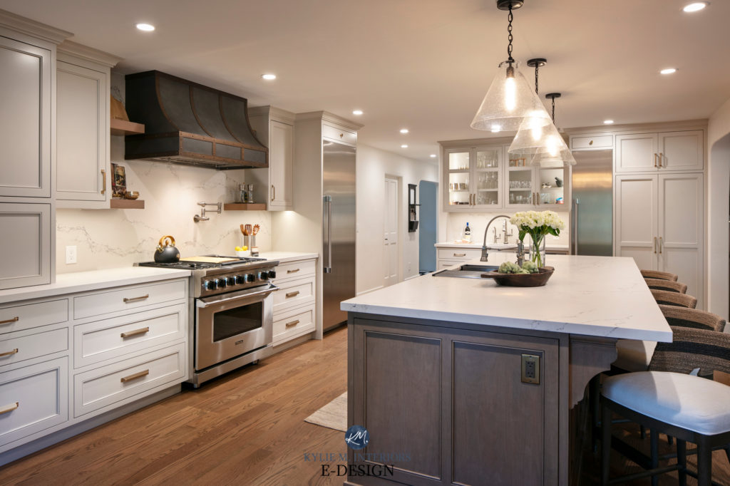
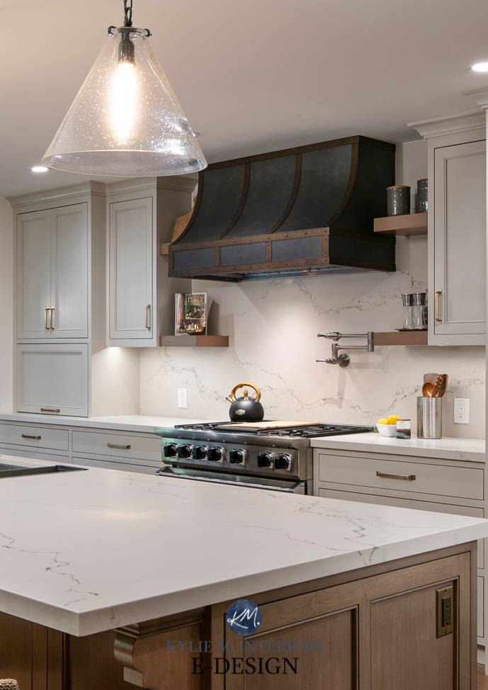
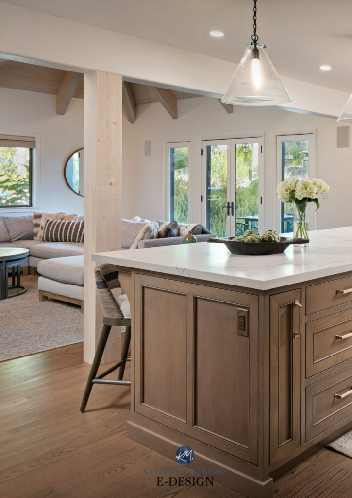
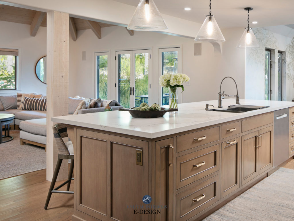
My client had a VERY clear idea of what she wanted in her Tudor kitchen, had a great contractor (Lewis Remodelling), and hired me to help her pull it all together with color. My first look at things involved a combination of Caesarstone Statuario Nuvo on the main countertops, along with a soapstone island countertop, as well as some other custom details (just WAIT until you see the range hood).
And while you MIGHT call me crazy (duly noted), I kindly suggested that the soapstone countertop was taking things too far.
Why?
Between the main cabinets (painted a popular, warm gray paint color), the wood island, the soapstone fireplace in the open layout living room, and the WICKEDLY gorgeous range hood, we had enough going on. I worried the soapstone would tip the scales, overwhelming the space with variety, rather than keeping it classic.
She agreed, and we’re both super happy that the soapstone was kept in the fireplace surround.
Ready, Betty (in homage to the late great Betty White)?
Let’s start in the kitchen…

We chose Benjamin Moore Revere Pewter (darkened by 25%) for the cabinets. My client had started with the idea of Benjamin Moore Edgecomb Gray, but with the countertop she chose, along with the James Mobly mural she wanted in the dining room, Edgecomb Gray leaned too warm.
ALL AFTER PHOTOS: RICK PHARAOH PHOTOGRAPHY
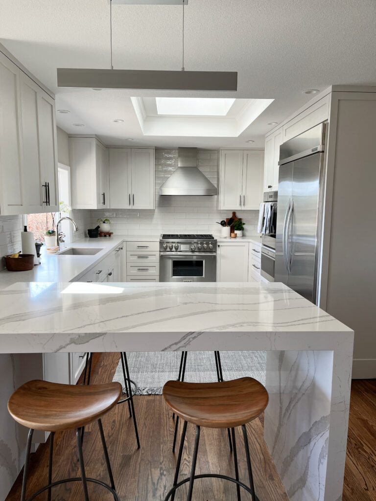
Adjusting the cabinets to Revere Pewter and adding a wink of depth made for the PERFECT backdrop to the Caesarstone white quartz countertops and wood island.
The Best White & Off-White Quartz Countertops
While the combination of interior lighting and photography can throw colours off-whack a bit (super technical term), this next photo is a great shot of Revere Pewter in action.
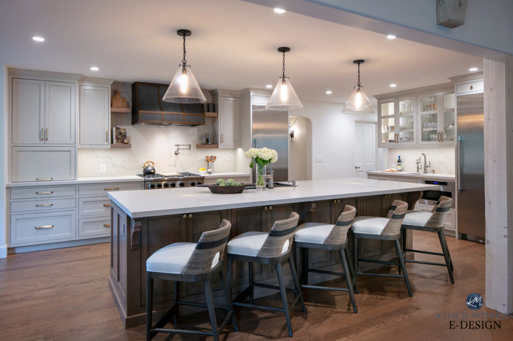
Swinging to the right, we see the bar area with an indiscreet stainless steel wine fridge. Personally, I’m not a huge fan of wine bottles on display unless they’re in a dramatic feature piece or empty (wink, wink).
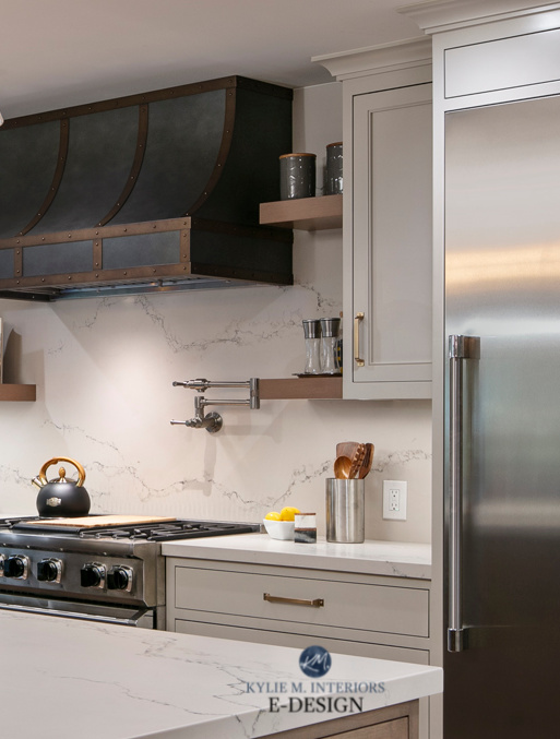
THE RANGE HOOD
Ummmm, did ya SEE THE RANGE HOOD? That is one metal-clad masterpiece…
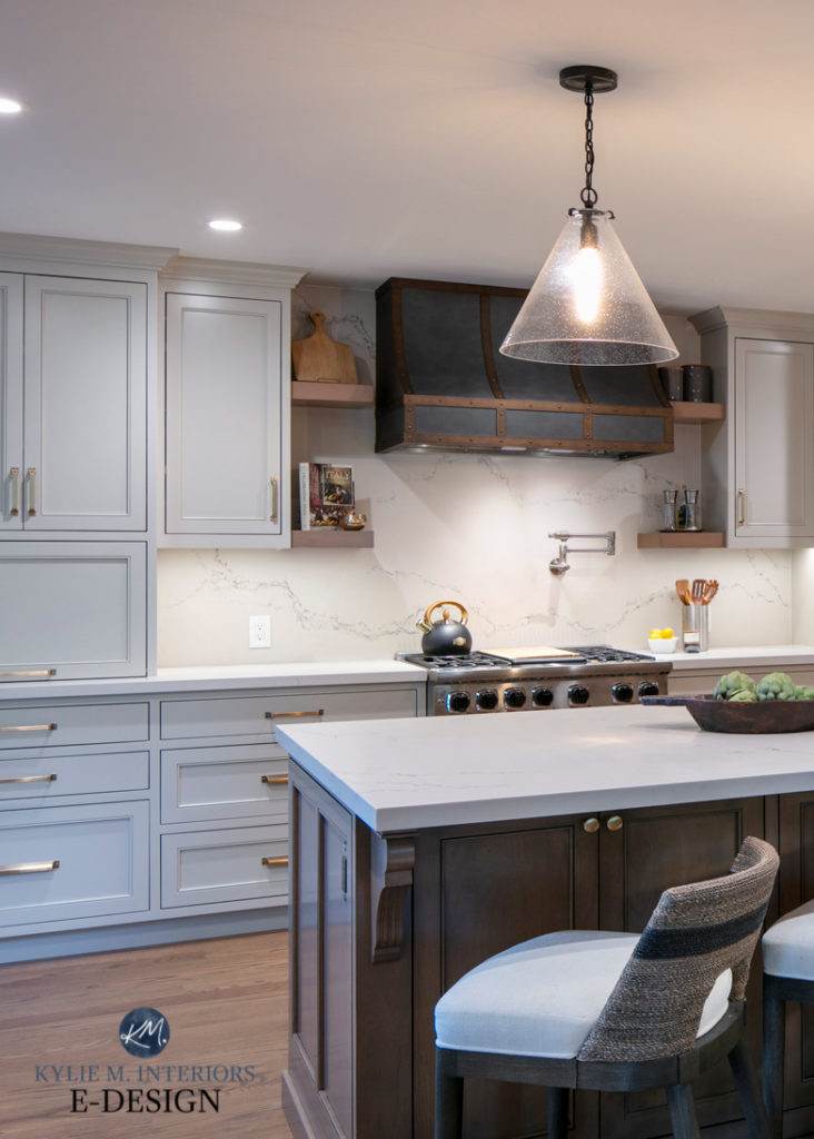
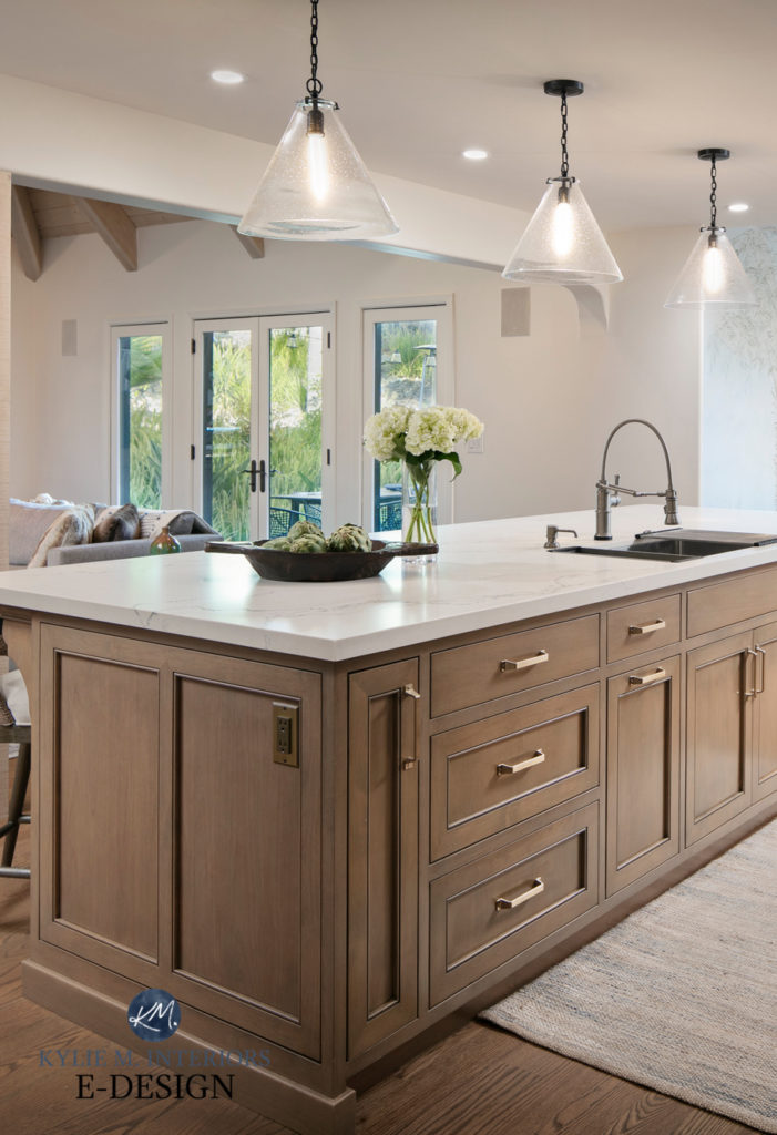
THE WOOD KITCHEN ISLAND
The wood stain on the island is also the perfect complement to the wood floor. Whereas some wood islands compete for attention, this bad boy is the perfect partner…
INTO THE LIVING ROOM…
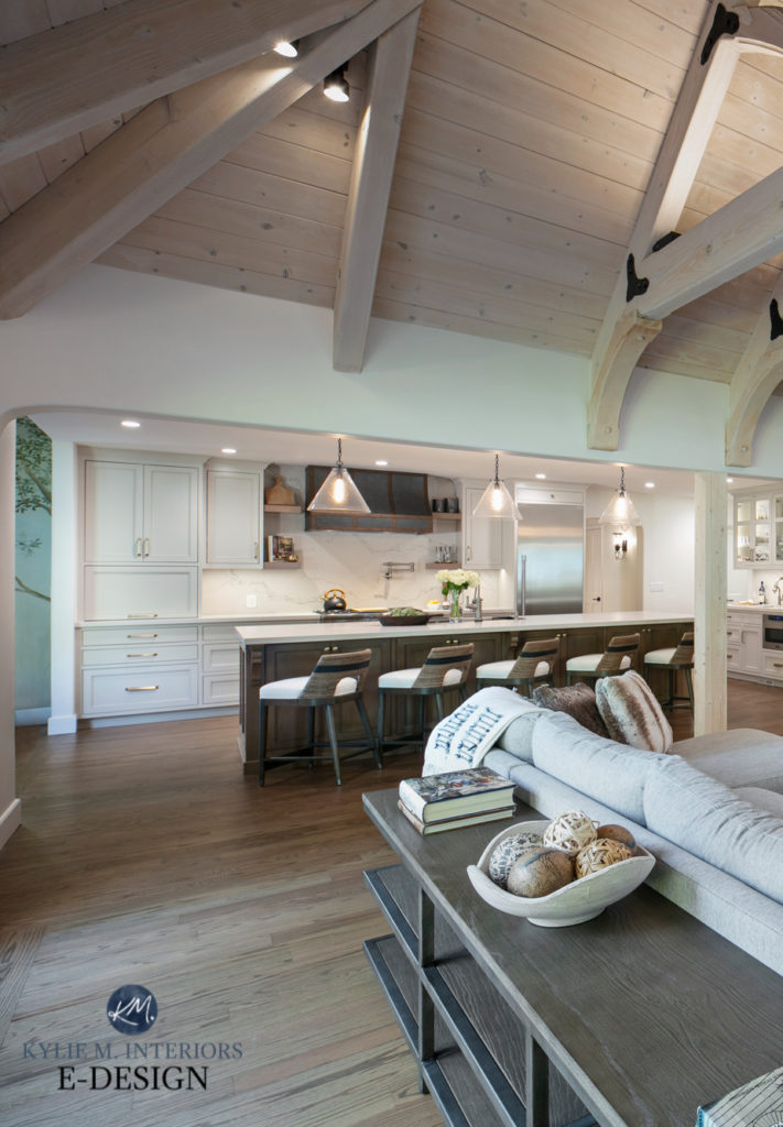
At this point, you might be wondering what color the walls are in this glorious Tudor kitchen. Or maybe you’re still mentally absorbing that range hood. Either way, the wall color we chose was Benjamin Moore White Dove, the PERFECT warm white for this project, which is best showcased in the living area.
In these next photos, White Dove looks far more creamy than it does in real life (it looks more like Sherwin Williams Creamy); the previous photo was a better representation. But all the same—HOLY FREAKIN’ CANNOLI!
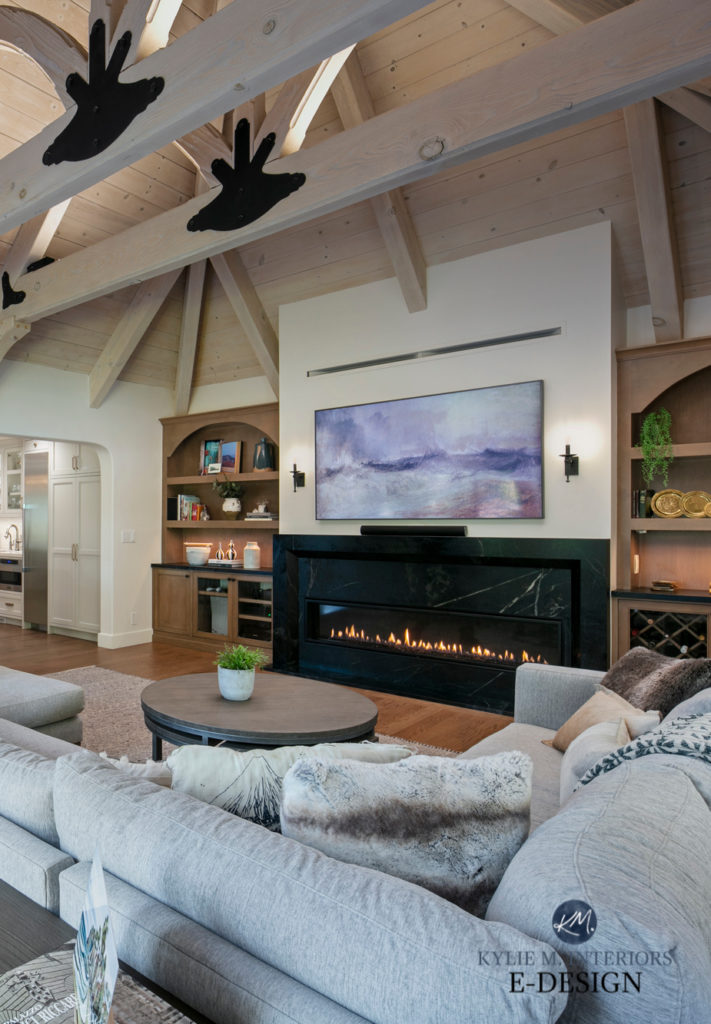
And that ceiling.
The subtle whitewash on the ceiling cuts the intensity of the wood stain back nicely without it flashing too pink. However, with the flooring being red oak, this subtle undertone is NOT unwelcome…
The Best Paint Colors for Rooms with High Ceilings
Here’s another full shot looking from the kitchen back to the living area—MAD LOVE. And just spend some time with Benjamin Moore White Dove, with its passive warm glow (there’s good reason why it’s one of my favorite shades of white). In fact, this next view is my favorite of them all.
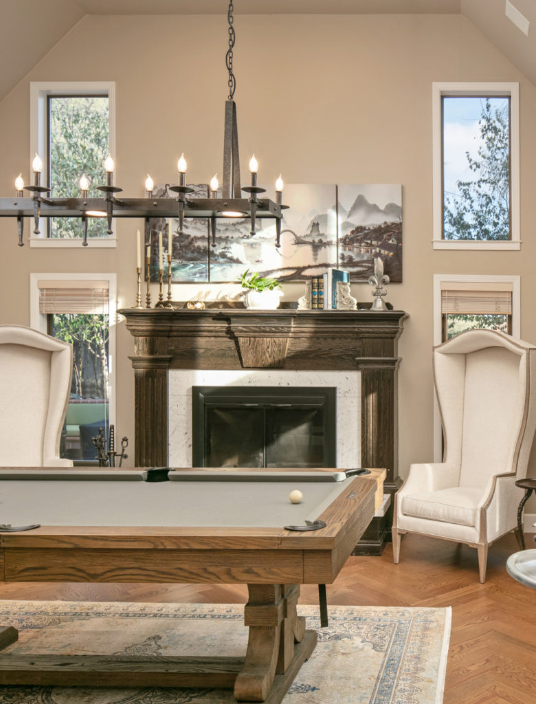
And I HAVE to share her pool table room with you, it’s the epitome of badassery…
THE FAMILY ROOM / POOL TABLE ROOM
Hey, is that really a knight playing peekaboo with me? DAMN STRAIGHT IT IS! Seriously, I’ve never done a consultation where there’s a knight in play. Given that this Tudor kitchen is in a Tudor home, it kinda makes sense. In fact, this room has the most Tudor-style in the whole home!
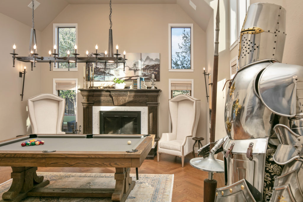
My client clearly has a great sense of style and chose to wrap it all up in Benjamin Moore Stone Hearth, a colour you might be seeing more of as those trends lean warmer and warmer!
The Best WHOLE HOME Warm Neutral Paint Colours
READ MORE
The Best Paint Colours for Kitchen Cabinets
Should You Paint Your Kitchen Cabinets or Keep Them Stained – a QUESTIONNAIRE
The 12 Best WHOLE HOME Gray & Greige Paint Colours
Benjamin Moore’s Best Warm White Paint Colours
NEED HELP?
CHECK OUT MY ONLINE PAINT COLOR CONSULTING PACKAGES!


Love it! On the hunt for counter stools and love these. Can you share where she got them and the name, please?
Hi Vicki, you’ll find them here! http://www.palecek.com/products/773879/K/03/FRITZ-ROPE-24
Gorgeous, the ceiling had me at hello!!!
Right? It’s a real showstopper – i dream about it!
Stunning! Curious as to the hardware finish on the cabinets, as well as the faucet and the light fixtures? Looks like they’re three different finishes?
I love this kitchen and paint color for cabinets! Using this for inspiration for our reno. What trim color did you use with white dove?
DEFINITELY White Dove, keeps things consistent.
Do you have a photo of this kitchen in natural light ? Also, would Fog Mist have worked in this same kitchen with white dove trim? I like to see a little contrast between the trim and wall. Thank you!
I love everything. Curious what stain you went with for the wooden islands and floor?
Hi Kylie!
Thank you much for your paint color reviews. They have helped so much in my renovation. I am also loving the combination of this wood and stain here on the island including the hardware. Wondering if its maple and what the stain color might be? It just might be perfect for my lower cabinets 🙂
Hi Kylie! I love the color of the island in this kitchen! What is the color stain you chose with the Revere Pewter cabinets?
We renovated our home a couple of years ago and this gorgeous kitchen was my inspiration. We painted the perimeter cabinets Revere Pewter but our island has a lot of red in the stain. Thinking of Urbane Bronze for island and hood. The red stain is throwing the whole room off. Are you able to consult for something like this?
Hey G. Queen! I can definitely consult on this! This would be the cabinet consult, but since you’re on a particular track, you could do the STANDARD consult rather than the FULL one. In the questionnaire, mention how you left me a comment on my blog and that I said I’d check it all out for you 🙂