
20 Years of Benjamin Moore’s Best Paint Color Trends
Bold to Subtle: Benjamin Moore’s Two-Decade Color Journey
Nothing excites this paint nerd more than learning about paint. Okay, maybe Ryan Reynolds in a Speedo is right up there, too, but we can talk about that on my personal blog (just joking; there isn’t one, but if there were, it’d be off the hook.
I wanted to explore how paint trends have changed, not just based on my own Online Color Consulting experience but from the paint brands themselves. I sent off emails, and my brain is spinning with the results!
Starting with my main squeeze, Ben.
Benjamin Moore’s paint and colors have been the go-to for homeowners since, well, the 1800s. In doing my research, I didn’t go back that far. It made more sense to keep things recent, as in the last 20-25 years, which coincides with how long I’ve been studying paint colors (and consulting with clients).

I’ll also write blog posts on Sherwin Williams and Samplize color trends, as each deserves my undying love and attention, but this one’s for you, Benny.
So, without further ado, let’s see what this color cowgirl has up her sleeves when it comes to Benjamin Moore, starting in 2005…
2005: BENJAMIN MOORE PAINT TRENDS
The information for this grouping is from 2005, but these colors (the neutrals, in particular) would’ve shown up a few years earlier and continued past 2005 (approximately 2000-2010). 
While the early 2000s (especially Tuscan-style homes) are usually associated with beige, I’m not surprised that cream was the big winner, with Benjamin Moore Navajo White coming in the top spot (I still recommend this color to my clients).
Paint Color Review of Benjamin Moore Navajo White
Sure, beige and tan were hot on walls, but cream was a top choice for cabinets and trims, too (which many of my clients are currently trying to update – insert Kleenex, jugs of wine, and funnels HERE).
Natural Wicker (also known as Bone White) was in second place, which is super interesting. It’s almost like a hybrid of cream and beige, which makes sense, given that richer, more saturated beiges were popular on walls.
Paint Color Review of Benjamin Moore Natural Wicker
What’s really cool is that even though these colors were popular 15+ years ago, many of them are still being used in today’s homes—that’s how timeless they are!
What’s NOT so timeless is the next color – Shaker Beige. I spend half my time helping clients transition out of colors like this and other Tuscan-era shades and finishes into softer, more modern shades (which we’ll get to shortly).
But here’s where things get buck wild and crazy. Why?
Well, the most popular colors also included Clearspring Green (what the WHUT?), Blueberry, and Old Claret.

I don’t know what kind of party y’all were going to, but there was something in those brownies. Don’t get me wrong, these colors are stunning as accents, alone and together, but a) they don’t coordinate as well with the most popular neutrals, and b) I just…where were you all using these colors?
Moving along…
KYLIE’S 2005 COLOR EXPERIENCE
Based on what I saw in local homes (I wasn’t consulting online at this point), the first three neutrals on this list make a lot of sense. Whether beige, tan, or cream, warm paint colors were huge from 2000 to 2010. I expect Benjamin Moore Muslin was mixed in there, too.
As for whites, I saw a lot of Benjamin Moore Cloud White (for trims). Behr’s whites were popular, too, as Sherwin Williams hadn’t really hit its mainstream stride yet (certainly not in my world).
Subscribe to Kylie M’s YOUTUBE for more great content!
2010: BENJAMIN MOORE PAINT TRENDS
The information for this grouping is from 2010, but these colors (the neutrals, in particular) showed up a few years earlier, and some of them are still kickin’ it in today’s home!
2010 is when things really started shifting. Beige began to lose traction, and gray was pickin’ it up. However, one color beat them both…

That’s right. Look who got invited to the party: none other than my favorite shade of white, Benjamin Moore White Dove. This white was kickin’ it in 2010 and is kickin’ it now for many good reasons, mainly because it’s one of the most flexible, versatile shades of white.
Next was Benjamin Moore Linen White. We can give thanks for its popularity, not only to walls but also kitchen cabinets and trims (again, I’m helping many clients transition out of this awkward phase).
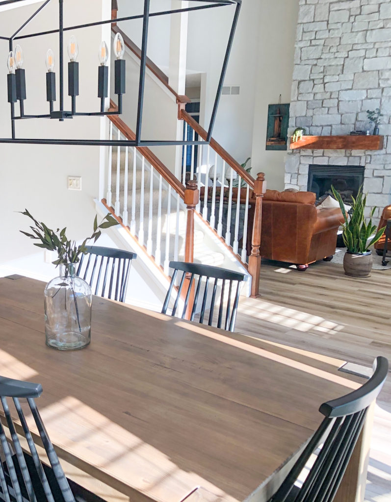
Don’t get me wrong, cream cabinets and trims are gorgeous in the right home (above). In the wrong home, they’re a huge PITA, and hard to transition into new styles and trends.
Now, here comes the big dog…
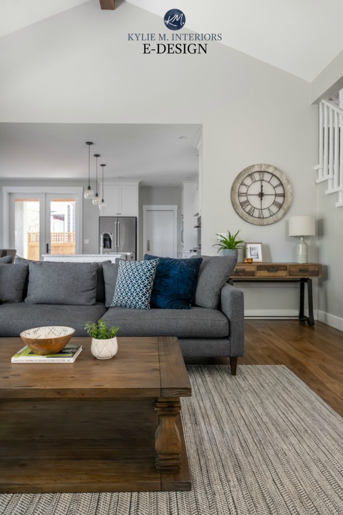
Benjamin Moore Revere Pewter – awooooooooo! Need I say more? This color hit the scene around 2010, and it NEVER STOPPED – and that’s a good thing as it’s amazeballs (it’s still going!).

Paint Color Review of Benjamin Moore Revere Pewter
Revere Pewter is still popular on walls and exteriors, but thanks to current home trends, we see a lot of it on kitchen cabinets (including my own) and interior trims. While this trend is fading, Revere Pewter walls won’t be going far.
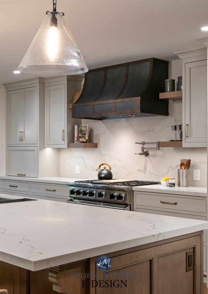
The Best Off-White & Light Paint Colors for Kitchen Cabinets
Shaker Beige was still hitting walls hard in 2010, but don’t worry; it wasn’t long for this world after that.
As for colors, my heart melted at the sight of the next two on the list – Benjamin Moore Palladian Blue and Guilford Green.

They’re so stinkin’ gorgeous and still usable in today’s average home.
KYLIE’S 2010 CONSULTING EXPERIENCE
While beiges were still strong in 2010, grays were coming in HOT. With barely a whisper of today’s top greiges and taupes, many of my clients were beige or gray—nothing in the middle.
Linen White is surprising as it’s never been a top choice for myself or my clients. Guilford Green and Palladian Blue aren’t popular right now, but they still hit the hot lists. When my clients want color on their walls without tipping the scales too far, these colors and similar shades still show up in my consultations.
2015: BENJAMIN MOORE PAINT TRENDS
The information for this grouping is from 2015, but these colors (the neutrals, in particular) showed up much earlier and continue to be popular.
2015 was an interesting year, as while we were still experiencing the gray-on-gray trend (it’s gone, btw), Modern Country Farmhouse was also working its magic (starting a few years earlier).
Today’s Modern Farmhouse is more neutral, cleaner, and transitional. Modern COUNTRY Farmhouse has some serious rustic, lived-in elements, including ye ole Shabby Chic vibe.

As for the previously popular Shaker Beige, I can only say thank goodness it’s gone.
Don’t get me wrong, every color has its place, but this color was the last one to leave the party, and it should’ve left 5-7 years earlier.
Benjamin Moore Simply White replaced Shaker Beige and took over third place (White Dove and Linen White were still in first and second place —seriously, what’s with Linen White, anyway?). I also love that Benjamin Moore quickly picked up on Simply White’s popularity, making it their Color of the Year for 2016.
Paint Color Review of Benjamin Moore Simply White
While Palladian Blue and Guilford Green were still the top ‘colors,’ they switched positions, with Guildford Green being the more popular shade. This makes 100% sense, as GG was the Color of the Year for 2015 and was hotter than me in skinny jeans and heels.
KYLIE 2015 CONSULTING EXPERIENCE
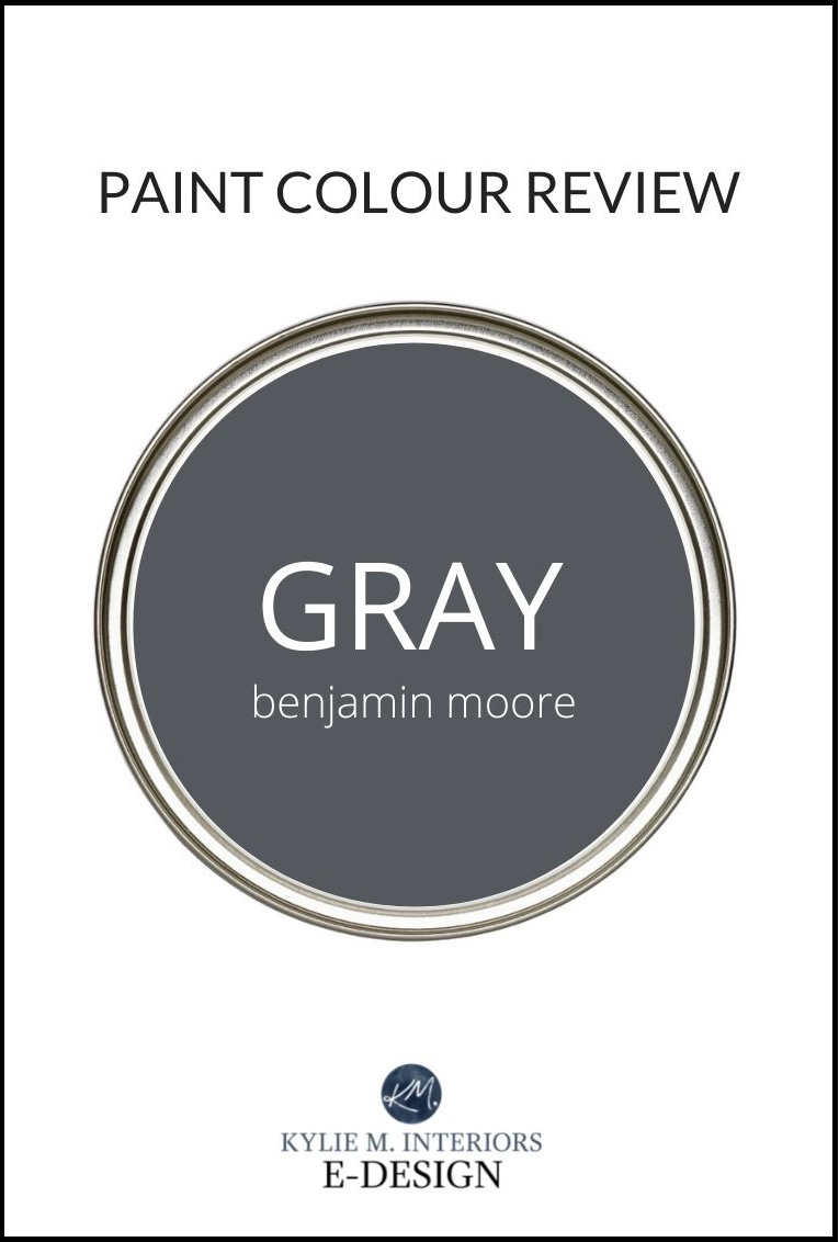
What’s surprising to me is that the only gray on this list is Revere Pewter (I’m sure some are in the top 20). At this time in my consulting career, most of my clients wanted gray (greige and taupe were just a twinkle in their eyes). Benjamin Moore Gray Owl and Stonington Gray, in particular, were two SUPER popular shades (and still are).
In fact, if I did 10 consults a day, 8 of them were for gray!
Paint Color Review of Benjamin Moore Stonington Gray
As for Simply White, I barely use Simply White (now or then). Most of my clients find it a touch too warm for their walls, trims, and cabinets and lean into the cleaner look of Chantilly Lace or the more passive, gentle warmth of Benjamin Moore White Dove—I’m surprised Simply White was one of the top whites given its warmth, but not surprised seeing as it became a COTY.
2020-2021: BENJAMIN MOORE PAINT TRENDS
The information for this grouping is from 2020-2021. The grays, specifically, showed up in force about 8-10 years earlier, but I guess they were just gaining steam, as they came out in full force in 2020!
With the previous four years fresh in our noggins, it might be a bit easier to relate to these next color trends…

Ten years later, what color was still going strong in FIRST PLACE?
Benjamin Moore’s White Dove; it’s like the Energizer Bunny of the paint world.
Now, I’m not going to give it as much credit as I did in 2010-2020 – for it to be a top shade in those years was a FEAT, as gray and beige were hot.
White Dove (and Simply White) were still in the top spots in 2020 because white walls became a huge trend thanks to the Modern Farmhouse style home (which really started a few years earlier). Don’t get me wrong, they’re still amazing for cabinets, trims, and ceilings, but people worldwide were (and still are) splashing white on every paintable surface in their homes.

Not surprisingly, Revere Pewter still made the list (third place), as it’s one of the most timeless shades of gray. But this is where we take things up a notch…
Can I get a HAAAAAALE YES?
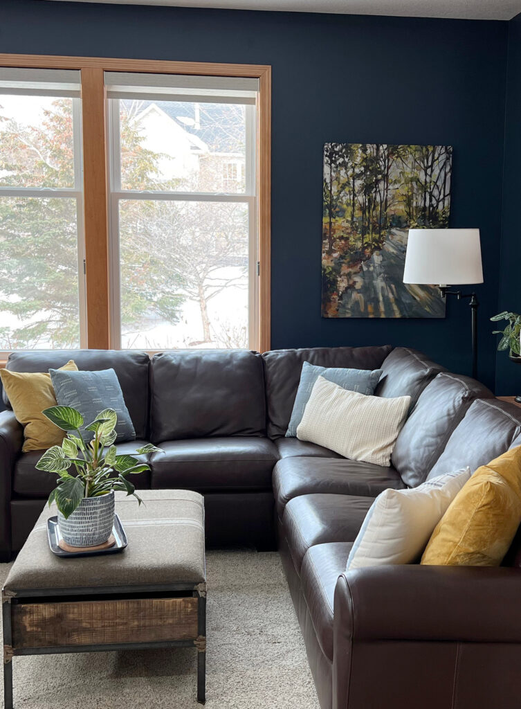
That’s right, Benjamin Moore Hale Navy hit the paint scene hard, not just as a top paint color but as the most popular shade of navy blue. Accent walls, cabinets, islands, and front doors – this color had them all covered (literally and figuratively).
Stonington Gray and Gray Owl? There they are – I knew they’d show up eventually. Remember that I’m honing in on specific years in this blog post, but between 2015 and 2020, I guarantee these two colors made a huge entrance (tassels and all).

Paint Color Review of Benjamin Moore Gray Owl
Paint Color Review of Benjamin Moore Stonington Gray
2022: BENJAMIN MOORE PAINT TRENDS
I’m curious to hear what you think of these trends – which ones you love and which ones you don’t. I have to say, 2022’s collection catches my eye…

As mentioned before, I was surprised that Simply White was a top shade, as so many of my clients prefer White Dove and Chantilly Lace…and there she is, proving that she’s NOT just a pretty face.
White Dove still held the top spot in 2022 with Chantilly Lace coming in a hot second place. This isn’t surprising, as the white and Modern Farmhouse trends were still super strong in 2022.
Chantilly Lace is a brighter, cleaner white. Based on what I currently see from my Online Color Consulting clients (and read in Youtube comments), trends are shifting a bit softer. While I don’t see White Dove going anywhere fast, Chantilly Lace walls won’t be a big thing in the coming years (not like they are now – plus, people curse its lack of coverage).
Of course, Revere Pewter is still in the top five.
Just think – paint color trends tend to last 5-10 years. White Dove and Revere Pewter are coming up on their 15th year as two of the most popular paint colors!
Hale Navy? Check.
Now, check out Kendall Charcoal and October Mist. As the Color of the Year for 2022, October Mist isn’t at all surprising. Coming out of Covid, many were looking for a bit of relief, and blues and greens are well-known for their stress-relieving quality (wine also helps, as do tranquilizer darts).
Kendall Charcoal is a badass and beautiful color that pops up on exteriors quite a bit (especially with the dark exterior trend). It’s also a great color for kitchen islands, accent walls, and even the inside of front doors.

FULL Paint Color Review of Benjamin Moore Kendall Charcoal
2023: BENJAMIN MOORE PAINT TRENDS
We’re getting closer to this year’s trends. And while I’m still not thrilled to see Swiss Coffee in the mix, I’m not surprised to see any of these other glorious shades…

Were you secretly hoping to see a new color in first place? You’d be the only one, as I’m excited to see White Dove still taking the TOP FRIGGIN’ SPOT! If you’re looking for a versatile, timeless shade of white, this one just might have you covered.

Moving along, Chantilly Lace is still in second place, which is not surprising.
In third place, we see Benjamin Moore Swiss Coffee, supporting the white-on-white-on-white Modern Farmhouse trend. However, I KNOW this color is only popular because Shea at Studio McGee used it so well in her home. If not for Shea, this color might not even make the top 20 list.
Paint Color Review of Benjamin Moore Swiss Coffee
Revere Pewter? Still going strong.
Hale Navy? Yuuuup.
Oooo, what do we have here? FINALLY, we see a greige-taupe coming in with her sleeves rolled up and ready to work. That color is none other than Benjamin Moore Edgecomb Gray.
Holy hot potato, this is one awesome color.
Paint Color Review of Benjamin Moore Edgecomb Gray
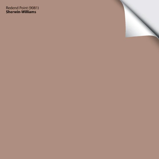
With trends shifting warmer, colors like Edgecomb Gray are hitting the paint scene hard as homeowners look to transition out of their gray-on-gray homes and into something warmer. While 2023 and 2024 don’t see us hitting beige…it’s coming.
2024…SO FAR: BENJAMIN MOORE PAINT TRENDS
We’ve arrived at our destination…finally.

White Dove is like Adele – Hellooooo? It’s me. Or maybe it’s more like Eminem – Guess who’s back? Back again? Either way, I clearly enjoy a wide range of music and am a huge dork.
There’s no doubt about it: trends are shifting warmer in 2024. Although the above list only suggests this with Pale Oak, I expect some results in the coming years.
How to Marry Beige & Gray In Your Home
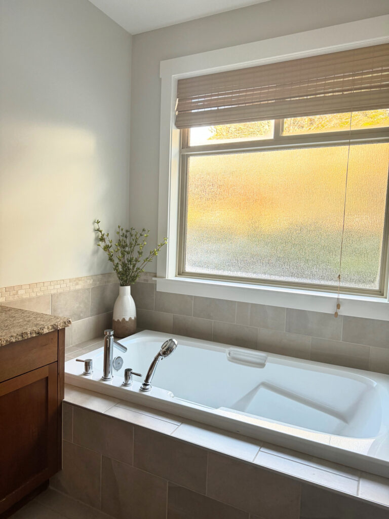
This said, of all the greiges, taupes, and warmer, transitional shades, I’m a bit surprised to see Pale Oak. Don’t get me wrong—it’s dang purdy, and I have it in my early 2000s outdated bathroom. It’s just that its pinkish undercurrent puts many off (but clearly not THAT many!). This said, given the finishes in many interiors, especially those from the early to mid-2000s, colors like Pale Oak are great transitional colors.
Again, Revere Pooter and Haaaaale Yes Navy.
But WHAT THE HECK DO WE HAVE HERE? Vintage Vogue?
COME TO MOMMA!

This isn’t Vintage Vogue, as I don’t have an image of it in action…yet.
The Best Medium to Dark Green Paint Colors
Green is definitely the most popular ‘color’ (non-neutral) for 2024, and I’m surprised it didn’t kick Hale Navy’s butt right out of its spot. Whether it’s for color-drenched rooms (walls/moldings/ceilings all the same color), painted cabinets, islands, accent walls, front doors, or as an accent color for your favorite Ginger’s hair, green is having a huge moment.
Vintage Vogue is a stunner. It’s a bit stronger than the average green my clients are choosing, but all the same, it’s gorgeous.

Well, there you have it. While I don’t see any big changes coming in at the end of the year, will White Dove hold its spot for 2025? We’ll have to wait and see!

READ MORE
How to Create a Timeless Home: 4-PART SERIES
The Best Warm Neutrals to Paint Your ENTIRE HOME
The Ultimate Guide to Using LRV to Choose Paint Colors
The Best White & Off-White Quartz Countertops


IIRC, BM Simply White was the closest white to Pottery Barn’s white furniture.
That was so fun following along and comparing my color journey with your BM timeline! We used Linen White as a whole house color including kitchen cabinets and trim in 1980’s. Countertops in the kitchen were soapstone. Floors were oak throughout as the home was built in 1950 so that made it easy.
Eventually we added some accent colors like revere pewter in the home office, October Mist in the bedroom, and painted our low light downstairs den in Simply White with Edgecomb trim and doors. We were amazed how much brightness Simply White brought to a room with only two windows and began using it to brighten some of the Linen White rooms. We seem to have skipped the grey trend altogether, instead sticking with off-white, black, wood and pewter tones. After almost 40 years in that home, we downsized to a new build in an over 55 community and thanks to this blog I am now diving into a new white, off-white and greige? color journey. I have about 20 SW 2×3 chips laid out on my dining table and have been drawn to a palette of Origami, Aesthetic White, and my favorite is SW Mortar in the Emerald Line. The home office is saturated in a dark green gray customized to match our IKEA Bodarp built in cabinets. I’m hoping you might be reviewing some of the Emerald Line colors soon. I’ll keep reading your posts and enjoying comparing swatches :-)!
I love your blog! I painted a bedroom in the color Horizon (BM) last year, and I love it. I originally had Gray Owl (maybe lightened by 25%), but it was time for a change and I wanted a lighter color. When I painted the sample on the wall and the warm, southern light hit it, I thought I was getting a color more like Sea Salt, thinking the soft, cozy blue/green was a pretty change. But Horizon is truly gray…and it’s beautiful!
In hindsight, I was going for something completely different (White Dove, maybe Aesthetic White?), but was worried about the room looking yellow. I wanted warmth, but didn’t know how to go about it.
I am happy with Horizon though! The lighter color makes a difference and looks gorgeous with Chantilly Lace trim. The color scheme I ended up with includes something along the lines of Hale Navy, Vintage Vogue, Natural Linen, and Rainwashed. The room has a “Scandinavian forest” feel to it. I incorporated air plants and landscape paintings. The painting I just purchased has matting that practically matches Vintage Vogue, so that was a happy surprise!
Mmmmm, this sounds lovely! Isn’t it interesting how things evolve when it comes to color an dour homes? I mean, I love White Dove and Aesthetic White, too, but it sounds like you found just the right flow and fit :).
This was fun! Surprised Urbane Bronze didn’t make the cut. Seemed like it was everywhere for a bit recently. And yep, Simply White didn’t work for me, but I do remember many of the old decorating blogs pushing it for a few years back around 2010 ish.
What a relief it was to see Hale Navy after all that beige and gray!! Don’t we all need COLOR after so many years of gray skies, and walls, and trims, and cabinets?? I know I did, I just painted my kitchen cabinets Enchanted Forest and my built in bookshelves Sea Serpent and it feels great. Might go with that old faithful, Revere Pewter on the walls tho lol
Isn’t it a fun read? I was SO EXCITED to see the results! And you never know – I’ll be doing one on Sherwin Williams and THAT’S where Urbane might pop up ;). And I’m also glad I’m not the only one who doesn’t love Simply White!
As for Hale Navy – mad love, eh? It’s so wicked cool. I”m also PUMPED you did those colors, I would LOVE LOVE LOVE to see them! Maybe check out Edgecomb Gray for the walls???
oooohhhh Urbane is a BM. duh. Well, that’s why I’m not the professional :)))
I had Hale Navy on my old kitchen door facing a sunroom. It loved the green plants and the cobblestone floor.
Edgecomb is lovely. I would need to darken it for the sun drenched south facing Sea Serpent room maybe? I’ve never tried that before but might give it a go. Feeling courageous!
Haha, even I get mixed up sometimes!
And I DO LOVE Edgecomb Gray! I’ve tried it 50% darker and its amazeballs and it could be quite lovely 50% darker, too!
This was interesting to follow along! My house is a 1960s house that I am slowly modernizing. Finished the bathroom and now ready to start kitchen cabinets, backsplash and walls. I am upgrading finally from white appliances to stainless steel after watching so many of your kitchen videos and blogs/photos. However, I am wanting to Paint my slab style cabinets all White and was thinking Chantilly Lace with Stainless new hardware. But….. I have a Winter Carnival countertops described as rich reds, muted browns, inviting greys and creams redefining granite stone calling upon the storied quarries of Brazil for inspiration. The ugly 1″ square tile backsplash is too busy so I’m looking at painting it….thinking either a white or a neutral light greige? Not sure how to determine if white cabinets, white backsplash and rich muted countertops will work? I don’t know how you do all of this…..I’ve watched sooooooooo many of your video’s, blogs and posts and while I absolutely love your talent and eye for color…….my darned eyes and brain just cant put these colors together.
Hey Ginger! Now, I’m not SUPER familiar with Winter Carnvial (to know what it needs off the top of my head), but it seems to me that it miiiiight like a softer, warmer white like BM White Dove?? Also, countertops like this are often a bit overwhelmed by white cabinets and white tile, so you might want to find a good neutral from your countertop to match?? Something in the light-medium range perhaps? if you’re super stuck, I do have Online Consulting!
Hi Kylie, I have been loving your YouTube content as well as been devouring your blog. I have been trying to pick the perfect neutral color for my open concept home with east/west facing windows. As I have been trying many many colors I have finally realized that my yellow walls along with the warm lighting and shadows made any color look off and fall flat or just continue to look yellow beige(even moonshine looked beige!!). Any way love love love the content, I will be signing up for your color course. Also those funky colors on your chart from around 2000 those were most likely inspired from the tv show Friends, they are the colors of the apartment.