Paint Colors to ‘ACCENT’ Red Wood Stains (oak, maple, cherry)
Trims, Cabinets, Floors, & More…
Are you looking for colors that coordinate with your red-stained wood finishes? Maybe you have bedroom furniture with a deep cherry red stain, or maybe your red oak kitchen cabinets or maple flooring have a distinct red hue.
Whatever you’ve got, I’ve got you covered, literally…in paint.
If you read my previous blog post, The Best NEUTRAL Paint Colors to GO WITH Red or Pink Woods, you learned about leaning into your red stains to soften them a bit. When you lean into your red and pink-toned finishes, you look at neutrals that are ‘pink and red friendly.’
That’s not what this blog post is about.
This is about ACCENTING your glorious red oak, maple, cherry, or pink-toned wood finishes. You’ll learn about partnering your wood with contrasting colors that make your trims, cabinets, or flooring look even more beautiful and stronger.
BEFORE WE GET STARTED…
- Sure, your red wood might seem bossy, but there are probably other things to consider, including countertops, stone, tiles, furniture, and your ROOMS’ EXPOSURE.
- A lot can depend on a) how red or pink your wood finish is, b) what other undertones it has mixed in (e.g., orange, yellow, purple), and how much of it there is compared to other finishes in the room.
In other words, these colors are a great place to start, but if you’re second-guessing yourself and are wondering about the above, you can find me HERE (no, not the local winery).
Don’t be scared; I gotchu, boo.

TIPS FOR CHOOSING THE BEST COLORS WITH WOOD TRIMS
Sampling colors with wood trim is WAY different than with white trim. White trim contrasts with paint colors, helping you see their depth and undertones.
When you compare paint samples to wood trims, it can be harder to get a read on their depth/color.
- Place white paper around your sample so a) you don’t get influenced by your existing wall color and b) you get a general idea of the color depth/undertones without the influence of your wood stain. Of course, how it looks with your wood matters the MOST, but white paper will help you get a read on it.

- Some people choose colors with more ‘color’ than muted undertones. The more color there is, the more your paint will show up against wood finishes (compared to some neutrals).
- Some opt for more depth and undertone with their neutrals (mostly gray and greige). This said, it can depend on the color you choose—sample and compare to see how different looks feel to you!
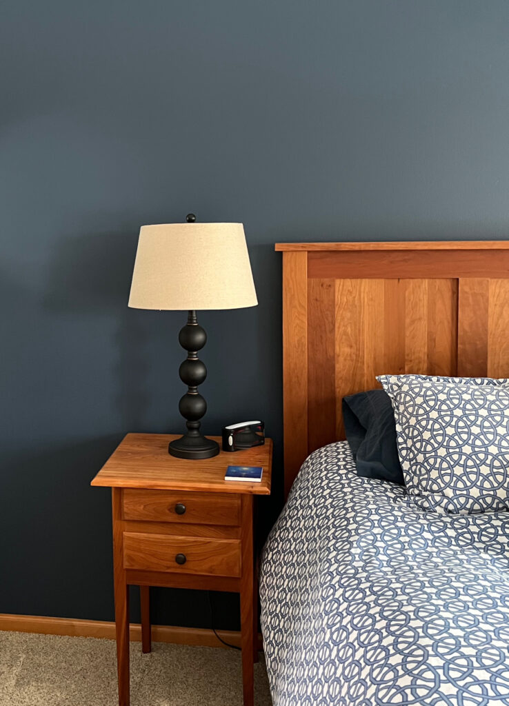
1. SHERWIN WILLIAMS COMFORT GRAY
Comfort Gray is an oh-so-lovely way to contrast your red or pink-stained wood without going over the top. While Comfort Gray is green with some blue, it has a heavy dose of gray that calms it down, offering a more muted contrast to your trims or cabinets (or floor/furniture).
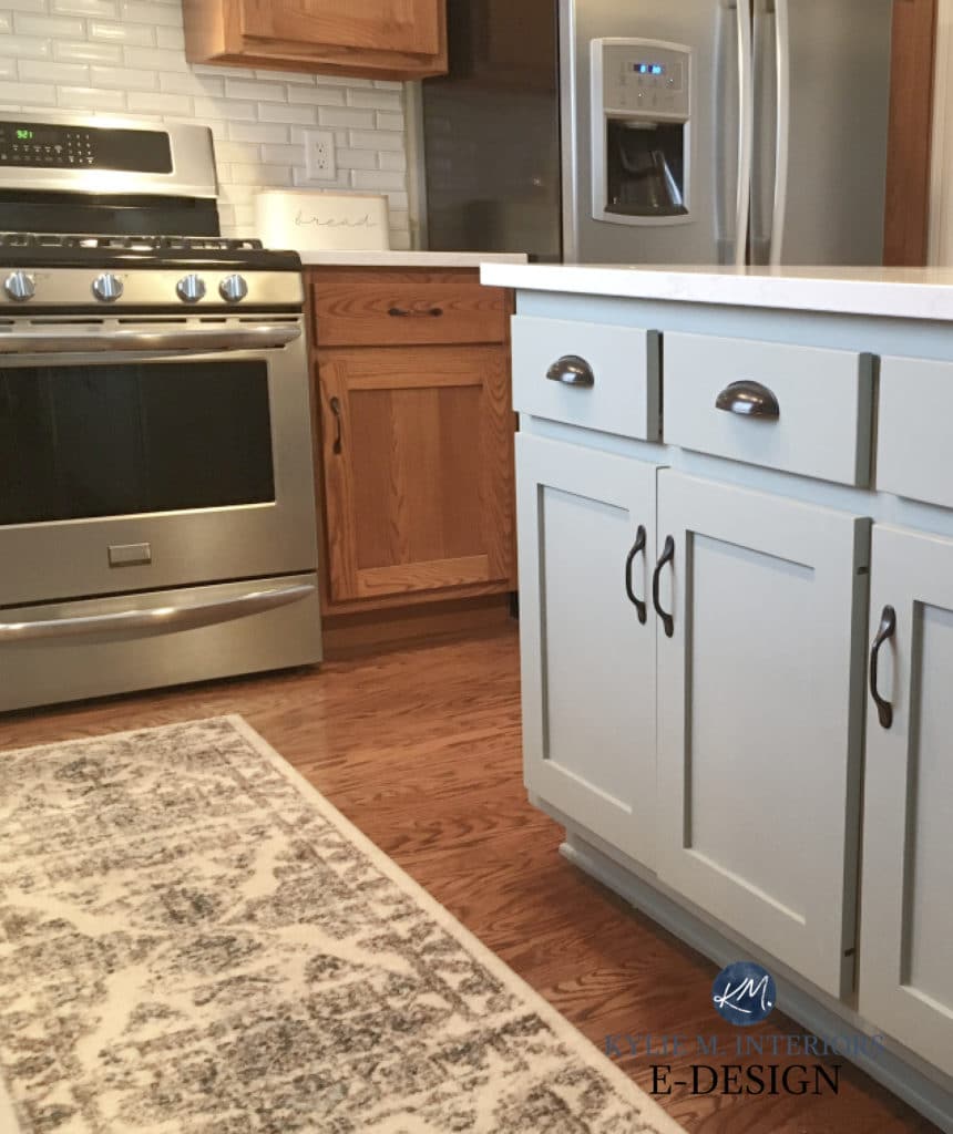
Paint Color Review of Sherwin Williams Comfort Gray
COLORS TO COMPARE WITH COMFORT GRAY
Lordy, where do I even start? There are so many shades in and around Comfort Gray—some a bit more green, blue, gray, etc. Comparing these similar shades will help you find the exact one that suits your interior finishes and red or pink-stained wood.
- Sherwin Williams Sea Salt is like a lighter version of Comfort Gray.
- If you want a bit more COLOR, look at Sherwin Williams Quietude, which has less gray than Comfort Gray.
- Benjamin Moore Gray Wisp is very similar to Comfort Gray and offers a wink more green, which might be just what your room needs!
While this isn’t red wood, here’s Quietude…

2. BENJAMIN MOORE PARIS RAIN 1501
If you’re down for accenting your red-stained wood without doing anything drastic, Paris Rain can be a gorgeous option. Would I partner it with many pink-stained woods? Probably not, as it could look dated.

If your wood is like this – in between golden oak and red, check out The Best Paint Colors to Update Golden Oak Trims, Cabinets, & Floors
Paris Rain is a naturally gorgeous shade of green. With a greige backdrop, it’s earth-toned and calming. With its LRV of 52.69, it adds a noticeable color to your walls without being remotely over or underwhelming (although that can be open to perception).
COLORS TO COMPARE WITH PARIS RAIN
Sampling and comparing similar shades is one of THE most important parts of your color journey!
- Benjamin Moore Vale Mist is a touch cooler and less greige than Paris Rain, with a slightly more noticeable green hue. This will accent your wood a bit more vs. less.
- Sherwin Williams Grassland is a touch darker and greener than Paris Rain – she’s a beauty!
- Find a few more gorgeous comparables here: The Best Light Green Paint Colors
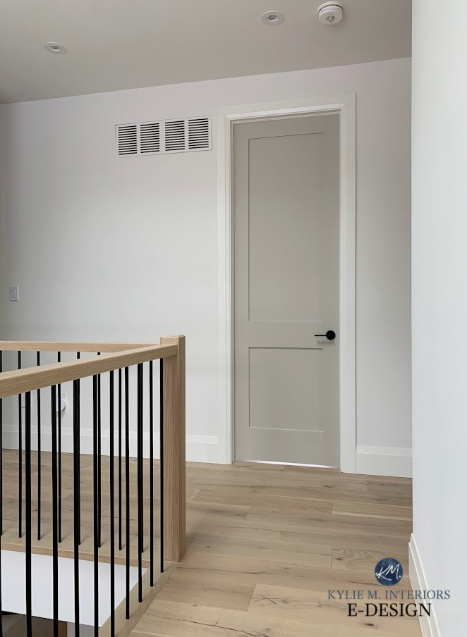
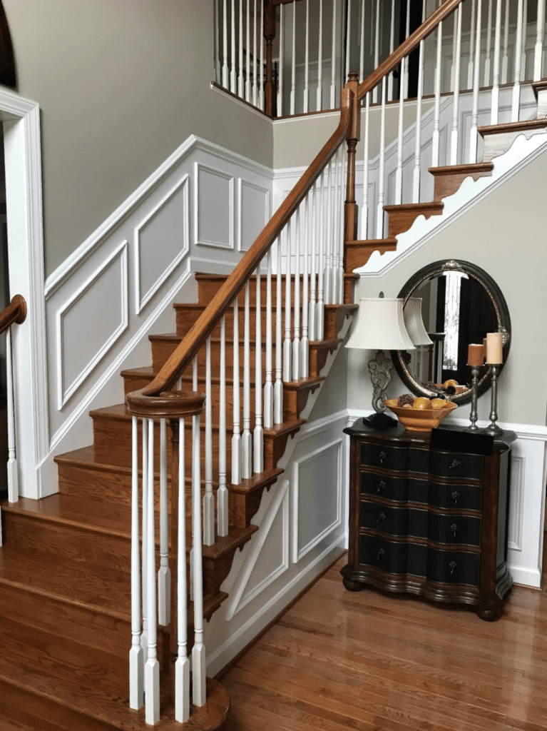
3. BENJAMIN MOORE REVERE PEWTER HC-172
While Revere Pewter doesn’t contrast as drastically with red-toned wood stains, it’s a great happy medium between passive and purposeful. Revere Pewter is a warm gray that winks at the greige world with its earthy, organic green undertone. This subtle green can play nicely with red woods without overreacting.
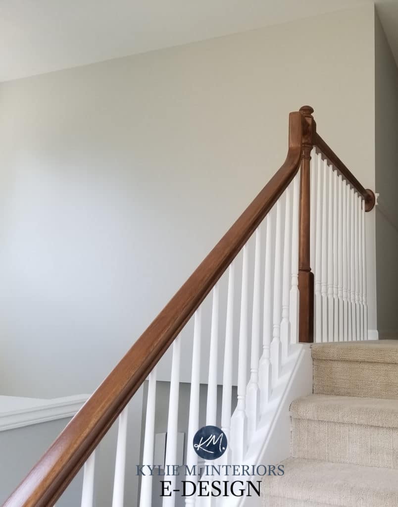
As shown in this staircase with red oak flooring, treads, and railing, Revere Pewter is at its best and most obvious. It doesn’t always pick up this degree of green, but when it does, it’s DARN PRETTY!
If you like this approach, you’ll also want to sample and compare Sherwim Williams Worldly Gray. It’s a bit lighter and more muted than Revere Pewter but has a similar purpose…

My FULL Paint Color Review of Sherwin Williams Worldly Gray
Notice the difference between the two. Does Worldly Gray offer ENOUGH interest on your walls? Do you have the natural light to support it? If so, rock on!
Here’s Revere Pewter in a home with dark wood trims and floors, looking soft, subtle, and organic…
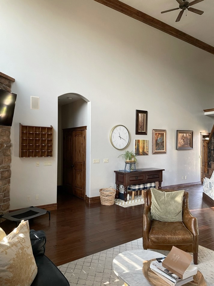
Just remember, neutrals like this ‘show up’ more when they have white trim to contrast with. If you have wood trim, make sure you like this more passive approach. Here are a few shots of Revere Pewter with white trim to show that difference…

If you like how Revere Pewter shows up with white trim more than wood, you might want to a) paint your trims or b) consider a warm gray or greige with more green, so it shows up a bit more against your wood.
My FULL Paint Color Review of Benjamin Moore Revere Pewter
COLORS TO COMPARE WITH REVERE PEWTER
- Sherwin Williams Worldly Gray, for sure
- Sherwin Williams Amazing Gray for a bit more depth and a touch more green
- Even better, check out my CURATED WARM GRAY COLOR BUNDLE!
Greens and green undertones complement the red-pink tones in oak, cherry, and maple woods. The question is – how MUCH green do you want?

4. SHERWIN WILLIAMS ANCIENT MARBLE 6162
For a bit more commitment to color without going balls-out, Ancient Marble is a great happy medium between colors like Revere Pewter and more committed shades of green.
Ancient Marble is a shade of green with a warm, greige backdrop. This gives it a more earth-toned, organic look than a ‘colorful’ one.

COLORS TO COMPARE WITH ANCIENT MARBLE
- If you love the degree of green in Ancient Marble but want more depth, check out Sherwin Williams Grassland.
- For a bit more gray and less green, Sherwin Williams Sedate Gray is wicked pretty.
- Benjamin Moore Spring Thaw is a bit more neutral – not as neutral as Sedate Gray.
- Want to see and compare more similar shades? There are some STUNNERS in my CURATED GREEN COLOR BUNDLE.
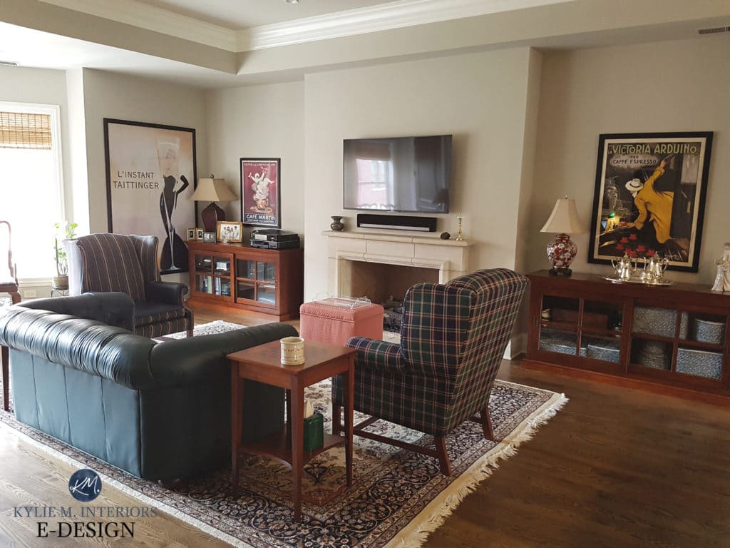
5. SHERWIN WILLIAMS SEA SALT 6204
Sea Salt is one of my favorite color chameleons. Sure, every color changes based on a room’s exposure, lighting, etc., but Sea Salt is well-known for changing its hue on a wall-to-wall basis!
Sometimes, Sea Salt reads green with some gray and blue in its backdrop. Other times, it’s a blue-green blend. However, in some rooms, it commits quite a bit to a blue hue, with the green falling into the background! Regardless, it looks beautiful in this living room with the dark, cherry red side table…

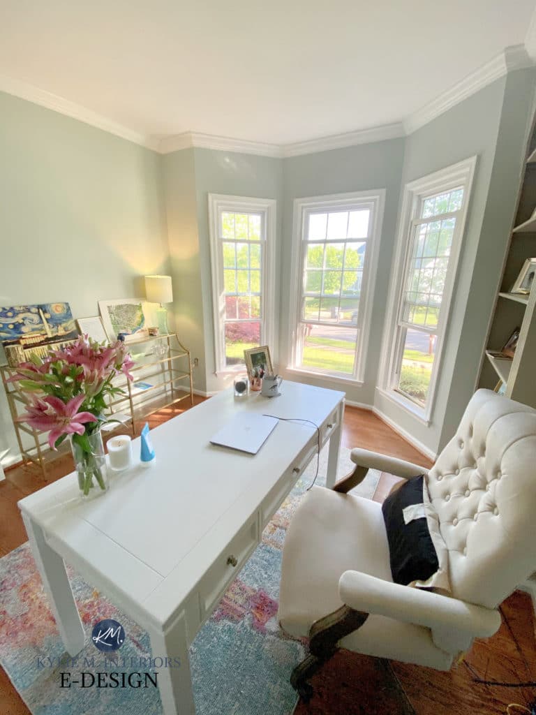
Here’s Sea Salt in a home office with red oak flooring, which shows a strong pink undertone. Notice how Sea Salt changes its tune every few feet…
SIMILAR COLORS TO COMPARE
- Definitely the previously mentioned Sherwin Williams Comfort Gray
- Benjamin Moore Quiet Moments is as soothing as it sounds.
- You can also compare the BEST blue-green-gray paint colors with my CURATED COLOR BUNDLE…

6. SHERWIN WILLIAMS JOGGING PATH 7638
I like Jogging Path. I’ve never used one as I don’t like running, but as a color, it’s fabulous. Jogging Path is for those who want more color on their walls than Revere Pewter offers but not as much green as Paris Rain and Ancient Marble.
This is because Jogging Path is a greige with a STRONG green undertone. With its LRV of 49, it won’t look as washed-out as some lighter colors without visually weighing a room down.
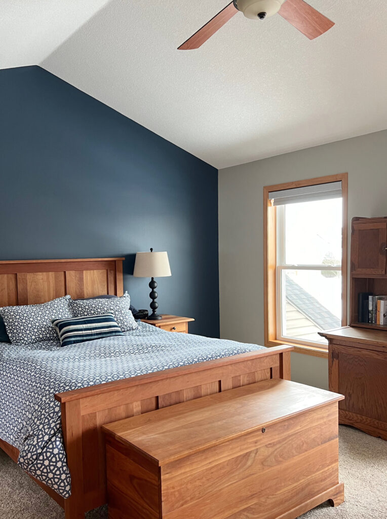
Here’s Jogging Path with wood trim and furniture (red undertone) and an accent wall (which you’ll learn about shortly)…
SIMILAR COLORS TO COMPARE
- Sherwin Williams Techno Gray for less muddiness.
- Benjamin Moore Senora Gray offers a bit more green and warmth.
- Sherwin Williams Gateway Gray is your gateway drug into a darker, slightly more saturated approach to greige.
My FULL Paint Color Review of Sherwin Williams Jogging Path
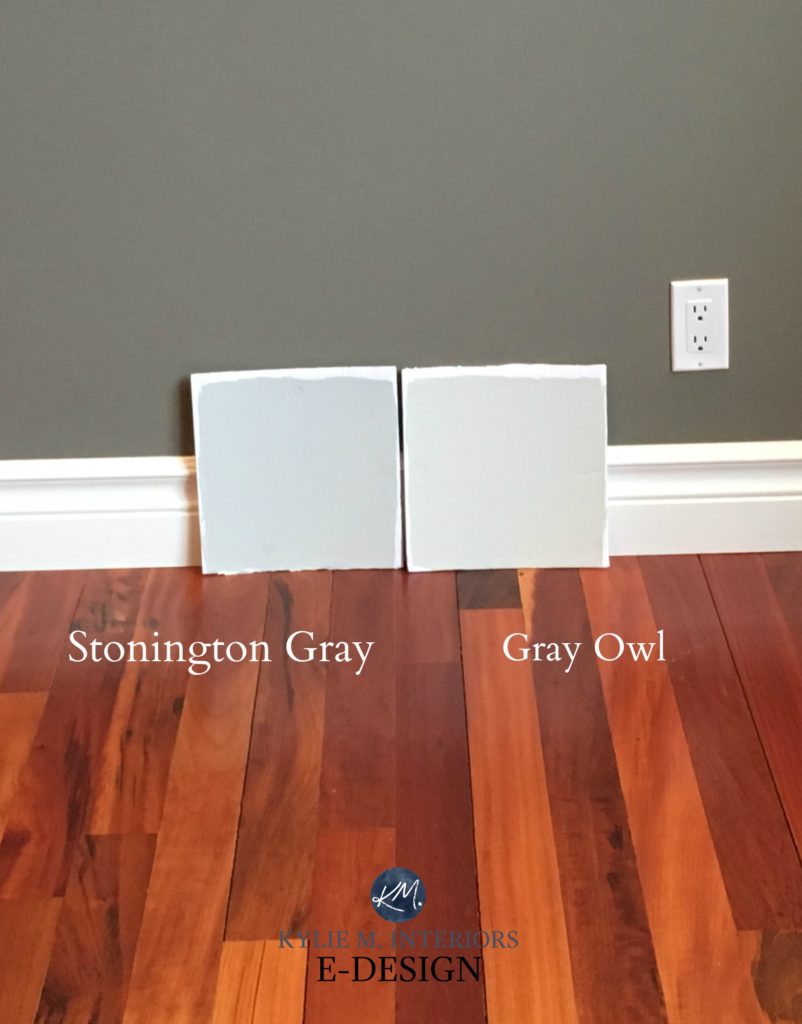
7. BENJAMIN MOORE GRAY OWL 2137-60
If you’re doing for passively contrasting your red or pink wood, Gray Owl is a great way to do it. Gray Owl is a light shade of stormy gray with a green-blue undertone. In my IDEAL world, this undertone will show up at the party (as shown below). Your room will also have adequate natural light; we don’t want it to fall flat.

Gray Owl has an LRV of 64.51, so it’s a lighter shade of gray. Again, with grays, I prefer them against white trim, so we can really see how they play. But if you have red-stained wood flooring or cabinets, it’s a great option (and you’re welcome to disagree; you might love Gray Owl with your wood trim!)
SIMILAR COLORS TO COMPARE
- Oooo, Benjamin Moore Stonington Gray is a gorgeous color with a bit more depth.
- Sherwin Williams Lattice has a beautiful blue-green hue tucked in its gray base.
My FULL Paint Color Review of Benjamin Moore Gray Owl
THE BEST ‘DARK’ PAINT COLORS WITH RED WOOD
If you’re feeling brave and want to expand your color palette, let’s dive in. The most popular colors are blue, green, and greige, starting with…
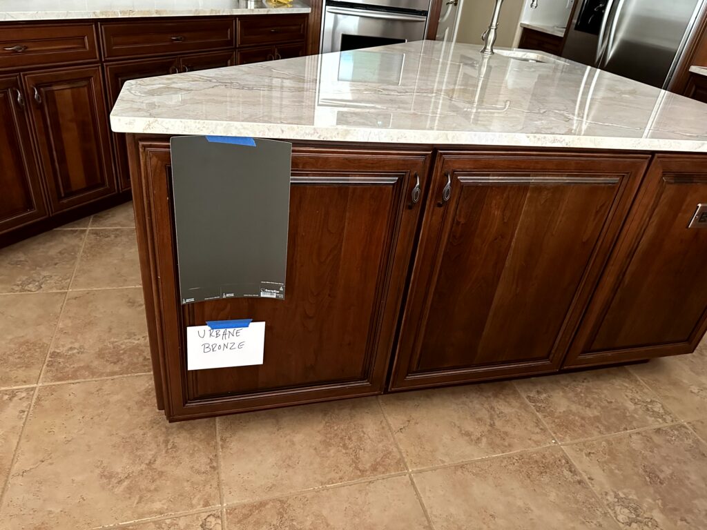
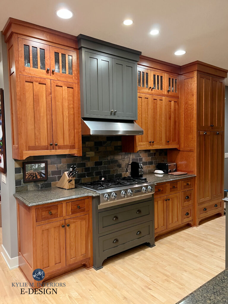
8. SHERWIN WILLIAMS URBANE BRONZE 7048
Urbane Bronze is near and dear to my heart. I have it on my kitchen island and stair railings—it’s amazeballs. And it looks even more beautiful against these red-orange cherry cabinets, offering a grounded, glorious contrast.
SIMILAR COLORS TO COMPARE
- You should definitely check out the lighter look of Sherwin Williams Porpoise.
- Benjamin Moore’s Dragon’s Breath is a great comparison.
- Hit a bit more green with Sherwin Williams Thunder Gray.
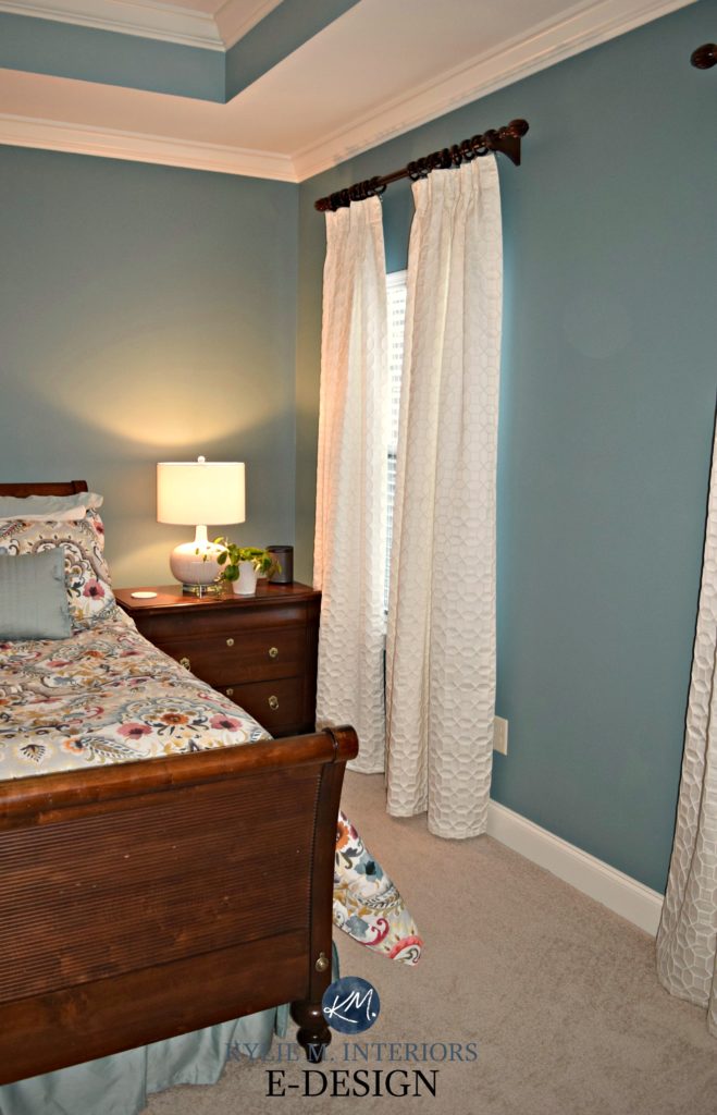
9. SHERWIN WILLIAMS MOODY BLUE 6221
Moody Blue is moodier than me at my time of the month (just joking; I’m NEVER moody; I’m a gem all the time). Seriously, though, this medium-depth shade of blue-green has a solid dose of gray that calms it down while still leaving you with plenty of color on your walls.
My FULL Paint Color Review of Sherwin Williams Moody Blue
SIMILAR COLORS TO COMPARE
- Sherwin Williams Underseas is pretty if you want to tip into a bit more green over blue.
- Sherwin Williams Peacock Plume has the same blue and green but less gray, meaning it’s more COLORFUL!
- Benjamin Moore Brewster Gray tips the scales, making the blue-green step back and bringing the gray forward (it’s so stinkin’ pretty).
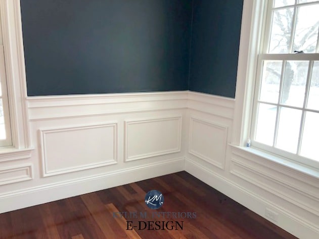
10. FARROW & BALL HAGUE BLUE NO.30
COME TO MOMMA—holy heck, do I ever love this color and this room. Hague Blue is a commitment to blue without hitting the primary end. While some black calms it down, it’s still ‘color-forward’ and has a touch of green, which stops it from looking royal blue or blue-purple.

Hague Blue runs along similar lines to the ever-popular Benjamin Moore Hale Navy. When comparing the two, you’ll see that Hague Blue has a wee nugget of green hiding it, compared to Hale Navy’s more traditional approach to navy.
Check out how Hague Blue plays off this console table’s gloriously rich red hue. (Seriously, could my clients be more talented? Look at that decorating!).

COLORS SIMILAR TO HAGUE BLUE
- Benjamin Moore Hale Navy, fo sho.
- Sherwin Williams Sea Serpent is a fantastic comparable
- Benjamin Moore Lead Gray, if you want a bit more gray and a touch more green
- Sherwin Williams Gale Force
11. SHERWIN WILLIAMS COCOON
My next Online Color Consulting client wanted to paint her strong cherry wood cabinets. Due to the surrounding finishes, a dark shade of green makes the most sense, and just look at how it dances with her red oak flooring!

Cocoon is a reasonably safe way to approach green. Sure, it’s darker, with its LRV of 15, but a) it’s not as dark as many darker shades of green, and b) it’s not as intense, thanks to a warm, greige backdrop that calms it down.
Green and red are natural BFFs.
SIMILAR GREENS TO COMPARE
Many shades surrounding Cocoon are worth sampling and comparing, including…
- Sherwin Williams Thunderous has a similar approach to green but less greige-based warmth.
- Benjamin Moore Mountain Moss is great if you want a BIT more color while still having a warm, neutral backdrop.
- If you want a slightly lighter approach, Sherwin Williams Hardware works – Muddled Basil takes you darker.
12. BENJAMIN MOORE HALE NAVY
ALLLLL HALE THE KING…of navy blue. Hale Navy has you covered if you’re looking for a well-balanced approach to navy blue. This gorgeous, saturated dark blue has the best of all worlds. It’s not so colorful that it’s in the primary range, but it’s not grayed out like some other popular blue-grays.
With its LRV of just over 8, Hale Navy is not messing around – she be dark and she be beautiful.
You might also check the lighter approach of the previously shown Benjamin Moore Newburyport Blue – same idea, but not as saturated…
13. SHERWIN WILLIAMS GRIZZLE GRAY
If you can’t decide between dark gray and green, Grizzle Gray has you covered with both. This is because Grizzle Gray is a green-gray – just like a good rose wine, it’s just enough of two different things without committing hard to either. It offers a purposeful but slightly more passive approach to accenting redwoods, as it’s not as strong as other popular dark greens.

My FULL Paint Color Review of Sherwin Williams Grizzle Gray
SIMILAR COLORS TO SAMPLE & COMPARE
When considering Grizzle Gray, you’ll want to compare shades that hit a bit more green and a bit more gray!
- Benjamin Moore Amherst Gray has a super passive green undertone.
- Sherwin Williams Night Owl is worth hooting and hollering over.
- Sherwin Williams Pewter Green offers more green than all three (mad, mad love).
14. SHERWIN WILLIAMS RIVERWAY 6222
I don’t always have the EXACT photo I need, as I only use those from my Online Color Consulting clients, readers, and friends. However, I have to introduce you to Riverway.
Riverway is a solid, medium-depth shade of teal (blue-green) with a decent gray backdrop calming it down. The wood in this record-lover’s room isn’t overly red, you get the idea…


The Best Off-White Paint Colors with Dark Wood Trim
SIMILAR COLORS TO COMPARE
Oh, where do I even START? There are so many badass and beautiful colors like Riverway. Hmmm…
- Sherwin Williams Still Water offers a similar approach with more depth.
- Benjamin Moore Caribbean Teal (shown below) is pretty awesome.
- Find more stunners in this blog post: The Best Dark Teal Paint Colors.
15. BENJAMIN MOORE BACKWOODS 469
While Vintage Vogue gets much of the attention (as it should), Backwoods sits politely in the background, just waiting to be sampled.
Backwoods is a dark shade of green that doesn’t mess around with its commitment to color. Sure, there are brighter greens, but also more muted ones. Backwoods is a great way to hit green when you want to be enveloped in a forest-inspired, nature-bathing shade, especially when you have red-toned woods.
SIMILAR COLORS TO COMPARE
- Benjamin Moore Vintage Vogue (of course).
- Sherwin Williams Rosemary is an awesome comparable
- Sherwin Williams Retreat is a bit more modest but equally stunning.
- ALL of which you can find in this blog post re: The Best Medium to Dark Green Paint Colors
Here’s Sherwin Williams Retreat in a moody den and a traditional dining room…

PHEW, we did it! I know my fingers are tired – how’s your face? That was a lot of reading!
READ MORE
Paint Colors That GO WITH Red-Toned Woods (Neutrals)
The Best ACCENT Colors for Pink (Red-Oak/Maple) or Pickled Wood Finishes
The Best Paint Colors to Update Dark Wood Trim
The Best Neutral Paint Colors With Light Pink-Red Wood Stains
The Best Paint Colors to Update Golden Oak Cabinets
NEED HELP?
Check out my Online Paint Color Consulting!