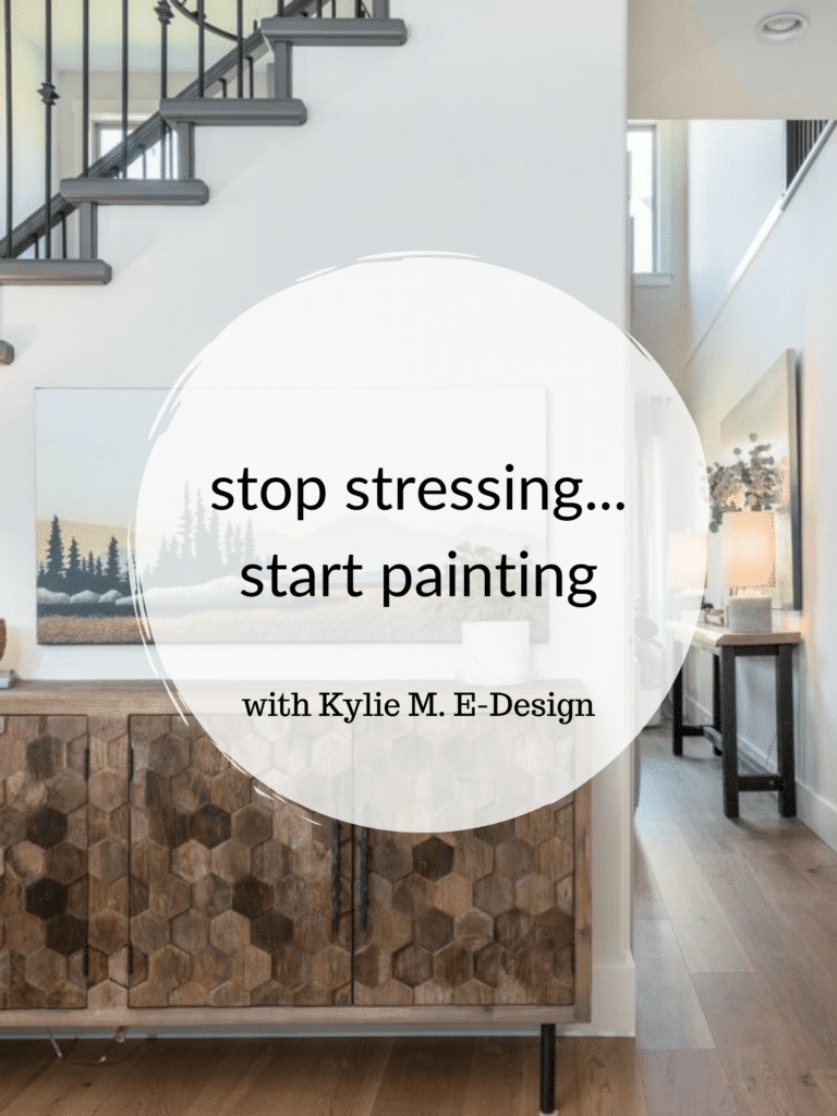
The 8 Best Off-White Neutral Paint Colors With Dark Wood
Dark wood trims, doors, cabinets, & floors
If you have medium to dark woods in your home and are searching for the perfect paint color, chances are, I’ve got it. Between this blog post and my one regarding the best non-whites to go with dark wood, you’ve got options.
But how do you know whether to go white, off-white or a color with a bit more personality? While your personal tastes matter, there are a few other things to consider…
- Your dark wood finishes and their undertones (yellow, orange, red, purple are the most common).
- Any surrounding finishes, including countertops, tiles, carpet, etc.
- The exposure of your room—not every room can handle the type of white you might like; it might need a softer approach.
And what’s the best way to figure all of this out? By sampling and comparing colors. And if that doesn’t work, well, you know where to find me (other than at Starbucks).
But aside from that, you have this blog post and one about WHITE PAINT COLORS WITH DARK WOOD and one about COLORS WITH DARK WOOD – this girl has got you covered, literally…in paint.
Also, every dark wood blog post has info at the start to help you learn about your woody challenges!
But first, you can’t just use me for colors and pretty pictures – you’ve got some LEARNIN’ to do.
If you like it, you’ll find more at the beginning of my other dark wood blog posts (linked at the end of this one).
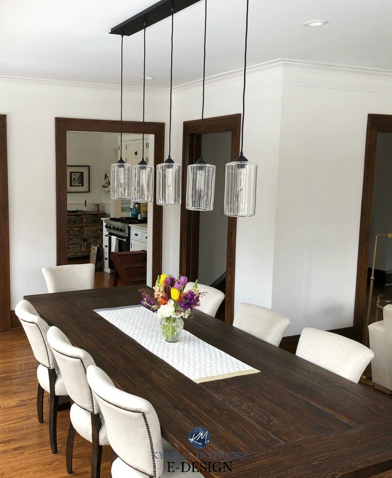
MEDIUM TO DARK WOOD TRIM
While dark wood trims in older homes can be impressive in thickness and quality, wood trims from the 70s and 80s are known for being narrow. So…
If you think the COLOR of your trim is the problem, think again…

- With its two-inch width, the SIZE of your trim is the 1970s, not the stain color. In other words, don’t curse the color; curse the size. Once you get three+ inches, things start looking better (that’s what she said).
- If you’re reading this blog post, I’m assuming that painting your trim is out of the question for financial, labor-intensive, and marital reasons (oh, those hubbies looove their wood…)
- While painting your dark wood trim from the ’70s would help modernize your home, remember that it’ll still be narrower than the modern style of white trim work. You’ll only get the full benefit when the trim is wide (in which case, you might be less inclined to paint it as it’s so darn pretty!)
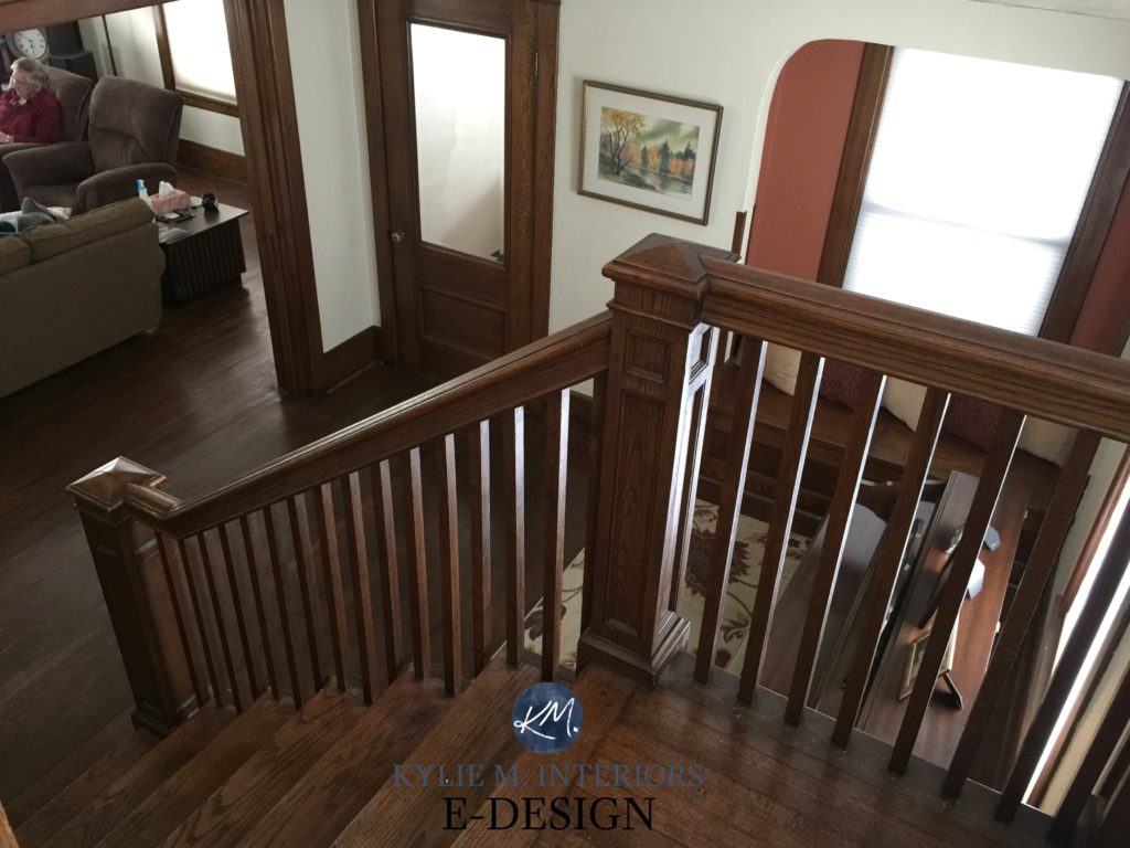
The above two photos are great examples of wider trim than the ’70s and ’80s versions.
So, while there isn’t much we can do about the size of your wood (wink wink), there’s a lot we can do with what’s around it (I’d say we could enhance your wood, but that might be crossing a line…which I do LOVE to do.)
MEDIUM TO DARK STAINED WOOD DOORS
Wood doors are either wrapped with wood trim in the same stain or white trim. Either way, if you don’t plan on painting them, I have colors for you to explore. Just consider that when white trim separates your wood door from the walls, you can often explore a bit more color, although you don’t HAVE to. Still, in my experience, my Online Color Consulting clients are usually a bit more flexible when they have white trim surrounding their stained wood doors.
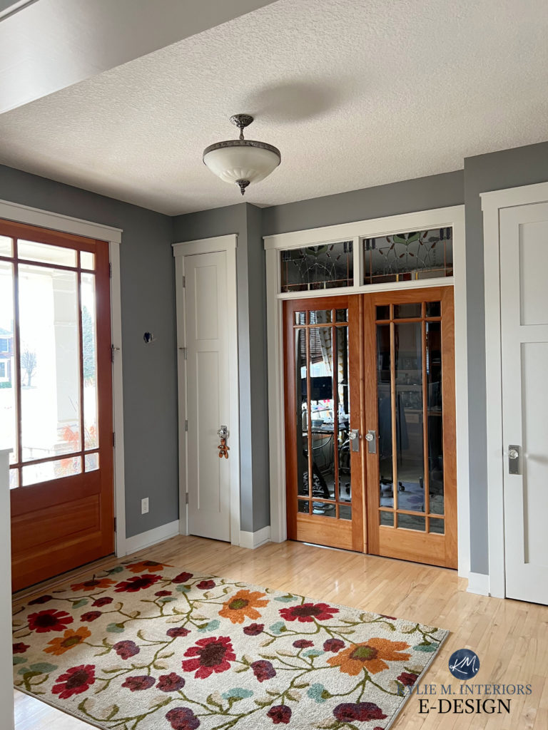
On the other hand, with wood trims and doors, the inclination is often to downplay and mute things a bit. In the end, it’s up to you how you approach it, but if you want more colorful options, finish this blog post, then go to my SEARCH and type in the types of colors you love (like green, blue, taupe) and see which blog posts pop up!
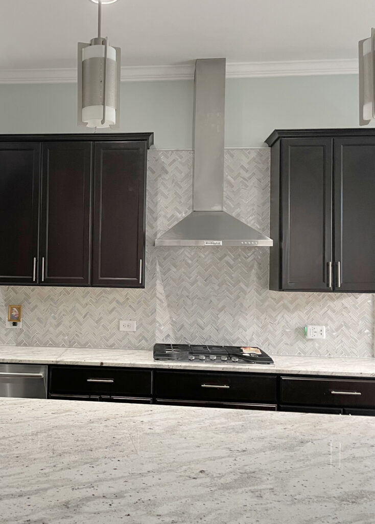
DARK WOOD CABINETS
In my Online Paint Color Consulting work, when my clients have medium—or dark-toned wood cabinets, they often want to lighten and brighten their kitchens, and I’ve got some great options for doing that!
Remember that while you’re focusing on your cabinets right now, your backsplash is the real shot caller in the kitchen.
Why?
Because it’s on the same vertical sight line as your cabinets, your backsplash ‘usually’ matters the most. I mean, sure, your walls are vertical, too, but your paint color is more changeable than your backsplash. So, when choosing your wall color, nod towards your cabinets, but pay closer attention to how these colors coordinate with your more permanent hard finishes.
Here’s the ‘usual’ hierarchy (there are exceptions based on the kitchen’s layout/amount of each product/etc.)…
- BACKSPLASH
- COUNTERTOP
- FLOORING & CABINETS OFTEN CARRY EQUAL WEIGHT
And yes, if you don’t have a backsplash, the next one in line is the countertop.
Now, if you’re inclined towards a bit more color on your walls, that can be gorgeous, too. While you won’t find overly colorful shades below, I have over 500 blog posts full of the best blue greens, violets, and more (type your fave color into the SEARCH and see what you get!)
MEDIUM TO DARK WOOD FLOORING
If you have a darker wood floor, you might be looking to lighten and brighten your space. Remember that while your wood floor and undertones matter, vertical finishes can play a bigger part in your color palette.
When choosing your paint color, consider your stone or brick fireplace, other permanent hard finishes, and soft furnishings – along with your wood.

Before we look at more colors…
TIPS & TRICKS: PAINT COLORS WITH DARK WOOD TRIM, CABINETS, & FLOORS
- The lighter the paint color, the more high-contrast your palette will be. As your color darkens, the contrast lowers. High-contrast combos can make a space look smaller, especially if you have a lot of doorways and windows. However, sometimes, we must find that happy medium between that and brightening our homes when dealing with dark wood finishes!
- When sampling paint colors, include white paper alongside your samples. Without something white to compare a paint color to, it can be hard to get a read on its depth and undertones on a small scale. I ALWAYS recommend using Samplize peel-and-stick paint color samples, as they’re more affordable and effective than paint sample pots.
- I’m a HUGE fan of dark colors, even with dark woods! If you paint your room a darker color and have dark wood, you’ll need adequate lighting to bring things to life. Lighten and brighten your space via accents and decor so there’s contrast, reflective value, and visual interest. If you ignore these topics, things may fall flat and heavy.
These colors won’t suit EVERY dark wood finish, but they’re the PERFECT place to start your color journey!

1. BENJAMIN MOORE BALLET WHITE OC-9
Ballet White is a soft, warm, subtle way to complement your dark wood trim, cabinets, and more mid-toned woods. While Ballet White has a cream base, it nods lightly at tan and greige, meaning the traditional yellow hue in most creams is greatly reduced.
Ballet White suits a variety of wood stains and colors but isn’t as great for wood stains with a LOT of red or violet in them.
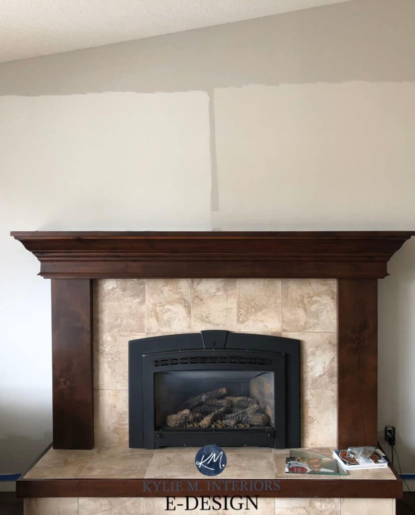
Here’s Ballet White again (below) in a relatively low-light living room with a beautiful brick fireplace…
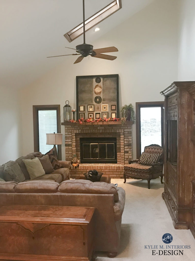
The trim in this room is a bit more ‘standard brown’ compared to the slightly stronger red-orange hues in the above kitchen, and you can see how soft and subtle Ballet White sits with it.
By the way, I rely 99.9% on photos from my E-Design clients, friends, and readers, so you’re seeing REAL homes with REALISTIC budgets.
While this next wood is a more medium-toned red oak, you can see how beautiful Ballet White is (the color closer to the drapes is Sherwin Williams Worldly Gray)…

SIMILAR SHADES OF HYBRID CREAM TO EXPLORE
One of the most important parts of choosing the best paint colors is comparing them to similar colors.
- Benjamin Moore Navajo White, which has a bit more creamy warmth to it – seeing a creamier color could help you land in the right spot.
- Sherwin Williams Shoji White, which is very similar to Ballet White but a bit lighter and less warm.
- Benjamin Moore White Sand has a similar look with a bit more body. Just be cautious of it with woods with a STRONG red hue.
FULL Paint Color Review of Benjamin Moore Ballet White
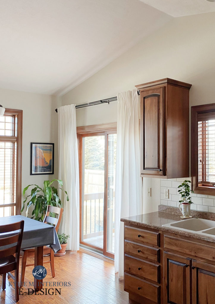
2. SHERWIN WILLIAMS WHITE DUCK
If it walks like a duck and talks like a duck…it’s not necessarily a duck. It could be me, as I used to be a dancer and walk weirdly. Or it could be White Duck, a gorgeous paint color that I go quackers for when it comes to dark wood trim, cabinets, and flooring.
Sure, the wood floor in this next home isn’t THAT dark, but it ain’t that light either and you can see how stunning White Duck looks with it…

The Best Paint Colors to Update Golden Oak
White Duck is an off-white neutral that’s similar to Ballet White, but when you compare them, notice how White Duck is a bit lighter and also a touch more muted/less warm.

SIMILAR OFF-WHITES COLORS TO COMPARE
Well, the list is pretty darn similar to that of Ballet White – I’d pick up what that’s throwin’ down, as well as a few others on this page.
My FULL Paint Color Review of Sherwin Williams White Duck
3. SHERWIN WILLIAMS CREAMY 7012
With a muted, creamy backdrop, Creamy is a great way to approach yellow without tipping the scales too far. This is because a neutral base tones down Creamy. It’s not as neutral as White Duck and Ballet White, but it has far less yellow than the average shade of cream.

My FULL Paint Color Review of Sherwin Williams Creamy
While the wall color is a touch too taupe for these Creamy cabinets, notice how nice Creamy looks against the dark wood floor (I’m just waiting for the AFTER photos!)…

My FULL Paint Color Review of Sherwin Williams Creamy
COLORS SIMILAR TO CREAMY
Sample and compare to make sure you land on the perfect color for you and your home!
- Benjamin Moore White Down
- Benjamin Moore Ballet White
- Sherwin Williams Casa Blanca
- Sherwin Williams Pearly White
4. SHERWIN WILLIAMS AESTHETIC WHITE
With trends leaning warmer and warmer, Aesthetic White is bound to be a popular shade. While old-school beiges are more golden and rich, Aesthetic White has a gray backdrop that calms it down. This atypical approach to beige is a great way to add passive warmth to your room without hitting the Tuscan end of things.
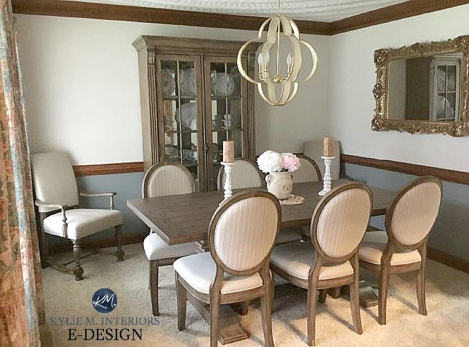
While a more modern approach is to paint the upper and lower walls the same color when you have a chair rail, the style of this room and the tone of the wood suit this two-color palette MUCH more than one single color would.
The cabinets in this next kitchen are painted Aesthetic White – look how they contrast with the wood framed counter stools (mad love)…

SIMILAR COLORS TO EXPLORE
When looking at a color like Aesthetic White, it’s about comparing it to slightly more beige options, as well as those with a bit more depth. COMPARISON is one of the most important steps in your color journey!
- Sherwin Williams Accessible Beige offers a bit more depth and a lower contrast with dark wood trim.
- Sherwin Williams Moderate White is a ‘bit’ more traditional in its approach to beige as it’s warmer without being over the top (at all).
- I’d hit Sherwin Williams Divine White at the same time, along with Benjamin Moore Maritime Whtie (which is coming up shortly).
My FULL Paint Color Review of Sherwin Williams Aesthetic White
Thank you, clients, readers, and friends, for sending your photos; you make my colorful little world go round!
5. BENJAMIN MOORE WHITE DOVE OC-17
How could we possibly talk about almost any wood stain without touching on White Dove? Admittedly, this color is also in the blog post about the best whites for dark wood, but I had to drop it here, too. This beautiful soft, warm white shade can be gorgeous with dark wood trim, offering a high-contrast look without the starkness of a brighter or more genuine shade of white. I mean, just LOOK at it…

Notice the creamy warmth of White Dove. If your wood is overly red or pink, you might find White Dove a touch creamy; however, you don’t have many options for whites with legit red or pink-stained woods.
Now, depending on your home’s finishes and natural light, you might not get the exact look shown above. Notice how it looks brighter on the far right near the floor (intense natural light) but softens up nicely and is creamy to the right of the fireplace—paint colors are crazy, eh?
My FULL Paint Color Review of Benjamin Moore White Dove
6. BENJAMIN MOORE PALE OAK OC-20
While this doesn’t work with every dark wood (none do), Pale Oak is particularly stunning with medium to dark woods with a reasonable amount of red (red-purple). Pale Oak is a beautifully soft shade of taupe. While it’s not quite off-white, it’s close, and its feather-light look can be a great partner to darker woods.
Pale Oak is the sample on the left.
Compared to warm grays with purple undertones, Pale Oak is warmer and more gentle. It sure as heck acts like an off-white compared to dark trim, as it’s with white trim that you better see its depth and level of contrast.
My FULL Paint Color Review of Benjamin Moore Pale Oak
7. BENJAMIN MOORE MARITIME WHITE 963
Maritime White is an off-white beige with gentle, pretty undertones. It’s perfect for those who love warmth but a) don’t like overt cream or yellow and b) don’t want too much color on their walls.

Maritime White has an LRV of 71.6, so it borders the light and off-white worlds. You’d see its depth more with white trim, whereas against darker wood trim, it looks softer.

My FULL Paint Color Review of Benjamin Moore Maritime White
Here is it with white trim (just for comparison)…

Sure, it can pick up a creamyish VIBE, but compare it to a more legit shade of cream, and you’ll see how amazeballs it is.
SIMILAR COLORS TO COMPARE
Oooo, I’ve got some good ones!
- Of course, Sherwin Williams Aesthetic White
- Sherwin Williams Moderate White
- Sherwin Williams Divine White
- Benjamin Moore Muslin
Ideas to Update Your Dark Wood Cabinets: 4 Palettes
8. SHERWIN WILLIAMS EGRET WHITE 7570
I’m obsessed with this color. Wedged between gray and taupe, Egret White is a great way to get passive warmth without strong taupe undertones (for those who are undertone-averse).
Just remember, some wood stains LOVE a color with a purposeful undertone!
These wood cabinets are more medium-toned than dark; the same goes for the maple floor, but they give you the right idea of how Egret White can interact with some red hues…

Ideas to Update Your 1990s Home
SIMILAR COLORS TO COMPARE
If you’re down for some taupe, let’s check out out some comparisons…
- Benjamin Moore Classic Gray
- Sherwin Williams City Loft
- Sherwin Williams Popular Gray (a bit darker)
DON’T FORGET; I’VE GOT MORE ON DARK WOOD…
The 4 Best Shades of White That Go With DARK WOOD
The 20 Best Paint Colors to Go With Oak and Wood
REAL Wood Kitchen Cabinets: Update Ideas
How to Mix and Match Wood Stains Like a Pro
The Best LIGHT Greige & Taupe Paint Colors
Update Oak or Wood Cabinets WITHOUT a Drop of Paint!
NEED HELP?
Check out my affordable Online Color Consulting Services!