
The Best Anti-Trend Paint Color Ideas
Tired of Design trends telling you what you ‘should & shouldn’t do’?
In the world of interior design, ‘trends’ is a hot word. However, what’s trendy doesn’t always appeal to the average home dweller. Or, more importantly, what’s trendy doesn’t suit every single home and its finishes.
Sure, trends might capture a percentage of homes/tastes, even a reasonably high one. However, that’s irrelevant if you aren’t selling your home and don’t love those colors.
This post may contain affiliate links. If you make a purchase through links on our site, we may earn a commission.You gotta love the home you live in.

When finding your room’s paint colors, you usually choose (often unknowingly) from three options…
- Paint colors that are in style and suit your room perfectly (and you actually like them!). If you don’t like them, you might still be okay living with them, as they technically look good.
- Paint colors that aren’t trendy, but they suit your home and you love them, and that makes you happy enough.
- Or…you might choose paint colors that are/aren’t trendy, and you love them, even if they don’t suit your home (#potentialfugliness). But hey, if you’re happy, life’s good (there is value in that!)

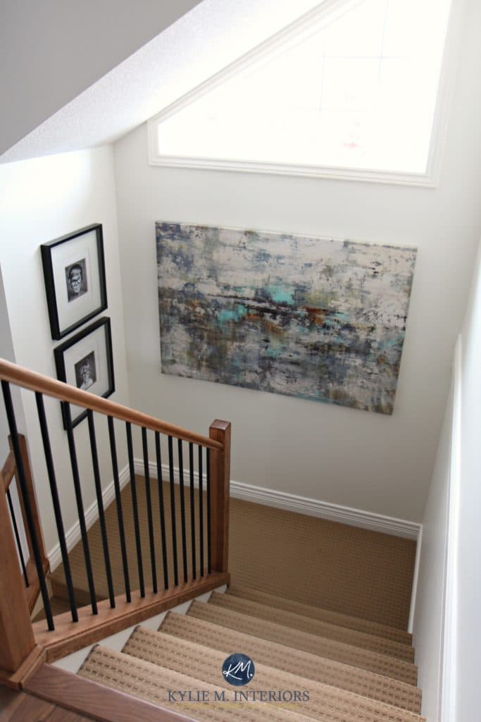
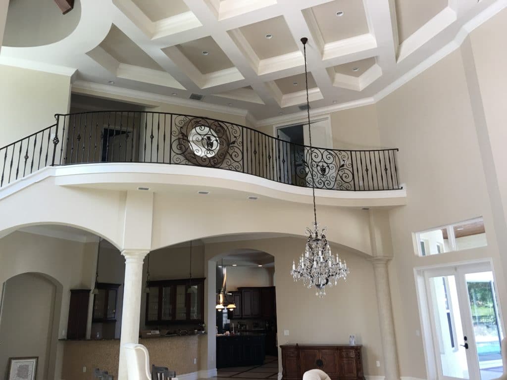
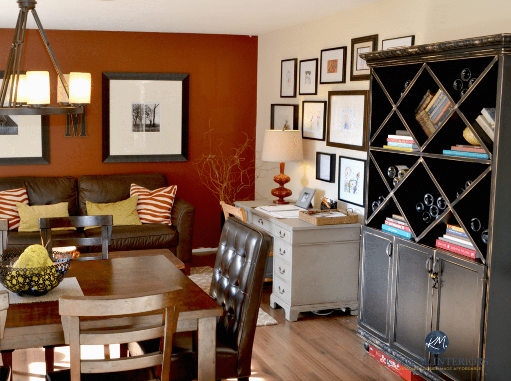
This space is a great example of #2
I’m all for Options 1 and 2. However, Option 3 is a stretch for this color-infused brain of mine. Being one of North America’s top experts in what’s both timeless and trendy for paint colors and home updates (yes, I’m cute AND humble), I get twitchy when things clash.
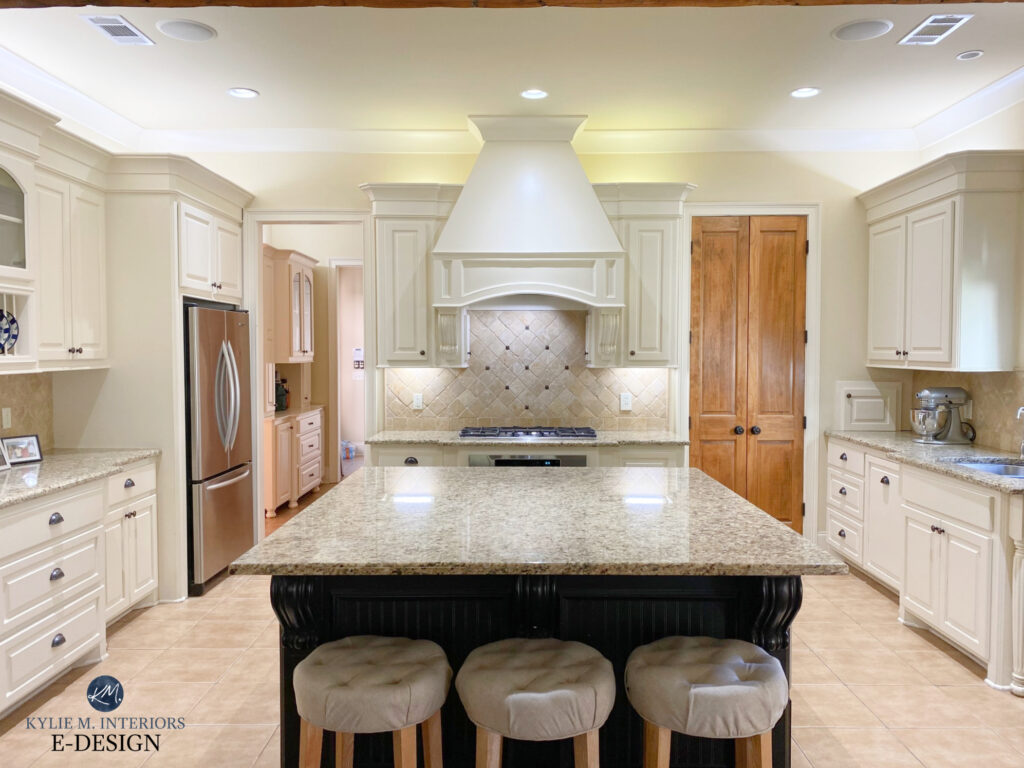
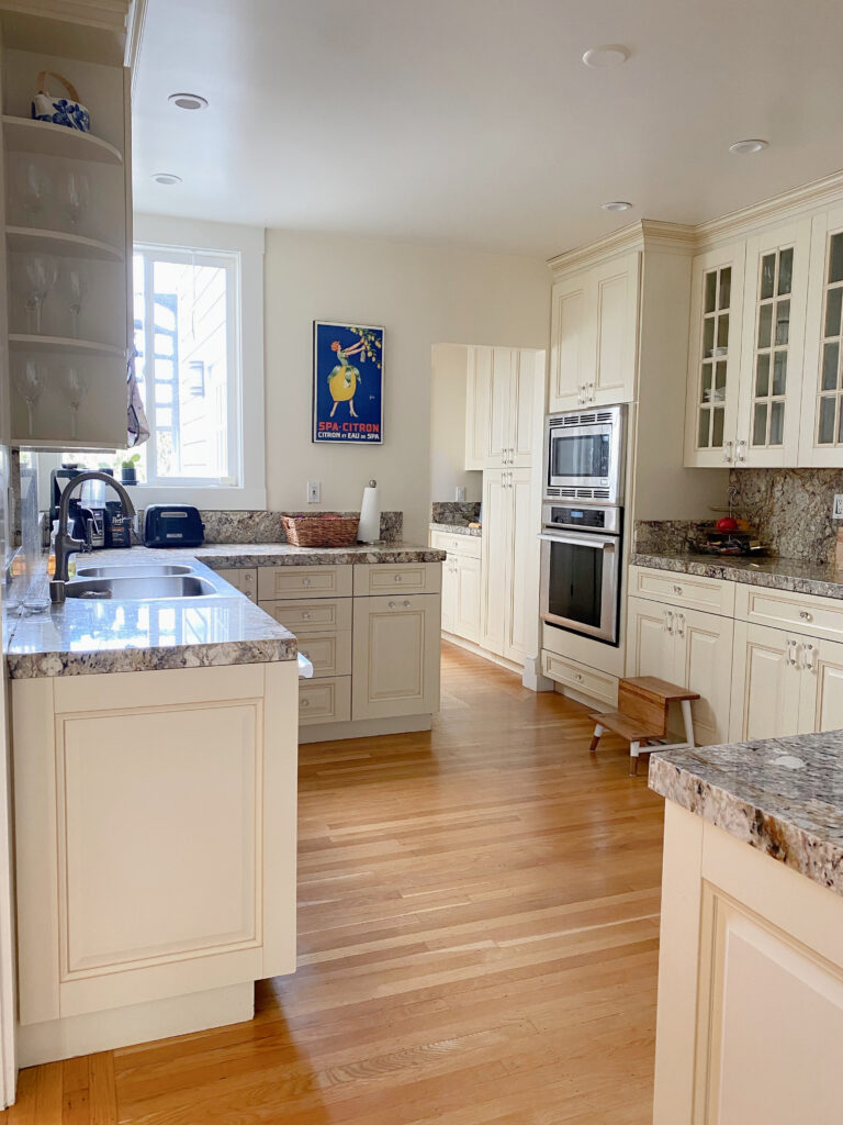
Don’t even get me STARTED on what isn’t working in this creamy kitchen (#kylieishyperventilatingandtwitchinginthecorner also #WHERE’SMYWINE)
If you’re into Option 3, well, giddy up, Sparkle Farts, you can choose any color you want! You’re okay with people walking in your home and possibly thinking ‘wow, that’s an interesting color choice…‘ You don’t care what people think or whether it technically ‘looks good’.

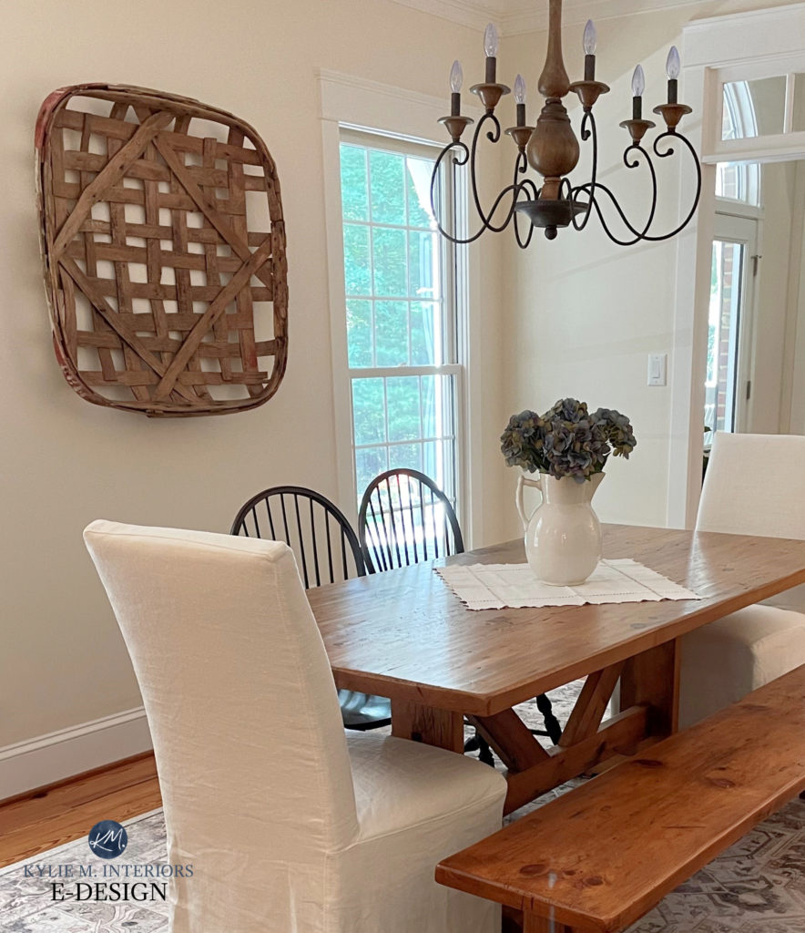
This is definitely an example of #3
You do you, boo.
This blog post is for those who fall under Option 2 (although it might satisfy Option 1 lovers, too). This means…
- These colors are generally easy to live with
- They often appeal to a wide range of people
- Most aren’t pumped full of personality, but there’s a time and place for that, anyway.
- They’re reasonably TIMELESS, because they aren’t following the trend cycles (knowing that nothing is fool-proof).
Funny enough, this blog post is similar to my blog post re: Benjamin Moore’s Most Timeless Paint Colors – there are some repeats, along with some new ones in each blog post.
WHAT’S THE DIFFERENCE BETWEEN TIMELESS & ANTI-TREND PAINT COLORS?
Not much, Buttercup, it’s a ‘same shit shart, different pile‘ situation (with a few minor tweaks).
Between the previously mentioned blog post and this one, you’ll find different colors (and a few repeats) to play with; all having similar intentions.

So, are you ready to get your paintin’ pants on? This said, I highly recommend painting in the nude – it’s very freeing.
MOVING ALONG!
One final note. Just because a color isn’t currently in style or trendy, doesn’t mean that at SOME POINT, it won’t hit the trend cycle…these things come and go.
1. BENJAMIN MOORE NAVAJO WHITE OC-95
When it comes to non-trendy, reasonably timeless colors, Navajo White is the winner winner chicken dinner.
While the Modern Farmhouse trend has come and gone (unless you actually HAVE a farmhouse), Benjamin Moore Navajo White is in it for the long haul.
While some cream paint colors can be obnoxious in their commitment to yellow, Navajo White is gentle and muted. With a yellow-orange base and no green, it suits a range of interior finishes (but not all, especially not ‘beige-inclined’ ones).

Benjamin Moore Navajo White: IMAGES, Info, & More!
2. SHERWIN WILLIAMS CREAMY 7012
For soft and simple, Creamy is gorgeous. One thing I love about Creamy is that you can use it two ways, creating slightly different looks with each…
CREAMY WALLS & TRIMS
If you paint your walls and trims Creamy, you get a seamless, simple look. A lot of people love this approach, as not only is it soft, but it also reduces how much cream you see.
Why?
Well, Creamy can look more passive when it’s directly compared to a whiter trim color.
CREAMY WALLS & WHITE TRIM
If you want to slightly enhance the warmth of Creamy and like a touch of contrast, you can paint your trims white.
Naturally, the contrast will be super low.
Why?

Because Creamy has an LRV of 81, it borders on the white range. White’s run approx 82-94. So you can only ever get 13 LRV points between your walls and trims (which I wouldn’t do; there are better, warmer whites than those bright ones).
In this next image, notice how subtle the contrast is between the walls (Creamy) and the trim (Benjamin Moore Cloud White) around the window.
Now, look at the contrast where the wall meets the baseboard, and the natural light isn’t washing the colors out…
Sherwin Williams Creamy: IMAGES, Info, & More
3. BENJAMIN MOORE REVERE PEWTER HC-172
If you get bent out of shape with the thought of a gray paint color being on this list, calm your tatas and keep reading.

Yes, gray is no longer a trend (which isn’t what this blog post is about anyway). However, the right gray, in the right space, works effortlessly – trendy or not.
You know a gray is good when it works even when it’s DRASTICALLY not in style or trendy.
In fact, Revere Pewter is THE most timeless gray paint color of all time, sitting near the top of Benjamin Moore’s top 5 for 15 years. So, if we’re talking about ‘anti-trend’ paint colors, Revere Pewter’s still riding that wave like a fat whale (in case you’re wondering, fat whales float really well).

Revere Pewter is an organic, earthy-toned warm gray-greige with a muddy green undertone. While this undertone doesn’t suit every finish, it manages to squeeze into the most interesting places – everywhere from walls and cabinets, to doors and exteriors.
Benjamin Moore Revere Pewter: FULL Paint Color Review
If you’re a fan of more COLORFUL paint colors, unclench those bumcheeks, we’ll get to you soon.
4. SHERWIN WILLIAMS WHITE DUCK 7010
While Shoji White is ragingly popular right now, there’s a reason I chose the achingly similar White Duck, and that reason is undertones. But first, let’s look at Shoji White – why not?
Shoji White is gorgeous, and you can definitely check it out; however, of the two colors, Shoji White is slightly more likely to pick up a pink undertone.
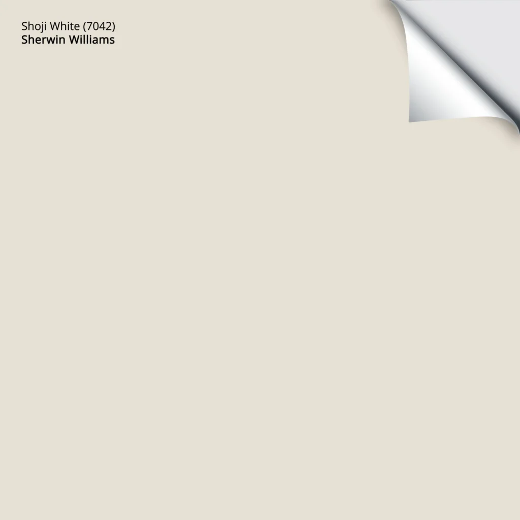
While you might love it, some people get weird about pink undertones – even when they’re this subtle.
Sherwin Williams Shoji White: FULL Paint Color Review
As for White Duck’s undertones…
While White Duck can wink at green, rather than pink, it’s more of an eye twitch than a full-fledged flirty wink.

White Duck is an off-white, warm, neutral paint color. With its LRV of 74, it’s easy to please and settles in nicely in many rooms and styles.
The Best Paint Colors to Update Darker Wood Finishes
Sherwin Williams White Duck: FULL Paint Color Review
99.9% of the photos in my blog are from my Online Color Consulting clients, readers, talented photographers, & friends— because real homes deserve to be celebrated (dirty laundry & all!) While not magazine-perfect, they’re packed with ideas & proven color choices to help you create a home you’ll love. REAL HOMES, REAL BUDGETS, REAL PEOPLE.
5. SHERWIN WILLIAMS LIGHT FRENCH GRAY 0055
Again, as far as gray goes – she gawn. However, some gray paint colors sit outside of the trend-cycle because they have some classic elements. This doesn’t mean they suit every space or style, but they’re better than many others.

The white paper helps you see the depth/approach of these Light French Gray cabinets
Light French Gray is one of those classic grays. In a room/home with adequate (or more) natural light and the right finishes, Light French Gray has a timeless quality that sets it apart.
With an LRV of 53 and MINIMAL committed undertones, this gray doesn’t scare me (whereas some others have me tinklin’ on my toenails – not that it takes much, I have a weak bladder #TMI).
Let’s make an example of this next room…
It’s gorgeous, don’t get me wrong, but if we’re talking about ‘anti-trends’, there are several dealbreakers…
- Shiplap (if it went from floor to ceiling, it would have more of a lifetime)
- Gray painted vanity
- Gray LVP or laminate flooring (learn more about those here)
- Reasonably bright white walls
- Black light fixture with exposed bulbs
- Black faucet and hardware
Again, pretty, but not timeless or anti-trend…at all. But notice the one thing I didn’t mention – the paint color. While nothing else is timeless/anti-trend, Light French Gray can be (as well as the toilet, but that’s a whole different topic).
Sherwin Williams Light French Gray: IMAGES, Info, & More
By the way, did you know you can HIRE ME to pick your paint colors?

6. BENJAMIN MOORE MUSLIN OC-12
Muslin is the OG of the beige world. Some have PTSD from the heavy, golden beiges of the early 2000s (which are back, btw), but don’t worry – this isn’t that type of beige.

The Best Paint Colors to Update Red-Stained, Cherry Wood Finishes
Muslin is a muted, flexible beige. It centers on an orange undertone, but doesn’t commit wildly to orange-yellow or orange-pink. As for depth, its LRV of 66.54 parks it smack dab in the ample bosom of the light range.
It’s also not gratuitously golden, offering your room a passive, but purposeful approach to warmth.

Benjamin Moore Muslin’s FULL Paint Color Review
7. BENJAMIN MOORE CLOUD WHITE OC-130
Cloud White is one of the best, warm white paint colors from Benjamin Moore and Sherwin Williams.

While many opt for a more muted warmth, like Benjamin Moore White Dove (also amazeballs), Cloud White offers a bit more of a creamy, traditional warmth.
Cloud White’s LRV is 85.05, so it’s not a bright white, but it’s a bit brighter than a few of its closest friends.
Benjamin Moore Cloud White: IMAGES, Info, & More
7. SHERWIN WILLIAMS NATURAL TAN 7567
If beiges aren’t your home’s best color, you might explore tan.
Waaaait one hot holy minute, there’s a difference between beige and tan?
- Beige sits its ample booty on an orange base. This can be orange-yellow or orange-pink (with green showing up here and there).
- Tan sits on a yellow base. This can be yellow-green or yellow-orange, but yellow drives the bus; erratically sometimes.

And while Natural Tan is a tan, it doesn’t dip far into that world, making it a bit more flexible for the average home, thanks to a considerably grayed-out backdrop.
Sherwin Williams Natural Tan: IMAGES, Info, & More
As for depth, its usable LRV of 65 is lighter and softer than its direct competition, Sherwin Williams Accessible Beige.

8. BENJAMIN MOORE MANCHESTER TAN HC-81
This bad boy has been kickin’ it for years. Whereas Muslin holds down the beige fort (as far as BM goes), Manchester Tan mans the tan one (also known as Berber White).

Manchester Tan is a tan paint color, but like Sherwin Williams Natural Tan, it’s not OVERLY committed to its yellow (yellow-green) undertone.
Where you’ll see a difference is that Manchester Tan is darker than both those colors, with its LRV of 63.24. It also has less gray in it, although it’s still reasonably passive.
Benjamin Moore Manchester Tan’s FULL Paint Color Review
On a side note, LOOK at how the undertones shift from left to right – WILD! Oh, the glory of paint colors vs. exposures.
9. SHERWIN WILLIAMS SOFTENED GREEN 6177
If you’re here for some color, I’ve got you covered. Softened Green is a gloriously gorgeous green from Sherwin Williams.
One thing that makes it so fabulous is that it’s not overly warm (green-yellow) while still holding a slightly organic warmth in its undercarriage.
Here’s your Peel & Stick sample of Softened Green…

Softened Green also has a great LRV of 49, which, compared to some lighter shades, offers a bit more contrast against white trim.
The Best Light Green Paint Colors
10. BENJAMIN MOORE BEACH GLASS 1564
Beach Glass is a gorgeous blue paint color. With the ability to flex into a range of styles, this paint color is anti-trend, while still looking trendy! Does that make any sense?

Thank you to my clients and readers for sending in your photos!
With its LRV of 49.7, Beach Glass has a bit more meat on its bones than lighter shades. In fact, it has almost the same LRV as Softened Green.
Here’s your Peel & Stick sample of Beach Glass…

Why?
Well, I find that the lighter a ‘color’ is (e.g., blue, green, etc.), the less likely it is to hold itself throughout time. This isn’t to say you need to go dark, but adding a wink more depth seems to carry colors like these a bit further.
If you want to see more beautiful blue-grays, read this: The Best Blue-Gray Paint Colors
Benjamin Moore Beach Glass: FULL Paint Color Review
11. SHERWIN WILLIAMS RAINWASHED 6211
Rainwashed is classically gorgeous. Traversing the wobbly bridge between the blue and green worlds, Rainwashed is a bit more blue-centric while having the green for balance, giving this color a slightly coastal vibe.

Rainwashed has an LRV of 59, so it’s lighter than the previous two, but still wedged nicely in the light world (on the lower, darker end of it).
Sherwin Williams Rainwashed: Paint Color Review
While many turn to Sherwin Williams Sea Salt, like me, it’s wildly unpredictable, and if you ask this color cowgirl, it’s a bit too light and grayed out to do the trick.
While timeless and anti-trend for the RIGHT space, it’s not high on my list.
I HIGHLY recommend sampling and comparing Rainwashed to some similar shades: The Best Blue-Green Blend Paint Colors.
12. BENJAMIN MOORE SAYBROOK SAGE HC-114
While various greens come and go in the paint color world (as far as trends go), there’s always SOME shade of green that’s in style.
Sure, I could’ve chosen Sherwin Williams Evergreen Fog, which is a stunner, but for the long haul/trend-wise, I think it’s a bit too gray. I also could’ve hit up Benjamin Moore October Mist, but we looked at that in my ‘most timeless paint colors‘ blog post.

Instead, let’s look at Saybrook Sage. This particular sage green paint color has a dollop of gray calming it—not so much that it’s dull or flat, but enough to wink at the earth-toned world with a come-hither glance.
It’s not too hard to find Saybrook Sage amongst these more ‘trendy’ shades of green-gray…
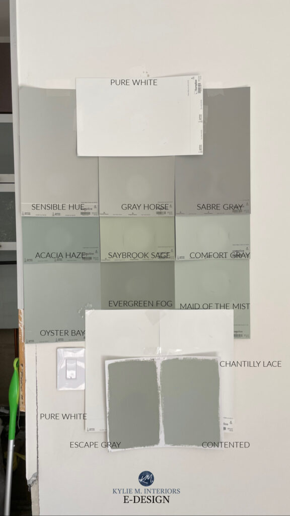
If one of these grabs your attention, here are the ones I’ve reviewed…
- Sherwin Williams Comfort Gray (crazy beautiful, and I ALMOST put it on the list)
- Sherwin Williams Evergreen Fog
- Sherwin Williams Acacia Haze
You’ll find several of the others in this blog post: The Best Green-Gray Paint Colors
With an LRV of 45.46, Saybrook Sage has some depth and interest without being remotely punchy.
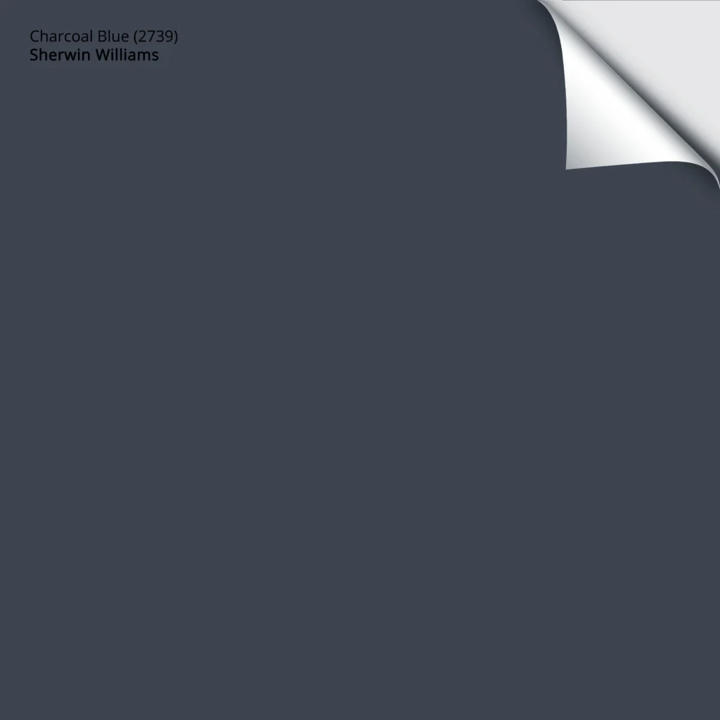
13. SHERWIN WILLIAMS CHARCOAL BLUE 2739
While it might featured in this anti-trend paint color blog post, some sort of navy blue is usually found in the world of design, no matter what’s in/out of style.

Charcoal Blue accent wall with Sherwin Williams Aesthetic White side walls
While it was a toss-up between this and Sherwin Williams Naval, I chose Charcoal Blue because it’s blue, without being quite as colorful as Naval (although both are fab).
Here’s a look-see at Naval, pretty, eh?

Sherwin Williams Naval Paint Color Review
Charcoal Blue is a great way to commit to blue without it being punchy or glow-in-the-dark colorful. While Benjamin Moore Hale Navy takes the title as THE most timeless and popular navy blue paint color, Charcoal Blue has its place near the top.
Here’s your Peel & Stick sample of Charcoal Blue…
The Best Navy Blue Paint Colors
14. BENJAMIN MOORE TAWNY ROSE 2173-20
Oooooh, I love me a good brick-inspired paint color! Bordering on brave, Tawny Rose is a beautiful, rusty paint color with some brown to calm it down (I could use a little brown in my life – this girl is FULL of beans).
The above accent wall in this small, open concept room is Tawny Rose, with the side walls in Benjamin Moore Gentle Cream (which almost made the list).
Lastly, while I don’t focus a ton on Farrow & Ball (they simply don’t have a ton of colors and aren’t as accessible), I want to share these two badass and beautiful colors with you…

The Best Medium to Dark Green Paint Colors
Like, what the wiggedy-what? (That’s my inner gangster talking). This space is so stinkin’ gorgeous.
You’re looking at Sherwin Williams Calke Green and Hague Blue, with Hague Blue being one of Farrow & Ball’s top colors.

I mean, talk about who gives a flyin’ fart about trends, this space is amazing, unique, and marches to the beat of its own anti-trend drummer.
And remember, while color trends come and go, and many of these shades have and will show up, it’s about how we feel about them when those trends are gone.
READ MORE
The 10 Most Timeless Interior Finishes
How to Create a Home You Love to Live In
Get the best paint color advice for a timeless home.


Hi Kylie,
As usual, a great and informative post! Just what I am needing right now, too! Not to be a pain (probably too late haha), but I wonder if you could do a post on browns that might have some staying power. I notice that medium to dark browns are being featured now, especially in bedrooms and studies, etc. and I am curious what you think about them competing with the medium/dark greens and blues that have staying power. Or is taupe better?
Also, if in the future it works with your goals, I would love love to see your take on dupes for Farrow and Ball using BM and SW, or other common North American paint manufacturers. There are posts out there, but you have the ultimate eagle eye in my opinion.
Finally–love your picture in this post! You are too cute!! 🙂
TONI, this is JUST the type of comment I love getting – I can really sink in!
It’s interesting, as browns are coming on pretty hot (‘sable’ brown being a big one). I feel like the richer, more chocolatey, sable browns will fade MUCH faster than more moderate, almost muted browns – to the point that I made 2 SEPARATE blog posts about them!Here’s the moderate one: https://www.kylieminteriors.ca/the-best-brown-paint-colors/ and here’s the more scrumptious, rich ones… https://www.kylieminteriors.ca/the-best-chocolate-sable-rich-brown-paint-colors-for-2025/
As for comparing to blues and greens…I just don’t think they’re in competition. Blues and greens rule. I was actually thinking this the other day, that no matter WHERE trends go, there’s always a blue or green kickin’ it. To the point that paint companies could pick one or the other for their ‘Colors of the Year’ and satisfy WAY more people. However, this would get boring, for sure :).
And thank you, that’s a fantastic idea for a blog post – I’ll do that, THANK you, Toni!
Thanks for your reply Kylie! You are amazing, thank you for getting back to me. I just happened to get on your blog to look for an idea for my cousin’s kitchen and I see it…a Farrow and Ball article!! OMG–I’m tingling. Gotta go read lol.