
A Black & White Ikea-Inspired Affordable Home Office
When creating the perfect home office, you can have the biggest ideas in the world, but a budget that fits in a super thin wallet. This is where I was at 6 or so years ago, creating a home office for Tim and me (as featured on Apartment Therapy).
Originally written in 2017, refreshed in 2025
Not everyone wants a black office, but this color cowgirl loves contrast, and the best way to get that is with black and white. While my tastes have shifted since, I still hanker for a good contrasting look in my workspace.
Okay, let’s back up the bus a bit here. Obviously, I work from home, and I work from home A LOT, to the tune of 8-10 hrs a day (or more, depending on my hyperfocus). Since my Online Color Consulting has taken off, I’ve cut back DRASTICALLY on my local work and spend most of my time drinking wine, coffee, and Bailey’s coffee, talking to myself, and typing.

The above image is getting ahead of itself. Let’s take things back a notch… this was the space (below) before I turned it into my office…
It took only a few months of twitching and crying in the corner for the hubs to agree that maybe it was time for a bit of a remodel – taking my office to the next level with regard to lighting and layout!
My new office had to be multi-purpose, so when planning the space, I needed to make room for the following:
- Two+ desk spaces for me n’ my homies (the kids). I like company and am happy when they come down and do their homework. Tim also helps me out A LOT with my website, so it’s nice to have him sit down for a while – nice for him that is
- Table and chairs to lay projects out on or for the kids to do crafts on
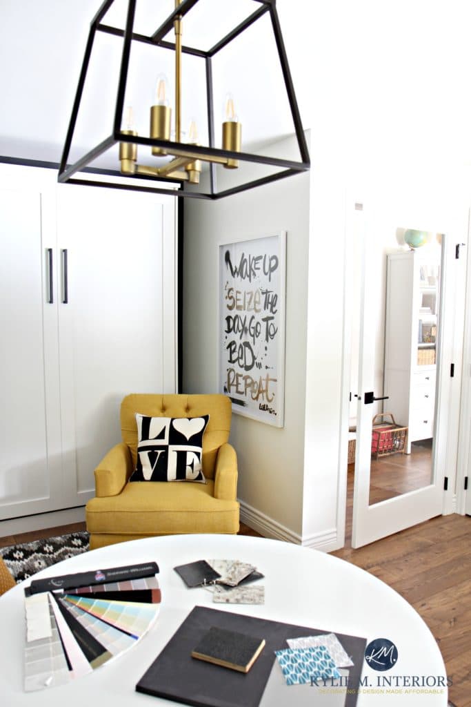
- Comfy chair to watch TV from
- Murphy bed. OH yes, a Murphy Bed
- Closet
And I managed to fit it ALL in with room to spare! So, let’s see how it came to be, starting from the pathway to my new home office…
A SMALL HALLWAY MAKEOVER
This was the hallway leading from our new entryway into the office and family room area…
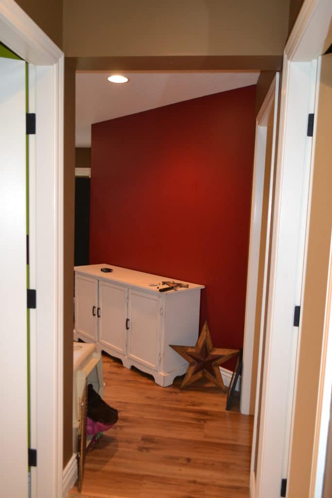
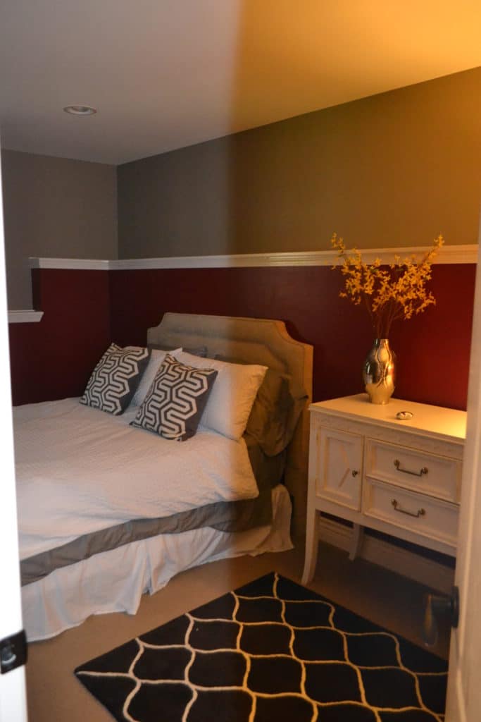
I didn’t choose these colors; they were there when we moved in.
When you stood in the entryway and looked down the hallway, you saw a lovely…red…wall (the door to the office ‘was’ on the far right).
Look down the hallway now, and you’ll see a 36″ extra-wide glass door and a 6 1/2′ window. We had to steal space from the family room so that we could fit that large window in – it was kind of a deal-breaker.
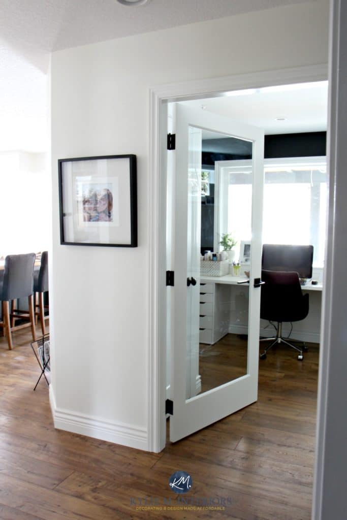
It’s amazing what light can do (and flooring, doors, and paint, but you get the idea).
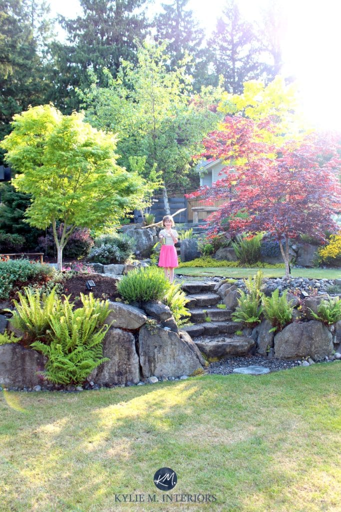
And here’s a snippet of what I now see when looking down the hallway and out that window. And yes, the house came with a free garden gnome…
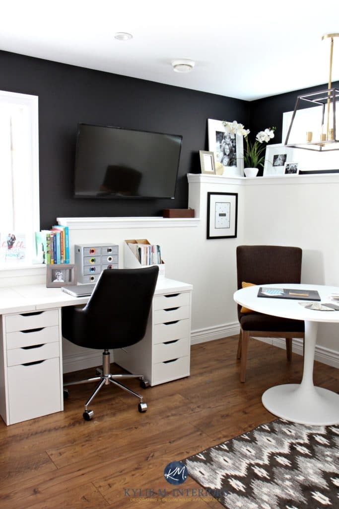
MY NEW BLACK & WHITE, IKEA HOME OFFICE
Whereas before, this room was dim and dingy, now, my ‘new’ home office is light, bright, and multi-purpose!
How Light Bulbs & Kelvins Affect Paint Colors
And you might think that black would drain a space, but think again! In the right space, black can add just the right contrast and impact – it can feel very grounding. The combo leaves me feeling inspired…I tried to come up with another gobsmackingly amazing word, but really – that’s all I’ve got.
LET THERE BE LIGHT…and there was.
Where Should You Paint an Accent Wall & What Color?
Of course, the new six-foot window adds a ton of light. But adding extra pot lights and a cute lil’ chandelier helps for cloudy days and dark nights.
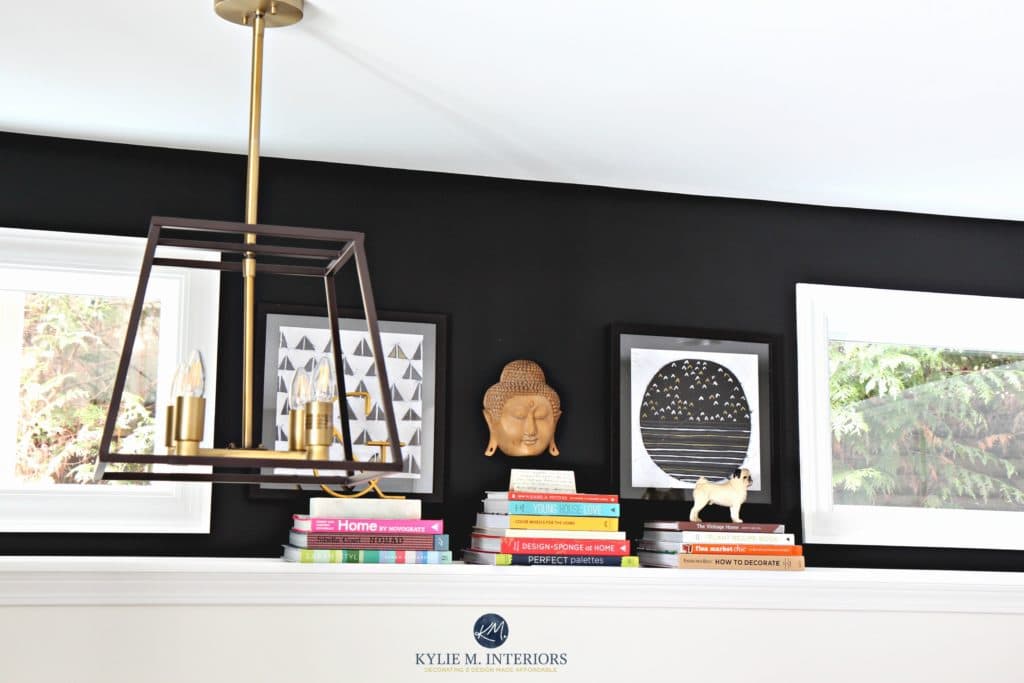
Look at this corner before. There wasn’t much I could do with the foundation wall, so I decided to work with it, creating contrast (which I love)…
And look at it now!
AN IKEA DESK HACK THAT FITS TWO
(three people if I add another extension) – right now, it’s 10′ long and just perfect!
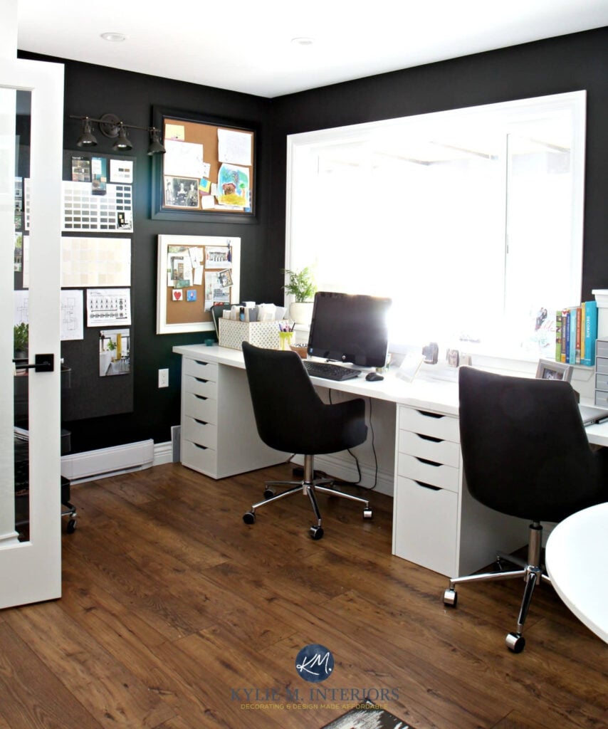
I couldn’t find a desk I loved, so I pieced this together using Ikea Alex drawer units and Linmon table tops. I’m super happy with how it works, and when I get bored (so like tomorrow), I can switch things around.
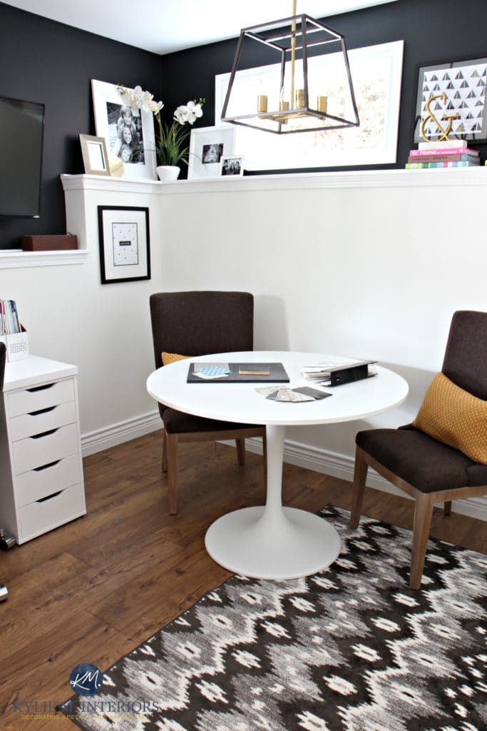
THE IKEA DOCKSTA PROJECT TABLE
I bought the Ikea Docksta table as it’s just the right diameter. I would love a marble top version, but money talks.
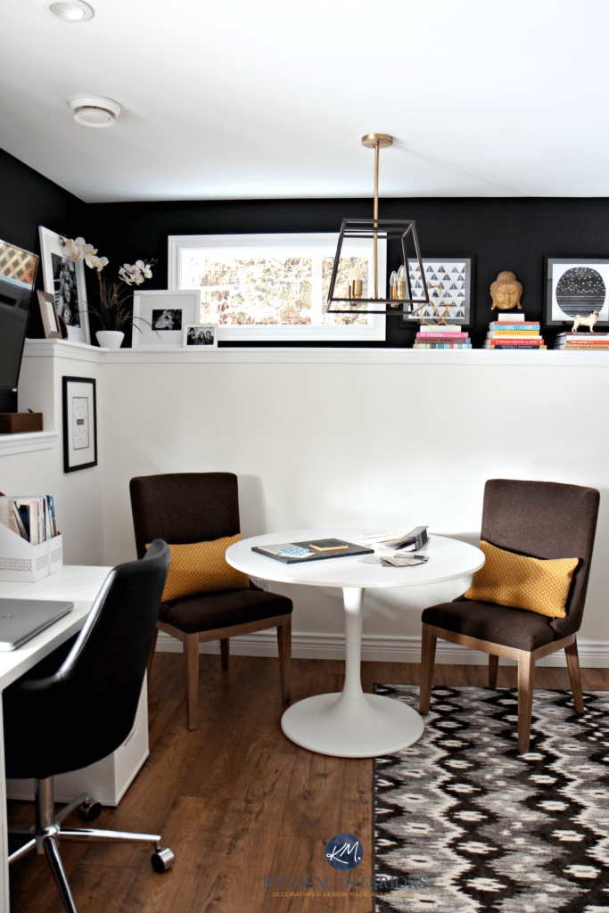
The accent chairs were on clearance at Scan Designs, so I got the pair for a great price!
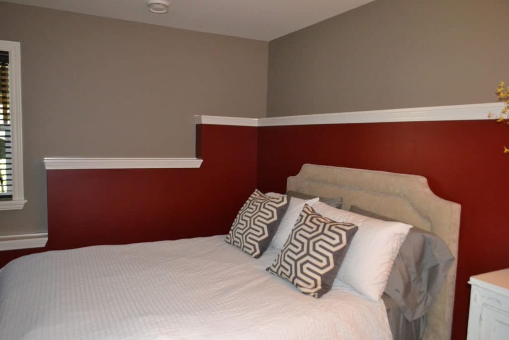
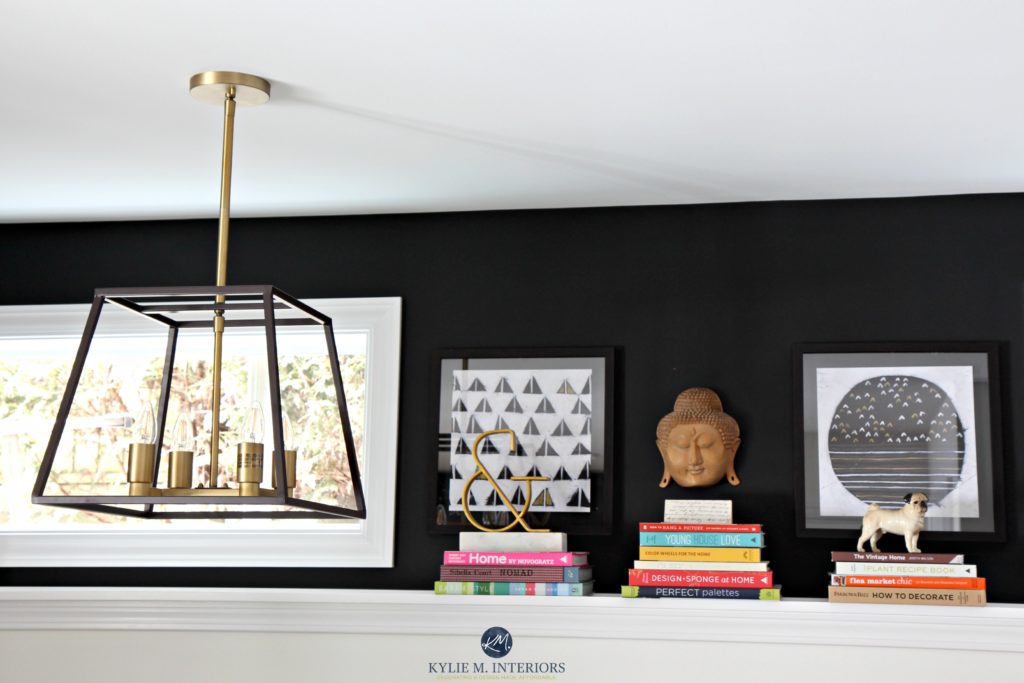
This stunning shade of black on the upper part of the foundation wall is Sherwin Williams Tricorn Black – it’s pretty much the most badass colour out there. Paired with fresh white trim and Benjamin Moore Cloud White on the lower foundation walls, it’s a super dynamic combo!
THE MURPHY BED
I’d always wanted a Murphy bed, but it seemed like a luxury item. Luckily, I found a local fellow who does a great job making/assembling these beasties! It’s all wood and painted Cloud White…
Remember, this was 3 home offices ago; my style has changed a lot since then!
Benjamin Moore Cloud White Paint Color Review
I planned it so that when the Murphy bed comes down, all I need to move is my lovely golden chair – everything else can stay where it is.
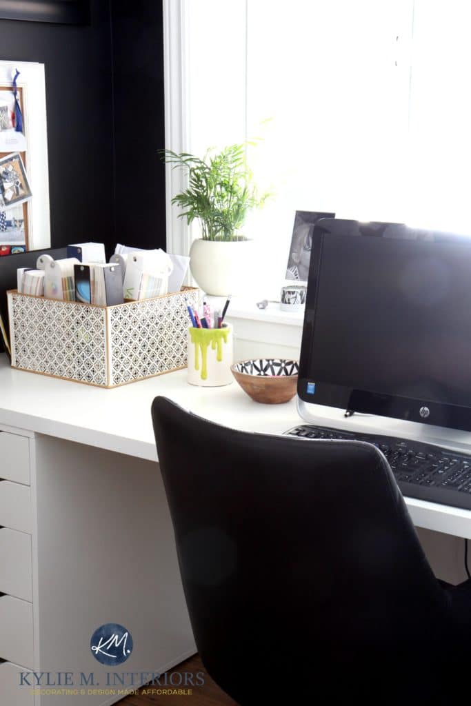
THE ORGANIZING BITS & PIECES
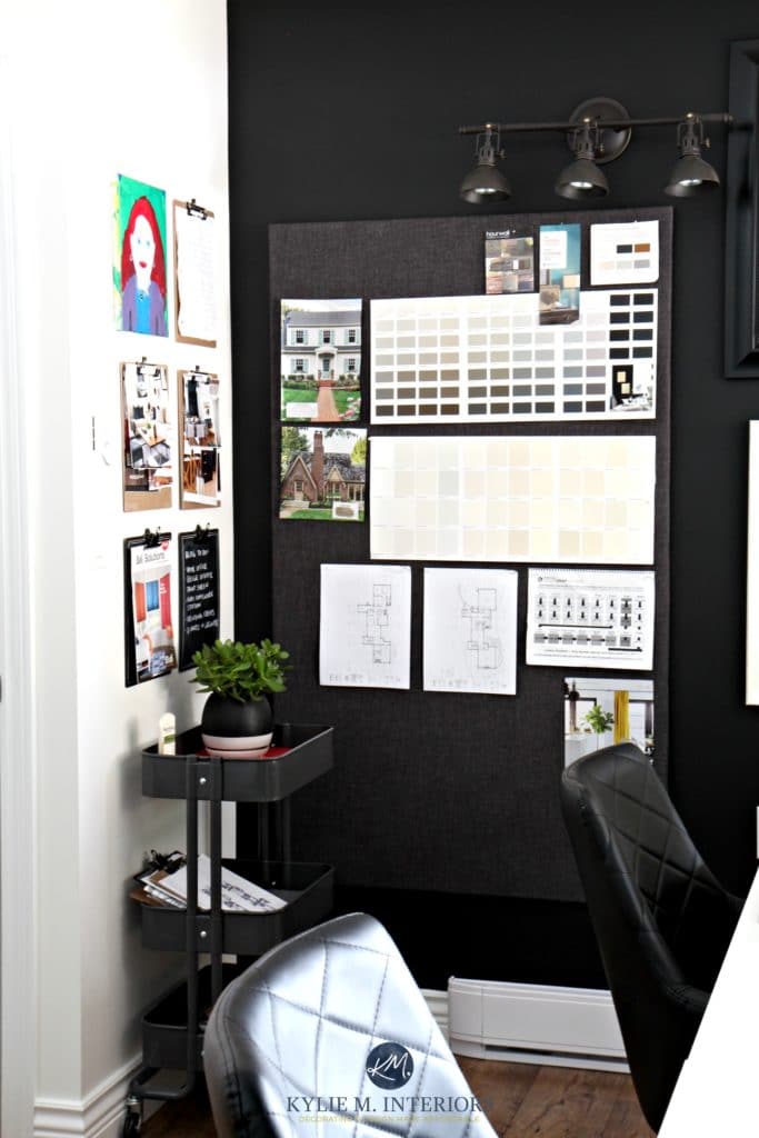
I bought the mother-of-all corkboards online as I couldn’t find a big enough one locally. At 3 x 5, she’s HOOOGE, and while she was ‘functional,’ she wasn’t very ‘funk-tional,’ so I grabbed my trusty staple gun and wrapped her up in fabric!
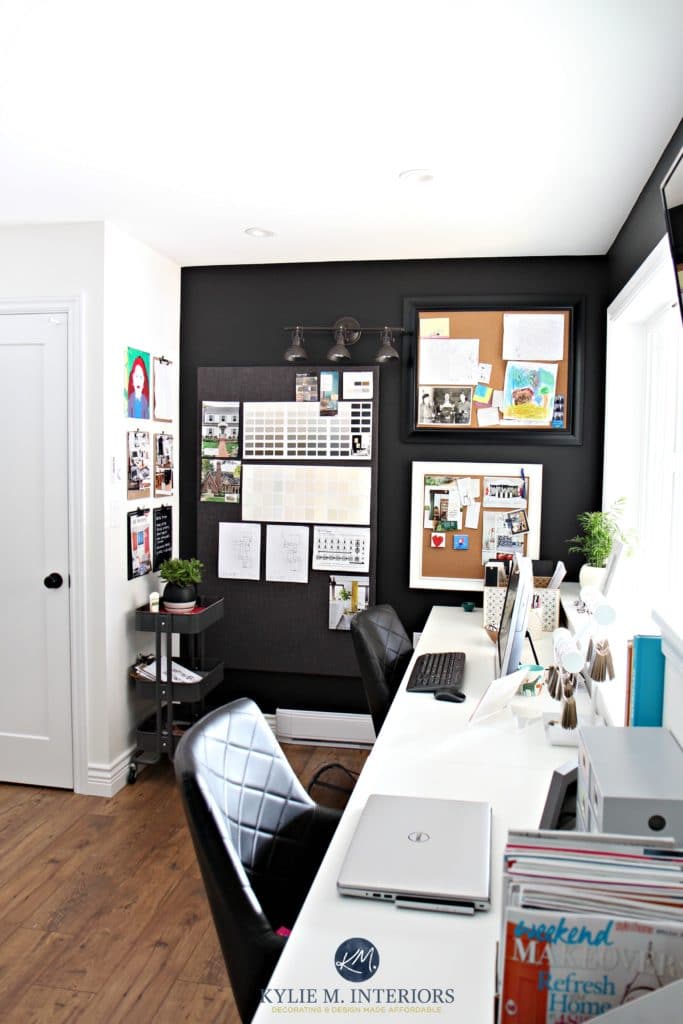
You can also see my task light from Wayfair and some smaller corkboards for the wee bits.
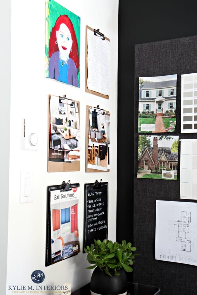
I also love clipboards (clearly, I throw my love around a lot). They’re a great way to tackle magazine pages, to-do lists, and more.
THE IKEA RASKOG CART
I’ve showcased the Ikea Raskog cart many times in our home – from the girls’ bedrooms, gym area, to cleaning product storage – I can’t get enough of this handy little unit (I say the same thing to Tim on Friday nights).
THE FUN STUFF
Okay, maybe it’s all fun, but I’m particularly jacked up about my décor. And if you’ve ever tried to decorate above a foundation wall, I’m sure you feel my pain. Luckily, I know what I’m doing…most of the time, anyway.
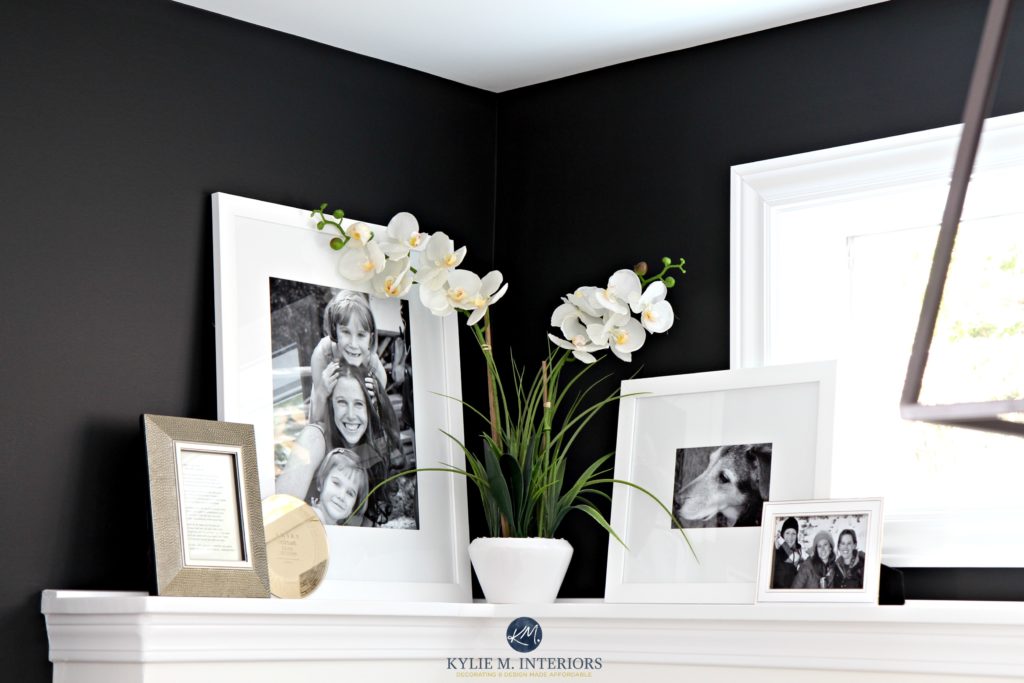
Can I tell you how much I love this space? Do I NEED to tell you how much I love this space?????? I’m sure my photos show how happy I am with how our home turned out!
So there you have it – this is where the magic…or at least MOST of the magic happens.
READ MORE
The Best Neutral Home Office Paint Colors
The Best Blue & Green Office Paint Colors
Get the best paint color & home update advice with Kylie M’s Online Color Consulting.
Originally written in 2017, edited/updated in 2025 to add new, fresh links!


You have very good taste 🙂
You are such a talented decorator Kylie. I love your reasonably priced ideas. You have done a great job on your new place. I love it all.
Don’t know if you remember our place but it was a green living/dining room & hallway. We have just used a BM ranchwood over it & it has turned out a wonderful med/dark taupe. I just love it. Now to put the room back together with some new ideas. I’s still going to use the coral as accents.
Your new office is gorgeous and worthy of a magazine cover! It’s interesting that a color specialist chose black and white for her office, LOL! I would never have guessed that those two colors could work so beautifully together in a space like that. You were very clever to use that strong contrast to turn the odd feature of your stepped foundation walls into an interesting “architectural detail”! BTW- I love your hanging clipboard idea!
Well thank you Phyllis! I know, i never figured myself to be a black and white girl, but I have to say that I’m desperately in love with it – it just suits the room to a tee!
And thanks for calling me clever – I like that 😉
~Kylie
Oh wowzah!! Simply ah-mazing. I love it. All of it. So visually interesting and so fun too. That portrait/painting is so special. The glass door leading into the office is so smart!! Everything is so inspiring. I think I’ve overused the word “so” lol. Makes me want to rip apart another room!! Fine job Kylie. Toodles!
Thank you Robin! It is super visually interesting and stimulating. I just feel energized and well-balanced when I work so it must have hit a happy place in me – whoda thunk it!
I lovvvvvvve it!! My favorite is your daughter’s art, of course!! It is just gorgeous! I painted the wall above the subway tile in my bathroom black and I couldn’t love it more. Why is black on walls just working these days?!!? If I had a room with more light I would do it in another room, you are lucky there.
Oh and looking again I now see Sibella Court’s Nomad on your shelf. Okay, I love you/it even more…she is my absolute favorite stylist! She reminds us to keep it personal and have fun decorating with things we love, not to worry about measuring every flipping thing b/f we set it down. Haha!
What a wonderful office! And I love that you did it without breaking the bank. In thinking about what to do in my office I had just decided I wanted at least one LARGE bulletin board hung beside my desk (tired of leaning over the desk to try to read what’s up there!) Do you mind telling us where you got yours, please?
Thank you! I got the corkboard from Staples online. It wasn’t cheap. Truly, you can get 30×40 ones at Jysk if you have one close by for $30. I could find 3×4 boards for reasonable prices, yet as SOON as I went larger it jacked up to like $200. But, I had it stuck in my head that that’s what I needed…and I’m glad I got it that size 🙂 I also considered doing 2 smaller boards that would take up approx. the same space. I hope that helps!
Yes, thanks!
As usually, amazing! Black and white just never gets old.
You should really consider using your design work as a way to keep you in the doe until you become famously rich from your novels. Clearly your other exceptional talent is writing, and I would certainly purchase any book, hopefully a comedy, from you!
Holy Buckets!!! I love your office space. So sophisticated. Great space to work in. Just my taste.
Well thank you Linda! I never would’ve thought I’d paint a room black – but I TOTALLY TOTALLY love it. I tend to rotate through colours on a whim, but this one is stickin’!!!
I just discovered your blog and I think everything you do is amazing. I am planning on either buying or building a house this coming year, please don’t raise your prices!!!
I’ll do my best Pam, I’m not anticipating any raising in the near future – I would love to help!
What a great transformation! I love the black and white.
THIS… is amazing! I also work from home (FTE corporate + freelance artist/designer) and need two workspaces for myself + guest room + artist studio complete with an easel/drawing table. Have been considering a black/white/gold theme and your design is the perfect combination. I’ve even been looking at the same Ikea products because I can’t swing a pricy desk scenario either. Love the murphy bed. I had that on my must have list as well. Thank you so much for the inspiration. Had no idea how to create a functional, creative and organized space incorporating all of my needs. You truly are exceptional at what you do!
In other news, based on your super awesome paint color reviews, I went with Revere Pewter (after testing millions of samples before finding your site) for a main living space color. It was perfect. Was terrified the green would show through, and it did not. Whew! Wish I had tried SW Colonnade Gray, given your recent post because it probably would have been even better. Lots of Northern light and roof overhangs blocking the lovely sun. Either way, it’s so much better than it was. So, thank you again! You rock lady! Next time…I’ll be hiring you for paint color selection. OMG that was so frustrating!
Oh Natalie, what a fabulous comment to get! I get a LOT of questions, which I answer when I can, but it was just so refreshing to read this and read your excitement! And seriously, you should see my NEW office. Okay, admittedly, not as high functioning as it’s just office and it’s ALLL black, but I FRIGGIN’ LOVE IT! I’m hoping to do a blog post on it SOON! You should let me know how your office turns out, I’d love to see it!!!
~Kylie
Oh my, I (aka ‘we’) love your posts. You always have such specific information on paint colors, how they change on wether the room’s lighting is from the south, north etc. We’ve been stumped on the right color for different rooms and your posts, photos and explanations save the day… Love your sense of humor, my husband will actually read your posts too. Thank you!
Well this is JUST what I love to hear, thank you Heather!
Kylie! Did I miss where you told us what WHITE.. and BLACK paint choice color you used for this specific project?
Hi Lauren! Those were BM Cloud White and SW Tricorn Black :).
I love that chandelier! Where is it from?
That was a Home Depot find – thank you!!!