The Best Neutral Home Office Paint Colors
The best paint colors for home offices aren’t always colorful. In fact, some of the most popular choices are totally (or at least partially) neutral. Gray, beige, greige, taupe, and even warm whites are common go-tos for workspaces.
But how do you know which one is best? Should you choose warm white for a professional look, off-white for your dark basement office, or dark gray for your oversized space? Is a cool color best for your mood, or do you thrive in cozy, inviting, warm spaces?
You’ll get some answers in this blog post! We’re going to walk through the five questions to ask yourself before choosing a paint color. Then we’ll look at some of the best colors to sample and compare.

Here are five important things to consider before you even start sampling…
1. WHAT MOOD DO YOU WANT IN YOUR OFFICE?
Home offices should feel personal, not just functional. Many of us spend more time in these rooms than any other, meaning it’s SO IMPORTANT that they feel good! Consider which keywords best capture the feeling you want to create…
- Comfortable and inviting
- Cozy, soft, and relaxing
- Productive, focused
- Stress-free and low-key
- Simple or striking
- Organic and natural
- Inspiring, energizing
- Creative, mood-lifting, cheerful
- Moody and dramatic or subtle and soft
- Stylish, sophisticated, and professional-looking
Feel free to add to your list as needed.

THEN, CONSIDER YOUR COLOR OPTIONS
Once you have a baseline vibe, consider what neutral colors make you FEEL that way. Remember, what’s calming and soothing to one person is a dumpster fire for another. You do you, boo.

When it comes to home offices, the most popular neutrals are…
- Light-medium or darker greiges
- Creamy, warm, simple whites or off-whites
- Grays with stronger undertones (not dull, icy, or flat grays), including lighter and darker shades
- Darker, moody, organic greiges
Again, this blog post focuses on neutrals. If you want some color, check out “The Best Blue & Green Paint Colors For a Calming Home Office.” (I’ll provide another link at the end of this blog post, don’t worry)
2. YOUR ROOM’S SIZE
Bigger isn’t always better (wink wink). Consider your room’s size and how you want it to feel. Do you want your small office to look cozy and inviting or bigger and brighter? If you have a big office, do you want to keep things light and bright, or bring the energy down with a darker, grounded paint color?
Let’s take a quick walk-through of what colors can do…
- LIGHT COOL colors help a space look bigger
- WARM DARKER colors can make a space look more intimate and smaller
- And yes, there are glorious places that sit right in the middle of both (cooler-darker, lighter-warmer); the above are just some baseline considerations.
Seriously, the greatest focus should be more on the feeling and mood you want in your office, not its size. Then, figure out which color will give you that (regardless of whether it looks bigger or smaller)…
3. WHAT’S YOUR LIGHTING SITUATION?
Natural and interior lighting are underrated but VITALLY IMPORTANT parts, not only in choosing a paint color but also in working comfortably in a space.
Because without LIGHT, no paint color will save you.

Whether you’ve set up shop in a dark, windowless basement or your main floor office just doesn’t have the light you need, there are solutions.
IMPROVE A LOW-LIGHT OR DARK OFFICE
Rather than accepting what you have, consider how you might improve your interior lighting (do this before you choose a color). This can include:
- Add lighting (hire an electrician) if possible
- If your current fixture only holds 1-2 bulbs, find one that holds more
- floor lamps
- table and desk lamps
- wall-mount, battery-operated fixtures

While I could go into the Kelvins of your light bulbs, the color of your lampshades (white is best for bright), and so on, you get the idea.
4. IS THIS SPACE FOR YOU, OR CLIENTS, TOO?
If you have a counselling or therapy business, or maybe massage or consulting, consider the feeling you want your clients to have when in this space. Think about the work you do and the colors that are most often associated with that.
Even if this color doesn’t 100% align with your personal tastes, you want your clients to come back, right? You know you’ve chosen a good color when a client tells their friends about the color in their therapist’s office.
5. TAKE CONTRAST VERY SERIOUSLY
With so much focus on ‘the right paint color,’ we often forget about how friggin’ important CONTRAST is. While contrast can apply to many things, for our purpose, it’s the difference in depth (light to dark, white to black) between one surface and another.
Let me baby-bird it to you…OPEN UP!
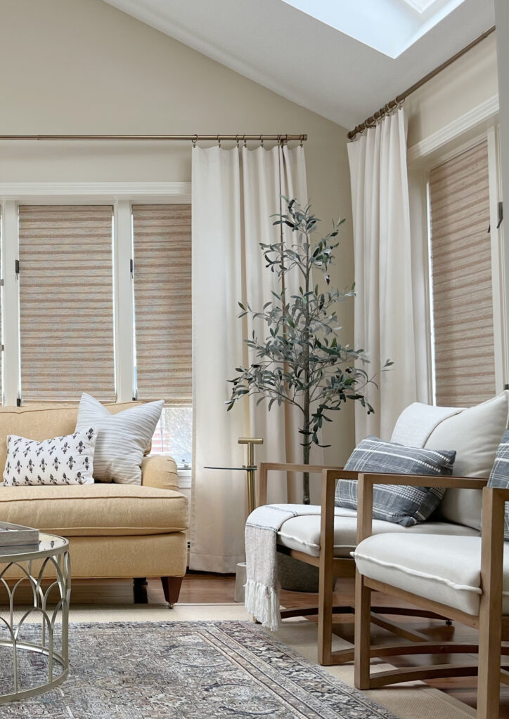
LOW-CONTRAST PALETTES
If you want a feeling of calm in your office, you might consider a low-contrast palette. With less opportunity for your eyes to jump from one surface to another, a space can feel more restful and less stressful.

Here are a few low-contrast offices on Pinterest (I only have so many of my own images in my files)…
- This office is reasonably low-contrast and subtle.
- Remember, home decor adds personality but can also create visual clutter and increase contrast, as shown HERE.
- This palette is reasonably low-key and gentle on the eyes.
MEDIUM-CONTRAST PALETTE
There’s a huge gray area (on the top of my husband’s head, thanks to me) between low-contrast and high-contrast – a lot of it’s open to perception. Here are a few generally medium-contrast spaces…
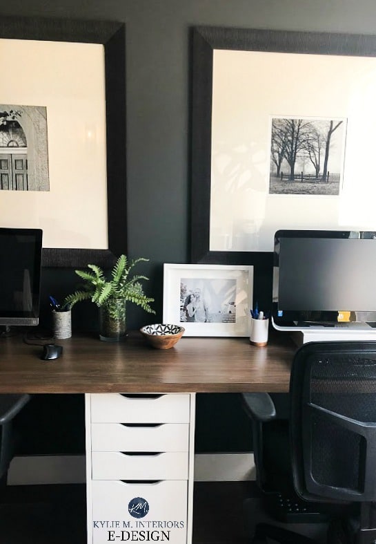
- This blue-on-wood office offers a soft, medium-contrast. While the built-ins and floor are of similar depth, the warm wood contrasts with the cool-toned cabinets.
- This office by Studio Mcgee offers an interesting blend of high- and low-contrast finishes that play well off each other. Because the walls, ceilings, and desk/built-ins are the same, I find this space a bit low-contrast, but the flooring adds a contrasting element!
- The walls and built-ins are low-contrast, while the wood desk adds contrast in this home office.
HIGH-CONTRAST PALETTE
If you like to see a noticeable, sometimes dramatic shift between depths (or colors), you might work well in a high-contrast palette.

- In this office, the dark cabinets, white walls, and wood floor create a striking contrast.
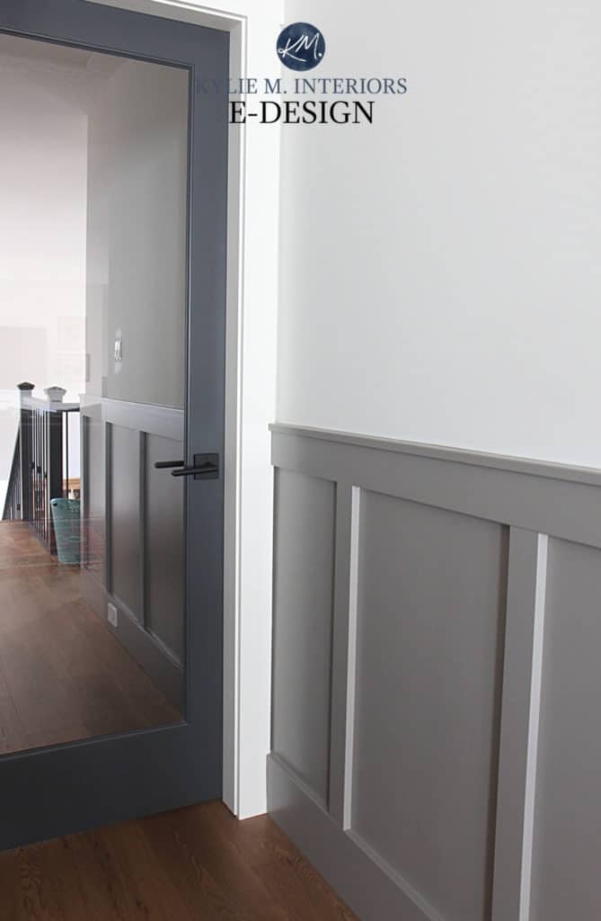
- Notice how the flooring, walls, trims, and desk (in general) in this home office are low-contrast, while the built-in cabinets offer strong contrast.
Remember, just as with colors, it’s not a ‘one-contrast-affects-all’ situation. Think about how different types of contrast make you feel – how you respond emotionally to them.
At this point, you might have an idea of…
- The feeling and mood you want based on your keywords
- A general idea of the types of colors you lean into – even if it’s just warm vs. cool.
- The DEPTH you want, either for your walls, cabinets, or both.
If not, don’t worry – you’ll see some great colors shortly.
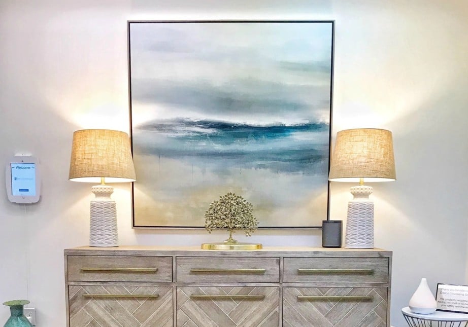
Office of Eddins Counselling, one of my Color Consulting clients
CALMING NEUTRALS FOR A STRESS-FREE, FOCUSED HOME OFFICE
Remember, it’s not just the color you need to consider, it’s the CONTRAST. Think about your office and its main paintable surfaces.
While we’ll hit a range of neutrals, to start, let’s hit a middle ground with…
LIGHT GRAY & TAUPE PAINT COLORS
While some grays can look flat, dull, and uninspiring in a room, grays with stronger undertones offer a calming, restful vibe. As for taupes, their gentle, welcoming vibe can create a cozy, yet still bright look.
Click on the highlighted names to see their FULL COLOR REVIEWS!
BENJAMIN MOORE PALE OAK: Pale Oak is a gorgeous, light taupe paint color. With gentle undertones, it offers a relaxing, ‘pretty’ look to a home office and pairs SO nicely with white.
Here’s Pale Oak on built-in cabinets with a green-gray paint color on the walls…

BENJAMIN MOORE CLASSIC GRAY: Classic Gray is the OG of the off-white world. This bad boy sits between warm gray and taupe, with more muted undertones than Pale Oak (it’s also a bit cooler).
Here’s Classic Gray looking calm. professional, and focused in an almost color-drenched home office…

BENJAMIN MOORE REVERE PEWTER: As far as timeless grays go, Revere Pewter is THE best. With an earth-toned, organic look and green undertone, it’s a gorgeous, calming color for a home office. Just make sure you have good lighting.
In this next office, Revere Pewter is on the wainscoting, bookshelves, and trims with my favorite warm white on the walls (yes, I am biased)…

SHERWIN WILLIAMS CITY LOFT: While I almost chose Sherwin Williams Egret White, I wanted to offer a bit more undertone. City Loft is a light taupe paint color with typical undertones (purple-pink)…just what we want!

Like what you see? Check out their REVIEWS: BM Classic Gray | BM Collingwood | BM Balboa Mist
For a soft, lower-contrast look, partner your gray or taupe walls with white furniture or a super low-key wood stain. For more contrast, consider dark-painted cabinets and a desk.
BENJAMIN MOORE STONINGTON GRAY: Stonington Gray is one of Benjamin Moore’s more timeless gray paint colors. Along with an LRV of 59.36, it has a beautiful blue-green, stormy undertone. Just make sure your home office has enough light.

WARM, OFF-WHITE NEUTRALS FOR HOME OFFICES
Whether you thrive in beige, tan, or off-white, I’ve got some glorious shades for you to check out. One color you won’t see is legit cream, since it’s not a popular shade in home offices. The creamiest we’ll get is more of an undercurrent rather than a commitment.
These neutrals coordinate well with a range of wood stains, white furniture, or even darker painted pieces if you want some serious contrast.
Click on the highlighted names to see their FULL COLOR REVIEWS!
BENJAMIN MOORE MARITIME WHITE: Benjamin Moore Maritime White is amazeballs. Warm, simple, not too bossy (unlike me), Maritime White is a gentle, off-white beige with flexible undertones.
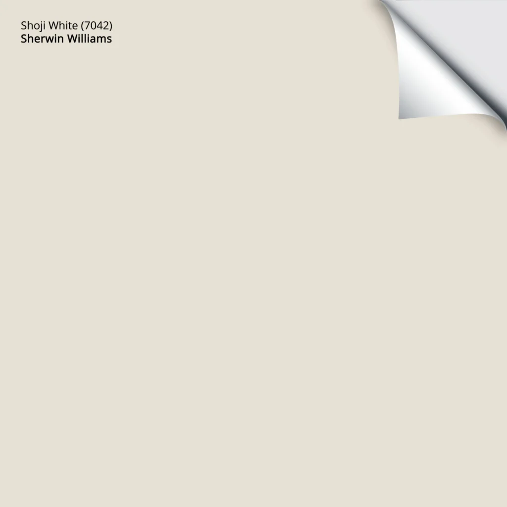
SHERWIN WILLIAMS SHOJI WHITE & WHITE DUCK: These two are currently kickin’ arse in the wild world of off-white.
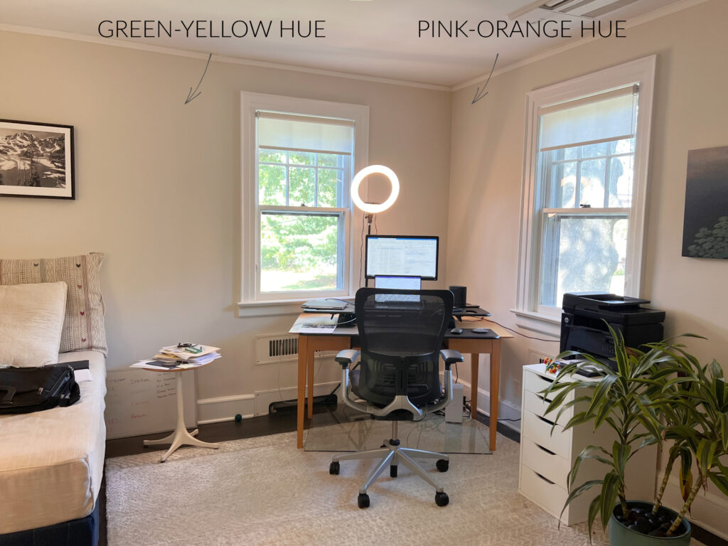
Remember, the Kelvins of your light bulbs and your room’s exposure can easily skew how a color looks! The above shows Shoji White.
They both have a creamy backdrop, but whereas Shoji White tips its hat slightly toward taupe, White Duck leans to greige. Sample and compare both to see how they settle in your space!
Here’s your Peel & Stick sample of Shoji White…
SHERWIN WILLIAMS AESTHETIC WHITE: This is one of my faves. Personally, I don’t like bossy beiges or tans with strong orange, yellow, or pink undertones. Aesthetic White is an off-white beige with a BUTTLOAD of gray, which takes a huge edge off it.

A color doesn’t need to be exciting to be just what you’re looking for.
MEDIUM TO MEDIUM-DARK NEUTRALS FOR HOME OFFICES
Not everyone wants a light or colorful home office. Some yearn for a darker, grounded look with neutrals. So, if you want more body or depth on your walls, desk, or cabinets, I’ve got some badass beauties for you…
Click on the highlighted names to see their FULL COLOR REVIEWS!
BENJAMIN MOORE PASHMINA: You bet your cute little booty, Pashmina made the list – and it should – as my home office is currently painted this color! Pashmina is a light-medium, greige paint color that leans warmer and offers a grounded, earth-toned look to your office.

SHERWIN WILLIAMS KEYSTONE GRAY: Whether for built-in cabinets or walls, colors like Keystone Gray are massively grounding and organic. This is a medium-depth greige-taupe with no committed undertones.
SHERWIN-WILLIAMS FAWN BRINDLE: Fawn Brindle is a great choice for those who want a passive, organic warmth (but not beige) and love green undertones.

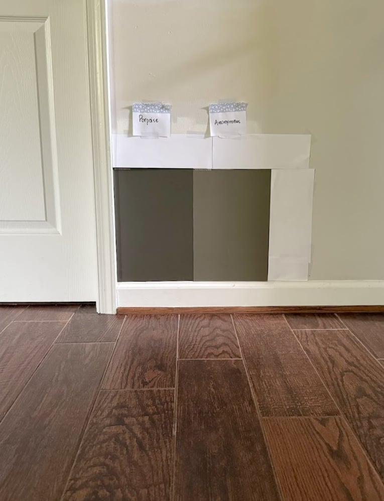
SHERWIN WILLIAMS ANONYMOUS: Anonymous is stunning. It’s a very solid, medium-depth greige with a glorious green undercurrent.
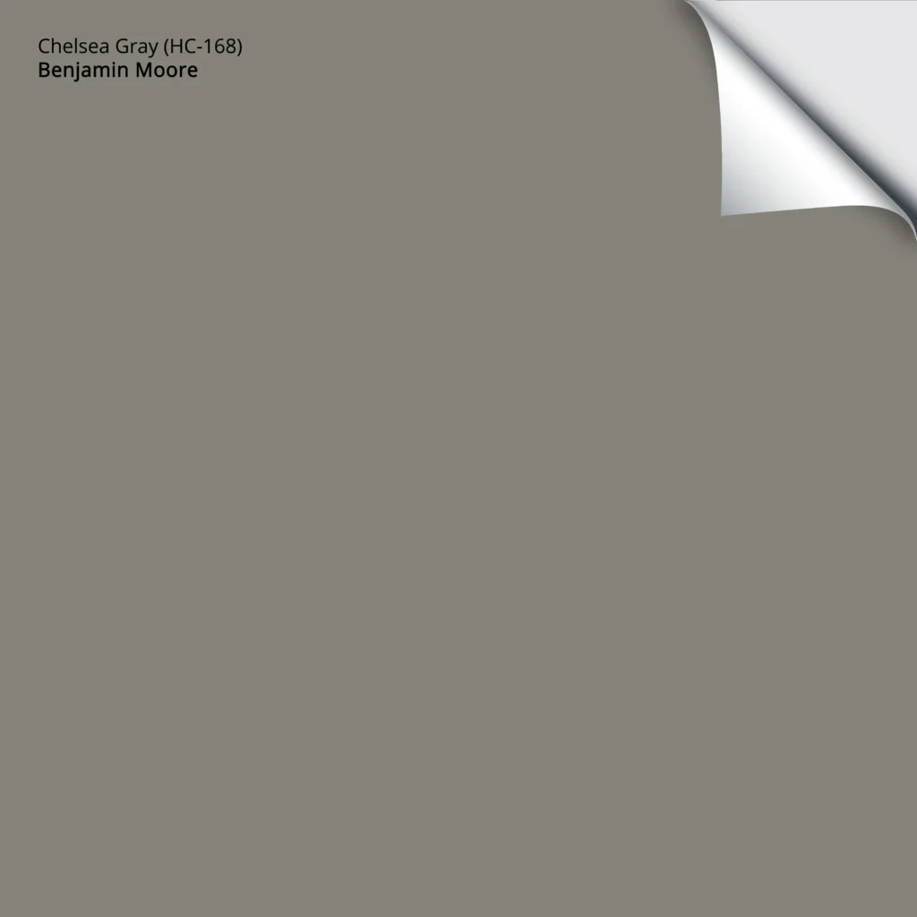
BENJAMIN MOORE CHELSEA GRAY: Chelsea Gray is a medium-depth charcoal gray paint color. While it’s warm, it doesn’t read that way. As for undertones, a rare flash of green pops up.
Here’s your Peel & Stick sample of Chelsea Gray…
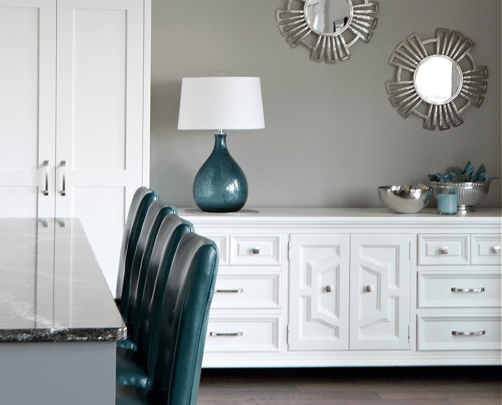
SHERWIN WILLIAMS DOVETAIL: If you love traditionally warm grays, Dovetail is gorgeous and has minimal undertones.
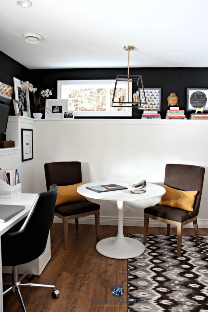
Here’s Dovetail in a dining area. Notice how the white cabinets offer a medium contrast with the walls. The teal accent adds some high contrast and personality…
THE BEST WHITES FOR A HOME OFFICE
When people think of white in an office, they often think of a ‘professional’ space. However, the wrong white can also give off a ‘clinical and sterile’ look. This is why choosing your white carefully is so important.
Click on the highlighted names to see their FULL COLOR REVIEWS!
SHERWIN WILLIAMS PURE WHITE: To keep things simple, check out Pure White. This is a soft white that’s neither stark nor overly warm. Be sure to add other colors and textures to your space to soften its approach.
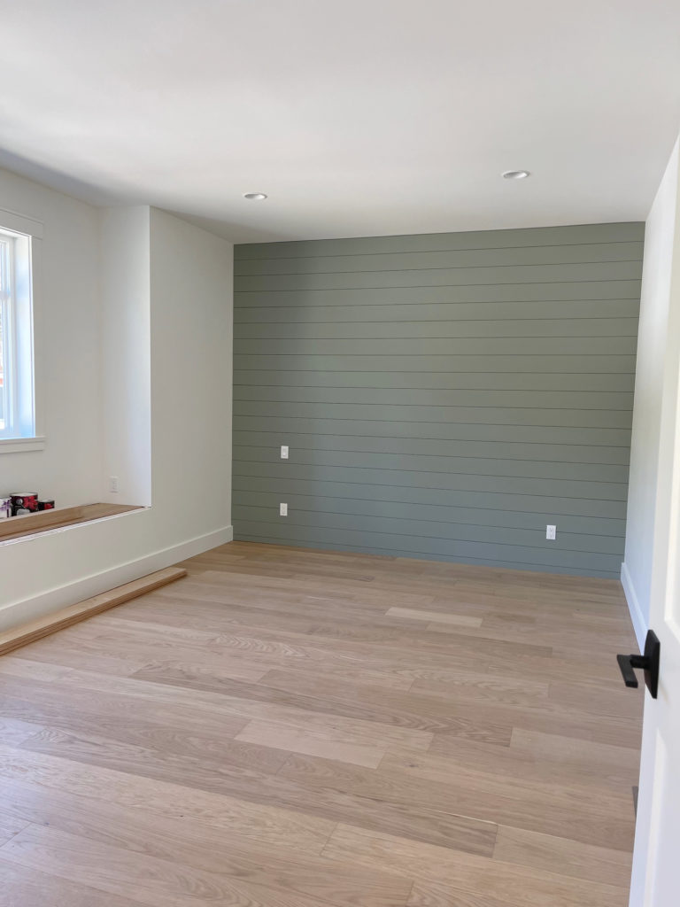
Here’s Pure White with a shiplap accent wall in Sherwin Williams Evergreen Fog – remember, white can be a great foundation for a beautiful and interesting palette…
BENJAMIN MOORE WHITE DOVE: For a soft, warm, inviting look, while staying in the wild world of white, White Dove is a gorgeous choice (I had my office this color for a while with black cabinets for a high-contrast palette).
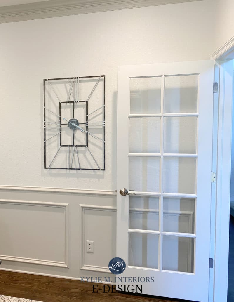
Here’s White Dove with Benjamin Moore Revere Pewter on the trim and wainscoting…
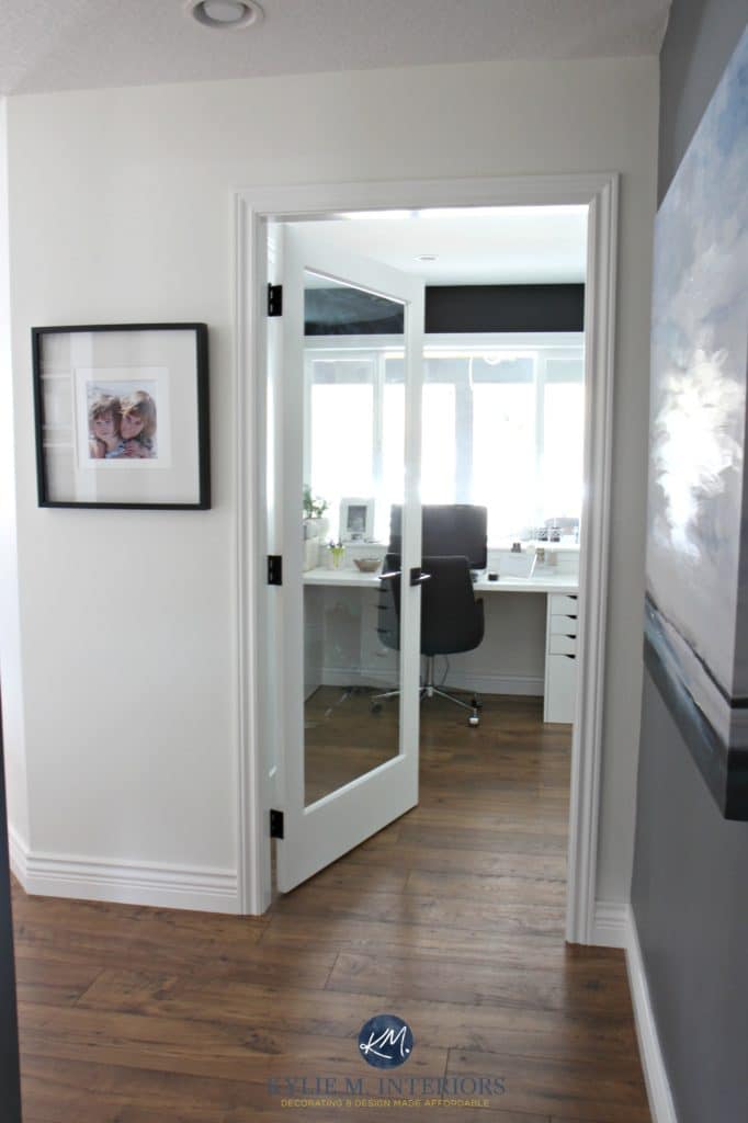
This basement hallway could easily lead to an equally dark office. Notice how White Dove adds a bit of energy with the light it’s given (but would be even better with more interior lighting)…
SHERWIN WILLIAMS ALABASTER: If White Dove isn’t quite warm enough, step into Alabaster. Just shy of the off-white world, Alabaster adds a gloriously warm vibe without an overcommitment to yellow/cream.
Office of Eddins Counselling
THE BEST DARK NEUTRALS FOR A HOME OFFICE
This is my wheelhouse, as this color cowgirl loves her some serious depth.
Click on the highlighted names to see their FULL COLOR REVIEWS!
SHERWIN WILLIAMS PORPOISE OR URBANE BRONZE: These are gloriously dark greiges with beautiful green undertones. Porpoise is a bit lighter than Urbane Bronze, but both are pretty skookum and add an awesome mood to any home office. While I prefer them on cabinets/desks, you can even color-drench your room with them.
Here’s Urbane Bronze in a tidy home office with Sherwin Williams Agreeable Gray on the walls…
SHERWIN WILLIAMS GAUNTLET GRAY: Gauntlet Gray is similar to the previously mentioned Dovetail, but has more depth.
This next image shows a whole whack of colors, many that we’ve talked about today…
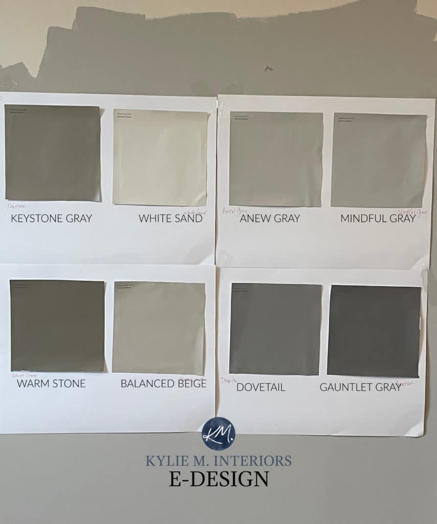
See something you like? Check out these REVIEWS: SW Keystone Gray | SW Anew Gray | SW Mindful Gray | SW Balanced Beige | SW Dovetail | SW Gauntlet Gray
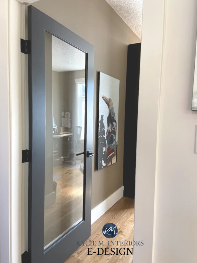
BENJAMIN MOORE CHEATING HEART: This color is near and dear to my heart, so much so that I’m hoping to use it on my new office built-ins and desk! While it classifies more as a dark blue than a neutral, it has a strong gray-black base, which calms it.
In the next image, Cheating Heart is on the glass door, White Dove is on the walls and trims, and Graystone is on the board-and-batten…
SHERWIN WILLIAMS IRON ORE: In a close second place (in my heart), Iron Ore is a wickedly dark color that looks like black, but is actually a soft black paint color. As for undertones, you’ll see a wink of green.
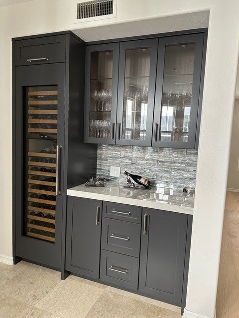
Here’s Iron Ore on the cabinets in a home bar (also a good idea for a home office)…
SHERWIN WILLIAMS TRICORN BLACK OR BENJAMIN MOORE BLACK 2132-10: These are both killer-dark shades of black for strong contrast with white trim.
Tricorn Black and Black 2132-10 (website link, not a review) are doing the same job; it just depends on the brand you prefer.
Tricorn Black with Benjamin Moore Cloud White
FREQUENTLY ASKED QUESTIONS
If you don’t find answers in this blog post, please leave a comment! In the meantime…
WHAT’S THE BEST NEUTRAL PAINT COLOR FOR A CALM, PROFESSIONAL HOME OFFICE?
For a calm, professional look, the simplicity of a bright or warm white paint color with dark furniture (wood or painted) goes a long way. While I would personally find that a bit boring, it suggests a clean, organized, focused approach.
The same can be said for various shades of gray, greige, and taupe.
Long story short, while it can depend on your industry and brand, most professionals lean into neutrals and avoid overly colorful shades that are full of personality. From there, you choose the depth (light/medium/dark) and the color type (warm/cool/gray/beige/etc) that suits your style and brand.
The Best Off-White Paint Colors
SHOULD A HOME OFFICE BE LIGHT OR DARK?
That’s a question only you can answer – there isn’t a definitive ‘yes’ or ‘no’. Personally, I prefer a darker home office because it feels grounding and relaxing. On the other hand, you might find a dark office heavy and depressing, and crave something lighter and brighter.
Think about the mood you want, and which colors relate to that feeling.
Also consider the contrast you want, as you can have a combination of light and dark with a medium to high-contrast palette!
WHAT HOME OFFICE PAINT COLORS ARE GOOD FOR ADHD & FOCUS?
Ahhh, that’s a HUGE one (that’s what she said). To cover this topic effectively, I’ve written an entire blog post…
The Best Home Office Paint Colors for an ADHD-Friendly Space
QUICK SUMMARY (TL;DR)
- Neutral paint colors are often seen as the most professional for a home office, especially white and gray.
- Neutral paint colors can be calming and help some people focus.
- Add interest to a neutral home office palette by varying the contrast between walls, cabinets, desk, and decor.
READ MORE
The Best Blue & Green Paint Colors for a Calming, Focused Home Office
The Best Calming, Stress-Reducing Paint Colors
Get the best paint color advice with Kylie M’s Online Color Consulting!