
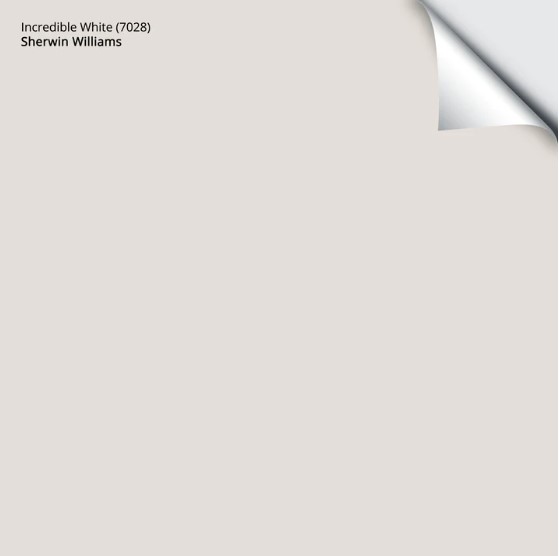
Sherwin Williams Incredible White 7028: Paint Color Review
Is Incredible White the right shade for you? I’d be surprised…
When it comes to off-white paint colors, it’s all about the undertones. And while Incredible White might look like a relatively simple neutral color, it sure as heck isn’t!
However, because my blog is 100% powered by photos from my Online Color Consulting clients, readers, and friends, I don’t have many pictures of this bad boy; it isn’t as popular as others. But that doesn’t mean it’s not the PERFECT paint color for you, so let’s get reading…

WHAT TYPE OF COLOR IS INCREDIBLE WHITE? GRAY, GREIGE, TAUPE?
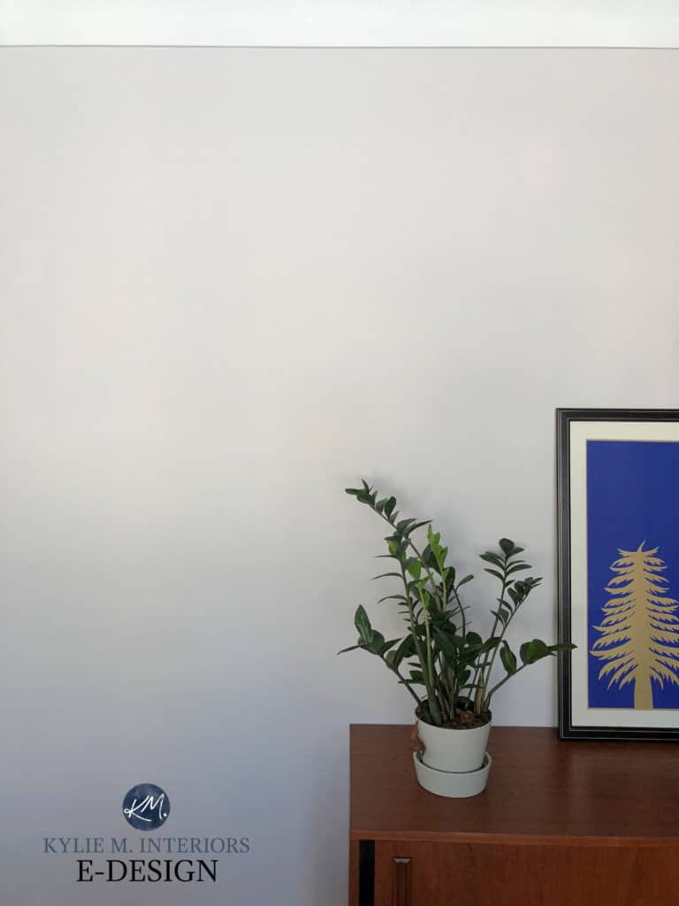
Incredible White is not incredibly neutral, that’s for sure, as it’s a shade of taupe with pretty noticeable undertones (which we’ll hit shortly).
Incredible White is a warm paint color because it’s taupe (in between gray and beige). Between this and its undertones, it suits all exposures with few limitations, which is rare for many neutrals. Some colors like this (with fewer undertones) can fall flat. While it can look muted, its degree of undertone often saves it from looking flat and dull.
North, East, South, West – Which Paint Color is the Best?
WHAT’S INCREDIBLE WHITE’S LRV?
With an LRV of 74, Incredible White is in the off-white range. However, because it’s not far into the off-white range, it could wash out in a bright room (as will any color with a reasonably high LRV).
As for dark rooms, while you need to be careful, its increased undertone can help it come to life a bit (colors need LIGHT to come to life!)
Not sure what LRV is? It could save your paint-lovin’ life – read all about it HERE.
WHAT ARE INCREDIBLE WHITE’S UNDERTONES?
Incredible White sits nicely between gray and beige – making it more like a greige, right? Not quite. Incredible White has pink and purple undertones – legit ones. This is usually the dealbreaker, as while colors with purple-pink undertones are super popular (and suit a wide range of interior finishes), most people don’t want to see this much of them.
However, if you love purple and pink undertones, this color could be right up your alley!
Here’s your Peel & Stick sample of Incredible White…
WHAT’S THE BEST WHITE TRIM COLOR WITH INCREDIBLE WHITE?
With Incredible White being an off-white and having purple-pink hues, I’d be super careful with its white partners, keeping things pretty darn white and bright…
- Sherwin Williams High Reflective White
- Benjamin Moore Chantilly Lace
The 4 Best White Paint Colors from Sherwin Williams
WHAT COLORS ARE SIMILAR TO INCREDIBLE WHITE?
If Incredible White’s undertones make you nervous, or if you love those hues and want colors with a similar approach, here are a few shades to check out…
- Benjamin Moore Classic Gray
- Sherwin Williams Eider White
- Sherwin Williams Heron Plume
- Benjamin Moore Silver Satin
Shown above, Classic Gray

Sherwin Williams Heron Plume
WHAT COLORS GO WITH INCREDIBLE WHITE?
Incredible White is reasonably flexible and can suit a variety of paint colors, such as…
- Slightly darker (or more) shades of taupe
- Some grays with blue or blue-green undertones
- Blue-green-gray blend paint colors
- It doesn’t want to be partnered with cream close by as the yellow will enhance the purple-pink, and they can clash.
READ MORE
The 10 Best Off-White Paint Colors
Warm Neutrals That AREN’T BEIGE!
Paint Color Review of Sherwin Williams Snowbound (mad love)
NEED HELP?
Check out my Online Paint Color Consulting!


I’ve learned so much from your website! Thank you for all of your work!
We’re painting our whole upstairs agreeable gray with alabaster trim. We have a playroom without any windows so I’m worried about it looking too dark. My local SW lady told me to use incredible white in that room because it would look the same as agreeable given the lighting change. My concern is 1-is that true? and 2-does incredible work with alabaster trim? They look so similar. I have samplizes of both, but the house isn’t built yet so I can’t see it in the room.
Hi Sara, I WOULDN’T DO IT! While Incredible White is pretty, it’s an off-white and no matter what the lighting conditions are, it won’t look like Agreeable Gray. In fact, it’s known for flashing more of a violet-pink undertone at times. It’s also not a great option with Alabaster as Incredible White would prefer a brighter white like High Reflective White (which paint stores hate making) or BM Chantilly Lace. Perhaps you want to try Agreeable Gray 25% lighter, just to see a subtle shift OR what about doing all Alabaster walls/trim/ceiling with a fun feature wall, either in a greige like SW Mega Greige, something soft and pretty like SW Comfort Gray or something FUN like Teal Stencil???