How to Choose Paint Colors: Who’s the Boss?
If you’re not the boss, what is?
When it comes to choosing the best paint color for a room, it’s about finding inspiration. However, inspiration isn’t always found in the most inspiring places. In fact, we often find inspiration in our BOSSIEST finishes – finishes that we aren’t always that thrilled with to begin with.
However, failure to find (or notice) inspiration is a great way to choose the wrong paint colour. So, how do you find inspiration? READ MY BLOG! Just joking #notreallyjoking.

WHAT’S A BOSSY FINISH?
Bossy finishes are those that call the color shots, either due to their size, depth, degree of color (saturation), or limitations. Now, that description alone doesn’t give you a lot to go on, but don’t worry, we ain’t done yet, buttercup.
Here are a few examples of bossy finishes with big limitations…
- Cream cabinets and trims (learn more HERE)
- Gray laminate or graywash wood flooring (learn more HERE)
- Almond bathroom fixtures (learn more HERE)
- Wall-to-wall carpet in a room with no other features

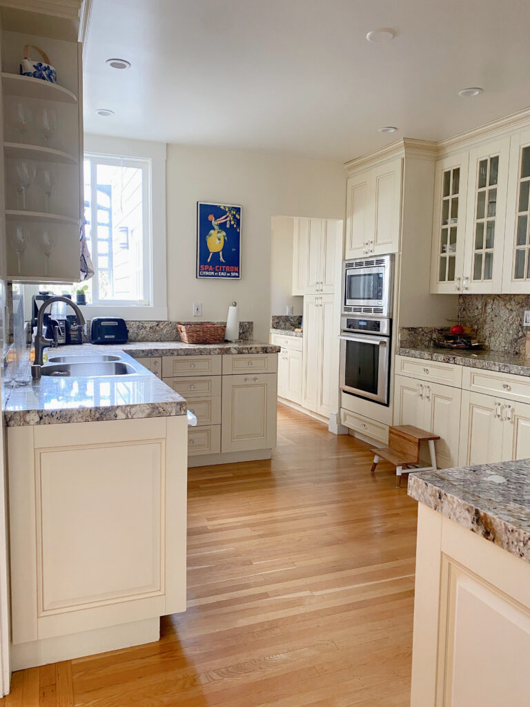
There are way too many bosses in this kitchen, yet none are calling the shots. From the start, the backsplash should’ve been the boss, in which case, the cabinets wouldn’t be painted cream.
Here are a few examples of bossy finishes that often have fewer limitations, but are still bossy…
- Vertically installed tiles that have multiple colors in them.
- Fireplace surrounds, including brick and stone with multiple colors in them.
- In a bedroom, bedding or drapes with several colors in the pattern
CAN A ROOM HAVE TWO BOSSY FINISHES?
You bet your cute lil’ booty or your big beautiful badonkadonk it can. While most rooms have one MAIN bossy finish, many rooms have reasonably bossy secondary finishes.

Both the marble backsplash and maple cabinets have needs, but as far as wall colors go, the backsplash is the boss!
From there, the best way to talk about bossy finishes and choosing the best paint colors for them is to break it down on a room-by-room basis.
This blog post isn’t about THE BEST PAINT COLORS, it’s about learning which finishes matter the most when CHOOSING paint colors.
I have hundreds of other blog posts dedicated to the best paint colors (use my SEARCH, it’s amazeballs).
YOUR KITCHEN’S BOSSY FINISH
When it comes to kitchens (or any room, really), there’s no end of layouts and palettes. These tips are based on the average kitchen in the average home – cool beans?


With no tile backsplash, it was easy to focus on the needs of the older granite countertops
IF YOU’RE CHOOSING A CABINET COLOR
With very few exceptions, the backsplash is the boss, as it makes a visual vertical connection with the cabinets.
It doesn’t matter how wild and crazy your countertop is; the backsplash calls the color shots.
Sure, all is well if your backsplash, countertop, and flooring all coordinate (like below). But if not, your backsplash is the boss…

While there’s room for a bit of mix and match when it comes to countertops and cabinet colors, there’s no room for error with the backsplash/cabinet combination.
Now, there are situations where the backsplash isn’t the boss, in which case, the COUNTERTOP is given a raise to boss position…

- When there’s no backsplash.
- If you have a slab backsplash (the countertop is used on the backsplash).
- When the backsplash is just white (ie, subway tile), but you don’t want white cabinets.
- When you’re choosing a paint color for your kitchen island.
IF YOU’RE CHOOSING A PAINT COLOR FOR YOUR WALLS
While the backsplash is still the boss, it doesn’t rule with as much of an iron fist. This is because while the backsplash and walls are both vertical, there’s FAR LESS backsplash actually touching the wall – in some cases, there isn’t any at all.
But there are a few curves in our color path with this topic…
IF YOU HAVE WOOD CABINETS OR WHITE CABINETS: You take your finishes as a whole into more consideration, with hopes that your finishes are reasonably well-coordinated and suit the same wall colors.

IF YOU HAVE PAINTED CABINETS: Your cabinet color is the boss, followed by the backsplash and its needs. Then, you can consider the countertop and flooring and whether they suit the same colors as your cabinets/backsplash.

Remember, sometimes you can’t make every finish 100% with the same paint color – either something has to give or be updated.
IF YOU HAVE CREAM CABINETS OR TRIM
As mentioned earlier, cream cabinets can be a bugger to coordinate with, as they have so many limitations.
This means they only suit so many paint colors. Even if your countertop is wildly flexible and your flooring is easy-to-please, cream cabinets and trims put out all the stops.

The Best Modern Paint Colors to Update Cream Cabinets
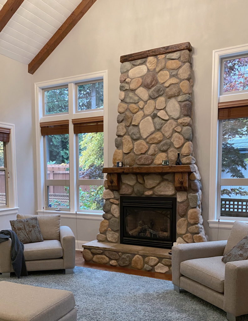
THE BOSSY FINISH IN YOUR LIVING ROOM OR FAMILY ROOM
If you have a fireplace in your living room or family room, it’s the bossy finish (with few exceptions).
Again, it comes down to vertical vs horizontal. Your fireplace is on the same vertical plane as your walls, so your eye connects them quickly compared to the flooring or furniture.

As for exceptions, if you have tile flooring, it can play a really big part, and even be the assistant boss to the fireplace, depending on how much stone/brick you have.
5 Affordable Ideas to Update Your Fireplace
Also, if your fireplace only has a small amount of stone or brick and is surrounded by a mantel/hearth, it can play a smaller part.
Unless you have a blank slate room (no finishes) your room should give you what you need regarding its best paint colors.
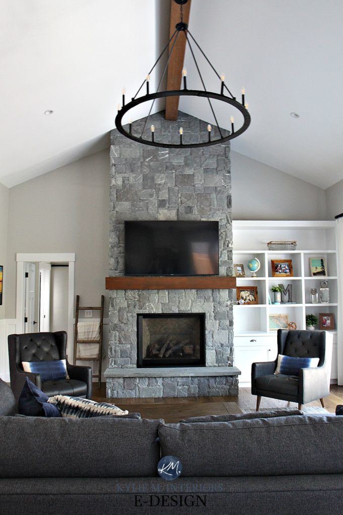
Whether it’s for the paint color on the walls, sectional fabric, or accent colors, the above stone fireplace gives us everything we need.

Remember, just because YOU want a colour doesn’t mean your home agrees with you – sample and compare carefully!

The Best Paint Colors With a Red or Pink Brick Fireplace
As shown in this next living room, sometimes transitioning from one style to another can be next to impossible, especially when you have a home with particular Tuscan/early 2000s vibes…
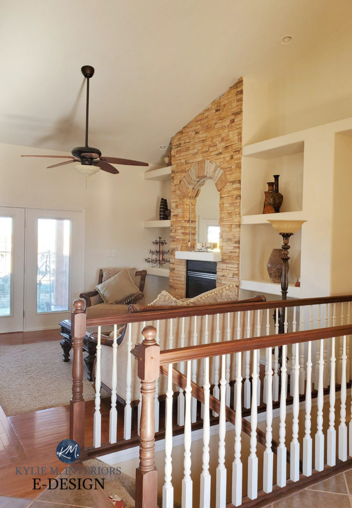
Even if the above homeowner had wanted something different (ie, gray or white), we’d create a hot mess, as that big ole stone fireplace calls the shots!
The key is to choose the most MODERN version of the type of colour your bossy surface demands.
YOUR BATHROOM’S BOSSY FINISH
Bathrooms can be hard when it comes to figuring out which finish is the bossiest. It can change drastically depending on the size of the bathroom and which finishes are/aren’t tiled.
I’m going to try to cover as many bases as I can!

There’s no denying who the boss is in this bathroom – AND IT AIN’T TONY DANZA!
THE SHOWER TILE
If you have a shower (or tub with a tiled surround) that’s reasonably noticeable upon walking into the room, and it has tile around its walls, there’s a good chance it’s the boss.
Again, vertical wall tiles are on the same plane as your walls.
Now, let’s hit a few exceptions…
- If you have a shower curtain covering your tile most of the time, you might look at your next bossy finish, which is either the flooring or countertop, depending on which is more dominant. If they coordinate, they can both be the boss as they’ll suit the same colors.
- If your shower is tucked in a corner and not as prominent, there’s a chance your floor or countertop is bossier.
- If you have a glass door that meets up with the edge of the tile and disrupts the connection between the tile/wall, the tile might not be the boss.
- If you have white tile in your shower, then you can easily move on to the next bossy finish.
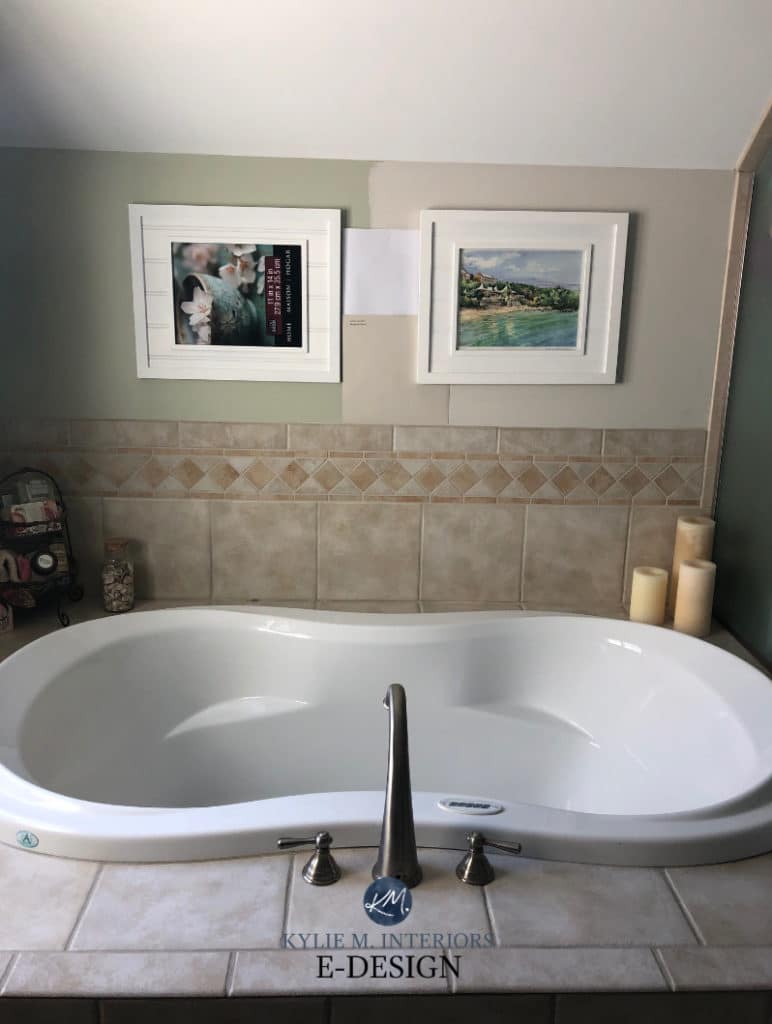
While the muted beige on these bathroom walls works with the accent tile in the shower, the MAIN TILE should’ve been the boss…

This would’ve led to a softer, more natural look with a warm gray with purple undertones or soft taupe paint color.
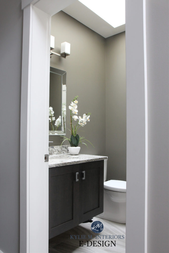
IF YOU HAVE A POWDER ROOM
Powder rooms don’t have tubs or showers, meaning you will either have your flooring or countertop as the boss. If it’s a darn small powder room, chances are the countertop is the boss as it’s closer to eye level, even though both are horizontal.
IF YOU HAVE A TON OF TILE FLOOR
If your bathroom has a buttload (look it up, it’s a thing) of tile on the floor and not as dominant tile in the shower, the tile floor might be the big shot caller when it comes to paint colors.
It’s easy to see what’s calling the shots in this big, badass bathroom…

Look at how much the right paint color calms this space down and mutes the pink in the tile (it’s like I know what I’m doing or something…)

Remember, sometimes you can’t make every finish 100% with the same paint color – either something has to give (not look as good as it could with the wall color) or be updated.
In this next example, notice how the old green color introduces something that isn’t already in the tile, and it doesn’t tie in very well. The NEW samples are the way to go, in which case, green could then be used as an accent colour (for art, towels, and decor)…
Green is a better accent color for this space, rather than a full room commitment
And even though the above tile isn’t traditionally INSPIRING, it’s definitely the bossiest surface in the room!
Why?
- because it has the most LIMITATIONS as to which paint colours will look good with it (due to its undertones)
- because it’s on a vertical surface
USING A SENTIMENTAL ITEM AS INSPIRATION
If you’re choosing a sentimental item (ie, artwork) as inspiration, you’d better plan on having it for a LOOOOONG time – this boss better not take early retirement.
Why?

- Artwork and such (even permanent pieces) are usually ‘secondary’ inspiration pieces (used to pull accent colors from). This is because they’re likely to be replaced over time, and you may not want to pick a new color scheme based on them. There ARE exceptions, but consider things carefully.
- Main finishes (tiles/countertops, etc…) tend to be higher cost items and are more ‘permanent’ – unless you’re like me and your home is a revolving door of products and colors – and husbands… :).
NOW THAT YOU’VE HIRED A BOSS…
BREAK DOWN ITS COLOR PALETTE
Figure out which colors exist in this piece, along with their UNDERTONES.
If you’re not sure what their undertones are, what should you do? Bring home a wide range of paint colors and see which ones blend/connect. From there, do your research on THOSE paint colors.
I’ve also got a GREAT blog post for you to read… What Are UNDERTONES & How to Find Them
DECIDE WHICH OF THESE COLORS YOU WOULD LIKE ON YOUR WALLS
For a color to be a contender, you should be able to clearly see it in your inspiration piece from EIGHT FEET AWAY.
If your piece only has 1-2 colors in it, it’s easier to add a new, possibly contrasting color to the palette.
If the boss piece has 3+ colors, it can be more challenging (but not impossible) to introduce a new color to the palette. However, repeating a color that your finish already gives you is easier.
In this next photo, there’s a wide range of colours to choose from in the stones…
And while I could go on and on…and on (as usual), these tips and ideas should get you well on your way to finding the best paint colour for your home.
READ MORE
The 12 Best Whole Home Gray & Greige Paint Colours
How to Create a TIMELESS Home – 4 PART SERIES
The Best Warm Neutrals That AREN’T BEIGE!
What Are UNDERTONES & How To Find Them
The Ultimate Guide to Choosing Paint Colours With LRV!
NEED HELP?
CHECK OUT MY E-COLOUR SERVICES!
Chat soon,