
How to Paint Rounded Drywall Corners (Bullnose)
3 Ways to Paint Rounded Drywall Corners with Different Paint Colors
Who invented rounded drywall corners anyway? Clearly, it wasn’t anyone with common sense, as they’re a royal P.I.T.A when you want to use two different paint colors.
Today, I’m sharing some ideas to help you figure out where to make a break between colors on a rounded corner. This blog post is not photo-heavy and is more detail-oriented, so get ‘yer reading glasses on!

But before we dive in, let me say that if you want a color palette that flows, using 1 paint color is best. It’s only if you HAVE to, or if you’re a glutton for punishment, that you’d use 2 colors that meet on a rounded corner (been there, done that).
Now, let’s see how we might get this done…
1. CHOOSE THE PRIMARY COLOR, NOT THE SECONDARY COLOR
When you’ve got two walls that meet at a 90-degree angle with a curved or rounded edge, you need to decide which room is the PRIMARY room (wall) and which is the SECONDARY room (wall).
If you choose to wrap one color around the corner (rather than break it in the middle of the curve), you’ll want to wrap the color belonging to the PRIMARY room, not the secondary.
THE PRIMARY ROOM
When it comes to rounded corners, we’re dealing with two rooms or walls that meet via a rounded or bullnose corner. Excluding hallways (coming up shortly), the PRIMARY room is the most important room of the two for whatever reason you decide.
Which room is primary, which is secondary? You’d have to ask the people who live there! Which is me. If I were to use two colors, I’d bring the dining/kitchen color around the corner into the living room. However, I chose one color as both spaces are pretty dominant.
Here are a few considerations…
- Which room do you have to walk through to get to the ‘other’ room? The room you walk through is often the PRIMARY room or area.
- Which room do you use more? The room you spend the most time in will often be the PRIMARY room.
- Which room is larger? The larger room will often be the PRIMARY room.
You might have a combination of the above, in which case, you’ll prioritize the room where you spend the most time.
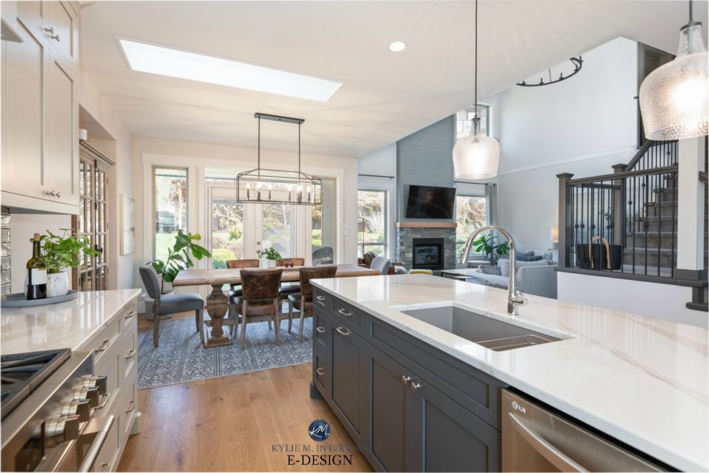
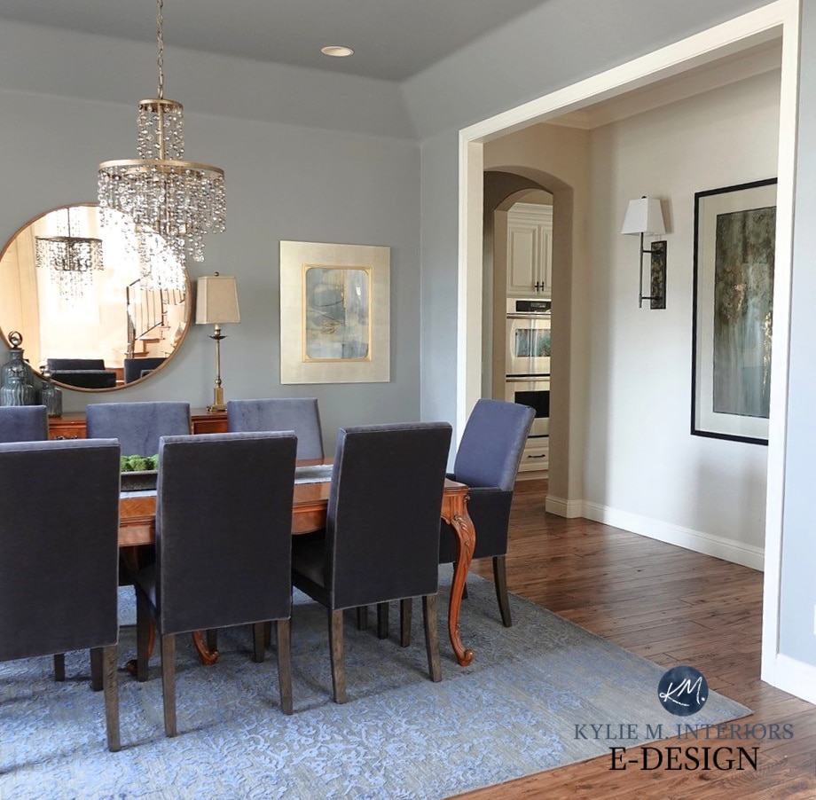
In the above photo, while this isn’t a rounded corner, the 5″ transition offers the same challenge. In this case, it’s best to have the dining/living area color rolling into the kitchen. On the other hand, if the kitchen colour was on that 5″ transition wall, there would be an awkward stripe that affects a VERY large, often-used space.
REMEMBER, if you don’t cut a rounded corner in HALF, you’re going to see a stripe of color in one room or the other. While seeing it in EITHER room isn’t awesome, try to choose the lesser of two evils.
THE SECONDARY ROOM
This is the room that comes in second place in the pecking order.
- This is often the smaller of the two rooms
- The secondary room is often used less than the main room
So, now that you’ve decided which area is primary and which is secondary, you’ll bring your ‘primary room color’ around your rounded or curved corner and will start your secondary color where the wall resumes its flatness.

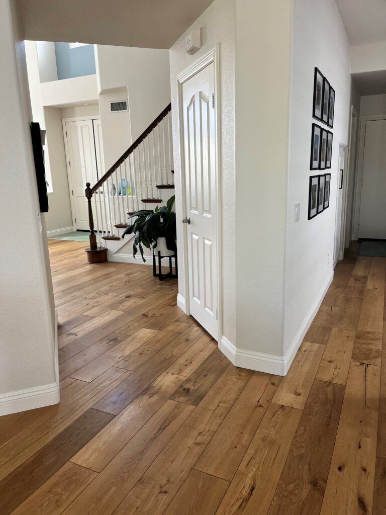
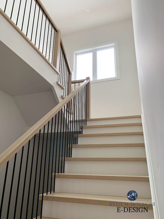
In the above area, we’re dealing with two transition-type areas – a staircase and a hallway. While they happen to be the same color, if we were to paint two different colors, the staircase would be the PRIMARY space with the hallway being the SECONDARY space.
Why?
Because we have to walk through the staircase area to get to the hallway. Now, the shaded areas may be whispering in your ear and telling you otherwise, which we will talk about below, but remember that these shadows will change as the sun shifts.
IMPORTANT DETAIL
The higher the contrast between the two colors (i.e., one is considerably lighter and one is considerably darker), the more likely it is that you should apply this next tip instead (to avoid a drastic, shocking stripe in one room or another).
The Best NOT BORING Paint Colours for a Dark Hallway
WHAT ABOUT HALLWAYS WITH ROUNDED CORNERS?
If you have a main hallway, ie, a hallway that the living room, dining room, and/or kitchen walls are attached to (via rounded corners), the hallway is almost always considered the SECONDARY area, assuming the rooms they lead to are main rooms.
Why?
Hallways are transition areas that you spend little time in. Main rooms are those where you tend to stay for minutes, if not hours. This means that the view you see from your main room matters the most. Do you want to sit and stare for hours at a vertical stripe of your hallway color?
The Best Paint Colors for a Dark Hallway
WHAT ABOUT SUPPORT BEAMS OR PILLARS WITH ROUNDED CORNERS?
From the heart of my bottom, choose one color. There’s no way to make a 2-color palette look good, as there are way too many architectural details to account for.

2. DIVIDE YOUR BULLNOSE OR CURVED CORNER IN HALF
This one is tricky, but if you’ve got a good eye and steady hands, it’s a great solution (in other words, not me, two glasses deep on a Friday night…). It’s also the best choice if your colors are high contrast with each other.
I prefer this option much more than Option 1 (but you do you, boo).
Use your Frog Tape (a better alternative to regular painters’ tape) and tape a vertical line down the center of your curved corner. This creates the ‘illusion of a 90-degree sharp angle’.
Of course, your corner is still rounded, but when you look at it from four feet away, it looks more like a standard corner, and you also reduce the risk of having a ‘stripe’ of another colour in your primary or secondary space.
I am not a pro-painter, but a ‘pretty darned good one,’ and this is almost always what I do with my rounded corners (when I want a 2-color palette, which I have to REALLY WANT to attempt this).
3. FIND THE NEAREST INSIDE CORNER
If you’re having trouble painting a clean, tight vertical line on your rounded corner, you may need to find your nearest inside corner and meet your opposing colors there. Not everyone can cut a clean line on a rounded corner, and you may need to sacrifice the flow of your paint color to make things work.
If all else fails, find a color you love for both spaces and avoid using two different colors.
4. BONUS IDEA: INSTALL MOLDINGS ON YOUR ROUNDED CORNERS
Hands down, this is my favorite idea for dealing with rounded drywall corners (other than painting both spaces the same color.
If you aren’t happy with how you painted your rounded corners, but still want a two-color paint palette, figure out which corners are the worst offenders and consider wrapping them in mouldings, which will cover up those damn edges and give you a fresh start.
In the next photo, notice how the inner hallway area has rounded corners, but the transition between the hallway and dining room is covered in mouldings – SMART!
Short of redrywalling, this is a great solution that will make your painting life a HECK of a lot easier.
READ MORE
Why You Keep Choosing the Wrong Paint Colours
The 12 Best WHOLE HOME Gray & Greige Paint Colours
5 Budget-Friendly Home Update Ideas
How to Deal with Popcorn or Textured Ceilings – Info You Need BEFORE You Scrape!
Need paint color help?
Check out my Online Color Consulting Services!
ORIGINALLY WRITTEN IN 2017, UPDATED IN 2025


thoughts on the bullnose going into a large archway, such as, Kitchen to Living room. Its actually two very large arches. I agree this stuff was not created with a designer anywhere in sight! Ugghhhh!
I know! I find that a lot of builders are going back to the 90 degree corners, just because the rounded ones can be such a bugger for the homeowner! If it was kitchen to living room, I would probably give priority to the livingroom and wrap most of the colour to that room.
I hope that helps!
~Kylie
I’ve been trying to figure out what to do with my bullnose corners, which is why I’m here. But I also came across a fairly highly-reviewed product called “blendmate” and I was wondering what your take on it would be. The idea is that it kind of paints three sections… the primary, the secondary, and a bit right on the middle of the nose that’s a blended shade of both colors… thereby making a softer line. I think it might look weird for highly contrasting colors.
Oy vay. Sounds complicated. I haven’t heard of it before, so I looked it up and I just don’t think I’d go for it. I mean, the corners and how they can look can also changes as the sun progresses and the shadows change, so I just think if it were ME, I would break the 2 colours right down the middle of the curve…
Arched doorways with bullnose corners. What do you think about painting insides of the archway the same as the baseboard, in my case white, then room colors are separated? It’s a thought I had.