Choose the right COLOUR to sell your home fast!
Partner post: The Top 8 LIGHT NEUTRAL Paint Colours for Home Staging
I’m not a consultant who believes that all homes sell better when painted light, neutral colours. In fact, many homes sell faster and for more money because their colours resonate on an emotional level with buyers, whether it’s because they have more COLOUR (chroma) to them or more DEPTH than the average light neutral paint colour.
So, this blog post is not only about COLOURS, it’s also about neutral with a bit more meat on their bones, ones that my Online Paint Colour Consulting clients (and home buyers) seem to fall in love with at first sight. Colours that might help YOU add some emotional and ACTUAL value to your home.
See the BEFORE & AFTER as well as colour details HERE
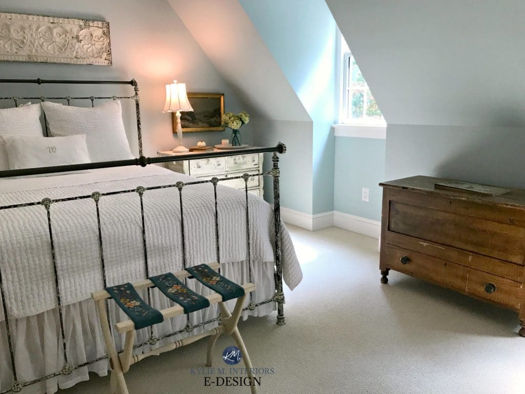
1. SHERWIN WILLIAMS SEA SALT SW 6204
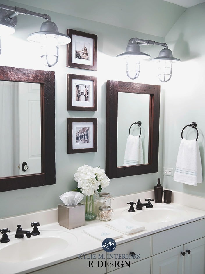
This is definitely one of the more popular green-blue inspired paint colours on the market! Sea Salt is a beautiful light green with a decent gray backdrop, but be warned – it also loves to flex into blue due to its particular blend!
Sea Salt has an LRV of 63, a GORGEOUS depth for the average room (read more about that HERE). It handles itself reasonably well in low-lit and brighter light, but like I always say, ‘if you don’t have enough artificial or natural light, there’s no paint colour that will save you’.
THE BEST ROOMS FOR SHERWIN WILLIAMS SEA SALT
- a master or guest bedroom
- bathroom
- homes with a beachy vibe
- Sea Salt is not a colour you would do multiple rooms in, its best for singular spaces
PAINT COLOURS THAT ARE SIMILAR TO SEA SALT BUT WITH A SLIGHTLY DIFFERENT LOOK
Sherwin Williams Rainwashed is similar to Sea Salt but leans harder into a blue undertone. Benjamin Moore Palladian Blue is VERY comparable if you prefer one brand over another.
The Ultimate Guide to Choosing Paint Colours with LRV
Paint Colour Review: Sherwin Williams Sea Salt
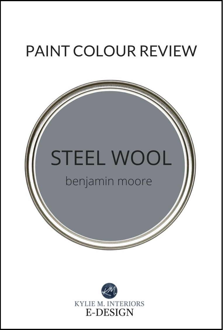
Steel Wool is AWESOME. It’s a medium-dark toned charcoal gray with a decent blue undertone. Blue loves to lean either green or purple, and this one leans slightly purple.
In fact, I used Steel Wool in our LAST home and it got RAVE reviews (and yes, the house did go into multiple offers).
Steel Wool has an LRV of 19 – BOOM! It’s certainly got some visual weight to it but NEVER looks black, even in a darker space.
THE BEST ROOMS OR WALLS FOR BENJAMIN MOORE STEEL WOOL
- a bedroom that is reasonably well-lit
- a family room
- as a feature wall
PAINT COLOURS THAT ARE SIMILAR TO STEEL WOOL BUT WITH A SLIGHTLY DIFFERENT LOOK
Sherwin Williams African Gray is a great comparable to Steel Wool, whereas Benjamin Moore Trout Gray has a bit less undertone and more depth. For even MORE depth, check out Benjamin Moore Gray 2121-10.
Paint Colour Review of Benjamin Moore Steel Wool
3. BENJAMIN MOORE REVERE PEWTER HC-172
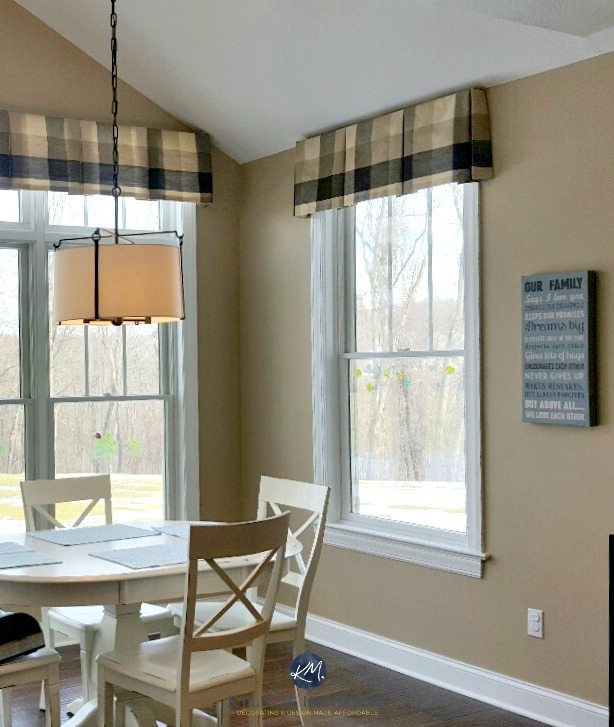
Revere Pewter is a lovely warm gray paint colour that’s been HUGELY popular in the last five years – and is still going strong. While many grays pick up a blue or purple undertone, Revere Pewter is more likely to pick up a faint earthy-green that makes it look warmer than the average gray. And because it’s likely to pick up a bit MORE undertone than many grays, I’ve included it in both the ‘best light NEUTRAL paint colours for staging‘ as well as this more COLOURFUL blog post.
With an LRV of 55, Revere Pewter has a bit more depth and undertone than the average ‘home staging paint colour‘. But let me tell you, it has HUGE mass appeal and suits MANY styles of homes.
All About Benjamin Moore Revere Pewter
THE BEST ROOMS FOR BENJAMIN MOORE REVERE PEWTER
- any or all of the 5 Key Rooms
-
bathrooms
-
south-facing rooms (to balance out the warm exposure a bit)
-
small or large rooms
-
when lightened by 25-50%, it is great for dark rooms or hallways
- I also have a soft spot for the slightly darker, Sherwin Williams Amazing Gray
PAINT COLOURS THAT ARE SIMILAR TO REVERE PEWTER BUT WITH A SLIGHTLY DIFFERENT LOOK
Benjamin Moore Rodeo is great if you want a colour that’s slightly lighter. Sherwin Williams Amazing Gray is a shade that’s similar to Revere Pewter but has a bit more depth and undertone.
4. BENJAMIN MOORE GIBRALTAR CLIFFS 1587
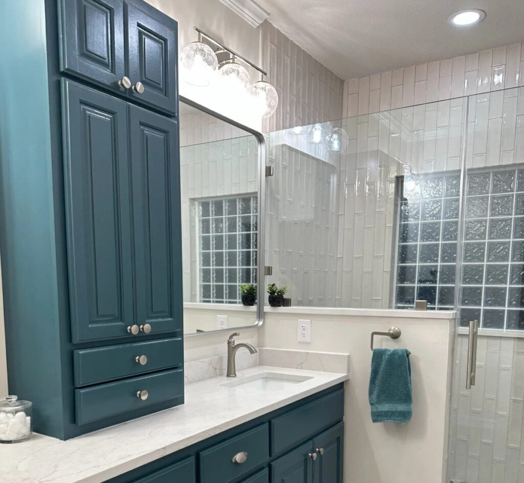
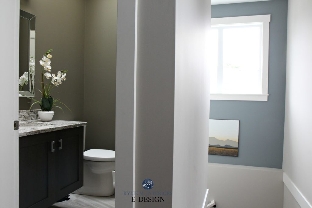
Gibraltar Cliffs is HANDS-DOWN one of the prettiest gray-blue paint colours, with just the right depth to envelop an entire room or act as a feature wall to light neutral paint colour.
Sherwin Williams Anonymous on the left, Gibraltar Cliffs and Sherwin Williams Colonnade Gray on the right
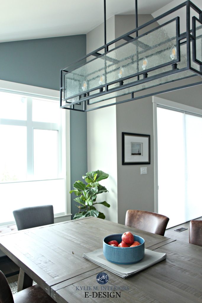
Gibraltar Cliffs has a reasonable depth with its LRV of 30. And not only is it a blue-gray blend, but it also has a soft green hiding in it as well.
THE BEST ROOMS FOR GIBRALTAR CLIFFS
- bedrooms that have reasonable natural light
- a small bathroom
- feature wall
- cabinets or bathroom vanities (can be stunning)
Paint Colour Review for Benjamin Moore Gibraltar Cliffs
PAINT COLOURS THAT ARE SIMILAR TO GIBRALTAR CLIFFS BUT WITH A SLIGHTLY DIFFERENT LOOK
Benjamin Moore Mount Saint Anne is similar to Gibraltar Cliffs and is great if you want a lighter approach.
Undoubtedly, you’ll be heading out in the near future to grab paint samples – stop right there! I want you to check out SAMPLIZE. Samplize offers peel and stick paint samples that are more AFFORDABLE, EASIER and more ENVIRONMENTALLY FRIENDLY than traditional paint pots. Here are just a FEW reasons why I recommend Samplize to my clients…
- samples arrive ON YOUR DOORSTEP in 1-3 business days, depending on location
- they’re more affordable than the samples pots/rollers/foam boards that are needed for traditional paint sampling
- if you keep the samples on their white paper, you can move them around the room
CHECK OUT SAMPLIZE HERE
5. BENJAMIN MOORE CHELSEA GRAY HC 168
Looking to make an impact? Then check out Chelsea Gray. This medium-toned gray colour makes for a striking feature or accent wall or can completely envelop a room in its loveliness! Is it brave? HECK YA, but if you have the right room, you can make a great statement with it.
Keep in mind that while it’s SAID to be a warm gray, Chelsea Gray usually looks cool (like me in aviators) and can pick up a minor green undertone.
The 4 Best Gray and Greige Paint Colours for Cabinets
With an LRV of 22, Chelsea Gray has some serious meat on its bones. But, time and time again, it holds up well, even in darker spaces (when you want more of a moody look vs light and bright).
THE BEST ROOMS FOR BENJAMIN MOORE CHELSEA GRAY
- feature or accent walls
- media rooms
- cabinets
PAINT COLOURS THAT ARE SIMILAR TO CHELSEA GRAY BUT WITH A SLIGHTLY DIFFERENT LOOK
I LOVE the slightly darker Benjamin Moore Amherst Gray for some serious impact and drama. As it relates to Sherwin Williams, check out Classic French Gray and the warmer Sherwin Williams Dovetail
Paint Colour Review: Benjamin Moore Chelsea Gray
Click HERE or on the above image to see available packages!
6. SHERWIN WILLIAMS SILVER STRAND SW 7057
Silver Strand is a light, but not a washed-out blend of blue, green, and even shades of gray. It’s also a bit of a chameleon as it seems to change its look based on WHO’S LOOKING AT IT! Some call it a blue-gray, others, a blue-green, but NOBODY calls it boring.
The 8 Best Blue and Green Paint Colours
With an LRV of 59, Silver Strand is a great way to get some colour on your walls and contrast with white trim, without overwhelming a space.
THE BEST ROOMS FOR SHERWIN WILLIAMS SILVER STRAND
- bedroom or bathroom
- a room that needs to look restful and relaxing
- great for a bit of colour without going TOO far
PAINT COLOURS THAT ARE SIMILAR TO SILVER STRAND BUT WITH A SLIGHTLY DIFFERENT STYLE
If Silver Strand is just too colourful, you might want to bump back to Benjamin Moore Gray Owl, which is a light gray with green-blue undertones. If you love that bit of colour, check out Benjamin Moore Gray Cashmere or the slightly darker Sherwin Williams Argos (mad love).
Paint Colour Review: Sherwin Williams Silver Strand
7. BENJAMIN MOORE ANCHOR GRAY 2126-30
Anchor Gray is STUNNING. And while not every home can handle a strong navy blue, Anchor Gray is a great way to get the navy look, without going overboard (get it?).
THE BEST ROOMS, WALLS OR SITUATIONS FOR BENJAMIN MOORE ANCHOR GRAY
- feature or accent walls
- cabinets or kitchen islands
- entire rooms, as long as they’re reasonably well-lit (check those bulbs!)
PAINT COLOURS THAT ARE SIMILAR TO ANCHOR GRAY BUT WITH A SLIGHTLY DIFFERENT STYLE
Of course, there’s ALWAYS Benjamin Moore Hale Navy which is a navy blue with more depth and colour than Anchor Gray. I also love the more muted approach of Benjamin Moore Trout Gray, which is a VERY popular medium-toned gray with violet-blue undertones.
The Best DARK GRAY Paint Colours from Benjamin Moore
8. BENJAMIN MOORE WOODLAWN BLUE HC-147
Woodlawn Blue is a GORGEOUS blue paint colour with just the right shade of gray to calm it down. As mentioned earlier, blue can lean either blue-purple or blue-green – this lovely one leans lightly into blue-green.
THE BEST ROOMS FOR BENJAMIN MOORE WOODLAWN BLUE
- a bedroom
- south-facing room to help balance the warm light
PAINT COLOURS THAT ARE SIMILAR TO WOODLAWN BLUE BUT WITH A SLIGHTLY DIFFERENT STYLE
If you add a wink of green to Woodlawn Blue, you’ll end up with a colour like Sherwin Williams Rainwashed, which is equally as pretty.
The Best Blue-Green Blend Paint Colours
The Best Blue-Gray Blend Paint Colours
OH, WHAT THE HAY, LET’S DO A FEW MORE…
9. SHERWIN WILLIAMS DORIAN GRAY SW 7017
I LOVE DORIAN GRAY! Dorian Gray’s LIGHTER version, Repose Gray, is definitely one of the more popular LIGHT warm gray paint colours, but for me, I love the body and contrast that Dorian Gray offers. When it comes to undertones, you’ll find this soft, medium-toned warm gray can pick up a very vague purple undertone that can sometimes flash a TINY wink green (vague).
THE BEST ROOMS, WALLS & SITUATIONS FOR DORIAN GRAY
- a kinky Friday night (50 Shades of Gray reference, for those in the know)
- entire rooms that are reasonably well-lit
- feature wall, if the other walls are off-white
- small bathroom
- I also love the slightly warmer Sherwin Williams Mega Greige
PAINT COLOURS THAT ARE SIMILAR TO SHERWIN WILLIAMS DORIAN GRAY
If you want a bit more depth, check out Sherwin Williams Dovetail which is particularly popular for feature walls and cabinets. Benjamin Moore Metropolis is also a beautiful medium-toned gray paint colour that has a bit more warmth.
Paint Colour Review of Sherwin Williams Dorian Gray
10. BENJAMIN MOORE ARCTIC SHADOWS 1559
Arctic Shadows is one of the only true greens on this page. Why? Blue has WAY more mass appeal, whereas the wrong green can actually date a space.
Arctic Shadows is a green-gray blend. So while you get COLOUR, you aren’t smacked upside the head with it, which is one of the reasons why it’s popular.
Kylie M & Tim Hanson Productions
The Best Benjamin Moore Green Paint Colours
THE BEST ROOMS FOR ARCTIC SHADOWS
- entire rooms
- cabinets and bathroom vanities
- rooms with wood surfaces if you want to ACCENT the wood
- balance south-facing or afternoon western sunshine
READ MORE
Home Staging Tips – 5 Key Rooms
The Best Light, Neutral Paint Colours for Home Staging
The 12 Best WHOLE HOME Gray & Greige Paint Colours
The 8 Best WHOLE HOME Warm Neutral Paint Colours
NEED HELP?
Check out my Online Consulting and Paint Colour services!
Chat soon,
Originally written in 2015, updated with new info and photos in 2021!
Hi
I have just painted a bedroom bleeker beige (north room) and it looks dull to me. What can I do now??? I have a creamy colored carpet but pine ceilings/cedar door and some log detail in room. (post & beam log house). I did Lenox tan in room below that one on North side also, and it really picks up all the natural surrounding forest outside, as well as pine ceilings seem to throw off color. Help I guess I should have gone lighter???
Yes, Bleeker Beige can be a tad…bleak. So, if you’re looking to repaint and would like a ‘slightly’ lighter and warmer look you could try Gentle Cream which is like a ‘heavy cream’ colour (without being too yellow) I love Gentle Cream!!! However, if you’re thinking that you might want to ‘accent’ the log details you could look at a soft greyish green (with a slight yellow undertone to warm it up) Although you have to still be careful with green in a north facing room, it can be quite pretty for complementing wood features. Camouflage would be my go to for that colour. Very soft, very pretty…but I would still do Gentle Cream…
Check those 2 out and let me know what you think. If you don’t like them I’ll throw a few more ideas your way 🙂
If you’d rather not paint and are looking to jazz things up with other details, then it will be ALL about the accent colours and texture as both of those things help to warm up a space. I’m always a fan of neutral bedspreads (as it allows for accent colours to really shine) so you could do a bedspread that is kind of an off-white/cream colour with some texture to it. Texture means that it’s not just a flat cotton – it should have a nice tactile feel or look to it.
For Bleeker Beige and wood details, Giant Sequoia/Copper Mine are gorgeous colours to warm up a space. If you pair that with a nice fudgy brown like Chocolate Brown/Middlebury Brown and just a smidge of Army Green (to accent the Giant Sequoia colour) you might find that the space has some depth and interest as the walls should hopefully just fall back as a backdrop.
To add texture and interest you could get a floor vase (glass or solid) that is approx. 24″tall. Then add those small river rocks to the bottom (you can get them from the dollar store in a bag) and some long straight or curly twigs. The twigs would go approx. 1.5x as high as the vase. On a dresser you could add some wicker balls or a wicker basket with trinkets in it – it’s all about texture!
And all that being said, if it were me…I would just repaint 🙂
So, I’m confused about the Lenox Tan. So you like how it picks up the forest outside but it’s kind of clashing with the pine ceiling? If that’s the case, it’s probably because Lenox Tan leans towards an orange undertone and pine ceilings tend to be a yellow undertone. This means that your orange and yellow aren’t happy together!
Monroe Bisque or Putnam Ivory are nice alternatives as they are a smidge lighter and have a smidge more yellow in them (althought Putnam still has a touch or orange, but it’s still okay). Sandy Brown is also a subtle shift – but possibly too subtle for you…And as always, I love Gentle Cream! However, you might find it too light if you’re looking for a slighter more rich colour.
Ooo, and all of that being said, I just finished a home that sounds like it has ‘similar’ features to yours and we used Cable Knit. This colour REALLY changes throughout the day – shifting undertones. But it is quite warm and lovely – something to look at anyways.
So, to summarize it all…
Bedroom Options- Gentle Cream or Camouflage
Other Room – Monroe Bisque, Putnam Ivory, Cable Knit (you could maybe look at these for your bedroom as well?) Remember, most colours can be lightened/darkened. So, if you like one of them but it’s a smidge dark, most paint companies can lighten things by 1/4.
Okay, so that’s probably information overload – as you can tell, I really get going sometimes!!! Please feel free to send me a few shots of the room if you’d like – if you’re not 100% on a solution. AND you must be from the beautiful USA as I see we spell Colour differently!!!
Please let me know how it goes or if there’s any confusion/questions 🙂
~Kylie
Hi Kylie
Wow, came across this when I was searching colors online! Thanks for all the suggestions. For now I won’t be changing out the bleeker beige as it is a big job to repaint, high ceilings etc. Doing a bathroom reno now, and again I’m uncertain. This room comes off kitchen area where the walls are Sparrow. I want something neutral that will look good with that. Leaning towards grant beige or edgecomb , muslin or Manchester tan, as I want some color. Hubby wants warm color. Have tile with beiges creamy whites and some rust streaks which I think complement the log color. Have a 42″ vanity that is the expresso color with white marble top. Mirror will probably be dark wood color to match vanity. Shower is all white. Room is on north side and has evergreens outside window. Room is 7×10. I could send pictures perhaps for a better idea. Not opposed to consultation and paying for some advice. Thanks
Kathy
Revelstoke BC
Hi Kathy, I’m so glad you found me! I would love to give you some help and it would just be the 1 hr consult for sure. If you hop onto my Online Consulting, you can grab an hour via Paypal and then right away you can send me some photos of your space/products so that I can give you the best colour recommendations possible! https://www.kylieminteriors.ca/online-decorating-design-consultation/ Looking forward to hearing from you!
~Kylie
Kylie recommended Gentle Cream for my almond fixtures bathroom through her online consultation. I love it. I would highly recommend her services. I can’t wait to get to the paint store for samples of Chasmiere Gray. Barb
Kylie – would Sherwin Williams Sea Salt go with a small kitchen with cherry cabinets, brown and beige granite countertops and a light beige stone backsplash. My living, dining, and kitchen are all one open space. I need a paint color that will be light , airy, and go with the beachy, cottage feeling he rest of the house has.
Author
Hi Susan, I do worry that Sea Salt could be a touch too gray/green/blue for the more beige/warm/reds of your kitchen – it could be just a touch too much colour/cool for the space! If you’d like me to take a look, I do have affordable E-design consulting – and it’s fun! https://www.kylieminteriors.ca/online-decorating-design-services/
Hi, love your site!
We just purchased a new home and the basement walls are white, it has a oak trim and built ins and the carpeting is longer with different shades of browns and creams. I am really in love with grey but am not sure if a grey color paint would look ok with all the browns?.. Any thoughts?
Hi Bethany, thank you, I love to hear that!!!!
Okay, so I think that gray and brown can be a super fab combo (and have it in my home!) So, it all depends on how dark or light you want your walls to be, so I’m going to throw some suggestions at you that cover both bases….
1. Light – Revere Pewter (Ben Moore…of course!) It’s a light gray (but not light enough to be an off-white) with a subtle yellow undertone. It’s the subtle yellow in this gray that will work so well with your oak trim and help to tie in with the warmer toned floors. Just make sure to add some nice charcoal accents in the room (like toss cushions/throws/etc…) so that the Revere Pewter has some gray friends 😉
2. Medium/Dark – Chelsea Gray is one of my uber fave colours. A lot of people find it too dark, so it may depend on your comfort zone. It would likely lower the contrast between your carpet and your walls (which in fact can make a space look bigger) but you might find it too heavy overall….
3. A smidge of colour….Desert TWilight. A nice heavy charcoal with a smidge of green in it. When placed next to your oak details the green will show more which is a good thing if you like green, but if you don’t you won’t be very happy…..
4. And of course…Gentle Cream. Gentle Cream gives you warm and freshness with the flexibility to have charcoal coloured accents/drapes/etc…throughout….
So, let me know what you think of those and PLEASE if you have any issues send me some pictures!!! And if it all works out I LOVE before and after photos!!!
~Kylie
We just bought a house and i like the paint for most of the interior walls – our painter matched it to BM Soleil. It’s our first home and I’m nervous that it’ll look too yellow. Most of our furniture is brown leather (dark). What do you think? The sellers think it was a sherwin williams colour but our painter likes BM. It’s. It’s nice and warm and goes well with the hardwood which is a warm colour.
Also our kitchen is from 1988 and has oak cupboards. Do you think a nice off white would be more modern? Do you have a recommendation for a white that would go with Soleil and possibly BM Grasslands in the kitchen?
Thanks!
Hi Natasha, thank you for writing and asking! Okay, so Soleil is a beautiful colour but it’s definitely ‘yellow’. Yellow really reflects a lot of natural and artificial light, meaning that the yellow that you pick isn’t always the yellow you get – it’s usually brighter! So, if you are looking for a fresh and ‘definitively yellow’ look then you will really like it. If you prefer a more ‘subtle yellow’ look then I’ve given you some suggestions below.
Okay, so it’s obviously ideal if I could talk to you, but since I can’t I’m just going to give you my best advice based on what ‘I would do’ with what seems to be your colour style….
1. Keep the Soleil in the main bottom stairwell/hallway/upper stairwell/livingroom/familyroom off of the kitchen
2. Paint the entryway a striking colour
3. Paint the kitchen a striking colour
4. I’m wavering between painting the diningroom a striking colour or keeping it the Soleil (I think I’d paint it something cool though 😉
Basically what we’re doing is we’re ‘sandwiching’ the yellow in your home. It will be flanked on either end by deeper colours which will add depth and interest!
Okay, so before I go any further, if you decide that the Soleil is too bright then here are some options…
1. Windham Cream HC 6 – Very similar to Soleil, but takes the ‘edge’ off of it
2. Philadelphia Cream HC 30 – Very similar but slight more ‘neutral’ (I looove this colour)
3. Powell Buff HC 35 – The most different from Soleil (but not drastically). It’s warm and grounded with just a touch of almost a brownish undertone, making it a nice foundation colour (another fave….)
Gentle Cream is an awesome colour, but some people might find it kind of ‘non-commital’. Compared to Soleil, it certainly is, however it’s a great complement when you have rooms or walls in other, stronger colours.
So, once you’ve decide what your ‘yellow’ is going to be, then we can move on to the fun stuff!! Here are some choices to consider for rooms 2, 3 and 4 as mentioned above…
Now normally I’d get more ‘opinions and tastes’ from you at this point, but since we’re on the computer I’ll just tell you what I think would look UBER great…
1. I’d paint the dining room a colour like ‘Chocolate Fondue CC 482’. Awesome colour, especially with your floor and dark leather furniture
2. For the entryway I’d consider either Chocolate Fondue or Thyme 2148-20. Both of these colours would look great with either Soleil or any of the other yellow’s I’ve thrown your way
3. For the kitchen there are 2 options. If you stick with Soleil then you could look at Rustic Brick 2091-20. If you choose any one of the other colours you could choose Rustic Brick or Salmon Stream 2173-30. Why? Well, because both of these colours will look awesome with the chocolate brown and yellow AND they will actually help to blend in your kitchen cabinets, meaning you don’t HAVE TO paint if you don’t want to! (Just add some black hardware to the doors 😉
If you DO still want to paint the kitchen cabinets, the rust will still look striking and would look gorgeous with Cloud White cabinets or Flurry CC100
(keep in mind you’d want to use flat or eggshell with these colours above, these depth of colours can look a bit abrasive when they are shiny at all)
The nice thing about doing the colours above is that now you can accent with green to your hearts content! Green is such a SUPER fab accent colour in the form of toss cushions, artwork, accessories, plants, in a fabric, etc…
If you like green in the kitchen, Grasslands IS a very pretty colour and it complements Soleil really nicely (but not the other yellows as much). However, you’d have to do the dining room in Chocolate Fondue or Whitall Brown for it all to work out!
Oh man, I just look at the photos of your home and my thoughts just fly all over – you’ve got such a great layout and so many options for colour placement!!!!
I know I’m going all verbal diarrhea on you here, I have a huge headache, but I’m excited to share some thoughts with you so I’m sorry if it’s all a lot of information!!!
Please, any questions on the above HOLLER!!! I don’t want to leave you confused at all. If you like one or none of the colours above and want a different ‘type of scheme’ for the diningroom and entryway then let me know and I’ll throw some more colour choices your way!!!
Ps. If you don’t mind, please don’t tell your friends I helped this much as I can’t always and then I feel TERRIBLE when someone asks and I can’t – I do try to limit myself with ‘big’ replies and try to keep things short and sweet, but sometimes I get excited about a home – and I’m excited for you!!!
However, if you’re so inclined, please share my blog with your friends, I LOVE IT when people subscribe for weekly updates, it makes my world go round!!!
Chat soon!~
~Kylie
Hi There!
We’re looking for a paint colour that won’t clash with with our light pine floors and deep red couches. Our living room is super small, but it has a lot of light. What colour would you recommend?
Thanks!
Veronica
Hi Veronica. You have a few choices, if you’re looking to ‘accent’ your red couches and pine floors you’d want to choose colours in the green-ish range. Sandy Hook gray is an amazing green/gray (with just a very smidge of blue in it so that it’s no too sagey)
However, if it were me, I’d keep on with the warm colours and look at colours like…..
1. Powell Buff
2. Gentle Cream (always a hit….)
3. Navajo White (the lightest of the 3)
Let me know what you think of those colours, if we’re on the right track or if you’d like something darker and more rich!
~Kylie
How do you feel about comfort gray? I’m deciding between that and agreeable gray. Leaning toward comfort gray but afraid may be too dark. North facing living room. Both s Williams paint
Author
Hi Judy! Well, they are so different it’s hard to compare! Comfort Gray will have a bit more personality but does have that bit of depth to it. Both can flash a bit cool in a north facing room, but Agreeable is a softer look… 🙂
Hi Kylie!
Great post! I love that you included what the colors are ‘great for’ and ‘when to avoid’ them. I was hoping you may be able to help me out..
I just painted my kitchen (with very limited natural light) Muslin. I choose muslin to work with my travertine backsplash. The very large test boards I painted looked great, but of course while looking at the color in the kitchen you’ll naturally compare it to the current wall color. During the testing phase Muslin’s pink undertones were noticable. And that was okay. Well now that the entire kitchen is painted, the yellow in it has really come through and it is actually khaki most of the day and definately at night. (Which is disturbing next to my somewhat pinkish travertine.)
I am currently choosing a color for the living room that the kitchen is semi-open too. My living room recieves southwest light, receives light all day and it can get very warm at night as the sun sets.. I would love to cool this room down and was looking at a few whites, but now with the ‘yellow’ and pink kitchen, I don’t think that is the best idea. I have blonde floors and mocha couches. I like neutral/muted colors. Greens, blues, grays, whites, browns, etc.. Can you suggest a color for my living room that would complement the mocha (pinky) couches and tone down the yellow from the Muslin. I am at a loss and cannot repaint again.. Did I mention I already painted the living room and kitchen once? Thanks!!
Ooo, so here’s the challenge I see. The colours that would best complement your mocha (pink)couches are colours that would not necessarily help to tone down the yellow in the kitchen. Hmmm, putting my thinking cap on it. I’m going to break it in to 2 sections.
#1 – Best Colours for the Muslin
a) Revere Pewter – This soft gray has a subtle yellow undertone in it. And I know it sounds funny, but when you’re looking to ‘downplay’ a colour, you are sometimes better to ‘go with it’ rather than ‘go against it’. Revere Pewter would ‘go with it’ in a soft and subtle way.
b) Camouflage – a Soft green with a gray/yellowish undertone.
c) Sandy Hook Gray – one of my all-time fave colours (could be the colour you end up with….)
#2 – Best Colours for Mocha (pinky) couches
a) Whitall Brown – amazing chocolate brown – but may be too dark for you (it’s super duper lovely though….)
b) Kingsport Gray – depending on how dark your couches are as you wouldn’t want the walls to be the same tone as your couch
A few others to consider….
1. Horizon Gray – really soft gray with green undertones – love this one. To make it match ‘tone-wise’ with Muslin though you could get it lightened by 1/4.
2. Gray Horse – Similar to above, but just a smidge more blue in it. It depends on ‘how’ pink your couches are as to whether the blue in it will accent the pink or just f3.low with it….
So, I’m pretty open on those colours as I haven’t seen your place and am just picturing everything. Let me know if I’m on the right track there as it’s easy for me to tweak some options if we’re close 🙂
~Kylie
Hi Kylie!
I love your paint colour advice … and most of all I love that you are a Benjamin Moore fan! I have Benjamin Moore paint throughout the house, and though I love the quality of the paint, I just can’t seem to get the colour combination/flow quite right. Hopefully you can shed some light:
We bought the house a couple of years ago for its beautiful location, and have done most major renovations. It is a very large ranch, with low ceilings and covered porches both front and back so even though the house faces East and has many very large windows, the amount of natural light is very limited. Then kitchen renovation was done last year. The custom cabinets are painted BM White Down. The granite counter tops are Imperial Coffee, which is a black/brown mix. The ceiling colour and wall colour are Manchester Tan and Bennington Gray respectively. It all looks wonderful! Here’s where I need your help. We removed a wall to open the kitchen into the dining room and replaced it with a large island, and this is where i started having some trouble. The maple hardwood floors in the dining room are Cinnamon in colour (various tones of warm browns rather than orangey), and the walls are currently painted BM Wheeling Neutral. It has been painted 3 times in the last year! BM Grant Beige (looked like drywall), Bleeker Beige (looked pinky), and Ranchood (looked dark and dingy) UGH! I have literally NO idea what to do with this room. It looks so off. The trim work in the dining room and kitchen is all Swiss Coffee (Behr) but the dining room has ceiling beams running through it which are a darker (not quite) walnut coloured stain and there is also a large reclaimed brick fireplace in the dining room which is slightly on the orange side. On top of that, there is a large patio door leading to the covered porch, with a view of the pool and all the greenery outside. So in short, the East facing wall opens to the foyer, the North is open to the Kitchen, the South facing wall has the fireplace, and the West has the patio door. Seems to me there is way too much going on in this space and I really could use some advice. Eventually the beams will be removed and the fireplace re-stoned but for now they have to stay put. I am open to painting the beams and the fireplace as well as repainting the walls, but would love to stick to my preferred accent colours — which right now are greys, blues, creams, browns and blacks. I also will need to consider a paint colour for the foyer which opens up into the dining room as you walk in the front door. Any suggestions you may have would be so welcome!!!
Ooo, I’m liking the sounds of your house!!! How about sending me some photos and I can get a feel for the space a bit better as I think I can really help you and I want to nail it (usually I can do it without photos, but I’m intrigued by your place!).
You can send the photos to [email protected] Try and send about 4 per room, so I get a really feel for the flow and what not (or more if you feel it’s necessary!)
I’m excited to get you on the right track 🙂
And please let me know you got this and that the photos are on the way because not everyone sets themselves up to get my replies, and I want to make sure that you know I’ve answered 🙂
In the end, all I ask is that you maybe share my site with some friends who like decorating and who might enjoy it as well!
Chat soon!
~Kylie
Thank you Kylie! I hope I didn’t overwhelm you with all the detail! I was trying to paint a picture for you as best I could. I will take some pics today and send them your way, and most certainly will share your site with friends and family.
I got the pics Carina, THANK YOU and I’m very excited to give you some food for thought. I’m just dead-smack in the middle of a nutso week and next week is looking much calmer, so I promise I will get to it as soon as I can as I really do want to help!!!!!
~Kylie
Okay, I’m back in action! Thank you for the photos – they are just what I needed!
So, firstly, I think your dining room ceiling is amazing and beautiful. A lot of designers paint those out white or black – which is called for in some cases where there is tongue and groove planks in the middle ceiling portions. HOWEVER, your beams are beautiful!!! If they aren’t your thing, you could certainly paint them out in the same cream as your kitchen cabinets (but I might cry…)
Your fireplace. Okay, I’m not a brick fan. However, there is the odd brick that is beautiful and yours is beautiful (I have a beautiful brick in my home and had an ugly one that I painted ;)) If you were wanting to paint the brick out as a temporary solution you could look at Benjamin Moore Willow, which is a charcoal based dark dark brown – lovely and ‘should’ be a great compliment to your countertops. You could also paint it cream, like your kitchen cabinet colour – lightened by 1/4.
Buuuuuuuut, if it were me, I would consider keeping the brick.
And as for the walls…
Thought #1 – My initial thought would be to continue the kitchen colour – Bennington Gray, into the dining room – this simplifies things and encourages continuity and flow. It should also be good whether you keep your brick or paint it cream. If you paint the brick Willow, then Bennington Gray might feel too heavy and you may want to transition over to the Manchester Tan on your walls.
Thought #2 – Then I thought, ‘Well, what about Revere Pewter’? Revere Pewter is a lovely soft and slightly warm gray. It would complement the grout in your brick fireplace (which sounds weird I know, but it’s amazing how it work wonders to establish that visual connection between wall/fireplace). My big concern with it is that it’s about 2 shades lighter than Bennington Gray, which means that they aren’t entirely balanced with each other. It would have to be something you would check out. If you got a quart and darkened it by 1/4 or even a 1/2 it could help, but I’d worry that maybe the warm tones would come out too much – I haven’t done it myself, but could be worth a try if you like the ‘colour’.
Thought #3 – AND THEN!!! I was like, ‘hmmm, what about some drama’? Going back to the whole ‘lets tie the fireplace visually into the room’ I was thinking that Chelsea Gray could be totally amazing. It’s a beautiful complement to not only Bennington Gray and Manchester Tan, but also is beautiful with cream (which means you could also ‘consider’ painting your fireplace cream if you really want to….)
Now Chelsea Gray is a dark colour for a lot of people. I’ve had it in my last 2 master bedrooms and currently have it on my kitchen cabinets and I loooove it. It’s a very rich look without being too heavy. It also allows for a wide variety of accent colours. If you like the ‘colour’ but are worried about the depth, you could have it lightened by 1/4 and see if that helps (although some Ben. Moore stores have trouble lightening some colours and you might have to get it done by Home Depot to see what it would look like).
You could also check out the Benjamin Moore ‘Colour Stories’ colours, which you have to ask about in-store. These…are…amazing…colour. However, the frustrating thing is that they don’t have colour chips available – you have to buy the colour deck for $20 or a sample at $10 – which I suppose is not the end of the world. I looove the colour ‘Smoke and Mirrors’ which is a great tonal match for Bennington Gray – might be worth checking out….
As for the entryway – we should figure out the dining room/fireplace first and then work things out from there 🙂
Okay, so let me know what you think about all that jazz – we’ll get you figured out girl!
Chat soon!
~Kylie
Kylie-
Making lots of runs to flooring/paint stores! Initially, was thinking Revere Pewter as a “current” color, but brown gray isn’t working as grays are turning lavender and for that matter so are neutral beige carpet samples. House receives low light…wider than normal overhangs, a couple of trees, kitchen in middle w only one window. I am know considering Putnam Ivory, but concerned it is a “dated” color. Do you have color choices that are good for low light houses? I am flexible, house will be rental, maybe resold so just needs to be appealing. Thank you!
Ann
Well, my constant go to is always Gentle Cream by Ben Moore. I have it in my own house in a variety of rooms and it always keeps on truckin’! Natural Linen and Muslin are also popular ones, but they might fall flat in your space. Would Cable Knit be too dark? I used to have it and found that it stayed consistently warm looking (although a touch too yellow in some lights) – but definitely warm.
Let me know what you think……
~Kylie
My son is getting married, need my house ready for lots of out of towers. I just painted my livingroom humble gold by sherwin Williams. It looks awful. My drapes are 5 shades of gold. Mostly deep colored with a stripe of burgundy. I have deep red/brown leather couches. I’ am just lost. Any help u could share, I would really appreciate.
Okay, so if it were me and I was looking at multi-toned gold drapes with some burghundy and red/brown leather I would consider a few of the following Benjamin Moore colours…(keeping in mind that your final choice will depend on the actual undertones of the gold in your drapes)
#1 Vellum – beautiful tone and weight to this colour. If you want something slightly lighter you could look at the one below called Summer Harvest
#2 Golden Straw is also pretty – but it just has a wee wee smidge of green in it (very subtle) but if your gold has a touch of green undertone it could be amazing.
#3 If your gold is touch orange you might like French Toast…
Let me know what you think of those colours….I hope this helps!
~Kylie
Hi Kylie!!! I love your eye for colour: can you tell me if I’m on the right track??
Just purchased home built in 1993, ALL original oak cabinets and trim–I would call it honey oak I think. Eventually hope to phase out the trim and do something to the cabinets but for now I have to somehow work with them. I am not a yellow fan, don’t mind green if it’s not really GREEN !!!( that make sense?! ;))
Am leaning towards revere pewter for main area and entrance and hall, the was going to do rockport grey in kitchen and dining room (I think south/south east facing windows)….not sure why but this choice worries me a bit…
Hubby wants rocky road or ranch wood in bedroom, and then we picked collingwood for kids rooms and we’re leaning towards dove wing or white down or maybe Elmira white for ensuite and main bathrooms. Floors are an oak laminate, I think….but I think not as orangey??
I would love to hear back from you!!!
Hired painter and he starts the day after we get possession so no time to sample on Walls and in the space itself before we move in….eeeek am I crazy!?
Thanks!!!
Hey Alicia!!!
Okay, so you have to be so careful with yellow oak. Any colour with green undertones can make your yellow look even MORE yellow which I’m thinking probably isn’t a good thing for you. So for that reason we are going to avoid any kind of green tones (and pink undertones as pink also looks tragic with yellow).
So, that being said, Revere Pewter is a great choice! It is a warm kind of muddy gray and a great complement to yellow oak as it helps to ‘neutralize things’ a bit.
Rockport Gray is an…amazing…colour. I understand your nerves about it as it is obviously not a super light colour. It’s very striking and strong and I worry a bit that it could overpower your oak cabinets. For that reason I’d say that you could lighten it 1/4 to take the edge off. Some Benjamin Moore stores can’t lighten their own colours easily, but a place like Home Depot can do it if you take them the colour sample.
I also love Ranchwood/Rocky Road, but compared to some of the other colours out there they can go almost a bit ‘taupeish’ – which is DEFINITELY not a good thing when you’re dealing with yellow oak – so I’d stay away from them.
Of course I’m not sitting with my colours right now as I’m in the coffee shop (my office 😉 trying to catch up, so I know I can get a bit more specific when I get home with regards to colour choice options.
My gut instinct is telling me that you will be safer in the Bennington Gray range (knowing that you can darken colours by 1/4 or 1/2 if you’re looking for something with a bit more depth).
I will add to this email later, but hopefully those thoughts can get you started on a slightly different train of thought for some of your colour selections!
~Kylie
Thank you so much!!! I thought ranch wood and rocky road might be too “off”… Hubby likes some “colour” as in neutrals but darker, thinks I’m picking all the same. Wondered if I should paint kids rooms revere pewter as well…
I have pictures if that would be any help?! I want to make sure I am right in calling them golden oak…but I think for. Sure they have yellow/orange to them…puke!!
Let me know if email pics would help!!
Thanks again so much, I would love to be able to “read” colours as well as you!!!
Alicia
Hi Kylie, I can’t say I have ever tried decorating advice via email, but I like your above suggestions so I am going to give it a try. I have a very open concept house with a large three story front wall. When we bought the house 3 years ago the entire main floor and hallways were painted Blonde from Sherwin Williams. We decided to make the three story wall our accent wall and it has been painted Grasslands (CC-590) and we love it. We would really like another suggestion for all the other walls as we really do not like the Blonde colour it is too creamy and dull. Our trim is all white, floors are honey oak and the kitchen cabinets are a medium brown colour. The house is situated in the woods so we do not get a ton of light, but there are lots of windows so we can see the woods outside everywhere. Wondering if you could suggest some Benjamin Moore colours to replace the Blonde to try and brighten it all up a bit,
Thank you so much for your help
Patricia
Hi Patricia, I’m so glad you decided to give me a try! Okay, so I’ve looked in my Sherwin Williams pack and Blonde is quite a dull colour when paired with Grasslands. It’s almost a ‘dun’ colour and I can see how it wouldn’t retain much warmth or vitality. The other problem is that it’s competing with Grasslands as their depths are similar, which isn’t doing either of them any favours as they just sit together rather than working off of each other.
Okay, so I’m going to throw a few options at you to check out….I’m assuming that while you want to brighten it up, you don’t necessarily want it a ‘bright’ colour, so I’m going to suggest these ones…
1. Standish White – Is a nicely grounded colour, but has some warmth and richness to it without being ‘too’ colourful
2. Of course, Gentle Cream – This is always my personal go-to colour when I want other colours to shine. It’s a great warm, bright and inviting ‘background’ colour, in that it lets your Grasslands, landscape and wood finishes really shine.
3. Cable Knit – Now you’ll look at this and might not think that it’s different enough from Blonde. However, it’s the degree of yellow in Cable Knit that really comes out on a large scale. Yellow is the only colour that reflects natural and artificial light, so when you have yellow in a colour, it will undoubtedly brighten when applied to the walls. So, while Cable Knit looks a bit flat perhaps, in reality the yellow in it really comes out at different times of the day based on weather/time/etc…
So, check those out and let me know what you think and I LOVE before and after photos so please feel free to send me some pics!!!
~Kylie
Hi again Kylie!!
Back to my previous post–/with all the honey oak trim cabinets and lighter oak? Lighter wood anyway laminate floors.
Appliances are white. You had suggested to keep the rockery grey but lighten it a shade…will it still be enough contrast to the revere pewter (they won’t look the same is all I (my husband) am worried about?!
Secondly you had suggested Bennington grey vs the tailed of stone hearth for master bedroom….could we do rock port in there as well? Still struggling with my decision for all the rooms…revere pewter throughout and rock port for kitchen and dining room…
I want a cream colour for bathroom or both bathroom and ensuite but worried about undertone so wondered about white down, dove wing, or Navajo white?? And if I should do colling wood to kids rooms? I can send pics if that helps but need an email. Sorry to ask again Ineed to let my painter know soon and since I can’t get into the house to test them I terrified of choosing something Awful!!!
Thanks again!!!!!
Alicia
No worries! Okay, so here’s a basic list of what I think would look super fab 😉
1. Kids rooms – almost ALWAYS look awesome in Revere Pewter. It’s warm kind of stone soft gray. I love it and it’s so versatile and flexible. For boys it looks so cute with navy blue/heavy lime green/red/orange/charcoal and for girls it looks sweet with lavender/orange/teal/hot pink
2. Maybe don’t lighten the Rockport – it is such a beautiful tone as is and should help to pull into the grains of your cabinets, I think the contrast will be nice with Revere Pewter
3. Looove Rockport Gray for sooo many rooms. Bedroom colour? Amazing. Without knowing the layout of your home, you might think about Revere Pewter in the dining room with the Rockport in the kitchen – just for some visual relief.
4. Bathroom. Albescent is nice, as is White Down. I think Navajo White will be too yellow when coming off of rooms in the gray tones.
Let me know what you think of that, I hope it helps!!!
~Kylie
Thank you thank you thank you!!!
I emailed you pics at your surreal hotmail address….just to show you the living room and kitchen and how it breaks up. And of course you’ll see allllll the oak!!!
Your advice is spot on!
We are painting our basement and trying to decide on color. The basement currently has medium oak beadboard on the bottom half of most walls, which we are definitely painting white like the rest of the trim in the house, but we are trying to decide on paint for the top half of the walls. Basement has a couple of small windows, but overall it’s pretty dark. That said, the basement tends to feel very cold, even in the summer, though it does have a neutral light colored carpeting, which warms it up a little. I don’t want it to feel dark, but I also don’t want it too feel too light/cold either since there will be a significant amount of white with the beadboard.
We’re also looking for a paint to complement for the bathroom/laundry room combo in the basement. This room has white/silver fixtures, a light/medium oak vanity and tile floor that looks kind of like stone (grey/brown with blue undertones)
Thank you for any and all thoughts and suggestions!!!
Hi Lanie, check out Navajo White and Gentle Cream – both would look fab with white beadboard for a fresh and warm space! For the bathroom you HAVE to check out Stonington Gray by Ben Moore – loooove this colour!
Hope those colours help you out – they are some of my go-to’s!!
~Kylie
Hi Kylie,
We just purchased a new home and we are trying to pick a BM paint color for our family room. We don’t get a lot of natural sunlight in this room even with our 4 windows. We have medium beige color carpet, an aqua blue sectional with brown tone woods. Our window treatments have blue, browns and reds. Our present wall color is BM Tiaconderoga Taupe which is very cozy but seem like it absorbs a lot of light. I was considering Lenox Tan. Can you make suggestions of a color and also a paint finish. Do I use flat or a sheen?
Thanks,
Sharon
Hi Sharon, you are totally on the right track with looking towards a more Neutral colour for your walls – your space sounds lovely by the way – I love colour!
First off, because I’ll probably forget to mention otherwise, use Eggshell finish for your walls or something like an Ulti-Matte (Regal Benjamin Moore) which is a wipeable flat.
Okay, so back to colour. Lenox Tan I think would be too heavy and just kind of a weird colour when placed next to all of your colourful things.
However, on the same lines, I’d love for you to check out these ones…
1. Monroe Bisque – a bit lighter and more neutral option – but still with nice warm undertones
2. Stone House – similar idea to Monroe Bisque, just a little bit less warmth.
3. Cable Knit – quite different from the other 2. It’s more of a ‘colour’ rather than a Neutral. I had this in my home for a while and it was very versatile as I could change any accents/accessories/colours around it and it always looked great. In some lights it looked more yellowish and other lights it would go a wee bit more neutral.
Let me know what you think of those Sharon, hope it helps!
~Kylie
Hello! Great site! What are your thoughts on revere pewter in a basement? Thanks!
Revere Pewter is an amazing colour, but it does depend on how bright your basement is. If you have a dark basement, you may want to think about having it lightened by 1/4 so that it doesn’t feel too heavy. Another big hit these days (although it’s cooler than Revere Pewter) is Gray Owl – definitely a beauty!
Usually in basements I head towards the creams – like Navajo White or Gentle Cream. You could consider doing the main area gray and any hallways in cream. OR you could do all of the walls cream and choose a Feature Wall to do dark gray, like Chelsea Gray. It’s a great way to make things look fabulous and interesting without feeling too dark and murky.
I hope that helps Ali!
~Kylie
Hi Kylie!
I’m struggling with trying to find a paint color for,my boys bedroom (ages 4 &6). They have PB sun valley espresso finished bunk beds and PB navy window panels. The carpet in the room is wall to wall beige. I went into my neighborhood hardware store today and the “color consultant” there said gray would not go well with the beige carpet. It is a small room and doesn’t get all that much light. I don’t want it to be depressing for them and I’m stuck with the carpet and navy blue panels due to $$$. Any suggestions? Thanks, Kylie!
Hi Maryellen, great question! Okay, my first thought (which requires minor labour, but I’ve done it so you can too!) Is to put a chair rail up at approx. 36″ from the floor. On the bottom portion you could have a colour that you love for them (sooo many colours look fabulous with navy blue) and then you can put Cloud White (which is basically a soft and bright white) on the top – with white trim in the middle. Did you check out my ‘boys bedroom colour post’? There’s some cutie-patootie colours on there that will also grow with them.
The consultant was ‘somewhat’ right as often beige and gray can look a bit murky together if not paired correctly. HOWEVER, charcoal gray and beige can look Fantastic. If you did the chair rail (really, just buy baseboard, either match what you have or buy 1/2″ x 3-5″ h flat trim and nail it to the wall – using a level of course 😉 you could then put Chelsea Gray on the bottom and Cloud White on top. Then it’s easy to accent with reds, funky greens, mid-toned blues and orange (blue, orange and gray is a classic combo).
If you aren’t so inclined to do the chair rail, you could also do the 2 colour thing with a feature wall and paint the wall that the bunk bed is on in a darker colour like Chelsea Gray or even something funky like Split Pea (which looks fabulous with Navajo White).
Okay, so as you can see I tend to blab on…here’s some basic details on the colour combos to applied using the ideas above…
1. Cloud White with Chelsea Gray, Split Pea, Hudson Bay or Labrador Blue (Labrador Blue is a fun way to make navy blue appear less harsh)
2. Navajo White (if you prefer more of a light cream to an off-white) with any of the above colours.
Please let me know what you think and here’s the post I was telling you about above – it’s got some great palettes on it! https://www.kylieminteriors.ca/best-benjamin-moore-paint-colour-palettes-for-boys-rooms/
Chat soon!
~Kylie
Hi Kylie,
I just came across your website today and I am hooked. I could read your advice for hours.
I also am a huge BM paint fan and after spending the last few days staring at paint chips, have decided to ask a pro.
With Christmas entertaining around the corner, we have decided to give our late 80s kitchen an update so the next few weeks will be full of change. Amazing what a can of paint can do. 🙂
The rest of the house is looking pretty good but the kitchen screams for help and now we are listening.
1000 square feet on the main floor and the living room and dining room are at the front of the house with the kitchen and family room at the back of the house which faces south.
We are having our cabinets professionally sprayed (taken off premises), adding ceramic tile to the floor and now may be the perfect time for granite countertop etc too.
Living room and dining room are Greenbrier beige and the family room behind the living room is Bleeker Beige and the kitchen to this point has been Manchester Tan with white cabinets. Dining room which butts up against kitchen, along with the living room have a deep wooden tone high quality laminate. Family room has a neutral carpet and furnishing etc are all in warm earth tones.
My question you ask is help with the kitchen. I am not interested in a stark white cabinet and Cloud White still looks a bit too white to me. I am wondering if you could give me some warm lighter neutrals for a kitchen which faces south which will blend in with Greenbrier and Bleeker. Ultimately, when the kitchen work is done I will also paint the kitchen so I would love your thoughts on cabinetry colour, with a paint colour for the wall. With those colours I would like to know what is best as far as a darker warmer colour ceramic and lighter countertop or vice versa or what. Lastly, if I may be so bold, we have a small entranceway inside the front door which has the Greenbrier biege in the rooms to the left and right. I would love your thoughts on a colour which would compliment the Greenbrier beige tones but be a pop of colour on the small entranceway wall.
Thanks so much Kylie – your website is fantastic and your advice superb!
Julianne
Hi Julianna, I’m SO sorry for my delay. I have had so many questions lately that I can hardly keep up and I just HATE leaving people hanging!!! What I’m doing now is saying that ‘I promise I will get to your question when I have a chance, but I just can’t say when’. I just have to give priority to my Local decorating projects and my Online Consulting and the rest I will get to as soon as I can.
If you’re in a hurry you’re welcome to check out my Online Consulting – which I’ve made as affordable as possible. However, if you’re happy to wait then hopefully I can get to your question soon!
I’m so happy you love my blog Julianna, I do put my heart and soul into it and I love reading comments like yours!
~kylie
Hi Kylie – I’m hoping you may be able to provide some colour suggestions. We’re finishing up our basement reno and are ready to paint our small basement room which will act as an extra spare room/entertainment room. The room is approx. 336 square feet with a pocket door and 2 closet doors. I was hoping you could recommend wall and trim colours that you find work really well in a small basement room. Someone suggested Benjamin Moore Calm OC-22 for the walls, however it looks very light and I wasn’t sure if I should use the same colour for everything (walls, trim, doors, etc.). I really appreciate your advice. Thanks for your help!
Hi Jordanna, Calm is a very nice colour but very…calm 🙂 I would lean more towards something like Palace White with Cloud White trim or even Muslin with Cloud White trim (Cloud white is just a great trim colour). Or, if you’d like a soft and subtle rich and warm palette you could look to Gentle Cream with Navajo White Trim…I hope that helps, thanks for the quick question!
~Kylie
Kylie,
Thank you so much for your insightful advice. I’ve enjoyed reading the questions and answers! My husband and I just bought our first house. It is an A-frame with a wall of windows overlooking a pond and woods. I want to keep a natural feel on the inside of the house since our main view is the outdoors. My house is also North facing and I have sampled accessible beige SW, and agreeable gray SW. Both look green/blue, muddy, and dark! I love earth tones but every thing seems dark in the house. What colors do you recommend? Also, what colors would you recommend for large, awkward shaped/high ceiling walls in an A-frame? Thank you in advance!
Rebekah
Hi Rebekah, I’m SO sorry to leave you waiting!
For some strange reason Business has been booming lately as has my Online Consulting (usually things quiet down more and more as we get close to Christmas)
I have your question in my roster, but can’t guarantee when I’ll be able to get to it as my spare time is at a minimum these days. If you’d like answers sooner (like within 3 days) you’re welcome to check out my Online Consulting (your question would just be a 1 hr consult at $30). However, if you’re happy to wait I promise I will get to you eventually!!!!
I was just at an A-frame home the other day so the look is fresh in my brain and hopefully I can sit down and spend some time with your question soon….
~Kylie
Help. Painters coming and I still can’t decide on interior wall colors. Our open plan includes entry foyer, dining room, 2 hallways and kitchen/family room/eat in kitchen with cherry cabinetry and red oak floors that have aged to honeyed tones. The countertops in kitchen are a neutral laminate of dark brown, warm grey and tan. I was thinking of using shaker beige in these areas. The office faces north with a palladium window and thought lenox tan. Guest bedroom has little natural light and thought to keep shaker beige. Guest bath is off hall across from office and next to guest bedroom. It has cherry cabinets and “dirty” brown/gray/beige tile. The master bedroom has a neutral tan carpet faces south and bath is the same as guest. The laundry room is off hall next to master and has pinky,taupe brown gray tile facing south. Confused. Any thoughts. Please. Thank you.
Hi Delores, I’m SO sorry to leave you waiting! My Decorating Business has been booming lately as has my Online Consulting, so between those 2 my time has been limited! I have your question in my roster, but can’t guarantee when I’ll be able to get to it. If you’d like answers sooner (like within 3 days) you’re welcome to check out my Online Consulting (your question would just be a 1 hr consult at $30). However, if you’re happy to wait I promise I will get to you eventually!!!!
Sorry!!
~Kylie
Great informative site. I am embarrassed to say that I have tried 22 paint samples and still cannot come up with a color that works for the bedrooms, formal living room, entry and hall facing southeast. The formal living room, entry and hall have brazilian cherry-wood floors. The bedrooms a medium light wheat colored beige carpet. Had hoped when we purchased the home to go more yellow antique white, but the yellows look to green or like dirty nicotine. The beige paints like SW kilm beige make the carpet look dirty. SW manchester tan, SW antique white, BM powell buff, BM monroe bisque, and tabacco road look green. The bedrooms are currently painted blue and the formal living room a a light medium purple. They seem to be the only colors seen so far that hold their own. The purple I could live with as it looks really nice against the cherrywood floors and my champagne couch set. But the blue – not. The taupe/mauve purple undertones make the carpet look a dirty orange beige. After reading your informative paint site what do you suggest? Do you think BM muslin or BM brandy cream, would work? Our trim and crown molding are painted Pratt & Lambert designer white (a bright white with a bit of a blue undertone). We do not like gray – that is the color we replaced in the bathrooms and family room. I truly appreciate any suggestions. Thanks for your help!
Oh Sheryl, I’m sorry to leave you waiting! My Decorating Business has been booming lately as has my Online Consulting, so between those 2 my time has been limited! I have your question in my roster, but can’t guarantee when I’ll be able to get to it. If you’d like answers sooner (like within 3 days) you’re welcome to check out my Online Consulting (your question would just be a 1 hr consult at $30). However, if you’re happy to wait I promise I will get to you eventually!!!!
~Kylie
Hello Kylie,
So I am revisiting my question back in December, hoping you are caught up a bit and have some recommendations for my undertone problems. I do want to update you we have removed the wheat carpet.
Thanks so much!
Sheryl
Why do you advise not using BM Sandy Hook Gray as an all over color?
I do loooove Sandy Hook Gray and I love it as an all over colour in a room, but in an entire home Sandy Hook Gray is best suited to South facing, or warmer exposure rooms because it’s a cool colour. In North Facing rooms, particularly ones with smaller windows or a patio overhang it can feel very cool and you can lose the beauty of the colour. I love the balance it offers to a warm exposure room.
In a Northern (cool) exposure room it would need to be accommodate by a lot of cream and chocolate brown to help add some visual warmth back to the space.
I hope that answers your question and thank you for asking it. I like it when I need to ‘think’ 🙂
~Kylie
I am stuggling to find a color for our bedroom. We have a large master bedroom with a sitting room off to the side which will be the closet area. We are installing hardwood floors as well, color and wood to TBD. The room is not a very bright room. We have sampled so many colors. Our furniture is cherry wood. We have greens in so many rooms in the house that we are leaning away from greens. We painted the room Thunder but hate it with the furniture. We have Thunder in our dining room which looks great. Any suggestions with the cherry furniture would be great. We have spent a ton on samples thus far.
Thank you!
Hi Robyn, I’m so sorry for my delayed reply! I’m just been crazy with Online Consultations and my day-to-day work that I’ve been directing a lot of questions towards my Online Consulting. https://www.kylieminteriors.ca/online-decorating-design-consultation/
But, you’ve been waiting so long and maybe I can help you with a few quick ideas. If they don’t work you might want to consider an online consult ($30 for this question) as you then you can send me some photos and we can really hit it!
Okay, so here’s a few thoughts for you.
Anything in the greens/yellows would accent your furniture, so while yellows would be brighter, I’m not sure that’s where we want to go. Blue tones, purple tones and neutrals is probably a better bet (which is probably what led you to Thunder so you ARE on the right track!)
(and keep in mind that if these are too dark for you, you can get the lightened)
So, I did have a client with Cherry cabinets and we tried Elephant Gray and it was ‘beautiful!!!’ It’s light enough to not feel heavy, gray enough to not be ‘too’ purple – and just gorgeous with the cherry cabinets.
If you want safe and neutral, then Grant Beige is a safe bet. It’s not necessarily as ‘interesting’ as the other colours, but it would allow you to do any number of accent colours with your toss cushions/drapes/etc…
If you like that idea but want something slightly warmer, the Muslin would give you the similar effect, just on the warmer end of things.
Okay, I hope that helps Robyn, let me know!
~Kylie
Sandlot Gray is very similar but a bit warmer
Hi Kylie,
I enjoy reading your posts and while I always agree with your suggestions, I rarely come up with any on my own, without a million trips to the paint store. The guys there don’t quite dread seeing me coming in but know they are in for a million questions.
Most recent paint color selection dilemma is for our living room:
– three large windows and and side windows around front door but has a NE exposure and front yard is completely shaded
– white plantation shutters over windows are always kept open (slats, not the actual shutters)
– medium brown oak floors
– entry way is someone separate from living area but not closed in
– leather sofa, love seat and chair are cocoa brown + brown rocking chair – already had these pieces before we bought this house…
– got a bright orange/blue – jewel tones – rug which lightens things up + multi colored/patterns pillows
– tables are antique oak + a table painted light taupey color and one that is orange (not ugly, just colorful)
– connects to dining room with a medium oak dining set – again, had before we bought this house
Have been looking at grays but they seem so cold. Previously taupey color but also too dark. After that, pastel yellow. Right now it is a blah very light off-white with a bit of yellow in it. Boring.
Benjamin Moore is our paint store. Have ‘fan book’ of colors which is 15 years old + a ton of sample color strips + Web site which I pour over and now I have discovered your site.
We typically get a color and end up cutting it by 1/4 or 1/2 white.
Gentle Cream and Cable Knit seem to goldy/yellow. Rocky Road a little too purpley. See what I mean about driving paint store guys crazy? What do you think of Ranchwood? Maybe cut 1/3 white?
Thanks!
Rebecca Gunder
Hi Rebecca, I would LOVE to help you out but lately I’ve been inundated with questions as well as my busy ‘everyday’ decorating work. I’m directing people toward my Online Consulting https://www.kylieminteriors.ca/online-decorating-design-consultation/ which I’ve priced to be AS affordable as possible for those in need!
I can see that your question would just be a 1 hr consult at $30.
I do hope I’ll get the chance to help you out! Otherwise I’m happy to include your questions on my list of questions to answer, but I have to give priority to my Online/In-home consults and can’t guarantee when I’ll get to your question….
Thanks Rebecca!
~Kylie
Hi Rebecca, I’m happy to give you a quick tip or 2, but I’m been just SWAMPED with questions on my Online Consulting as well as my day-to-day decorating that I’ve had to direct most questions to my Online Consulting https://www.kylieminteriors.ca/online-decorating-design-consultation/ (as you can send me photos of your room then which helps ALOT!)
But to give you a foot forward here’s a few thoughts for you 🙂
#1 – Have you looked at Muslin? It is similar to Gentle Cream, but takes the yellow out of it – making it a bit more ‘neutral’ (without being cold)
I also like Stone House, but sounds like it might be just a touch heavy for your space
#2 – Sounds like Ranchwood would be too cool toned for your space with your exposure
Sounds like you have some great neutrals with your couches/flooring and some fun accent colours. I guess it’s whether you want to play off of one of those colours or make things ‘neutral’ so that you have flexibility. Seems to me like flexibility would work well and then if your entryway is set up right you could put one of the accent colour (jewel tones from your rug) in that space to link the 2 spaces visually.
I hope that helps Rebecca!!!!
~Kylie
Hello there I am painting my 19 yr old daughters room which faces south and has lots of windows on the south side of the room. She has antique off white traditional furniture with dark hardwood floors. I can’t make up my mind between ranchwood and bleeker beige. She doesn’t want it to look too beigey but at the same time does want a nice contrast with the furniture. I know the two are completely different colors not sure if the ranchwood is too dark or too grey with the traditional furniture. Thought about the stone hearth as well. My color in the hallway leading to her bedroom is sag harbour grey. Your suggestions are much appreciated. Confused!
Maria
Hi Maria, I hope I’m not too late! Ranchwood definitely has taupe undertones, which isn’t always as popular with teenagers. Bleeker Beige will be a lot more flexible as would a colour like Bennington Gray. Have you checked out Sandy Hook Gray? It’s a greige with a greenish undertone and is very pretty!
Hi Kylie,
I’m trying to paint our kitchen and family room which has no divider in between. Our kitchen has off-white (a little bit yellow) cabinets with hazelnut glaze. The countertop is black galaxy granite. The kitchen and family room are facing southeast. Besides, we have green/light green blinds in both kitchen and family room. I used BM Powell Puff but the color came out lighter during daytime but became more yellow under yellow light bulks. I don’t want to use darker color because it will go to the family room. Any suggestions?
Thanks,
Christina
Hi Christina, normally I refer these questions to my Online Consulting so that I can see photos and what not, but a few quick thoughts for you would be Grant Beige, Bennington Gray or maybe even Revere Pewter (love this colour!!!)
If you want to consider a consult here’s the link… https://www.kylieminteriors.ca/online-decorating-design-consultation/
Hope that helps!
~Kylie
Hello:
I am looking to paint the entire open concept in our kitchen, dining room, living room and the front foyer with one neutral color. I currently have dark ebony cabinets, tan with black speckles granite countertops, stone backsplash (grays, whites, creams, etc), dark/distressed wood floors, and thick dark brown baseboards in our house. Currently, we have the basic contractor’s paint “Beige” and it’s too yellow in our house. What color would you recommend?
Thanks!
Hi Brook, normally I refer questions to my Online Consulting, but a quick thought for you would be Grant Beige or Bennington Gray which don’t usually go yellow and are typical ‘greige’ paint colours that seem to work well in most spaces – hope that helps!
~Kylie
Hi,
I recently purchased cherry mahogany cabinets for my kitchen with butterum countertop and beige 4×4 tiles for my backsplash. Although small, you can see my living room from kitchen which is cableknit BM. Can you recommend a paint color for kitchen?
Hello! I would love to help you with your home. At this time I would like to refer you to my budget-friendly Online Consulting so that you can fill out a Personalized Questionnaire/attach photos and I can give your home my undivided attention. Hope to hear from you! https://www.kylieminteriors.ca/online-decorating-design-consultation/
~Kylie
Hi Kylie
My wife and I are in a bit of a dilemma. We had a designer come out to the house for a new look to our open concept which includes a 300sq ft addition featuring a new kitchen. We have painted the walls Navajo White and have a feature wall in a medium grey tone with ledge stone rock. In the ledge stone are both of the wall colours along with a few others. Our problem is, we were asked to paint a wall in the background (our chimney chase), a burgandy colour and to get our leather furniture in the same colour. The problem is, we can’t find a leather sectional in this colour. Do you have any suggestions of a new colour to mix with our NW and G colours. Also, our floor is a light Maple style 12mm laminate that looks amazing. Hope to here back from you. Thanks
Darcy and Cheryl Labiuk
Hello! I would love to help you with your home. At this time I would like to refer you to my budget-friendly Online Consulting so that you can fill out a Personalized Questionnaire/attach photos and I can give your home my undivided attention. Hope to hear from you! https://www.kylieminteriors.ca/online-decorating-design-consultation/
~Kylie
I love your advice and how you break down color into understandable words. I have basement kitchenette cabinets that I am planning to paint a grey color. The tops are fake Carrera marble and the floor is a black/gray/brown fake wood vinyl. The walls are BM White Dove. I have tried many samples and have yet to find the right cabinet color.
You like Sandy Hook Grey. I am wondering if you think that would make a good cabinet color. Colors that might work are Thunder (BM) and also Fieldstone (pretty but too green for the space and I am worried about it clashing with sage couch a distance away that I am accenting the wall with Revere Pewter). Also, can you think of an accent color across from the Kitchenette that would warm up the space. I am working with greys but finding them really challenging. In general I prefer warm colors.
Thank you so much! I hope you can save me from pulling my hair out.
Marjori
Hi Marjori, I’m sorry to say that I’ve been quite swamped lately with my day-to-day decorating and Online Consulting and have been referring most questions to my Online Consulting as an affordable way for my readers to get answers to their questions. I hope to deal with all questions at some point, but have to give priority to my Online Consulting clients at this time. Thank you for asking! https://www.kylieminteriors.ca/online-decorating-design-consultation/
~Kylie
Hi..Want to repaint our condo smallish den and kitchen combo. Front of condo is Wilmington Tan and we like it. In our den, we bought a new cream color leather sofa. We have light maple floors and cream color California shutters, mantle and kitchen cabinets. We have a chocolate leather chair and a striped chair with rusts, chocolate, grey, brown, burgundy…lots of darker colors. We are leaning towards Revere Pewter…something different than the Baffin Island we have now – we’re tired of it. I am somewhat concerned about the Revere Pewter with the light maple floors. And the only grey we have in the room is one of the stripes from the occasional chair. We put Thunder and Pashmina up on boards but both seem dark in the room. Do you think the Revere Pewter might work with these colors? Thanks SO much!!!!
Hi Candy, I think I’d sway you away from Revere Pewter mostly because it doesn’t look great with Wilmington Tan (it’s so fresh it makes Wilmington look a bit sickly).
I’d love to offer you some solutions but I have to be careful as I now refer questions like these to my Online Consulting and people can get upset when I answer one persons question and not another – I hope you understand.
But to get you in the right direction, stick with the warmer tones as I don’t think the grays will jive with the rest of your palette. If you would like me to choose a few colour options for you I can do that via my Online Consulting where you get to send me photos of your home so I can get a feel for how everything looks. Your Consultation would be a $40 fee. https://www.kylieminteriors.ca/online-decorating-design-consultation/
Thanks for asking Candy, I hope that helps a bit!
~Kylie
Can’t decide on a color….living room, gray carpet/light tiles around, mahogany furniture, rose beige leather sofa , lt burnt orange side chair, river rock stone fireplace.
Was trying gray, but is too boring, can’t do dark colors since room is small,
please help
Hi Debbie, I would love to help but I get quite inundated with questions similar to yours and refer most to my Online Consulting. I could give you 2-3 paint colour options for your living room that coordinate with your existing elements for a $40 Consultation fee. I give my recommendations based on photos you would provide as well as explanations you can understand why things work and why they don’t.
Thanks for your understanding!
~Kylie https://www.kylieminteriors.ca/online-decorating-design-services/
Can Chelsea Gray work in a north facing room?
Hey Kylie!
We are building our home, and just curious to your thoughts about a few colors, and maybe to see if you have any suggestions. Nothing is built yet, so I have no idea about North/south facing rooms (yet!) 🙂 I have been in love with the idea of Benjamin Moore Cotton balls for cabinets & trim, and Edgecomb gray for walls. Any other ideas for wall paint? Should I stay away from Cotton balls? I keep hearing/reading about Cloud white for cabinet and trim, but wanted something a little different.
Thanks for the help and for the great advice!
Hi Crystal, thank you for asking. While I do my best to answer ‘generic’ decorating/paint questions, when it comes to specific rooms/needs I direct my readers to my Online Consulting, this way I can look at photos and spend some quality time with you and your home! It sounds like you would be in the ‘Single Room Paint Colour’ Package which is $45. Here is the link if you are interested ? https://www.kylieminteriors.ca/online-decorating-design-services/
And Cotton Balls is a lovely choice, just keep in mind it has quite a yellow base to it. BM Simply White is similar, but slightly softer and more safe!
~Kylie
Hi, Kylie
Great post!!! Am so happy I came across your site. So much great paint color inspiration and advice. My husband and I are building a Barndominium….. barn with 1000 Sq. ft. apartment….. and plan to move into that while we build our home. I need to come up with an all over paint color for the apartment walls and am so undecided and confused. It’s not a large space and very open. Kitchen with white cabinets flows in to living area. Floors are stained concrete and very dark; Kemiko acid stain in Walnut, which has a little warmth ‘marbling’ through it but mostly dark brown. The apartment faces primarily North. Our current home has SW Macadamia which is pretty warm. I was hoping to find something a little lighter and an in-between warm and cool tone? Any thoughts on this project would be SOOO appreciated ☺️ Emily Larson
Hi Emily! Your Barndomium sounds AWESOME, so exciting! Now because I get SO many personal questions in a day, I do need to refer you to my E-design. It’s affordable and fun and this way I can see photos and pick your brain a bit on the questionnaire to come up with the best colour options for you and your new home! If that interests you, you can check it out here 🙂 https://www.kylieminteriors.ca/product-category/interior-paint-colors/
~Kylie
Great advice on colours. I am trying to update my Providence Olive bedroom. Hallway is Decator Buff and trim is wheeling neutral. I have samples of bennington grey, Clarksville grey, pashmina and grant beige and am looking at sandy hook gray which you have suggested many times in your post. I like bennington grey but on some walls, it looks too light against the trim. any suggestions?
Hi Linda, sounds like you’re going around the gauntlet with those colours! Now because I receive so many personal questions in a day, I do need to refer you to my Online Colour consulting. It’s affordable and it’s fun and THIS way I can look at photos of your room, along with your answers to a questionnaire and come up with some good colour options! If that interests you, here’s the link to check out… https://www.kylieminteriors.ca/product-category/interior-paint-colors/
Chat soon! ~Kylie
I am stumped. I have a kitchen/dining that joins the living room/hall area. I have painted the living/hall in Benjamin Moore Revere Pewter. I love it. I was thinking a darker grey for the kitchen/dining to make the Revere Pewter look a little greyer. But the sample I got of SW Elephant Ear makes it look like a warehouse. I have a lot of light in the kitchen/dining. I have Early American Oak cabinets, dark granite countertop, and light pecan floors. Painting the door facings and baseboards white. Any suggestions?
//www.dropbox.com/sh/hnbe9vdqoz5qybw/AADSDHZlpx0cmho-8-icSS2Ga?dl=0
Hi Marilyn! When it comes to personal questions I do need to refer to my Online Consulting. I give us much info as i can via my blog posts and then if that doesn’t work, perhaps we need to look a bit closer at things and get some one-on-one help! It’s affordable and fun! If that interests you, here’s the link to the packages… https://www.kylieminteriors.ca/online-decorating-design-services/
Chat soon,
~Kylie
Hi Kylie! Love your work. What’s your professional opinion on “North Hampton Beige” in a smaller living room with a white washed fire place ?
Hi Brittany! If it’s a smaller room but has some good lighting and maybe even south facing light, North Hampton could be very pretty. However, if it’s a dark room or north facing, it might feel a bit drab I’m thinking…Hope that helps!
~Kylie
HI, would Revere Pewter work with orange accents? I am looking for a stone color color that is warm and will of well with orange accents. I now have french white on the walls and it is too creamy I would like to brighten up the room.
Author
Revere Pewter would be beautiful with orange, particulary a more grounded kind of pumpkin orange!
I have more of a burnt orange couch and oversized chair. The rug has Burgundy and orange and little pops of turquoise but is mostly dark feeling. I have purchased Accessible Beige for that room, but now I’m second guessing my choice. I feel like it needs something a bit heavier/cozier? It’s 15 ft ceilings and lots of windows and south facing. Would Revere Pewter be better? I also considered Edgecomb Gray. Painters will be here in the morning–any help or opinions would be so appreciated!!
I recently found your website and love it!
We purchased our house a year ago. It has cathedral ceilings and big windows facing south. So lots of light. The previous owners painted the trim cream and the walls a pea green (or diarrhea green) , peachy orange, and the kitchen (open concept) a warm dark orange. Horrible!! The cabinets are 90’s yucky oak.
After reading numerous of your posts, I settled on Lenox Tan for the main body of the living room with Whitall Brown as an accent wall. It looks amazing.
I am so glad I found your website, I never would have thought of those colors before.
I painted a sample of Lenox Tan on one of the kitchen walls, and it looks green. So wierd because the lighting is about the same, the kitchen gets south and west sun.
I tried some BM Fennel Seed, certainly more yellow (which I love) and it looks better and goes well with the cream trim and Lenox Tan and Whitall Brown. Yet, I am not convinced. The counter tops are very dark, black with brown, same with the tile and stainless and black appliances. The island is a dark brown, almost black.
Do you have any ideas on a wall color that would be better than Fennel Seed?
Author
Hi Hillary! There is NOTHING like Diarrhea Green to warm up a room! Now, I do try to give as much helpful info on my blog, and if that doesn’t work, you might like to check out my E-design it is affordable and fun – this way I can look at photos of your space and spend some time with it! There’s more to consider, such as exposure, amount of natural light, furnishings, etc…and I don’t like to just guess! https://www.kylieminteriors.ca/online-decorating-design-services/
~Kylie
I love the blue room and the sea salt bathroom. The potato chip joke was hilarious when I finally got it lol
Author
Oh good, I’m glad someone likes my cheesy humour 😉