The 18 Best Whole Home Gray Paint Colors
When painting every room in your home the same color, gray might seem like an easy solution. But it’s not. Between undertones, temperature, and trends, grays are rarely a safe ‘whole home’ option.
Whereas there’s often a happy medium found with warm off-whites and subtle beiges, grays need to suit a wide range of interior finishes, and not all grays are up to the task.
However, all is not lost! There’s a solid handful (which is what my hubby calls me) of grays with great potential due to a mix of undertones, temperature, and DEPTH.

While gray paint colors aren’t trendy anymore, there are several reasons why you might want to paint multiple rooms, or even your whole home, gray.
- You don’t care about trends; you want to surround yourself with colors you love.
- You believe in doing what’s best for your home’s finishes, and your finishes need gray.
- You LOVE gray and are living in your home for a long time (so resale isn’t an issue).
- You know that there are ways to incorporate gray in today’s modern, updated home without it looking outdated.

Whatever your reason(s), I’m here for you with some of the best gray paint colors for the whole shebang, or even just part of the shebang (definitely the bang part – wink wink).
For those of you feeling a little butthurt that I said ‘gray is no longer trendy‘, YOU might think gray is still trendy, but that’s doesn’t mean it’s true.

This doesn’t mean you can’t love it for your home, you absolutely can – I insist! However, if you care about resale OR trends, gray isn’t the best choice (said with love).
This is also based on personal experience, as I have several shades of gray in my home, including cabinets, walls, and accent walls – so don’t shoot the cute little Ginger messenger.

Now, I’m not a ‘tell you what to do’ Color Expert (although I am a bossy lil’ thang). Instead, I’m a ‘help you learn how to do it yourself‘ kinda gal, so let’s chat just a little bit more…
Why?
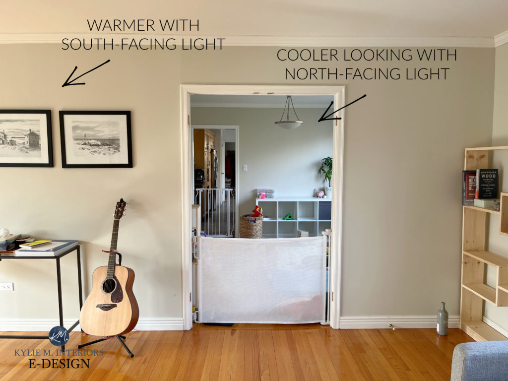
Because if you’re painting more than one room, you’re probably dealing with a range of exposures. These exposures will affect how your gray paint color looks from room to room.
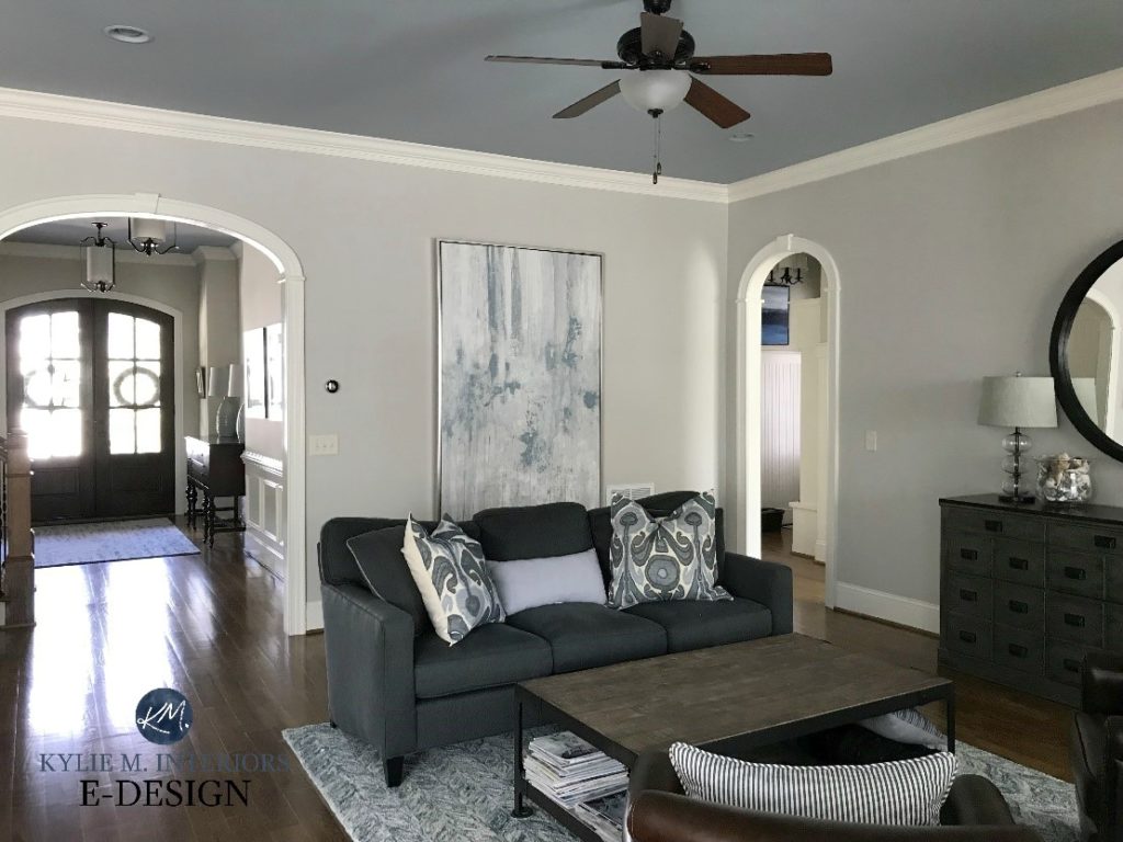
GRAY IN NORTH-FACING ROOMS
EVERY gray has an undertone, and depending on how dominant that undertone is, you might notice it a wink more in a room with northern exposure.

It’s also important to note that north-facing rooms have a cool light. When you add a cool paint color to a cool room, you’re hitting it with a double-whammy (which I commonly refer to as Tim’s favorite Friday-night move).
In this case, warm gray paint colors often balance a north-facing room better than cool, traditional shades of gray (we’ll look at some wonderfully warm shades shortly).
Can I Paint My North-Facing Room Gray?
GRAY PAINT COLORS IN EAST-FACING ROOMS
In a room with eastern exposure, cool colors will look more or less themselves in the morning. However, in the afternoon light, they can look flatter than me in Grade 11.

Want to know something weird? Ya, you do.
- Look at the previous photo (staircase/entryway with wood floor and door)
- Compare it to the above photo (plain wall, wood floor)
This is the same paint color – Benjamin Moore Gray Owl. Notice how glorified its undertones are in the first photo compared to the flatness in the second. Crazy, eh?
If you’re painting rooms with difference exposures, expect your paint color to look different in each room (with atleast a small thread of consistency).
GRAY PAINT COLORS IN SOUTH-FACING ROOMS
South-facing light is warm, and rooms with this exposure love how gray paint colors add a bit of visual balance.
Just remember, when the sun goes down, so does the warmth. You need to love your gray in all lighting conditions, and consider light bulbs with lower KELVINS on cloudy days/early evenings.
The other thing to note is that southern light and west-facing afternoon light can really soften a cool gray paint color. I often prefer how cool colors look in south- and west-facing rooms compared to north-facing rooms!
The Best Paint Colors for a South-Facing Room
GRAY PAINT COLORS IN WEST-FACING ROOMS
Western light is flat in the morning but warms up in the afternoon. And while you won’t get overly toasty-looking walls, you might notice your favorite gray paint color looking much warmer than usual (while still offering a bit of balance to warm south-facing sunshine).
Of course, there are tons of rooms with 2 or even 3 exposures, and they’re creatures unto themselves. I wouldn’t get too bent out of shape at this point, but once you’re done reading this blog post, check out: How to Pick Paint Colors for Rooms With 2+ Exposures
Now, because this blog post is about the best gray paint colors for your entire home….
Does this mean you have to paint EVERY SINGLE ROOM GRAY?
Helllls no. In fact, I recommend finding a balance rather than making a full-home commitment to one single paint color. But you do you, boo.
Let me say that one more time in a different, less passive-aggressive way…
I wouldn’t paint my ENTIRE home any of these colors. Unless you’re building a new home and doing very careful coordination between spaces and finishes, most homes have rooms and finishes with slightly (or drastically) different needs. Just sayin’.
Also, painting every room one color can be boring…
That’s right, I said it – boring. If you don’t have the architecture, interior finishes, furnishings, and/or decor to complement a simple color palette, your home could lack personality and visual interest. You don’t need ALL of those things to have a gorgeous space, but a few are ideal.

If you need help choosing or coordinating, you know where to find me (no, not at STARBUCKS, although that’s a reasonably safe bet).
CAN GRAY PAINT COLORS BE TIMELESS?
Yessss… said slowly, with great hesitation.
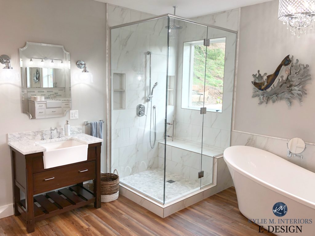
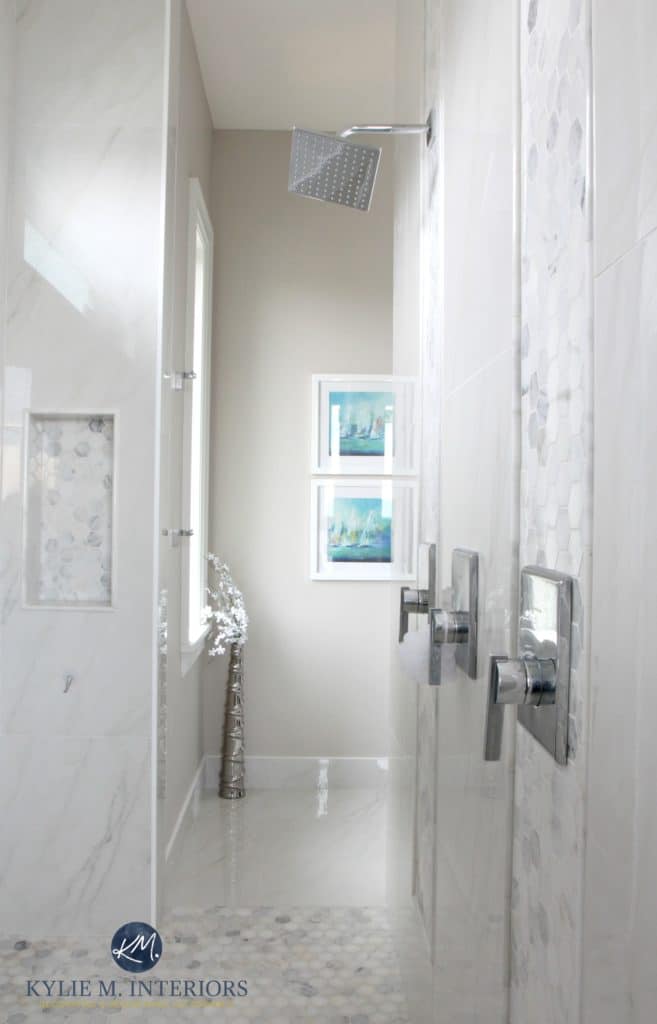
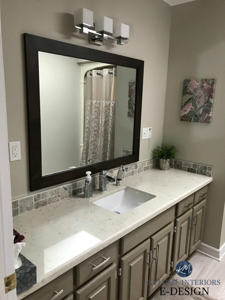
SINGLE ROOMS: Classic, timeless rooms like this bathroom (below) can carry gray a long way – into the next decade (or more). This isn’t just about the paint color; it’s about the palette and finishes as a whole.

GRAY EXTERIORS: Many exteriors look timeless in gray, as gray is often the best color choice based on a home’s exterior finishes (roof, brick, stone, etc.). What is no longer trendy is the dark gray home with black windows and black trim.
This little gem (below) looks gorgeous in a soft gray. This foundation leaves room to change the shutter and front door color as trends shift…

Now, those titillating tips aren’t what you’re here for. You came here for my wit and charm, right? For sure. You also want to know which gray paint colors are best for your whole home, or at least for more than a single room.
Lastly (because I love to hear myself talk AND type).
BECAUSE GRAY ISN’T TRENDY ANYMORE…
You may want to consider moderation (or not). If you’re slightly worried that gray isn’t in style, consider a happy medium when painting your home. For example…
- Paint your main living areas a soft, flexible shade of gray. Then, choose coordinating, trendier colors for adjoining rooms (warm, off-white or light neutrals, blue-greens, etc.).
- Paint your main living areas a more popular, mainstream neutral (maybe one of these ‘whole home warm neutral paint colors‘), then choose your favorite shade(s) of gray for adjoining rooms.

Now, let’s talk color (and yes, I talk this much in real life, too).
THE BEST GRAY PAINT COLORS FOR YOUR WHOLE HOME
Whether you decide to paint all your rooms or opt for a bit of moderation, these are some of the most popular shades of gray for kitchens, living rooms, bedrooms, and more.
The best grays for your entire home will likely have an LRV between 62 and 73.
Pay attention to the undertones of each suggestion below. If you’re unsure which gray undertone suits your home best, sample a variety and compare them to each other and to your finishes. 
I jacked up the undertones in some to show the differences a bit better. These blobs are just general references for the types of colors you’ll see below!
1. BENJAMIN MOORE COLLINGWOOD OC-28
Benjamin Moore Collingwood is a warm gray (trying to be a taupe) that commits to a subtle, soft purple undertone.
While the ‘purple’ word might seem scary, many interior finishes (countertops, tile, etc.) need a commitment to this particular undertone.
As for depth, Collingwood has an LRV of 62, which is fab for the average room.
More often than not, the main undertone in ‘grayish’ interior finishes is purple (not blue or green).

REVIEWS: BM Classic Gray | SW City Loft | BM Balboa Mist
Color Review of Benjamin Moore Collingwood
3 ALTERNATIVES TO COMPARE WITH COLLINGWOOD
Sometimes a small tweak in temperature, undertone, or depth makes all the difference!
- Benjamin Moore Balboa Mist is a bit lighter with slightly more noticeable undertones.
- Benjamin Moore Nimbus has a bit more depth and a slightly cooler approach.
- Sherwin Williams Agreeable Gray is VERY similar, but has a more balanced undertone (can slide green or purple).
The 13 Best Grays With PURPLE Undertones
2. SHERWIN WILLIAMS GUILD GREY 9561
Sherwin Williams Guild Gray is the new kid on the block. And while the New Kids on the Block are no longer trendy either, this particular gray has a better shot at standing the test of time* thanks to its moderate temperature, depth, and muted undertones.
*It’s not timeless, but it’s better than many other shades of gray that are darker and cooler.

Guild Gray has an LRV of 63, placing it in the light range and in a somewhat sweet spot – neither too light and washed out nor overly heavy and drab.
By the way, I’m spelling it as Guild Grey and Guild Gray for a reason. The American spelling of Gray is…gray. Grey is more UK. I bet more people will search for Guild Gray vs. its proper spelling.

As for temperature, Guild Grey is stormy, meaning it’s not overtly cold or warm, but parks its cute little butt somewhere in the middle.
When it comes to undertones, I find Guild Grey VERY intriguing. It doesn’t have overt purple undertones, but it also doesn’t really cater to blue or green (I desperately wish this color were around during the gray trend – we could’ve used it and abused it). In all, it’s MOST like a slightly cleaner, less stormy Big Chill (#3).
2 ALTERNATIVES TO COMPARE WITH GUILD GRAY
Because you should never choose a paint color without comparing it to similar shades…
- Sherwin Williams Big Chill (#3, below) – sometimes a small shift in undertone makes all the difference!
- Sherwin Williams On the Rocks (#4) to double-check that your finishes don’t prefer a purple undertone.
3. SHERWIN WILLIAMS BIG CHILL SW-7648
Big Chill is very cool…literally and figuratively. It’s a light, stormy kind of gray with a soft, super subtle blue undertone. Like most grays, it can flex into other cool undertones, but like me when I’m constipated, it doesn’t go easily.
Big Chill isn’t overly chill or icy gray, but it sure as heck isn’t warm, especially in a north-facing room. And with its LRV of 62, it hits me RIGHT in the happy place (Tim could take some lessons from it, wink wink).
Paint Color Review of Sherwin Williams Big Chill
3 ALTERNATIVES TO COMPARE WITH BIG CHILL…
- Oh, absolutely Sherwin Williams Guild Gray (#2), no doubt about it.
- Sherwin Williams On the Rocks (#4, below) to see what a shift to a bit more purple undertone does with your finishes.
- Benjamin Moore Stonington Gray (#8) is a bit less stormy and offers a bit more depth and undertone.
4. SHERWIN WILLIAMS ON THE ROCKS 7671
On the Rocks is one of the most well-balanced grays (if you ask me). While it’s (personally) too cool for this color cowgirl, many love its approach to temperature.

This is because On the Rocks isn’t overly warm or cold. Instead, it comes off a bit stormy, with a soft purple undertone. Because of its temperature, in some lights it leans a wink cool (purple-blue), while in others, it goes a tiny bit warm (purple-pink) with its undertones.

As for depth, On the Rock’s LRV of 62 is a great place to start for the average room.
REVIEW of Sherwin Williams On the Rocks
3 ALTERNATIVES TO COMPARE WITH ON THE ROCKS…
- Check out Benjamin Moore Collingwood (#1) for a bit more warmth.
- If On the Rock’s purple undertones have you nervous, compare it with Big Chill (#3) and Guild Grey (#2).
- Benjamin Moore Nimbus is another great one to sample and compare.
5. SHERWIN WILLIAMS REFLECTION 7661
Not everyone loves warm grays. Even stormy grays can push the comfort zone of many cool gray lovers. However, in my experience Online Color Consulting, very few people crave these super cool colors. This is why…
a) I don’t have any images of them in action, as my clients rarely ask for/choose them – they aren’t the most popular types of gray
b) I don’t have many colors in this range to suggest, as they can be a ‘bit’ riskier (at least for resale)
But, for those of you who lean this way, I gotchu boo, and have some beauties for you to explore, starting with…

Reflection is a light shade of slightly icy, cool gray, and one of the best gray paint colors for those who are cool-inclined. I chose it for its moderate approach, not just to being cold, but towards undertones.
You might find that with stormy and warm grays, the undertones CAN appear more subtle. However, once you get into the icy cold range, the undertones don’t have many places to hide and can appear a bit (or a lot) stronger.

Reflection caters to a cool, stormy purple undertone that can easily swing purple-blue in some lighting conditions. However, of the icy cool hues, it has some of the more modest undertones, which is why I chose it for you!
3 ALTERNATIVES TO COMPARE WITH REFLECTION…
- Sherwin Williams Gray Screen (LRV 59) offers a bit more depth and flexible undertones.
- Sherwin Williams Olympus White is an even cooler, crisper approach to cool gray.
- For a bit more depth and commitment, check out Sherwin Williams Lazy Gray.
Just remember, even though YOU might prefer blue or green undertones, more often than not, interior finishes coordinate best with purple ones.
6. BENJAMIN MOORE PAPER WHITE OC-55
While many of the popular grays in this blog post have LRVs between 60 and 70, this bad boy is one of our lighter options.
Paper White is an off-white gray paint color with an LRV of 74.41. This is a great number if you want a lighter, slightly fresher approach while still showing up against white trim.

Paper White is somewhat related to the popular Benjamin Moore Gray Owl. Sure, it’s fallen in the ranks in the last few years (with warmer trends replacing grays), but it had a HUGE following (and still does, to a degree).

Benjamin Moore Gray Owl
This means that, like Gray Owl, it can look quite…gray. However, depending on your room’s exposure and conditions, it could take on a green-blue undertone.
7. SHERWIN WILLIAMS CITY LOFT 7631
City Loft is one of my favorite warm neutrals. But I have to admit something…
It’s more taupe than gray.

This is because City Loft has a bit more warmth than the average ‘warm gray paint color’. However, it can offer a slightly grayish look without the traditionally cool hues you get in many grays.
As for depth, its LRV of 70 has it acting double-duty, as it can look light or like an off-white.
With its gentle purple-pink undertones, City Loft suits a whackload of interior finishes without going over the top.
Sherwin Williams City Loft Color Review
ALTERNATIVE COLORS TO COMPARE WITH CITY LOFT…
If you love this look more so than the cooler or stormier grays, I highly recommend checking out…
- Benjamin Moore Classic Gray
- Sherwin Williams Egret White
- Benjamin Moore Pale Oak
Find those and more in: The Best Taupe & Greige Paint Colors for Your Entire Home
99.5% of the photos in my blog are from my Online Color Consulting clients, readers, talented photographers, & friends— because real homes deserve to be celebrated (dirty laundry & all!) While not magazine-perfect, they’re packed with ideas & proven color choices to help you create a home you’ll love.
8. BENJAMIN MOORE GRAY CLOUD 2126-60
Let’s say you looked at Reflection (#4) and thought to yourself, ‘yeaaaah, I like it, but I think I want something COLDER‘.
Gray Cloud isn’t messin’ around – this is one icy cool gray paint color. Like Reflection, it has a slightly higher LRV (68.92), so it’s a lighter paint color.
Here’s your Peel & Stick sample of Gray Cloud…

Would I paint my home Grays Cloud? HELLLLLS NO, but I love warm grays. I only like cool grays when they’re darker.
But again, (sadly), it’s not all about me.
I chose Gray Cloud for you as it hits the icy cool nerve without AS much undertone as its kissin’ cousin (not recommended literally or figuratively, btw), Benjamin Moore Bunny Gray.
It most definitely has a blue undertone. Blue undertones tend to swing blue-green or blue-purple – this bad boy is blue-purple.
ALTERNATIVES TO COMPARE WITH GRAY CLOUD…
- Benjamin Moore Bunny Gray if you want more undertone and a crisper look.
- Sherwin Williams Olympus White is similar, but a bit stormier.
- Benjamin Moore Graytint for a stormier, slightly more purple undertone.
9. SHERWIN WILLIAMS SILVERPOINTE 7653
I’ve recommended Silverpointe to many clients, especially when they crave a gray with a subtle, gentle, blue-green undertone.

Silverpointe is a stormy, smoky gray paint color with an interesting, almost coastal quality without dipping into the more colorful end of things.
With its LRV of 64, Silverpointe lands in a sweet spot (as far as light-depth grays go). Not so dark that it winks at the light-medium depths, but also nowhere near the off-white world.

And don’t get me wrong, I LOVE SILVERPOINTE! However, if a few of your rooms have finishes that don’t suit its undertones, don’t be afraid to play around a bit with a 2-color palette! Silverpointe suits quite a few of the lighter, slightly warmer grays mentioned here.
Get the best color advice…
10. BENJAMIN MOORE BALBOA MIST OC-27
Balboa Mist is a fan fave, for sure. This light, warm shade of gray features gorgeous purple-pink undertones that pair well with a wide range of interior finishes and lighting conditions.
Don’t let the 2 ‘p’ words scare you – purple and pink are two COMMON undertones found in countertops, tiles, and carpet!
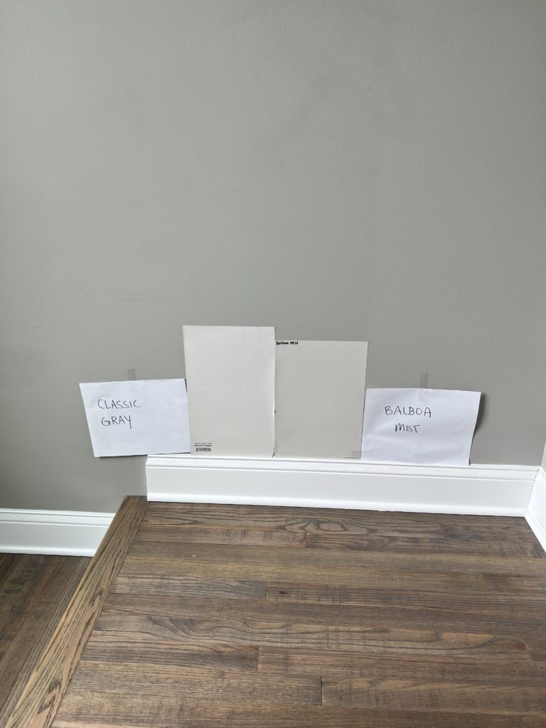
Benjamin Moore Classic Gray is a lighter, warmer alternative to Balboa Mist
With its LRV of 65.53, Balboa Mist is an awesome depth for the average room. As the Great Goldilocks once said – not too light, not too dark, but juuuuuuust right.
REVIEW of Benjamin Moore Balboa Mist
3 ALTERNATIVES TO COMPARE WITH BALBOA MIST
- Oh, Benjamin Moore Collingwood (#1), fo sho.
- I might even take a look at Benjamin Moore Light Pewter
- Sherwin Williams City Loft (#6), which you already know I love
11. BENJAMIN MOORE CLASSIC GRAY
If it were my home and I wanted every room the same color AND I wanted gray, I’d choose Classic Gray. But it’s not ALL about me…

Classic Gray with Benjamin Moore’s Chantilly Lace
Whereas some of the others on this page can pick up green, and others are a bit darker, Classic Gray is an off-white gray with warm, subtle undertones. These undertones can flash a touch of purple-pink, making this color look taupe at times.
Find Classic Gray and similar shades in this blog post: The Best Whole Home Taupe & Greige Paint Colors.
Benjamin Moore Classic Gray Review
12. SHERWIN WILLIAMS GOSSAMER VEIL 9165
Gossamer Veil’s popularity has increased in the last few years. Sure, trends are leaning a bit warmer, but many are still looking for mild, muted, warm gray paint colors.
Gossamer Veil is a gentle, light-depth shade of warm gray with an almost dusky backdrop.
Of the undertones, it favors green. It’s not obscenely green by any stretch of the most vivid imagination, but it’s not common for it to flash purple.
For this reason, Gossamer Veil is more popular for coastal-style homes and less for the ‘mainstream residential home’ where the interior finishes don’t often cater to green undertones.
Sherwin Williams Gossamer Veil: Color Review
Often grays with green undertones are good in a two+ color palette. This way, you can change gears in rooms that don’t suit a green undertone, but enjoy it where you want it!
2 ALTERNATIVES TO COMPARE WITH GOSSAMER VEIL
- Humor the crazy lil’ Ginger and check out Sherwin Williams Egret White and see which best suits your finishes.
- Sherwin Williams Drift of Mist (#13), for a lighter, breezier approach.
13. SHERWIN-WILLIAMS VESSEL 9547
Vessel is one of Sherwin Williams newer gray paint colors from its Emerald Designer Collection.
Why do I like Vessel?
Well, a lot of people are still sampling Sherwin Williams Repose Gray, with the hopes that it’s their best ‘whole home paint color’. And while it can work, I bet Vessel is a better fit.
Here’s your Peel & Stick sample of Vessel…

- FUN FACT: Repose Gray was HOT in the last 5-7 years (prior to the white trend). However, like rectal thermometers, it’s no longer as popular as it once was.
- Repose Gray’s undertones are quite unpredictable, ranging from purple and green to the odd flash of blue. Vessel is far more likely to cater to a soft, warm purple undertone – it’s quite gentle. It’s also less likely to grab green.
- Because of Repose Gray’s variability, it doesn’t always suit a ton of interior finishes. Vessel’s attachment to purple makes it a bit more flexible.
- Repose Gray’s depth, combined with its particular warmth and undertones, leaves me feeling a little twitchy n’ bitchy (just joking, I’m never bitchy…RIGHT TIM?!) And while Vessel is the same depth (LRV of 58), its undertone profile makes me much happier.
Here’s Repose Gray lookin’ good…
I just don’t trust it to look this good all the time.
ALTERNATIVES TO COMPARE WITH VESSEL
- I’d definitely check out Benjamin Moore Nimbus.
- Benjamin Moore Collingwood (#1) offers a bit more warmth
- Check out Sherwin Williams On the Rocks (#4), too.
14. SHERWIN WILLIAMS DRIFT OF MIST 9166
Drift of Mist is an interesting one. While I don’t entirely trust its undertones, TONNNS of people have fallen for its subtle and slightly lighter, gentler approach to gray.
With an LRV of 69 (hehe. And, yes, I’m a 40+ woman stuck in a 16-year-old boy’s brain), Drift of Mist is much lighter than most of the others, offering an airy, slightly coastal vibe to your home.
This coastal vibe comes with a slight penchant for green, which is what makes me nervous. Sometimes I prefer a slightly more purposefully placed green undertone rather than a super-slight, insanely subtle one, especially with warm grays.
Why?
With Drift of Mist’s warmth and mild undertones, I worry about it looking a bit murky in some lighting. Murky and muddy can be interesting with slightly darker shades like Benjamin Moore Revere Pewter, but in these lighter, almost off-white tones, I have my worries.
Dunn Edward’s Foggy Day is quite similar to Drift of Mist (a bit lighter)
But again, it’s not all about me and it just might be the PERFECT color for you and your home!
WHOLE HOME GRAYS WITH A BIT MORE DEPTH
For those of you who want a bit more depth without getting too hot n’ heavy (you can read into that line as much as you want), I’ve got a few with some more meat on their bones. Just keep in mind…
- These colors are great for personal choice, but if you’re considering resale, they’re better for just one or two rooms – lighter paint colors are generally best for resale.
- If you have low-light spaces or considerably dark rooms, these colors can look slightly heavy or drab (depending on your tastes). You might consider a two or three-color palette, with lighter, brighter, or more colorful shades in the dark rooms.
The Best Paint Colors for Hallways
15. BENJAMIN MOORE STONINGTON GRAY HC-170
Stonington Gray is, hands down, one of Benjamin Moore’s most timeless shades of gray. Kickin’ it for a few decades now, Stonington gray has graced bathroom walls, bedrooms, living rooms, and kitchens all over North America.

A lot of the time, Stonington Gray settles pretty darn gray. However, it can pick up blue or blue-green undertones that many people love.
What you want to be careful of is its depth. Stonington Gray has an LRV of 59.36, which isn’t at all BAD, it’s just a touch darker than you might prefer (or not).
Color Review: Benjamin Moore Stonington Gray
3 ALTERNATIVES TO COMPARE WITH STONINGTON GRAY
- Benjamin Moore Gray Owl for a lighter look with a blue-green undertone.
- Benjamin Moore Sterling offers a slightly cleaner, less stormy approach to gray without looking too icy cold.
- Sherwin Williams Silverpointe (previously mentioned) offers a slightly lighter take but has a similar approach to gray.
You might not be able to satisfy every room, countertop, finish, and flooring in your home with one paint color—sometimes, something has to give. Be prepared to look at additional colors for your palette if needed.
16. SHERWIN WILLIAMS LIGHT FRENCH GRAY 0055
Not everyone loves lighter shades of gray. And while they might not want anything too drastic, gray paint colors with a slightly lower LRV suit a ton of homes and homeowners. This includes colors like Light French Gray.
While Light French Gray might not be ENTIRELY true to its name, it is ‘reasonably’ light with its LRV of 53, putting it in the higher/lighter end of the light-medium range.

Light French Gray is also a popular choice for painted kitchen cabinets.
This depth offers a color with a bit more depth and contrast, especially with white trim and cabinets, compared to lighter shades.
As for undertones, Light French Gray caters to a gorgeously mild, stormy purple undertone.
REVIEW of Sherwin Williams Light French Gray
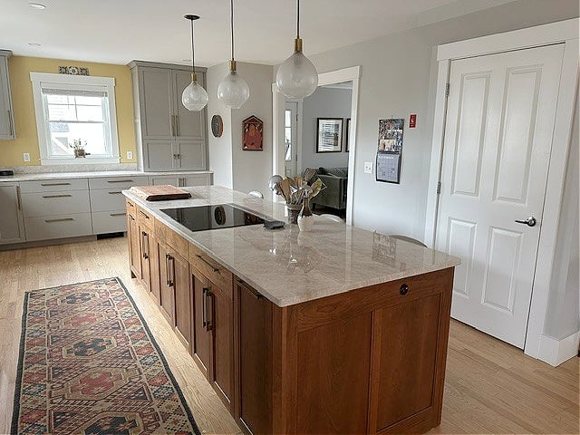
17. SHERWIN WILLIAMS COLONNADE GRAY SW-7641
My love affair with Colonnade Gray has been going on for a while. While I sure as heck didn’t love our last home, I did love how Colonnade Gray looked in it.
Colonnade has an LRV of 53, so it sits like a soft, light-medium depth rather than a fresher, brighter ‘light’ depth. Gorgeous? Absolutely, but a different approach than colors that are approx. 60+.
Colonnade Gray looks gorgeous in my client’s home (below) with the navy blue kitchen island and crisp white cabinets…

Review of Sherwin Williams Colonnade Gray
18. BENJAMIN MOORE REVERE PEWTER HC-172
As far as LRV goes, Revere Pewter is a bit dark when it comes to universally beautiful paint colors, but because of mass appeal (so many love it), I almost squeezed it in with the first batch of colors – DAMN, is it a popular color!
In this next photo, look at how soft and pretty Revere Pewter is in the bedroom. However, look at how moody it becomes around the doorway to the bathroom, where it’s more shaded. This will happen much more easily with colors with a lower LRV.

Revere Pewter in the bedroom, Wickham Gray in the bathroom
If you prefer a paint color with a bit more depth and body, you might prefer Sherwin Williams Amazing Gray. If you want less green, check out Sherwin Williams Worldly Gray.
Review of Benjamin Moore Revere Pewter
REALLY, THOUGH, IS IT A GOOD IDEA TO PAINT YOUR WHOLE HOME GRAY?
There’s only one situation where it’s a good idea – when you love gray/your finishes suit gray, AND you aren’t selling your home.

Gray isn’t trendy anymore, and if you a) love to stay on top of trends or b) are thinking about selling, painting your whole home gray will hold it back.
Instead, consider gray for some main living areas, but branch out with other colors in secondary rooms (or reverse that).
QUICK SUMMARY (TL;DR)
- While gray isn’t a safe choice for a whole-home paint color, many still want to try it.
- The average interior finish suits purple undertones over blue or green.’
- Pay attention to how your room’s exposure reacts to the different types of grays.
- The best grays will likely have an LRV between 62 and 73.
READ MORE
The Best Taupe & Greige Paint Colors for Your WHOLE HOME
The Best Whole Home Off-White Paint Colors
Get the best color advice…

Updated with new content and images for 2026