
How to Choose Your Room’s Best Shade of Gray
4 Tips for Choosing a Gray Paint Color (& why it’s so friggin’ hard!)
In the words of the great Leonard Bernstein, ‘I feel PRETTY and WITTY and GRAAAAAY!’. Okay, so maybe it was gay, not gray, but either way, I’m feeling pretty and witty. And since I’m feeling so darn great, it’s a good time to do some deep-diving into the world of gray.
Other than white, gray is, hands-down, one of the most challenging paint colors to choose (to which many of you might say that ANY paint color is hard to choose), but seriously, gray is a bugger.
Why is gray such a PITA? Because it’s a chameleon, and no matter which gray you choose, it will shift itself on a wall-to-wall basis. That’s right; just when you think you’ve landed on the gray of your dreams, it changes its tune.

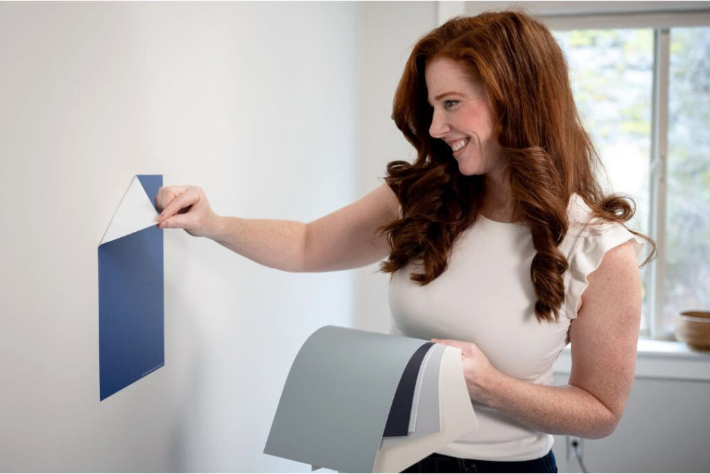
If you want to enter the wild world of grays, these five tips should help. If you’re stuck, I have a great Online Paint Color Consulting service (it’s also super fun).
1. KNOW YOUR ROOM’S BEST & WORST UNDERTONES
Gray will have undertones of blue, green, or purple. However, you might not want any undertones, or maybe you like one or two of them but not the others.
Well, guess what, Buttercup?
What your room needs is more important than what you want. Alternatively, you can prioritize your tastes and potentially have a clashing hot mess – you do you, boo.
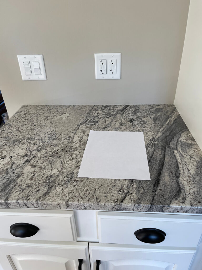
Benjamin Moore Revere Pewter with granite countertops
However, while some grays commit pretty hard to one particular undertone, many grays will flex their color muscles depending on the following:
- Time of day (position of the sun).
- Your room’s exposure.
- The temperature of your light bulbs.
- Exterior factors, i.e., green grass/shrubs, a red brick wall close by, etc…
- Interior finishings such as a warm wood floor or a forest green sofa.
- The actual ‘recipe’ of the color (what colors are blended to create it).
- Your PERCEPTION. While the color itself isn’t subjective (it is what it is), how it’s perceived can vary from person to person!

Sherwin Williams Dovetail
Benjamin Moore Shoreline is a great example of a gray that can’t decide which undertones it wants to flash—purple, blue, green—it’s happy to show you all of them. It’s a great example of gray and its (ahem) ‘flexibility’ (said slowly and painfully using air quotes).

You might even think those walls are three different colors, but they’re all Shoreline!
Sherwin Williams Repose Gray is equally unpredictable, as shown in this foyer…
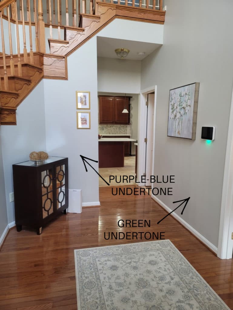
However, many grays are similar to Shoreline and Repose Gray in that their surrounding environment easily influences them.
But here’s the trick…
The more committed a color is to its undertone, the less likely it is to grab the others. So, if you purposefully want to avoid blue or green, find a gray that commits to purple.
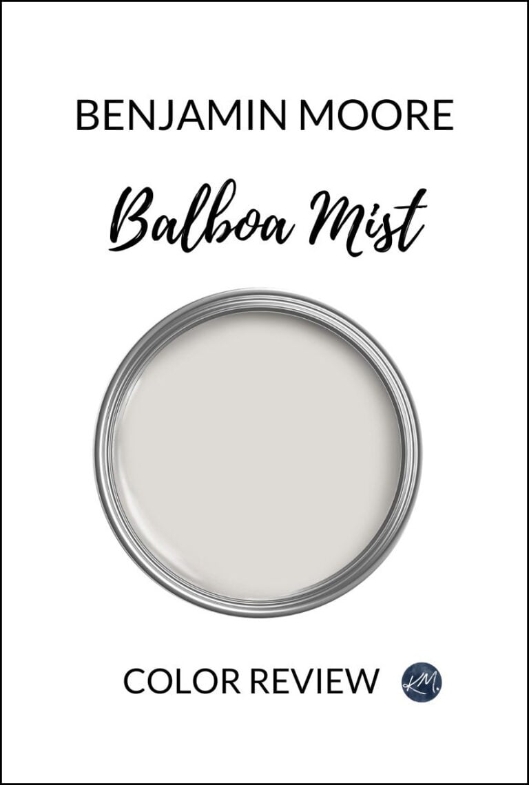
A gray like Benjamin Moore Balboa Mist COMMITS to violet.
If you despise purple undertones, choose a gray that heavily favors blue and green. Given the right circumstance, they might still flash the other undertone, but they’re WAY less likely due to their particular undertone commitment.
Do your research and sample a range of grays. See which undertones coordinate with your bossiest finishes (e.g., countertop, tile, fireplace stone, etc.). While you’ll want to consider your room’s exposure and personal tastes, you should prioritize what your room needs.
For example, the travertine tile in this next room has a bit of gray-purple in it. The cherry red stain on the wood cabinets also does well with gray-purple. Add these together and we get Benjamin Moore Collingwood on the walls…

The Best Paint Colors with Red Wood Stains
2. BE PATIENT WITH YOUR GRAY SAMPLES
You’ll be greatly disappointed if you expect your gray to look the same on every wall. IT WILL CHANGE AND IT WILL HAVE UNDERTONES. I promise. As shown in the previous examples, gray will flex itself more than a 10-year-old gymnast, not just from home to home, but from wall to wall!
Once we accept a paint color’s limitations and tendencies, we can let go of things and breathe a little easier.
Sample and compare a minimum of three shades of gray. Move them to different walls at different times of the day (always place your samples next to trim, tile, stone, etc.; never just floating on the middle of the wall). The key is to find a gray that you ‘generally like on every wall, at least 75% of the time’ while trying to avoid the specific undertones that you don’t like.
In this next bedroom, the subtle blue-green undertones of Coventry Gray look beautiful with the wood furniture – a subtle contrast that offers interest without popping too much…
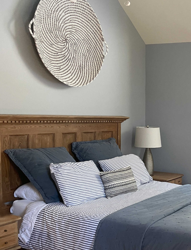
Benjamin Moore Coventry Gray
3. DECIDE HOW LIGHT OR DARK YOU WANT YOUR WALLS TO BE
Whether you love a light, fresh gray or a dark, moody one, your room will also have preferences based on its existing finishes. The great thing is that unlike undertones, which need to cater to your finishes, your personal tastes can also play a big part in your final choice.
Benjamin Moore Chelsea Gray
But before you dive in, you might want to learn about LRV. LRV stands for Light Reflectance Value. Every paint color has an LRV number on a scale of 0 to 100, with 0 being black and 100 being white.
Once you know the LRV range you want, finding colors within that range will be much easier!
The Ultimate Guide to Choosing Paint Colors With LRV
Aside from each paint color’s LRV number, here are some other considerations…
- Consider a darker shade of gray if you want your room to be cozy and intimate.
- Light grays are great for a bright, modern approach. They’re also the ideal depth for ‘multi-room’ gray applications (where multiple rooms are painted the same color).
- Cool, north-facing rooms usually suit a WARM GRAY over a cool gray.
- Warm, south-facing rooms or those with western afternoon light often benefit from a cool gray but can also handle warm ones.
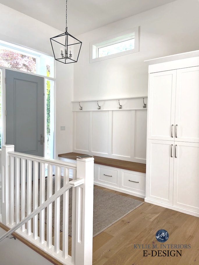
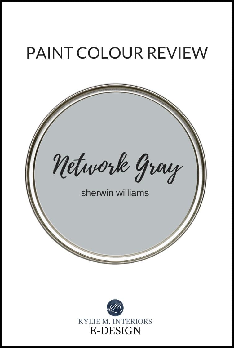
In this next bathroom, notice how the blue undertone of Sherwin Williams Network Gray picks up this same color in the tile floor…

Just keep in mind that based on current trends, gray is out, and warm colors are in. If you aren’t worried about trends, hit gray as hard as you want. However, if trends or resale are on your mind, you might want to paint gray in moderation (e.g., a few rooms vs. your entire home) or consider something warmer.
4. SAMPLE YOUR GRAY THE RIGHT WAY
Of the colors you’ve explored, you might have already found your room’s perfect shade of gray—you just discarded it because you didn’t sample it correctly!
Looking at this next photo, it might be harder to see each colors temperature and undertones by itself. But by comparing them, it’s easier to see the ebb and flow of things…

Ideally, there wouldnl’t be that extra white space betwen the samples – just the white that surrounds each sample as this can help you see the shift between hues a bit easier.
- Sherwin Williams Analytical Gray: Is actually a greige (warmer than gray) with an earthy green undertone (Here’s your Peel & Stick sample).
- Sherwin Williams Argos: Is a stormy gray with a blue-green undertone (Peel & Stick).
- Sherwin Williams Sensible Hue Another lovely stormy gray with a green undertone (Peel & Stick).
- Sherwin Williams Amazing Gray: Another shade of greige but it has a bit less green than Analytical Gray (you’d see this if they were closer together) (Peel & Stick).
- Sherwin Williams Magnetic Gray: Gray with a blue-green undertone (Peel & Stick).
- Benjamin Moore Wales Gray: Has the most undertone/color of them all – a beautiful blue (Peel & Stick)!
SAMPLING TIPS
- Your existing paint color will skew your perception of your new samples—you must separate the old and new samples with white paper or posterboard between them.
- You need LARGE SAMPLES and should never rely on the small paper chips from the paint store.
- NEVER pick a sample based on how it looks at the paint store – look at it in your home.
- Don’t just hang your sample in the middle of the wall and expect it to look perfect. Place it next to trim, backsplash, stone, etc… to see how it relates to its surrounding finishes.
In fact, read this… How to Sample Paint Colors the RIGHT WAY
THE TOP 10 SHADES OF GRAY TO GET YOU STARTED…
Which gray paint color is the most popular can depend on the depth you’re looking for and what you’re painting—walls, cabinets, or exteriors. However, these ten colors should get you started (from lightest to darkest.
- Benjamin Moore Classic Gray
- Benjamin Moore Silver Satin
- Benjamin Moore Balboa Mist
- Benjamin Moore Gray Owl
- Benjamin Moore Collingwood
- Sherwin Williams Repose Gray
- Benjamin Moore Revere Pewter
- Benjamin Moore Stonington Gray
- Sherwin Williams Light French Gray
- Sherwin Williams Dovetail
- Benjamin Moore Chelsea Gray
- Sherwin Williams Gauntlet Gray
READ MORE
The 12 Best WHOLE HOME Gray & Greige Paint Colors
The TOP 10 WARM Gray Paint Colors
The Best Warm Neutrals That AREN’T BEIGE!
NEED HELP?
Check out my E-design & Online Paint Color Consulting packages!

ORIGINALLY WRITTEN IN 2018, AWESOMELY UPDATED FOR YOU IN 2024


My favorite light gray is Sherwin Williams ‘Passive’. I have it in my living room that faces south west and it is the most gorgeous true-to-proper-light-gray I’ve found. ( I had to paint over a Benjamin Moore shade that worked great in my foyer and hallway but drove me nuts with how blue it looked in my living room. )
Hello Kylie….What grey paint colour is on the wall of the picture after Tip #3 (stop guessing, start painting)? Thanks….Toni
Hiya Toni! You are the 2nd one to ask that! That is SW Ellie Gray with SW Big Chill. Ellie Gray can sometimes swing a weee (like super wee) wink blue-green!
~Kylie
I used SW Zircon in a hallway, stairwell, bathroom and bedroom and like it in all lighting. It’s fresh looking.
Thank you for letting us know Janu, it’s comments like these that help other readers explore new colours! The last comment was about Knitting Needles, which is quite similar with it’s SUPER passive purple undertone!
~Kylie
Have you ever used Sherwin Williams knitting needles? It is a beautiful shade of gray that doesn’t appear to have a blue, green, or purple undertone. I absolutely love it! Are used it in my master bedroom and master bath. You are correct though, it looks totally different in each room. 🙂
I love the dark gray on the page you displayed that says “start painting stop guessing “. What color is that wall? It’s very rich looking.
I really enjoy reading your articles. They are informative as well as being entertaining! You were very witty!
Well, thank you Kelly! And yes, I have used Knitting Needles, it’s GORGEOUS (I just referred it to an E-design client today too!). And while it might look pretty darned gray to you, it does flex a bit into purple (just so you know ;). YOu might not even see it until you compare it to say, a gray-green or blue-green!
As for that ‘Stop Guessing, Start Painting, that is SW Ellie Gray which is a soft moody gray with a VERY (very) VAGUE blue-green undertone. 🙂
very informative info about grays. I have revere pewter and it does seem to look good with everything….I would like something fresher, but I just can’t stand the purple, blue, pink, or strong green undertones. Could you do a video on the Sherwin Williams paint color “On the Rocks” ? I’m really interested to hear how you would review it. Thank you!
Hi Kylie;
So what you are saying is that there are basically 50 shades of gray or is it grey? I love your blog it’s not only entertaining but very educational!I have a question for you Kylie, So if you had let say stonington gray and you wanted to transition into a more neutral color down the hall or adjacent room without having to paint over stonington,…what would be your choice? What is your go to neutral, what would compliment stonington without clashing with it? Would love to know your thoughts on your choice of neutrals, would it be gray, or not?
Thanks!
Ooo, to complement it, but get out of gray, I almost think you’d want to go to a warm off-white, slightly creamy, something like BM White Down, but the warmth of it will pop a bit more off of Stonington. And while it’s not entirely ‘warm’, I do like Classic Gray which is a slightly warm gray :), a bit of a transition perhaps.
Thanks KYLIE, so from a LRV perspective that you cover so well in your videos (thank you)I I do prefer the LRV of such colors as;Tapestry beige, balboa mist, edgecomb gray and so on…Would any of these colors work alongside stonington gray??? I don’t mind gray tones that are a tad more neutral I am just trying to lean away from the blue hue that stonington brings, as my room is a shady one. Thanks
I chose Collingwood for my southwest bedroom after failing with Anew Gray(too much green). MOST times of the day I’m happy with my choice but certain hours I still get a hint of green. Based on your blog, I attribute this to lots of green outside my window from our yard and open space behind us. I wish I’d gone a tad darker because of the light in the room.
Kylie, your blog has been tremendously helpful! Thank you.
Thanks for the drinking advice – that has been the most helpful tip during this process. I’m currently reading this posting (again) while sipping Rose. We are moving to a (mostly) North facing apartment in NYC with good windows. The other exposures are East and face a brick townhouse wall (aaaah, NYC). The whole apartment is currently painted Super White which is a little too stark for our tastes but we may just give up and use that! Yes, the bedroom looks pink in the morning.
The living dining, foyer are one big room. The kitchen and bath are grey and white. We thought – easy-peasey we currently have Revere Pewter and love it in our south facing apt. WRONG – looked terrible. So tried foam boards with all the grays in your blog – Balboa (purple) , Edgecomb and Classic Gray (too beige), paper white (too blue), Gray Owl (too blue). We finally found BM Light Pewter, but I can’t find it reviewed anywhere to understand their possible undertones. They actually seems like a lighter, slightly grayer version of Revere Pewter , and we found Rodeo which seems like a lighter RP. Have you ever seen anyone use BM Light Pewter (or Rodeo)?
Cheers!
Okay, so while they can flex around, Rodeo can favour a very (and I do mean VERY) mild green, not unlike Revere Pewter. Light Pewter is a warm gray that can pick up a weee faint purple, but fractional 🙂
I don’t like grey AT ALL in any way, shape, form or hue (green-grey, purple-grey, its all screams grey to me). Grey just looks depressing. I’ve had several design “consults” with color experts and they all recommended grey hues – even when I told them I “hate” grey in any form. Unfortunately, I listened to them and now hate my living room – but I’m selling soon so it will look “trendy” by golly! It seems to me most designers/color experts have their “stock-trendy colors” and recommend them. I’m hoping that the “grey-trend” will end in 2020 (it started in 2010, at least on the US “coasts” which are quick to embrace the latest trend), having outlived it’s 10 year “run”.
At any rate to each his own. I found the post interesting from the perspective of how light influences colors – even grey. I’ve learned a lot about color undertones and light from this blog (thanks Kylie!) and can’t wait to pick out colors in my new place.
Oh Joyce, you know, you aren’t the only one! I’ve had a lot of demand lately for the warmer end of things and I think things are slowly swinging around. I don’t know that we’ll hit full-blown beige anytime soon (with regard to neutrals), but things they are a changin’!
~Kylie
We recently used Gray Owl for a client/friend (I helped raise him, now I get to help him decorate as we’ve both moved to another state – how fun!). Gray Owl definitely went greener, which works as he has a green leather sectional and a green-grey brick fireplace. However, it got darker than we wanted in the areas that don’t have a lot of natural light.
Hi Kylie! I a recently discovered your blog, and I love it! After four years in our home, we are finally getting around to redoing our laundry/mudroom. Hooray! My husband is doing all the work–all I have to do is pick the paint color. We chose pretty gray cabinets (to replace the old brown ones) and the floor is a lovely whitish gray faux-wood. Washer and dryer are white. It’s a north-facing room with a ton of sunlight from the one big window. I wanted to do a blue (my favorite color, and yet I have no blue paint anywhere in our house), but we worried about going too dark. So we finally chose Stonington Gray, based on some of your reviews. While I love the color, I think it’s too similar to the cabinet color. So should we go light, like maybe Silver Satin or an off-white (which seems boring to me) or pick a different color altogether? We put up some Revere Pewter (along with Gray Owl and several other blue/grays) but I’m just not sure with the gray cabinets. Any thoughts? Thank you!!
What colour is the one where the bath tub is?
Hi Patty, I believe that was BM Wickham Gray 🙂
Hi Kylie,
Love your posts as you provide so much information. What is the difference between SW knitting needles and SW Silverplate? I painted my bedroom SW tinsmith but it turned out baby blue, so I’m looking for a colour that looks more gray.
Oooo good question as there’s a big difference! Well, in my eyes anyway ;). Silverplate is a soft stormy gray that can grab a blue (or sometimes blue-green) undertone – but it is SOFTER AND MORE MUTED than the blue found in
Tinsmith for sure.
Knitting Needles is also that bit stormy (not icy cold) but leans into a soft PURPLE undertone. Of the 3, I would say Silverplate would SEEM the most neutral, although all grays have some undertones – it’s just about picking the ones that suit your room the best!
Thank you for sharing your tips! Can you please tell me the colour of the walls in the photo of the white kitchen with wicker counter stools please? The photo just above your video. Thank you.