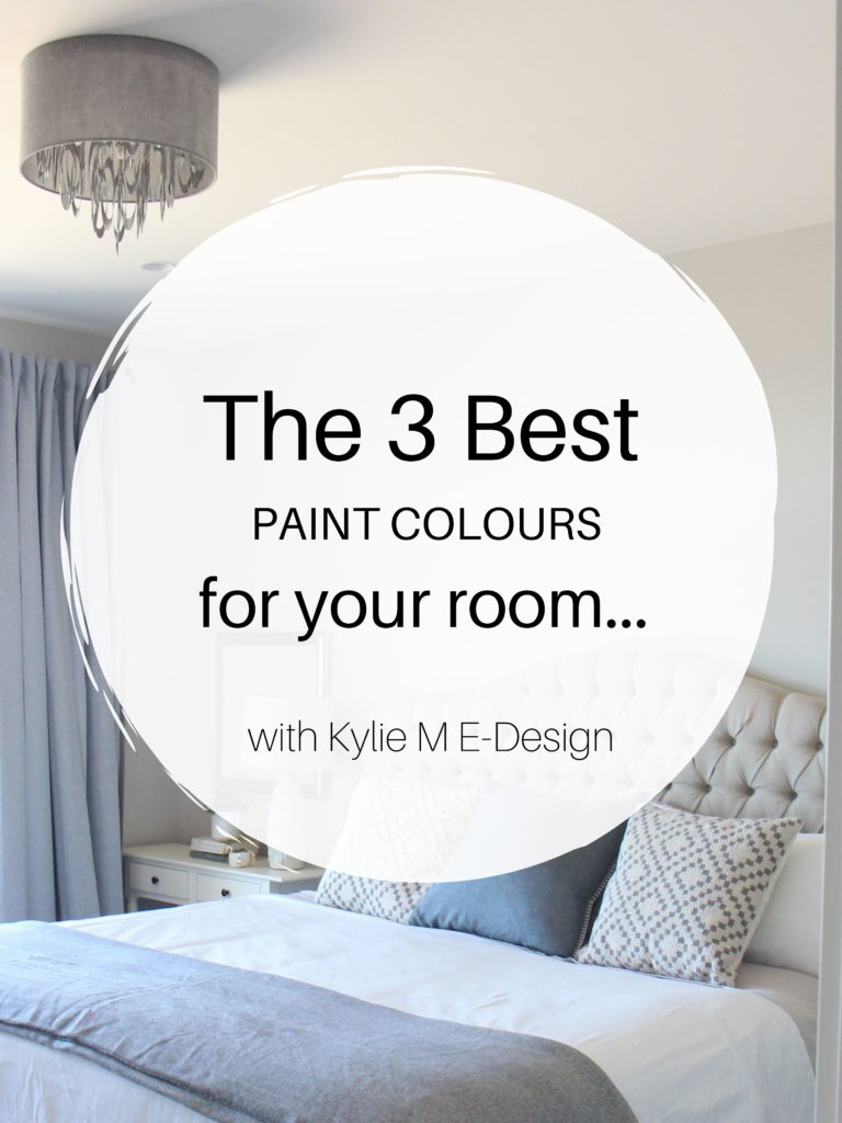
The 14 Best Light Blue Paint Colors
LIGHT BLUE HUES: CALM, COOL, & COLLECTED
Warm colors come and go, but cool shades like blue and green are always in style, whether on walls, cabinets, or exteriors. But how do you CHOOSE the right blue when there are so many choices? You do your research, starting with the best blue-greens, blue-violets, and blue-grays. And while I covered the types of blue here, here’s the down n’ dirty…
BLUE-GREEN
Blue-greens are the most popular shades of blue.
Why?
Blue-violet is popular and versatile in the darker range, but when it comes to coordinating with interior finishes and adjoining room palettes, blue-greens are far more flexible.
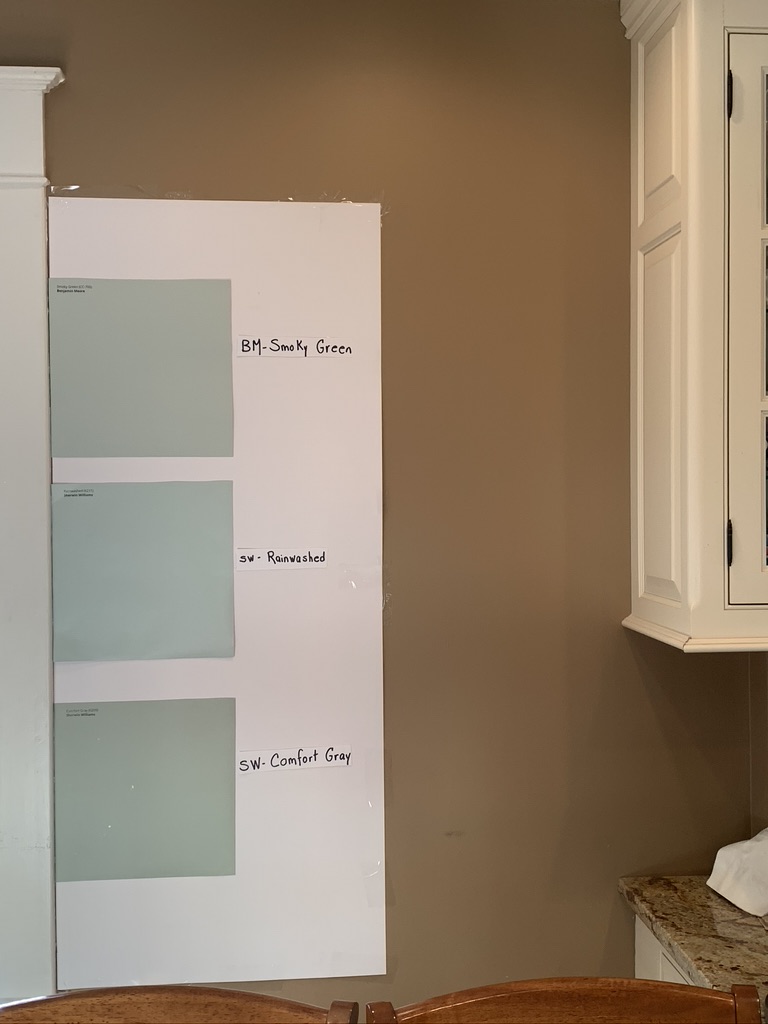
In this next photo, notice that all three colors are blue-green blends, but Rainwashed (in the middle) caters to more blue than the other two (which cater more to green)…
Blue-green is also popular because it’s more closely associated with a cottage, beach, lake, or coastal-style home—all of which are trendy (and in the right location—timeless). Blue violets tend to have a more traditional, formal vibe, which isn’t trendy (but can still be your jam, for sure).

BLUE-PURPLE
Sherwin Williams chose blue-purple as its color of the year back in 2024—Upward. You might think that blue-purples would then become more popular. Nope. They’re still a distant, not as well-loved cousin to blue-greens.
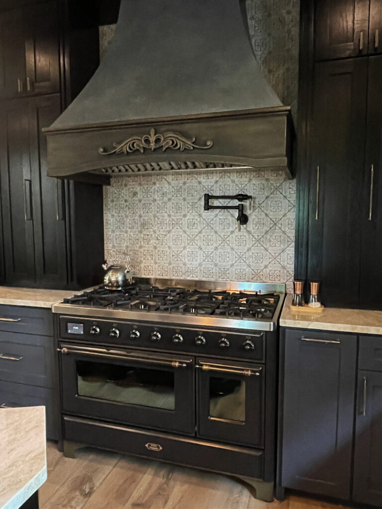
In this next photo, thanks to the accent tile behind the stove and the cushions on the stools, this kitchen could handle a blue-purple paint color on the walls or cabinets…

Sherwin Williams Pure White cabinets / Benjamin Moore Classic Gray walls
Will blue-violet ever surpass blue-green in popularity?
I doubt it, at least not on the lighter end of things. This is because (as mentioned above) blue violets are about as flexible as my 46-year-old husband, who often needs help putting on his socks (so he’s either not flexible or likes to see me bend over—wink wink).
BLUE-GRAY
Blue-grays encompass the above two categories and are more popular than more legit, true-blues. Again, this comes down to versatility. Clean blues suit fewer hard interior finishes (i.e., countertops, tiles, carpet) and are more likely to relate to linens and home decor.
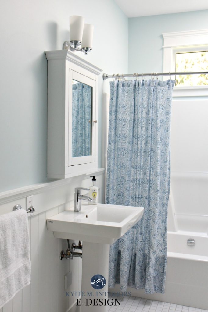
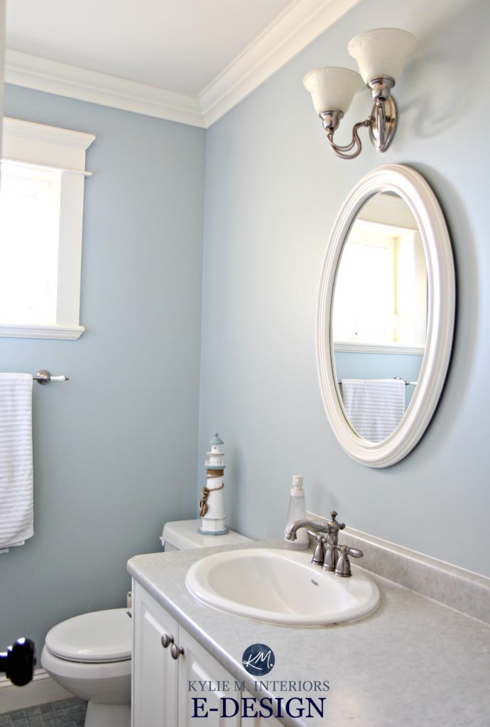
Blue-grays can be blue-violet grays or blue-green grays, as shown in this next bathroom, painted in Benjamin Moore Gray Cashmere…
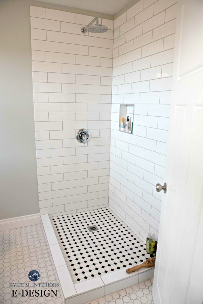
Blue-grays can be subtle, where the gray is almost unnoticeable, leaving your walls a reasonably bright shade of blue, to SUPER muted, where the gray and blue overlap and can be confused for the other.
LEGIT SHADES OF BLUE
Some blues are more or less ‘blue.’ They might lean a wee wink to blue-violet or blue-green, but their overall approach is more genuine than most other shades.
This means that not only do you need to find a blue that you fall in love with, but it needs to coordinate with your finishes as well. If you need help with that, I have an awesome Online Paint Color Consulting service, but otherwise, READ ON!
Benjamin Moore Woodlawn Blue (which we’ll talk about shortly) is a blue-green
WHERE DO LIGHT BLUE PAINT COLORS LOOK BEST?
Whereas darker shades of blue are popular on kitchen cabinets, islands, front doors, and accent walls, lighter shades are less common on these surfaces. Sure, some kitchens can pull off light blue cabinets, and the odd door can handle a lighter blue hue, but MOST of the time, light blues are relegated to the following areas:
- bedrooms
- bathrooms
- family rooms or playrooms
- some kitchen islands or bathroom vanities
You might notice that I didn’t include multiple groups of rooms or open-concept spaces in the above list. While there are ALWAYS exceptions, and your home could be one of them, the average home is best suited to neutrals when color is applied on a larger scale. It’s more common to have multiple rooms or open-concept spaces painted a neutral color so that the palette has flexibility. If you commit to blue on a large scale, either in three+ main rooms or an open-concept style space, it will limit the finishes you can choose, including the colors in adjoining spaces.
Again, you do you, boo, and if you think you and your home can rock blue on a larger scale, then let ‘er rip, tater chip.

1. SHERWIN WILLIAMS TRADEWIND 6218
Tradewind is a more classic approach to light blue. As its name implies, Tradewind has a wee touch of coastal green and a modest dollop of stormy gray; Tradewind gives a legit blue look without touching the baby blue end of things.
While it’s not blue-green enough to create a more spa-inspired vibe, this color is a classic choice for beach lovers.
Tradewind has an LRV of 61, which is in my happy range (60-65), as this depth tends to suit the average room (average size/quality of light). Will you see the green or gray in Tradewind? Not obviously, as you can in Rainwashed, but in a room with warm afternoon western sunshine, expect to see Tradewind looking more blue-green.
Sherwin Williams Tradewind: IMAGES, Info, & More
2. BENJAMIN MOORE OCEAN AIR 2123-50
Ocean Air could be your perfect color for a calm blue with a fresh, cheerful approach. While Ocean Air does have some gray in it, it’s marginal compared to some of the other shades on this page. It also has a bit of green, but not enough to show up at the party with tassels on (and not much else).
As for depth, Ocean Air has an LRV of 71.84. With this LRV, Ocean Air is a blue paint color close to the off-white range, but doesn’t quite make it there. Instead, Ocean Air settles on the higher end of the LIGHT range, offering more contrast with white trim than a typical off-white paint color.
Because Ocean Air is more cheerful and fresh, it’s more common to see it on bedroom or bathroom walls and less common for cabinets or exteriors.
3. BENJAMIN MOORE QUIET MOMENTS 1563
Quiet Moments is as soothing as it sounds, and what Tim wishes we had more of around our home. With whispers of blue, green, and gray, this relaxing shade of blue offers a spa-like vibe to any space. It’s a great way to nod toward blue without committing to it on a large scale.
Get your Peel & Stick sample of Quiet Moments…
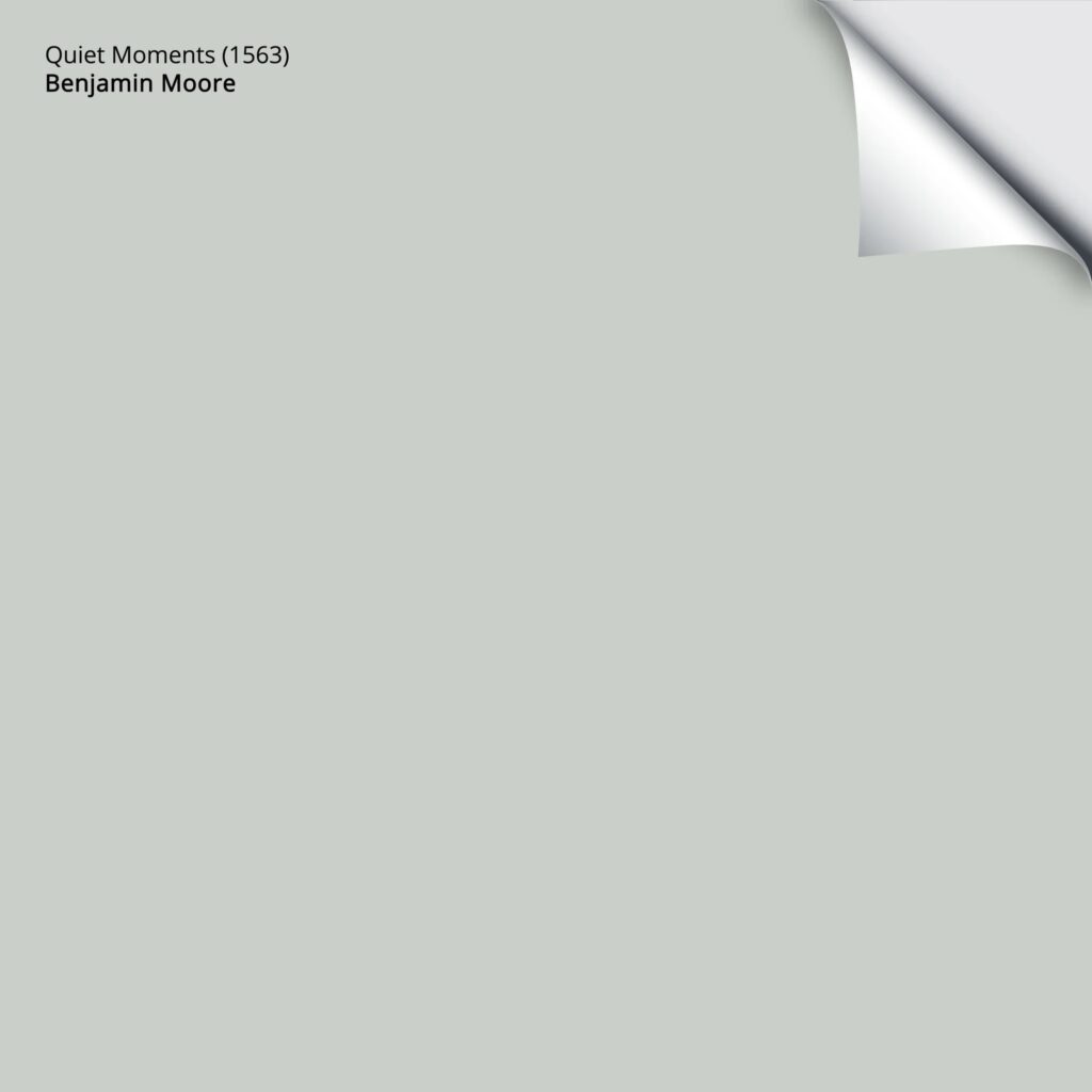
Quiet Moments is a light-depth paint color with an LRV of 60.73. It sits on the edge of my happy range (60-65), which suits the average room with an average amount of light.
If you like Quiet Moments but find it a touch too blue, check out Sherwin Williams Silver Strand, which is similar but a bit smokier and greener.
The Best Paint Colors with Gray Woods
4. BENJAMIN MOORE WOODLAWN BLUE HC 147
Woodlawn Blue is a trendy approach to blue that doesn’t go anywhere near baby blue. Most commonly found in bedrooms and the odd bathroom, Woodlawn Blue (if you ask me) is the perfect approach to blue with a strong foundation of blue, a smattering of gray, and a wee dollop of green for good measure.
What makes this blue trendy?
Its soft gray backdrop leaves a beautiful shade of blue on your walls without overwhelming a space with color. Its gray undertone and a subtle hint of green make Woodlawn Blue look a bit earth-toned, making it usable in a coastal, modern farmhouse, or vintage-style home.
If you want a slightly darker color with similar tendencies, check out Benjamin Moore Wedgewood Gray.
5. SHERWIN WILLIAMS HINTING BLUE 6519
Hinting Blue is one of the more colorful shades in this blog post. While it has a touch of gray, Hinting Blue is committed to its color. Another great thing about this popular light blue is that it doesn’t cater to violet or green, giving you a very legit approach to blue.
Could it look a touch baby blue?
It’s all about perception. PERSONALLY, yes, but sometimes that’s what a space calls for!
Here’s your Peel & Stick sample of Hinting Blue…

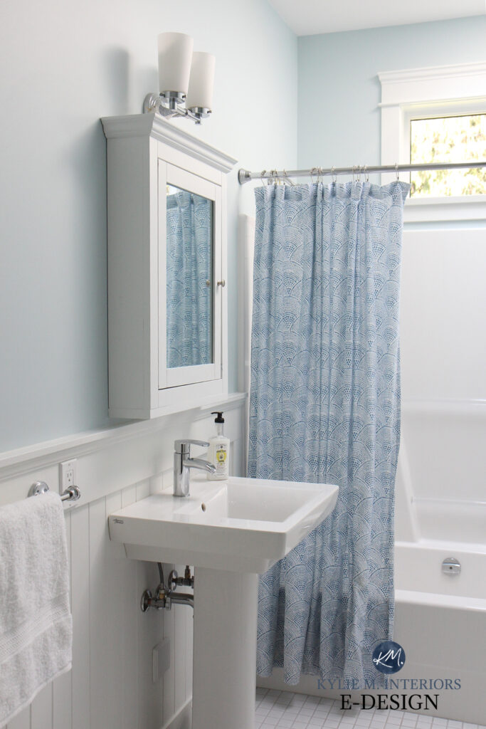
In this next bathroom, while Hinting Blue looks lovely, it prefers clean, crisp whites to warm whites or cream tones.

How to Coordinate Gray & Beige / Warm & Cool
Hinting Blue has an LRV of 68, putting it on the higher end of the light range but not quite in the off-white world. You’ll see a beautiful, crisp, clean contrast with the right white trim. If you want to see similar colors, check out Sherwin Williams Mild Blue, which picks up a touch of violet, and Sherwin Williams Balmy, which is more colorful/less gray than Hinting Blue.
As for Benjamin Moore’s match to Hinting Blue, no color is bang-on. I suppose you could check out Beacon Gray, which is comparable but slightly more blue-purple.
Should You Color Match Between Paint Brands?
6. SHERWIN WILLIAMS SLEEPY HOLLOW
Sleepy Hollow is a beautiful blue hue that’s pretty well-balanced. I almost chose Moonmist, the lighter version, but it seems a touch too baby blue for the average blue-lover (myself included). Sleepy Hollow’s lower LRV (57) leaves you with a beautiful blue hue without saying boo hoo for your new baby blue room.
Here’s your Peel & Stick sample of Sleepy Hollow…

6. SHERWIN WILLIAMS RAIN 6219
Rain is for my fellow pluviophiles who want more depth and blue on their walls. Of the colors on this page, it’s one of the more popular choices.
With an LRV of 49, Rain is a light-medium depth shade of blue. As for undertones, just like its lighter version, Tradewind, Rain has a touch of green and a calming dose of gray.
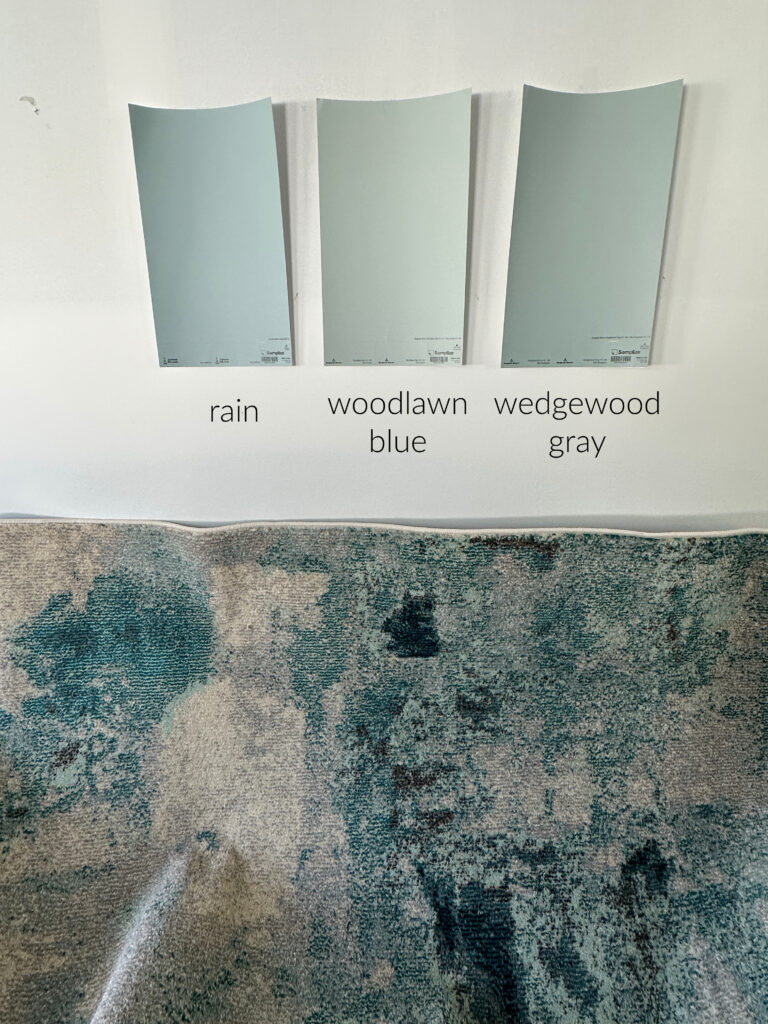
The above image shows how different the three shades of blue can be. While all of these are blue, Woodlawn Blue and Wedgewood Gray look far more green. These are blue-forward colors, for sure, but compared to the minimal amount of green in Rain, they look more green.

7. BENJAMIN MOORE SMOKE 2122-40
Smoke is one of my favorite shades of blue—I wish my clients chose it more often! Smoke has a noticeable gray undercurrent, making it smoky (minus the tobacco-tinged walls and smoker’s cough). But don’t be fooled; while gray is hiding in it, Smoke will ‘look blue’ on your walls; it’s just more calm and subtle in its approach.
Smoke offers more than a gray undertone; there’s a whisper of green in there, too, but it’s not very noticeable.
8. SHERWIN WILLIAMS RAINWASHED 6211
When I have an Online Color Consulting client looking for a coastal, fresh shade of blue, Rainwashed is one of the first that comes to mind. With a noticeable hit of green and a modest amount of gray, Rainwashed is one of this page’s more popular shades of blue.
If you love blue and want to see how it can change, play with the Kelvins of your light bulbs. Light bulbs with lower Kelvins (e.g., 2700K) can make a blue-green look a bit sun-kissed and cozy. Bulbs with a higher Kelvin (e.g., 4500+) will enhance the crisp, clean look of blue. Just keep in mind that rooms bathed in higher Kelvins can be quite cold and clinical-looking, so choose carefully.

Rainwashed has an LRV of 59. While this is on the slightly lower end of the light range, in the right room (with adequate lighting), Rainwashed is a cool, coastal, relaxing color. It’s not quite colorful enough to be considered FRESH, but it’s not overly foggy. If you like Rainwashed, but want a bit more depth, Quietude is wicked pretty.

While I don’t often suggest light blues for cabinets (I usually start in the slightly darker, light-medium range) because Rainwashed has a bit more depth than the average blue and that touch of green for flexibility, it can be an interesting choice in the right space. However, you’ll more often find it on walls.
My FULL Paint Color Review of Sherwin Williams Rainwashed
If you lean hard into blues with a good gray undertone, you might enjoy: The Best BLUE-Gray Paint Colors – check it out when you’re done this blog post!
9. SHERWIN WILLIAMS NORTH STAR
North Star could be your color if you prefer a more subdued blue-gray hue. This moody, stormy shade of blue-gray is far less colorful than other shades—some would argue whether it’s blue with gray or gray with a blue hue!

The Best Paint Colors to Go With Golden Oak Woods
North Star has an LRV of 62, which is in the sweet spot for the average room with an average amount of natural light. If you have a dark room, you miiiiight want a blue with a bit less gray, so that it shows up a bit more. Or maybe not; it could be perfect for you no matter your lighting situation!
The Best Blue-Gray Paint Colors
10. SHERWIN WILLIAMS TOPSAIL 6217
Most of the blues on this page are in light to light-medium depths. Topsail has something different to offer. With an LRV of 75 and a touch of green mixed in, Topsail is a fresh, pastel-inspired, clean approach to blue. A blue like this demands a crisp, clean white trim color—nothing overly creamy or warm.

Get your PEEL & STICK SAMPLE OF TOPSAIL HERE
Here are just a few projects a color like Topsail is good for…
- kid’s room or baby nursery
- room that needs a calming paint color with a spa vibe
- a counseling office
- guest bedroom in a coastal or beach-style home
11. SHERWIN WILLIAMS UPWARD 6239
Upward was a surprising choice as Sherwin Williams’s Color of the Year for 2024, and thankfully we’ve moved on.
Why?
As mentioned earlier, blue-green paint colors are more usable than blue-purples. While Upward’s degree of gray certainly helps it out, it will have limited uses.
However, this doesn’t mean it’s not perfect for your space, especially with its LRV of 57.2. This places Upward in the light range, but on the lower end.
Paint Color Review of Sherwin Williams Upward
COLORS THAT ARE SIMILAR TO UPWARD
- Benjamin Moore’s Gentle Gray is like a slightly grayer take on Upward
- Benjamin Moore Instinct is like Upward with LESS gray in it, offering a more powdery blue look
- Sherwin Williams Icy is brighter/more colorful than Upward, meaning it has less gray in it
12. BENJAMIN MOORE PALLADIAN BLUE HC-144
Palladian Blue has been one of the top blue paint colors for a long time, even before these types of colors hit the big time.

Palladian Blue is a light-depth blue paint color thanks to its LRV of 60.4. As for its particular blend, it has a reasonably noticeable green undercurrent and a dollop of gray for balance.
As to whether it’s TOO green, it’s all about comparison…
- Compare Palladian Blue to Woodlawn Blue (#4) and you’ll see more green and less gray in Palladian.
- On the other hand, compare it to the gorgeous Benjamin Moore Prescott Green, and it’s easy to see Palladian’s commitment to blue!
My next client hired me to improve their Palladian Blue home. They still wanted a blue-green-ish hue, but Palladian Blue was too strong…

Instead, I suggested the equally as beautiful, Sherwin Williams Oyster Bay for a more subtle, coastal vibe that better suits this gorgeous little Cape Cod stunner…

Remember, sampling and comparing colors is the best way to find your home’s PERFECT shade!
Benjamin Moore Palladian Blue: IMAGES, Info, & More
13. SHERWIN WILLIAMS LULLABY 9136
Lullaby is as soothing as it sounds. With a commitment to blue and a calming gray foundation, Lullaby is a great choice if you want the ‘baby blue look’ without it looking like an old-school baby blue hue.
While Lullaby could cater to a very, very minor green, it is really a more or less neutral-looking shade of blue with no real commitment to any secondary undertone.

Get your PEEL & STICK SAMPLE OF LULLABY!
SIMILAR COLORS TO COMPARE WITH LULLABY
- If you want to see more blue, you could explore Sherwin Williams Moonmist (just watch the ‘baby blue’ factor)
- Sherwin Williams Niebla Azul is an amazeballs, slightly darker take on Lullaby
- For a bit more stormy depth, Benjamin Moore Silver Gray is STUNNING
- Benjamin Moore Glass Slipper is a great comparable to Lullaby
14. BENJAMIN MOORE SUMMER SHOWER 2135-60
If you love a brighter, fresher, airier approach to blue, check out Summer Shower.
This beautiful color has an LRV of 69.43, which means it’s in the light range, but on the higher end of it. As for undertones, expect this blue hue to pick up a little touch of green.
Again, because 99.8% of my photos are from Online Color Consulting clients, readers, and friends, I don’t always have the images I need. However, here’s its Samplize image…
Here’s a 9×12 Peel & Stick sample of Summer Shower…

WHAT WHITE PAINT COLORS GO WITH LIGHT BLUE?
Ooooo, that’s a loaded question.
- What depth of blue do you have?
- Is it blue-green or blue-purple?
- How COMMITTED is it to color?
While I can’t cover every single aspect, I can definitely get you started.
- If you love a lighter, cleaner shade of blue, consider bright, more true shades of white for trims and cabinets.
- If your chosen blue is blue-purple, it’s more likely to suit a true white paint color. On the other hand, blue-greens enjoy true whites and some brighter, warm whites.
- If your blue has a good dose of gray, there’s not much it can’t handle, including some warmer, creamier whites (if it has gray AND a reasonable depth).
READ MORE
The Best Lighter BLUE-Gray Paint Colors
The 11 Best MEDIUM DEPTH Blue Paint Colors
Light to Medium Blue-Gray Paint Colors
The Best Blue-Green Blend Paint Colors
The Ultimate Guide to Choosing White Paint Colors
Get the best color advice…
Check out my Online Paint Color Consulting!