
3 White Kitchen Cabinet Palettes: REAL HOMES, Real Budgets
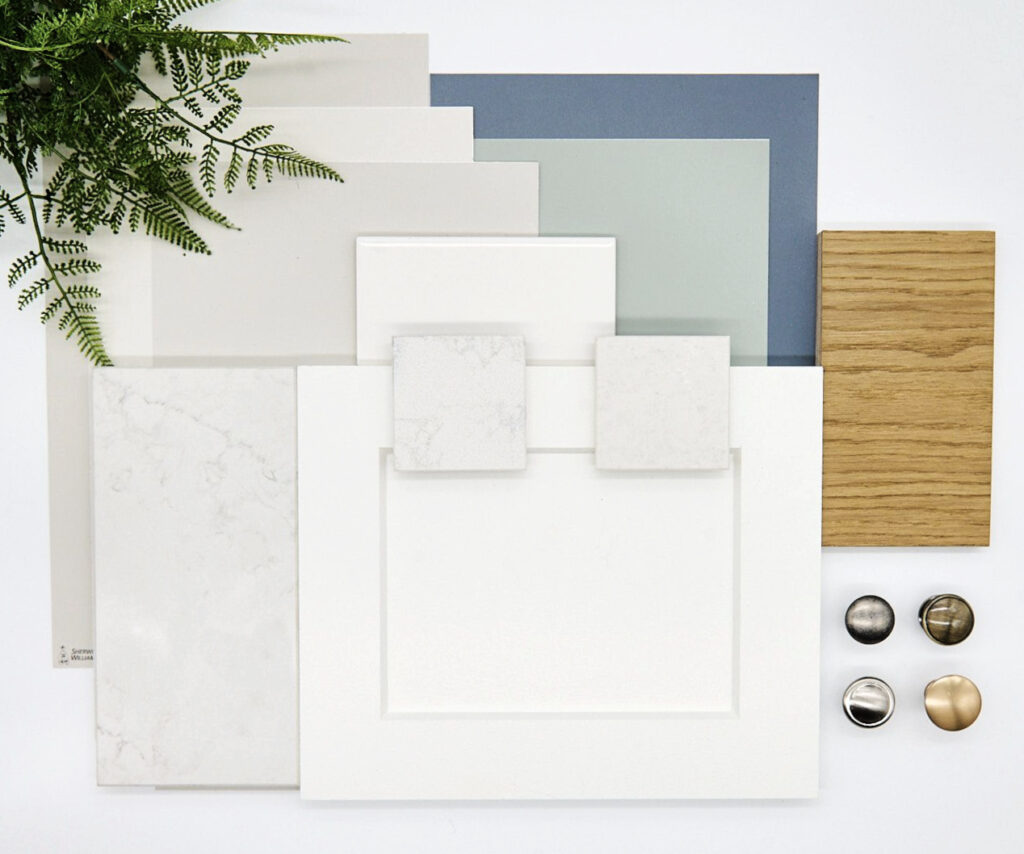
COUNTERTOP, BACKSPLASH, CABINETS, & MORE
Are you designing a white kitchen but don’t know how to coordinate your finishes? Or maybe you’re updating your existing kitchen with white cabinets and don’t know which backsplash and countertop will look good.
Sure, you can get lost on Pinterest, Instagram (find me there!), or Houzz, which are full of endless inspiration, but if you don’t want to hire a Designer, how do YOU create the same look?

Thank GOD you have me—just joking. Although that is what I say to my husband…daily.
Pinterest and Instagram can be great places to get inspiration. As for Houzz, I find their projects pretty unrelatable and unhelpful for the average homeowner. Which is where my blog comes in. Sure, I show some fancy homes, but you’ll also find super relatable homes—like mine and yours.

When looking through images, you might find yourself drawn to a similar look. While it might be about the finishes and colors, it could also be about contrast.
Have you ever considered the type of CONTRAST you’re drawn to?
Contrast (for the sake of this blog post) refers to the difference in DEPTH between finishes, using three basic depths: Light, medium, and dark.
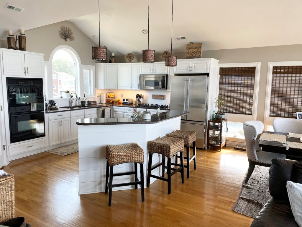
1. THE HIGHER-CONTRAST WHITE KITCHEN/BATHROOM PALETTE
A high-contrast white kitchen palette is often the most striking.
Why?

This kitchen palette is between medium and high contrast
Because it offers the most variation in depth between finishes. So, rather than blending your 3 finishes (white on white on white), you vary the depth of at least one of them.
The best way to create a high-contrast palette is to have white cabinets and backsplash and a dark or black countertop.
Before, this kitchen had a lot going on. While it had a reasonably low-contrast palette, the amount of texture was overwhelming.

6 Reasons Your Wood Cabinets Might Look Outdated
We kept the original, older granite countertop and updated its look with warm white cabinets and a matching backsplash…
All the photos in my blog are from my Online Color Consulting clients, readers, & friends— because real homes deserve to be celebrated (dirty laundry & all!) While not magazine-perfect, they’re packed with ideas & proven color choices to help you create a home you’ll love.
This next kitchen is a higher-contrast palette with its soft, cream-colored cabinets, matching subway tile backsplash, and black granite countertop…

When comparing the last two kitchens, notice how the black hardware in this one pops and adds another layer of contrast to the polished nickel in the other.
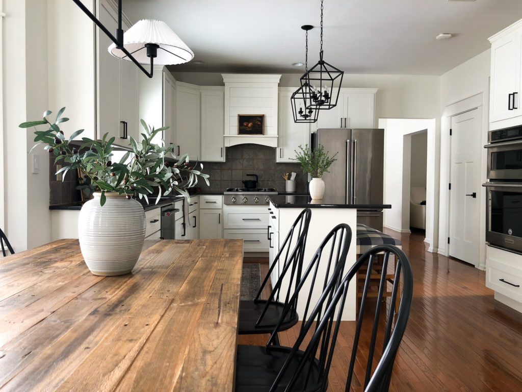
Here’s another palette that’s high contrast with softening elements (backsplash and wood island)…
While you might think that a dark floor and white cabinets would also be contrasting, it’s not the same effect. The dark floor grounds the space. There’s contrast, but it’s not as graphic.
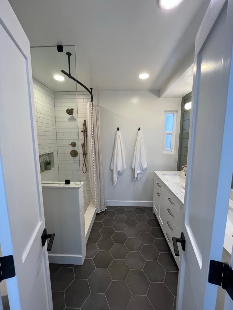
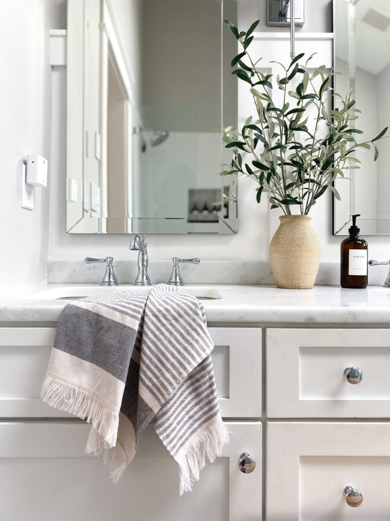
The black hexagon tile floor contrasts with the white vanity and warm white walls (Sherwin Williams Alabaster). The green shiplap accent wall behind the vanity is in medium contrast with the quartz countertop and walls.
HOW TO TONE DOWN A HIGH-CONTRAST PALETTE
Whereas a low-contrast palette often needs visual interest, a high-contrast one often needs finishes that soften the edge, including…
- A more simple tile pattern (backsplash or flooring),
- A simple dark countertop (minimal veining).
- No black hardware on white cabinets.
- Limit the amount of shiny/reflective finishes.
- Counter stools that are fabric or a woven material.
Save yourself the stress – get a CURATED KITCHEN PALETTE!
2. MEDIUM-CONTRAST WHITE KITCHEN (OR BATHROOM) PALETTE
A medium-contrast space is usually my happy place, as it can be a great happy place between styles and trends! The medium contrast kitchen offers a noticeable, but not shocking, change between products. It’s usually a combo of…
a) One product that is white or off-white and two medium-toned (i.e., white cabinets with medium-toned countertops and backsplash).
b) Two products are white off-white and one medium-toned (i.e., white cabinets, white backsplash, and medium-toned countertop).

I have a few things to note about the kitchen above (which happens to be my old one; I even cleaned off the empty wine bottles and KD boxes for you—yay me).
- The contrast between the white cabinets (Benjamin Moore Cloud White) and countertops is medium. The countertops offer a soft contrast with the white cabinets, but they don’t POP.
- The backsplash is more in line with the color of the cabinets while still bringing out a few of the creamy tones of the countertop.
- By the way, I also saved major bucks by choosing an affordable but awesome laminate on the perimeter countertops and quartz on the island (the main countertop is Soapstone Sequoia by Formica and it’s amazeballs).
Check out this next bathroom. The tile floor, vanity, and countertop are low-contrast, while the shower tile adds a medium-contrast element for interest…
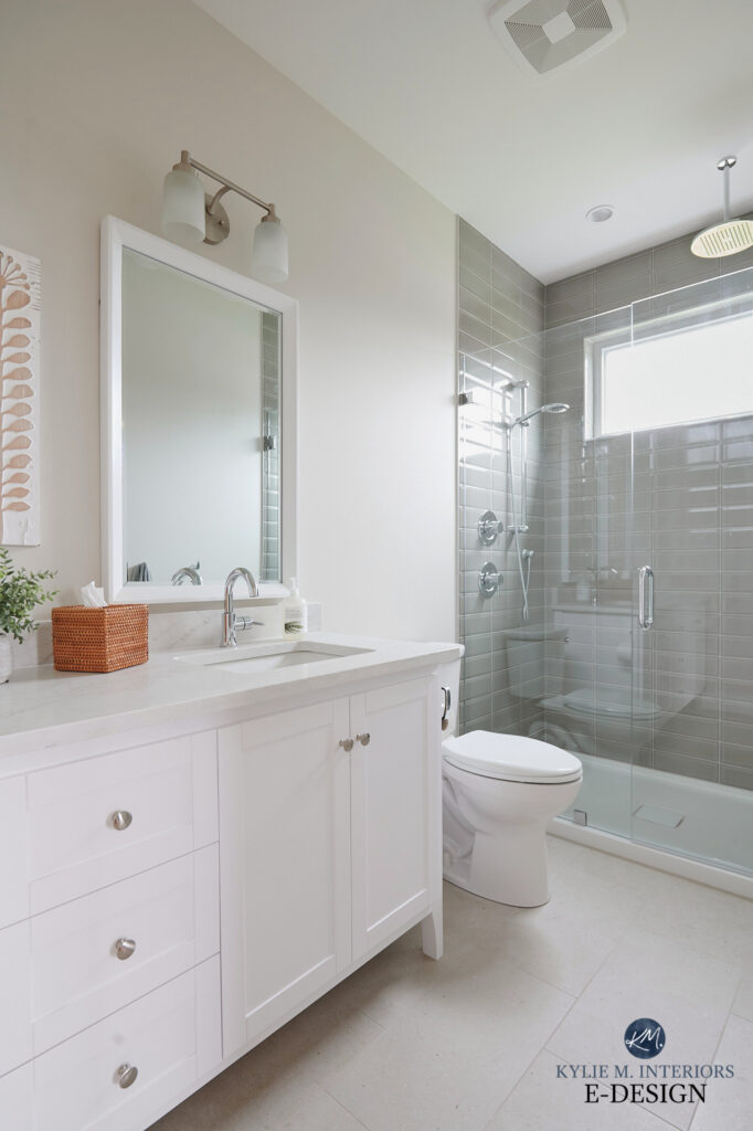
Sherwin Williams Aesthetic White: IMAGES, Info, & More
You can also add interest to a low-contrast kitchen palette by painting the island a darker, coordinating paint color.
Some might say this next kitchen is low-contrast based on the white cabinets, backsplash, and quartz countertop.

The Best Medium to Dark Green Paint Colors
What do YOU think? Do you think the dark green island adds some moderation/medium-contrast or you do think it’s a low-contrast kitchen?
It doesn’t really matter, as long as you create the look you like in YOUR kitchen!
This next bathroom is built on a white platform, with a white acrylic shower surround (that you can’t see), warm white walls (Benjamin Moore White Dove), and a white countertop…
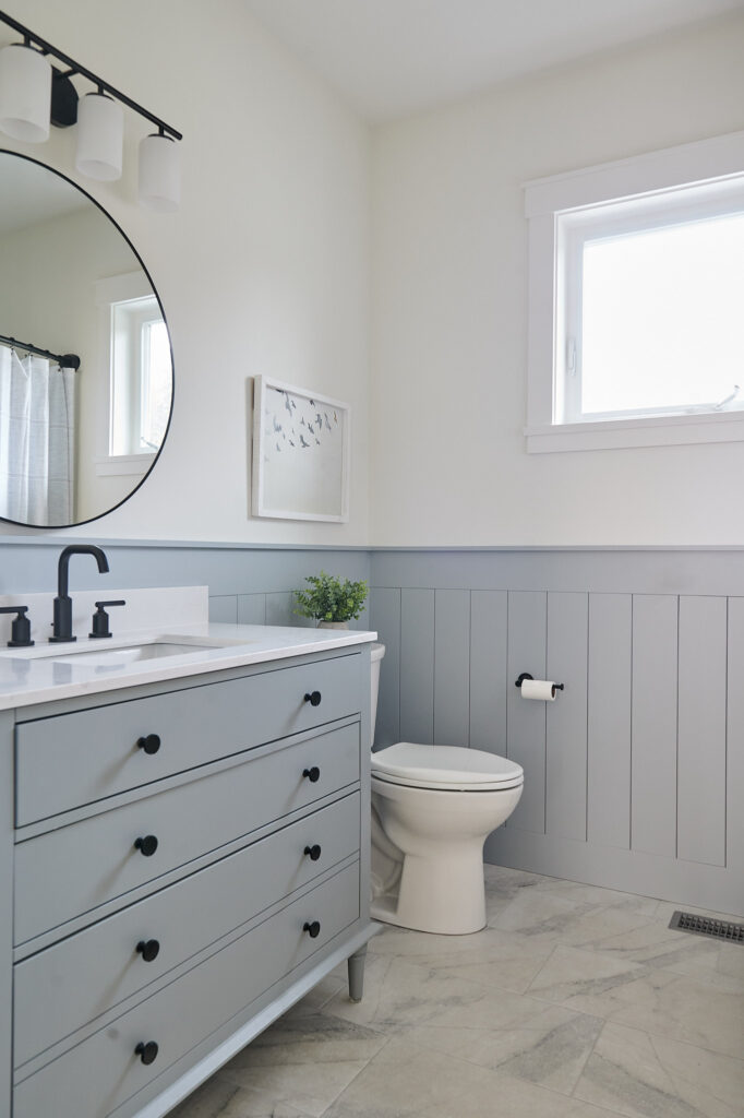
The Best Light to Medium Blue-Gray Paint Colors
From there, interest was added with a medium-depth shade of gray on the vanity and a vertical shiplap accent.
HOW TO ADD INTEREST TO A MEDIUM-CONTRAST SPACE
Medium contrast palettes tend to have some visual interest already, so you don’t need to go too far to finish things off!
- Backsplash or countertop with some detail in it, rather than a solid color
- Backsplash with texture (i.e., a stone like travertine or slate)
- Medium-toned paint color on the walls, kitchen island, or bathroom vanity
- Black or shiny nickel/chrome hardware (black isn’t as timeless)
The New Era of Laminate Countertops & Why They Rock
3. THE LOW-CONTRAST WHITE KITCHEN (OR BATHROOM)
A low-contrast kitchen or bathroom is simple and relatively seamless.
Why?
While there are many different finishes to coordinate, there isn’t a big shift between the color/depth of the cabinets, countertop, and backsplash.
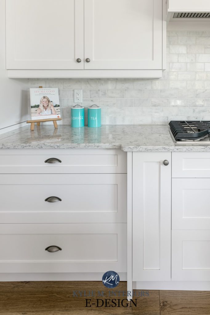
This first kitchen has white cabinets (Sherwin Williams Pure White), a white quartz countertop, and white subway tile.

This quartz countertop is LX Hausys Minuet
The above palette could look a bit flat and bland. Don’t get me wrong, some people like a super simple look, but if you want to jazz up your white-on-white space, consider a backsplash or shower tile with some detail or interest. For this kitchen, we chose a white BEVELLED subway tile.
Backsplash Trends: Zellige, Herringbone, Subway Tile & More!
The soft warmth of these next kitchen cabinets, combined with the soft white of the backsplash and countertop, creates a low-contrast palette.

Even the muted gray-blue-green island doesn’t add enough contrast to shift this kitchen out of the low-contrast range.
This next kitchen is low-contrast, with white cabinets (Sherwin Williams High Reflective White), a marble-look white quartz countertop, and a marble subway tile backsplash…
Affordable Ways to Design With Marble
The above kitchen is another low-contrast combo. Notice the subtle shift between the soft gray tones of the countertop and backsplash and the white cabinets. The veining in the backsplash and countertop adds a bit of interest.
The Best White & Off-White Quartz Countertops
One of my FAVORITE ways to jazz up a white-on-white bathroom is with chrome faucets and hardware.
Chrome hardware and fixtures are a beautiful way to add bling and visual interest without adding a lot of contrast or color…
Another way to add interest to a white-on-white-on-white kitchen is with black hardware. While this is a trend (popular in Modern Farmhouse Palettes), it’s a great way to add interest and contrast (just know that it’s on the way out if you worry about that type of thing)!
This next kitchen has beautiful warm white cabinets, with white quartz countertops (Silestone Et Calacatta Gold), and a beadboard backsplash…

The 8 Best Benjamin Moore WHITE Paint Colors
To look at this next kitchen, you’d think it’s all low-contrast…

But once you factor in the island, you see how it adds a medium to high-contrast element for some visual interest!

Of course, once the wood floor is in, it will soften the effect of the wood island a bit.
The Best White & Off-White Quartz Countertops
ADD INTEREST TO A LOW-CONTRAST WHITE KITCHEN OR BATHROOM
- Slightly darker grout on the backsplash will show off the pattern of the tile layout.
- A unique tile layout on the floor or backsplash (i.e., herringbone pattern).
- Paint your kitchen island a medium to dark paint color or stain it.
- Medium to dark-toned flooring.
- A backsplash or countertop with some visual interest (e.g., veining in the countertop, textured or mosaic tile backsplash).
- Shiny cabinet hardware and plumbing fixtures (polished nickel or chrome).
Of course, many other things go into creating a beautiful room, but hopefully, these tips and ideas will get you started on the right foot!
READ MORE
See all of Kylie’s CURATED KITCHEN PALETTES
How to Choose Your Kitchen’s Best Cabinet Colors
The 8 Best Off-White Cabinet Colors
The 5 Best White Cabinet Colors (Almost Fool-Proof)
NEED HELP?
Check out my E-Design and Online Colour Consulting Packages!

ORIGINALLY WRITTEN IN 2017, UPDATED IN 2024


Hi
We like the Cambria Torquay Design for our kitchen. The cabinet colour is OC17. After reading this post, I now understand what look I like. . Can you please suggest a Cambria design that we can pair with Torquay – say Torquay on the island and perimeter with onother design. Porcelain tile on the floor / a light grey/beige color.
Thank you so much / we are running out of time! I wish I had found this post earlier. Thank you so much
Hi Amira, thank you for your note! Unfortunately I don’t answer these types of questions lightly and would need to refer you to my E-design for some one-on-one help! https://www.kylieminteriors.ca/online-decorating-design-services/
~Kylie
I am interested in painting my kitchen and kitchen cabinets all white in the medium contrast. Can you tell me what paint is best for 10 ft. Ceiling showing rafters and what contrasting white colors for walls and cabinets. The kitchen windows face out to the bay facing west. Kitchen gets a huge amt. of sun. We are using Quartz-Ocean Jasper. We will using white subway tiles for back splash and any lighting over island will be a brushed nickel. Just not sure what whites should go where. Hopefully you can give me some much needed suggestions!! Thanks 🙂
Hi Leslie! I do try to give as much info as I can on my blog complimentary and if that doesn’t work, sometimes it’s time for me to take a look! I do have a very affordable and fun E-design service that could work well for you if you’re interested… https://www.kylieminteriors.ca/online-decorating-design-services/ This way I can spend some proper time with your room, rather than just tossing something out…
~Kylie
Hi Kylie
I love your Medium contrast kitchen. What colour paint is used on the walls? Thanks!
Your site has been a great source of information for me as I am painting/updating my entire home.
I just have to say, you put out on a ton of great articles. We were already using to figure out how to choose paint colors for our house. Now we are nearing the deadline for making choices on our kitchen remodel and we feel blessed to have found this article by you. My wife is doing a white kitchen and the designer for the remodeling company has been completely useless. We have been left to research everything on our own and white kitchens are not as easy as they seem. We have been to 12 locations looking at quartz slabs trying to find the right one for our bright white transitional cabinets. This article puts a nice framework on white kitchens. I wish I had seen it previously but am happy I’ve found it now. Bright white cabinets with silestone eternal statuario quartz is where we are now, so low contrast and we will add interest with the backsplash. Their are a lot of off white quartz slabs that look different in lighting and photos and look beige or dark against bright white cabinets. Sounds like elements of your medium and low contrast approaches would help in that situation. There are a lot of people out their trying to match their bright white cabinets to a marble-look quartz countertop and driving themselves crazy.
Thank you for this comment Jonathan! You’re right, quartz is DAMN TRICKY, and as you said, what you THINK is ‘white’ is anything but!
Agreed -we chose silestone eternal statuario quartz as well and it is stunning. The designer recommended a bright white subway tile that matches beautifully to SW High Reflective White but I feel like the subway tile is too white for the countertops. It is white – unlike a lot of quartz which is more of an off-white but it isn’t quite as bright as high reflective white. The countertops match up better to SW Pure White but finding a white subway tile that matches Pure White has been a challenge! I’m half tempted to change to a grey subway tile!