
The 4 Most Timeless Beige Paint Colors
The Best Beiges & Tans for a Modern & Timeless Home
Guess who’s back? That’s right – BEIGE, BABY! While it’s taken a few years to see the pendulum swing, beige and tan are, once again, popular colors. However, not every shade hits the top of the list. Some are still very dated-looking, harkening back to the heavy, Tuscan-inspired beiges of the early 2000s.
While those heavier beiges can be pretty, they aren’t timeless. How do I know? I’ve spent the last ten years helping my Online Color Consulting clients paint over them with more modern shades.
But for the sake of this blog post, we’re not looking for modern – we’re looking for timeless. Okay, maybe we want a little of both, but here’s the deal…
There is no foolproof, timeless paint color. There are only colors that have a ‘better chance than others’ of transitioning through the varying trends.
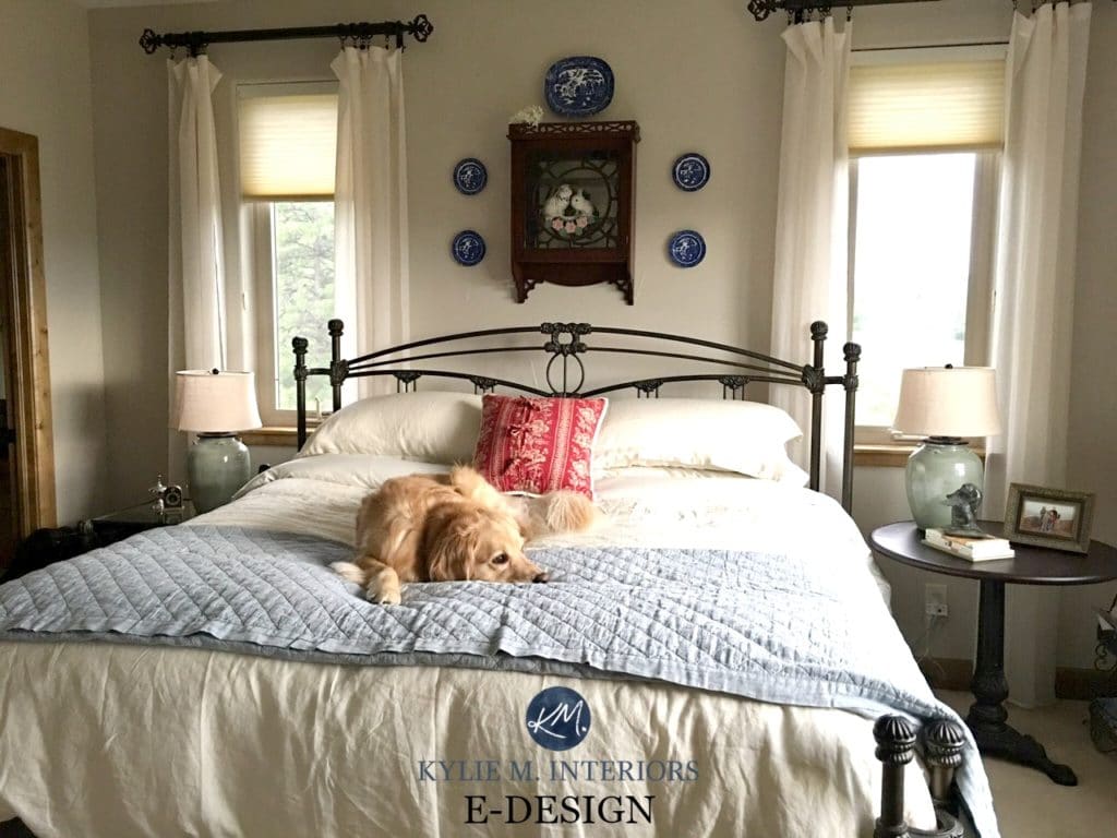
This dog has waited patiently for beige to come back.
This is why I’ve pulled together the beige and tan paint colors from Sherwin Williams and Benjamin Moore—ones that have a better chance of standing the test of time. I refer to these colors in my Online Paint Color Consulting as they go above and beyond boring old builder’s beige.
Because let’s face it, not everyone loves greige, taupe, or white; sometimes beige is just what a home and homeowner need – it’s just about picking the best Ginger beige for the job (or both, really).
Before we jump in, there’s one more thing we need to chat about…
YOU CAN’T USE THESE BEIGES EVERYWHERE
Current cabinet trends include shades of dark green and a wide range of off-white and light-depth (non-white) cabinet colors. While you might be tempted to slap one of these beiges on your cabinets, I suggest you think twice.
Don’t get me wrong, I love non-white cabinets (and have some in my own home), but as far as ‘timeless choices go,’ white is the most timeless cabinet color. Sure, peruse these colors for your cabinets, but think carefully before committing, as you could hold yourself back in the long run!
Long story short…
These colors are best for WALLS.

1. BENJAMIN MOORE MARITIME WHITE OC-5
Maritime White is a stunner (I might even love it more than Aesthetic White). Whereas some beiges come in more hot n’ heavy than me in my early 20s, this beige comes in with a polite nod and kiss on the cheek. As for depth, Maritime White’s LRV of 71.6 puts it closer to the OFF-WHITE world, which means it’s lighter and brighter.

As trends change, the lighter a main wall color is, the more likely it is to last through the trends.
This is one reason why some light, warm grays are still in style while other, slightly darker shades are out of style (as gray is more or less outdated based on ‘current trends’).
Here’s your Samplize PEEL & STICK sample of Maritime White!
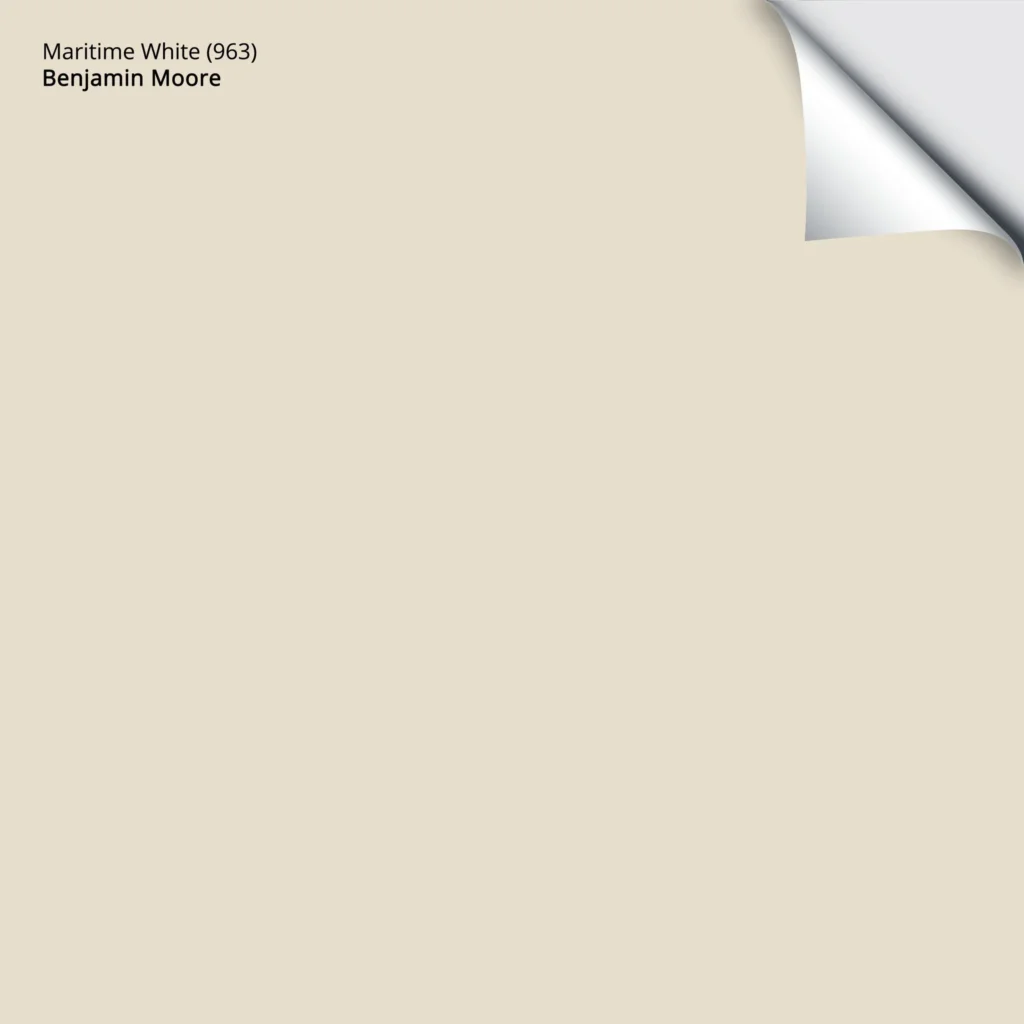
As for undertones, being a beige, Maritime White has a lovely but subtle orange hue. It’s also flexible towards finishes that need a bit of orange-pink or orange-yellow, as long as they don’t swing HARD one way or the other.
If you like Benjamin Moore’s Maritime White and Sherwin Williams Aesthetic White, sample and compare them to similar shades with your own CURATED BEIGE COLOR BUNDLE.
My FULL Paint Color Review of Benjamin Moore Maritime White
2. SHERWIN WILLIAMS NATURAL LINEN SW 9109
Natural Linen is kissin’ cousins with Muslin (listed below). While this is illegal in some states (as it should be), when it comes to paint colors, these two are definitely worth checking out.
With its LRV of 66, Natural Linen has a moderate depth, sitting in the middle of the ‘light range.’ As for undertones, it has that beautiful orange backdrop, as beiges do, but compared to Muslin, it’s more subtle in its approach.
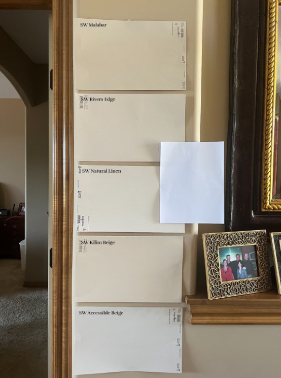
READ THE REVIEWS OF: Sherwin Williams River’s Edge, Kilim Beige, Accessible Beige

My FULL Paint Color Review of Sherwin Williams Natural Linen
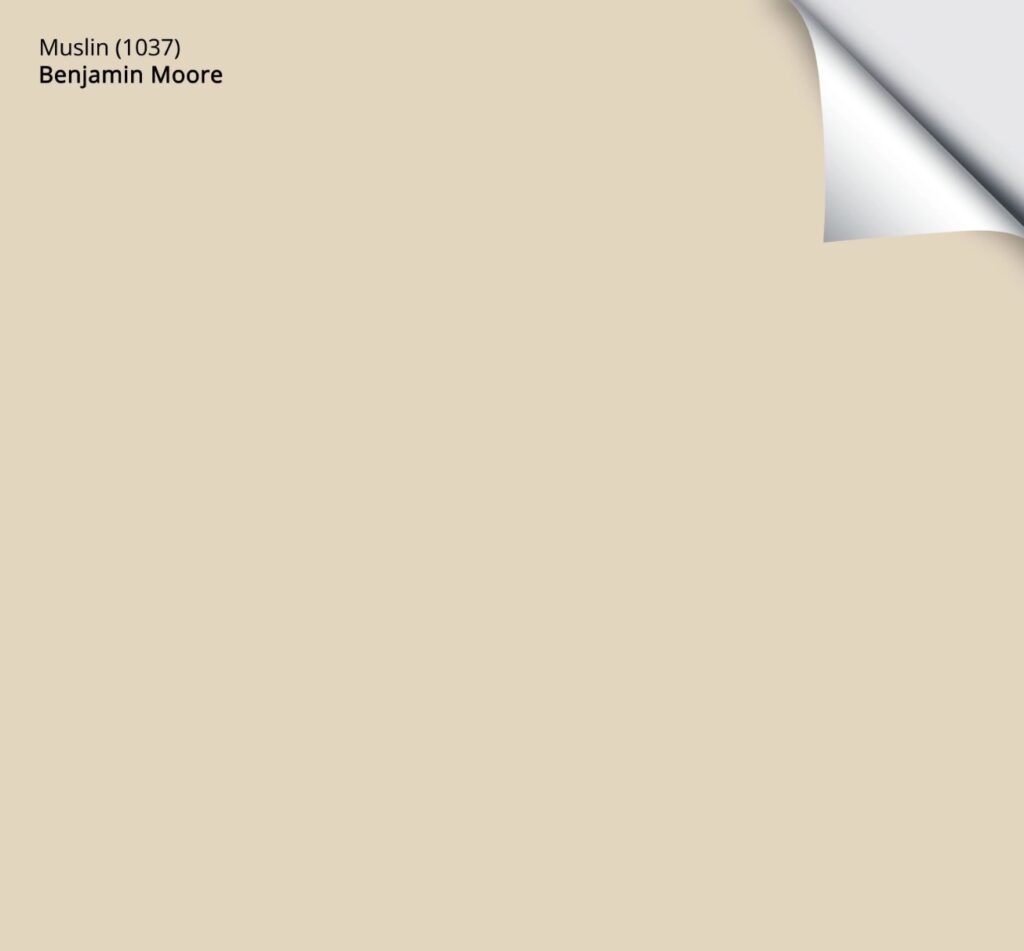
3. BENJAMIN MOORE MUSLIN OC-12 / CC-110
I’ve long loved Muslin, not just because it’s a great fabric for burp cloths but because of its soft, subtle approach on walls.
Some beiges hit their orange undertone HARD and can swing wildly into yellow, green, and pink – not Muslin. Muslin has that ‘beige-centric’ orange undertone, but a) it’s muted, and b) it’s reasonably flexible towards yellow and pink. This matters a lot when coordinating a paint color with beige tile, as you often need a versatile shade to hit the right spot.
Muslin is hands down, one of THE most timeless beige paint colors.

How to Update Outdated Granite Countertops
My FULL Paint Color Review of Benjamin Moore Muslin
Muslin is a light beige with an LRV of 66.54. This depth means it’s nestled snugly in the buxom bosom of my ideal LRV range.

Muslin was popular in the early 2000s as it suits many Tuscan-style, beige-on-beige homes. While it fell in popularity in the ‘gray years’ (2010-2020), it never disappeared. This tells me that, more so than many other beige and tan paint colors, it’s more timeless and flexible.
Here’s your Samplize Peel & Stick sample of Muslin!
If you like the slightly darker nature of Benjamin Moore’s Muslin and Sherwin Williams Natural Linen, sample and compare them to similar shades with this CURATED LIGHT BEIGE COLOR BUNDLE.
4. SHERWIN WILLIAMS NATURAL TAN SW 7567
Natural Tan is something I’ll never know about, given my pasty white Ginger arse. Oh, not THAT type of natural tan…silly me. Natural Tan is the epitome of tan as it’s muted, subtle, and, in the right light (i.e., north-facing), seems to lean a wee willy wink into gray. This gray backdrop reduces the degree of color and undertones you see, making it a bit easier to coordinate with.
My Paint Color Review: Sherwin Williams Natural Tan
However, whereas Accessible Beige’s depth holds it back a bit, with Natural Tan, it’s its undertones. While it usually reads pretty neutral, it can pick up a slight green undertone. Sure, it’s pretty, but this green undertone is much more challenging to coordinate with, as most warm interior finishes cater to beige (orange), not tan.
Take a look at this next image…
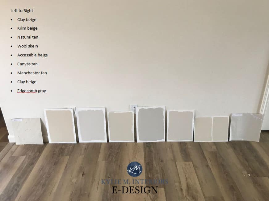
First, I want to make a few points…
- Never lean your paint samples; they should always be 100% vertical on the wall. Light reflects differently off an angled or horizontal surface.
- Use Samplize Peel & Stick rather than sample pots – save time and money.
- Natural Tan is next to a SUPER strong beige, Kilim Beige, so it looks much grayer in comparison. Kilim Beige is a beautiful, popular, but more old-school shade of beige.
Now, if you ask me, those are the top contenders for the most TIMELESS colors. Again, nothing is foolproof, but some will last longer than others.
This said (oh, we’re not done yet)…there are a handful more that are super popular, even if they aren’t as timeless (besides, some people love to repaint every five to ten years, anyway).
5. SHERWIN WILLIAMS ACCESSIBLE BEIGE SW 7036
Accessible Beige is, hands-down, the most popular beige in my repertoire. I have a Rolodex of paint colors in my brain (you younger folk might want to look that one up), and Accessible Beige comes up often when consulting with my Online Color clients.
Accessible Beige is a light-depth paint color that leans a bit gray, so it doesn’t have an even REMOTELY golden approach, making it popular on walls, cabinets, and exteriors. It’s also a great way to lean slightly into the gray-greige world without going so far that you alienate a beige-inclined home.

4-PART SERIES: How to Create a Timeless, Trend-Proof Home
Because of its depth, Accessible Beige is not as timeless as the others. Its LRV of 58 puts it on the lower, darker end of the light range. Is it still pretty? HECK YES! But does its depth make it a bit less versatile? Also, yes.

My FULL Color Review of Sherwin Williams Accessible Beige
YOUTUBE COLOR Review of Sherwin Williams Accessible Beige
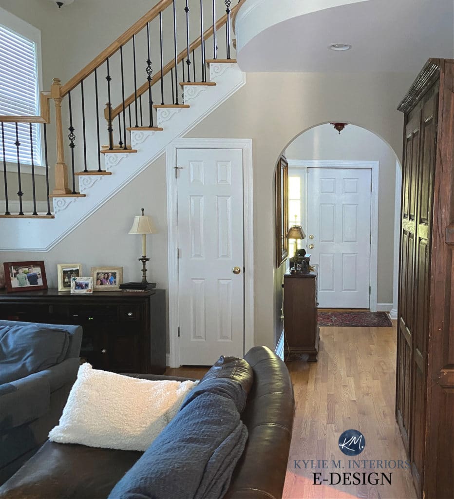
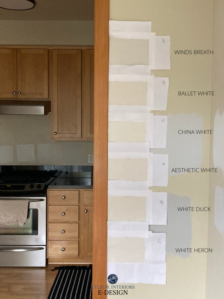
6. SHERWIN WILLIAMS AESTHETIC WHITE SW 7035
When it comes to beige and tan paint colors that can last through trends, the lighter and more subtle, the better. This is why Aesthetic White is at the top of my list, a list that’s definitely in order.
Aesthetic White is nothing short of amazeballs. This off-white shade of beige is slightly darker than the average off-white, giving it a subtle but noticeable contrast with a well-chosen white trim.
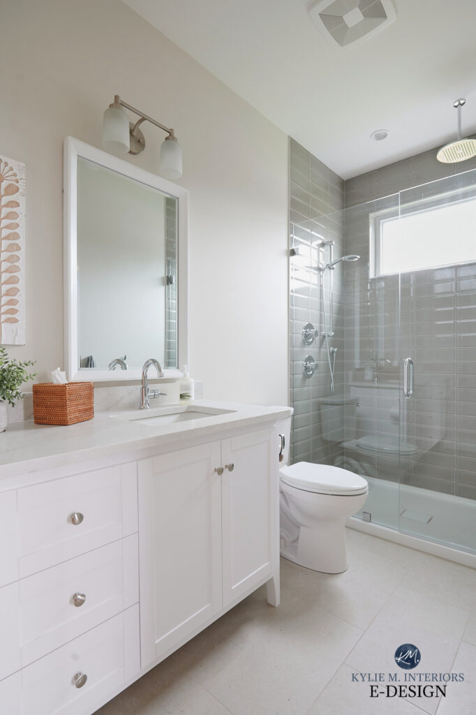
As for undertones, Aesthetic White is shockingly neutral. This means it can be open to interpretation. Some find it a bit green, and others find it a bit pink or purple—which doesn’t make sense as these colors are opposite…but it happens. It’s also known for leaning a bit more gray than not in some lighting situations. In other words, sample it carefully and see how it settles in your space.
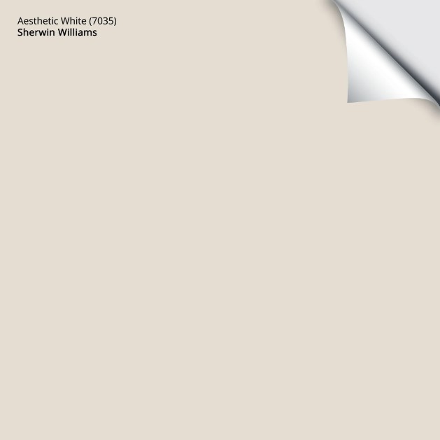
Here’s your Samplize PEEL & STICK sample of Aesthetic White!
My Paint Color Review of Sherwin Williams Aesthetic White
Once you’ve finished this blog post, here are reviews of the above colors: Winds Breath / Ballet White / White Duck / White Heron. This said, none are as beige as Aesthetic White or the colors listed below.
7. BENJAMIN MOORE MANCHESTER TAN HC-81
Manchester Tan has to be one of Benjamin Moore’s most requested beige/tan paint colors, as it’s been kickin’ it longer than Abby Wambach. I’ll wait while you Google her name to get the pun.
While I wish it had a slightly higher LRV (its LRV is 63.24), Manchester Tan’s undertones make me a bit nervous. Sure, it can look pretty darn neutral, but like Natural Tan, the odd flash of green pops up, which can be a hot mess when coordinated with the wrong interior finish (of which there are many).
This isn’t to say it’s not the best color for your room, but sample carefully and compare it to similar shades to see which settles best.

My FULL Paint Color Review of Benjamin Moore Manchester Tan
8. SHERWIN WILLIAMS BALANCED BEIGE SW 7037
Oh, Balanced Beige. If I had my druthers (I wouldn’t talk like an 85-year-old English lady), I’d also put Balanced Beige at the top of the list. However, as far as the most timeless warm neutrals go, Balanced Beige doesn’t make the cut.

With its LRV of 46, Balanced Beige plants itself well into the light-medium range, making it beautiful for walls and cabinets but a bit too dark to be flexible for the long term. Its depth and undertones are like Accessible Beige with a bit more depth – it’s chonkier.
As shown on these walls, Balanced Beige tips nicely into gray while still keeping a passive warmth…

But as shown in this next photo, it easily leans back into its subtle warmth…

My FULL Paint Color Review of Sherwin Williams Balanced Beige
If you like beiges with a bit more meat on their bones – colors like Balanced Beige and Accessible Beige, get your own CURATED LIGHT & LIGHT-MEDIUM BEIGE COLOR BUNDLE to sample and compare top shades!
READ MORE…
4-PART SERIES: How to Create a Timeless, Trend-Proof Home
The 3 Most Timeless Paint Colors (Part 2 of 4)
The 8 Best WHOLE HOME WARM Paint Colors
The Best Cream Paint Colors: Benjamin Moore & Sherwin Williams
Is Beige Back? You Might be Surprised!
NEED HELP?
Check out my Online Paint Color Consulting


ORIGINALLY WRITTEN IN 2017, UPDATED IN 2025


I love all your posts and videos!! You’re so good at explaining colors and undertones!! My question for you is my kitchen/dining room is painted SW agreeable gray and I want to repaint my adjoining living room with more of a warmer beige/tan. What colors should I look at that would pair good with the agreeable gray? Thanks so much!
Hey Chelsea! Have you looked at the likes of Accessible Beige, Natural Tan and Aesthetic White?
what about a 1982 house with a orangish brown fake wood floor? My husband wants to paint our bedroom beige and likes Kilim beige, but I also like balanced beige. Would either of those go good with a brown-toned floor with definite orange tones? Now that I look at it our dresser has an orange tone to it too. Would beige even work with our room?
Does Clay Beige have a pink underdone at all? I’m looking for something that will coordinate well with Ballet White and really don’t want anything that flashes pink. I’m toying with the idea of Manchester Tan as well. Thank you!
NOPE! You should be good with either ;).
I am picking out paint colors now and I have tried sample of some of the colors that you displayed, but it shows differently in my house. What do you think of the Benjamin Moore color palette starting with lighthouse landing 1044-1046 and palette with winter wheat 232 -233? I like the light beigey look but wonder if it will be true to its color.
Is there a beige that will work with Edgecomb Gray and not enhance the green undertone. Currently the beige (Shaker Beige) is clashing with the Edgecomb and making it seem more green. Is there another beige you can suggest that might work better. Thank you so much.
I have painted my lake house open concept main living area Alabaster and hate it. The windows reflecting the trees outside the windows line the area on the south facing side is a sickening green yellow color. Please help. I want a neutral color. Accessible beige?? I’ve also heart SW base is green which is another potential cause. I’m so frustrated.
Oooo, it’s TOUGH to balance out that green light, and sometimes you can’t, short of choosing an overly orange, pink, or violet hue for your walls. The thing is, of the beiges, ACcessible is a BIT more likely than others to pick up a vague green undertone, so I imagine it will go ‘next level’ with your exposure/trees. I mean, I can see how Alabaster wouldn’t be great as it would go sicky yellow-green BECAUSE of the degree of yellow in it. I even get a wink of that with White Dove, which isn’t as warm as Alabaster.
I’d love to tell that one color will fix it all, but sometimes the color that fixes it is either a) SUPER dark or b) overly orange-pink in the evening hours, and even then even they sometimes grab green.
If I were you, and without knowing your home, I would look at something like Sherwin Williams City Loft, Alpaca, Popular Gray, Benjamin Moore Collingwood, Balboa Mist. These are all warm violet-based colors that ‘usually’ stand up well to green light. The darker a color is, the less light it reflects. As for darker colors, you can choose a darker color to reflect light…but then your lake home is painted a dark color. Having a lake home myself, I can’t see this being a big hit ;).
I was in a similar situation. BM Camouflage in north facing low light room with lots of reflecting greenery. After debating and hesitating for about 3 weeks, I have learned to embrace the green and now I love it! Indoor plants and placement of furniture has helped but I much prefer it to painting a dark room darker.
Hi Kylie! I’m wondering about your thoughts on BM’s Natural Cream?? It’s making me nervous that I can’t find much information about it on your channel or site…..
I had really thought I’d end up using Edgecomb, but I just haven’t been able to fall in love with it, and I keep seeing pink (spontaneously cries here).
I’m liking Natural Cream, but again nervous and hoping for your insight with a colour review!!! Sigh, I’ve been stuck in decision paralysis for months now :/
Welllll, I don’t talk about it much because I don’t totally TRUST it! With the difference between the two, I’m not sure you’ll feel much better. Also, make sure you’re sampling EG with white paper around it, as your existing wall color ‘could’ be throwing you off a bit :).
If the pink is killing you, it sounds like you need to lean into a wink of green, to help counteract the chance of pink. There isn’t REALLY a direct comparable that’s more green, but some general colors to explore could be SW White Duck, Natural Choice, BM Ashwood. HOWEVER, also check out colors like SW Modern Gray and Egret White. They might be as bad as EG or MAYBE they feel just a bit different without having to really dip into the green pool :).
Hi Kylie!
In your first photo (the bedroom with the adorable beige dog), what color is on the walls? Thanks, Lisa 🙂
That’s SW Accessible Beige!
Hi Kylie,
Have you done Manchester Tan at 75% and if yes, do you have any pics? I’m thinking I’d like it a bit lighter but don’t want to wash away all the color.
Thank you!
I haven’t, Susan!