
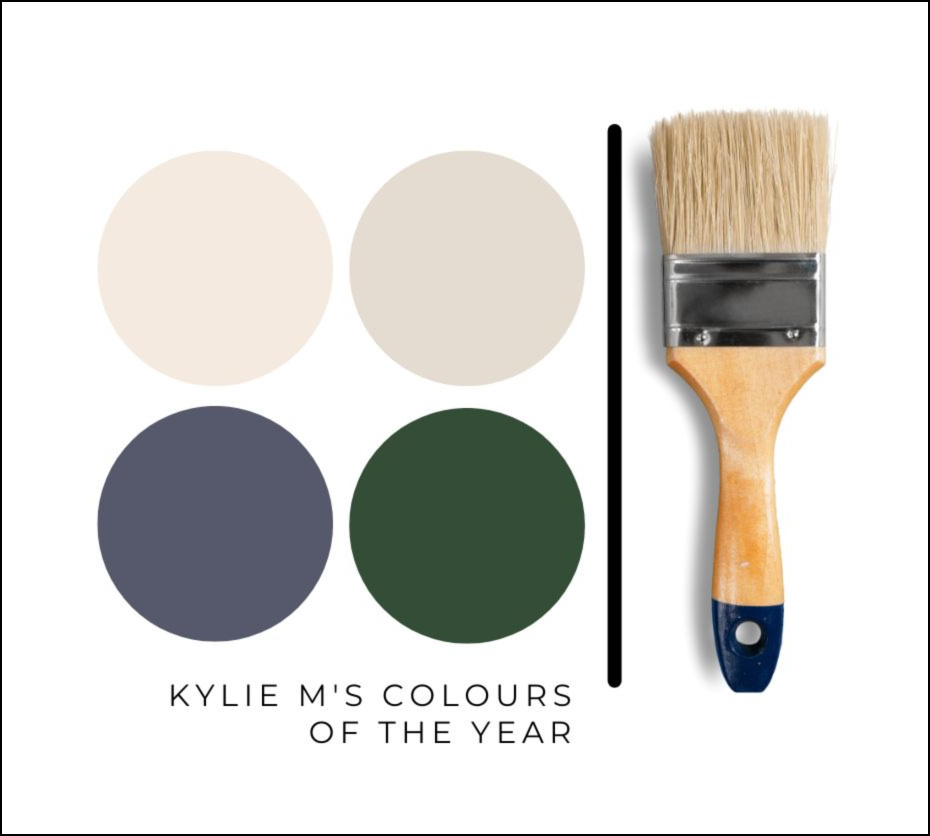
KYLIE M’S COLORS OF THE YEAR: 2023 Collection (Benjamin Moore & Sherwin Williams)
KYLIE M’S TOP COLOUR FOR 2023: BENJAMIN MOORE & SHERWIN WILLIAMS
Wait, did I say ‘colour’ as in SINGULAR COLOUR? You KNOW I could never limit myself to just…one…colour. It’s like choosing your favourite child; you love them for different reasons. And yes, each of the colours below is like the love child between myself and either Ben or Sherm. Neither knows about my passionate love-fest with the other, so let’s just keep that on the QT.
So, while each brand rolls out its chosen Colour of the Year, with Kylie M, you’re not getting ONE Colour of the Year, but TWO wild and wonderful colours to choose from. Okay, maybe they’re not so wild, but HOLY HECK, are they ever wonderful.
Sherwin Williams hit it out of the park with their Colour of the Year for 2022, Evergreen Fog.
But first, let’s talk about what a Colour of the Year should be (according to me)…
- a darn good option for more than one type of surface
- gets people excited to get PAINTING!
- nods at coming trends
- while it doesn’t need to speak to EVERYONE (no colour would), it needs to have a fighting chance in today’s average home
So, while the big brands focus on a LARGER-scale approach (and maybe a little shock factor based on some of this year’s choices)…
My focus is on YOU and what might inspire you to get out your paintbrush!
And while you might be nervous to see BEIGE back on the horizon, I promise you, this first colour is a gooder.
1. COLOR OF THE YEAR – SHERWIN WILLIAMS AESTHETIC WHITE
I can’t say ENOUGH about Aesthetic White and what it offers the average home.
Why?
Where do I even BEGIN? Let’s start with the basics.
WHY IS AESTHETIC WHITE KYLIE M’S #1 COLOUR OF THE YEAR?
With trends leaning warmer, many of my clients are ready to embrace the beige end of things. However, the builder basic beiges from the 1990s and RICH beiges from the early 2000s scare the pants off them – and I don’t blame them. Aesthetic White is a polite ‘pants on’ introduction to the warmer end of things (which I can’t say about my first date with Tim – JUST JOKING, MOM!).
WHAT TYPE OF COLOUR IS AESTHETIC WHITE?
Aesthetic White is an OFF-WHITE beige paint colour. Again, the b-word is a touchy subject for some; I get it. However, Aesthetic White isn’t like the others as it picks up a whisper of gray, taking that traditionally warm backdrop back a few notches.
In fact, Aesthetic White is so muted that many would argue that it’s HARDLY a beige at all, given how different it is from the others. This is my exact point; it’s my special child, and I’m playing favorites.
Is Aesthetic White an EXCITING colour?
Nope.
Does Aesthetic White have a strong personality or the type of vibe you could get emotional about?
Not really.
Let’s be honest, it’s easier to get excited by photos of Ryan Reynolds in a Speedo with a buttload of wine in his arms more COLOURFUL options (btw, I encourage you to look up the word buttload). But just because a Colour of the Year isn’t TITILLATING doesn’t mean it’s not a great option for you and your home.
A Colour of the Year doesn’t NEED to be stimulating or exciting; it needs to show people the way forward.
WHAT’S THE LRV OF AESTHETIC WHITE?
Aesthetic White has an LRV of 73, winking at the off-white world while still offering a nice contrast with the right white trim colour. While we’re not QUITE out of the ‘all white’ world yet, trends are shifting. In the coming year, we’ll see some softness on our walls with these more moderate LRVs – maybe a bit less white, while still being bright. Oh yeah, and things are warming up too – for reals.
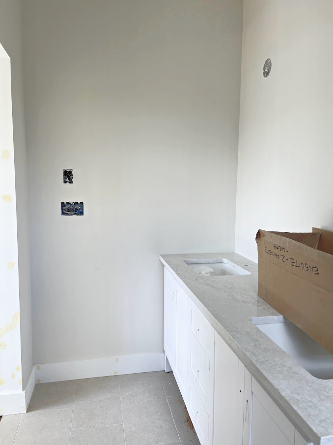
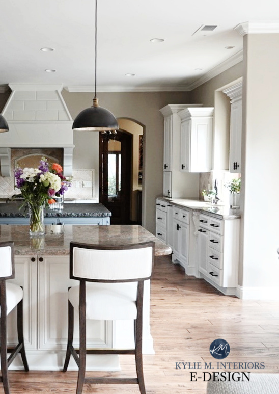
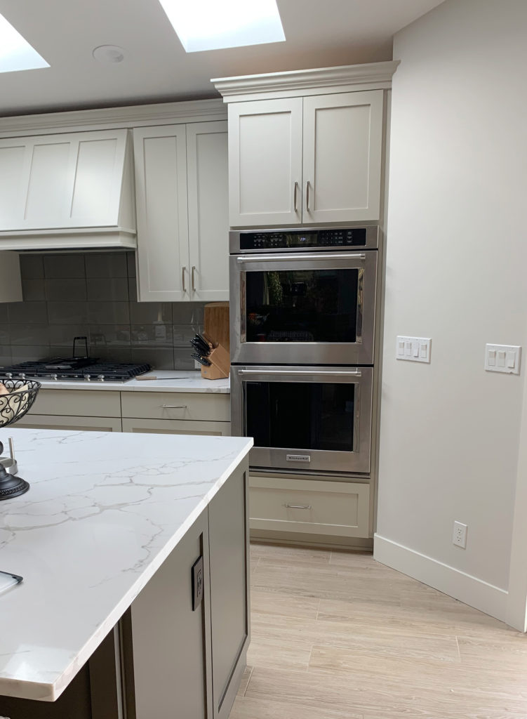
AESTHETIC WHITE ON KITCHEN CABINETS
Aesthetic White can be a great fit for those remodeling kitchens or bathrooms with slightly more outdated surrounding finishes. On the other hand, with the trending cabinet colours being on the softer, neutral side of things, Aesthetic White is definitely in the running for today’s modern kitchen, although this does make ye ole Ginger a lil twitchy.
Why?
Off-white, light depth, and mushroom-coloured cabinets are definitely trending. And while they’re beautiful, they’re also very limiting (read more on this topic HERE). However, there are a few exceptions as to when off-white or light-depth cabinets are a great choice for your kitchen or bathroom, for example:
- you’re staying in your home long enough that ANY trend will be irrelevant
- you LOVE the look and have the funds to change things down the road (if needed)
- you live in an older home
This last point is important as many homes built in the last 30-40 years don’t suit white cabinets, making off-white/light depth cabinets the next best choice. This way, it’s not about what’s TRENDY; it’s about what suits the existing finishes and helps them look more updated.
But anyway, let’s move along…
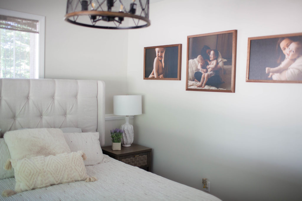
AESTHETIC WHITE ON WALLS
Not only is Aesthetic White good for a single room, but it’s also a viable choice for an entire HOME (I mean, it has to suit your finishes, of course).
AESTHETIC WHITE ON EXTERIORS
While white exteriors are still going strong (I wouldn’t mind seeing a LITTLE ebb in this trend), some are leaning into a softer approach, especially with black windows and charcoal roofs.
KYLIE’S SUMMARY OF AESTHETIC WHITE
Let’s see how Aesthetic White does based on my high expectations…
- Is Aesthetic White a good option for more than one type of surface? YOU BET YOUR BOOTY IT IS!
- Does it get people excited to get PAINTING? I sure hope so!
- Does Aesthetic White speak to coming trends? Absolutely, trends are leaning warmer.
And while Aesthetic White won’t appeal to EVERYONE (find me a colour that does…), it definitely has a fighting chance in today’s average home.
Get your PEEL & STICK sample HERE
FULL Paint Colour Review of Sherwin Williams Aesthetic White
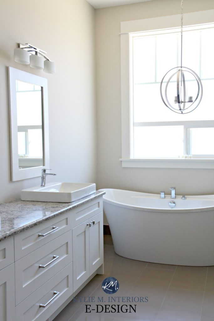
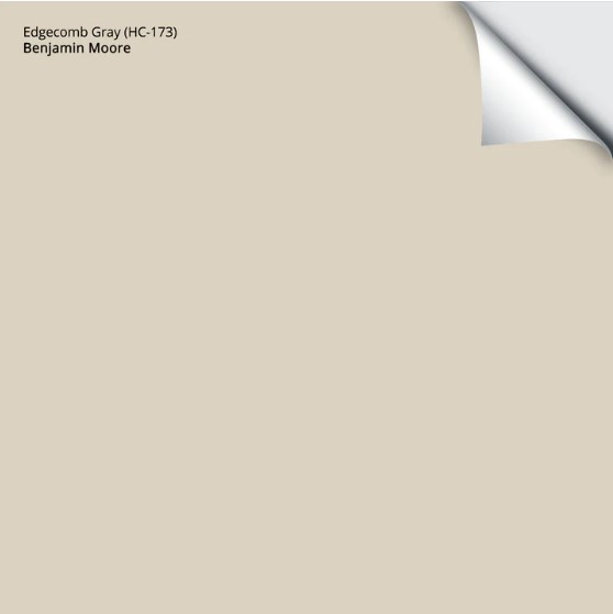
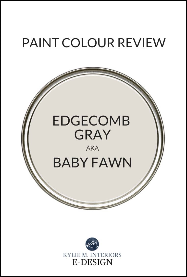
2. COLOR OF THE YEAR – BENJAMIN MOORE EDGECOMB GRAY
I have MAD love for Edgecomb Gray, and for those who follow me on Instagram, it should be NO surprise to find it in my TOP 2.
Again, in any COTY (Colour of the Year), I’m looking at how USEABLE it is for the everyday homeowner. There’s certainly a place for a more ‘creative’ COTY in the high-design world, but lord knows ‘high design’ is NOT what you follow me for (wink wink).
WHY IS EDGECOMB GRAY KYLIE M’S #2 COLOUR OF THE YEAR?
It’s YOU who picked Edgecomb Gray. That’s right, the demand for Edgecomb Gray has been HUGE. It comes up often in my Online Consulting as a colour my clients are HOPING to use or a colour that I’m SUGGESTING they use—winner winner chicken dinner.
Let’s check out some deets.
WHAT TYPE OF COLOUR IS EDGECOMB GRAY?
Edgecomb Gray is a colour NINJA, deftly straddling the gray and beige worlds like a 10-year-old gymnast. Not only that, Edgecomb Gray is a neutral paint colour with the LEAST UNDERTONE – minimal pink, minimal green – SWEET FREAKIN’ POTATO!
And BECAUSE Edgecomb Gray is nestled so snuggly between gray and beige, she doesn’t CATER to the cool or the warm side. Sure, she offers a polite nod; a chaste kiss good night, but neither warm nor cool are going up for a nightcap with Edgecomb – she’s not that kinda colour.
WHAT’S THE LRV OF EDGECOMB GRAY?
Edgecomb Gray has an LRV of 63, which is almost SMACK DAB on my most magical LRV number. This LRV makes Edgecomb Gray a LIGHT depth paint colour, meaning you’ll see a good shot of contrast with the right white trim.
Where you want to be careful is that if you have a dark room, Edgecomb Gray can look a bit flat. Just remember…
There is no LIFE where there is no LIGHT
Give your dark room adequate lighting, and Edgecomb Gray can be an awesome choice.
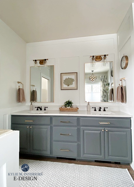
EDGECOMB GRAY ON KITCHEN CABINETS
Edgecomb Gray is DEFINITELY a trendy choice for kitchen cabinets. BUUUUUUT (Kardashian-sized), even though it’s a beautiful colour, remember that off-white and light depth cabinet colors can limit you in the LONG-run (as discussed earlier).
Another important note is that Edgecomb Gray can look a bit warmer than expected because of the paint used on cabinets. This expectation is based on what you might’ve seen on a friend’s walls or Pinterest. If you choose Edgecomb Gray, before buying gallons and slapping it on your cabinets, get a quart in the type of paint/finish you plan on using to ensure it’s sitting JUST how you want it.
EDGECOMB GRAY ON WALLS
Sure, you COULD use Edgecomb Gray as a feature wall if the rest of your walls are white, but MOST people won’t. Where Edgecomb Gray really hits its stride is on ALL of the walls in a room. Edgecomb Gray often fits well into an existing colour palette as a single room. On the other hand, if you want to paint your ENTIRE HOME one colour, Edgecomb suits various surfaces, lighting situations, and exposures!
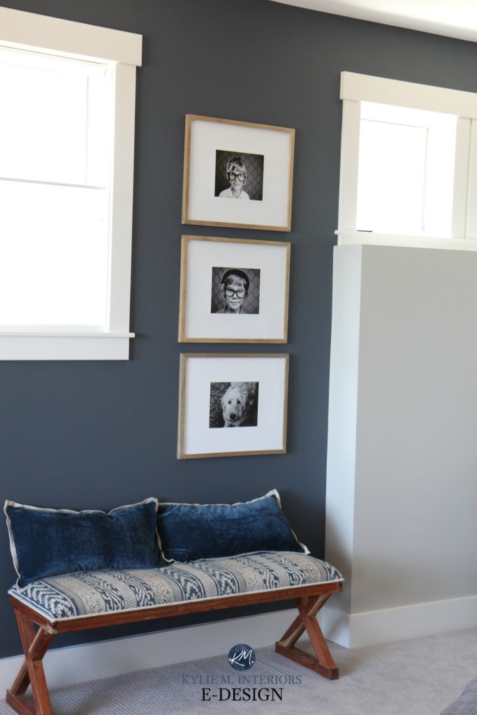
Kylie M with V1 Real Estate Photography
EDGECOMB GRAY ON EXTERIORS
Trends aren’t just leaning warmer on the INSIDE of our homes; I’m also getting requests for more warmth on exteriors. Of course, gray will ALWAYS be a timeless choice if it suits the house it’s on, but for those who want a softer, warmer approach, Edgecomb Gray is a great option.
5 Steps to Picking Your Perfect Exterior Paint Colour
Just remember, colors can look DIFFERENT on exteriors compared to interiors. Expect Edgecomb Gray to lean away from its gray base and pick up a slightly creamy vibe!
And while I have MAD love for Aesthetic White, there’s one BIG REASON why you might choose Edgecomb Gray as YOUR top colour for 2023…
EDGECOMB GRAY IS ONE OF THE BEST TRANSITION COLOURS
When it comes to changing from one trend (or style) to another, there won’t always be that one magical colour that helps a home transition into its next phase.
Why?
Let’s take gray, for example. Gray was overdone in the last ten years as a finish and a paint colour. This overuse often leaves gray so DOMINANT in a home that it’s hard to transition OUT of it. Or you can transition out, but you need more LARGE-SCALE changes along with paint (i.e., countertop, flooring).
And while not every gray-inspired home can handle the subtle warmth of Edgecomb Gray, it’s a great place to start for those wanting to warm things up a little.
Edgecomb Gray (lightened) with Benjamin Moore Revere Pewter cabinets
But we’re not done yet…
On the OTHER end of things, while trends are leaning warmer, many are still trying to get OUT of the richer, saturated beiges of the early 2000s and into something a bit cooler. And just like with gray, some homes (i.e., Tuscan style) are so overrun with beige that they don’t easily transition into a new palette – enter Edgecomb Gray. This doesn’t mean it WILL work, but it has a good shot as far as transitional colors go.
KYLIE’S SUMMARY OF EDGECOMB GRAY
Let’s see how Edgecomb Gray does based on my expectations of a COTY…
- Is Edgecomb Gray a good option for more than one type of surface? Definitely.
- Will it get people excited to get PAINTING? Yerp.
- Does Edgecomb Gray speak to coming trends? Yes. And while I expect to see more beige in the coming years, again, sometimes it’s about finding a TRANSITIONAL colour, rather than embracing a whole new look (insert $$$$ here).
Get your PEEL & STICK sample HERE
FULL Paint Colour Review of Benjamin Moore Edgecomb Gray
When it comes to paint colors, whether they’re neutral or colorful, there’s never a one-trick pony – a colour that suits ALL homes and ALL purposes. All I can do is get you going in the right direction with options that have POTENTIAL!
THE RUNNER-UP COLOUR OF THE YEAR…
I take a lot of my cues from my Online Colour Consulting clients. And while MANY of you are leaning warmer, this isn’t translating into the ‘all-out beige’ end of things…yet. In fact, I’m still seeing a TON of demand for transitional colors, including Sherwin Williams Egret White, Benjamin Moore Winds Breath, AND…Sherwin Williams Agreeable Gray.
Sherwin Williams Egret White ALMOST made the cut – maybe next year!
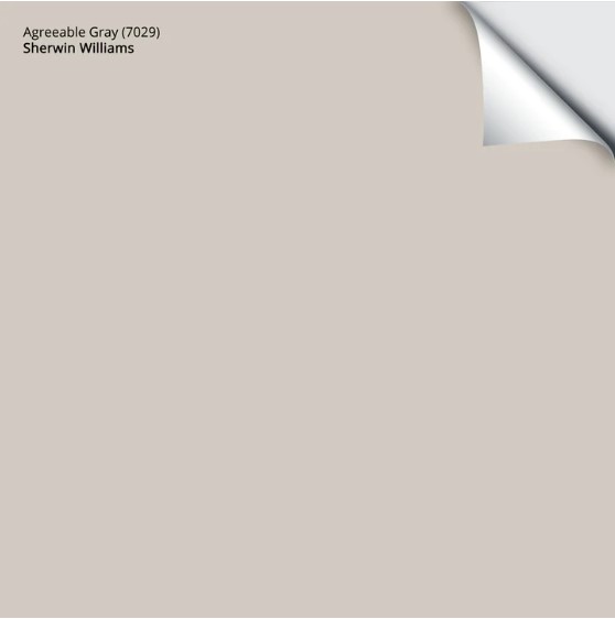
Agreeable Gray is a greige at heart. However, it’s definitely open to perception as in some lights/exposures, it reads as a warm gray, and in others, taupe. It also has a WICKED awesome LRV of 60, making it suitable for a wide range of rooms.
DOES AGREEABLE GRAY WORK ON KITCHEN CABINETS
Whether you’re painting your kitchen cabinets or bathroom vanity, based on today’s cabinet trends, Agreeable Gray could be an awesome choice. Being a good transition colour, it can help shift you out of the gray world (if that’s where you’re stuck) and into a slightly warmer look – all without alienating your finishes. Of course, this is assuming your finishes can handle this bit more warmth – try it out!
AGREEABLE GRAY ON WALLS
While Agreeable Gray isn’t really the DEPTH to be a great feature wall colour, it’s a contender for a single room or an ENTIRE HOME, thanks to its ability to shift based on a room’s lighting and exposure.
AGREEABLE GRAY ON EXTERIORS
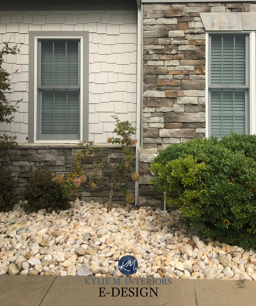
Agreeable Gray is definitely a consideration for your exterior palette. With its flexible undertones, Agreeable Gray nods politely at a wide range of brick and stone facades while also humoring a range of roof colors.
Soooo, why isn’t Agreeable Gray one of THE top colors?
It’s number three, so it’s doing alright for itself. However, Agreeable Gray doesn’t speak very loudly about UPCOMING trends, even though it might help you transition out of the previous one a bit easier.
Aesthetic White and Edgecomb Gray have the same potential to help you shift into a new palette (depending on your finishes, of course). Still, unlike Agreeable Gray, they’re giving a more solid wink and a nod to what’s coming down the pipeline.
Get your PEEL & STICK sample HERE
FULL Paint Colour Review of Sherwin Williams Agreeable Gray
And you might think we’re done. But let’s be honest, the Ginger loves to hear herself talk/type. I also don’t want to leave you colour lovers out of the mix. So, I thought I’d briefly touch on a few COLOURS I see being popular in the coming year…
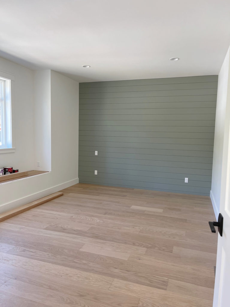
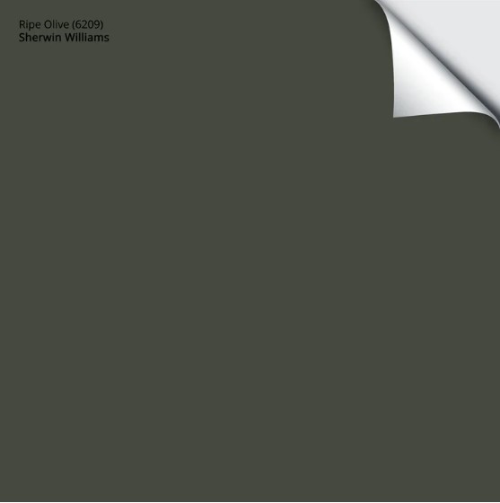
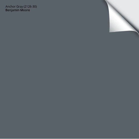
SHERWIN WILLIAMS RIPE OLIVE & BENJAMIN MOORE ANCHOR GRAY
While trends are leaning warmer, on average, we’re not into the warmer colors as it relates to shades of yellow, orange, and red. Sure, I could argue for a rust-inspired colour, but for where trends are going and what we’re willing to try, a lot of us just aren’t there…yet.
Regarding COLORS (not neutrals), we still loooooove our cool hues, especially the blues, and greens. This is where Ripe Olive and Anchor Gray come to play.
Ermmmmm, Kylie, didn’t you say GRAY is going out of style?
Don’t get yer knickers in a knot re: Anchor GRAY. Just because a colour ‘says’ it’s something, doesn’t mean it IS. Sure, Anchor Gray has gray, but it’s a GORGEOUS shade of muted blue at heart. And let me tell you; I get a TON of requests for the best blue-gray paint colors – they’re trending hard.

Ermmmm, Kylie, re: Ripe Olive, didn’t we do green last year?
You bet your BOOTY we did, but here are a few things to consider…
- not all greens are created equal
- not all greens are used for the same purpose
- trends and focuses can easily transition from one year to the next; there doesn’t NEED to be a monumental shift
- I see this colour being BIG in the coming year, regardless of whether we saw lighter versions of this particular hue in previous years
And let me tell you, Ripe Olive puts a WHOLE new swing on green compared to the softer approach of Sherwin Williams Evergreen Fog and Benjamin Moore October Mist. But I’ll be honest; it was a straight toss-up between Ripe Olive and the slightly lighter look of Pewter Green. Seriously, I agonized. I mean, nothing a bottle of wine and a funnel didn’t help, but still.
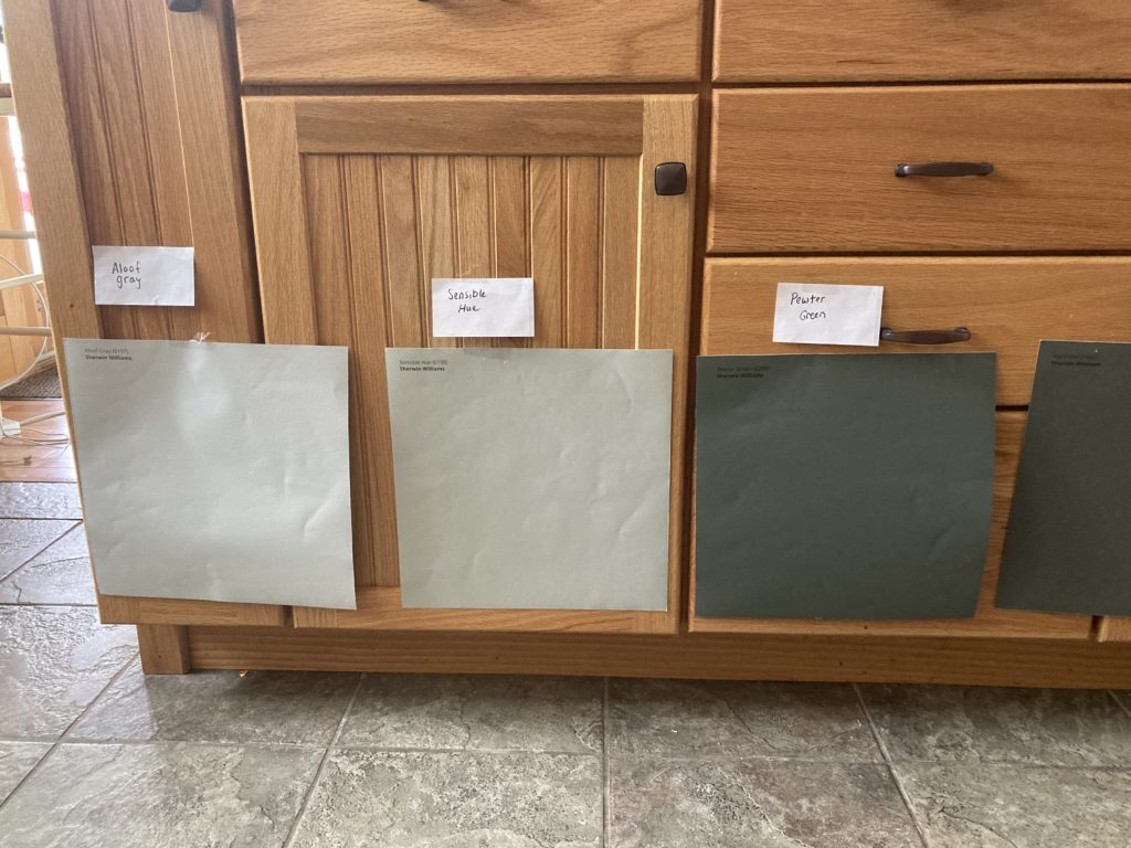
Pewter Green (far right) is a STUNNER
KYLIE, WHY DID YOU CHOOSE THESE 2 COLOURS?
I chose these two colors for very specific reasons (obviously).
1. While the previous three colors have more mass appeal for the average ROOM, I wanted to choose some colors that are specific to accent areas AS WELL AS rooms.
2. It’s often easier to get an emotional response from looking at a color versus a neutral one.
Think about it.
When you see certain COLOURS, do you automatically have an emotional response, either positive or negative? On the other hand, do you sometimes have to THINK about neutrals a bit more about whether you like them or not (this is a generalization)? In my in-home experience, I saw these emotional reactions, or lack thereof, repeatedly (more so with women than men).
3. BOTH colors have a degree of gray in them – they aren’t overwhelming. While the world is definitely craving the more colorful end of things, choosing colors with a degree of gray is an approach that’s likely to suit more homes (and personal tastes) versus catering to the minority with a more intense choice.
OH MY GOD, DO I EVER STOP TALKING?
No.
WHAT ARE THE LRVS OF RIPE OLIVE & ANCHOR GRAY?
Ripe Olive is coming in HOT with an LRV of 6. With this relatively low LRV, some colors can look a bit blackish at times, and while Ripe Olive will certainly look DARKER in a low-light area, it has a bit more chroma/colour, helping it rise to the occasion.
Here’s Ripe Olive in a simulated photo of my kitchen…
As for Anchor Gray, it has an LRV of almost 12, making it a medium-dark colour (WINKING at the dark range). Again, a moderate amount of gray slows this colour down without hampering its style in a low-light space.
RIPE OLIVE & ANCHOR GRAY ON KITCHEN CABINETS OR ISLANDS
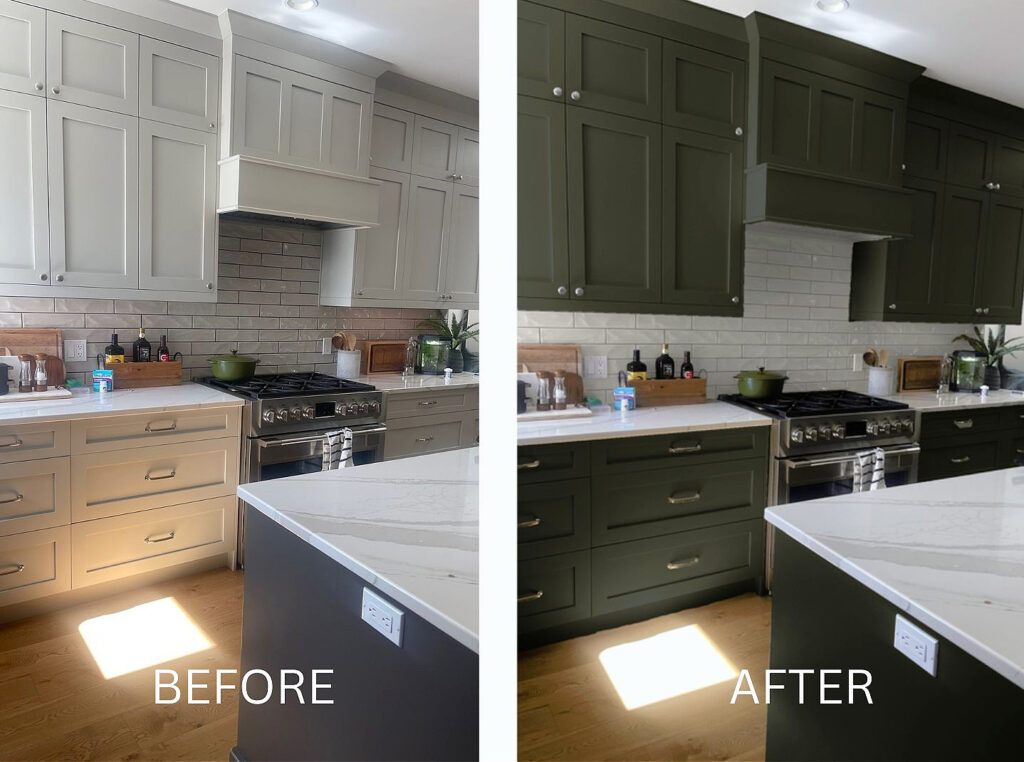
COME TO MOMMA! Seriously, if you decide to use Ripe Olive or Anchor Gray on your kitchen or bathroom cabinets – SEND PICS! In the meantime, check out Sherwin Williams Rosemary on these kitchen cabinets…
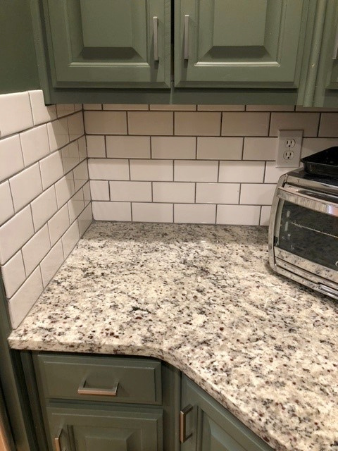
SERIOUSLY, what an awesome way to update granite countertops and oak cabinets. And while I miiiiight do black hardware instead, this overall look is AMAZING!
While some greens can be a bit overpowering on a large scale, because Ripe Olive has some gray in it, it makes for a great green cabinet colour without going over the top.
In the above bathroom, Sherwin Williams Isle of Pines is GORGEOUS, but being a stronger shade of green could be overwhelming on a larger scale (see more of this home here).
The 8 Best Green Paint Colours
RIPE OLIVE & ANCHOR GRAY ON WALLS
- Would I paint an entire room Ripe Olive or Anchor Gray? AbsoTOOTLEY I would (and did).
- Would I paint a feature wall in Ripe Olive or Anchor Gray? Just try to stop me.
Long story short, while they won’t suit EVERY home, they definitely have potential.
FULL Paint Colour Review of Benjamin Moore Anchor Gray
RIPE OLIVE & ANCHOR GRAY ON FRONT DOORS
While MANY greens are trending, including Sherwin William’s COTY 2022, Evergreen Fog, many of my clients have been asking for DARKER shades of green for their front doors. Dark green hues like Ripe Olive can complement various brick, stonework and siding colors.
Get your PEEL & STICK samples HERE (Ripe Olive) & HERE (Anchor Gray)
Well, this is impressive – I’ve even exhausted myself.
READ MORE
The 3 Best, Most Timeless Neutral Paint Colours
The 8 Best WHOLE HOME Warm Neutral Paint Colours
The 12 Best WHOLE HOME Gray & Greige Paint Colours
The Ultimate Guide to White Paint Colours
Not sure which paint colour is best for YOUR home?
Check out my Online Paint Colour Consulting – I’d love to help!
Chat soon,


EEEEK! I had decided to use AW for the smaller, less-lit areas of our new build and Agreeable Gray in the larger main living areas. Now you have me considering using it as a whole house color!! I tend to lean toward grays but trying to tiptoe into the warm side of things. Do you think it would look too washed out in an open concept living/dining area with both northern & southern light and pure white cabinets/trim with a stained wood island??
Oooooo, I do LOVE Aesthetic White so much! I’m actually considering the SAME THING. We have open-concept living with MOSTLY northern light, but a bit of southern, and White Dove trim (and warm gray cabinets). Would it look too washed out? it depends on HOW MUCH light you get. If your room is washed with light – it could, but that doesn’t mean it’s still not PRETTY because, at this point, anything short of a solid light-medium depth will wash out quite a bit. Long story short, if i were YOU (but without seeing your home), I would do it 🙂
I THINK IM GONNA DO IT! Thank you so much, Kylie – you’re a color ANGEL! I figure, if I don’t like how light it is I can always re-paint these smaller areas with a more medium depth color. Will keep you posted on how it turns out… 😬
I am desperately seeking the “perfect” dark-ish green and dark-ish blue to love up the rest of our house. Are Anchor Gray and Ripe Olive the Holy Grail I seek? We are refreshing a big, old (circa 1853) house which got stuck somewhere in the 1970’s. With your help, Kylie, I have adopted White Dove trim and Edgecomb Gray walls for much of the house. (Grazie mille, dear Paint Goddess!) If I look from an EG hall to an AG or RO room will I sigh with happiness?
P.S. Most of our rooms obligingly face south. The ones that don’t are getting a good talking to.
Would you pair aesthetic white with edgecomb grey? e.g. edgecomb cabinets, aesthetic walls? Or too similar?
Yup, I wouldn’t do it.
Thanks for the quick response! Really appreciate all your work