
KYLIE M’S Colors of the Year 2018
COLORS TO BE INSPIRED BY
How do you feel about the ‘colors of the year’ for 2018? Based on what COULD’VE been chosen, I’m pretty darn happy! Some years offer a hot mess of shades, whereas this year has a solid selection.
Any ‘Color of the Year’, should be a shade that EXCITES, IGNITES, and gets you excited to get your paintin’ pants on. While not all of these will satisfy every homeowner, wall, cabinets, or door, there’s definitely some potential.
Let’s look at the four main brands and their 2018 Colours of the year…
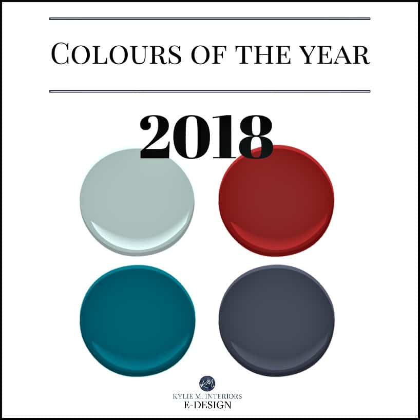
Behr Quiet Moments / Benjamin Moore Caliente / Sherwin Williams Oceanside / PPG Black Flame
BEHR. Nicely done; I can see many of us biting on this one. (See my Quiet Moments Colour Review)
BM CALIENTE? Of the hundreds of e-designs I’ve done this year alone, only two have requested red on a scale larger than their front door. Not to say it’s not stunning; it is. I’m just not sure how many people will actually use it. (See my Caliente Colour Review)
SW OCCEANSIDE. I get it; I really do. But while many of my clients want some form of blue/green/gray – it’s more like Quiet Moments they’re looking for. However, I see this color’s intrigue, specifically for front doors or accents.
PPG BLACK FLAME. You’d be SURPRISED at how many of my clients are interested in a colour like this. In smaller rooms, feature walls, cabinets, and front doors, these darker moody colors are in it to win it.
So, if I were coming up with the 2018 Colours of the Year (which I am shortly), where would I look? I would look where almost EVERYBODY is looking – Pinterest (you should follow me here – drink the Koolaid, it’s goooood). I sure as heck wouldn’t be looking at airports, Moma (Museum of Modern Art), or fashion runways.
And why does that matter?
Because I think that MOST of us aren’t looking in those places. I like to think that I’m a pretty good representation of the everyday person (who likes to drink wine by noon), and while some of these color trends make sense for magazines or marketing, that doesn’t mean that they make sense for US and how we use colors regularly.
Let’s get this party started…
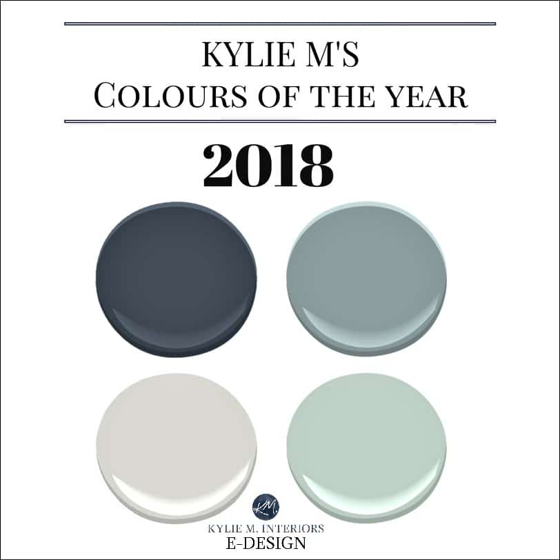
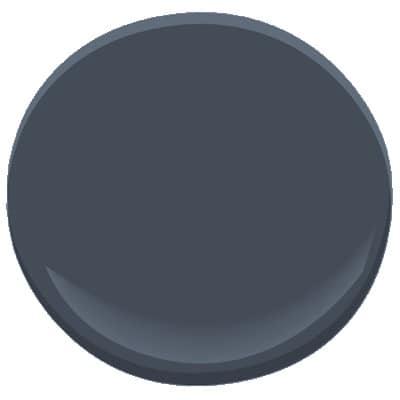
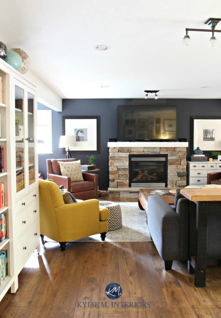
SHERWIN WILLIAMS CYBERSPACE 7076
This is SIMILARR to PPG Black Flame (great minds think alike). Cyberspace is a dark blue with a strong gray undercurrent. It’s striking without being punchy. It can act like a neutral, without being boring or typical.
A BIT MORE ABOUT CYBERSPACE
Cyberspace is pretty damn dark with an LRV of 6, but the navy will rise on a large scale – it’s really a great way to do ‘navy blue’ with committing to the real deal (for the color-phobes).
The Ultimate Guide to LRV and Choosing Paint Colors
WHERE CAN YOU USE CYBERSPACE?
- On the front door
- As a feature wall
- In a small room (like a powder room)
- In a media room
- On kitchen cabinets
Paint Color Review: Sherwin Williams Cyberspace
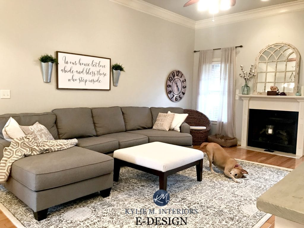
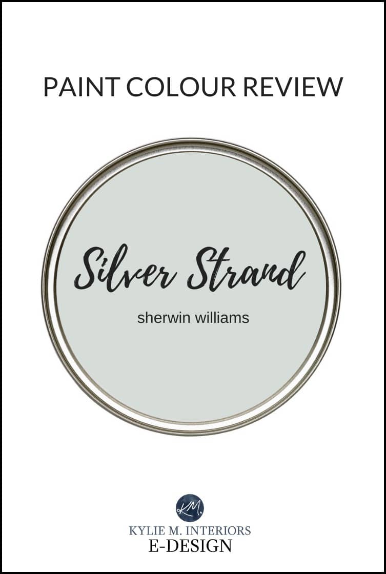
SHERWIN WILLIAMS AGREEABLE GRAY 7029
While we aren’t out of the gray world yet, I find that more and more people are looking for a slightly softer, dare I say, WARMER approach to their paint colors, and THIS is where Agreeable Gray comes into play. Is it inspiring? No. Is it titillating (hehe)? No. But it DOES have MASS appeal and would satisfy any NUMBER of rooms and tastes.
Kylie M E-Designs & Gingham and Grace
Another reason it is a good CYOT (color of the year) is because it’s a stepping stone. Many of my clients are trying to get out of the beige range but aren’t quite ready to embrace the traditionally cool-toned gray paint colors. Agreeable Gray is a nod to gray without totally alienating our warmer inclinations – now THAT is inspiring!
How to Change from Beige to Gray
I think the dog is doing yoga – the downward dog, obviously
A BIT MORE ABOUT AGREEABLE GRAY
It has an LRV of 60, which is darn close to my MAGIC number for the average homeowner/room. It’s flexible because it isn’t a hardcore gray. And while it’s certainly not WARM, it’s also not a traditionally cold colour as the subtle beige/greige undertone saves the day.
WHERE CAN YOU USE AGREEABLE GRAY?
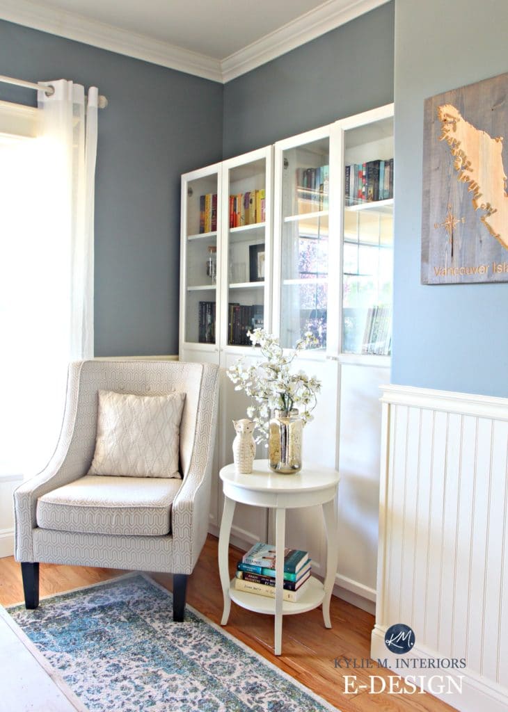
- Agreeable Gray will go even MORE gray in a north-facing room and can pick up a subtle blueish cast. Is this bad? No, but it is if you’re nervous about cool tones (as shown in the living room above)
- Agreeable Gray won’t hold itself up AS well in a room without a lot of natural light; it can get a bit muddy/flat as it doesn’t have a lot of ‘colour’ in it – you HAVE to supplement with adequate interior lighting
- It can be a GREAT transition colour for those wanting to flex out of the beige tones without going TOTALLY gray. I also like the light/medium version of Agreeable Gray which is Anew Gray.
Paint Color Review: Sherwin Williams Agreeable Gray

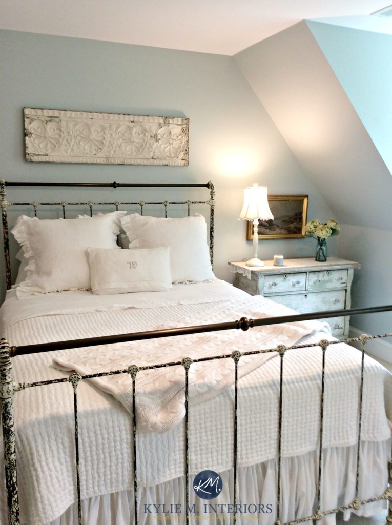
BENJAMIN MOORE WOODLAWN BLUE HC 147
Woodlawn Blue is the EPITOME of what my clients are asking for when they want a bit of color (and yes, that is a big word for me). It’s blue with a vague gray base and a wink o’ green. It hits just the right note, not too boring or punchy.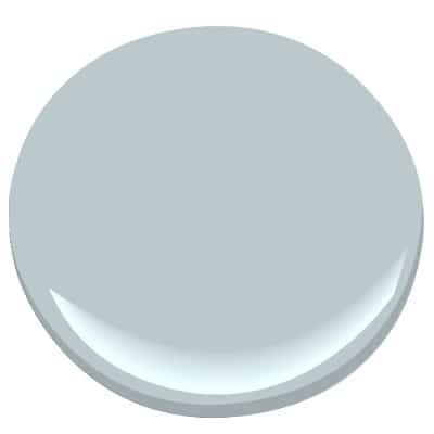
A BIT MORE ABOUT WOODLAWN BLUE
It has an LRV of almost 61, so it’s a pretty ‘average’ depth. If you don’t like green undertones, you’ll probably STILL LIKE this colour as the green is super duper passive and hardly shows up at the party (unlike me, who shows up with a coconut bra and a tutu).
WHERE CAN YOU USE WOODLAWN BLUE?
- It’s gorgeous for a master bedroom or a guest bedroom
- It’s beautiful for a playroom that doubles as a family room!
- A dining room with wood-toned furniture
- It’s a beautiful complement to wood tones and is great for the country farmhouse or beachy look
- A great way to add fresh life to a laundry room or bathroom!
The 8 Best Blue and Green Paint Colors
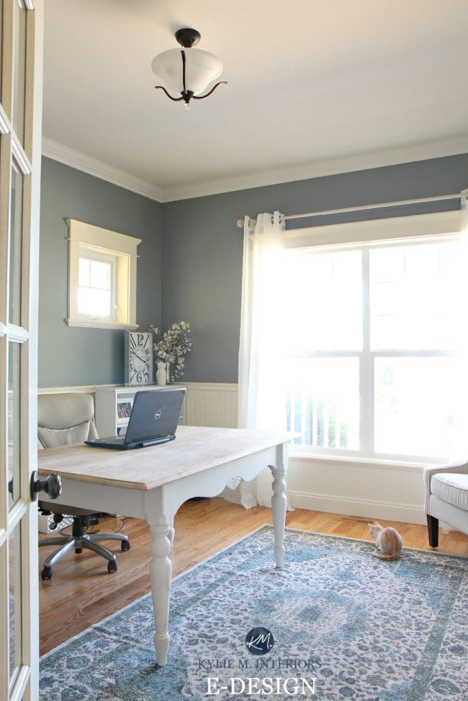
BENJAMIN MOORE STONYBROOK 1566
Stonybrook is a bit brave, but not so much that it will fall TOTALLY out of your comfort zone. This is a blue/gray blend, pretty well-balanced between the two, with a subtle green that just stops it from going cold, icy, OR purple.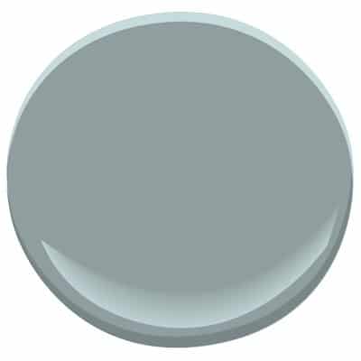
A BIT MORE ABOUT STONYBROOK
This is a beautiful medium-toned blue/gray with a passive green undertone. It’s not rich, it’s not fresh – it’s calm. With an LRV of 28, it’s stormy and moody without being heavy.
WHERE CAN YOU USE STONYBROOK?
- I might hesitate to hit it in a north-facing room, simply because it is a bit more of a stormy colour
- It is great for a reasonably well-lit room
- a beautiful complement to warm wood tones
- great for a beachy, but more grounded vibe (not fresh and airy)
- good in a medium size room or as an accent wall
So, what do you think? Are there any of these that you find inspiring?
Let’s find YOUR perfect colour!
Check out my fun Online Color Consulting Packages!

Chat soon,

ORIGINALLY WRITTEN IN 2017, UPDATED IN 2022 FOR GRAMMAR N’ STUFF


Hi Kylie!
After literally putting 13 colors on my wall as samples my favorite color turned out to be Sherwin Williams Balanced Beige. I used Assessible beige in the hall decided it was too light for the other rooms and went with balanced beige. I love how it goes with every one of my rooms and looks more grey in some and more beige in others!!! ❤️
I love Balanced Beige, it’s a great neutral with that wink of gray in it – good choice!
Kylie – you are so RIGHT ON! THese 4 are much more likely to be the colors of the year than the ones being touted. You are not only a master of colors, you are a master of words. I love reading your articles each month! I learn something new each time. Thanks!
Wow Ellen, what a lovely note! Thank you 🙂
I love your posts. They’re so educational AND entertaining! What do you think of Stonybrook for kitchen cabinets? And what would you say about Woodlawn blue in an open family room that the kids schlep all their toys into (so it becomoes a playroom) that opens into an eat-in kitchen–too much? It has a ton of warm wood tones in the floors and in some furniture, so I was thinking it met all of the “criteria” so to speak…I just do’nt know if it would be overload….? Thank you!!!
Hi Charlotte! Stonybrook would be beautiful on cabinets, just keep in mind that with the subtle increase in sheen the colour can come up a wink more – in the depth of colour I might lean toward the safety of Chelsea Gray (without knowing what your countertops/flooring/lighting area). As for Woodlawn, yes you know, it might be too much. I love it, but I find that it’s easier to tire of a colour on a LARGE scale. I might go to the slightly more subtle BM Beach Glass for something like that… 🙂
Knocking on the door of 60 years old, I often think how predictable I’ve become. (read boring). Which is why I love your take on Caliente. About 10 years ago I painted the walls in a small bedroom with flat, rich Caliente. Everything else in the room is white – trim, bedspread, doors, ceiling etc. Yes it is dark and yes it is small, but I still love the color. Could it be that I’m still a rebel at heart- if only a color rebel? I can live with that just fine.
. Thank you for writing your blog – I Love, Love, LOVE your posts and always read them hungrily.
Ooooo good for you Lisa – i DO think it has it’s place and I bet it looks awesome – look, you were 10 YEARS ahead of the trend 😉
~Kylie
Kylie for the win! These are colours I will use IRL. LOVE, love the cyberspace.
Thanks Sherry – I do too, I have mad love for it (which would make sense as my walls are painted in it…) 🙂
I love these colors!! your blog has really helped me pick colors for my new home. Thank-you! And you’re adorable <3
Well thank you Lacey!
If I used Cyberspace as an accent color, what would be a good color for the rest of the walls in the room?
I’ve used Cyberspace with SW Creamy to add a bit of soft warmth. You can also look at the gray tones, like SW Big Chill!
How do you think SW Wool Skien would do with an accent wall in Cyberspace? The room is mostly east facing but open to west facing dining room with a covered porch.
Hi Kelly, it’s not sitting quite right with me, as Wool Skein can pick up that interesting green undertone and Cyberspace goes nowhere near green – I wouldn’t do it!
I have a foyer/dining area in bm van cortland blue and a hall in BM wilmington tan. what would you recommend for a living room adjacent? I can’t decide if i want to go light or dark. The furniture is neutral and i like black accents throughout the house
Hi Janice, thank you for the note! There’s a lot to consider when picking a colour, like what TYPE of neutrla the furniture is, what the exposure is and other things – it’s just not something I can guess at, I’m sorry! I try to give as much complimentary info as I can on my blog and if that doesn’t work, it might be time for a closer look with my E-design – it’s affordable and fun! https://www.kylieminteriors.ca/online-decorating-design-services/
~Kylie
I was inspired by Cyberspace in your house and used it for an accent wall in my mudroom. I love it! It works perfectly with the slate tiles, cherry bench, and pine ceiling that were already there and pulls everything together really well. It’s such a good mix of cozy and cool/edgy and I wouldn’t have found it if I hadn’t been desperately wandering through your site, so thanks!
Oooo, I love to hear that Martha – and I would love to see photos if you’re so inclined! (you can email them to me at kylie@kylieminteriors.ca) either way, thank you for letting me know!
~Kylie
Hi Kylie,
I really enjoy reading your blogs and they are so informative and helpful!
I have painted a dining room in Agreeable Gray and am thinking of painting the kitchen Anew Gray or Amazing Gray. I am worried about the green coming thru. Which color Anew Gray or Amazing Gray renders less green and more greige?
Thanks,
Arlene
Thank you Arlene – and ABSOLUTELY Anew Gray – no doubt…
I love the colors you’ve chosen…definitely approachable for us regular people.
Does Cyberspace seem like a reasonable compromise for a 10 year old boy who wants black walls? I might be able to sway him with that awesome color name! It’s an average size bedroom with south and east facing windows. I’ve got yellow-ish oak floors & his furniture is light wood that reads yellow. I’d probably be better off painting the furniture black and going with lighter walls, but that sounds like a lot of work.
Thanks!
Cathy – oh heck yes! And really, I DID paint my 11 year old daughters feature wall in black – so that is an option too 😉 – a great way to give him what he wants and then balance it off with a more neutral main colour! However, if you want to do all of the walls, Cyberspace is WICKED cool, as is the similar BM Gray 2121-10 which has slightly less navy blue in it…
I hope that helps!
~Kylie
Yes, this is immensely helpful! I sometimes need a nudge to be daring. Thank you!!
I love your 2018 color picks and am intrigued by Cyberspace – how do you think it compares with SW Grizzle Grey 7068 for an accent wall (where I’d like to place our TV)?
Ooo good question Liz, as I’ve lived with both! Grizzle Gray is a dark gray-green. The green is passive, but definitely shows up to the party on the larger scale. The same could be said of Cyberspace, except it’s a gray/navy blend. Cyberspace is also a dark colour, whereas GRizzle is more of a med-dark, so it will hold up a bit better if you don’t have tons of light, whereas in the right (or wrong light), Cyberspace can almost look blackish (but soft blackish with a bit of blue).
Hi Kylie! I just used Cyberspace for our tiny, L shaped, windowless half bath and I am so in love with it, the color is gorgeous. I wanted a slate blue/gray color and was stuck between cyberspace and Ben Moore’s evening dove. Your blog tipped me toward cyberspace and I couldn’t be happier so THANK YOU!!! I already had some dark wood shelves in there that I thought I would be replacing. But now I LOVE how the dark wood tones look with the paint color, it’s so moody and interesting. So now I’m on the hunt for an antique/vintage wood framed mirror above the pedestal sink instead of the modern gold mirror I initially purchased. And don’t even ask about fixtures, I’m completely second guessing all the trendy gold finishes I had intended! I’m tempted to use cyberspace on our fireplace/tv wall as you did, I love it so much. Love your blog, thanks again!
Wendi, this is JUST the note I love to get – thank you! I know, I was JUST at a house where we did Cyberspace on the built-ins and it’s just so flippin’ gorgeous – i bet your bathroom looks awesome too 🙂
Just discovered your blog as I search for color for my newly gutted kitchen, dining and hearth rooms. You seem to love all the same colors that I do! I am particularly tickled to see that 2 of your colors of the year for 2018 are the colors I chose for our mudroom- Quiet Moments (both north and south facing as it runs front to back) and the adjacent powder room in Stonybrook (no windows but nice lighting and mid-dark wood vanity). Stonybrook really pops with the white bathroom fixtures.
I have spent the last 6 hours reading your blog in its entirety! We are now BFFs!
Sweet, I LOVE new bff’s – cheers to that! You made some beautiful choices, I loooove Stonybrook!
Love your blog Kylie!!! I did the gold dots that you had a link to in my daughter’s room with rainwashed walls and Gloss hot pink accents and I am in love with it!! I’m now on to painting my kids’ 10 x 10 game room. It is an east facing room with a large window. I want to paint the whole room Cyberspace but am wondering if that’s too dark and if I should go a shade lighter and do web gray instead? Also will the brown carpet be a problem? What are your thoughts? Thanks!!