
Kylie M’s 10 Most Recommended Paint Colors (Benjamin Moore & Sherwin Williams)
With thousands of color options, are you surprised I can narrow it down to Kylie M’s 15 best, most recommended paint colors? Don’t be – I play favorites with paint colors and husbands. And as you can see, I also occasionally talk in third person.
I love paint colors and real homes. To say I’m obsessed is an understatement (thank goodness I have OCD to support me through my obsession…wait…is that how it works?) Anyway. With over 12,000 in-home and virtual paint color consultations completed, there are a handful of colors I suggest time and again.
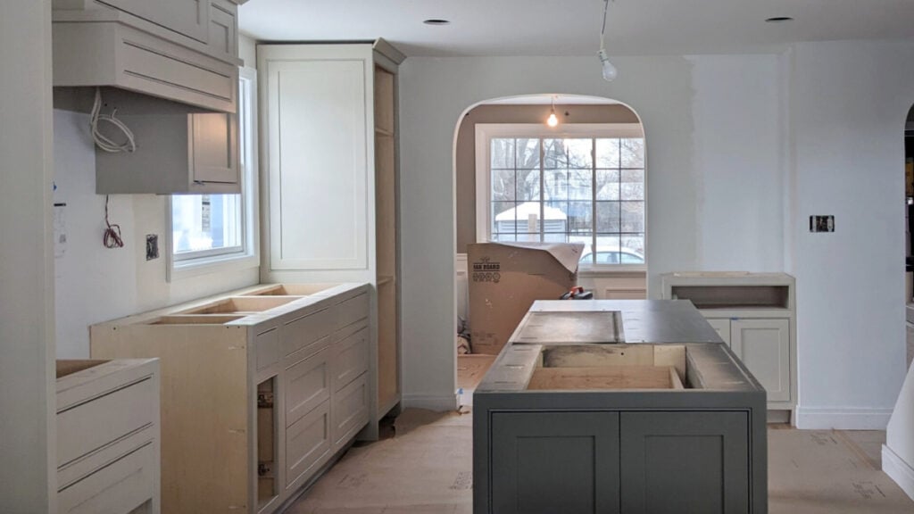
Do I step outside the color box? All the time, every single day, but I’ve still got my ‘tried, true, and trusted’ shades. Okay, maybe not trusted – you can’t bet on any paint color being fool-proof, but you know what I mean.

But first, let’s talk about what makes a ‘most recommended paint color’ according to Kylie M. Interiors.
- It has to suit at least 2 finishes in the average home: walls, cabinets, accent walls, trim, exterior, and doors.
- It doesn’t need to speak to everyone (no color would); it needs to have a fighting chance in today’s average home. That said, if paint colors are really speaking to you, keep drinking.
- It’s gotten rave reviews from my clients. We don’t want any one-hit-wonders here.
My focus is on YOU and what might inspire you to get out your paintbrush!
And while you might be nervous to see BEIGE back on the horizon, I promise you, this first color is a gooder.
1. SHERWIN WILLIAMS AESTHETIC WHITE 7035
While it didn’t hit my radar until about 2 years ago, Aesthetic White has been near the top of my list since then.
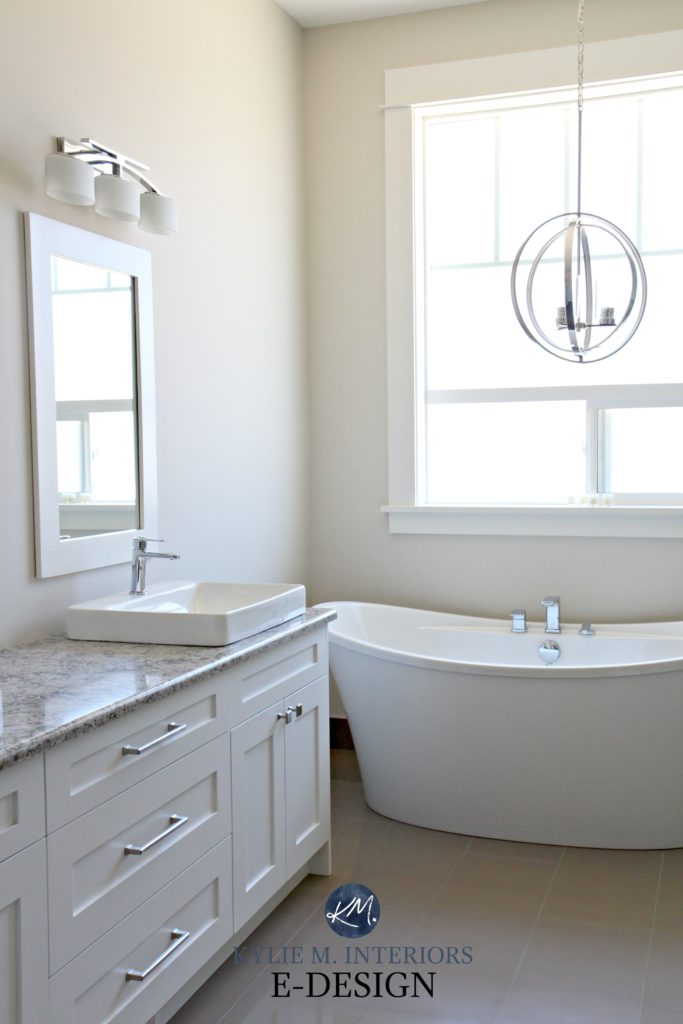
With warm paint color trends, many of my clients are ready to embrace the beige end of things. However, the builder basic beiges from the 1990s and RICH beiges from the early 2000s scare the pants off them – and I don’t blame them. Thankfully, Aesthetic White is a polite ‘pants on’ introduction to the warmer end of things (which I can’t say about my first date with Tim – JUST JOKING, MOM!).
Aesthetic White is an off-white, warm neutral paint color. While I hesitate to call it beige, it sure as heck winks that way with a super passive warmth. As for depth, its LRV of 73 parks it in the off-white world.
Here it is in a living room with north-facing light…
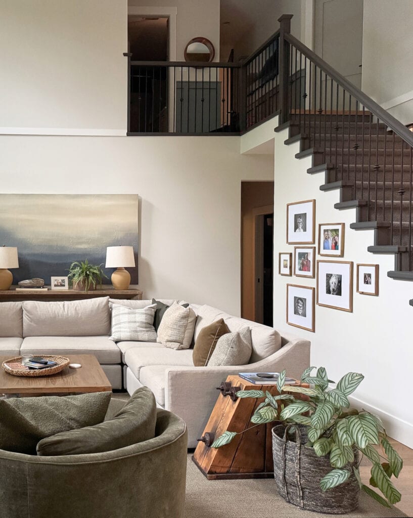
Is Aesthetic White an EXCITING color?
Ermmmm, noooo.
Does Aesthetic White have a strong personality or the type of vibe you could get emotional about?
Not really, you probably won’t get in your feels about this one.
Let’s be honest, it’s easier to get excited by photos of Ryan Reynolds in a Speedo with a buttload of wine in his arms, the more COLORFUL options (btw, I encourage you to look up the word buttload). But just because a color doesn’t tussle your tatas doesn’t mean it’s not a great option for you and your home.
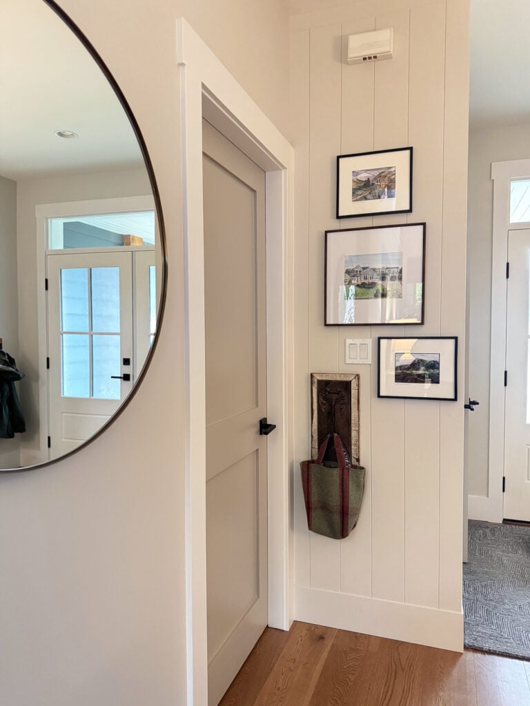
Here it is on my client’s updated kitchen cabinets (with their original, outdated granite)…
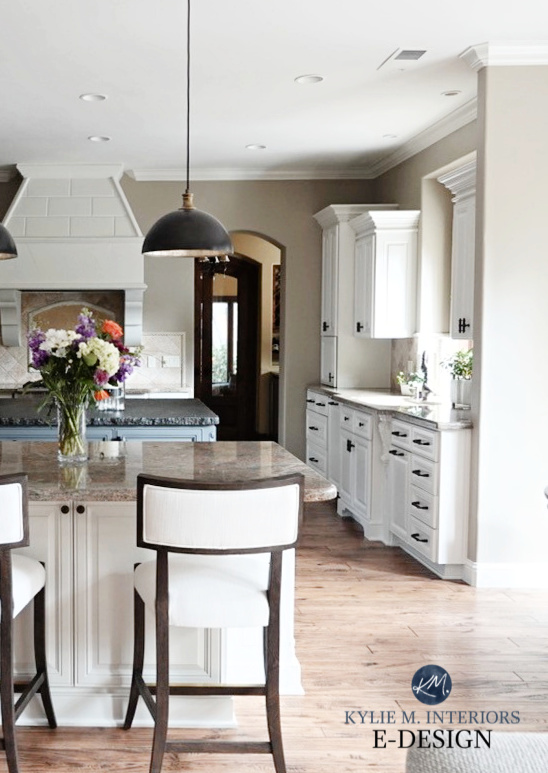
WHY I RECOMMEND AESTHETIC WHITE
Let’s see why Aesthetic White is one of my most recommended paint colors…
- Is Aesthetic White a good option for more than one type of surface? YOU BET YOUR BOOTY IT IS! Single rooms, open-concept spaces, and it’s even a great neutral for your whole home.
- Does it get people excited to get PAINTING? I sure hope so!
- Does Aesthetic White speak to current trends or help update older finishes? Yes.
And while Aesthetic White won’t appeal to everyone (find me a color that does…), it definitely has a fighting chance in today’s average home.
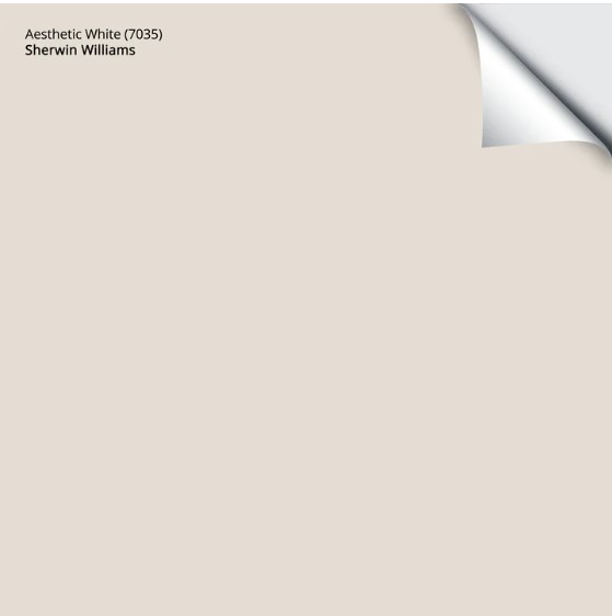
Get your PEEL & STICK sample HERE
Paint Color Review of Sherwin Williams Aesthetic White
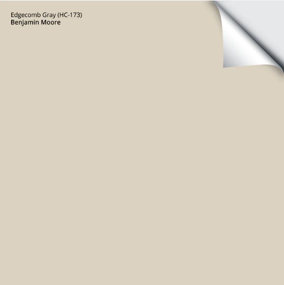
2. BENJAMIN MOORE EDGECOMB GRAY HC-173
I have mad love for Edgecomb Gray, and for those who follow me on Instagram, it should be no surprise to find it in my TOP 2.
Edgecomb Gray is a light taupe-greige. It doesn’t commit hard to a green or pink-purple undertone and is pretty flexible – it’s a color ninja. As for depth, its LRV of 63.09 places it in the light range – smack dab in its ample bosom. This LRV means it offers a noticeable, but not overwhelming contrast with the right white trim color.
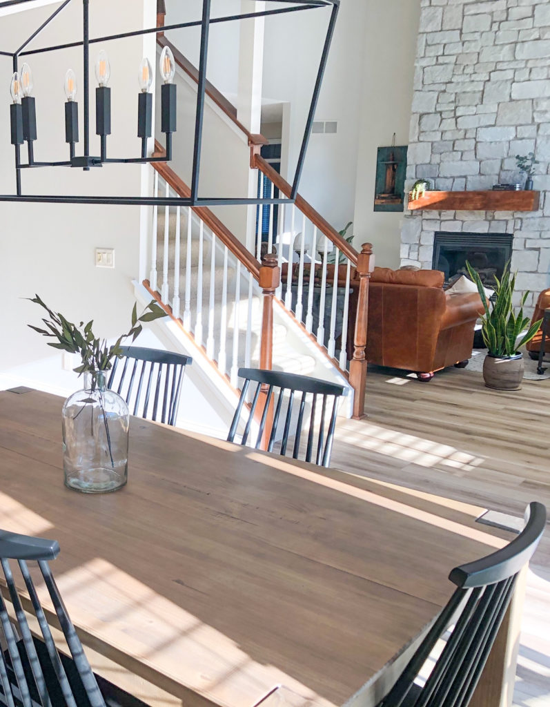
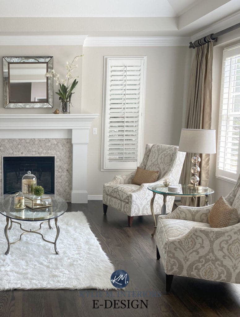
Where you want to be careful is that if you have a dark room, Edgecomb Gray can look a bit flat. Just remember…
There is no LIFE where there is no LIGHT
Give your dark room adequate lighting, and Edgecomb Gray can be an awesome choice.
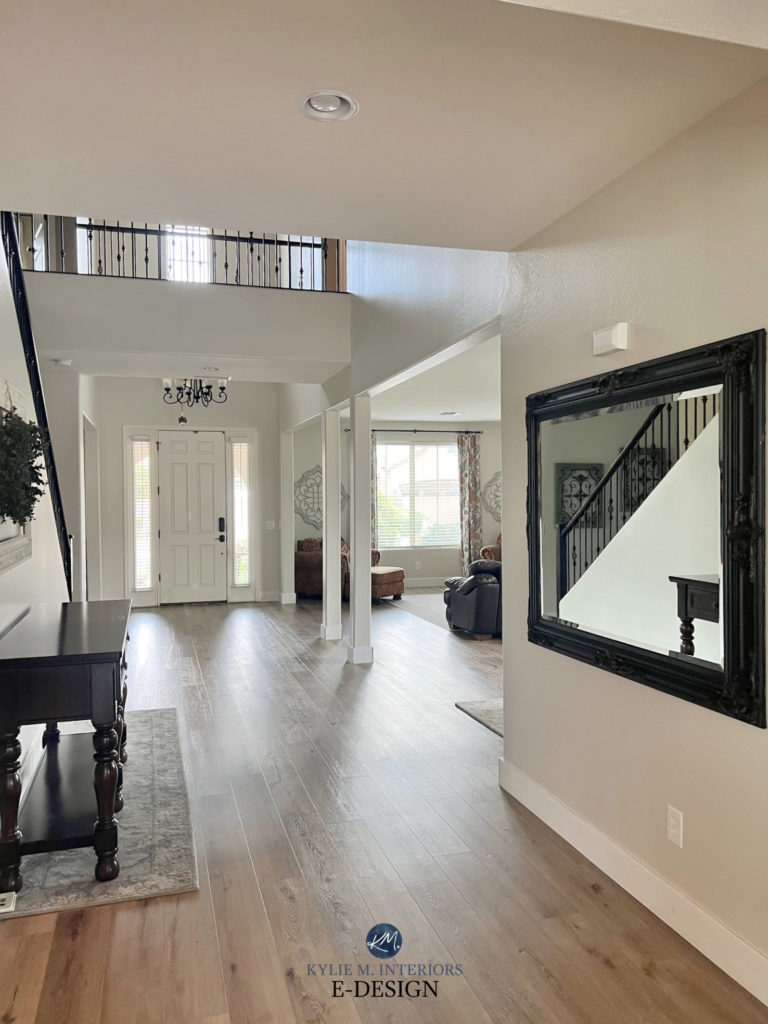
WHY I RECOMMEND EDGECOMB GRAY
Why is Edgecomb Gray one of my recommended paint colors? Let me count the ways…or really, I’m just going to bullet-point them.
- It’s awesome for a single room or open-concept space.
- It works well as a whole-home paint color, assuming the rooms are reasonably well lit.
- It’s a beautiful color for painted kitchen cabinets, especially for those who love off-white and light depth cabinet colors.
- Some even use it on their exterior (mostly siding, not trim).
- It goes with a wide range of wood tones
Get your PEEL & STICK sample HERE
Paint Colour Review of Benjamin Moore Edgecomb Gray
When it comes to paint colors, whether they’re neutral or colorful, there’s no foolproof color – a color that suits ALL homes and ALL purposes. All I can do is get you going in the right direction with options that have POTENTIAL!
3. SHERWIN WILLIAMS AUSTERE GRAY SW 6184
Are you looking for a gray paint color that’s been kissed by green? And I’m not talking about a little peck on the cheek, we’re going full Francais on this one.

Here it is in east-facing morning light.
I fell in love after helping my good friend choose it for her home. She loves green, but didn’t want to be smacked upside the head by Kermit the Frog. This is where Austere Gray (and a few others) came to play.

Here it is in west-facing, later afternoon light. You can see it TRYING to lean warm!
Austere Gray is a beautiful green-gray (or gray-green, depending on how you see it) paint color. With its LRV of 51, it’s in the light-medium range. While it’s a warm green (according to my color science studies), you know I like to keep things a little more ‘real home’ friendly around here. Instead, I like to share with you how it’s most likely to appear on your walls – and that is, as a green-gray that caaaan swing a bit green-blue.
My next client chose it for her staircase and hallway as it’s a pretty complement to her taupe carpet…

WHY I RECOMMEND AUSTERE GRAY
- It’s fine to pick a neutral, but a bit of easy-to-love color is fun, too!
- It’s gorgeous in a single room, but it works well in open-concept spaces, too. Whereas some colors can be overwhelming, this softer commitment suits many people.
- You could also sample it for your exterior siding or stucco.
- It offers a coastal or beachy look without being kitschy.
The Best Green Gray Paint Colors
4. BENJAMIN MOORE MARITIME WHITE 963
I’ve been spouting off about Maritime White for years, and it’s time it got more love and attention – this color is amazeballs.

Look at how it suits this old, historic wood trim, door, and floor!
Maritime White is a light beige paint color. Not 2000s Tuscan beige, not 1990s builder’s beige, but beautiful, balanced, badass beige. While its LRV of 71.6 puts it at the high end of the light range, it behaves like an off-white with its feather-light touch.

WHY IS IT ONE OF MY RECOMMENDED PAINT COLORS?
- I often have clients with older homes or those from the early 2000s (Tuscan-era). They want to update their home, but their finishes are finicky – Maritime White often hits the spot.
- It’s fab in a single-room, open-concept space, or whole home
- Kitchen cabinets can look beautiful painted in Maritime White, as can exteriors.
Paint Color Review of Benjamin Moore Maritime White
5. BENJAMIN MOORE PASHMINA AF-100
This color had me at hello. With its murky, muddy blend and organic vibe, I love recommending this color to my clients (I know, those keywords make it sound SO lovely, right?).
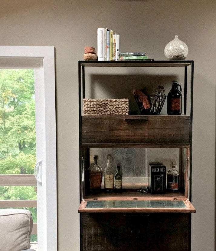
Pashmina isn’t just lovely wrapped around your neck; it’s a fabulous color to wrap around the walls of your room. Stuck between gray and beige (but winking WAY more at beige), Pashmina is a greige-taupe paint color.

While its scientific roots suggest it’s in the yellow-red family, in real homes with real lighting (the anti-science of it all), it can appear with a mild green undertone, but more often settles as a subtly warm, nature-inspired neutral.
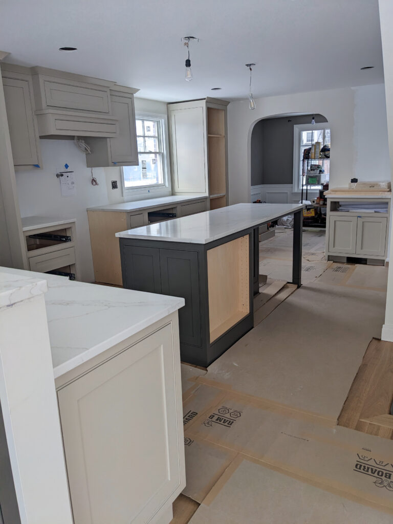
WHY PASHMINA IS A MOST RECOMMENDED PAINT COLOR
- Not everyone wants light neutrals – some people crave moodier, meatier shades, and Pashmina often hits the spot.
- It’s gorgeous in a single room (but a bit heavy for most open-concept spaces or whole homes).
- Cabinets look stunning painted Pashmina, and its depth accommodates a wider range of wall color pairings compared to the off-white/light world.
- I’d absolutely sample it for an exterior, either as the main color, trim, garage door, etc.
- Great for accent doors or accent walls.
Benjamin Moore Pashmina Paint Color Review
6. SHERWIN WILLIAMS FOGGY DAY SW 6235
I love Foggy Day so much, I have it in my own home. Once I spent more than a minute researching this color, I knew I had to have it. Here it is in our upstairs hallway, leading into our family room…

I’ve paired it with Benjamin Moore White Dove walls
Not only is Foggy Day one of my recommended paint colors for you, but it also comes with a personal opinion based on having it in my own home.
Foggy Day is a wickedly gorgeous blue-green paint color. While it focuses heavier on blue, it’s allllll balanced out by a solid dose of gray. As for depth, its LRV of 20 means it has some serious meat on its bones.

WHY I RECOMMEND FOGGY DAY…ALL THE TIME
- This color is so pretty in a single room, as long as the room isn’t too dark or drab.
- It’s beautiful as an accent wall, or as shown above, on a feature like board and batten.
- If you need a beautiful color for your front door (inside or outside), but are nervous about too much color, it’s a great option.
- It’s also beautiful for the main exterior house color.
- It’s a gorgeous paint color for a kitchen island, bathroom vanity, or even all of your cabinets.
Sherwin Williams Foggy Day Paint Color Review
7. SHERWIN WILLIAMS NATURAL LINEN SW 9109
If you asked me this same question a few years ago, I would’ve said Sherwin Williams Agreeable Gray. However, the tides have turned, the earth has shifted, and trends have shifted warmer. While I still hit on Agreeable Gray all the time, it’s not nearly as popular as it was.

Instead, Natural Linen has taken Agreeable Gray’s place on my ‘most recommended’ list.
Natural Linen is a light shade of beige. It’s darker than the previously mentioned Maritime White, but it’s still tucked nicely in the light range, with an LRV of 66. It’s also a super well-balanced beige that doesn’t cater hard to orange-yellow or orange-pink. It’s more likely to settle as a soft, subtle beige with a gentle orange undertone.

WHY I RECOMMEND NATURAL LINEN
- It’s one of my most recommended paint colors for those ready to enter the world of beige – it just suits so many homes!
- It’s a great color for a single room or open-concept
- Many of my online color consulting clients find the ever-popular Sherwin Williams Accessible Beige a bit too heavy for their whole home. Natural Linen offers a great adjustment.
- You can also sample it for your exterior (main house color – it’s not as common for trims).
- It’s a great color for those homes that demand beige, but have homeowners who are nervous.

Don’t worry, that sponge-paint in the hallway is now long gone – as are the plastic-bag filled valances that came with it.
Sherwin Williams Natural Linen Color Review
8. SHERWIN WILLIAMS URBANE BRONZE SW 7048
Sue-prize, sue-prize. If you’ve known me for a while, you know I have a lady boner for Urbane Bronze.
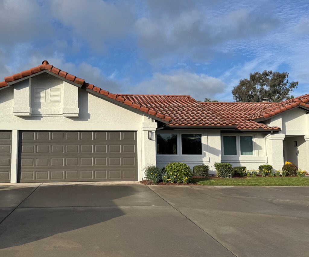
Urbane Bronze is a dark greige, meaning it’s a warm neutral. While it’s not always obvious, it very easily appears with a green undertone across a range of lighting situations, so watch for it (if you want it, great; if not, you might want to change colors).
Urbane Bronze has an LRV of 8, so it ain’t messing around when it comes to depth – she be dark. Here it is on my staircase railing – it’s on my kitchen island, too…
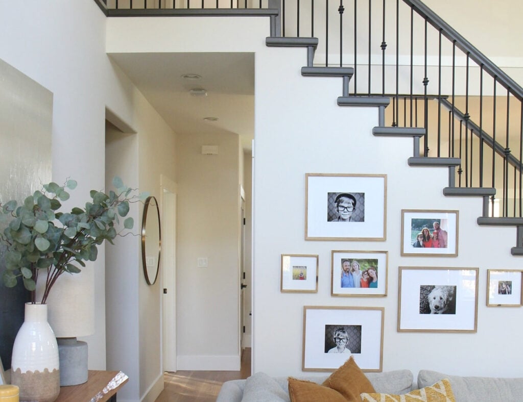
WHY I RECOMMEND URBANE BRONZE ON AN ALMOST DAILY BASIS
It’s warm, it’s organic, and it’s a great replacement when black is too harsh, gray is too cold, and brown is too warm. It’s one of my ABSOLUTE MOST recommended paint colors – hands-down.
It’s like Frank’s Hot Sauce – I put that #$%&*$# on anything.
- While some people might paint it in a single room, it’s a bit dark for most (except heathens like me – I love dark colors).
- It’s great as an accent wall and goes with a wide range of neutral paint colors.
- If you want to paint your interior doors a neat color, it’s a gorgeous option.
- Beautiful on exteriors, either as the main color, trim, garage doors, or front door.
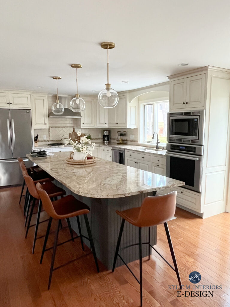
- Absolutely solid gold as a cabinet or kitchen island paint color.
This isn’t my kitchen, I just wanted to show you how it’s a great option with cream cabinets and older granite countertops…
Sherwin Williams Urbane Bronze Color Review
9. SHERWIN WILLIAMS EGRET WHITE
Ahhhhh, Egret White. This one hit me about 2-3 years ago, when I noticed the shift away from gray toward warmer shades. When transitioning a home (especially updating those from the previous gray trend), we sometimes need colors that bridge the gap – Egret White is one of those colors.
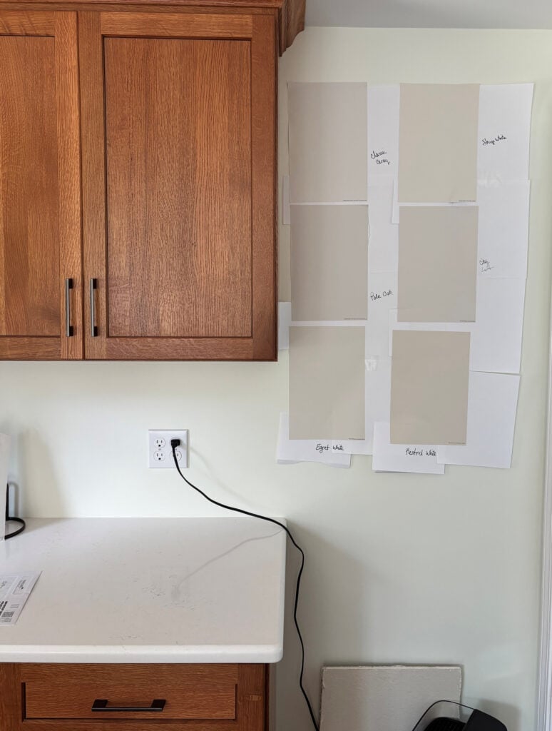
OTHER REVIEWS: BM Classic Gray, SW Shoji White, BM Pale Oak, SW City Loft
Egret White is a light-depth shade of taupe. Its LRV is 70, so it sits lighter in that range, nodding at the off-white world. It also has gentle taupe undertones, so it rarely shows up as an overbearing taupe with purple-pink.
Before, this bathroom was overwhelming, and the pink tile took over…

After, it looks fresh and updated on a BUDGET with Sherwin Williams Egret White on the walls and a painted vanity…

WHY ITS A RECOMMENDED PAINT COLOR
I recommend this color on a daily basis for a ton of good reasons – here are a few…
- It’s a great transitional color between the gray and beige worlds.
- It suits a wide range of interior finishes.
- It’s fabulous for single rooms, open-concept spaces, and whole homes.
- Exteriors look great in this color as it’s not as stark as white, but offers a bright look.
Sherwin Williams Egret White Paint Color Review
10. BENJAMIN MOORE WHITE DOVE
You know I couldn’t write this blog post without mentioning my one true love…RYAN REYNOLDS! Oh, and Tim…and White Dove.
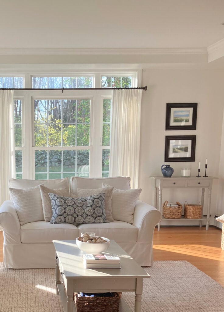
White Dove is one of the best paint colors and, absolutely, one of my favorites.
White Dove is a soft, warm white paint color. A bit creamy without being too yellow, a bit muted without being too gray, White Dove is often the perfect happy medium in the world of white.
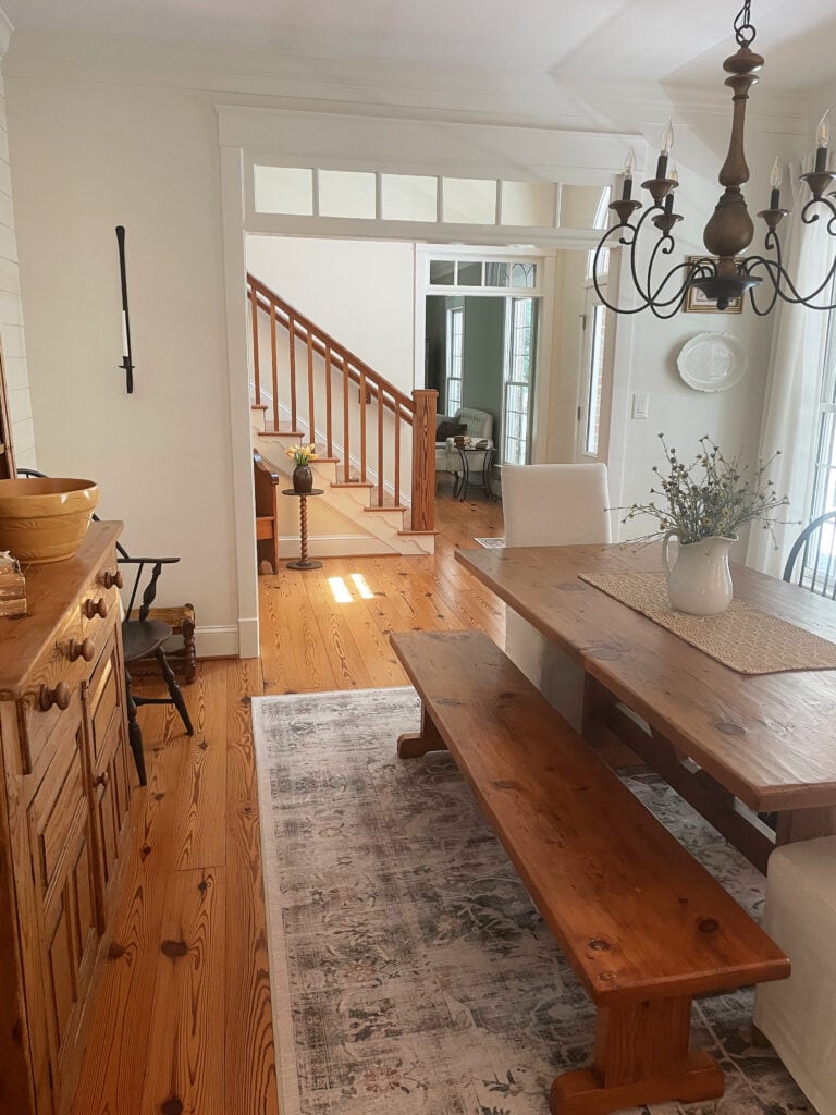
WHY WHITE DOVE IS THE MOST RECOMMENDED PAINT COLOR
Notice I said THE most recommended paint color. That’s right – nothing beats this bad boy – let’s find out why…
- It’s great for trims, doors, and ceilings
- It suits a super wide range of wall colors and finishes
- While the trend has softened, it’s still being used a TON in single rooms, open-concept spaces, and whole homes.
- The modern farmhouse exterior trend has fallen like a brick, but White Dove is still a hit when a home authentically suits white. It’s also great for exterior trim and what not.
- It’s a great cabinet color – timeless and easy.
Benjamin Moore White Dove Paint Color Review
FREQUENTLY ASKED QUESTIONS
In case you have any wandering queries or quandaries…
WHAT’S THE MOST POPULAR PAINT COLOR FOR A WHOLE HOUSE?
Ooooo, for popularity, I might still give a bit of it to Sherwin Williams Accessible Beige. However, in my experience, I find Sherwin Williams Natural Linen way more suitable to the average home, same with Benjamin Moore Maritime White.
WHAT PAINT COLORS NEVER GO OUT OF STYLE?
Ermmm, it depends on your home. Historic, character, and era-specific homes (pre-1970s) often retain their colors for much longer in a more timeless way. However, those some colors can look dated in newer homes, given the right decade.
The Most Timeless Paint Colors
Very generally speaking, Benjamin Moore Maritime White is great, as is Navajo White. Funny enough, Benjamin Moore Revere Pewter has been kickin’ it since about 2005 and STILL HASN’T STOPPED! It’s just not being used on a ‘whole home’ scale anymore.
SUMMARY OF MY MOST RECOMMENDED PAINT COLORS
- Sherwin Williams Aesthetic White – great for everything from single rooms to whole homes
- Benjamin Moore Edgecomb Gray – a great transition color between gray and beige
- Sherwin Williams Austere Gray – when you want to entertain a bit of color without going too far
- Benjamin Moore Maritime White for a soft, easy, warm look
- Benjamin Moore Pashmina – for a muddy, earthy, organic look witih a grounded vibe
- Sherwin Williams Foggy Day – one of my favorite gray-blue-green blends
- Sherwin Williams Natural Linen – perfect for those dabbling in the wild world of beige
- And, of course, Sherwin Williams Urbane Bronze – the Frank’s Hot Sauce of the paint color world
READ MORE
The 3 Best, Most Timeless Neutral Paint Colors
The 8 Best WHOLE HOME Warm Neutral Paint Colors
Get the best paint color advice with Kylie M’s Online Paint Color Consulting – I’d love to help!







Hi Kylie! Great post! I love these colors!
I have sw neutral ground in most of my open floor plan. Thinking of changing paint in our kitchen/family room from canvas tan to neutral ground OR aesthetic white. On the paint chip, it does not look like these colors are too different. Can you compare neutral ground to aesthetic white? (I have alabaster on the trim currently and I know you said aesthetic white would not do well with alabaster). Thanks!!
Oooo, if you already have Neutral Ground in play, I would continue with it as Aesthetic White has a slightly different vibe/approach 🙂
What trim with asthetic white walls?
I love SW Pure White or BM White Dove (I love it 25% lighter with Aesthetic White)
How would Ripe Olive work with travertine tile? I love greens!
I’m in the process of painting my bathroom cabinets; the bathroom has travertine tile from floor to ceiling. I have painted the cabinets BM pismo dunes and it doesn’t look good at all. I’m at a dead halt after 1-1/2 coats of paint. I don’t know what to choose!
Oooooo yes, it could be a STUNNING complement to travertine tile!
I do love the word “Buttload”😂 Your blogs always make me smile!
It’s a classic and should be part of everyday conversation ;).
TY, Kylie, for such a full post. I ‘m intrigued by the photo showing your use of Edgecomb Gray lightened. And I recall you mentioning that you have lightened up to 50% or more, if memory serves. What is the amount lightened in the photo? And what undertone shines through upon lightening, say, if in a southern location?
We had six SW colors to choose from for whole house paint on our semi-custom new home. I searched all of them on your blog and decided Aesthetic White was the best choice based on its versatility. I love it! It’s clean and somehow rich while providing a neutral backdrop that doesn’t feel apartment basic. It doesn’t have me chomping at the bit to paint every room a different color, it just fits!
Bonus: We didn’t get to choose the exterior colors as they’d already been selected by the neighborhood designer. However, we totally won that lottery; our front door is Ripe Olive!
Wahoooo, don’t you just love little coincidences like this?! They did a great job and YOU did a great job choosing Aesthetic White!
SW Ripe Olive should have been Color of the year for SW, but Kylie you are one step ahead of the game by choosing this color! I love SW evergreen fog, but ripe olive is sw evergreen’s wicked cousin. My friend painted her nightstands this color and it is so elegant and rich. She paired this color sw mantra for the walls and sw pure white trim. This combination is very beachy and serene.
YES YES YES, isn’t it so GORGEOUS? I’m so glad your friend loves it too as I think there are a LOT of us out there who are in love with this colour!
I plan to do lower cabinets in Ripe Olive or Pewter Green. Which white for uppers would you recommend? Eastern exposure from the adjoining rooms (open floor plan) with 3 sun tunnels in the kitchen to help compensate.
Oooo, a lot of this would come down to your COUNTERTOP and backsplash – it will be less about exposure/lighting/personal preferences. These greens are SO FLEXIBLE, but my fave choices would be along te lines of SW Pure White, BM White Dove and SW Alabaster 🙂
Hi Kylie! I am gaining so much knowledge from all of your posts! We are currently building and I think I’m going to go with Aesthetic White for most of our home w/Pure White for the trim. Thinking most likely Pure White for our kitchen cabinets with a Walnut Island but I guess I could even do Aesthetic on those? My laundry room and guest bath will have SW Ripe Olive cabinetry and then my kid’s bathroom I am thinking of SW Roycroft Pewter (definitely open to suggestions on this, maybe even Sherwin-Williams Chelsea Gray?) for their vanity. My question is, in these rooms would it look better to use Pure White on the walls or still continue the Aesthetic White with the Pure White trim as I am doing in the rest of the home? Thank you!
Hi!! I’m so glad to find your post-I was about to give up on finding a warm whole house color that isn’t white (or cream!) It struck me a couple of days ago that I was looking for beige but since it isn’t popular I couldn’t find helpful direction on Pinterest:)
Aesthetic White is so beautiful!
If I go with AW on our Spanish inspired 1984 home-interior walls, what color would you suggest for the ceilings?
Thanks!!!
This is great to hear! It’s a colour that SHOULD be getting more exposure – it’s amazing! As for the ceiling, while some rooms can handle Aesthetic White on the ceiling (not textured ceilings thought)some people prefer SW Pure White. In our home I did AW with BM White Dove 25% lighter 🙂
I painted the outside of my house Pewter Green 4 years ago! With SW Greenblack on the garage doors and accent areas and SW Natural Choice on trim. It’s been a success and 2 homeowners have copied my look. They stopped by and begged for my paint colors. So don’t let bold colors stop you!
I painted my cabinets True White from SW, and Accessible Beige walls. Is TW a good white for beige or do I need another color?
Hiya! I’m thinking you might mean Pure White? If so, Pure White is great with Accessible Beige!
I like edgecomb gray but also like revere pewter. Would any of these colors go with off white cabinets and old Venetian gold countertop in a south facing kitchen?
Oooo, I’d say of the 2 Edgecomb could be better, but it’s even MORE about how it jibes with the backsplash as it’s on the same vertical sight line as the walls :).
I stumbled upon Edgecomb gray last year myself and it quickly became one of our go to colors for rental properties we own as well as our home. It is the perfect balance, not too gray and not too beige!!
Hi Kylie! I have similar layout as Melissa [above comment] with large kitchen window facing south but have eastern exposure in the kitchen as well as western light from another room [open concept]. I’m planning sun tunnels too as my 1880 log construction house [which has been finished with gyproc inside] has 18″ windowsills [even in July and August, the house, so far, is VERY dark]. I have a ceiling to floor greige/taupe rough and random brick wall housing a wall oven, kind of orange-influenced yellowy cream laminate countertops with rust, greige and deep gray veining. My floors are deep brown with peachy/orange undertones manufactured wood. Do you think BM Swiss Coffee would be a good allover white for the walls? I’m thinking that or BM Hazelnut Cream as an alternative for the kitchen walls and possibly BM Chilled Chardonnay for the backsplash because atm, the backsplash is too yellow. I do like the roughness and size of the backsplash tile so I thought I might paint it, preserving the grout lines. Can you visualize this? Does it sound like it might work? Thanks in advance. I really like your thorough explanations, both in your videos and your articles, thankyou.🙂
What color trim do you recommend with edgecomb gray?
It suits a variety of whites, especially BM White Dove, Chantilly Lace and SW Pure White 🙂
Kylie you are just spot on with the color suggestions. I am getting ready to paint my home exterior Accessible Beige with Bright White trim. I think I may be using the Aesthetic White for interior . . . thank you for all your suggestions, it is sometimes exhausting looking through so many samples. It really helps that you hone in on some really amazing colors. Thank you!
You’re most welcome, Diane! I’m glad you love it as much as I do 🙂
Squeeeee! We re-did our family room last year and painted it Aesthetic White! I wanted a light color, a little warm, compatible with the brown and gray tones we have in the adjacent kitchen—but no yellow or muddy undertones—with JUST enough color to contrast with the white trim and white brick fireplace. And now it’s Kylie’s Color of the Year!! I bask in reflected glory.
Seriously, it’s fantastic. It looks great as the light changes in the room from morning to evening, somehow keeping the same character throughout. It’s refreshing during the day and cozy at night.
I LOVE to hear this – thank you! It is such a great, flexible colour. Thanks for your comment as it helps others decide if it could be worth sampling!
Kylie, you nailed it, again! I’ve painted our last 4 homes based on advice from your posts, spot on every time. My husband is so happy not have to repaint because weird undertones are showing up! These colors are just what I’m wanting right now, so in love with Anchor Gray. You are “reading” our collective heart 💙
Yes, i LOVE LOVE LOVE to hear this, thank you for this note, you’ve made MY heart happy 🙂
How does aesthetic white work with BM White Dove? All the trim in my (OLD!) house is white dove but I have a bathroom that needs a bit of subtle contrast.
Hi Kylie! You mention you have AW in your home – do you have a picture of it? I was thinking of AW as an all over color, but I am most concerned how it appears in Northern light. Do you get northern light, and does the color appear pink or lavender? How does it compare in Southern light, which I also get?
Hi Christy! The main room I have it in is south-facing, although I also have it in my bathroom with east-facing light. I’m YET to see any pink or lavender out of it, but it would gray out that bit in northern light :). If you go to my Instagram, I’ve posted the odd photo of it!!