
Choose the Perfect Paint Color Palette for Your Girl’s Bedroom
BEDROOM SHADES THAT WILL MAKE YOU & YOUR KID HAPPY
Are you looking for paint colour ideas that both you and your child love? Or maybe your wee one isn’t even BORN yet and you want to create a welcoming space for their arrival. Whatever your situation, I’ve got some great colours for you.
Now, to be TOTALLY honest, I struggled with this blog post.
Why?
Because I know that there should be no ‘masculine or feminine colours’; that boys can love pink and girls can love blue and so on. But, for the sake of Google search and reaching those who are looking for a certain RANGE of colours, there are definitely ‘keywords’ that are traditionally applied to many of these shades.
What I’m trying to say is that OF COURSE, you can put these colours in ANY kid’s room or nursery, I’m just trying to make this blog post ‘Google search’ friendly so that those who WANT these colours for ANY reason can find them! Does that even make sense? Long story short, my heart is in a good place.
If you’re looking for some great options for ANY kid – boy, girl, non-binary, gender neutral, I have a great blog post for that too!
TIPS FOR CHOOSING BEDROOM PAINT COLORS WITH YOUR KIDS
Kids often ‘level up’ when it comes to colours for their rooms. If you come in prepared, there’s a better chance of landing on a colour that you can both live with!
1. DON’T LET THEM PICK ANY COLOUR THEY WANT
If you’re going to let them choose any colour, you probably wouldn’t be reading this blog post.
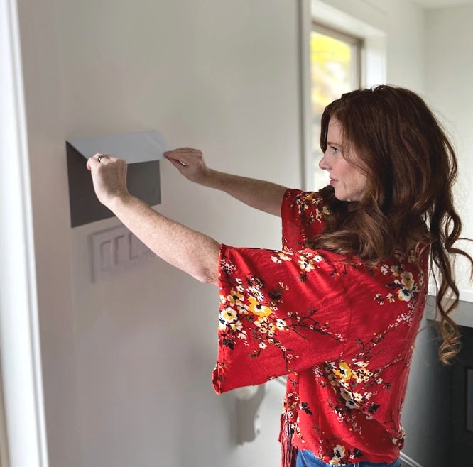
- Ask them to tell you two different colours that they would like on their walls (i.e., green or pink). Go to the paint store (by yourself) and pick up three to four different versions of these colours that you can live with. Now don’t go all boring and earthy – stretch your comfort zone a bit and look for colours that bridge the gap between their need for brightness and your need for sanity.
- When you get home, show them the colour chips that you’ve pre-approved and let them pick the one they want, and really, let them pick it. You may have a fave, but you’ve already narrowed it down to what you can live with so leave the rest up to them.
Shown above, Sherwin William’s Embellished Blue
2. IF HONEY BOO-BOO INSISTS ON A CRAZY COLOUR, CHOOSE A SINGLE WALL FOR THAT COLOUR TO GO ON
- Tell them that THREE of the walls will remain white/cream/gray and they can put WHATEVER colour they want on their one feature wall (usually the wall that the bed is on). When they get bored of this colour (which they will) it’s an easy change. Consider Cloud White or a soft subtle gray as your main/neutral colour.
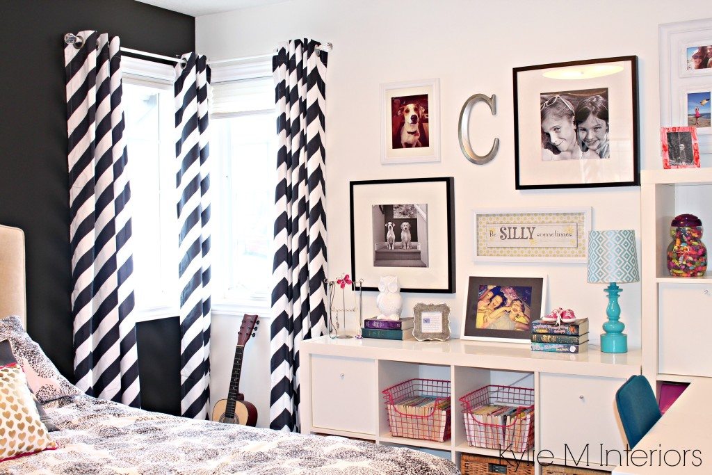
Shown above Benjamin Moore Simply White with BM Black 2123-10
3. INSTALL A CHAIR RAIL or BOARD & BATTEN
A chair rail is a piece of trim, usually 3-5″ tall (1/2″ thick) that is placed horizontally around the room at approx 36-42″ from the floor. Choose a neutral/off-white/light gray for the top of the walls and let your wee one choose the colour for the bottom (either their own choice or one of the ones you’ve narrowed down for them). If you opt for board and batten, the bottom walls will all be the same color as the trim.
This works for a few reasons….
- When they inevitably get bored with that month’s favourite colour you won’t even need a ladder to change it up. All it will take is a gallon of paint, a bottle of wine and an afternoon.
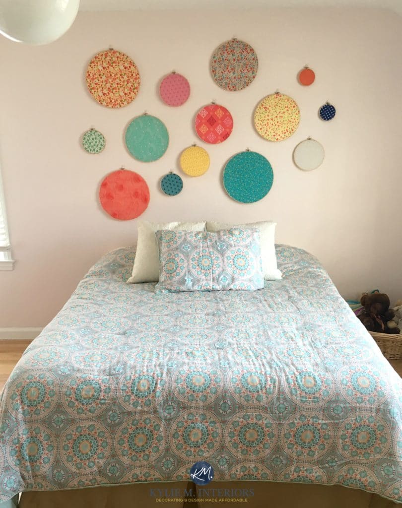
- If lil Taylor chooses Flaming Pink as their most fave colour, it won’t feel like you get punched in the face with colour every time you walk in the room as the colour will essentially be only on 1/3 of the wall space.
- You don’t ever have to change the top colour. If you choose a colour that is neutral/off-white/white/gray, then all you ever have to change is the bottom.
The 8 Best Benjamin Moore White Paint Colours
Benjamin Moore’s Best Cream Paint Colours
Shown above Benjamin Moore Pink Bliss
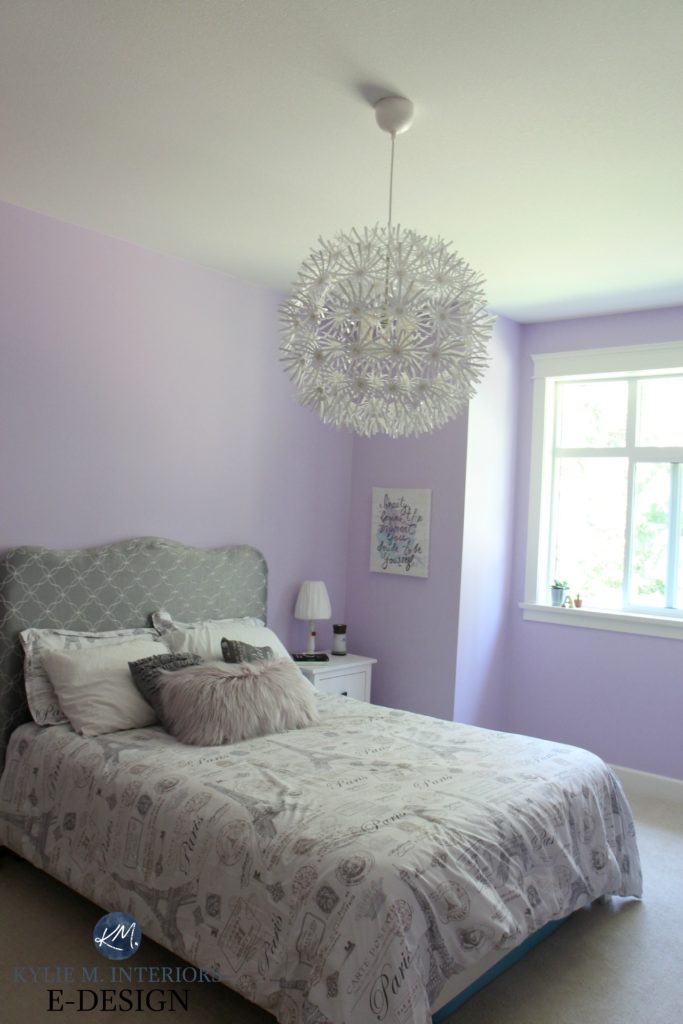
Shown above Benjamin Moore’s Lily Lavender
Now let’s get down to the fun stuff!
STEP 1 CHOOSE THE MAIN/FOUNDATION WALL COLOUR
It’s important to set the foundation before you dive into the fun parts…
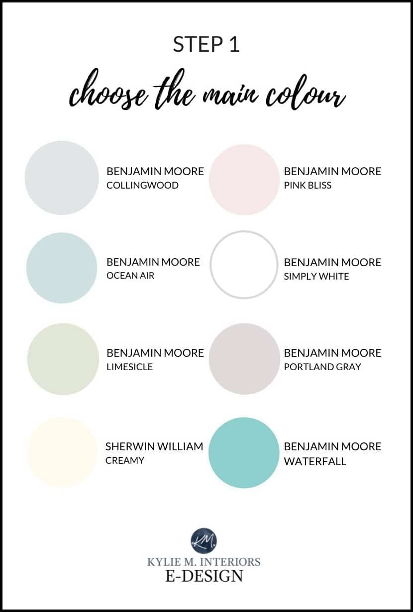
Your foundation colour sets the stage as it’s the MAIN wall colour. This is the colour you’ll build your palette from. Let’s take a quick look at the above shades…
BENJAMIN MOORE GRAY OWL
Gray Owl is a light gray with very subtle undertones of green/blue. Learn all about this beautiful colour here – Colour Review of Gray Owl.
The 12 Best Whole Home Gray & Greige Paint Colours
BENJAMIN MOORE PINK BLISS
Pink Bliss is a soft colour that says pink, without being bubble-gum about it. See a cute pink girl’s room here.

Shown above, Benjamin Moore Pink Bliss
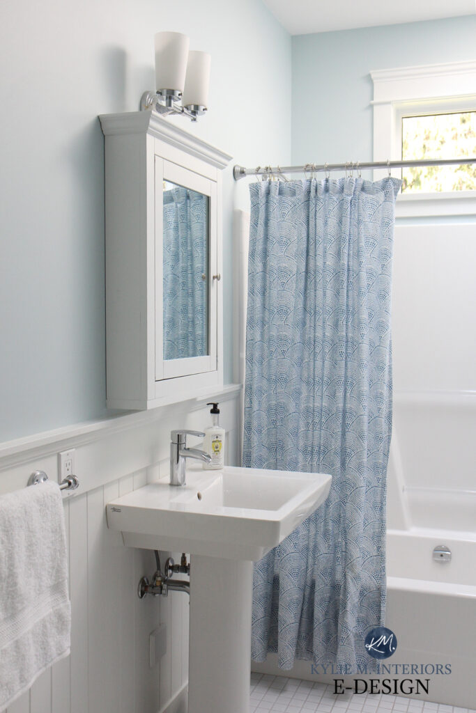
BENJAMIN MOORE OCEAN AIR
Ocean Air is a soft blue with a hint of gray and green to calm it down.
This isn’t a kid’s bedroom, but it IS a kid’s washroom, showing Ocean Air at its most charming…
BENJAMIN MOORE SIMPLY WHITE
Simply White is a brighter warm white with just a wink of cheery yellow. Keep in mind that there are MANY awesome shades of white to explore – find some to compare with Simply White here: Benjamin Moore’s 8 Best White Paint Colours
BENJAMIN MOORE LIMESICLE
Limesicle is just the right amount of green to give a fresh, organic look without being too earthy, punchy or PEA-inspired! However, it’s not my ONLY fave shade of green – I’ve got a bunch more here: The 7 Best Green Paint Colours
BENJAMIN MOORE PORTLAND GRAY
Portland Gray is a nice NOD towards violet without committing 100% to an OVERLY purple colour. If you want to see more purple and less gray, I’ve got some great options here: The 9 Best Purple (Violet) Paint Colours
SHERWIN WILLIAMS CREAMY
Creamy is a GORGEOUS off-white cream, which means it has a yellow base. However, with its neutral backdrop, it offers a more passive, subtle warmth compared to more traditional cream colours.
If you want to see more shades of cream (more muted AND more yellow), check this out: The Best Cream Paint Colours
BENJAMIN MOORE WATERFALL
Waterfall is a light-medium depth paint colour with a blend of blue/green (it’s like a not-so-dark shade of teal). This is a ‘colour first’ colour and the gray is only there to soften and tone it down a bit. Want a slightly more muted approach? Check out these bad boys: The 8 Best Blue-Green Paint Colours
Of course, there are many more gorgeous paint colours out there. If you don’t find what you need here, I’m happy to help you pick the PERFECT one for you and your chickadee via my E-Design. (You can also check out OTHER blog posts)

Shown above, Benjamin Moore Icy Moon Drops
STEP 2 CHOOSE YOUR NEUTRALS
While this might SEEM like the non-exciting part, this is where things start poppin’. With the introduction of your main wall colour and a solid neutral or two, your other accent colours (STEP 3) will come to LIFE!
- These are just some general colour ideas, don’t take them TOO literally. You can tweak them to feel more vintage, lively or earth-toned – whatever suits your kids the best!
-
For accent colours to be effective they need to be seen THREE times in a room. Ideally, you’ll be able to draw a triangle between the three so that your eye will carry the colour throughout the space.
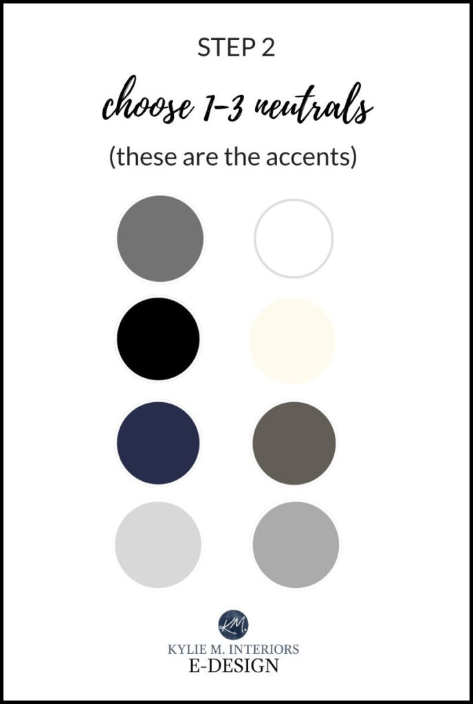
If you want to pick up some samples of the above accent colors to use as your guides when shopping, here’s the list…
- Sherwin Williams Gauntlet Gray or Dovetail
- Sherwin Williams Tricorn Black
- Benjamin Moore Hale Navy
- Benjamin Moore Stonington Gray
- Sherwin Williams High Reflective White or Benjamin Moore Chantilly Lace
- Benjamin Moore Windswept
- Benjamin Moore Willow
- Sherwin Williams Dovetail or Benjamin Moore Chelsea Gray
SAMPLIZE offers peel-and-stick paint samples that are more AFFORDABLE, EASIER and more ENVIRONMENTALLY FRIENDLY than traditional paint pots.
PLUS, they show up on your doorstep in 1 DAY!
Visit the SAMPLIZE website HERE
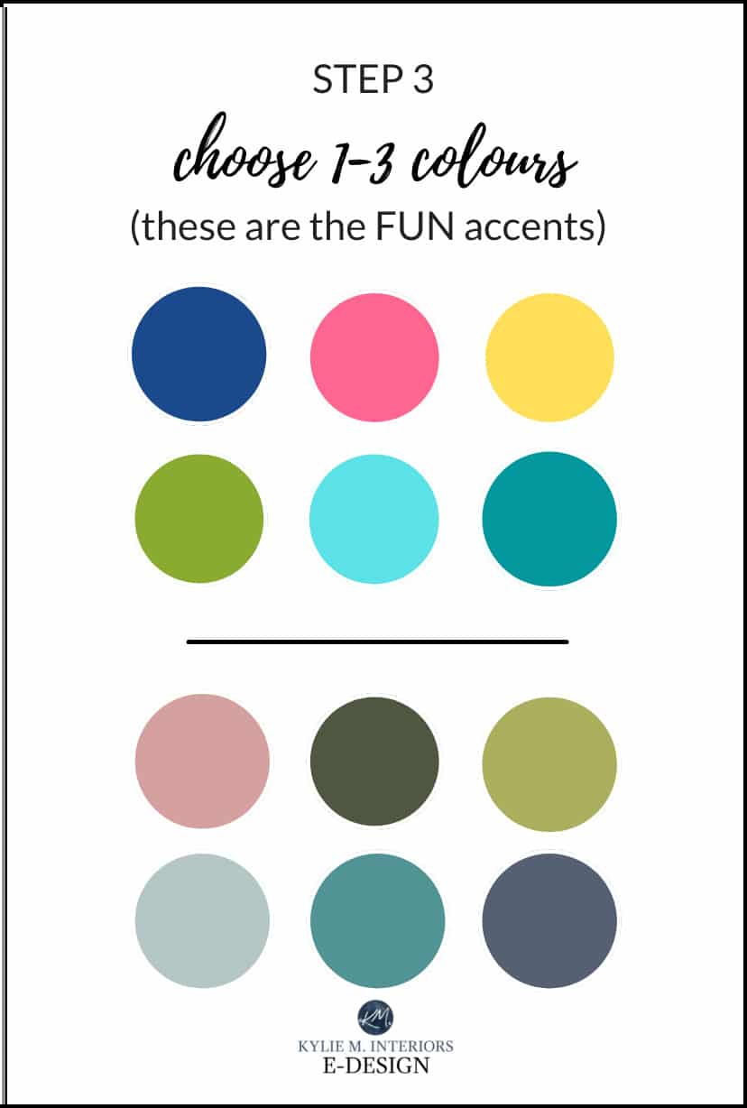
STEP 3 CHOOSE YOUR FUN ACCENT COLOURS
- If you’ve chosen one or two NEUTRAL accent colours from Step 2, choose only one, two or three ‘COLOURS’.
- If you’ve chosen two or three NEUTRAL accent colours from Step 2, choose only one or two ‘COLOURS’.
PEOPLE ALSO ASK…
WHAT’S THE BEST PAINT COLOR FOR A GIRL’S ROOM?
There is no ‘best colour’ for a girl’s room, as just like adults, kids have their own tastes. I would say the colours suggested in STEP 1 (above) are great places to start as they cover most of the colour families. Of those, my favourite colours for girls’ rooms include Benjamin Moore Simply White, Ocean Air, and Waterfall.
READ MORE
5 Gray Paint Color Palettes for a Kid’s Bedroom (PART 1 of 3)
The Best Paint Colours for a Kid’s Room (PART 2 of 3)
How to Create a PAINT COLOUR PALETTE for a Kid’s Room (PART 3 of 3)
NEED HELP?
Check out my fun Color Consulting Packages!


ORIGINALLY WRITTEN IN 2017, UPDATED IN 2023


Hi Kylie,
I came across your blog while researching paint colors to suggest to my parents as living room, dining room and library/sunroom colors. Just wanted to say that while I love the calmer color choices here, when I was ten I picked out a green close to Benjamin’s Moore’s Spring Leaf. Ten years later, I still love the color. It goes well with the white and pale pink curtains, pine furniture, and various red wall decorations and bedsheets. The color is bright but oddly soothing; I think the north-facing windows offset some of the yellow in the green to calm things down a bit.
Just wanted people to know that bold colors can be quite beautiful if done well, even in a bedroom!
Cheers,
Archana
Hi Archana, thank you for the note! It’s comments that these that help readers think outside the box and it sounds like you made a beautiful choice!
If a room has a lot of lavender in it already (with bedding and rug,) what color family would you suggest to put on the walls? My four year old wants more purple on the walls, but I think it will be overkill… I was thinking some calm shade of blue to offset it? Or maybe a very light shade of lavaeder (almost white)? Do you have any suggestions?
Thank you!
Hi Erica, thank you for the note! When it comes to personal questions I really do need to take the time to look at photos and go through a questionnaire, this way I can give you ideas that actually make sense for the room, rather than just guessing! If that interests you, it is affordable and fun! Here’s the link…. https://www.kylieminteriors.ca/online-decorating-design-services/
~Kylie
I love your blog! As a Mom of twin girls who is struggling with the seemingly daunting task of deciding on not one, but two colours for their bedroom makeovers, I appreciate all of your guidance. There are so many choices that it is so hard to know where to begin. I love the suggestion of chair rail and a vibrant colour below.
Well thank you Christine, I’m glad it’s been helpful and I LOOOVE the feedback 🙂
I have chair rail everywhere in this house and hAte itbut before I go to the effort of removing it should I try the white top colored bottom approach or jus take it off?
Hi Julianna! Check out this blog post https://www.kylieminteriors.ca/the-best-way-to-paint-a-wall-with-a-chair-rail-dado-rail/ as it shows you the different options when you have a chair rail. Sometimes taking it off can be a pain, depending on how many times a room has been painted as there can be quite a big ‘paint ledge’ where the rail was that will need to be REALLY sanded down. If the room was painted more than once, this could be a pain in the butt!