How to Create a Gender Neutral (Kid’s Room) Paint Colour Palette: (PART 3 of 3)
5 Best Benjamin Moore Gender Neutral Paint Colour Palettes
Are you trying to figure out the best paint colour palette for your new baby’s nursery? Are you patiently (or impatiently) waiting for the big day to meet your new lil nugget? Then you’ll love this article!
I’ve created THREE Easy Steps to help you make a colour palette that is gender-neutral enough to suit a boy or a girl – or both/neither!
STEP 1 CHOOSE YOUR MAIN WALL COLOUR
The best place to start is to choose your main wall colour. This colour is the foundation for your room; the colour that alllll other colours work off of, including your accents and trim colour. This colour might be inspired by bed linens, artwork, or a painted piece of furniture. Or maybe you’re starting from scratch entirely! Regardless, I’ve got a great range for you to check out…
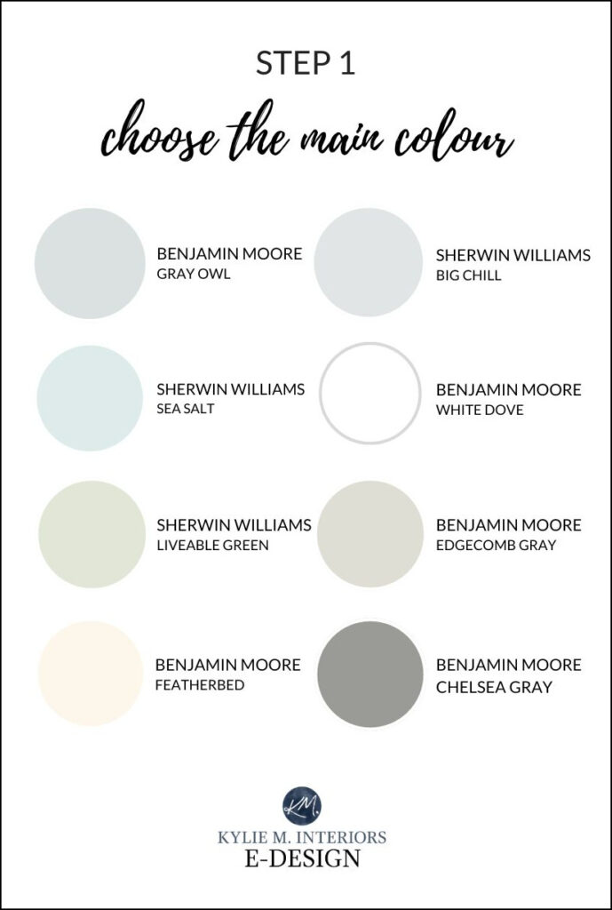
There’s NO SHORTAGE of gorgeous paint colours for a gender-neutral nursery, playroom, or bedroom, just keep in mind that off-white neutral paint colours can make for great base colours, making it easier to add a wide range of accent colours!
Here are some quick details on the colors shown above. If you want to see photos of these colours in action, click on their colour reviews (linked where available, as I don’t have a review for ALL of these colours yet).
BENJAMIN MOORE GRAY OWL OC-52
Gray Owl is a soft, light gray with calming, subtle undertones of blue/green. While it’s one of the more popular shades for kid’s rooms, there are a few other grays that give it a run for its money, including Benjamin Moore Stonington Gray. Read all about Gray Owl here: Colour Review of Gray Owl.
SIMILAR COLOURS TO EXPLORE: Sherwin Williams Big Chill, Sherwin Williams Passive
SHERWIN WILLIAMS BIG CHILL SW 7648
When it comes to light, cool gray paint colours, Big Chill is an awesome choice. The LRV of Big Chill is 62, which is in the right range for the average room. If you want a bit more depth/undertone, you can also look at Benjamin Moore Stonington Gray.
FULL Paint Color Review of Sherwin Williams Big Chill
SHERWIN WILLIAMS SEA SALT
Sea Salt is a soft light blend of gray, blue and green – it’s also fabulous with vinegar on potato chips. Whereas the dominant colour in Gray Owl is gray, the gray in this shade takes a bit of a backseat, as the blue and green shift depending on the exposure of the room. As a baby’s room colour, it’s soft and subtle, but still cheerful. For a younger child, it has a wink of fun without hitting the ‘overly colourful’ end of things.
SIMILAR COLOURS TO EXPLORE: Benjamin Moore Palladian Blue, Sherwin Williams Silver Strand, Sherwin Williams Rainwashed
See more blue-green blends HERE
BENJAMIN MOORE WHITE DOVE OC-17
White Dove is a beautiful, soft, warm white that’s a great option for north or south-facing rooms (or east/west). White Dove sets a great stage for an accent wall in a calming, moody neutral and is the perfect backdrop for stronger shades with a bit more personality! However, it’s not the only fab white…
SIMILAR COLOURS TO EXPLORE: Sherwin Williams Pure White, Alabaster, Benjamin Moore Cloud White, Chantilly Lace
FULL Paint Color Review of Benjamin Moore White Dove
SHERWIN WILLIAMS LIVEABLE GREEN SW 6176
As far as shades of green go, this one is pretty darn liveable. Liveable Green commits to its hue without being overly bright or cheerful – it’s more of a modest light green.
The 18 Best Blue & Green Paint Colors for Bedrooms
BENJAMIN MOORE EDGECOMB GRAY HC-173
Edgecomb Gray is a GORGEOUS greige that’s well-balanced between gray and beige. You can even light it by 25% or 50% for a softer approach. Edgecomg Gray is a more organic look for a kid’s room with its modest, neutral approach. You can also jazz it up with a navy blue accent wall or a dark, rich shade of green.
SIMILAR COLOURS TO EXPLORE: You could go a bit warmer with Sherwin Williams White Duck. Sherwin Williams Aesthetic White is a bit lighter and more beige (a personal fave).
FULL Paint Color Review of Benjamin Moore Edgecomb Gray
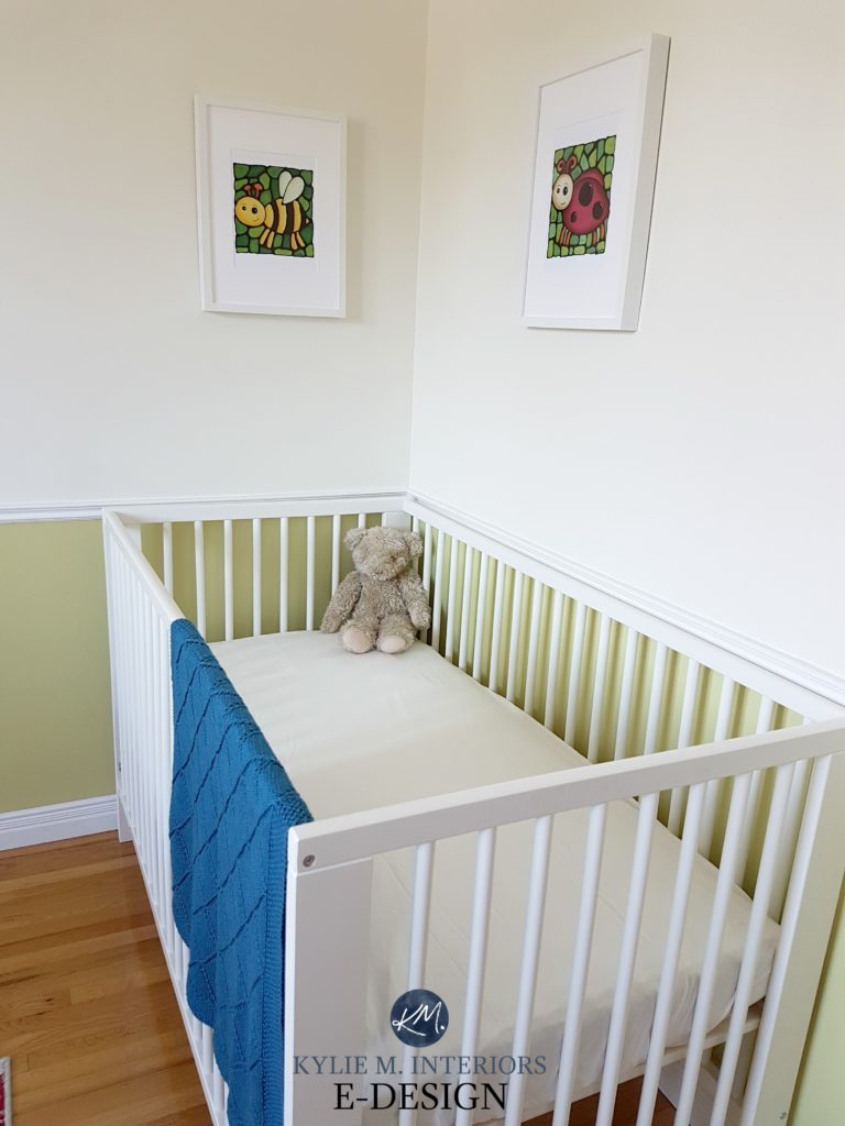
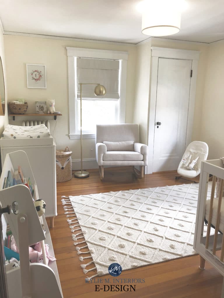
BENJAMIN MOORE FEATHERBED 928
Featherbed is a gorgeous, slightly stronger yellow paint colour, which can be great if you have north or east-facing light as the yellow will hold itself a bit better compared to the softer cream range.

SIMILAR COLOURS TO CHECK OUT: Sherwin Williams Creamy, Benjamin Moore White Down (these are MUCH more muted creams)
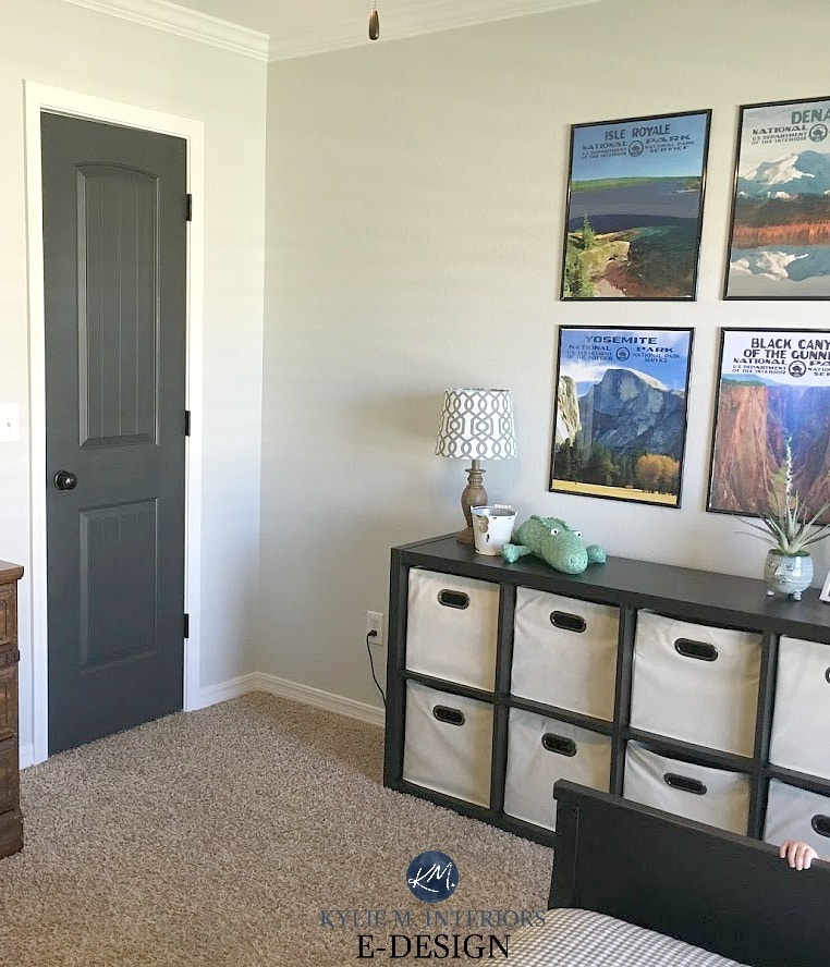
REAL HOMES, REAL BUDGETS – THANK YOU to my Online Colour Consulting clients for sending in your photos – you make my colourful little world go round!
BENJAMIN MOORE CHELSEA GRAY HC-168
Feeling brave? Chelsea Gray is a beautiful, medium-toned charcoal that grounds a room, whether it’s a feature wall or on EVERY wall.
SIMILAR COLOURS TO EXPLORE: Sherwin Williams Dovetail, Dorian Gray, Benjamin Moore Amherst Gray
FULL Paint Color Review of Benjamin Moore Chelsea Gray
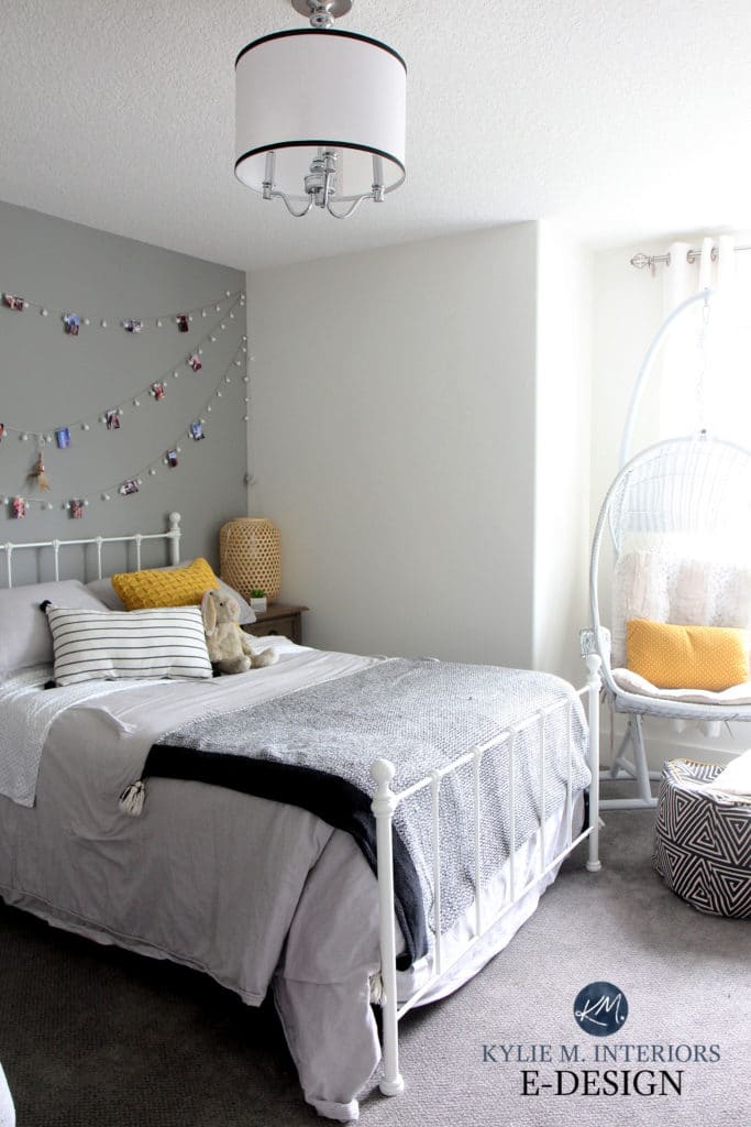
STEP 2 CHOOSE YOUR MAIN NEUTRAL ACCENT COLOURS
Your neutral accent colours might come naturally to your room via the furniture you choose, so be sure to keep this in mind! However, you can also add neutrals via linens, drapes, rugs, and accessories.
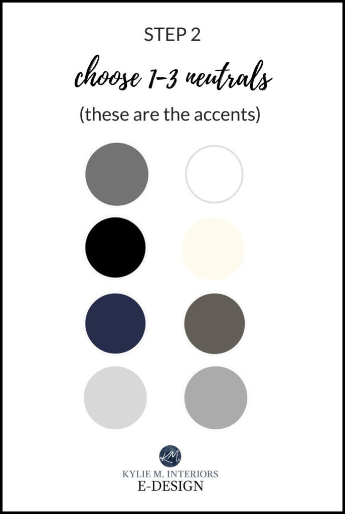
TIP 1: Don’t take these accent colours too literally (which is why there aren’t names next to them). These are just jumping-off points for you to take inspiration from!
TIP 2: While you can choose more than three, I wouldn’t choose three DIFFERENT colours. I would only add variation using one colour in different DEPTHS (otherwise it can get pretty busy).
TIP 3: Not all of the above neutrals will suit ALL of the STEP 1 colours, as it greatly depends on which wall colour you choose. Generally speaking, black, gray, and white will go with ANY of the colours in STEP 1; brown/cream/tan can be a bit trickier to integrate.
TIP 4: You don’t HAVE to choose a neutral accent colour (although white is usually necessary). If you favour a more colourful approach, move on to STEP 3!

STEP 3 CHOOSE YOUR MAIN FUN ACCENT ‘COLOURS’
While I love a good neutral palette, there’s nothing like a few pops of colour to add personality to a room! And while there are MANY MORE wild and wonderful colours than what I’ve shown below (ie: teal and orange), these should get you started!
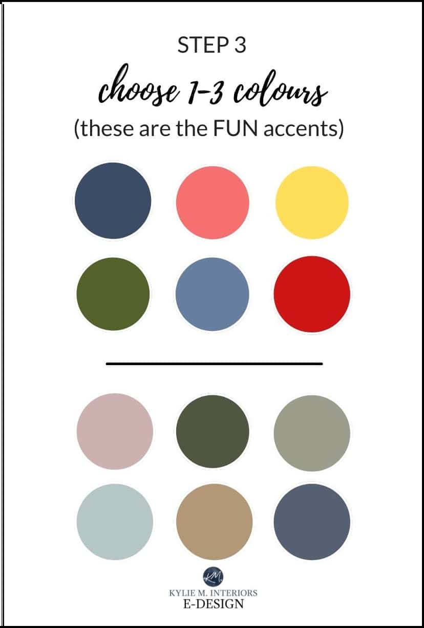
- If you’ve chosen ONE OR TWO neutrals from STEP 2, choose one, two or three colours. Keep in mind that less is OFTEN more for intense accent colours.
- If you’ve chosen THREE neutrals from STEP 2, choose only one or two ‘colours’. Of course, there might be secondary accent colours in smaller pieces/patterns, but it’s about them being in the backdrop and not obvious parts of the palette.
OTHER THINGS TO CONSIDER WHEN CHOOSING A PAINT COLOR
- North-facing rooms that are low-light don’t handle cooler, heavier colours as well.
- South-facing rooms can benefit from cool-toned paint colours.
- While you might have a good idea of what YOU want the room to look like, make sure to include your child in the process!
- Does your room have east or west-facing light? READ THIS
- Size matters! Pay attention to the depth of your paint colour to make sure it suits your room.
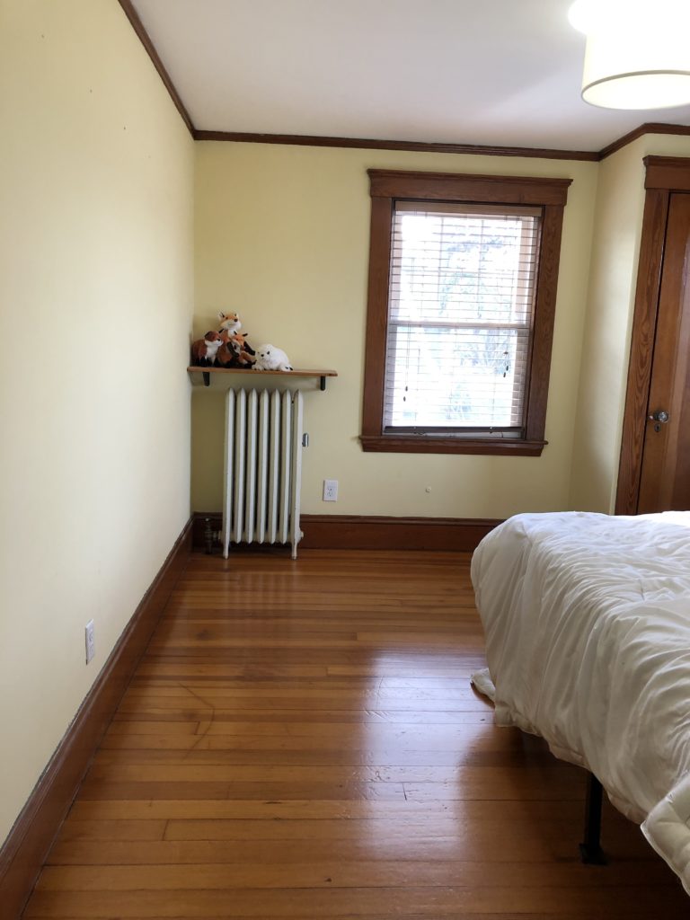
Before, the yellow was a bit too strong for this soon-to-be nursery…
After, with Featherbed, everything is much softer and muted looking, while still having some good ‘colour’ to it…
READ MORE
5 GRAY Paint Colours for a Kid’s Room PART 1 of 3
The 9 Best Paint Colours for a KIDS Room: Part 2 of 3
The Best WHOLE HOME Gray & Greige Paint Colours
Not sure which colour is best for you n’ baby boo?
Check out my E-design and Online Colour Consulting!
If you enjoyed this post and would like to learn more please consider subscribing for ‘quasi-weekly’ FREE updates!
Originally written in 2018, updated in 2023