
Sherwin Williams 2025 Color Collection: Everything YOU Need to Know!
8 Paint Colors, Endless Possibilities: Colors of the Year
It’s the most, wonderful time…of the year. No, not Christmas – it’s COTY-TIME! That’s right; Autumn is when my favorite brands, Benjamin Moore and Sherwin Williams, spill the beans on their TOP color choices for the upcoming year.
This year, Sherwin Williams hit it out of the park by taking their cues from me. That’s right, me (I’m sure this is more fluke than purposeful, but just go with it…).
I’ve never had a ‘Color of the Year.’ Instead, I offer my readers a ‘Collection of Curated Colors’ to choose from every year. And now Sherwin Williams did the same…just sayin’.
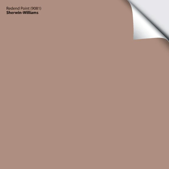
Will these colors be better than 2023’s Redend Point? Or Upward, which was okay but nothing to write home about. Will they beat the ever-awesome 2022 color Evergreen Fog (which my clients are still pining over – get it?) Yes…and no.

Some of these colors are gorgeous, for sure. Others leave a lot to be desired for the average homeowner. But maybe you’re not the average homeowner and see a few that have you pulling out your paintin’ pants – we’ll have to wait and see!
Now, I know you’re just here for the pretty images and my wit…
However, most of these colors aren’t ones my Online Color Consulting clients have used – they’re not mainstream.
And since I rely 99% on those images, I don’t have photos of these bad boys in action. However, I have the info and ideas you need to get rolling. I’ve also included images from Samplize or Sherwin Williams to help you along (I don’t ‘borrow’ from other Creators for my content).
So, let’s dive into the ten colors selected for the 2025 Color of the Year COLLECTION.

SHERWIN WILLIAMS GROUNDED 6089
Grounded is a rich, warm, but not overly heavy shade of brown that’s like a comforting pick-me-up cup of joe. This rich, earthy color could bring all the flavors of a room together with a yummy, inviting warmth.
It’s a color that keeps your space feeling, well… grounded.
As for depth, Grounded has an LRV of 12. In some color groups (ahem, dark gray), this depth could look a bit drab and heavy in some spaces, but being a richer shade of brown, Grounded doesn’t carry the same visual weight as some other colors.

Image from Samplize Peel & Stick
Not sure what LRV is? It could save your paint-lovin’ life – read all about it HERE.
WHERE CAN YOU USE GROUNDED?
While Grounded won’t have a place in every home, it does have multiple potential usages!
- It’s ideal for accent walls to add depth without overwhelming the space.
- It works perfectly in an office or bedroom, where you want to feel cozy and grounded (I’m runnin’ this pun into the GROUND).
- Can ground (I can’t stop) an open-concept area, providing a neutral backdrop that lets other elements shine.

Get your Samplize PEEL & STICK SAMPLE HERE!
SHERWIN WILLIAMS SUNBLEACHED 9585
Let me introduce you to Sunbleached. It’s warm, light, and gently smooched by the sun. It’s a soft neutral with just the faintest touch of gray. It has a whisper of warmth but is airy enough to keep your space open.
Now, enough of those random descriptive words – let’s get down to business. Sunbleached is a tricky lil’ bugger. Most neutrals cater to an undertone in a more defined way, such as purple, pink, green, etc.
Like Leonardo DiCaprio, Sunbleached doesn’t want to commit.
This means it will adjust based on its space, exposure, and surrounding finishes. Sure, every color does this, but Sunbleached can really shift. It’s slightly more likely to cast a TOUCH taupe without the obvious violet-pink of many of the most popular shades. However, give it a room with a tendency to pick up green, and Sunbleached will run with it faster than me after eating a bowl of chili.
The shade that’s always ready to brighten your day, no sunscreen required.
Sunbleached has an LRV of 75, making it an OFF-WHITE depth. It’s light enough to keep your room fresh and open but with just enough color to give your walls a soft, feather-light presence.
The Best Creamy White & Off-White Paint Colors
WHERE CAN YOU USE SUNBLEACHED?
I can’t think of many spaces where you CAN’T use sunbleached – so long as your hard surfaces have the right undertones for it!
- Works beautifully in living rooms and bedrooms, where you want a light, fresh feel without being too stark or cold. The same goes for the taupes in this color bundle.
- Perfect for dark hallways and entryways, adding a softness. Just make sure it doesn’t look dingy. If so, head to a brighter shade of warm white.
- Ideal for open-concept layouts, creating an airy flow that ties everything together while letting other design elements take the stage.
- Fab for coastal-inspired spaces as it’s a great backdrop for a more calming, beachy palette.
Get your Samplize PEEL & STICK SAMPLE HERE!
SHERWIN WILLIAMS CHARTREUSE 0073
Chartreuse is always a touchy color – people love or hate it. I’m on the love it team – like MAD LOVE (stalker style), but I appreciate it’s not everyone’s cup of tea. This is because Chartreuse is a lively blend of yellow and green that instantly adds a punch of personality to any space.
Chartreuse says, ‘Let’s party!‘ However, like myself, whether it was inviting is questionable.
It’s refreshing and a little bit unexpected (like a bidet). While it’s more of a wild card and not for everyone or every home, I think we can agree that it’s FUN.
Chartreuse has an LRV of 64, making it a LIGHT depth.
HOWEVER…for those who love chartreuse (the color in general), you might find this particular shade on the edge of ‘too colorful.’ Personally, I prefer my chartreuse with way more depth, something like Sherwin Williams Hep Green. However, if you like a bit more of a ‘lime-inspired’ approach, Chartreuse could hit the spot.
WHERE CAN YOU USE CHARTREUSE?
Chartreuse is too punchy for a whole room, but it could be magical in the right place.
- Front doors could be the perfect place to show off Chartreuse. Especially paired with darker grays or blues.
- An accent table in an eclectic room.

Get your Samplize PEEL & STICK SAMPLE HERE!
SHERWIN WILLIAMS BOSC PEAR 6390
Bosc Pear is interesting and I’m very intrigued. This is because Bosc Pear is a darker, kind of earthy, caramelly gold-brown, sweet-potato-looking (with less pink) shade of…orange-brown with a slightly burnt look. Shall I go on? No. Sherwin Williams says it’s a shade of yellow. And I hate to burst their bubble, but this ain’t yellow.
Is this the pear-fect color for you??

As for depth, Bosc Pear has an LRV of 32, meaning it’s medium. It strikes that middle balance of not being too heavy while offering serious richness to a space.
WHERE CAN YOU USE BOSC PEAR?
Bosc Pear has a bit more personality, so it won’t work just anywhere (kind of like me; I got fired from most jobs and work best at home). Thoughtful placement is key to maximizing this color’s richness.
- It’s an interesting color that can be used throughout a room for a rich, vintage, or even organic vibe.
- As an accent wall, although I think it’s lovely enough to hold a whole room to itself.
- While it has limited uses, I’m actually pretty excited about this color.

Get your Samplize PEEL & STICK SAMPLE HERE!
SHERWIN WILLIAMS WHITE SNOW 9541
If you’re looking for a crisp, clean white that feels like a winter wonderland without all the shoveling, White Snow could be the one for you.
Be like Elsa and Let it Go with White Snow (for you Frozen fans out there who aren’t six years old).
White Snow comes in at an LRV of 90, making it a true light-reflecting powerhouse. With this degree of brightness, you can expect it to bounce light around a room like nobody’s business, keeping things bright and airy.
Paint Color Review of Sherwin Williams White Snow
Now, of course, you want to compare every color to similar shades, but when it comes to whites, it’s super important as they can be harder to read without comparables. While you may LOVE White Snow, once you compare it to a slightly warmer white like, say, Sherwin Williams Pure White or Greek Villa, you may see things you didn’t before!
Always always always sample and compare!

Compare my FAVORITE shades of white with this curated WHITE COLOR BUNDLE.
WHERE CAN YOU USE WHITE SNOW?
White Snow is pretty versatile and can be used in many different ways.
- It’s great for trim and ceilings to create contrast with any number of wall colors.
- Perfect for rooms needing a fresh, clean white that isn’t overtly cold or stark.
- It works as a whole-home color for those who love that airy, gallery-inspired look (but I’d prefer a touch more warmth in my white).
Get your Samplize PEEL & STICK SAMPLE HERE!
SHERWIN WILLIAMS RAIN CLOUD 9639
Rain Cloud is a friggin’ glorious blend of blue, green, and gray – TALK TO ME! Sure, it has a touch of moodiness, but like me during my time of the month, it’s still approachable.
It’s like a hug from a rain cloud, minus the soggy socks (I live on the West Coast of Canada, so this is a real consideration).
Rain Cloud is in Sherwin Williams’s newer Emerald Designer Edition Collection, and the only way to get a sample is through Samplize Peel & Stick (link below) – they can’t do sample pots and don’t have the paper chips in-store. It’s also in the high-end, most expensive line of paint. In other words, it’s beautiful but not at an accessible price point for the average homeowner.

Image of Rain Cloud from Samplize Peel & Stick
Rain Cloud has an LRV of 11, making it a deep MEDIUM-DARK depth (1 point away from just being DARK, though).
WHERE CAN YOU USE RAIN CLOUD?
While Rain Cloud won’t work in every corner of your home, there are some sweet spots where the sun is always shinin’…
- Perfect for creating a cozy, intimate bedroom or reading nook.
- Ideal for accent walls that need a little extra mood without going full-on dark and stormy.
- It’s a strikingly bold choice for kitchen cabinets or a bathroom vanity. Even if it’s just on your kitchen island, it’ll get your friend’s talking.
- It works beautifully in a bathroom to add personality.
Get your Samplize PEEL & STICK SAMPLE HERE!
SHERWIN WILLIAMS CLOVE 9605
If you’re looking for a wickedly dark, warm paint color, Clove could be right up your alley. This super skookum shade of brown goes head to head with the ever-popular Sherwin Williams Black Fox, but with more meat on its bones.
What is this ‘meat’ I speak of? Well, Clove isn’t just any old ‘dark shade of brown’; it’s intensely grounded without any type of ‘fudgy’ warmth (fudgy being a super technical term – google it). With its LRV of 5, Clove is one of the best dark browns (almost black) on the market (along with Sherwin Williams Sealskin).
While you might not rub THIS Clove on your meat, you might want to roll it on your walls.

Not sure what LRV is? It could save your paint-lovin’ life – read all about it HERE.
WHERE CAN YOU USE CLOVE?
This badass beauty is super versatile as long as you want to go deep (that’s what she said)…
- Gorgeous as an accent wall, adding a seductive wink of interest without hitting the wild world of black.
- A great color for exterior trim or a front door accent color.
- If your countertop calls for a super dark, brown-based warmth, Clove could be a beautiful island paint color.
Get your Samplize PEEL & STICK SAMPLE HERE!
SHERWIN WILLIAMS MALABAR 9110
Malabar is a beautiful (but kind of dated, if you ask me—and you are asking me) beige. It carries that rich, classic warmth that used to be the go-to neutral in homes, giving spaces a cozy feel. Don’t get me wrong, though…
Beiges are making a comeback, but most homeowners aren’t ready for this depth.
But guess what? I have a few photos of Malabar in action (this first one is a ‘before’ photo as my client wanted to brighten things up)…

Nowadays, homeowners are leaning toward lighter, more modern beiges that feel fresh and light rather than heavy and traditional. If you’re after a more current aesthetic, you might want to lighten things up a bit…
But if you’re all about cozy, rich, and warm, Malabar could be your beige soulmate without tipping the scales too far!
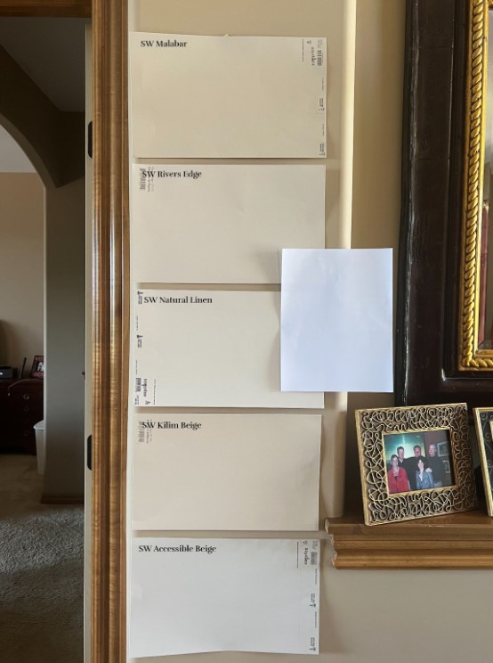
The most popular colors from the above are Sherwin Williams Natural Linen and Accessible Beige (although it’s not a ‘typical’ beige).
WHERE CAN YOU USE MALABAR?
While Malabar may not suit every modern home, it can work in spaces that crave a traditional, even Tuscan charm.
- It could be good in rooms that need a grounded, earthy vibe—think family rooms or dens that thrive on warmth and comfort.
- Malabar’s deeper beige can suit spaces like libraries, offices, or formal dining rooms.
- Works beautifully in homes with a more classic or transitional style, where you want a rich backdrop without going all-in on dark tones.
- If you have a Tuscan-style home that suits colors like this, you might want to CHECK THIS BAD BOY OUT.

Get your Samplize PEEL & STICK SAMPLE HERE!
SHERWIN WILLIAMS MAUVE FINERY 6282
Mauve Finery is…surprising. A color like this is likely chosen to add variety and interest to a Collection rather than as a ‘color with mass appeal for the average home.’ But hey, if you love lavender, it’s got you covered!
Mauve Finery is purple. Now, Benjamin Moore chose Cinnamon Slate, a glorious shade of purple, as their COTY; however, these two colors are a world apart. Mauve Finery is beautiful but not super usable for the average home or homeowner’s tastes. Cinnamon Slate is beautiful and highly usable in the average home—you just need to like some degree of purple.
Mauve Finery is fine, but we all know what ‘fine’ means in woman-speak).

As for depth, Mauve Finery has an LRV of 51, making it a light-medium depth.
WHERE CAN YOU USE MAUVE FINERY?
This pretty lady is a picky one. But unlike me in my early 20s, she won’t go dating just anyone with two feet and a heartbeat…
- It could be a lovely color for a nursery.
- Beautiful for a kid’s room if your wee one has a hankerin’ for purple
- Beautiful as an accent wall, especially with soft, warm white walls.

Get your Samplize PEEL & STICK SAMPLE HERE!
By the way, do you know that HGTV Sherwin Williams put together a Color Collection with even more gorgeous shades than what’s shown here?
HGTV Sherwin Williams Color Collection for 2025
But here’s the big question: Which Sherwin Williams Color Collection do YOU like the most, based on the number of colors you might consider using in or on your home?

If you ask this color cowgirl, I lean pretty hard into the HGTV Collection. Sure, White Snow is amazeballs, but it’s only available in the Emerald Designer line. And while I do love Grounded, Bosc Pear, and Rain Cloud (again, in the expensive Emerald line), more colors in the HGTV group hit my happy place, including Snowbound, Delft, Riverway, and Nutshell.
READ MORE
The Best WHOLE HOME Warm Neutral Paint Colors
The Best Off-White & Light Paint Colors for Cabinets
The 14 Best TRENDY Beige & Tan Paint Colors
Benjamin Moore Cinnamon Slate: Color of the Year 2025
NEED HELP?
Check out my Online Paint Color Consulting!


Hi, Kylie,
Thanks for the great discussion of the 2025 color capsule of the year. Would you consider discussing palette colors as sometimes representing more than paint? When I read the posts Sherwin Williams offers about this capsule, it seems they regard the capsule’s palette as colors that go beyond paint. They call it “a collection of colors chosen for how well they work together.” The magic is supposedly in the combining, whether the colors are interpreted as walls & cabinetry, other surfaces, upholstery & curtains, wall art, furniture, or other decor. For instance, sunbleached for walls and cabinets, white snow for trim, and then grounded representing wood tones or leather, malabar and raincloud representing colors of upholstery or rugs or curtains, bosc pear as candle holders or baskets or pottery, chartreuse for pillows, mauve finery for a throw. To me, this is the only way this palette makes any sense for real homes. Also, for the expensive Designer Color Collection colors such as sunbleached, could you suggest alternatives?
I like this thought. I mean, it’s hard, as so much of what they do isn’t kind of standard or used in the ‘average’ home, you know? It’s sometimes a bit more ‘out there’ unless you loooove color (like me, although my home is stil pretty tame!).
But yes, I like what you’re puttin’ down here! I just got my Samplize order of the COTY’s and I”m going to play with this idea!
I agree with you–Bosc Pear is not yellow. But I can’t agree with you that Hep Green is chartreuse–it has more red than green in it so if chartreuse is midway between green and yellow…this is not that.
How about: Bosc Pear is yellow adjacent and Hep Green is chartreuse adjacent?
Hey Linda! So, I agree that Hep Green has more red in its RGB, but when it comes to colors and RGB, strange but TRUE, but red + green can make a yellow – this is computer talk, not paint talk (if it’s the RGB you’re referring to). I just learned this the other dya, which blew my mind a bit, as red and green have always meant brown to me!
Hi!!! Love ALL your posts and still LOVE the colors you helped me choose when we built our house 9 years ago! I came across this post and was happy to see a review on SW Clove. My question is….in a sunny room with an accent wall of Clove, what color would you recommend to use for the rest of the room? Thank you!!
Stephanie
Oooo, that’s a good question. I’d have to lean into soft, muted warm neutrals, maybe like SW White Duck, Aesthetic White, Accessible Beige 🙂