
HGTV Sherwin Williams Colors of the Year: 2025 Collection
From Basic to Bold: Sherwin Williams Top Color Choices
Oh, you thought Sherwin Williams had just one Color Collection? Oh no, there are two – the real Sherwin Williams one and the HGTV Collection (confusing, but true).
What’s interesting is that I think many of the colors in this collection kick the butt of the colors in the ‘real’ Sherwin Williams Collection, which is too bad, as it gets way more coverage. C’est la vie, which is French for WHAT THE WHAT? HOW DID THIS HAPPEN? Just joking; it means ‘that’s life.‘
But, seriously, this collection includes some friggin’ fabulous colors that deserve a spot in the lime light.
Do I like these colors more than the ever-popular 2022 color of the year, Evergreen Fog? Yes…and no. I love Evergreen Fog as much as ever, but a few of these new selections will give it a run for its money as long-term favorites, not just for the current year. This said, several of these shades leave me feeling a little twitchy.

Now, I know you’re just here for the pretty images and my wit. However, some of these colors aren’t ones my Online Color Consulting clients have used. And since I rely 99% on those images, I don’t have photos of these bad boys in action. However, I have the info and ideas you need to get rolling, so let’s dive into the 11 colors selected for the 2025 HGTV Color of the Year Collection.

SHERWIN WILLIAMS SNOWBOUND 7004
I can’t even TELL you how happy I am to see this color pop up. Snowbound is a warm, soft white paint color. It’s the kind of white that whispers, “I’m warm and inviting, but I’ve also got a touch of sophistication and class up my sleeve!” It’s kind of like me, although without the sophistication and class.
Snowbound is a soft white with just enough warmth to keep it from feeling cold or sterile, making it the go-to choice for someone who wants a clean, fresh look without feeling like you’re living in a snow cave.
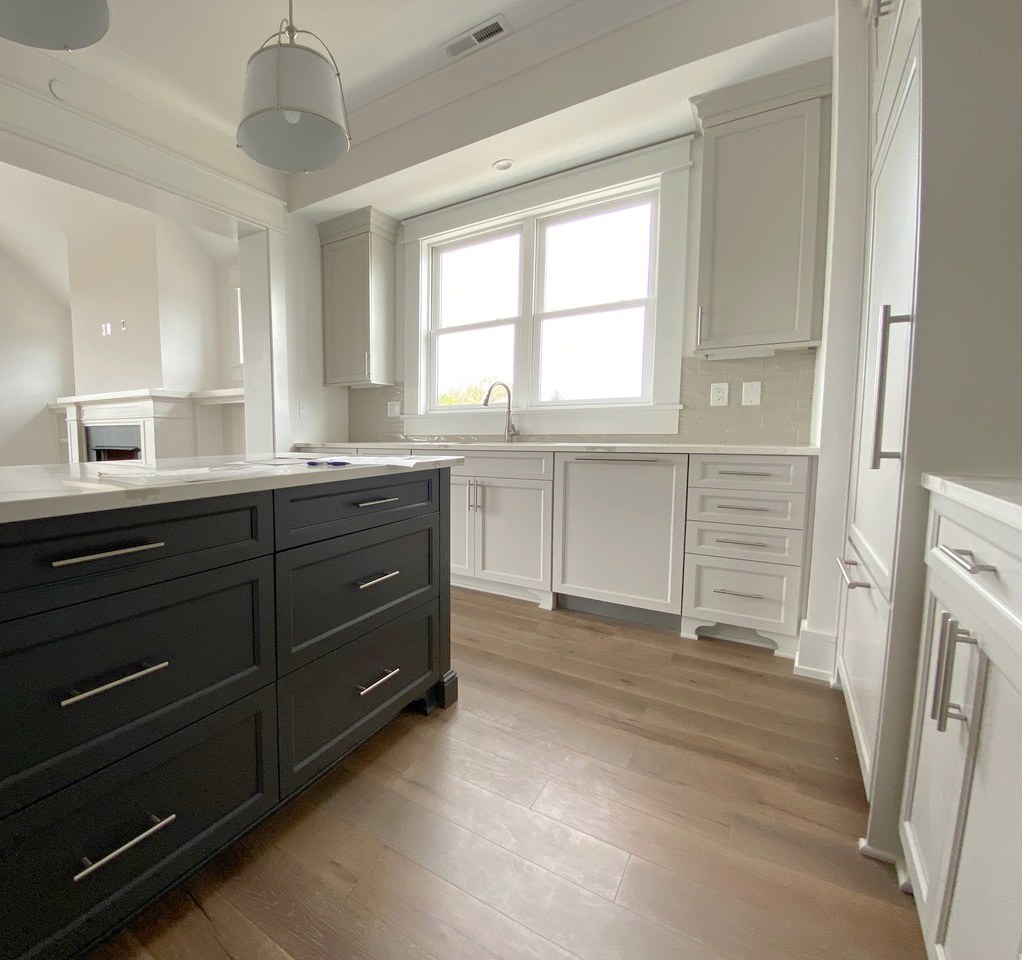
This next image shows Snowbound on the kitchen walls, Agreeable Gray on the cabinets, and Iron Ore on the island…
Think of Snowbound as the cashmere of whites – warm but refined, cozy yet stylish!
As for depth, Snowbound has an LRV of 83, putting it in the white range but not far into it. While most popular whites range from about 83 to 95 (learn about LRV here), Snowbound’s slightly lower LRV gives it a softness that makes it less clinical than brighter whites. Its subtle undertones keep it from feeling too sterile, offering a more approachable, liveable white.
My Full Paint Color Review of Snowbound (but keep reading this blog post first)
Snowbound is a perfect choice if you love white but want more personality than what you’d get with a super bright white like High Reflective White (94). Snowbound brings that subtlety – like the friend who’s always there for you but never steals the spotlight.
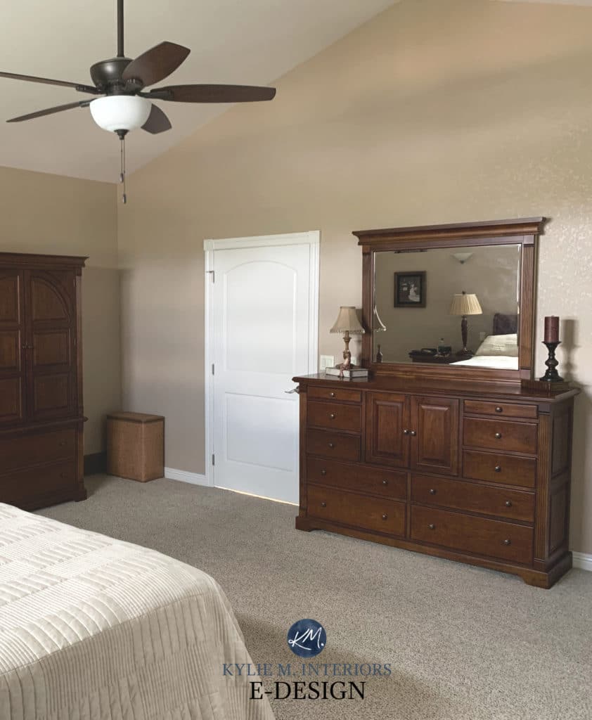
Here’s Snowbound looking a bit creamier than usual on these kitchen cabinets, with a Gauntlet Gray accent wall…

Not sure what LRV is? It could save your paint-lovin’ life – read all about it HERE.
WHERE CAN YOU USE SNOWBOUND?
Snowbound is no one-trick pony, making it a fab choice for many painting projects.
- Amazeballs for a single room.
- Great for multiple rooms or an entire home.
- At this depth, it can be used on walls, trims, and cabinets for a bright, seamless look (color drench).
- Its gentle warmth pairs beautifully with a wide range of wood stains and undertones, making it a flexible choice for open-concept spaces, living rooms, and bedrooms where you want a soft but clean backdrop.

Get your Samplize PEEL & STICK SAMPLE HERE!
SHERWIN WILLIAMS QUIETUDE 6212
Quietude is that soft, dreamy blue-green that instantly makes you want to take a deep, relaxing breath and yell, ‘TIM, WHERE’S MY WINE?’ It’s a peaceful, tranquil shade with just the right gray undertone to keep it from feeling too pastel or too beachy while leaving a lot of color on your walls.
It’s like having a mini spa right in your home – a color that wraps around you like a cozy blanket and makes everything feel calmer.
Here’s a simple shot of Quietude via Sherwin William’s website…

As for its depth, Quietude has an LRV of 48, plunking it comfortably in the light-medium range, allowing it to add depth to a room without feeling too heavy. It has enough depth to bring a sense of coziness to a room without sucking up all the light.
If you’re looking for a color that adds a bit of oomph without feeling too intense, Quietude is whispering ‘pick me’ in your ear.
My Paint Color Review of Sherwin Williams Quietude
WHERE CAN YOU USE QUIETUDE?
Quietude is versatile and open to a wide range of painting projects, including…
- While Quietude is too colorful for a WHOLE home, it’s absolute magic in a single room (or maybe two).
- While it works in almost any room, it’s famous in bedrooms, bathrooms, and any room where you want a calming, relaxing, yet striking look.
- Quietude can look gorgeous on kitchen cabinets, bathroom vanities, and kitchen islands.
- If you’re looking for a blue-green front door color that winks at teal without the intensity or depth, Quietude could be the perfect choice.
Quietude is wildly similar to Wythe Blue, shown with other blue-green samples on this door. The exterior lighting jacks its color up a bit, but it’s a good general look at things.


Get your Samplize PEEL & STICK SAMPLE HERE!
SHERWIN WILLIAMS NOMADIC DESERT 6107
Oooookay, I did NOT see this coming (and I’d love to see it going). Sure, trends are leaning warmer, but not as many are ready for these deeper, darker shades of beige (early 2000s Tuscan Trend, anyone?).
This said, if you’re looking for a rich, more committed approach to beige or tan, Nomadic Desert is a warm, grounded neutral that has a bit more meat on its bones.
If you’re looking for a beige that isn’t too blah, this is the one!
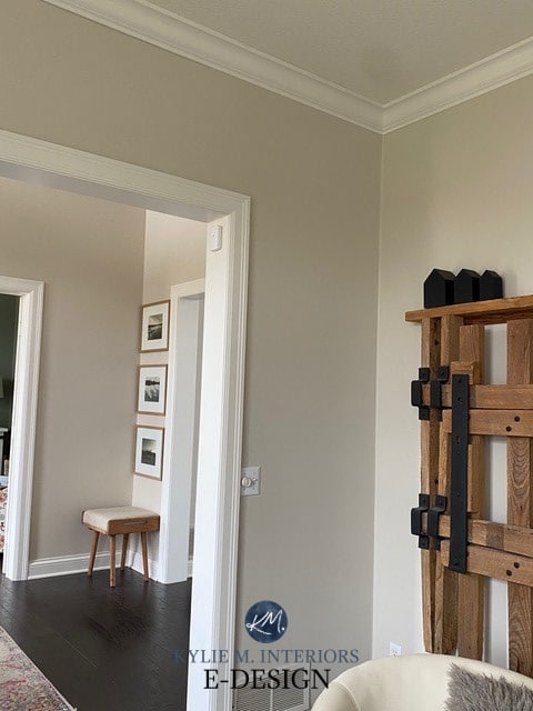
Here’s the BEFORE photo of my client’s foyer. She hired me to get rid of her tired ole Nomadic Desert walls and update them with a more modern shade…

While the photo below isn’t at the same angle as the previous one, she chose Benjamin Moore Muslin…

We still needed beige to go with her tile floor and wood stains (and the flow of her home), but Muslin offers a lighter, more modern look (the same can be said of Sherwin Williams Natural Linen, which was also an option and I have MAD LOVE for it).
Long story short, Nomadic Desert is pretty, but it’s not an updated color for the average home.
This doesn’t mean you can’t love it for your home; I just want to give you a little food for thought based on my experiences.
As for depth, Nomadic Desert has an LRV of 46, making it a light-medium depth warm, neutral paint color. It could work for those who want a neutral that isn’t washed out or too light but still works in various lighting conditions.
WHERE CAN YOU USE NOMADIC DESERT?
While lighter beiges and tans are far more versatile, Nomadic Desert has a few uses (I know, I sound SO excited…)
- It’s great for a single room or multiple rooms.
- Sure, you can paint your whole home this color, but keep in mind that if I do 10 consults a day, approximately 50% of them involve helping homeowners get rid of rich beiges—just…like…this.
- Nomadic Desert can be a great choice for exterior siding or stucco, as it suits a decent range of stone and brickwork.
 Get your Samplize PEEL & STICK SAMPLE HERE!
SHERWIN WILLIAMS CONVIVIAL YELLOW 6393
Is Convivial Yellow my favorite color in this collection? Hell, no. Unfortunately, I think some colors are chosen to ‘look good in the Color Collection as a whole’ rather than being great colors to paint your home.
I mean, if you want yellow walls, Convivial Yellow is warm, cheerful, and beautiful – if sunshine could be bottled and painted on walls, it would look like Convivial Yellow! Would I want it in my home? No. That doesn’t mean it’s terrible, though; it’s just pretty darn yellow!
How many of my clients have asked for yellow or gold in the last three to five years? Out of thousands of consults, about ten.
This doesn’t mean that it’s not the color you’re looking for; I just don’t see it being hugely popular yet.
Convivial Yellow has an LRV of 69 (no comment). This means it’s in the light range and on the higher side of it. Just note its degree of color (chroma), which can show up at the party more than expected, especially if you expect more of a ‘cream-yellow’ than a ‘golden yellow.’
The Best Paint NUMBER for Your Home – 62
WHERE CAN YOU USE CONVIVIAL YELLOW?
Unlike the previous shades, Convivial Yellow isn’t quite as flexible—you’ll want to be careful where and how you use it (which shouldn’t be said of ANY color of the Year).
- It’s best in north or east-facing sunrooms, which should look warm and inviting but fall a bit flat due to their exposure.
- If you want to paint your kid’s playroom or a guest bedroom a feel-good, happy hue, this could be your color!
- I’d be nervous about it in rooms with south-facing or warm afternoon western sunshine, as this baddy be HAAAWT!

Get your Samplize PEEL & STICK SAMPLE HERE!
SHERWIN WILLIAMS SPICED CIDER 7702
Spiced Cider is the color equivalent of snuggling up by the fire with a bottle of wine, one glass, and a cozy blanket. It’s a deep, rich orange with a beautiful brown, earthy vibe. It’s warm, inviting, and perfect for adding a touch of coziness with more color than a neutral brown or beige.
As for depth, Spiced Cider comes in at 23, making it a slightly darker medium-depth color. However, where more neutral shades can fall flat, this gorgeous rusty hue has a great degree of color, so the depth is less of a concern.
WHERE CAN YOU USE SPICED CIDER?
Being an orange-based color, you’ll want to use it strategically, as not every room can pull off a shade like this.
- It’s great for a single room or two, but no more than that.
- Spiced Cider can be a gorgeous accent color for a feature wall.
- Gorgeous for bedrooms, offices, dining rooms, or even a powder room for a dose of personality.
This color will make your space feel seriously spiiiicy.

Get your Samplize PEEL & STICK SAMPLE HERE!
SHERWIN WILLIAMS STUCCO 7569
While the trends I’m seeing lean more towards beige (orange undertones) or more muted shades of tan, I see where Stucco (Previously known as Pure Linen 4043) comes from.
Stucco is like your chic, laid-back best friend with a perfect tan, which makes sense as it’s a tan paint color with a reasonably noticeable yellow-green undertone!
Stucco’s depth is about the only thing I REALLY love about it. Sitting at 63, it’s in the light range and a great depth for the average room with adequate natural light. It’s not that I don’t like this color as it can work in some rooms; HOWEVER, it’s never at the top of my list (or even in the middle).
If you like Stucco, I encourage you to check out a more flexible shade like Sherwin Williams Natural Tan and compare both of these to the shades in my CURATED TAN COLOR BUNDLE.
WHERE CAN YOU USE A COLOR LIKE STUCCO?
Stucco can work in a variety of places. That said, if I’m choosing a tan, I’d choose a more muted, less yellow-green option—just sayin’.
- In a single room or multiple rooms
- It can also work on a whole-home basis; that said, Stucco is less likely to suit a wide range of interior finishes than one of the more modern shades of beige.
- A great option for the exterior of your home.
 Get your Samplize PEEL & STICK SAMPLE HERE!

SHERWIN WILLIAMS DELFT 9134
COME TO MOMMA—NOW WE’RE TALKIN’! Delft is a gorgeous paint color and a great choice for this collection.
With its dreamy blue hue, Delft offers color with a muted backdrop to slow it down. Not only that, Delft is a blue with a decent lean toward green, offering a more coastal, cozy approach to this particular hue.
Delft is dramatic without being overwhelming (unlike myself, who is both).
I don’t have photos of Delft in action (yet), so I grabbed this from the Sherwin Williams website (blurry, but it works) to give you a meat n’ potatoes look at it…

Coming in with an LRV of 33, Delft is a medium depth. It absorbs light in a way that makes rooms feel cozy and intimate, so it’s perfect for spaces where you want to create a little drama and depth without too much visual weight.
The Best Blue-Green Paint Colors
WHERE CAN YOU USE DELFT?
Where CAN’T you use Delft? Just joking. While this particular shade of blue is super flexible, it does have limitations.
- Delft is fabulous for an accent wall in a bedroom, living room, or dining room.
- It’s a gorgeous choice for a statement room, especially a laundry or powder room.
- While it makes a statement, it can also be gorgeous in bedrooms and home offices.
- Delft is gorgeous for cabinets, either the whole kitchen or just your kitchen island or bathroom vanity.
- Delft is a beauty for the inside or outside of your front door.

Get your Samplize PEEL & STICK SAMPLE HERE!
SHERWIN WILLIAMS ROCKY RIVER 6215
Just when I thought it couldn’t get any better, Sherwin Williams chose Rocky River. Rocky River is the perfect blend of deep green and blue that feels grounding and refreshing, like dipping your toes in a cool pool. It’s bold with an earthy vibe—a color versatile enough to feel at home in a rustic cabin or a modern, sleek space. If you’re into deep, calming colors that make a statement without shouting, Rocky River’s got your back.
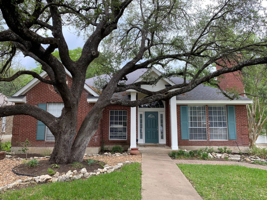
Here’s Rocky River on the shutters and front door of this beautiful red brick exterior…
The Best Shutter Colors for Brick Exteriors
As for depth, Rocky River’s LRV is 15, which means it’s a MEDIUM-DARK depth, perfect for creating bold spaces.
WHERE CAN YOU USE ROCKY RIVER?
While Rocky River isn’t for every home, this beautiful, dark shade of green-blue could be used in several places.
- This color was made for accent walls, kitchens, or a cozy library or home office.
- Gorgeous for kitchen islands or bathroom vanities (heck, do the entire kitchen – why not?).
- As shown above, it’s a beautiful color for a front door or shutters.
- Rocky River pairs perfectly with natural woods, leather, and soft whites or off-white beiges to balance its depth. It can also be used in bathrooms for a rich, spa-like retreat. Rocky River is definitely a statement-maker.

Get your Samplize PEEL & STICK SAMPLE HERE!
SHERWIN WILLIAMS SEQUIN 6394
Well, it seems like gold is in. If you ask this color cowgirl, while gold is making its way into some homes, it’s not mainstream enough to hit it this hard. But hey, you do you, boo.
Sequin is like a little ray of sunshine on your walls! It’s a soft, creamy yellow with just enough warmth to make it feel inviting but light enough to keep things fresh and airy. This color brings all the happy vibes without being too bold or overpowering – it’s like the soft glow of a sunrise, waking up your space in the prettiest way.
Now, some golds lean more orange, others more green. Sequin is most definitely a yellow-green. Consider yourself warned: Yellow-greens can be trickier to fit into a palette as they suit fewer interior finishes than yellow-oranges.
As for depth, Sequin has an LRV of 57, which falls into the lower end of the light range, flirting with the line of becoming a light-medium depth.
WHERE CAN YOU USE SEQUIN?
Sequin might show up in some homes, but it won’t be on many finishes or in many rooms…
- Single rooms or, at the most, two rooms in your palette
Yuuuup, that’s it. It’s darn pretty, but it’s not that useful.

Get your Samplize PEEL & STICK SAMPLE HERE!
SHERWIN WILLIAMS NUTSHELL 6040 (LESS BROWN)
Okay, here we go – someone on the color-selecting team made a GREAT choice with Nutshell (previously known as Less Brown).
This is a rich, deep taupe that borders on brown. As for undertones, it has a gorgeous purple undercurrent (which makes it taupe), creating a wickedly earthy and alluring color. It’s the color of a cozy, warm embrace – like sipping hot cocoa by the fire or pulling on your favorite chunky sweater.
It’s sophisticated without being stuffy – a color that feels timeless and modern at the same time.
With an LRV of 14, Nutshell is a deeper color that brings subtle drama and coziness to a space. It’s definitely on the darker end of the spectrum, but it will add warmth and depth without feeling too heavy (although that is totally open to perception). It’s perfect for creating intimate, cozy spaces, especially in rooms where you want to add a little mood and style.
WHERE CAN YOU USE NUTSHELL?
While I haven’t had any clients use Nutshell/Less Brown, I expect it to pop up much more in the coming year(s). I’d be happy to see it in the following situations…
- As an accent wall in almost any room, but especially a bedroom.
- In a single room.
- This color could be amazeballs on an exterior.
- It’s a beautiful, rich shade for a small bathroom, adding personality without too much punch.
- Check out some of my favorite dark shades of taupe in this blog post or my CURATED DARK TAUPE COLOR BUNDLE. Be sure to add Less Brown/Nutshell to your order (it should come up as one name or the other).

Get your Peel & Stick sample of Nutshell/Less Brown HERE!
By the way, do you know that the REAL Sherwin Williams put together a Color Collection with a few stunners?
Sherwin Williams 2025 Color Capsule
But here’s the big question: Which Sherwin Williams Color Collection do YOU like the most, based on the number of colors you might consider using in or on your home?

If you ask this color cowgirl, I lean pretty hard into the HGTV Collection. Sure, White Snow is amazeballs, but it’s only available in the Emerald Designer line. And while I do love Grounded, Bosc Pear, and Rain Cloud (again, in the expensive Emerald line), more colors in the HGTV group hit my happy place, including Snowbound, Delft, Riverway, and Nutshell.
READ MORE
Benjamin Moore’s Color of the Year: Cinnamon Slate
Stair & Railing Trends for 2025
The 13 Best Blue & Green Blend Paint Colors The 10 Best Blue-Gray Paint Colors
NEED HELP?
Check out my Online Paint Color Consulting – I’d love to help!


Woohoo, Kylie! I’ve been subscribed to your blog for about 8 years, during which time hubby and I’ve been deciding on what to build for a retirement home. I’ve looked at colors, I’ve dreamed, I’ve read everything you’ve written about blue-green (which I see as green) and until SW came out with the 2025 HGTV Collection for 2025, I hadn’t fallen in love. Now I have! I picked up the SW brochure and each of the paint chips at Lowe’s, and I’ve been drooling since.
Our bedroom and bath will be Quietude. I may even decide to color drench the ceiling, at least in the bathroom. Hubby may faint if I have the bedroom walls, ceiling, and woodwork painted in the same color! I realize it’s trendy, but I love it, and I won’t ever redecorate this house (so I say now!) so why shouldn’t I do it? The great room/dining/kitchen are all one room, 21’X41’, west to east. I’m going to have white subway tile for the backsplash, and I’m seriously thinking about painting Delft above the tile to the 15’ ceiling. The island is big, 4’X9’, and even though hubby may choke, it’s going to be PAINTED Rocky River. We both love natural wood, and I’ll have the remainder of the maple cabinets finished in a natural stain. But I also love the idea of painting the front door Rocky River…would that be completely weird to open a front door painted one color, and have a view of a kitchen island painted in the same color?
The windowless hallway from the garage to the main part of the house is 26’ long, and here I was thinking of using Convivial Yellow because I truly love yellow. We have a short, windowless hallway in our current home that’s painted yellow, and I love it. But. I know how hard it is to get a yellow that truly looks great. I’ve been wondering if reducing the Convivial Yellow by 50% or even 75% is the way to go. That hallway has 5 36” doors, and the walls will be lined with many g’kids canvas prints, so there won’t be foot after foot of unbroken yellow.
The great room/dining room will have a vaulted ceiling, walls 12’ on sides and 15’ peak. I think I might just go with snowbound on walls and trim. There’s a 12’ deep covered porch in front of the great room, so not a lot of direct sunlight, even though it faces west. There are small windows above the 12’ walls that face east, too.
Nutshell is going somewhere, maybe as an accent wall in the auxiliary bedrooms and on the walls of their Jack & Jill bath. I’ll admit it: I don’t like gray! I’ve been reluctantly thinking “I guess my neutral will be gray”, but I’ve never liked the idea. I’m thinking the neutral of this house is going to be Snowbound…and lots of color takes off from there!
We expect to break ground soon, and should be in by mid-year 2025. Can you tell I’m excited?
This is the best thing I’ve read in a long time – AMAZING! And it sounds like you’re like m – I was like a kid in a candy shop looking at all of the gorgeous shades! Re: Convivial Yellow, just be careful, it can be tricky and I’m not sure what it would do upon lightening. Miiiiiight I talk you into something a bit different, but still yellow-cream inspired like Creme or DEcor White?