28 Best Colors That Go With Agreeable Gray (Walls, Cabinets, Exterior)
Even with design trends leaning warmer, many still reach for the calm, neutral approach of Sherwin Williams Agreeable Gray.
However, Agreeable Gray is rarely used on its own. Whether you use it in your whole home, a single room, on kitchen cabinets, or your exterior, you need colors that go with it, either as accents, for adjoining rooms, trims, doors, and more.
Thank goodness you have me (wink wink).
To get this color party started, let’s do a quick summary of what you can expect from Agreeable Gray in the average room.
A SUMMARY OF AGREEABLE GRAY
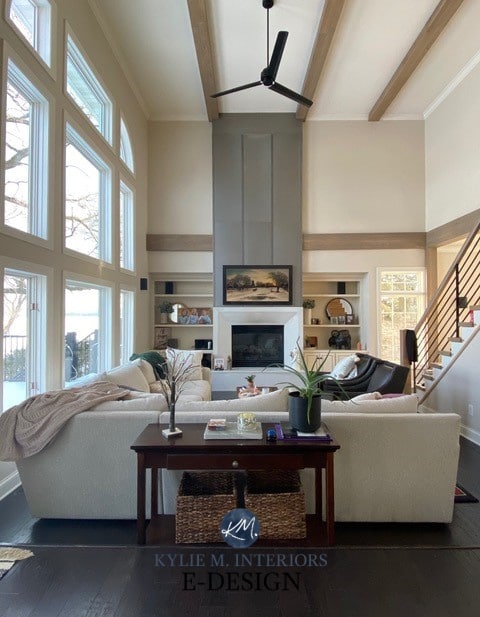
Agreeable Gray is a warm, greige-taupe paint color. It doesn’t commit wholeheartedly to a pink, purple, or green undertone, making it pretty darn versatile.

Its LRV of 60 is a great starting place for the average room. Although many reach for lighter shades, Agreeable Gray is still popular for its balanced approach to depth, warmth, and undertones.
Boom. Done.

A FEW FUN FACTS BEFORE WE START
- There are very few off-white paint colors that go well with Agreeable Gray (especially right next to it) – it’s dang fussy. In most cases, you’re best off with a well-chosen white or a color that’s 15-20+ LRV points darker than A.G. That said, it depends on what you need an off-white for – you might find just what you need below!
- In the light to light-medium range (let’s say LRVs between 25-75), it often prefers neutrals with undertones or, at most, ‘colors’ with a strong neutral gray base to calm them. It doesn’t like overly colorful shades.
- Once you get into the darker end of things, A.G. can handle a bit more color (chroma), but even then, it can be fussy.
- It doesn’t always like colors that are warmer AND darker than it. If you want to choose a warm color, start with hues with an LRV above 60 and a super-muted approach to warmth.

Now, let’s get into the guts n’ glory of Agreeable Gray’s best coordinating paint colors…
THE BEST COLORS TO GO WITH AGREEABLE GRAY
We’re covering a lot of needs with this blog post…
- Colors that go with Agreeable Gray walls (e.g., for an accent wall, adjoining room, trims, cabinets, exterior finishes, etc.)
- Those that coordinate with Agreeable Gray cabinets, either for a kitchen island or attached walls.
- Colors that go with Agreeable Gray siding, for trim, the front door, shutters, or garage doors.
- And maybe even a few that go with AG trims and interior doors, although those are more few and far between.
This means that not ALL of the colors listed below work for every need. Sample carefully, compare similar shades, and see which lands best for you and your home.
Let the color games…BEGIN!
5 BEST WHITE PAINT COLORS WITH AGREEABLE GRAY
If you’re looking for a white for your walls, trims, or cabinets, you’re bound to find it here…
1. SHERWIN WILLIAMS PURE WHITE 7005
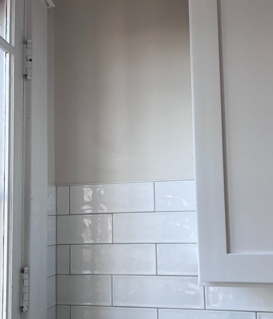
Pure White is my favorite white with Agreeable Gray. It’s soft, simple, and not too creamy and warm. Whether you need it for trims, cabinets, or an adjoining room, it’s usually (but not always) an easy win.
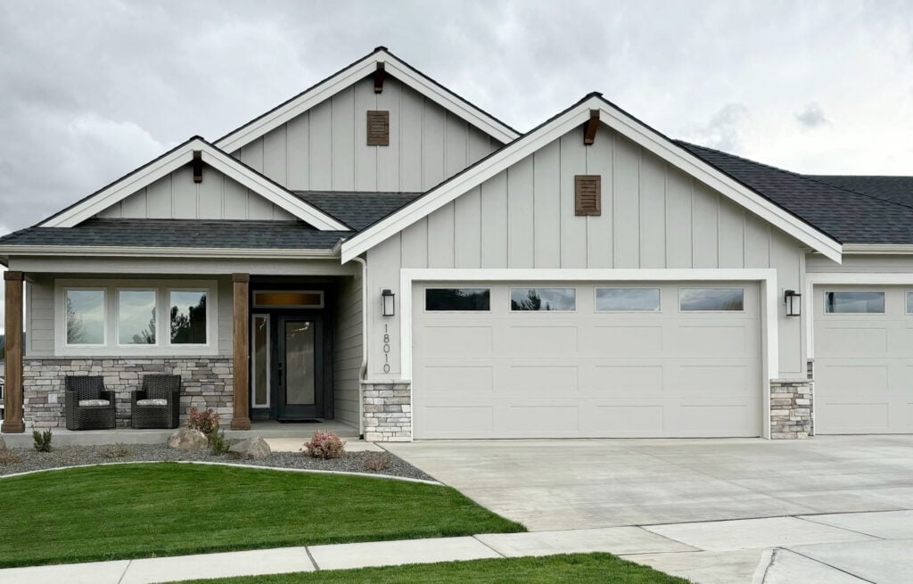
Here’s Pure White on the exterior of a home with Agreeable Gray siding…
And here it is on the interior trim and doors in this next beautiful home…

Paint Color Review of Pure White
SIMILAR COLORS TO COMPARE: Never choose a paint color without comparing it to similar shades. Sometimes a small tweak takes a color from good to great!
Compare Pure White with Benjamin Moore White Dove (coming up shortly) for a bit more warmth. for a slightly cleaner contrast, check out Sherwin-Williams White Snow (coming up).
2. BENJAMIN MOORE WHITE DOVE OC-17
While I tried to keep this blog post strictly to Sherwin Williams colors, like my self-control around Cornuts, that obviously didn’t last long – a few are too darn good not to mention.
Benjamin Moore White Dove is along similar lines to Sherwin Williams Pure White, as they’re both soft whites. However, White Dove has just a bit more warmth, making it a beautiful partner to Agreeable Gray.
Here’s a good sampling of White Dove, along with a few other whites and cooler gray hues…

If any of the other samples catch your eye (or both eyes if you’re not a pirate), here are their reviews…
- BM Edgecomb Gray | BM Stonington Gray | SW On the Rocks | SW Light French Gray | BM Chantilly Lace
Benjamin Moore White Dove Color Review
3. BENJAMIN MOORE CHANTILLY LACE OC-65
If you’re looking for a brighter, cleaner contrast with your Agreeable Gray walls, cabinets, or trim, Chantilly Lace could do the trick.
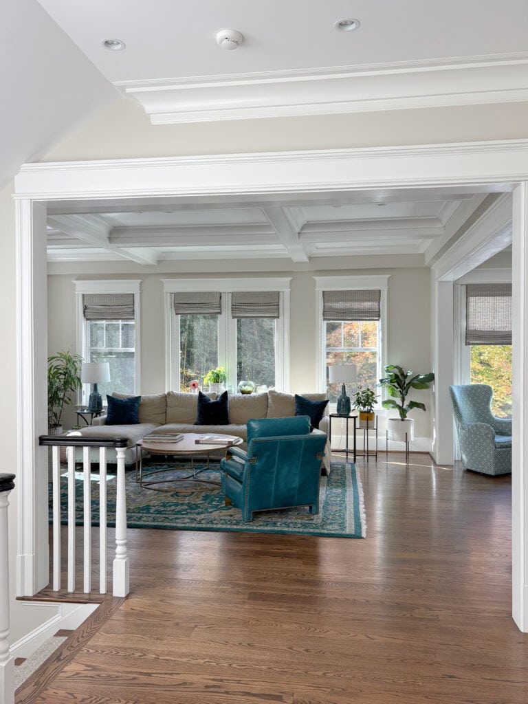
While it’s very similar to Sherwin Williams White Snow (coming up shortly), Chantilly Lace is a bit whiter/less warm. Here it is on the walls with Agreeable Gray board-and-batten and trim…
Here’s the same room in better lighting, with Agreeable Gray on the island, board & batten, and door trim, and Chantilly Lace on the cabinets/walls…
He’s clearly a yoga fan, as he’s doing the downward dog.
Benjamin Moore Chantilly Lace Color Review
4. SHERWIN WILLIAMS WHITE SNOW 9541
Where Benjamin Moore has the ever-famous Chantilly Lace, Sherwin Williams now has White Snow.
This is a newer color (in the last few years) from SW, and is their best ‘whiter white’, while still having a bit of softness. Its LRV of 90 offers more brightness and crispness when paired with Agreeable Gray, at least compared to the previously mentioned, Pure White.
Sherwin Williams White Snow Color Review
5. SHERWIN WILLIAMS EXTRA WHITE
Extra White is another one I love to pair with Agreeable Gray. Sure, Pure White and White Dove are often at the top of my list, but Extra White is never far off.
This built-in baddy is painted Extra White, and you can see a snippet of Agreeable Gray on the far left…


Extra White is a softish white (LRV 86). While it looks like a cool white in the fan deck, expect a bit of warmth when used as a trim or cabinet color.
Sherwin Williams Extra White Color Review
What about the other popular whites?
Some people pair Agreeable Gray with Alabaster or Greek Villa. While they’re passable, they aren’t nearly as good as the previous 5 shades. Their warmth and undertones make them less than ideal.
8 BEST OFF-WHITE, LIGHT, & LIGHT MEDIUM COLORS
If you’re looking for a more interesting partner for your Agreeable Gray finish, I’ve got some beauties for you to explore. The LRVs of these colors will range from…
- 74-81 (off-whites)
- 55-73 (light)
- 40-54 (light-medium)
If you don’t know what LRV is – 3 SLAPS WITH A WET NOODLE! Just joking. When you’re done with this blog post, read this one.
Remember, not every color is perfect for EVERY job, so sample and compare carefully to see how each color lands in your space.
1. SHERWIN WILLIAMS ORIGAMI WHITE 7636
Origami White doesn’t get nearly enough appreciation. This is a gentle shade of off-white that’s incredibly neutral. It has gray roots with a beautifully subtle, grounded, taupeish warmth.
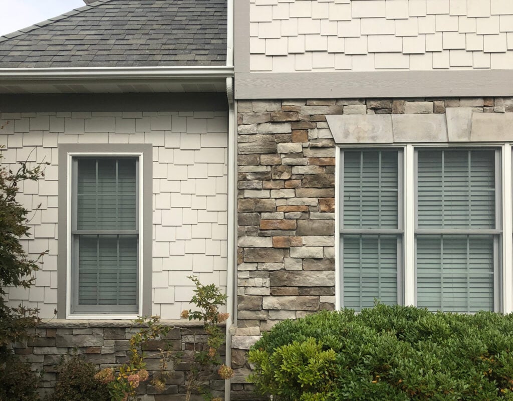
On this next exterior, the intention wasn’t to use them together – it was an either/or situation. while Agreeable Gray looks a touch violet, it’s just the lighting/image – it’s usually FAR more balanced looking…
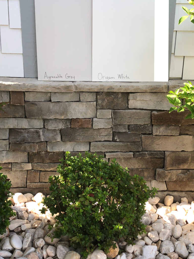
Between the two shades, the homeowners ended up choosing Agreeable Gray for their shakes, and look at how GORGEOUS it turned out – not purple at all (it’s like I know what I’m doing or something)…
Paint Color Review of Origami White
SIMILAR COLORS TO SAMPLE & COMPARE: Sometimes a little tweak is all it takes! Compare Origami White with Sherwin Williams Heron Plume for a bit less warmth/warm gray, White Heron for a bit more creamy backdrop, and Aesthetic White (coming up next).
And remember, just because it’s listed here, doesn’t mean it goes with Agreeable Gray for EVERY single use – sample and compare carefully!
2. SHERWIN WILLIAMS AESTHETIC WHITE 7035
Aesthetic White is one of my favorite warm off-white paint colors – so much that I painted half my home with it (I darkened it for more oomph).
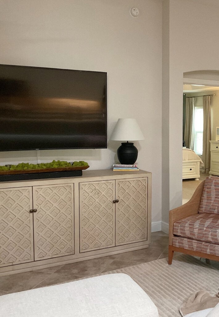
This isn’t my living room (as I’m yet to tidy it enough for photos), but it’s still a great example of Aesthetic White in action…
Aesthetic White is an off-white beige that’s heavily doused with gray, taking a huge bite of its beigey-warm butt.
Paint Color Review of Aesthetic White
SIMILAR COLORS TO COMPARE: The previously mentioned Origami White and Heron Plume, and maybe even Sherwin Williams Shoji White. Sometimes, all it takes is a small tweak in undertones or temperature to land on your perfect shade.
3. SHERWIN WILLIAMS TECHNO GRAY 6170
Techno Gray is a vastly underappreciated greige-inspired paint color. While many greiges come in more muted, and some greens are too overwhelming, Techno Gray is the perfect blend of both – enough green to be interesting, but not so much that it’s bossy.
3. SHERWIN WILLIAMS ALOOF GRAY 6197
Aloof Gray is a light shade of green-gray with an LRV of 58. While it doesn’t necessarily contain a ton of blue, in some lights, it leans that way.
Many people don’t want grays that are non-committal, or those that can swing into purple undertones. A color like Aloof Gray can be a great solution as it commits to its green without being overbearing.

SIMILAR COLORS TO COMPARE: You might only be a small shade away from your perfect paint color! Compare Aloof Gray with Sherwin Williams Conservative Gray and Sedate Gray. Sedate Gray is warmer, whereas Conservative Gray is a touch greener and cleaner.
Why aren’t there many beiges that go with Agreeable Gray?
Agreeable Gray is fussy with beiges that are darker than it. If a color is warmer than A.G. it prefers it to be LIGHTER (LRV higher than 65, really) and considerably muted in warmth and undertones.
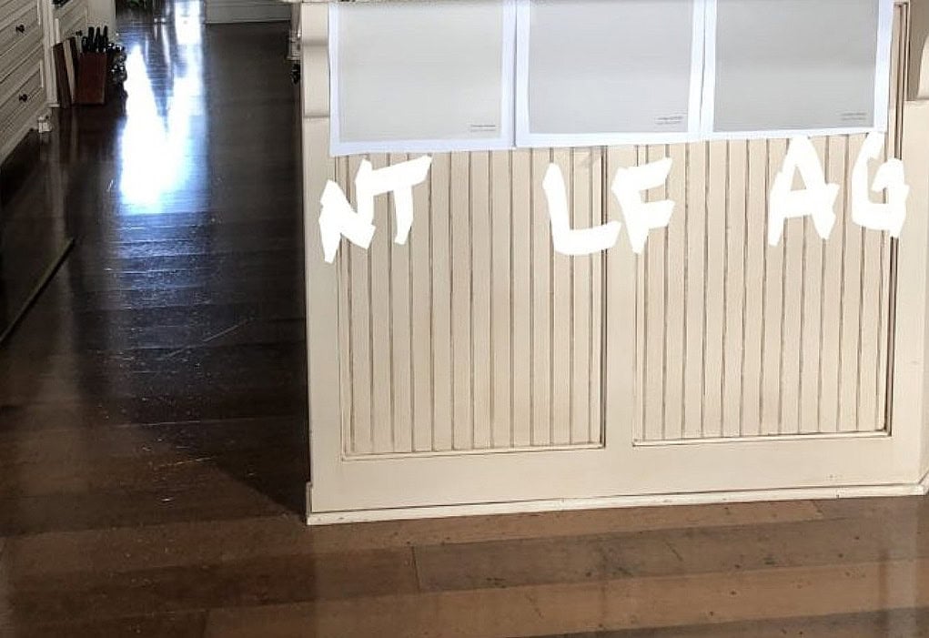
Sherwin Williams Natural Tan, Benjamin Moore London Fog, and Agreeable Gray
This means that while some beiges and tans, like Sherwin Williams Accessible Beige and Natural Tan, can look in a ‘whole home palette’ with Agreeable Gray, they (and darker beiges) don’t always want to be right next to A.G.
4. SHERWIN WILLIAMS COMFORT GRAY 6205
COME TO MOMMA, I friggin’ love this color. Even though my home doesn’t suit a color like this, I’m still obsessed.
There are many shades similar to Comfort Gray that look equally gorgeous with Agreeable Gray, including these…
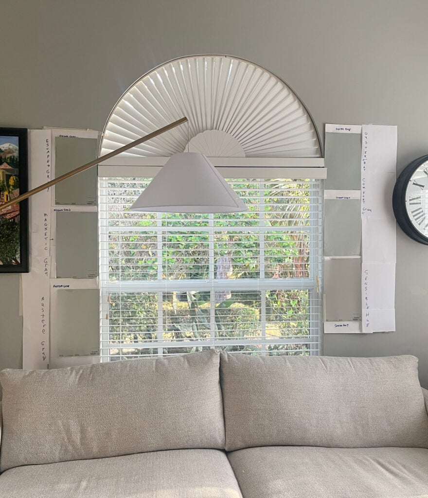
SW Escape Gray | SW Magnetic Gray | SW Austere Gray | SW Oyster Bay | SW Sensible Hue
Comfort Gray is a light-medium green-gray that tends to lean toward green-blue. This offers a kind of coastal vibe without looking too kitschy.
Sherwin Williams Comfort Gray Color Review
5. SHERWIN WILLIAMS SUNBLEACHED
Sunbleached is a newish color from Sherwin Williams Emerald Designer Collection. It has an LRV of 75, so it sits nicely in the off-white range and can be a pretty color in a palette with Agreeable Gray.
Here’s your Peel & Stick sample of Sunbleached…

Between warm gray, taupe, and greige, Sunbleached is most likely to cater to a mild taupe without being remotely colorful (it has a very low chroma).
SIMILAR COLORS TO COMPARE: I would definitely throw Sherwin Williams Mortar in the mix (coming up shortly), which has a bit less tendency towards taupe. Heron Plume is another to compare, as it’s a bit cooler than Sunbleached.
6. SHERWIN WILLIAMS SILVER STRAND 7057
Silver Strand is one of the (few) more colorful, lighter options that go well with Agreeable Gray. As mentioned earlier, you’ll find that A.G. struggles with lighter colors that have too much color (chroma).
Silver Strand is a blue-green-gray blend that really flexes its colorful muscles, often catering to blue over green or gray. Its LRV of 59 puts it pretty on par with A.G.s.
However, I’d only use Silver Strand if the room you’re using it in is a bit darker. If it’s too light, it won’t settle as well with Agreeable Gray. Or, try the slightly darker Sherwin Williams Argos.
Sherwin Williams Silver Strand Color Review
7. SHERWIN WILLIAMS SENSIBLE HUE
Sensible Hue is a light-medium, uber stormy gray with a green backdrop that can look a bit cool vs. warm. As for depth, its LRV is 46,

When a color is stormy, it has a heaviness to it (it’s a good thing, as it can be quite grounding). This makes it far less fresh than some lighter grays, but not as weighty as the medium-depths.
The Best Green-Gray Paint Colors
If you’re wondering why there aren’t more blue paint colors, don’t get your titties in a tussle – they’re coming up shortly. Blue doesn’t really start vibing with Agreeable Gray until the SOLID medium-depths or darker.
8. SHERWIN WILLIAMS MORTAR 9584
If you love the looks of Sunbleached, you’ll probably love Mortar too.
Mortar has an LRV of 74, so it’s a touch darker (fractionally) than Sunbleached (75). You’ll also find it a wink grayer. While these are all subtle shifts, maybe you like Mortar more in a warmer, sun-drenched south-facing room and Sunbleached more in your cooler north-facing room!
Here’s your Peel & Stick sample of Mortar…
The Best Warm Off-White Paint Colors
7 MEDIUM-DEPTH COLORS THAT GO WITH AGREEABLE GRAY
Medium-depth colors have LRVs between 20 and 40 (approximately). While you might need a darker shade like these for your walls (if you have Agreeable Gray cabinets or trims), or an adjoining room, most people want a slightly darker color for…
- Kitchen cabinets
- A kitchen island
- An accent wall
- Exterior trim
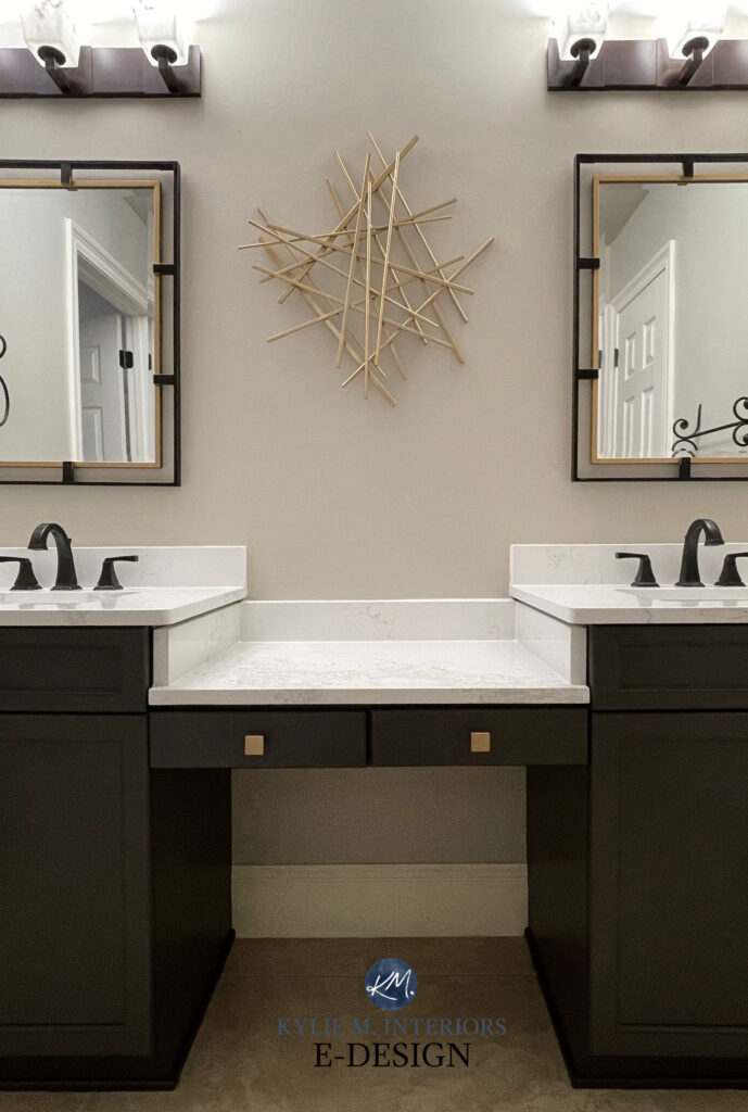
Agreeable Gray cabinets, White Dove walls, Sherwin Williams Urbane Bronze island (coming in the DARK section).
Regardless, I’ve gotchu, boo…
1. SHERWIN WILLIAMS DORIAN GRAY 7017
Dorian Gray is a muddy, murky, warm gray – and I say that like it’s a good thing because it is! Dorian Gray’s mood is similar to Agreeable Gray’s, making them great partners.
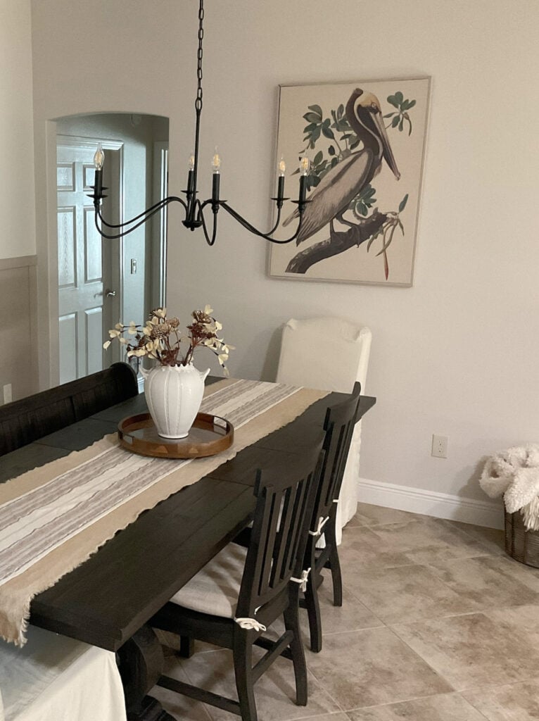
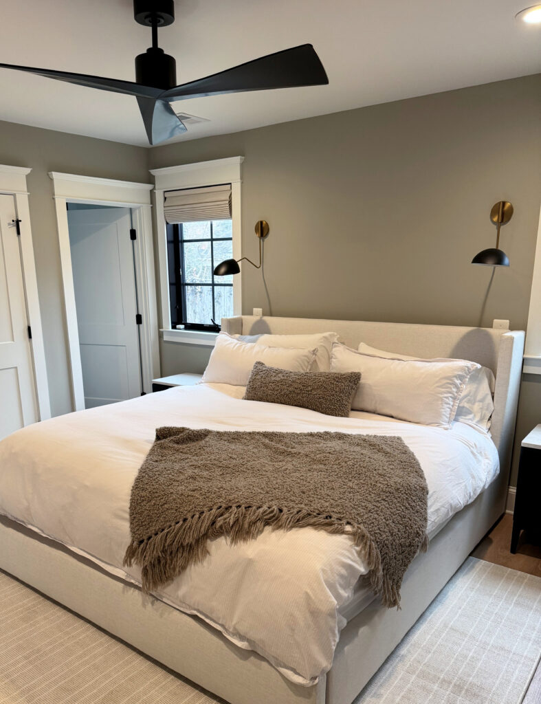
The headboard in this bedroom (below) has a similar look to A.G. with the accent wall in Dorian Gray…
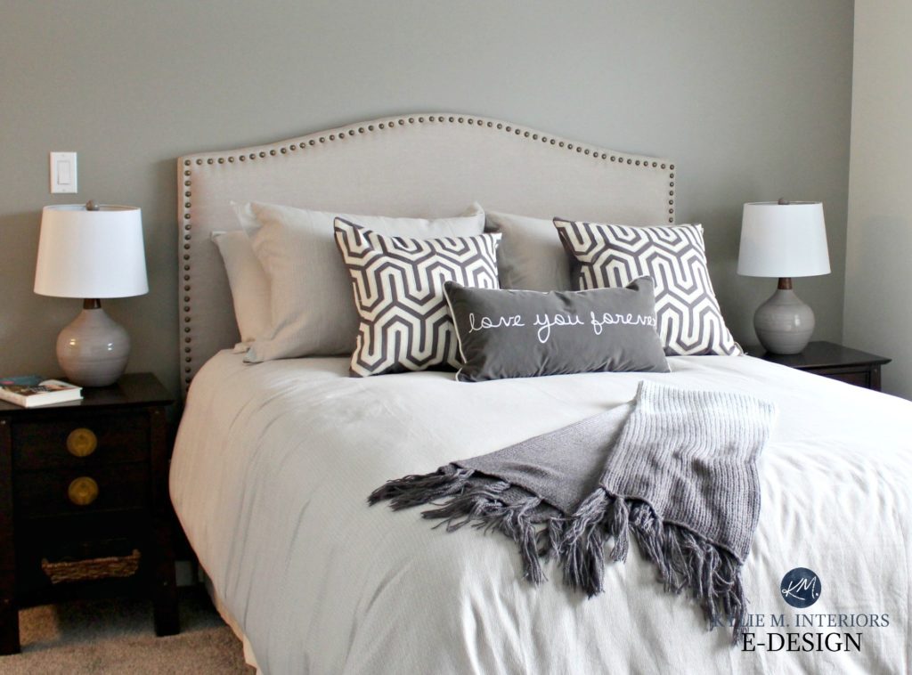
Dorian Gray has an LRV of 39 and undertones that can shift between purple and green.
Sherwin Williams Dorian Gray Color Review
SIMILAR COLORS TO COMPARE: Sherwin Williams Pussywillow, Pavestone, and Dovetail, which is a good shade darker (coming up).
Remember, just because I don’t have a color listed here, doesn’t mean it won’t work. While these are some of my favorites, there are MANY more gorgeous shades out there!
2. SHERWIN WILLIAMS TIN LIZZIE 9163
Tin Lizzie is a skookum, solid medium-depth shade of gray with a green-blue undertone. While it’s not technically ‘blue’, this type of green can lean that way a bit, while rarely abandoning green.
While these next walls are painted Benjamin Moore Ballet White, Agreeable Gray walls would look just as gorgeous with these Tin Lizzie front doors…

The Best Paint Colors for the INSIDE of Your Front Door
As for depth, its LRV of 30 sits smack dab in the middle of medium-depths ample bosom, ready for your accent wall, cabinets, or otherwise.
SIMILAR COLORS TO COMPARE: There are a bunch, but I’d start with Sherwin Williams Gray Matters for a bit more softness and Illusive Green for a bit more color.
3. SHERWIN WILLIAMS CORNWALL SLATE 9131
While Sherwin Williams Evergreen Fog seems to get all the attention, PERSONALLY, I’m obsessed with Cornwall Slate.
How to Update Older Granite Countertops Without Replacing Them
Cornwall Slate is a medium green (LRV 29). It’s definitely green, but it’s far more muted and organic than some of the bolder shades.
SIMILAR COLORS TO COMPARE: If you love how Cornwall Slate looks, it’s important to sample and compare similar shades, including: Sherwin Williams Evergreen Fog, which offers a bit more color, Sherwin Williams Rare Gray, which is a bit lighter, & Honed Soapstone, which offers a beautiful warmth.
The Best Green-Gray Paint Colors from Sherwin Williams
4. SHERWIN WILLIAMS DOVETAIL 7018
Dovetail is undoubtedly one of Sherwin Williams most popular warm gray paint colors. It’s also a gorgeous partner to Agreeable Gray walls, siding, or cabinets.
Here’s Dovetail on a kitchen island with A.G walls…
Dovetail is great as an accent wall, front door color, on a kitchen island, and much more.
Sherwin Williams Dovetail Color Review
SIMILAR COLORS TO COMPARE: Comparing similar shades is the best way to find your PERFECT paint color. Be sure to check out: Sherwin Williams Gauntlet Gray (coming up shortly), which is a shade darker than Dovetail & Sherwin Williams Porpoise, which is warmer and has more green in its undercarriage.
Get the best paint color advice with Kylie M’s Online Color Consulting
5. SHERWIN WILLIAMS MINERAL DEPOSIT
There’s nothing like a beautifully moody gray blend with Agreeable Gray. These moody grays have either green undertones or a blue-green blend, like Mineral Deposit.
Mineral Deposit has an LRV of 43, making it a subtly effective accent to Agreeable Gray. Great for a feature wall, front door, or whatever else you might need.
SIMILAR COLORS TO COMPARE: If you love how Mineral Deposit looks, compare it to Sherwin Williams Gris for a bit more stormy depth. I also love Unusual Gray, which leans a bit more into green.
The Best Light to Medium Gray-Blue Paint Colors
6. SHERWIN WILLIAMS CADET 9143
Cadet is a beautifully stormy blue-gray blend. This depth is where blue really starts to come into its own as a good partner for Agreeable Gray.

Cadet (left) and the previously mentioned, Tin Lizzie (right), to coordinate with dark wood trim
Cadet has an LRV of 31, so it’s smack dab in the middle of the medium-depths. It also has a great blue-gray blend that doesn’t lean too much toward either shade.
The Best Light to Medium Gray-Blue Paint Colors
7. SHERWIN WILLIAMS RETREAT
Retreat is a medium-depth blend of green-blue, with a healthy dollop of gray to calm it down.

Sherwin Williams Retreat Color Review
SIMILAR COLORS TO COMPARE: I just about chose Sherwin Williams Acacia Haze, which is a bit lighter, but went for Retreat instead. Evergreen Fog is pretty, too, but sometimes it comes off a wink too green.
DARK COLORS THAT GO WITH AGREEABLE GRAY: ACCENTS & MORE
If you’re looking for the perfect dark, moody paint color, along with helpful advice and slightly inappropriate remarks, you’ve come to the right place.
Seriously, there are so many wickedly gorgeous dark colors that coordinate with Agreeable Gray. Whether you need one for an accent wall, kitchen cabinets, or island, your front door, or otherwise, I’ve got some badass beauties for you to explore…
1. SHERWIN WILLIAMS CYBERSPACE 7076
Cyberspace is ridiculously pretty. It’s a super dark blend of gray and blue, bordering on blue-black in some lights.

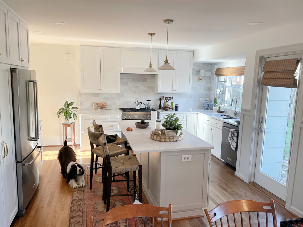
Pure White cabinets, Agreeable Gray walls, Cyberspace lower cabinets
Cyberspace is especially popular for kitchen islands, but also shows up on front doors (inside and outside) and accent walls.
Sherwin Williams Cyberspace Color Review
SIMILAR COLORS TO COMPARE: OH, you better look at Benjamin Moore Hale Navy, as it offers a bit more obvious blue hue. I also love Cheating Heart (coming up shortly).
2. SHERWIN WILLIAMS GAUNTLET GRAY 7019
Gauntlet Gray is one of Sherwin’s best darker gray paint colors. Being a warm gray, it nestles in snugly with Agreeable Gray’s passive warmth, without flashing obvious undertones.

In this next home, it’s easy to see how pretty Gauntlet Gray looks with its Agreeable Gray walls…

I’d love to see the side lights, and maybe even the entire door trim painted Gauntlet Gray, too.
Sherwin Williams Gauntlet Gray Color Review
3. SHERWIN WILLIAMS GRAYS HARBOR 6236
As for darker accent colors, Grays Harbor is one of my personal favorites. In the words of the late, Great Fat Bastard – this color is dead sexy. It’s a gorgeous melange of blue, green, and gray, all wrapped up in a moody depth.
Here’s your Peel & Stick sample of Grays Harbor…
Front door? Accent wall? Kitchen island? Adjoining room? You can fill ‘yer colorful little boots with this bad boy any day.
SIMILAR COLORS TO COMPARE: Please, check out Sherwin Williams Foggy Day, which is a bit lighter (I have it in my home and love it). For a less noticeable undertone, compare it with Sherwin Williams Web Gray, too.
4. SHERWIN WILLIAMS GRIZZLE GRAY 7068
Grizzle Gray is (in my not-so-humble opinion) one of Sherwin Williams best green-gray paint colors.

Many others lean more into green, whereas others (Roycroft Pewter) don’t grab enough. Grizzle Gray comes in with a noticeable, but not overwhelming green hue, calmed down by a strong dark gray base.
Paint Color Review of Grizzle Gray
COLORS TO COMPARE: Whether you want a little more green or less, check these out: Sherwin Williams Roycroft Pewter (for less green), Sherwin Williams Night Owl for a more noticeable green.
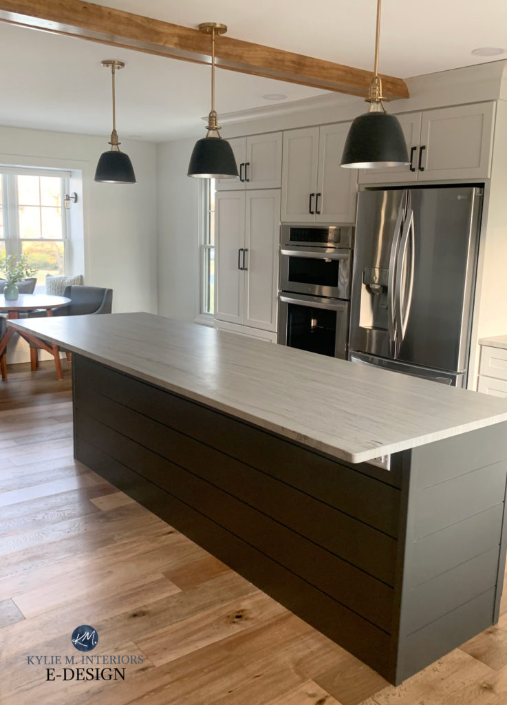
5. SHERWIN WILLIAMS URBANE BRONZE 7048
Holy hot balls, do I love this color or WHAT. In fact, I have it on my kitchen island and stair railings – it’s been there for 7 years and ain’t goin’ anywhere soon.

How to Update Your 2000s Staircase
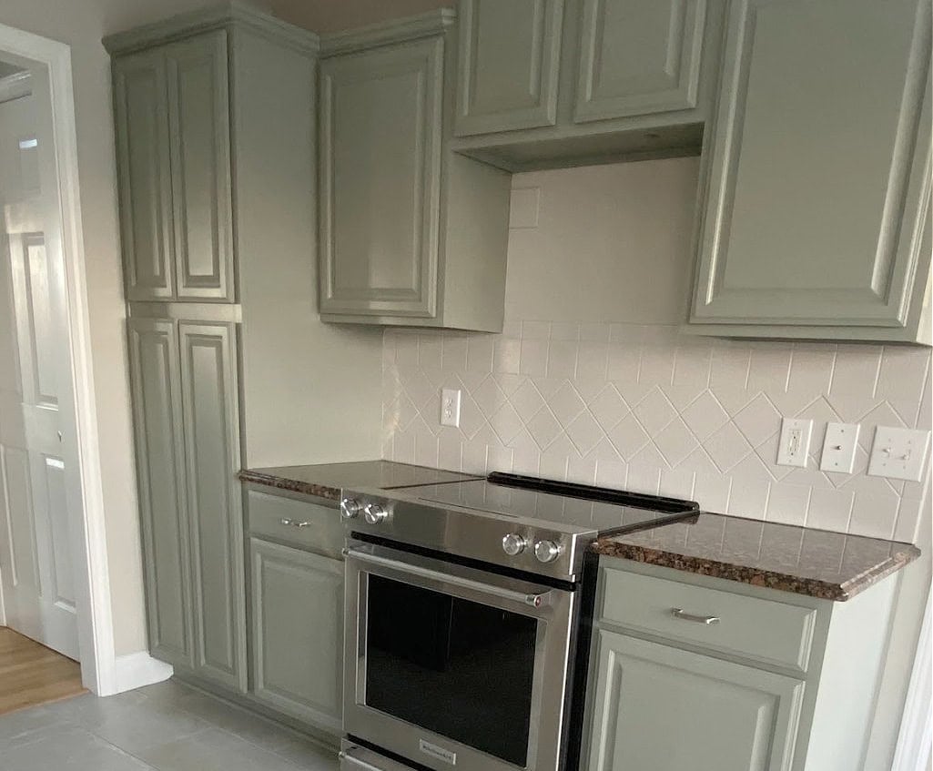
Urbane Bronze is a wickedly dark, greige paint color that can flash a warm, brownish green hue. This makes it a beautiful accent color with Agreeable Gray, whether for cabinets, trims, doors, etc.
While this next image is a bit misty, it’s easy to see how Urbane Bronze goes with the Agreeable Gray cabinets…
Sherwin Williams Urbane Bronze Color Review
SIMILAR COLORS TO COMPARE: While I could give you a list, including Porpoise and Dragon’s Breath, maybe you should read this instead: Urbane Bronze vs. 6 Popular Greige Paint Colors.
6. SHERWIN WILLIAMS IRON ORE 7069
While black has its place, more often than not, Iron Ore is a better choice, especially as an accent to Agreeable Gray.

Iron Ore is a soft shade of black with a gentle, sometimes hard-to-see, green undertone.
SIMILAR COLORS TO COMPARE: If you want a more genuine black contrast, check out Sherwin Williams Tricorn Black. If you prefer a blue undertone rather than green, Benjamin Moore Cheating Heart (next up) is badass and beautiful.
Sherwin Williams Iron Ore Color Review
7. BENJAMIN MOORE CHEATING HEART 1617
Again, I tried to keep it to just Sherwin Williams colors, but in some color groups, Benjamin kicks Sherwin’s arse.
Cheating Heart is like no other. This is a dark charcoal gray with a blue-black base. While it certainly nods at navy blue, it’s far darker and more grounded. This makes it a gorgeous accent color for Agreeable Gray and many other similar shades.

Cheating Heart office door with Benjamin Moore Pashmina walls
It shows up everywhere – on exterior doors, accent walls, kitchen cabinets, and even entire rooms…

COLORS TO COMPARE: If you love Cheating Heart as much as I do, compare it with Sherwin Williams Cyberspace, for a bit more blue hue. I also love Benjamin Moore’s Wrought Iron, which is darker and a bit more blue-black.
Benjamin Moore Cheating Heart Color Review
8. SHERWIN WILLIAMS PEWTER GREEN
Did I save the best for last? Maybe! Pewter Green is glooooriously, but not garulously green.

Great as an accent wall, on a kitchen island, or as a feature door, Pewter Green is a great way to add some personality to your home without going too far into the color world.
SIMILAR COLORS TO COMPARE: Oh, there’s more where that came from. Be sure to compare Pewter Green to Sherwin Williams Retreat for a lighter, less dense look. For a slightly more organic approach, Sherwin Williams Cast Iron is another one of my faves.
Sherwin Williams Pewter Green Color Review
A SUMMARY OF AGREEABLE GRAY & ITS BEST COLOR PAIRINGS
Let’s throw on our assless chaps and round this bad boy up (this summary is based on my extensive experience)…
- BEST WHITE TRIM COLOR FOR AGREEABLE GRAY: Sherwin Williams Pure White
- BEST DARK, MUTED ACCENT COLOR: Sherwin Williams Grizzle Gray
- BEST CABINET COLOR: Sherwin Williams Pure White
- BEST ISLAND COLOR: Sherwin Williams Urbane Bronze
- BEST GENERAL ACCENT COLORS: Dark green-grays, dark blue-grays, and dark greiges.
- BEST BLUE WITH AGREEABLE GRAY: Sherwin Williams Cadet or Foggy Day, both of which are blue-grays with green, too.
- BEST GREEN: Sherwin Williams Night Owl or Pewter Green
- BEST BEIGE WITH AGREEABLE GRAY: Sherwin Williams Aesthetic White. Sherwin Williams Accessible Beige, but not right next to each other.
READ MORE
The Best Medium to Dark Green Paint Colors: Sherwin Williams
The Best Darker Gray-Blue Paint Colors
Get the best paint color advice with Kylie M’s Online Color Consulting