
The 12 Best Off-White Neutral Paint Colors
Popular Warm Off-Whites: Benjamin Moore & Sherwin Williams
I get asked about off-whites ALL the time, the most common question being, ‘I was thinking of using this off-white paint color. Are there any sneaky undertones I should know about?’ You bet your booty there is!
Splashes of blue, touches of purple, hints of green, and even pink, off-whites are darn hard to choose. And whatever happened to the ease of builder beige anyway? Well, it looks like it’s BACK. Who’da thunk it.
Before we get into the guts n’ the glory, let’s talk about off-whites and why they’re such a bugger to choose. And if this is your first time on my blog, the Ginger likes to hear herself talk (or type). Consider yourself warned.
OFF-WHITE PAINT COLORS
Knowing where the cut-off is between white, off-white, and light-depth paint colors can be tricky if you aren’t familiar with LRV. Not sure what LRV is? You should read this blog post; it will become your best friend (or I will, one or the other).
While 60-70 is the magic LRV range for almost any room, the LRV range for off-whites is between 73-81 (approx).
In this range, you’ll find off-whites that are light and bright but will still show some contrast with standard white trim.
Off-white color = higher LRV = more light reflection. This means that if the light shining on your wall has a ‘color’ to it, your walls can pick up on that. For example…
- If you have a ton of green outside your window (grass/trees), your off-white walls might pick up a hint of green.
- If your porch floor is painted red or your neighbor has red siding, your off-white walls might look a tad pink as the red is reflected on your walls, and the high LRV of your walls reflects it.
And then there are exposures (north/south/east/west facing), which have their own quirks (don’t we all…) Add all these things together, along with the needs of your furnishings and your personal tastes – let’s just say that off-whites are tricky.
And THAT’S why we’re having our lil chat today.
I’ve pulled together some of my favorite off-whites that I suggest to my Online Color Consulting clients daily. These colors are relatively neutral, but that doesn’t mean they’re fool-proof (there are no fool-proof neutrals). It all depends on your home, exposure, furnishings, interior finishings, and, of COURSE, personal tastes, but they’ll at least get you started!

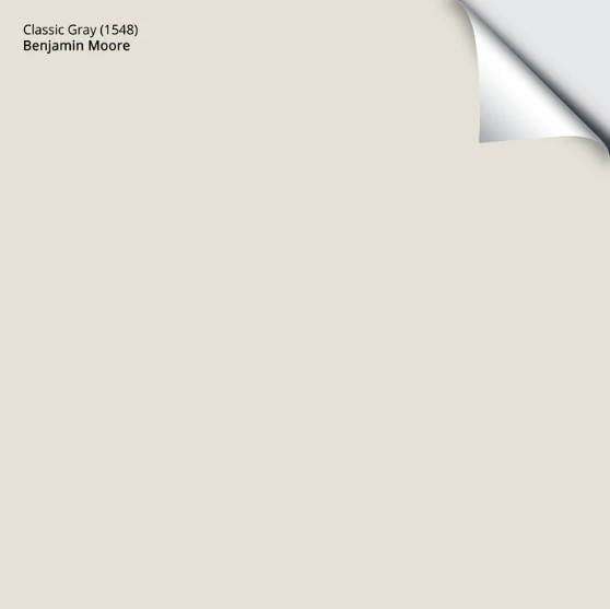
1. BENJAMIN MOORE CLASSIC GRAY OC-23
Classic Gray is a warm gray (quasi-taupe) in the off-white range. It’s on the edge of the off-white range, winking at the light depths. This means you’ll see a good degree of contrast if you choose a reasonably white color for your trim.
Any gray (even super warm ones like Classic Gray) will have blue, purple, green, or a mix of those undertones, and this one is no exception.
Classic Gray favors a very (very) mild purple-pink undertone. This undertone doesn’t always show up to the party, but it’s quite passive when it does.

And, as usual, I’m being anal (one of my redeeming qualities according to my husband). You might look at this color and think, ‘Good Lord, what IS she talking about – this color is NEUTRAL!’ It’s that subtle. I just don’t want you to be surprised once it’s on your walls.
WHY IS CLASSIC GRAY SUCH A POPULAR PAINT COLOR?
- Classic Gray has an LRV of almost 75, so it’s in the off-white range but has a bit more body than most.
- Classic Gray can look quite taupe in some lights and can easily be considered one (taupe being warmer than gray).
- While Classic Gray FAVORS gray, it never looks icy cold like traditional gray paint colors.
- With its subtle warmth, Classic Gray is MORE likely to last longer than some of the other gray paint colors.
- While gray flooring is no longer trendy, many are trying to warm up their gray wood floors and finishes. Classic Gray is often a gateway color for doing so.

Benjamin Moore Chantilly Lace is the white on the trims and wainscoting, Classic Gray walls
WHAT OFF-WHITE PAINT COLOURS ARE SIMILAR?
There’s a whole wiggedy-whack of colors that can be great alternatives to Classic Gray. Besides, you should never pick a color all on its lonesome – sample and compare to find your perfect shade.
- Sherwin Williams Egret White is equally as amazeballs and has a bit more body.
- If you need a bit more undertone, Sherwin Williams City Loft is gorgeous.
- Benjamin Moore Balboa Mist offers a bit more depth and undertone – it’s a super popular shade.
- For the best range, check out my CURATED WARM GRAY & TAUPE COLOR BUNDLE
Here’s your Peel & Stick sample of Classic Gray…
FULL Paint Colour Review: Benjamin Moore Classic Gray
2. SHERWIN WILLIAMS WHITE DUCK SW 7010
I LOVE White Duck, as it’s the perfect blend of cream with a SOLID tan/gray base to calm it down. If you like cream walls but don’t like yellow, White Duck could be the hybrid you’re looking for.
Having used this color in my brother’s house (not shown above), I’ve seen firsthand how it shifts from a beige-greige blend (but never definitively gray or beige) into a subdued, neutralized barely-there cream—mad love. I’ve also seen firsthand how lucky he is to have me in his life #truestory.
WHY IS WHITE DUCK A POPULAR OFF-WHITE PAINT COLOR?
- White Duck has an LRV of 74, so it’s on the border of off-white and light, offering CONTRAST with trim without the visual weight of darker colors.
- It’s great if you’re looking for a warm but not obviously beige, gray, or creamy neutral.
- Like Aesthetic White (coming shortly), it’s one of the few options with no obvious undertone to wrestle with. Even though White Duck can grab a wink of green, it’s fractional, at best, like my patience.
- It’s a great choice for a north, east, west, or south-facing room
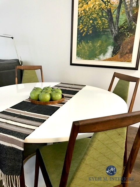
Check out White Duck in this two-story room. Compare how it looks on the end wall vs the walls on the left…

See a green undertone? That’s MORE about the light reflecting from outside than the color itself.
White Duck definitely speaks my love language.
COLORS TO COMPARE WITH WHITE DUCK
Sample and compare, always! Subtle changes in undertone, depth, or temperature can make one color perfect over another.
- Sherwin Williams Shoji White, which offers a subtle tweak in undertones, dropping the green.
- The ever-gorgeous and timeless Benjamin Moore Ballet White is a popular choice in this range.
- If your home suits a grayed-out beige vs. a grayed-out cream, check out Sherwin Williams Aesthetic White.
- ACTUALLY, check out this CURATED COLOR BUNDLE for a range of colors to sample and compare.
Here are a few of the above colors in a row…
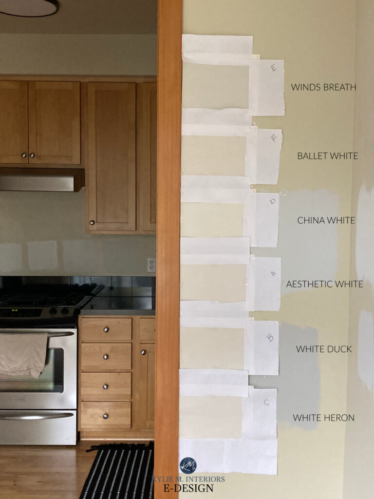
I’ll only link to the colors NOT mentioned on this page: BM Wind’s Breath | BM Ballet White | BM China White (#10 below) | SW Aesthetic White (#6 below) | SW White Heron (#9 below)
FULL Paint Colour Review of Sherwin Williams White Duck
3. BENJAMIN MOORE SILVER SATIN OC-26
Silver Satin is the grayest of the bunch and is a soft, slightly warm gray. And while it’s not my PERSONAL fave, it has a decent following due to its non-committal warmth. However, it also has a sneaky undertone to consider…

Remember, every gray will have an undertone, and Silver Satin favors a very slight purple hue. If you like the general look of Silver Satin but want your walls LIGHTER, Benjamin Moore Calm has a similar approach (and I get nervous about it for the same reason – not warm enough and a bit…too…purple.)
A BIT MORE ABOUT SILVER SATIN…
Let’s find out what makes this color tick…
- While some off-whites hover on the off-white and light boundary, Silver Satin’s LRV of 76 parks its butt firmly in the off-white range.
- Many interior finishes suit Silver Satin’s undertones, more so than grays with green or blue undertones.
- Silver Satin looks pretty with Sherwin Williams Pure White or Benjamin Moore Chantilly Lace on trim work – two HUGELY popular white paint colors.
- While some choose it for their cabinets, personally, it’s too light and purple (as shown below…)
The Best Off-White Cabinet Paint Colors
COLORS TO COMPARE…
- Sherwin Williams Toque White is just a touch warmer (like Silver Satin, I don’t refer to it often).
- Also, explore Eider White, which you’ll learn about shortly. However, I prefer the subtle approach of Silver Satin to BOTH of those paint colors.
- Also, check out Sherwin Williams Heron Plume – a bit different, but I like it a lot more (and it’s all about me, sooooo).
And just because I’m not a huge fan, doesn’t mean you can’t be – clearly other people love it, and not everybody has to humor the slightly manic Ginger.
Dunn Edward’s Faded Gray is very similar to Silver Satin.
FULL Paint Color Review of Silver Satin
4. SHERWIN WILLIAMS CREAMY SW 7012
Creamy is one of my favorite warm off-white paint colors that’s not beige or gray! However, if you’re looking for a legit shade of cream, this ain’t it.

BM Ballet White | SW Creamy | SW Steamed Milk | BM Simply White | SW Neutral Ground
Creamy tucks itself snugly between the buxom bosom of the off-white and creamy white worlds. It comes down to your perspective. I don’t treat Creamy as a ‘normal shade of white‘ because of its slightly lower LRV of 81 (82+ is my ideal LRV). This, combined with its subtle creamy (yellow) warmth, leaves it a bit too dark and heavy to act like white, and it isn’t nearly as flexible.
While I might hesitate to use Creamy on walls and trims (because of its LRV and undertones), it’s amazeballs for walls!
Regarding the cream world, I’ve had many clients say they love cream paint colors but don’t love yellow. This is where Creamy comes in REALLY handy!

The Best Paint Colors for Dark Wood Trim
When choosing a cream paint color, it’s important to note that cream IS yellow; it just has a neutral base to calm it down.
If you choose Creamy, its neutral base calms it down, leaving you with a more passive, muted warmth on your walls. It’s that anti-yellow for cream lovers.
Creamy walls with Sherwin Williams Alabaster cabinets
IS CREAMY A POPULAR OFF-WHITE?
Yes, Creamy is a hugely popular paint color, mostly because, like Frank’s Hot Sauce, people put that #!$&?! on everything – much to my chagrin. Again, using Creamy on cabinets and trims isn’t my favorite move (read below for an explanation), but you do you, boo.
- Creamy offers a soft warmth without a ton of color. Whereas some other popular shades of cream show up at the party with yellow tassels on, Creamy sneaks in the back door. In other words, Creamy has enough warmth to be warm, without being obnoxious.
- No matter your exposure, Creamy offers a subtle look, keeping in mind that it will pick up more warmth with southern or afternoon western sun.
- It’s beautiful on walls, but be careful when painting trims or cabinets Creamy unless your kitchen calls for it! If you have to use it on cabinets, that’s fine, but once it hits trims, you start limiting your wall color options, especially if it’s on a large scale throughout your home.
COLORS TO COMPARE WITH CREAMY
If you want to see some alternatives (smart move), here are a few of my favorites…
- If you’d like something with a wee wink more colour, check out Benjamin Moore Linen White and Timid White, which are beautiful shades of cream with a more noticeable warmth (while still being soft and subtle).
- If you want a lighter shade in the WHITE range, check out Sherwin Williams Alabaster or Dover White.
- I’ve also enjoyed Sherwin Williams Pearly White lately (coming up shortly), for a more grounded, passive warmth.
FULL Paint Colour Review of Sherwin Williams Creamy
5. SHERWIN WILLIAMS EIDER WHITE 7014
I didn’t pick this one—you guys did. That’s right; I have a secret master list that I refer to that shows me which colors are being purchased the MOST between Benjamin Moore, Sherwin Williams, and Farrow & Ball.
And while Eider White isn’t a favorite of mine, you all seem to like it, so let’s check it out!
Eider White looks surprisingly warm on these cabinets and less purple than usual.
Eider White is an off-white neutral paint color that’s a warm gray with a purple undertone. This same undertone can be found in a few other colors on this page, but in Eider White, it shows up WARMER. Eider White could be awesome if you love purple and are excited to see it pop up. However, better options exist if you’re a bit sensitive to the P word.
Here’s your Peel & Stick sample of Eider White…

That’s why it makes me nervous. I would NEVER put it on cabinets and trims and would only suggest it for walls when it’s the only color that makes sense for the surrounding finishes and homeowners’ tastes.
- Eider White looks best with a simple white trim like Sherwin Williams High Reflective White or Benjamin Moore Chantilly Lace. Alternatively, you can paint your walls and trim the same color, which can make the violet undertone seem a bit more subtle.
COLORS THAT ARE SIMILAR TO EIDER WHITE
I’d DEFINITELY do some comparisons when it comes to this bad boy. That undertone you might not have noticed could all of a sudden look more obvious compared to a more muted shade.
- Benjamin Moore Silver Satin (#3) is a great one to compare – similar vibe, for sure.
- If you love Eider White (I forgive you) and want a touch more warmth, check out Sherwin Williams Incredible White.
- For a softer, warmer look with less noticeable taupe undertones, Sherwin Williams Heron Plume is a stunner.
FULL Paint Color Review of Sherwin Williams Eider White

Click HERE or on the above image to see the available packages!
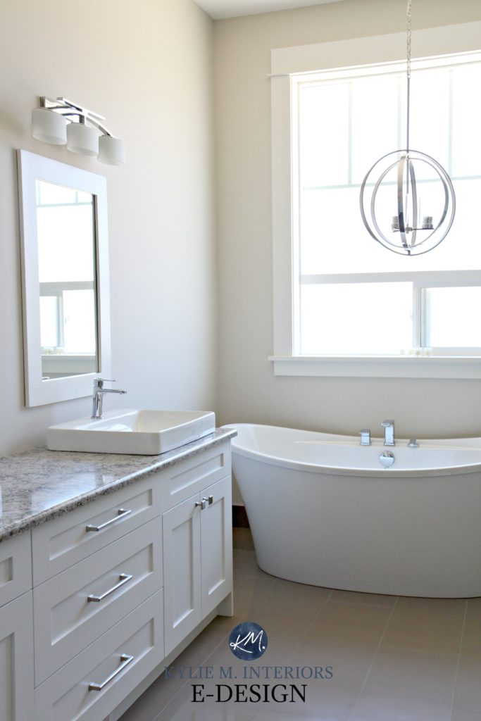
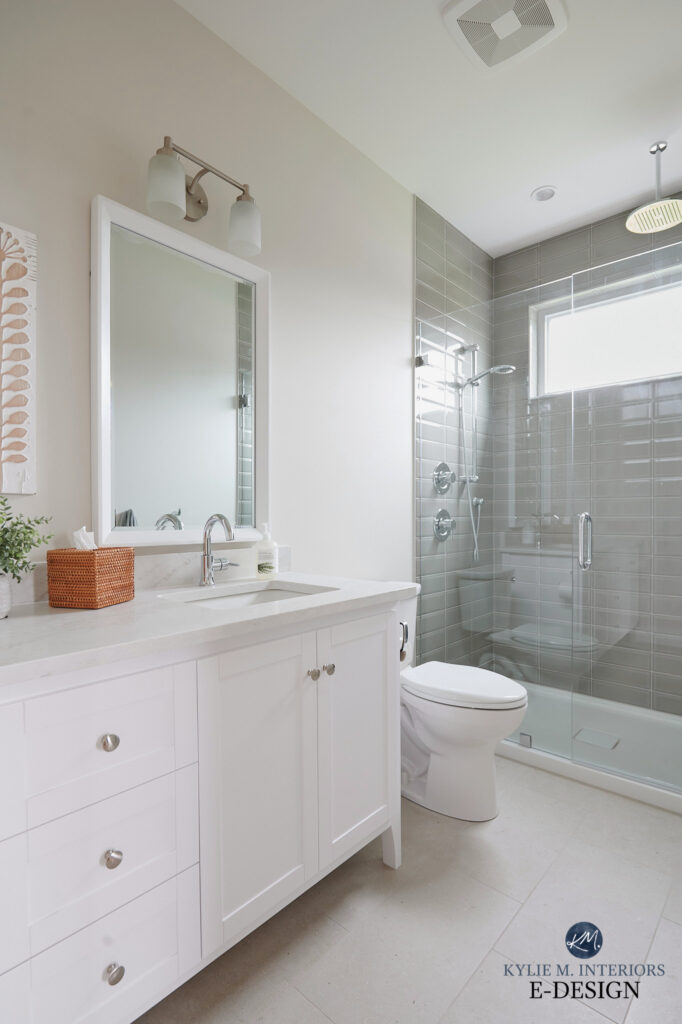
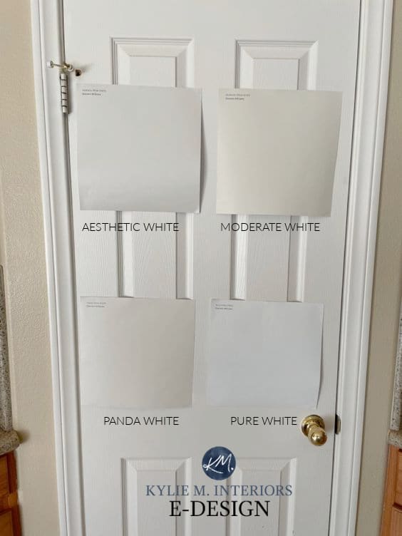
6. SHERWIN WILLIAMS AESTHETIC WHITE 7035
Aesthetic White is a soft, light beige in the off-white range, but it’s not just any old beige. Many popular beige paint colors have a slightly golden, yellow-orange undertone. Aesthetic White does have some warmth, but it’s nicely subdued by a wink o’ gray, which, like my underarm odor, is surprisingly strong at times!
This bathroom (below) is a great example of Aesthetic White in action (east-facing light)…
Subscribe to my YOUTUBE channel for more great Kylie M. content!

A BIT MORE ABOUT AESTHETIC WHITE
- Aesthetic White has an LRV of 73, so it’s another on-the-border colour, but I still find that it gives a fab off-white look with no obvious green/purple/blue/colour in it
- It looks beautiful with Sherwin Williams Pure White on trim work
- It’s nice for a north-facing room for a neutral but not particularly warm or cold look
- With the way trends are leaning, Aesthetic White is set to be a VERY popular paint colour
Here’s a good shot showing Aesthetic White with a few other off-whites (and Sherwin Williams Pure White)…
Sherwin Williams Aesthetic White: Paint Color Review
If you love Aesthetic White, I recommend comparing it to this range of paint colors.
7. SHERWIN WILLIAMS MODERATE WHITE 6140
With trends leaning warmer, expect more of this beautiful beige coming your way! Moderate White is an off-white beige with a gentle orange undertone, popular in homes with abundant beige finishes, including carpet, tiles, and countertops.
WHY WILL MODERATE WHITE BE POPULAR IN THE COMING DAYS?
- Trends are leaning warmer, away from gray, and closer to the beige end.
- Moderate White has muted undertones that suit a WIDE range of interior finishes.
- It’s a MODERN take on the heavy, rich beiges from the early 2000s (learn how to update your 2000s home).
- The BEST trim color for Moderate White is a lighter version of itself. Ask your paint store to make sample pots 50% and 75% lighter – see which contrast you like best.

Ideas to Update Your 1990s Home
Sherwin Williams Moderate White: Paint Colour Review
WHAT COLORS ARE SIMILAR TO MODERATE WHITE?
While it’s a short list, it’s a good one…
- Benjamin Moore Maritime White is amazeballs
- Sherwin Williams Divine White is a great comparable
- I would also check out Sherwin Williams Kestrel White

SW River’s Edge | SW Maritime White | SW Moderate White (even though it says River’s Edge) | SW Divine White | BM Cedar Key
Thank you to my Online Color clients, readers, and friends for sending your photos in – you make my colorful world go around!
8. SHERWIN WILLIAMS PEARLY WHITE 7009
If you’re looking for a super subtle approach to cream and are okay with a little ‘dirt’ in your color, Pearly White could hit the spot.

I mean, to say it’s cream is a stretch of the imagination, but the type of warmth it hides can wink this way.
Pearly White has a ton of gray and a touch of an ALMOST tan-beige, but tends to read like a super dirty cream (definitely X-rated).

The Best Paint Colors for the INSIDE of Your Front Door
MORE ABOUT PEARLY WHITE
If your pearly whites are the same color as Pearly White, you’re in a world of trouble – BRUSH YOUR TEETH!
- Pearly White is an off-white, in the middle of the range. It won’t get mistaken for white, but it offers a low contrast with white trim.
- Not only is Pearly White popular on walls, it’s hot on cabinets and exteriors, too.

Pearly White walls with my favorite warm white cabinet and trim color.
COLORS TO COMPARE WITH PEARLY WHITE
- For a bit more noticeable warmth and depth, check out Sherwin Williams Shoji White
- Sherwin-Williams Origami White is quite similar, offering a touch more gray-taupe.
- Benjamin Moore Dove Wing has a bit more warmth and energy but a similar vibe.
- If Pearly White falls too flat and gray for your painting project, you might shift to Sherwin Williams Creamy.
Sherwin Williams Pearly White: IMAGES, Info, & More
9. SHERWIN WILLIAMS WHITE HERON
White Heron is an off-white that’s a real color ninja, flexing its way into a wide variety of homes. This is because White Heron isn’t super committed to a particular neutral and can pick up a slight taupe (pinkish) look and even lean into cream without looking YELLOW like traditional cream paint colors do.
This next image (mid-project) shows White Heron’s crazy flexibility and slightly higher LRV of 76…

While these aren’t all off-white, they’re still gorgeous: SW Egret White | BM Edgecomb Gray | SW Modern Gray
In the above photo, notice how White Heron looks a bit creamy compared to the taupe of Egret White, as well as Edgecomb Gray.
In this next photo, it’s easier to see some of its pink hue…

WILL WHITE HERON BE A POPULAR COLOR?
While White Heron has the potential to be a top shade, its subtle pink undertone will likely hold it back. This isn’t to say it won’t be perfect for YOUR home, but when my Online Paint Color Consulting clients ask for flexible, warm neutrals, they often try to avoid pink.
Just keep in mind…
- White Heron is bright enough to be used in a dark hallway or room
- With its unique blend of undertones, White Heron is SUPER versatile and can suit some trickier surfaces – GIVE IT A TRY!
- White Heron looks beautiful with a simpler approach to white trim or cabinets, something like Sherwin Williams Pure White or Extra White
FULL Paint Color Review of Sherwin Williams White Heron
10. BENJAMIN MOORE CHINA WHITE (SEA PEARL)
China White, also known as Sea Pearl, is a color I’m just starting to spend more time with.
Why?
With trends leaning warmer by the day, I need more colors in my toolbelt, and China White is quite handy!
I LOVE its passive, non-committal warmth!
China White (Sea Pearl) is an off-white kind of creamy tan/beige with THE most muted undertones. This could be a great color for you if you’re not a fan of overt yellow, orange, green, or pink hues. Just remember that the less a color commits to an undertone, the more likely it is to pick up others via its environment, your light bulbs, or the room’s exposure. This gorgeous off-white has an LRV of 76.43, so it’s a touch lighter than some on this page but still well within the off-white range (NOWHERE near ‘white.’)
If you want a nice white trim color for China White/Sea Pearl, check out Benjamin Moore Chantilly Lace.

This room is color-drenched (color-washed) with Sea Pearl on the walls, trims, and doors.
WHAT COLORS ARE SIMILAR TO CHINA WHITE/SEA PEARL?
- I would compare it to Sherwin Williams Aesthetic White, which was mentioned earlier.
- Sherwin Williams’s Origami White is another interesting one.
11. SHERWIN WILLIAMS SHOJI WHITE 7042
Shoji White is HUGELY popular right now on walls, cabinets, and even exteriors. What makes it such a hot choice?
Many interior finishes love a color with a touch (or more) of a pink undertone. And while Shoji White’s undertone can be incredibly passive, this wink of color often satisfies these finishes without scaring off the homeowners.
Before, these glazed cabinets looked worn out and dated and a touch too creamy for the backsplash…

After, Shoji White cleans things up while still humoring the finishes’ undertones (not every kitchen suits white cabinets!)…

COLORS THAT ARE SIMILAR
If you’re exploring Shoji White, I highly recommend sampling and comparing…
- Sherwin Williams White Duck
- Benjamin Moore Ballet White
- Sherwin Williams Aesthetic White
Here’s an awesome image of some good comparison, including many colors I’ve already mentioned!

I’ll only link to the ones NOT already mentioned on this page. Aesthetic White (#6 previous mention) | SW Heron Plume | SW Pure White | SW Pearly White (#8) | SW White Heron (#9) | SW Origami White
12. SHERWIN WILLIAMS DRIFT OF MIST
Drift of Mist is a touch darker than regular off-whites – more in the higher end of the light range. But there are few colors like this that also happen to be popular/usable, so I wanted to toss it in.
Personally, I’m not a fan, but y’all seem to like it!
MORE ABOUT DRIFT OF MIST
- Drift of Mist has an LRV of 69, so it winks provocatively at the off-white world without committing to a relationship.
- While it comes off like a smoky, stormy, slightly warm gray, a) it can lean surprisingly warm, and b) a green undertone can flash up (super subtle and not common, but be careful if you put this color with finishes that prefer a noted purple-pink/taupe undertone).

This kind of backsplash makes me twitchy (as it’s pretty but very faaaar from timeless), but overall, this kitchen is pretty!
COLORS TO COMPARE WITH DRIFT OF MIST
- Add a bit more depth and body with the gorgeous, Sherwin Williams Gossamer Veil.
- If the idea of a vague green undertone makes you twitchy, shift to Sherwin Williams City Loft or Egret White.
Sherwin Williams Drift of Mist: IMAGES, Info, & More
READ MORE
The 8 Best Warm Neutral Paint Colors With NO YELLOW UNDERTONE
Sherwin Williams Origami White: Paint Color Review
The 12 Best WHOLE HOME Gray and Greige Paint Colours
Paint Colour Review of Sherwin Williams Egret White
The 8 Best WHOLE HOME Warm Neutral Paint Colours
Need Kylie’s help?

Check out my Expert Paint Color Consulting Packages!

First published in 2019, awesomely updated in 2025


Your last comment about. SW creamy left me curious. Why do you not recommend on cabinets?
Hi Angela! Well, it’s not that it doesn’t look PRETTY (as I LOVE Creamy), but it’s not as versatile as some other white/off-whites. It works in the odd space, but in the ideal world, the trim/cabinets/ceilings/doors in this white/off-white range would be the same colour. Creamy is a tricky one on trim/cabinets as it doesn’t partner up quite as easily with wall colour options (because of the creamy/yellow in it), it’s not quite as versatile as the likes of BM White Dove, SW Alabaster and BM Cloud White. So it’s not that it’s BAD, it can just be limiting for other choices 🙂
Thank you for asking!
~Kylie
Thanks for your reply! I’m starting to research white paint for kitchen cabinets so appreciate your feedback on Creamy. I have SW Alabaster trim throughout.
I’m a non designer – home owner / design enthusiast here and just came across this blog when trying to search for a comparison with some off whites (because I’m
having a heck of a time choosing a color for my mantle now that I had tile installed in the surround that I think I’m about to regret).
The last designer I used (NOT Kylie) insisted that I’d love Creamy on my interior doors and trim despite me not feelin’ it. I was told that it was her ‘go to’ for trim
and that once it was up, she was sure that I’d love it. I second guessed myself and trusted her expertise and hated it. Friends that came over said it looked dingy in natural light and they were right. It IS light and may appear white but it just never really looked clean and fresh…it reminded me of trim and doors that needed to be freshly painted despite them being newly painted.
This time around, we just had our home painted with SW Aesthetic White and chose SW Pure White for the doors and trim (I went with flat, ceiling white on the ceilings) and I LOOOOVE it so much more!!! Ironically, I was ‘this close’ to going with Shoji White instead. I can’t recall why I went with Aesthetic White but I honestly don’t think I could have gone wrong with either one. I totally agree with Kylie to never use Creamy on trim, doors or cabinets though! It’ll appear like an ageing white. – and not in a good way.
Hi Christina! I’m sorry you had that experience, and I can absolutely imagine how tricky/disappointing it was for you. Pure White is definitely MUCH easier to work around and coordinate with! Thanks for sending a note as it’s comments like yours that help others make up their minds too!
As always, thanks for a fabulous review, and timely for me, because I am returning to whites over some grays. I have mad love (as you would say) for classic gray and dying to try. However, I am intrigued by what you say about Aesthetic White, and ironically enough, I just ordered a big color swatch of that from my local SW store. Question….the way you describe Aesthetic White…except for the beige part, it sounds a bit like BM White Dove. Is it? Or what might be the difference there? That’s another color I want to try using.
Love your blog! We are trying to decide on a color for our custom made kitchen cabinets. It’s betwee Sherwin Williams Extra White and Sherwin Williams Pure White. Do you think Extra White is always too bright?
SW Simply White was recommended to me by a professional for kitchen cabinets. Paired with White Dove for walls. It’s beautiful together!
I would love to see that combo
Hi Kylie!
I also enjoy reading your posts!
This will probably seem so off base today because everything leans the opposite, but are there any off-white neutral colors that you have used that have green undertones that you would recommend? I know you mentioned SW7014 Eider White, but I’m talking maybe something on SW strip #258 (ex. Nuance, Moderne White, Ethereal White, Frosty White, etc.).
I’m asking for those of us that have major dislike of pink, purple and/or red undertones, and have major issues with those undertones coming through due to the natural lighting, etc. I’m at a loss due to the lighting in my main entry – everything I’ve tried that is beige, greige, or grey has the pink, red, purple come out – it faces mainly North & partly West. So I’m thinking of trying to combat it with a green undertone – but not like Revere Pewter, that just doesn’t have enough green undertone. And not BM Grey Owl – again, not enough green, as it starts to have purple come out for me in that entry area. But yet something still light & fresh.
Honestly, I discovered through SW paint samples, that the more Raw Umber the paint formula has, the more I have issues with those undertones I dislike. I think I’ve tried just about every color you mentioned above (other than Eider White) – so I think I need to swing into green undertones. Just don’t want an ugly, muddy army-like green either. Is it possible to have a green undertone and still look in style, fresh & good with SW Pure White? Is there one that will also look good in a South Facing room too, as my entry connects to the family room that faces the south. So I need a balance to balance the green, so that it doesn’t look gold when the sun hits in the family room.
Am I the only one that is looking for a green undertone?
I used Shoji White in our West-facing foyer with Pure White trim and it has the tiniest hint of green. It looks great with Pure White for a little bit of contrast. We have Colonnade Gray throughout the rest of the open floor plan house and Shoji coordinates nicely. It’s nice and bright for the entry but doesn’t call too much attention to itself. I’d recommend giving it a try!
Christy, I totally feel your frustration! Every green-gray I’ve tried in the 70-75 lrv range flashes pink (boo) when I’d rather it flash green or a green that flashes gray (yay) which I’d be totally fine with since my countertops are a green-gray, off- white granite. Changed my lighting to daylight bulbs throughout an open floor plan and changed trim from BM white dove to SW Alabaster then painted entry, kitchen, dining room and hallway in BM Revere Pewter lrv 55 (mixed at BM) thinking it would hold truer to a green-gray. It mostly does except in the kitchen where the lighting is the brightest, it still flashes pink at certain times of the day and in the hallway and entry where there is less light RP is too muddy. Thinking BM Edgecomb in the hall and family room which is also low light? Or, starting over and trying SW Jogging Path and SW Grecian Ivory- maybe they wouldn’t flash pink?
BM Moonshine, definitely. It’s a lovely gray-green.
I so enjoy your reviews, Kylie. Please keep up the good work you’re doing. Cheers!
Best post–EVER! I love Creamy White and now I have a new favorite–White Duck or may be Aesthetic White? The White Duck with the Edgecomb Gray is beautiful. My house came with Dover White on all walls, and I hate it. To me, it is so yellow looking, and I have northern exposure throughout. Might be time to paint. Thanks so much KM.
Thanks for the ‘whites’ education. We are starting with a blank slate. I think I’m going with SW Alabaster cabinets and trim. Would White Duck walls go with Alabaster trim?
Hi Lisa, yes, that could be quite pretty!
Hi Kylie!
I loved this post. I got so much going on that choosing a white, off-white, neutral is DAUNTING! I have floor to ceiling windows on both north and east facing walls. Light comes in and hits one LARGE wall. BUT, honey floors and kitchen cabinets (open concept living/dining/kitchen); and beautiful greenery outside (with distant ocean views…no neighbors) are driving me crazy.
OBJECTIVE: warm/cozy/inviting. I painted samples of Benjamin Moore’s White Dove and Simply White. So many blogs, articles, painters, etc., but I don’t know what to do? Can you give me guidance? I want the trim and walls to be the same color so the view is the standout. I won’t have too many bold pieces in home. Only a blue/grayish velvet sofa. Everything else is either wood/neutral tones.
If it were ME, and I had to choose 1 of my FAVE whites…I’d hit White Dove, or for a bit more warm/cozy – SW Alabaster, as you do have the northern light and White Dove can only work SO hard… 🙂
Hi Kylie, What color trim would you suggest to compliment the SW White Duck walls? I have been looking everywhere but haven’t been able to find much.
Thank you!
Hi Jenn, take a look at BM White Dove, it could be quite lovely!
We used Wider White in our new home in several rooms to complement Light French Gray which we Love!! EW pulls a Rose/Pink undertones!! Awful looking- now have to repaint. Any suggestions? We have dark Floors with our trim in BM Decorators White.
Hi Todd, thank you for your note! I actually have an E-design service just for this! I try to give as much complimentary as I can on my website, but if that doesn’t work you may enjoy sending me photos and getting me to spend some time with your home! https://www.kylieminteriors.ca/online-decorating-design-services/
~Kylie
Hello Kylie Thank you for the insight and knowledge you have been sharing with us. I am looking to paint the interior in an off white color . My trim is BM white dove and so are my kitchen cabinets. Mi have warm wood floors I have sampled Shoji and Natural Chouce, and Natural Ground.
Looking for something neutral that isn’t gray or beige. I guess you call that griege. I’ve been reading all your posts but haven’t seen you mention natural choice or natural ground. You seem to really like white duck Can you provide insight?
Thank you
I am reading and rereading all your info about colors. The insight you give about undertones and room exposures is so helpful. We are building and I’m having to pick colors before we even have drywall. Painting sample boards this week to take and view in the rooms. I feel like I’m on track with my choices. Only have one question – my builder uses SW Snowbound for all doors and trim. I haven’t been able to find any mention of this for a trim color. It looks a bit dingy to me. Hoping I’ll love it. Any comments about that color? Leaning towards White Duck for the master bed and warm gray/Greige for our main living spaces (northern exposure in most rooms with LARGE windows). Thanks for all the info you share!
Hmmmm, is there any way you can ask him to NOT use Snowbound? It’s a soft, warm gray that can pick up a pink/purple undertone which would NOT be so hot with warmer colours like White Duck (which is fab btw). I would much rather see you in SW Pure White which is more simple and flexible. I can’t see it being a big deal for him to switch up. I mean, he might save money buying it in HUGE bulk, but in the end, it’s you who’s paying for it and I wouldn’t do it… 🙂 Or if you have to have it, I might look at softer greige, warm gray and cool gray colours 🙂
I can’t say Thank You enough for your insightful information! I feel like I’ve been through every paint sample known to man! We have a house full of shadows, even though we have lots of windows (and outside those windows are tons of trees). Every time I think I’ve found the right Beige (NOT Greige – I know call me crazy), it ends up grey. My last gallon was Accessible Beige, but once again, it gave way to grey. I’m going tomorrow to get a sample of White Duck (fingers crossed).
Hi Kylie,
I have those dreaded cream / off white cabinets you spoke of…. ( Slight brown glazing on inset edges of doors) Trying to find a white paint that will work with them and earth-tones in countertop… Do you think white dove or alabaster would work. I’d love to use Chantilly lace but unfortunately too bright for the open floor plan kitchen. I started with painted foam boards but have expanded to painting samples on the wall… please help ???? Any recommendations are appreciated.
.
Hi Sams Mom! I don’t know, I don’t think there is a white that I would partner up, it sounds like any white will just make your cabinets look creamier and dingier. I wouldn’t do it. I think you’ll need to get well into the off-white range…
Oh boy????.. How far into off white? Any suggestions. ????The kitchen although open floor plan still has defined walls that surrounds cabinets.. would it be okay to use a white on other walls or still won’t work. I don’t have much time to decide 🙁
Thank you for your help,
Hi Samsmom, I have the exact issue! What paint color did you choose and are you happy with your decision?
Hi Kylie,
I have read so many of your posts and love them! They are very informative. We have a finished basement (almost…still a work in progress) and I am trying to freshen it up. The office is now being turned into a bedroom and it only has one small window and the bathroom does not have any windows. The other open rooms have windows but they do not get direct sunlight. I think I want to paint the entire basement the same color, but I am really having a hard time with all the options. Can you give me two good choices for rooms without a lot of natural light? Thank you!
Hi, I am seriously considering SW White Duck for my new build. Would you spend the extra $1,700 to do 3-tone (white ceilings) or is White Duck light enough to not really matter if the ceiling is the same color as the walls? I’m thinking SW Pure White for the trim. Thanks, your posts are fabulous!
Oooo, if it were ME, I would lean towards doing the ceiling the same as the trim so that I have more flexibility down the road – White Duck on the ceiling will limit you LONG-term for wall colours :).
Hi – love the idea of Creamy with Pure White trim, no crown molding like your house, so for the ceiling – what color??
I am so happy you’re a fan of aesthetic white as it validates what I had chosen to paint my walls a few years ago. I had spent so much time trying to find a “gray-ish” color that would clean up my crema marfil floors (boo 🙁 ). It is warm enough not to clash with the crema but crisps up the entire look. It makes the crema look more expensive. I now have it in almost every room of my house, even where the floors aren’t marble. It seems to go with warm and cool colors.
Hi, I have been having a hard time picking a white to use as a transition from the colors in my living room into my family room. My walls in the living room are a Ralph Lauren Suede paint that has a goldish/saddle color. My floors are in the honey family and everything that I have tried reads either blue or yellow. I have tried SW Nuance (reads blue) and SW Natural Choice (reads yellow). Help! I was considering SW White Duck or SW Aesthetic White. Can you tell me which one would be a better choice that will not read yellow? I have found that anything in the greyish white family looks terrible against my glazed crown molding. The molding looks great with the suede paint but, will be touching the wall where I need to paint my transition color. I really do not want to paint the wall a true white as that would be to much of a contrast against the suede paint. Any suggestion that you may have will be great. I love your post and information. Thanks
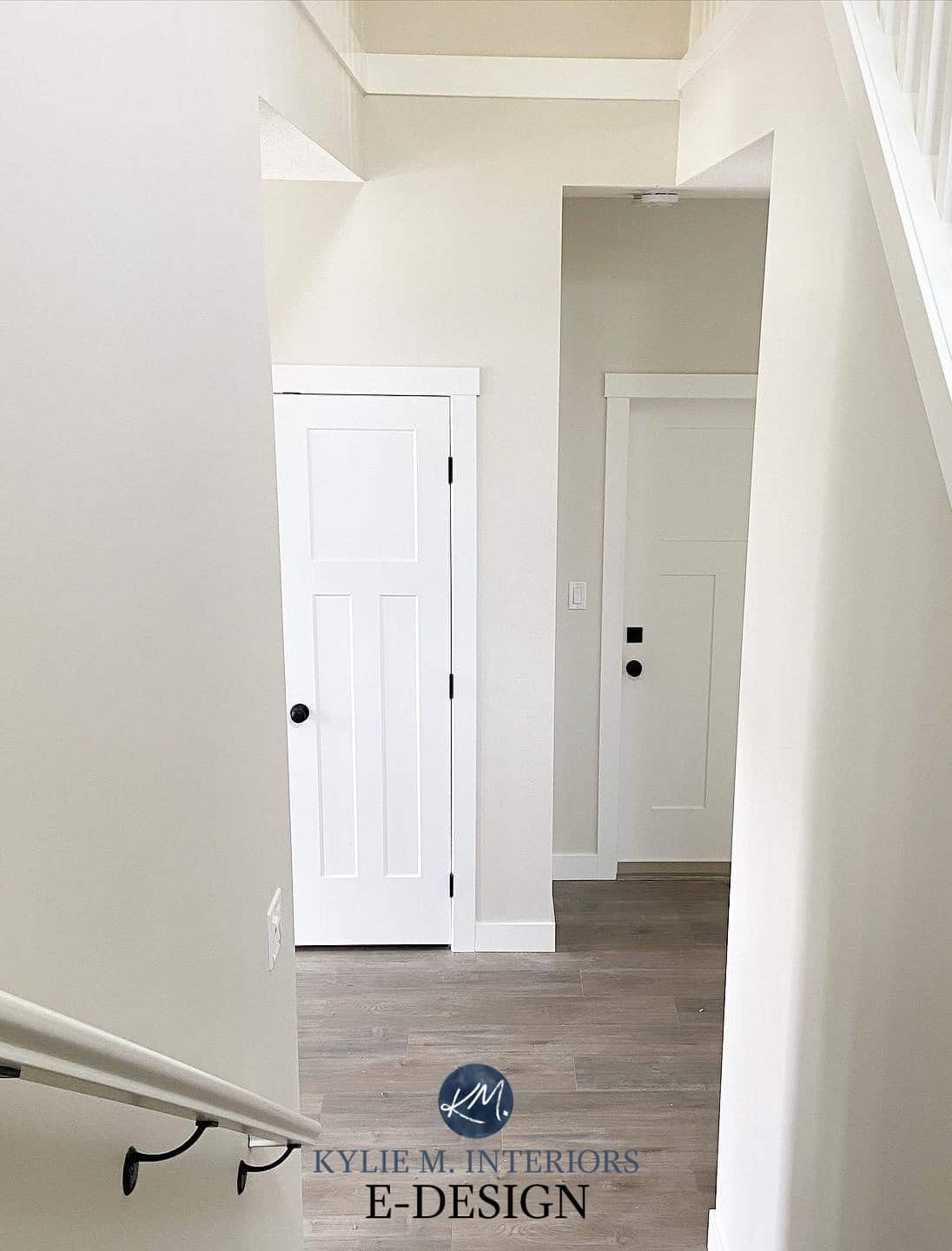
Hi Kylie, I have been trying to choose a white BM for new construction entry way and hallways. I am usually much quicker at this but it seems to be a lot of wall space. There is typical new construction moulding halfway up the wall and it is double story. I do not want beige or cream. I tried classic grey and vanilla milkshake as samples but just to much color for what i want here. Would you suggest chatilly lace, oxford white or decorator’s white. the trim is white semi gloss. Attached rooms are grey tones decorating is modern farmhouse ish. ty so much I have been reading many blogs and you seem like the best person to ask lol.