
The 16 Best Wall Paint Colors to Update Cream Cabinets & Trim
WHICH PAINT COLORS GO WITH CREAM (off-white) CABINETS & TRIM?
Are you frustrated with your cream cabinets or overly warm white trim? Can’t find a modern paint color that looks good with them? You aren’t the only one.
I deal with this topic daily in my Online Paint Color Consulting, and it’s always the same story – cream cabinets, beige walls, and a deep desire for something FRESHER.
However, as the Rolling Stones always say, ‘You can’t always get what you waaaaant, especially if you have off-white or cream cabinets and trim’ (I might’ve added that last part). This is just one reason why I don’t recommend that anyone hop on the current trend of painting their cabinets some form of light greige, beige, or cream, as I guarantee that in ten years, most you will wish you’d chosen white (and will be whispering sweet nothings in my ear, asking me to help).
Sherwin Williams Dover White with glaze (which lowers the LRV)
But before we get into the best paint colors to update cream cabinets, let’s have a little chat…actually, let’s make it a big one.
Why do we need to talk before we get into the good stuff? Does all of this seem like an awful lot for one darn paint color?
Let me ask you a question: How has your search gone so far? Chances are, you’ve been trying colors, and they aren’t working. This blog post tells you WHY and teaches you HOW so you can move forward with confidence and stop struggling to find a color that doesn’t exist.
And if all else fails, there’s wine.

THE REASON WHY CREAM CABINETS ARE AWESOME
While you might feel like everything is doom and gloom (if you wish you had white cabinets), they have redeeming features!
THEY WORK WITH THEIR EXISTING FINISHES (HOPEFULLY)
Based on existing finishes, especially in homes from the early 2000s, some kitchens don’t suit white cabinets and better suit a wood stain or a non-white paint color. In these situations, a warm off-white or cream can come in darn handy, often saving the day. I’ve fallen in love with many cream kitchens when they’re done well.
- This goes for kitchens that currently have cream cabinets and suit their finishes.
- This also applies to kitchens that might be wood right now and have a countertop and backsplash that suit cream cabinets, not white ones.
And that’s it. Seriously, I would love to give you more reasons why cream cabinets are awesome, but for the majority of people, cream cabinets are a HUGE PITA (I’ll let you figure that one out).
Sherwin Williams Antique White with glaze
When updating the paint color on the walls in a home with cream cabinets or trim without updating anything else, it’s easy to forget that the surrounding surfaces are often coordinated with the cream cabinets.
This is an important detail because it’s not just your CREAM CABINETS OR TRIMS that will be fussy about their wall color partners; it’s their coordinated surrounding finishes. Some finishes aren’t easy to transition into a more modern, updated look, meaning your cabinets might be the least of your concerns.
Sometimes, there isn’t one magical paint color that makes your cabinets, finishes, and YOU 100% happy; in this case, a ‘happy medium’ comes in handy.

However, if you know the COLOR NAME of your off-white or cream cabinets, you’re already a step ahead…
STEP 1: YOUR COLOR & ITS LRV
If you know your creamy cabinet or trim paint color, find its LRV and proceed to STEP 2.
If you have no idea what color is on your cabinets, the most common creams used for cabinets and trim are as follows. By the way, I recommend you get large samples and place them on your cabinets to find your best match; small ones aren’t big enough to get a good read on for an important job like this.
- Sherwin Williams Antique White LRV 72 (SAMPLE HERE)
- Sherwin Williams Navajo White LRV 72 (SAMPLE HERE)
- Sherwin Williams Creamy LRV 81, mild undertones, and darn close to being a soft white (SAMPLE HERE)
- Sherwin Williams Casa Blanca LRV 76 (SAMPLE HERE)
- Benjamin Moore Navajo White LRV 78 (SAMPLE HERE)
- Benjamin Moore Linen White LRV 81 is close to being a soft white, but with a reasonably strong yellow hue (SAMPLE HERE)
- Benjamin Moore White Down LRV 77 (SAMPLE HERE)
- Benjamin Moore Gentle Cream LRV 72 (SAMPLE HERE)
If these aren’t close, go back and get more – get as close as you can, as this color will be your guide as you need its LRV.

As for your walls…
To start, look for paint colors with an LRV of 55 or lower. The goal is to get 20+ LRV points between your cabinet/trim and wall color.
Of course, this can vary depending on how light or dark your particular shade of cream is:
- If your cream paint color is LIGHTER (approx 78), you might look at paint colors with an LRV of 58 or lower, as this would put approximately 20+ LRV points between the two colors
- If your cream paint color is DARKER (approx 72), you might look at paint colors with an LRV of 52 or lower, again putting somewhere around 20+ LRV points between the two colors.
- Are there some colors with less of an LRV difference that can work? Maybe! But I’ll link to those later.
Remember, just because you want a certain paint color doesn’t mean your home agrees!
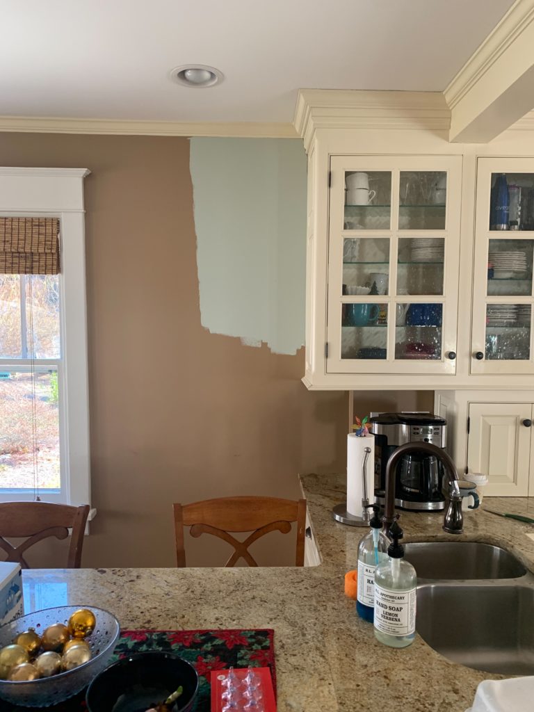
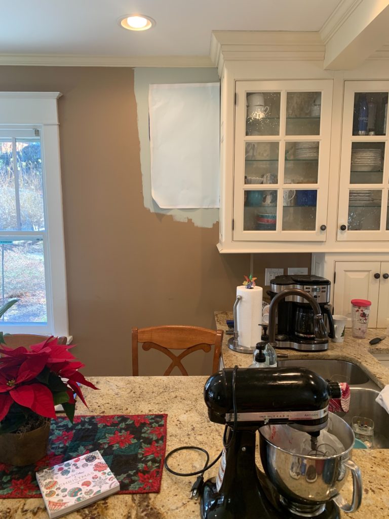
My next Online Color Consulting client wanted to update their cream cabinets by lightening their wall color considerably. However, their cabinets made that next to impossible, short of painting their walls the same color!
The cabinets are Sherwin Williams Antique White; the sample on the door is Sherwin Williams Creamy, and it ain’t workin’.
STEP 2: UNDERSTAND THE COLOR YOU’RE DEALING WITH
Once you know the cream you’re dealing with, it’s important to acknowledge its strength. The more yellow it is (cream is a yellow hue color), the more yellow it’ll look when partnered with colors that are cooler than it.
- The more MUTED your cream cabinet or trim color is, the more flexible it will be toward other colors, as the YELLOW will be less bossy.
- The COOLER the color is that you try to partner with your cream cabinets or trim, the more yellow you risk them looking (opposites attract and make each other stronger).
- Most of the cream colors on the previous list have reasonably strong undertones except for Sherwin Williams Creamy and Benjamin Moore White Down, which are more muted.
- Cream cabinets with glaze on them will be LESS FRIENDLY towards colors that are cooler than them. They will also need wall colors that are a wee bit darker.
WHAT IF YOUR CREAM CABINETS HAVE A GLAZE ON THEM?
This is always a tough one, and at some point, you can only get so close to finding your exact color match when cabinets have a glaze on them.
Do your best to figure out what the original color might’ve been and add a few LRV points for the extra depth added by the glaze. This is an important step; this number will help guide you toward a starting point when looking for compatible paint colors. Yes, glazed cream cabinets or trim add another layer to the beast.
Are you ready, Betty? Do you want to see the BEST PAINT COLORS to update cream cabinets and trim? To do this effectively and to apply to as many people as possible…
I’m basing this on the average cream kitchen (lighter than Sherwin Williams Antique White, for those of you with this particular shade of cream or one with similar depth).
Remember, I can only kill so many birds with one stone (or feed so many birds with one scone) – I’M JUST…ONE…WOMAN!
The above combo is off, as the walls are too cool & light for the cabinets.
TWO THINGS THESE COLORS WON’T DO FOR YOU
1. They won’t make your cabinets or trim look anything other than cream/yellow. They’re a yellow paint color, and short of painting them, they are what they are.
2. Lightening and brightening are often the goals in rooms with cream cabinets. However, these options won’t make your room look light and bright compared to traditional off-white and light paint colors. But it’s not these paint color options stopping you; it’s your cream cabinets and trim; they have limitations (don’t kill the wee Ginger messenger!). Your room might look brighter than it USED to if it happened to be painted a darker color, but that’s as far as you’ll get short of painting your walls the same color as your cabinets or painting your trim/cabinets white.
OH MY GOD, DOES SHE EVER STOP TALKING? No, no, I don’t…
THE BEST PAINT COLORS TO GO WITH (UPDATE) CREAM CABINETS & TRIM
Remember, the yellow hue of your cabinets/trim may hold you back from your wildest color dreams (mine are full of paint samples, Ryan Gosling, wine, and Doritos). But this doesn’t mean you can’t find a good happy medium.
If you CAN’T or WON’T paint your cream cabinets and trim a more flexible shade, sometimes a happy medium is as good as it gets #truthbomb.

To be honest, some of the upcoming colors make me a bit twitchy with some cream paint colors, but settle okay with others – it depends on the cream you’re dealing with and your surrounding finishes. However, they might give you the flexibility to accommodate your cabinets and your other finishes, creating a purposeful and coordinated palette.
1. SHERWIN WILLIAMS AMAZING GRAY 7044
Amazing Gray is amazeballs, and I love it with some of the more muted cream cabinets. Many people start with Sherwin Williams Worldly Gray, looking for a light shade of greige, but with its LRV of 57, combined with its subtle undertone, it’s just too soft for most cream cabinets and trims.
Amazing Gray has an LRV of 47, and its slightly noticeable green undertone goes with a relatively wide variety of cream cabinets and trim. This LRV puts Amazing Gray more than 20 points lower than the average cream paint color – AMAZING!
PAINT COLORS THAT ARE SIMILAR TO AMAZING GRAY
- Sherwin Williams Jogging Path #5 has a wink more green (it’s coming up shortly; it’s fab)
- Sherwin Williams Analytical Gray
- Benjamin Moore Northern Cliffs offers a bit more depth and body
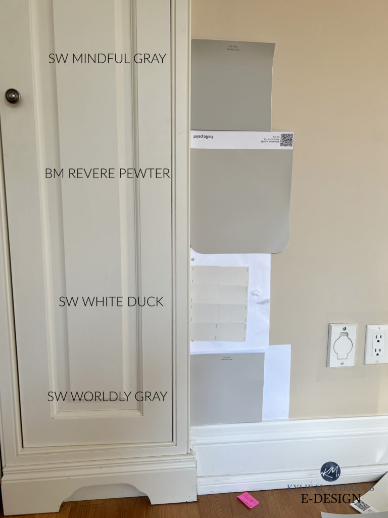
- Sherwin Williams Mindful Gray is a bit grayer and more grounded (SAMPLE HERE)
Sherwin Williams Amazing Gray: IMAGES, Info, & More
These kitchen cabinets (below) are painted Sherwin Williams Alabaster, a soft, warm white on the edge of the off-white/cream world. Amazing Gray (on the walls) is pretty darn happy with this color but might handle a cream with a bit more depth…
2. SHERWIN WILLIAMS STONE LION 7507
Stone Lion is a light-medium-depth beige paint color with muted undertones. It sits reasonably well with most cream paint colors because it doesn’t have the same level of taupe found in Sherwin Williams Balanced Beige, which is most people’s first choice in this range (and is coming up shortly).

While it might be darker than you have in mind, your creamy trim or cabinets might disagree with you! Here’s Stone Lion with cream trim…

Stone Lion has an LRV of 38, making it a medium-depth warm neutral that’s WELL below the boundaries of cream. You could also explore the lighter look of Sherwin Williams Loggia, with its LRV of 48. However, the lighter-again Shiittake might be too flat-looking (not warm enough at this depth) for some cream paint colors.
The Best Stone-Inspired Greige, Taupe, Beige, & Gray Paint Colors
PAINT COLORS THAT ARE SIMILAR TO STONE LION
- Sherwin Williams Tony Taupe
- Benjamin Moore Brandon Beige
3. BENJAMIN MOORE CLAY BEIGE
Admittedly, Clay Beige is a tight squeeze with many cream colors, but oooo, it can be a badass and beautiful to update cream cabinets – the right cream cabinets.
Clay Beige is a light shade of tan (not a beige, so it doesn’t center on an orange undertone). Its incredibly muted undertones make it one of this page’s more updated warm colors.

Clay beige is similar to the top left sample.
However, being lighter and more subtle, it won’t suit more dense, rich shades of cream.
PAINT COLORS SIMILAR TO CLAY BEIGE
- Benjamin Moore Manchester Tan is quite similar and a great sample to compare.
- Sherwin Williams Sand Beach offers a bit more depth and body.
4. SHERWIN WILLIAMS MACADAMIA 6142
While Macadamia can be next-level awesome with cream cabinets, particularly Antique White, it’s also the type of color many of my Online Color Consulting clients try to avoid! But this doesn’t mean it’s not a good option.
The thing is, cream cabinets and trim (Antique White in particular) can be pretty fussy regarding the wall colors they’re partnered with—you won’t have many GREAT options, but this is one of them.
Macadamia is a light-medium-depth beige with an LRV of 49 and reasonably strong undertones. If you see how Macadamia works but can’t bring yourself to paint your walls a beige this dark, look at the lighter version, Softer Tan, but it might be a bit more of a stretch.
PAINT COLORS THAT ARE SIMILAR TO MACADAMIA
- Sherwin Williams Nomadic Desert, but be careful. If your cream is hiding a green hue, it could be a hot mess.
- Benjamin Moore Wheeling Neutral – amazeballs.
- Sherwin Williams Kilim Beige is lighter but is known to work with some cream cabinets and trims.
- Benjamin Moore Hush is an interesting, lighter shade. Just be careful with creams that have more orange in them.
- Benjamin Moore Lenox Tan is a great comparison.
Kilim Beige, shown in this next kitchen, is well-suited to these cream cabinets and surrounding finishes…
5. SHERWIN WILLIAMS JOGGING PATH
I’m obsessed with Jogging Path (not that I’ve ever been on one – this hot mama jama does NOT like running). Not only does it have a beautiful green hue, but it also complements a reasonable range of cream paint colors, as long as they’re subtle and more muted.
Just remember, the green undertone in Jogging Path Gray can make your cream cabinets or trim look a bit more yellow in comparison.
Jogging Path is a shade of greige with a reasonably noticeable green undercurrent. It could be wicked pretty with your cream cabinets, but is it the right color for your countertop and backsplash? WE’LL SEE!

PAINT COLORS THAT ARE SIMILAR TO JOGGING PATH
- Sherwin Williams Amazing Gray #1
- Sherwin Williams Gateway Gray is loverly
- Benjamin Moore Seattle Mist, if you think you can sneak in a slightly lighter shade. Just be careful with those rich creams, and note that cooler shades can enhance your cream’s yellow!
This process isn’t just about colors to update cream cabinets or trim; make sure the paint colors you sample suit your other finishes, such as countertops, backsplash, and flooring!
6. BENJAMIN MOORE BENNINGTON GRAY HC-82
You might be excited at the word ‘gray,’ but don’t be fooled—this is just another color named by someone who was CLEARLY in the cups (which I am after writing this epically long blog post). While Bennington Gray is certainly not as warm as Macadamia, it sure as heck isn’t gray.
Here’s your Peel & Stick sample of Bennington Gray…

Bennington Gray has an LRV of 47 – BOOM, mad love. It’s also a great happy medium if your home needs warmth, but you don’t love the more traditional Tuscan approach of Macadamia.
PAINT COLORS THAT ARE SIMILAR TO BENNINGTON GRAY
- Benjamin Moore Grant Beige #7 (SAMPLE HERE)
- Benjamin Moore Bleeker Beige (SAMPLE HERE)
FULL Paint Color Review of Benjamin Moore Bennington Gray & Bleeker Beige
7. BENJAMIN MOORE GRANT BEIGE HC-83
If the above beige and tan paint colors are too strong, but you see how a warm shade might be your home’s best color, you could check out Grant Beige. Grant Beige is a tan color with a bit less undertone than many popular beige and tan paint colors, without falling into the greige range.
Disappointed to see ANOTHER beige or tan? Don’t get your titties in a tussle; I’m not here to tell you what you WANT to hear; I’m here to help you avoid a fugly kitchen combo. Many of the lighter colors we WANT to pair with our cream cabinets and trim are simply the wrong choice.
Grant Beige has an LRV of 56, so it’s on the edge of the light and light-medium range. This makes it a great option, especially for some mid- to light cream colors.
PAINT COLORS THAT ARE SIMILAR TO GRANT BEIGE
- Sherwin Williams Sandbar (SAMPLE HERE)
- Benjamin Moore Manchester Tan for a lighter approach
Sandbar (left), Clay Beige 25% darker (right)
FULL Paint Color Review of Benjamin Moore Grant Beige
I usually start with the above colors when looking to update cream cabinets and trim. But again, a lot can change depending on the surrounding finishes, including the backsplash, countertop, and flooring.
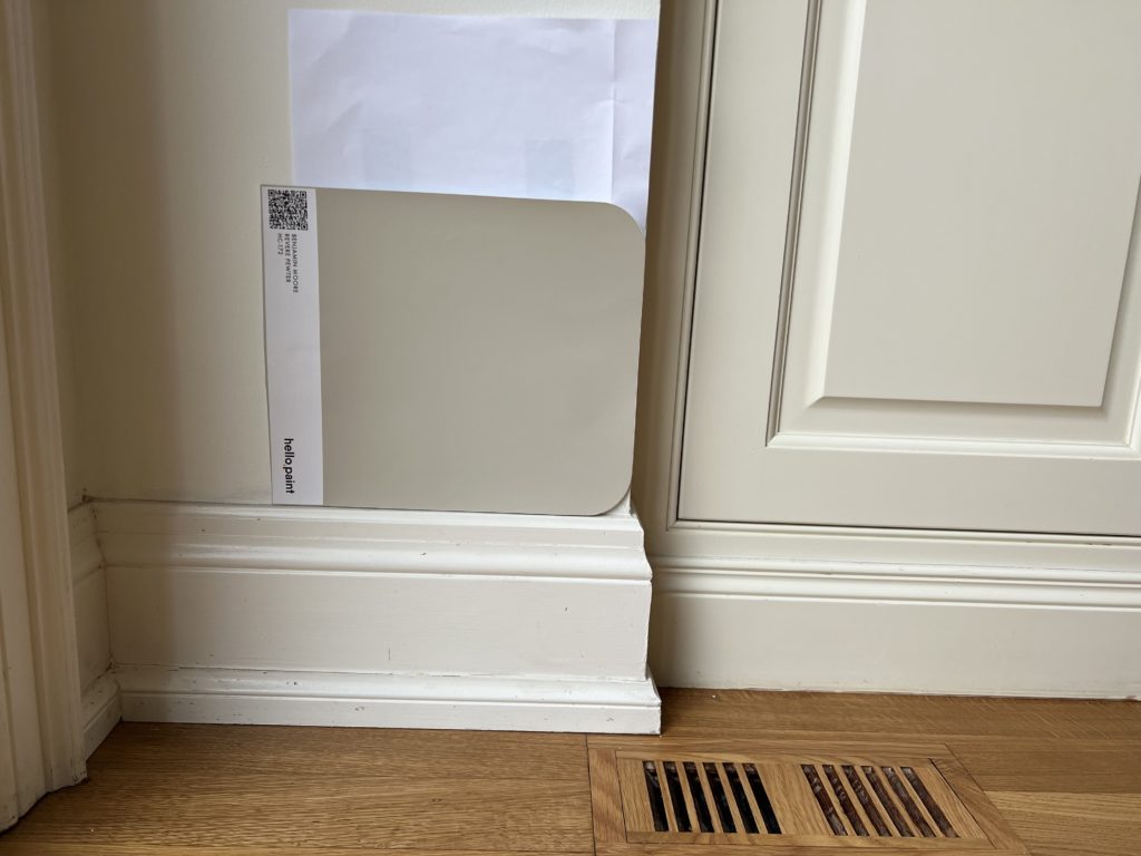
8. BENJAMIN MOORE REVERE PEWTER HC-172
While I get nervous about Revere Pewter with the darker cream paint colors, it’s often a nice partner to lighter, more muted cream paint colors. It will still make the cream look more yellow ‘in comparison,’ but that happens so easily when you partner a warm color with a color that’s cooler than it.
In this next photo, there are a few things at play…
1. The trim is whiter than the cabinets, making the cabinets look more yellow. Overall, the trim looks considerably bright and warm with a reasonable yellow tint.
2. This is a low-light area, and Revere Pewter looks muddier than usual.
Revere Pewter has an LRV of 55, making it a heavy, light-depth, warm gray with a slightly earthy green undertone that doesn’t always show up to the party. Regarding coordinating with cream paint colors, it’s best if it does all of that and then some!
Once again, in this next photo, Revere Pewter looks WAY warmer and muddier than usual – this is what we hope it does…
PAINT COLORS THAT ARE SIMILAR TO REVERE PEWTER
- Sherwin Williams Amazing Gray #1
- Sherwin Williams Jogging Path #5
FULL Paint Color Review of Benjamin Moore Revere Pewter
9. SHERWIN WILLIAMS COLONNADE GRAY 7641
Like Revere Pewter, Colonnade Gray is touchy with cream paint colors with more yellow or depth. But it can be an interesting partner to lighter and muted creams.
This next example shows Colonnade Gray with cream trim in a bedroom. Notice how the cream doesn’t act like traditional white trim, even with a modern paint color partner, but that’s because it’s not white.
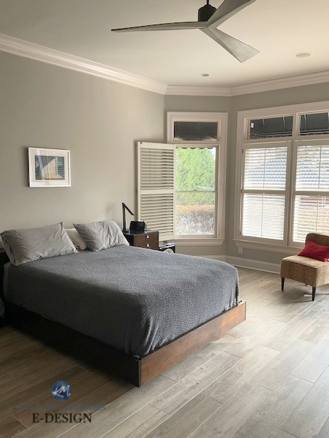
Colonnade Gray can be a slightly better option than Revere Pewter because it has a lower LRV, at 53, compared to Revere Pewter’s 55. However, Revere Pewter one-ups Colonnade Gray in the muddy department, pulling that organic warmth off way better.
PAINT COLORS THAT ARE SIMILAR TO COLONNADE GRAY
- Sherwin Williams Mindful Gray…maybe (SAMPLE HERE)
- Benjamin Moore Revere Pewter #8
Sherwin Williams Colonnade Gray: IMAGES, Info, & More
The COOLER a paint color is or the more COLOR it has (purple, blue, or green), the more it will CONTRAST with the yellow of your cabinet cabinets or trim – nature of the beast, but this doesn’t mean they aren’t pretty combos if you’re so inclined!
10. SHERWIN WILLIAMS VERSATILE GRAY 6072
Versatile Gray is a light-medium-depth taupe paint color that looks pretty with many cream cabinets.
Why?
Well, when surrounded by the right countertops/tiles or carpet, the taupe (violet, slightly violet-pink) undertone can be a pretty accent—AS LONG AS YOUR CREAM DOESN’T HAVE ANY GREEN IN IT.
The painted furniture in this next bedroom is SUPER creamy-yellow. Notice how Versatile Gray settles with it…

In this next photo, Versatile Gray humors the cream cabinets while tapping into the countertop’s needs. Would I usually put Versatile Gray with cream cabinets? Probably not (but there are exceptions), but again, when looking for a happy medium, sometimes you have to think outside the color box!
Versatile Gray has an LRV of 48, making it a great contender for various creams.
However, many homeowners want a lighter, warm gray, greige, or taupe with their cream cabinets. Let’s look at the lighter version, Popular Gray – wooooooof…
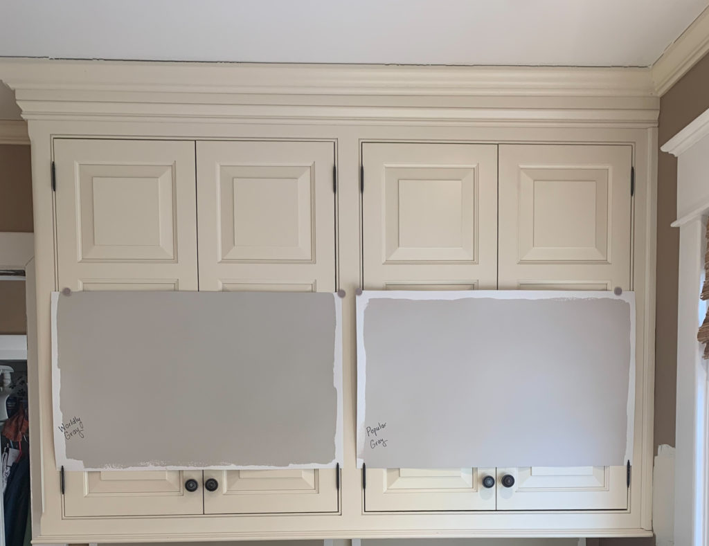
Do you see how the cabinets’ cream-yellow fights with Popular Gray (right)? And while Worldly Gray (left) is no screamin’ glory either, its slightly lower LRV makes it a bit better (I still wouldn’t do it).
Why?
Because there isn’t enough LRV or difference in depth between the cabinet color and these samples. Even though my client might’ve wanted a lighter warm gray or greige/taupe paint color, it’s easy to see how a light-medium version like Versatile Gray (or the previously mentioned, Amazing Gray, which is the light-medium version of Worldly Gray) makes a better connection.
HOORAY FOR HAPPY MEDIUMS!
PAINT COLORS THAT ARE SIMILAR TO VERSATILE GRAY
- Sherwin Williams Requisite Gray, although it’s often a touch too cool/violet (SAMPLE HERE)
Sherwin Williams Versatile Gray
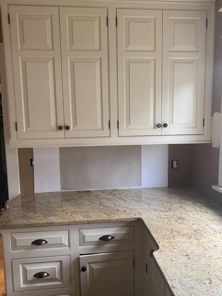
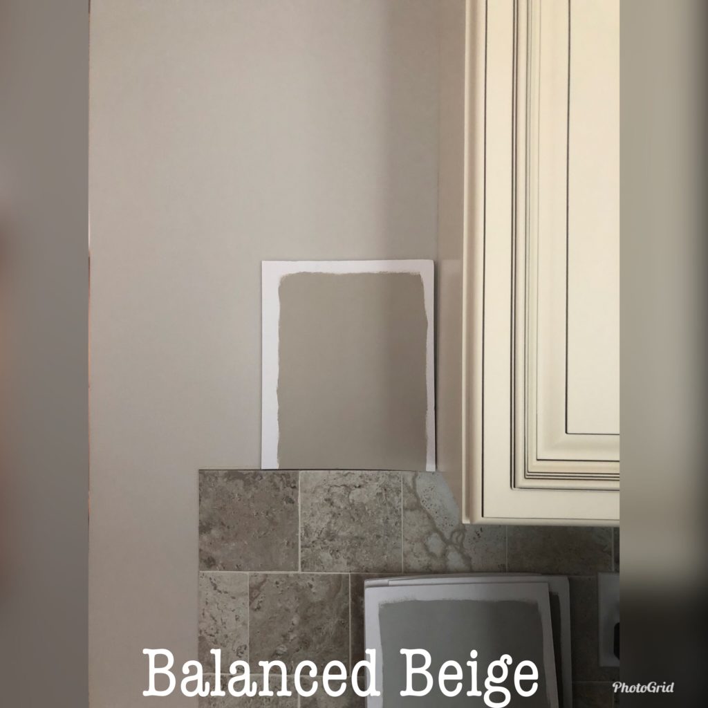
11. SHERWIN WILLIAMS BALANCED BEIGE 7037
Balanced Beige is touch-and-go and highly dependent on your cabinets, the amount of yellow they have, and the potential glaze they have on them.
In this next kitchen, look at how flat and taupe Accessible Beige (left) looks compared to the glazed cream cabinets. While Balanced Beige (right) is better, it’s still too toned down for the degree of warmth in the glaze—close, but no cigar!
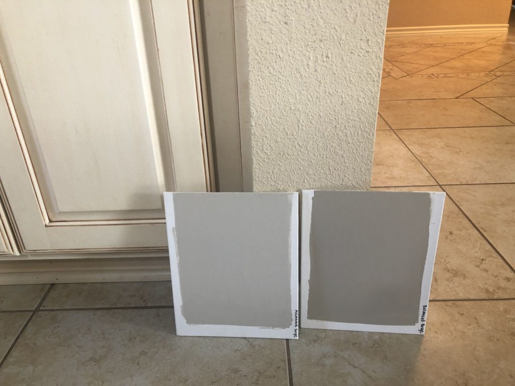
In this next kitchen, notice how the glaze on the cabinets isn’t as warm as in the previous version. Because the glaze is more toned-down and the backsplash is agreeable, Balanced Beige is a slightly better fit.
Balanced Beige has an LRV of 46, which is definitely in its favor.
While it’s okay with some of the more muted and lighter cream paint colors, it’s too taupe for others (including Antique White and creams with a similar depth). It’s in this section because sometimes it’s just that happy medium between cream cabinets/trim and surrounding finishes. My best advice is to try 25% darker, as you’ll have a better shot by lowering its LRV. Or even better, check out the darker version, Tony Taupe.
While this next photo isn’t super (I only use photos from my Online Color clients, friends, and readers), it shows Balanced Beige with creamy cabinets…

Note how Balanced Beige looks a bit drab and flat. Sure, it’s great with the white trim, and it’s ooookay with the cabinets, but it could be way better (I can’t wait to see the AFTER photos!)
PAINT COLORS THAT ARE SIMILAR TO BALANCED BEIGE
- Sherwin Williams Loggia (SAMPLE HERE)
- Benjamin Moore Stone Hearth #2
Oooo, I have a great example of Accessible Beige with cream cabinets to show you, to hammer down how it’s NOT a great option…
My Online Color Consulting client hired me to fix her kitchen, but changing the paint color wasn’t easy. Sure, the backsplash and paint color are well-coordinated, but the granite and cream cabinets do their own thing and don’t suit the other surfaces. Accessible Beige (and the backsplash) look too taupe/flat compared to the yellow/cream of the cabinets—it’s a bad combination that makes the cabinets look more yellow and dated.
The above is a great example of a kitchen that has beautiful finishes that aren’t well-coordinated with each other. And paint can’t fix everything when a good foundation isn’t in place.
Pick the best paint color for the home you have, not the home you WISH you had.
Sherwin Williams Balanced Beige: IMAGES, Info, & More
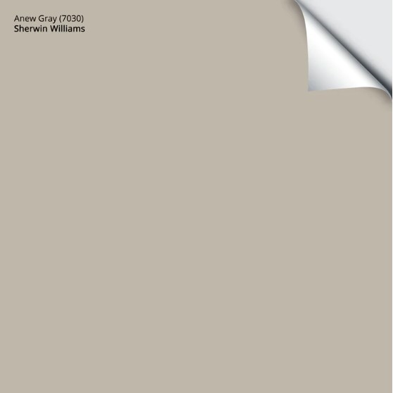
12. SHERWIN WILLIAMS ANEW GRAY 7030
Anew Gray is a popular light-medium-depth greige/taupe paint color. However, it has less undertone than some of the previously mentioned colors. This means it can look a bit washy and non-committal compared to a cream paint color—sample carefully!
Don’t get me wrong, I love Anew Gray, but when coordinating with cream cabinets and trims, often a bit MORE undertone is better than a bit less.
Here’s your Peel & Stick sample of Anew Gray…YAY!
PAINT COLORS THAT ARE SIMILAR TO ANEW GRAY
- Sherwin Williams Mindful Gray
- Sherwin Williams Amazing Gray #1
- Sherwin Williams Mega Greige
- Sherwin Williams Versatile Gray (#10)
Sherwin Williams Anew Gray: IMAGES, Info, & More
13. BENJAMIN MOORE PASHMINA AF-100
While Pashmina isn’t always friendly towards some of the darker or more intense cream paint colors (ones with more yellow in them), it can be a pretty complement to a muted cream or off-white.
This next image shows Pashmina (top) and Balanced Beige (bottom) with subtly warm cabinets and trim. To see their depth, look at how the trim compares to the light switch…

Pashmina has an LRV of 44, making it a great depth for various cream shades. As for its color, Pashmina is a greige paint color with a slight nod towards green.
PAINT COLORS THAT ARE SIMILAR(ISH) TO PASHMINA
Benjamin Moore Pashmina, IMAGES, Info, & More
14. SHERWIN WILLIAMS COMFORT GRAY 6205
Comfort Gray is one of the most popular green-blue-gray blend paint colors because while it certainly has COLOR, its gray base calms it right down for a more muted approach.
This next photo is a wicked example of a cool paint color in action with cream cabinets…
Comfort Gray has an LRV of 54, making it a bit touchy with some of the darker cream paint colors, but an interesting option for slightly lighter, more muted shades of cream.
In general, Comfort Gray with these cream cabinets is a beautiful combination.
- Would I like them in rooms that are next to each other? Sure.
- Do I want them right up against each other? Personally, no. Sure, they look pretty together, but the cool hue of Comfort Gray is making the cabinets and trim look more yellow in comparison, a look that not everyone is going for…but maybe YOU ARE!
While I wouldn’t go any lighter or more colorful than Comfort Gray (e.g., Sea Salt or Rainwashed) if you’re okay with this warm-cool play and your cream is light enough, they could work for you.
Look at Sweet Bluette (below) as an example of a cool color that will not update cream cabinets. Sometimes, my clients need to see something to understand why it doesn’t work, and I’d say this gave them a pretty clear eyeball on things…
PAINT COLORS THAT ARE SIMILAR TO COMFORT GRAY
- Sherwin Williams Argos (below, much grayer – SAMPLE HERE)
- Sherwin Williams Sensible Hue (grayer, SAMPLE HERE)
FULL Paint Color Review of Sherwin Williams Comfort Gray
15. SHERWIN WILLIAMS ARGOS 7065
Argos is a wicked pretty, light-medium gray paint color with a green-blue undertone. However, being a cool paint color, it’ll make your cream cabinets or trim look that much warmer in comparison. This is a pretty combo, but it needs to be the look you’re going for.
While the trim in this dining room isn’t overly creamy, it’s easy to see how Argos plays with its softness…
PAINT COLORS THAT ARE SIMILAR TO ARGOS
- Sherwin Williams Tinsmith (it’s lighter, so be careful – SAMPLE HERE)
- Sherwin Williams Silverplate (again, lighter – SAMPLE HERE)
FULL Paint Color Review of Sherwin Williams Argos
As for that elusive blog post I mentioned earlier..
WHAT ARE THE BEST OFF-WHITE & LIGHT WALL COLORS TO GO WITH CREAM CABINETS & TRIMS?
Lighter colors can be harder to coordinate with cream cabinets and trims, as if they undertones don’t align, it can be even MORE obvious that things don’t jibe (compared to some darker colors).
And while it’s DEFINITELY more of a hit and miss situation, I’ve got quite a few colors for you to sample and compare.
Just…sample carefully.
Modern Paint Colors to Update Cream Cabinets & Trims
PEOPLE ALSO ASK…
ARE CREAM CABINETS OUTDATED?
In today’s average home? Yes, cream cabinets are outdated (don’t shoot the messenger!).
While some are still painting their cabinets cream, they look more timeless in country-style, vintage, or traditional-style homes (some), particularly those with black countertops.
HOW DO YOU UPDATE CREAM CABINETS?
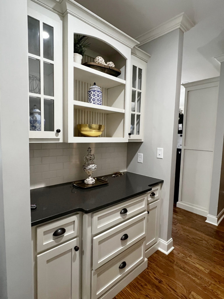
Aside from choosing one of the paint colors suggested above, a new backsplash can help to update cream cabinets and make them look more modern. In particular, look for a 3×6 subway tile that’s the same cream as your cabinets – NEVER choose a tile that’s whiter than your cabinets.
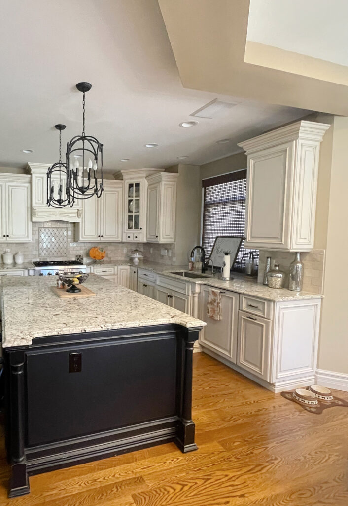
Also, consider hardware in a finish that suits its surroundings (usually oil-rubbed bronze or black) but has a slightly more modern profile (check these out). While oil-rubbed bronze isn’t an updated finish, it often suits homes with cream cabinets.
PHEW, we did it! Hopefully, you found the best paint color for you and your cream-inspired home. If not, you know where to find me (and no, it’s not at the winery).
How to Update Cream Cabinets: COMMON QUESTIONS
Modern Paint Colors to Update Cream Cabinets & Trims
And in case you’re wondering about some colors I didn’t mention, there might be a good reason…
POPULAR COLORS THAT DON’T UPDATE CREAM CABINETS (SO YOU CAN STOP WONDERING)
While I could go into all the reasons why, having read the above information, you’ll understand. These colors come up ALL THE TIME, with my E-design clients hoping to update cream cabinets or trim with them.
Of course, if your cream is lighter and has muted undertones, you have a better chance, but don’t hold your breath for too long.
- Sherwin Williams Accessible Beige
- Sherwin Williams Agreeable Gray
- Sherwin Williams Worldly Gray
- Sherwin Williams Popular Gray
- Sherwin Williams Alpaca
- Benjamin Moore’s Big Chill
- Benjamin Moore Edgecomb Gray
- Benjamin Moore Cedar Key
- Benjamin Moore Balboa Mist
- Benjamin Moore Collingwood
I could go on, but those are the usual offenders. If you have very light cream trim or cabinets, could they work? Maybe. If they do, send photos, but most of the time, they’re just too light or have the wrong undertones.
READ MORE
How to Update Cream Cabinets or Trim: COMMON QUESTIONS
The 10 Most Timeless Finishes for Your Home
The Best MODERN Cream Cabinet Paint Colors
Cream Paint Colors for a Classic, Traditional Kitchen Cabinet
The 12 Best WHOLE HOME Gray & Greige Paint Colors
The Best WHOLE HOME Warm Neutral Paint Colors
NEED HELP?
Check out my ONLINE PAINT COLOR CONSULTING!

ORIGINALLY WRITTEN IN 2022, UPDATED IN 2025


This is so good! In my last house that was built in 2009, it had Tuscan vibes but I wanted to update it so I ended up going with accessible beige. It turned out lovely!
Another question, I had my husband go to Sherwin Williams and get Extra White. They gave him the white off the shelf also called Extra White. Do you know if the base they use (Extra White) is the same as the color Extra White 7006. It would seem like the base Extra White wouldn’t have any tint to it. Why the heck do they call them the same thing?! Now I’m confused because I may just have base on my ceiling and base moldings in my basement. Help?!!
Hi Suzette, YES, it is the same white (they do the same with High Reflective White, just to confuse everyone ;)) – these colours are often used as BASES for other colours. I’ve found that if they had some extra white tint to the gallon, it improves the coverage a bit more too :).
Hi Kylie,
I am currently thinking of painting the kitchen walls, Ranchwood by Benjamin Moore. The walls are currently ballet white by Benjamin Moore. My cabinets are a cream color. Wondering if Ranchwood would be a good choice.?
Thank you,
Nicole
Oh gosh, it’s so hard to say without knowing the cream and seeing the countertop and backsplash!
I am SO tempted to jump on the greige cabinet trend like you mentioned (possibly SW Modern Gray) but don’t want to run into some of these same problems down the road! I know you said you don’t recommend it, but if I were to go this route, would the same advice still apply that my walls should be at least 20 LRV points difference to create enough contrast? And would it be a mistake to go lighter on the walls, in a soft white range? Thank you in advance, your blog is super helpful!!
Yes, Alyssa, this is EXACTLY right :).
Kylie, thank you so much for your insight. I feel like this post was written for me! Having this dilemma as we speak! Early 2000’s home, SW Creamy trim and cabinets. When we bought the house it was painted Practical Beige on the first floor and Napery on the foyer and second floor. (Why not one color throughout? Whyyyy??) I then thought it would be a great idea to repaint Silver Strand on the first floor and Accessible Beige 70% on the foyer and second floor. Again, why didn’t I do one color throughout? The world may never know. 😂 And of course, the Silver Strand pulls alllll the yellow out of the trim and cabinets with our West-facing windows on the first floor. I really want to brighten up the space and I’m deciding between Creamy, Swiss coffee and Greek Villa on the walls but I don’t want the undertones fighting each other. However, the sample of Creamy (from Samplize) looks very yellow to me. I’m afraid it might be too much as an overall color. Should I cut the formula or leave as is? Paint the downstairs Accessible Beige and call it a day? Move houses and start over? 🤣 Thank you so much! 😁
Hi Maren, you know what? I just finished a YOUTUBE video showing a whole RAAAAANGE of ideas with cream cabinets, including Sherwin Williams Antique White AND….CREAMY!
Long story short, if you’re going to do cream walls, they need to BE Creamy. You could tryyyyyyy 25% lighter, but this could increase the yellow in Creamy, hard to say – but it NEVER hurts to try. I’m hoping the hubs will get teh video edited early this week and put it out – it’s really nice to see things in action :).
That is fantastic!!! Thank you so much!! Looking forward to it.
Kylie,
This is an awesome tutorial on cream colors! I’ve been refreshing my home for sale and have run into almost every scenario you described. We’re finished now, but I’m thrilled to see that I eventually wound up with much of the solutions you suggested. And sometimes, out of sheer frustration, I’ve just created just the right undertone and LRV by mixing paint colors. (of course, these colors could never be duplicated as I mixed by eye!)
On another note, we are moving to a new build and I’m already daunted by where we are starting. The trim is SW Princeton White, which isn’t available to retail customers, only builders. I even called SW and they wouldn’t give me the LRV or undertones or breakdown. My cabinets are factory painted KraftMaid Moonshine and although I have a sample chip, I need more info. Are you familiar with these colors? How would you suggest I begin with finding the undertones and LRV of these colors?
Hi Donna, I LOVE to hear this, clearly you’ve got some great instincts!
So, I sent an email to Sherwin Williams about Princeton White; we’ll see if I get anything back :).
Now, I don’t know anything on Moonshine by Kraftmaid, but to look it up online, it gives me the same concerns as cream cabinets – I see it giving you a hard time down the road and potentially limiting your choices? But again, I’m only looking at online images :). I mean, the YELLOW of cream cabinets can be tricky, and while the online images of Moonshine are all over the place, it’s not necessarily the COLOUR, but the DEPTH that will be tough. It looks like an off-white/light depth cabinet, so it takes up ‘that colour slot’.
Kylie,
Thank you for your response! Moonstone does look like an off-white with green-gray undertones. I know I will be in for a challenge and look forward to working with you on this. The builder confirmed that they will be painting the walls Princeton White as well. Once we are settled, I’ll be in touch to purchase one of your packages for selecting new wall colors. Depending on what the Princeton White trim looks like, maybe we can keep it. To my eye, in the sample home, it looks close to Pure White – but not exactly. I’ll be interested if you hear back. Thank you again!
Hey Donna! So, I hear back. She was surprised that I’d heard about this magical colour. The LRV is 76 and she’s sending me a sample to peruse – I’ll let you know!
Good grief! While I always love reading your blogs, is there any paint colours other than brown beige or grey tones that will
Go with cream cabinets? Mine are yellow undertones with a south facing room. But I am honestly am really sick of all these colours! What about greens? Sage green, spring green etc. Anything other than greiges, beiges etc!?? Thanks! Currently in this house we bought, its a dark brownish grey colour with the cream. Its depressing!
Hi Stephanie! I do have several gray-blue-greens and greiges in that blog post to check out, along with Comfort Gary which is a green with gray in it!
Kylie, thank you for your extremely helpful analysis and playful delivery.
I have vintage blonde midcentury bedroom furniture and am having a hard time finding a wall color. The room faces north.
For curtains maybe a chocolate or coconut shell might work?
This is so helpful, thank you! And probably why I have been struggling to find a wall color with our glazed white kitchen cabinets. Quick question….we have a very open kitchen, family room, hallway, entry foyer, open upstairs. Meaning there is nowhere to “stop” the paint color. There’s no moulding or trim on the doorways, it all flows together with those rounded edges you’ve mentioned before (why do builders do this?!?). Can I paint my kitchen walls something like BM Revere Pewter with LRV of 55 then the rest of the rooms (family room, hallway, entry foyer, open upstairs) Revere Pewter lightened by 25%? I love colors about 62 LRV (thanks to your blog!). But I know my cabinets NEED the lower LRV but I just don’t want that low LRV ALL over my house so I was trying to compromise by painting only the walls that NEED the low LRV RP standard strength then lightening it by 25% for everything else. Or do people not do this anymore?!? Should I just pick 2 complimentary different colors? Or am I stuck needing to paint everything the low LRV to satisfy my cabinets?
I’ve already perfected my straight line painting with our BM Stonington Gray playroom and BM Edgecomb Gray dining room, both of which open to the hallway and foyer, respectively, that I’ve mentioned.
So I am planning to paint my kitchen BM Calla Lily (top pick at the moment) or BM Pale Moon or possible BM Soliel. I currently have what seem to be an Antique White (warm tone, they were painted before I moved here so not sure of the actual color/brand) cabinets that are really the same color as all the trim and closet to current wall color. I do like the cabinet color but since I have to repaint everything I want to make sure to pair it with the Yellow of the wall color. I see a lot of the white kitchens use a very bright white which I do not want. I want to complement the yellow but not be brightish but warm. I see the simply white or dove white might be options or like the mayo or alpine white. Yes spins the head and now I have oodles of swatches and samples lol. I have a fair amount of light in the room. Basically the whole kitchen area is getting repainted including walls, cabinets, trim ceilings. For a yellow paint on walls (and backsplash that will have colors of white, cream, beige in it), is there a white / cream cabinet color that would be good (or ones to stay away from?
Yes! My cabinets are BM linen white and I HATE it! They were already that color. They are top-notch cabinets, but the color is awful!! I want to repaint, but don’t know what to paint them since the backsplash is cream, too. Yuck!!
Right? Sometimes one thing leads to another and it’s hard to know where to STOP!
Many thanks for the article: found the introduction to LRV informative.
But really, why does the entire world, seemingly, want to look like a Pottery Barn or Restoration HW catalog, based largely on shades of gray or beige. I get that photographs really well, but is pretty darn boring to live with – especially when everyone is using those tones. What about actual colors?
Just moving into a Craftsman shotgun bungalow that has the grey walls, cream trim treatment. Would really like to find better alternative: especially given how drab place looks in winter light (or really gloom).
I love this article but I need desperate help. I love cream cabinets and I did choose it for our cabinets in a new build because all of our home furnishings is very warm and would clash with white white. I took the cabinet to get match what color it was. It is the closet to Benjamin Moore Spanish white. The LRV 76.28. The kitchen and dining and living room is open floor concept so the walls In these rooms will all be the same color since it is one big room anyways. I could accent the wall in which the cabinets hang. The counters are ethereal glow silestone counters. I choose this because of the slight gold streaks. I would love to accent the wall the cabinets would hang but I have no idea what will go with it. Plum? I am also thinking gold hardware. I am more of a elegant tradition girl. I do not like grays. Also I don’t know how to look for color by the lrv to begin with. I hope you can give a little advice.
We are getting kitchen cabinets in SW alabaster and are planning on painting the trim the same. Would like a whole house color that is a warm neutral to go in the kitchen, dining and living room (north facing) and that will work well in the tall bright south facing entry. What SW color would work best, is there one?
Hi Tiffany! While Alabaster matters, equally as important are the flooring, countertops, tiles, and any type of fireplace stone, brick and furnishings – I’d just be shootin’ in the dark if I were to give you a color!
This was great. Now I know not to paint my cabinets a cream. I am having trouble deciding on a color for my kitchen cabinets. Currently they are cherry wood. My counter top is one of the creamy granites with black and dark brown worked into it pretty heavy. My backsplash is travertine. The space is small so I want to brighten it up. I love the Sherwin Williams color sea salt and thought of painting the walls that color. But just not sure about the cabinets or if I should leave them cherry and change the hardware. They do have some wear I would like to repair or cover. Thoughts?
Hi again! Now, it’s SO hard to say. Travertine backsplash USUALLY caters towards soft off-white beiges like Benjamin Moore Maritime White – colors like that. I mean, a hardware update is a GREAT start, but from the sounds of your finishes, Sea Salt might not have the warmth your finishes need, especially if it isn’t a color you can find in your countertop/backsplash. If you get stuck, I do have a great consulting service! It’s out of stock right now, but will be back next week! https://www.kylieminteriors.ca/hire-kylie/#packages
Just bought a home with the most maddening “cream” trim…I’m pulling my hair out w paint colors! We did not want to repaint all the trim and it honestly didn’t look all that cream until we started changing their browns and beiges. I thought it was close to Dover white, but it makes Dover white look bright white. From old paint cans it looks like it’s a valspar color called Woodrow Wilson linen. In my bedroom I wanted to do all off white walls with an accent wall in a dark navy with framed moldings. Anyway, if I match it I’m afraid it will look so yellow…any thoughts on a cream to compliment this super yellow cream trim?? Appreciate any thoughts, I’m about to paint the living room for a 3rd time bc I’m struggling so much, so I’m hoping to get the bedroom done right lol! I LOATHE this trim color!
Oooo Manda, it sounds to me like you already DO have super yellow and its hard to avoid once its there. If you hit it with a wall color that’s a more muted cream, it will only accent how yellow it is. I would lean into matching it as your best solution to a tricky spot. Otherwise, I would just hang tight until you can paint the trim. I”m sorry!
Long time fan and project manager/house flipper here. You’ve guided me away from many potential paint catastrophes, and I enjoy your humor and spunk! I’ve always been happy with the paint we’ve done in our reno’s and new builds (as have the buyers!)
Now I’m helping my mom sell her house (it’s been on the market for a year.) She has yellow glaze sponge paint throughout the 5000 sq feet. It was beautiful for her and kudos to her for following her heart into Italianate but we’ve yet to find a buyer who sees it the same. Currently, most of it is being painted buyer-friendly Agreeable Gray and looks great so far.
The problem area is the kitchen with its Windham Cream-like brown glazed cabinets, brown travertine backsplash. With the stainless appliances everyone has demanded and a new island, it’s not in the budget to paint them. I’m hoping if it’s done right, with dark hardware and dark light fixtures, it could be pivoted to the mountain lodge look desired in the area.
The living room situated at 45 degrees of the kitchen area has a charcoal gray stone fireplace, we are looking at dark Clarksville Gray with charcoal on the flanking bookcases. The island will be sage, or charcoal. Then there’s the yellow to deal with.
Very glad to read that Agreeable Gray won’t go, although it is in adjacent hallway. Tried Simply White, it’s awful! Was thinking Accessible Beige, but no.
So it’s Agreeable Gray from the hallway and adjacent large room to the left of staircase is converging with the living room’s dark gray green in this kitchen/dining area with its cream yellow cabinets, soon to be contrasting island and it’s many angled seating area (never do a 45 degree attached room, awkward).
After reading your article, I’m trying to decide if I can go with a darker gray or beige on the wall by the cabinets, and in the seating area, or is this too many colors for potential buyers to handle? Thank you for listening! I hope my description didn’t make your brain hurt like mine is!
Hey Kristen! It SOUNDS to me like you might need to try a more mid-toned greige with a reasonable green undertone? I mean, it’s super hard to say without seeing the space, but that’s my first thought – something like SW Intellectual Gray???
Kylie, thank you SO much for your reply! (I really feel SO honored!) Just a quick follow-up, you mentioned Grant Beige in your article. We just happen to have that paint color on hand so we tried it in the kitchen and it worked fine with the cream cabinets. In this space, it looks like a darker Agreeable Gray so it goes well with the rest. This home update has been extra challenging because it’s 1000 miles away, so “fine” equals great…hopefully, it will be pleasing to a buyer! Thank you again for sharing your talents and gifts and being such a treasure and resource in paint education and beautifying homes everywhere!
Hi Kylie, Wish I’d read your post sooner! Cabinets are being painted SW Creamy as well as my trim.
The wall color I chose is SW Natural Linen. Painting began today and one of my rooms has a pinkish/orange cast. So I am really stressed ! Need to talk to my painter asap and change the Natural Linen and I’m wondering if SW Softer Tan will be my best option. My oak hardwood floors will be stained a medium brown. Please help with suggestions!!!
Hi Kylie! Thanks so much for this very in depth post. I’m having a very hard time with the exact issue right now. We have antique white kitchen cabinets and currently have our walls painted Fawn Brindle (75% color). We’re wanting to update the wall color. I’ve looked at samples of Accessible beige & modern gray but need to go a bit darker. The trim in our house is Pure white. Ugh… need to decide on paint asap! I would LOVE any input or suggestions!
Hey Lisa, I would love to help, but I put my best general ideas in this blog post – otherwise I really need to SEE your home via my Online Color Consulting :).
Hi Kylie,
I have a similar but slightly different cream color issue. I have dark cabinets, anew grey walls (open concept), and creamy for the trim. We built our house in 2014 and the designers helping us didn’t take the natural light into consideration when they recommended the Anew Gray, creamy trim combination. The natural light is north/west facing so the Anew Grey looks purple most of the day. The creamy trim is everywhere and my
husband refuses to change it or the dark cabinet/floor colors. Since the cabinets and floors are dark I am trying to brighten up the rest of the space. Any good tips on colors that would work with all these restrictions/issues?
Well Julie, you’re lookin’ at the colors in this blog post! Creamy is a tough customer – not as tough as some of the heavier creams, but still calls a lot of shots. Pick up a sample of Anew Gray and Creamy. Use Anew Gray as your baseline and look at colors that are a bit warmer and a bit lighter – see how far you can push your luck with Creamy :).
frustrated eith my cabinets since they are a heavy cream color. I read through this made notes then after most sections it says won’t work with antique white. I wish I had color names to go with antique white other than macadamia. my house had driftwood everywhere anxld paired nice with the cabinets but I can’t stand the dark brown. debating on spending the money and getting cabinets painted because I feel like im stuck. I did use rockport gray which worked in my laundry room with same cabinets but small room low light. I think I’m going bald over this. read so many of your blogs.
Hi,Kylie.I understand the logic of how whites bring out yellow undertones in cream cabinets.Im wondering if you would use a color like bm natural cream with white dove walls.My house is tricky altogether,but especially the lighting.Im wanting a modern rustic/ organic but casual look,and ready to paint my cabinets.Im liking a lot of pictures with this color( or similar) cabinets.I was gonna do bottoms and island in a darker color.What do you think? White dove seems a little full on my cabinets.