
The 18 Best Blue & Green Blend Paint Colors: Light to Medium
The Top Beautiful Shades of Blue-Green-Gray (blends)
As far as paint color trends go, no other color blend is more popular than blue-green. Call it turquoise, teal, robin’s egg, whatever the heck you want – I call it awesome.
And there’s no doubt that Sherwin Williams and Benjamin Moore have the best blue-green blend paint colors. Their ability to tap into the trendy end of things and the traditional means they are my ‘go-to brands’ when I’m doing my Online Paint Color Consulting.
This post may contain affiliate links. If you make a purchase through links on our site, we may earn a commission.But just because you have options, doesn’t mean it’s easy to choose (kind of like with husbands…)

BLUE-GREEN FUN FACTS
- Cool paint colors, such as blue, green, and gray, often suit warm, south-facing rooms, as they can balance out the warm light coming into the window.
- The darker your room is (or if it’s north-facing), the more vibrant you’ll want your particular blend to be, as it’ll need to stand up against the shadows.
- Blue-green blends are often seen as calming colors. This makes them great for bedrooms, bathrooms, and office spaces, especially in counseling and therapy rooms.
- Many green-gray blends can grab a subtle blue undertone, depending on the type of green you’re dealing with (green-blue or green-yellow) and the combination of natural and artificial lighting.
- Many blue-gray blends can pick up a subtle green hue, depending on the type of blue used.
- If you’re nervous about color, you might want to embrace a GRAY-BLUE (more gray) with a green undertone rather than a ‘color’ with a bit of gray.
- Blue-green colors look warmer (and are more popular) than blue-purple ones (although both are traditionally cool).

While blue violets can be GORGEOUS, especially in the darker range, blue-greens are often seen as a bit warmer and better suited to north-facing spaces.
If you’re nervous about committing to too much color, remember that you can always choose a gray paint color with blue-green undertones (a few are listed below) and then accent with your favorite shades of blue-green!

Now, without further ado, let’s find a blue-green hue for you!

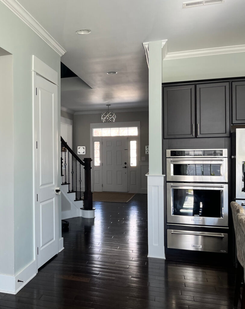
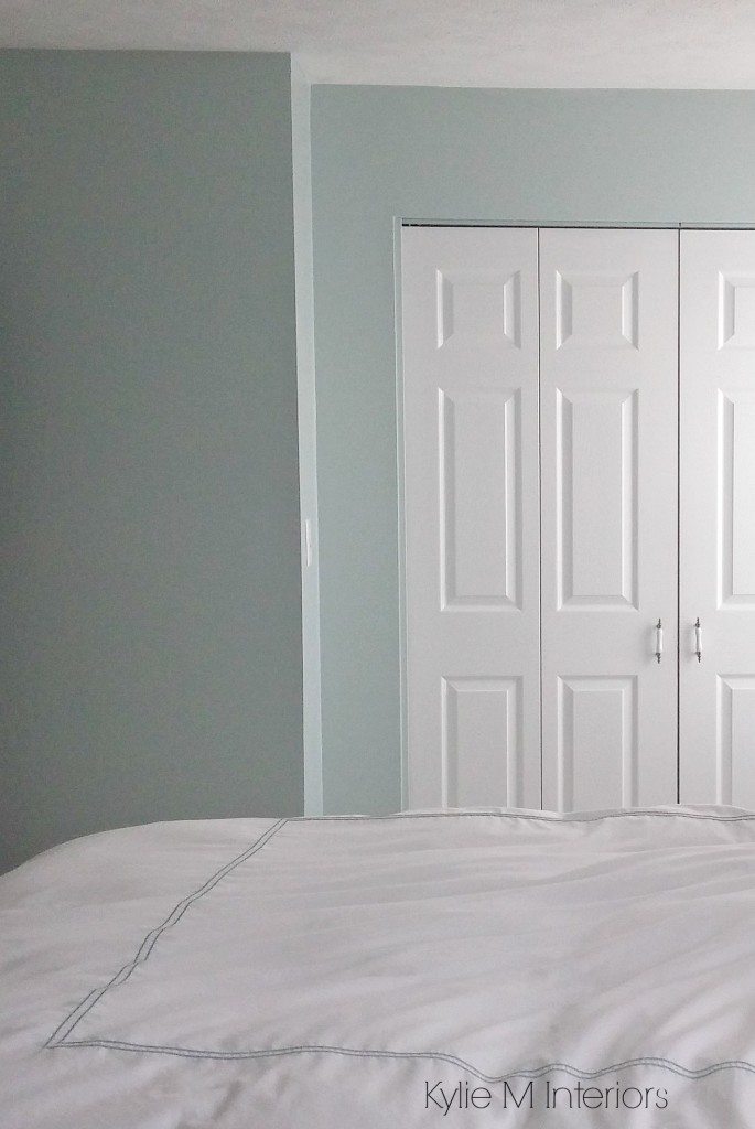
1. SHERWIN WILLIAMS SEA SALT SW-6204
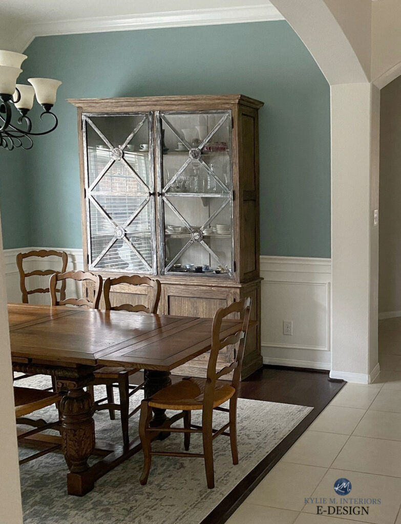
Sea Salt is definitely in the TOP THREE regarding green paint colors. That’s right; Sea Salt is actually a green-gray blend. However, it’s known to lean blue, so I included it as one of my favorites! The green and gray (and blue) colors combine, creating a subtly colorful, calming blend perfect for a relaxing spa-style bathroom or family-friendly space.

Compare this image of Sea Salt looking more blue-gray in this kitchen, to it appearing more green-gray in this next dining room…
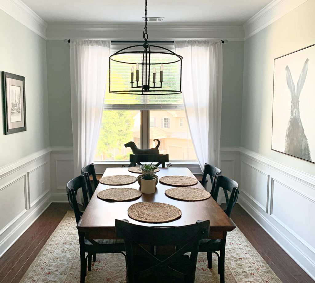
The LRV of Sea Salt is 64, so while it’s a light colour, it won’t reflect as much light into a room as you’d think.
WHY IS SEA SALT A POPULAR PAINT COLOR?
Sea Salt is one of the top green-blue-gray blends. I don’t know if it’s because the name winks at a coastal, beachy vibe or that its more subtle approach to color is appealing.
Don’t get me wrong; Sea Salt is wickedly pretty, but like me, it’s also wildly unpredictable.
You HAVE to get the SAMPLIZE peel-and-stick to see how it might act in your room (rather than relying on a small paint chip).
- If you don’t like blue, this is a risky color. If you don’t like green, this is ALSO a risky color!
- While Sea Salt is great for a single room, it’s not as nice for a whole home (too much of a good thing).
Now, all of this makes it sound like a not-so-great choice. THINK AGAIN!
It’s about knowing what to expect with Sea Salt, and once you understand what it might do, it’s easier to wrap your mind and walls ariound it.
Sherwin Williams Sea Salt: Undertones, Ideas, & More…
2. SHERWIN WILLIAMS QUIETUDE 6212
While lighter blue-greens aren’t always my jam (I’m more of a peanut butter gal), Quietude is daaaaamn pretty.

Coming in with an LRV of 48, Quietude is a light-medium depth blue-green-gray blend. The gray takes a step back compared to many of the colors on this page, but still softens Quietude’s slightly spicier personality (Tim wishes I’d drink a cup of gray).
Sherwin Williams Quietude: IMAGES, Info, & More
WHY IS QUIETUDE A POPULAR BLUE-GREEN COLOR?
- Quietude offers a commitment to color without looking teal or aquamarine, thanks to its gray backdrop.
- It’s a great happy medium between ‘not enough color’ and ‘too much’.
- Its depth makes it a great accent wall color for a white room or a shutter or front door color for a white exterior.
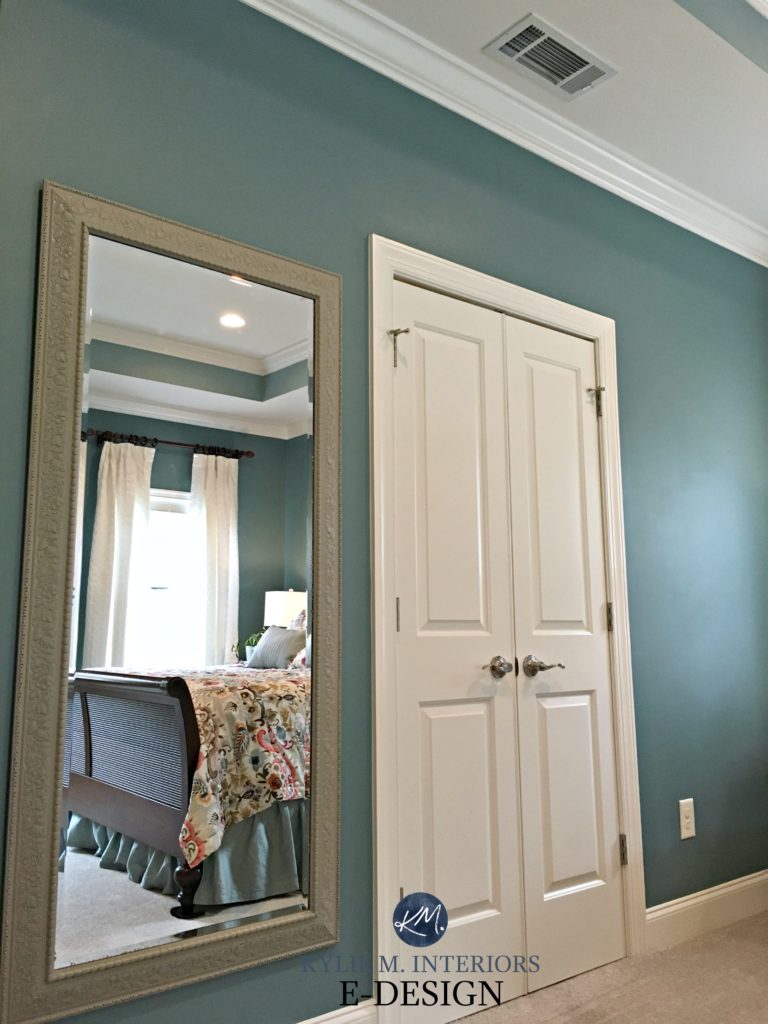
3. BENJAMIN MOORE GRAY CASHMERE 2138-60
Gray Cashmere is a LIGHT mix of green, blue, and gray, with a bit more gray than not. It certainly won’t look like a plain shade of gray, but the gray works to calm the blue-green blend down quite a bit. And while it’s a blend of those three colors, it more often leans blue-gray than green-gray.

Gray Cashmere has an LRV of 65, the highest on this page.
IS GRAY CASHMERE A POPULAR BLUE-GREEN-GRAY PAINT COLOR?
While many are inclined towards a more gray-centric look with this type of color (e.g., Benjamin Moore Gray Owl), Gray Cashmere is an awesome choice for those who want a whisper of color.
- Gray Cashmere is a popular bedroom and bathroom paint color with a relaxing vibe.
- For those who love blue-green blends, Gray Cashmere rarely gets them tinklin’ on their toenails – it’s just not that colorful. Instead, it’s likely to appeal to those who like a feather-light approach to color.
All the photos in my blog are from my Online Color Consulting clients, readers, & friends— because real homes deserve to be celebrated (dirty laundry & all!) While not magazine-perfect, they’re packed with ideas & proven color choices to help you create a home you’ll love.
4. BENJAMIN MOORE MOUNT SAINT ANNE 1565
Mount Saint Anne is a gorgeous blue-green with a decent gray backdrop, calming it down. The overall blend is relaxing, yet still colorful enough to be interesting. Mount Saint Anne has an LRV of 42, so she’s solidly in the medium tones.
Like most of the colors on this page, Mount Saint Anne is a glooorious way to contrast and complement wood finishes such as trims, furniture, flooring, and cabinets…
The Best Paint Colors with Wood Cabinets & Trim
WHY IS MOUNT SAINT ANNE POPULAR?
- Mount Saint Anne is super popular for a calm coastal look.
- While it can be a touch cool for a north-facing room, it’s a great way to balance out the warm sunshine in a south-facing room.
- If you want a lighter touch, check out Benjamin Moore Beach Glass.
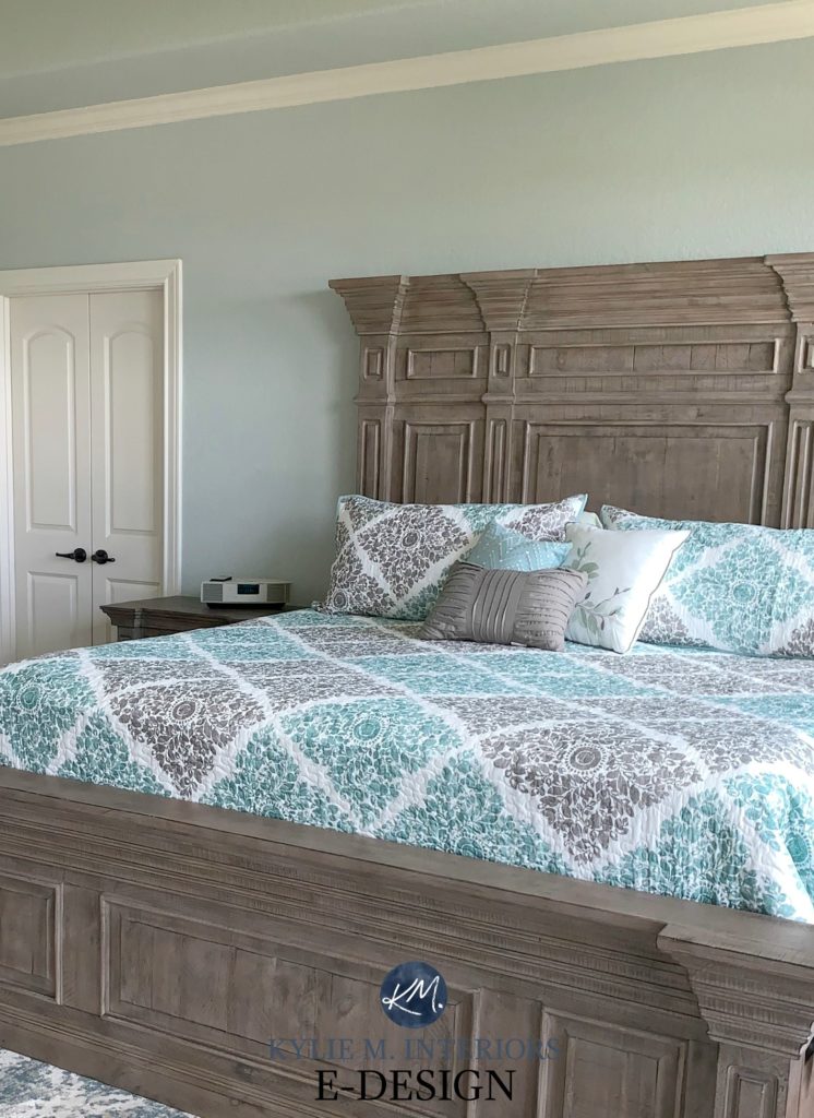
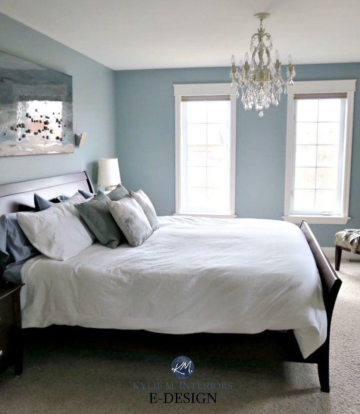
5. SHERWIN WILLIAMS RAINWASHED SW-6211
Rainwashed lights me up like a friggin’ firecracker (let’s be honest, I’m a Ginger – it doesn’t take much). With its slightly more ‘colorful’ approach to blue and green, it’s wicked pretty for bedrooms, in particular.
Sure, there’s gray calming it, but it takes a bit of a backseat, making Rainwashed more ‘color-forward’.
The LRV of Rainwashed is 60, making it a light-depth blue-green paint color.
WHY IS RAINWASHED A POPULAR SHADE OF BLUE-GREEN?
- Rainwashed is definitely ‘color-forward’ as the gray takes a backseat, but it’s not even close to overwhelming for the average blue-green lover.
- It’s super popular for both beachy and modern farmhouse-style homes!
- Even kids love this color as it’s a happy medium between the more colorful end of things (which kids often love) and their parents often more muted preferences.
Here’s your Peel & Stick sample of Rainwashed…

FULL Paint Color Review of Sherwin Williams Rainwashed
Paint Color Review of Benjamin Moore Palladian Blue (very similar)
6. BENJAMIN MOORE GIBRALTAR CLIFFS 1587
HOT DAMN, I love this color! Gibraltar Cliffs is a gorgeous choice for a soft, slightly West Coast vibe! It blends blue and gray with a decent green to soften it up.
Notice in the above photos how the color can change or recede depending on the light it receives.
Gibraltar Cliffs has an LRV of 30, so while it’s slightly darker, its color rises nicely, especially when hit with a dash of natural light! Unlike this photo below, it’s tucked in a slightly shady corner and picks up a super moody vibe…

WHY IS GIBRALTAR CLIFFS A POPULAR BLUE-GREEN PAINT COLOR?
- It’s great for a whole room if you have enough light
- It’s gorgeous as an accent wall with gray, soft cream, or flexible, warm, off-white walls
FULL Paint Color Review of Benjamin Moore Gibraltar Cliffs
7. SHERWIN WILLIAMS EARL GREY 7660
Earl Grey isn’t really a blue-green; it’s more of a GRAY with a reasonably noticeable but not overpowering blue-green undertone.
With its gray foundation, Earl Grey offers a calm, coastal look.
Earl Gray is a medium-depth paint color with an LRV of 32. If you have a dark room, this LRV, combined with Earl Gray’s reduced undertones, could make it look a bit flat and drab. Earl Gray does best in a room with adequate lighting to bring it to life!
Check out these next comparisons…

BM Gibraltar Cliffs | BM Steep Cliff Gray | SW Moody Blue | SW Riverway
- Compare Earl Gray to Gibraltar Cliffs – notice how Gibraltar Cliffs has a bit more blue-green showing.
- Comparing Moody Blue and Earl Gray helps you see how GRAY Earl Gray can look!
IS EARL GRAY A POPULAR PAINT COLOR?
Nope. Sure, it has its followers, but it’s not nearly as popular as colors that are more forward with their blue-green hues.
Subscribe to my Kylie M YOUTUBE channel for more great Kylie M. content!
8. BENJAMIN MOORE WOODLAWN BLUE HC-147
Woodlawn Blue might come across pretty darn blue at times – more often than not, but it’s actually a green hue. However, with the way natural lighting often affects it, you can expect some surprises – more often it presents as a blue with some green and some gray to calm it.
Should it really be called Woodlawn Green? No, you’ll find that it often leans into blue – surprisingly so!
A color like Woodlawn Blue holds up nicely in a north-facing room (which could look TOO cold with a real true blue on the walls).
Why does this wee dab o’ blue matter?
Green loves to lean green-yellow or green-blue. Without a bit of blue, green will lean warm and more organic.
WHY IS WOODLAWN BLUE POPULAR?
- Woodlawn has an LRV of 61, so it’s light but not SUPER bright.
- Woodlawn Blue is calming and helps balance the visual warmth of a south-facing room or a west-facing room in the afternoon.
- With its increased color (chroma), Woodlawn Blue is a good color for dark rooms.
Get expert color advice…
Check out my ONLINE PAINT COLOR PACKAGES – let me make it easy for you!
9. SHERWIN WILLIAMS MOODY BLUE 6221
While this blog post doesn’t dabble in the darker end of the blue-green world, Moody Blue winks at the darker range with a ‘come hither’ glance.
Moody Blue has an LRV of 27, parking its ample booty in the middle of the medium depths. As for its ‘color’, its degree of gray helps it look ‘less than teal’, but more than coastal.
WHY IS MOODY BLUE POPULAR?
- While not everyone can handle a color this dark in a room, for those who love a bit of personality, Moody Blue is a great way to hit this look without going buckwild.
- Moody Blue is gorgeous for accent walls, teal-inspired kitchen islands, front doors, and more.
10. SHERWIN WILLIAMS COMFORT GRAY 6205
Comfort Gray is essentially the light-medium version of Sea Salt. And just like Sea Salt, it’s a bit of a ninja, looking more blue-green in some rooms and green-blue in others!
If we’re talking interiors, Sea Salt is more popular. However, for the exterior of a home, Comfort Gray offers a bit more depth, which can hold up better if there’s a lot of natural light.
WHY IS COMFORT GRAY A POPULAR PAINT COLOR?
- Comfort Gray has an LRV of 54. Not sure what LRV is? This LRV means Comfort Gray has more meat on its bones, offering more contrast with white trim.
- Comfort Gray is a beautiful choice for a south-facing room to balance out those warm sunbeams!
- Some blue-greens are super forward with their color. Comfort Gray offers its color on a platter without making it the WHOLE MEAL.
FULL Paint Colour Review of Sherwin Williams Comfort Gray
While many of the colors in this next image aren’t on this list (as they’re too green or too gray), this should help you see how Comfort Gray compares to other popular shades…
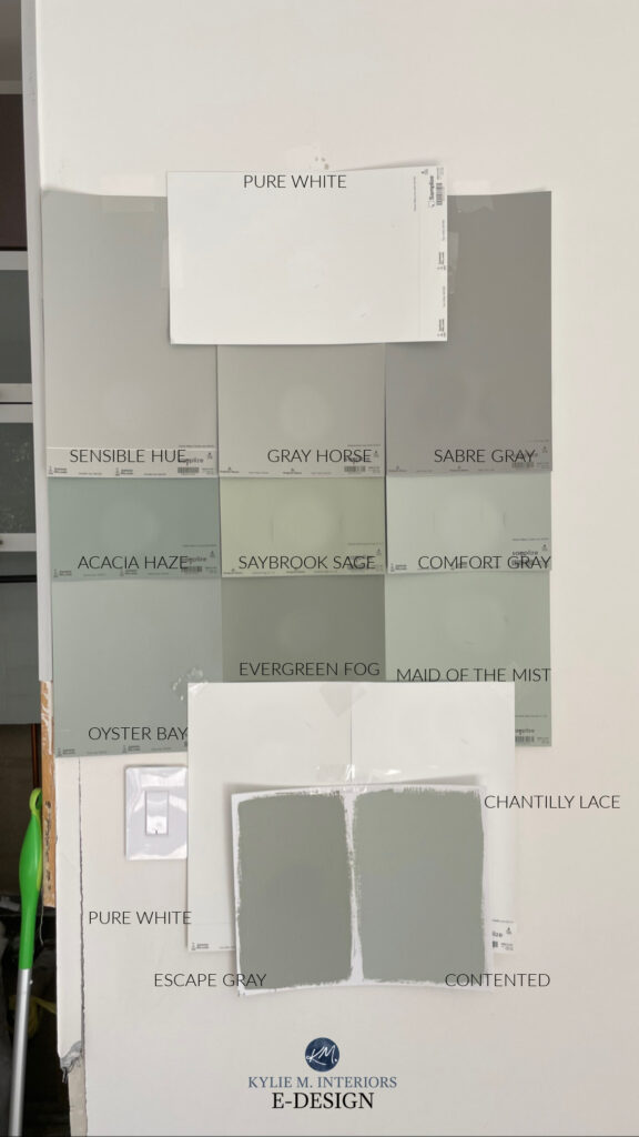
Here are reviews of a few of the above shades: Evergreen Fog | Comfort Gray | Pure White | Chantilly Lace | Acacia Haze (the rest are TBA!)
11. SHERWIN WILLIAMS SILVER STRAND 7057
Silver Strand is a gorgeous blend of blue, green, and gray—although it usually favors blue the most!
WHY IS SILVER STRAND A POPULAR PAINT COLOR?
- Silver Strand has an LRV of 59, so it’s a light depth but has a bit more body than others. This works well if you have quite a bit of natural light.
- While Silver Strand is a blend, it’s much more likely to favor the blue, which is softened quite a bit by the gray, with the green playing a smaller part.
- Silver Strand can be a great choice if you want a wink of color but aren’t ready to commit on a large scale.

Paint Color Review of Sherwin Williams Silver Strand
12. SHERWIN WILLIAMS LATTICE 7654
Lattice is a light blend of gray, blue, and green—just a whisper of color for those who aren’t ready to commit fully!
WHY IS LATTICE A POPULAR PAINT COLOUR?
- Lattice has an LRV of 61, so it has a great light depth and is almost on my sweet spot (don’t tell Tim, he’s been searching for that spot for years).
- Lattice can just as easily favor the blue over the green OR the green over the blue, giving it TONS of flexibility.
- Overall, Lattice is one of the GRAYEST blends on this page.
By the way, Lattice is QUITE similar to Sherwin Williams Front Porch if you want a color to compare. Sometimes, it’s that subtle tweak of undertones that does the trick!
The 16 Best Paint Colors with Oak or Wood Cabinets & Trim
13. SHERWIN WILLIAMS SILVERMIST 7621
Silvermist is one of the most beautiful blue-green paint colors—I get asked about it all the time in my Online Paint Color Consulting! While it looks a bit grayer and calmer in some spaces, its blue-green blend always rises to the top.
Thanks to its gray backdrop, Silvermist is muted enough to be calm but has enough color to add interest and personality to your walls. Just make sure it doesn’t take its color a bit too far for the look you’re wanting.

WHY IS SILVERMIST A POPULAR BLUE-GREEN BLEND?
With its LRV of 47, Silvermist has more meat on its bones than many others. And while it has its place in many homes, I think its beauty and potential gets missed a lot due to its PLACEMENT in the fan deck (it’s not in the main blue-green section).
- Silvermist’s LRV of 47 puts it on the slightly darker side of the light-medium range, making it great for 1 room but a bit much for an entire home.
- Whether Silvermist caters to its blue side or its green one is hit-and-miss!
- If you love the idea of a soft blue-green on your front door, Silvermist is a good one to consider.
FULL Paint Color Review of Sherwin Williams Silvermist
The Best HAINT BLUE Paint Colors for Your Porch Ceiling
14. BENJAMIN MOORE QUIET MOMENTS
Can we have a quiet moment for Quiet Moments? HELLLLLS NO, this color is amazeballs.
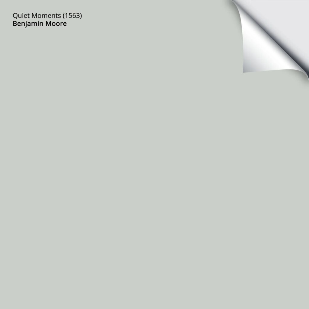
Here’s your Peel & Stick sample of Quiet Moments
With an LRV of 60.73, Quiet Moments falls within the light range, but slightly on the lower end of this range.
WHY IS QUIET MOMENTS POPULAR?
- While some of the best blue and green blend paint colors are more obvious in their approach, Quiet Moments offers up a bit more gray.
- Its depth makes it less popular for kitchen cabinets, accent walls, or doors, but it makes up for this as a hot shade for any number of rooms, especially bedrooms.
Benjamin Moore Quiet Moments: IMAGES, Info, & More
15. BENJAMIN MOORE BEACH GLASS 1564
If you’re looking for a shade that caters to blue with a polite nod toward gray and green, I’ve saved one of the best til almost last.
Beach Glass has been around for a long time for good reason. Sitting right above Mount Saint Anne in the fan deck, Beach Glass has a similar approach, but its higher LRV leaves a softer impression on your walls.

Beach Glass has an LRV of 50, so it’s on the slightly darker side of the light-medium range but BLUER and lighter than Silvermist.
WHY IS BEACH GLASS SO AMAZEBALLS?
- Beach Glass is the type of depth that adds personality to your walls without overwhelming them with color.
- I also think Beach Glass was well named, as even its name suggests a relaxing mood!
- For a bit more beautiful depth, check out Benjamin Moore Mount Saint Anne.
Benjamin Moore Beach Glass: IMAGES, Info, & More
16. BENJAMIN MOORE STRATTON BLUE HC-142
Stratton Blue is a stunner if you want a color with a bit more meat on its bones, both in depth and color!
Stratton Blue has an LRV of 38, so while it’s hitting the medium depths, it’s not a heavyweight by any stretch.
In this next photo, I suggested a range of brighter blue-greens for my Online Color Consulting client. Compare Stratton Blue to the popular Wythe Blue, which is slightly lighter…

WHY IS STRATTON BLUE SO POPULAR?
- It’s gorgeous on the inside or outside of a front door (or even an entire exterior!).
- Great feature wall color.
- Stratton Blue also works well for an ENTIRE room.
- With its commitment to color, Stratton Blue works well in dark rooms, as its chroma helps it stand out against shaded or dark areas.
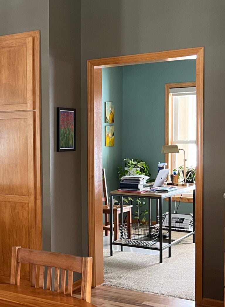
17. BENJAMIN MOORE WALES GRAY 1585
As far as badass and beautiful blends of blue, green, and gray go, Wales Gray might be at the bottom of this list, but it’s at the top of mine!

Whereas many other colors on this page are ‘color-forward,’ Wales Gray takes a pretty well-balanced approach to its blend, so you’re not overwhelmed by gray or color.
Wales Gray has an LRV of 53.54, so it winks provocatively at the lower end of the light range but offers a bit more contrast with white trim.
WHY DO I LOVE WALES GRAY SO MUCH?
- I love its balanced look—just enough color to be interesting without too much gray that would make it fall flatter than me in Grade 8.
- Whereas some of the stronger blue-greens can be a bit strong for the average exterior, Wales Gray’s more modest approach can settle nicely.
- It’s beautiful for an entire room, with a soft, coastal-inspired accent wall and kitchen cabinets!
18. BENJAMIN MOORE BOOTHBAY GRAY
I thought I’d finish this blog post on a quiet note (I think Tim slipped some ‘gray’ into my coffee and Bailey’s).

Boothbay Gray speaks my language when it comes to gray vs. color. While it’s not overtly blue-green, Boothbay Gray is a gorgeous way to get a blue-green look with minimal commitment.
The Best Sage Green Paint Colors for Cabinets
WHY IS BOOTHBAY GRAY A POPULAR BLUE-GREEN PAINT COLOR?
- While it’s not a top choice for all walls in a room, Boothbay Gray makes a great accent wall partner to any number of warm, soft white paint colors or flexible, warm off-white paint colors.
- Boothbay Gray is gorgeous for kitchen cabinets or even just your island or lower cabinets.
- It also makes for a beautiful door color, both inside and outside.
The Best Blue-Gray Paint Colors
While it looks CONSIDERABLY grayer in this next photo, I love how my friend’s kitchen island turned out with Boothbay Gray…

Get your SAMPLIZE PEEL & STICK samples of some of Kylie M’s recommended colors from this post!
PEOPLE ALSO ASK…
WHAT’S SHERWIN WILLIAMS MOST POPULAR BLUE-GREEN PAINT COLOR?
According to SAMPLIZE Peel & Stick, Sherwin Williams Sea Salt and Rainwashed are the two most popular shades of blue-green. Whether it’s their depth or their exact blend of green, blue, and gray, these two calming, spa-inspired colors often pop up on walls but not so much on cabinets or exteriors.
Remember to watch Sea Salt, particularly, as it’s known to swing WILDLY between blue and green – you’ll want to sample it and see where it lands in your home!
The 10 Best Paint Colors to Create Calm & Reduce Stress
WHAT’S BENJAMIN MOORE’S MOST POPULAR SHADE?
What I find interesting is that while Sherwin Williams most popular blue-greens are Sea Salt and Rainwashed, Benjamin Moore’s most popular one is Beach Glass.
Why is this interesting?
Because I’m a HUGE nerd about color and get excited about weird things. Also, Benjamin Moore has the spitting image of Rainwashed with Benjamin Moore Palladian Blue (they aren’t the same, but are similar). So, you’d think that Palladian Blue would be hot, right? It’s not. Sure, it makes the top 100, but it’s nowhere near Rainwashed in popularity.

WHAT PAINT COLORS GO BEST WITH BLUE-GREEN BLENDS?
Blue-green blends can be quite flexible and enjoy being part of a palette with…
- A wide range of cream paint colors and warm off-whites like Benjamin Moore Ballet White and Sherwin Williams Aesthetic White. These warm-cool combinations can add energy to a space.
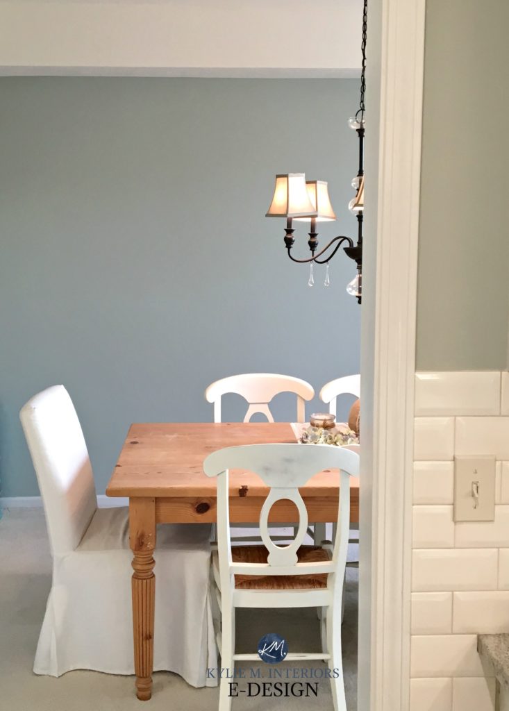
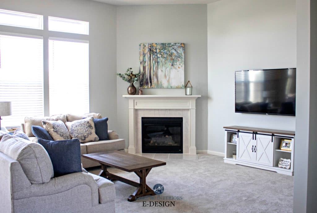
- Blue greens also enjoy warm shades of gray and greige, including colors like Benjamin Moore Edgecomb Gray and Revere Pewter.
In this next photo, Benjamin Moore Imperial Gray (another gorgeous shade) plays well with the more muted approach of Benjamin Moore Silver Satin in the dining room.
So there you have it – just a few of the BEST blue-green paint colors!
READ MORE
The 11 Best SAGE Green-Inspired Paint Colors
The Best Blue & Green Paint Colors for Bedrooms
The Best Light Blue Paint Colors
The Best HAINT BLUE Paint Colors for Your Porch Ceiling
The TOP 12 MEDIUM DEPTH Blue Paint Colors
The 10 Best Paint Colors to Create Calm and Reduce Stress
Need help?
Check out my Online / E-Design Paint Color Consultations!
Related Video!

ORIGINALLY WRITTEN IN 2019, UPDATED FOR YOU IN 2025


BM Aegean Teal curious! Named color of the year. What are your thoughts?
You know, it’s BEAUTIFUL, it’s just tough. I like to see Colours of the Year that have a bit more mass appeal. If it can be used on a feature wall, island, front door, kitchen cabinets – that kind of thing, well, I’m ALL in. I just think Aegean Teal is a bit limiting, which means less people can use it!
Hello Kylie,
Great article. Have you ever considered Magnetic Grey? I have painted several rooms in my home in this grey/blue color. Some of my friends loved it so much they used it as well.
I used your consulting service for my front door and will be reaching out for advice on my sunroom.
I DO love Magnetic Gray! It has such a moody look to it and can be gorgeous :). And I’m happy to help you with your sunroom! If for some reason my consults are sold out, just send me an email and I’ll try to squeeze you in 🙂
Hello Kylie,
Great article. Have you ever considered Magnetic Grey? I have painted several rooms in my home in this grey/blue color. Some of my friends loved it so much they used it as well.
I used your consulting service for my front door and will be reaching out soon for advice on my sunroom.
Thanks again.
Thoughts on an entire North Facing Master Bedroom in Caribbean teal? Lots of windows (3 bay) but Michigan, North Facing… currently going with Mineral Green color match from Joanna Gaines in a Ben Moore. (Which we are obsessed with in our south facing living room)
We don’t like “accent walls” so it would be all or nothing.
We definitely want a green/blue that isn’t BLUE BLUE or sage green. 🙄. Ha…which is why we love our living room..it changes colors throughout the day.
YESSSS, Amanda, I love the idea of this. Even with north-facing light, Caribbean Teal has such a great ‘color’ to it, without being overwhelming NOR too grayed out. I’d love to see how it turns out!
Hi Kylie…well we totally went for it…But it’s actually Aegean Teal..Not Caribbean…and we LOVE IT. Not quite finished with the rest of the furniture etc. but it’s absolutely incredible.
I love your web site and have appreciated how much I have learned. When can I hire you?! Spots haven’t opened. 🙁
I am looking for a green blue for the exterior of our Cape Cod style home in inland Massachusetts. One person on our block has SW Oyster Bay, which looks quite good but we were hoping to find something more vivid and less subject to looking washed out. Any suggestions? Thank you so much!
Hiya! Well, I’m taking some time off (intermittently) this summer, but i TRY to open some up Mon/Wed/Fri when I can!!! If you can’t get one within a week or two, please send me an email and I’ll see if I can squeeze you in! It’s more efficient/smooth through the website, but I don’t want to leave you hanging! kylie@kylieminteriors.ca
Kylie
What is your opinion on Rushing River for a mudroom locker color with a small window from the south.
Without seeing the room, off the top, I don’t see any problem – it’s lovely!
Would you consider Wales Gray for a coastal exterior east facing home?
Oh, heck YES I would!
What are your thoughts on a Sea Salt exterior and dark blue doors (considering naval) for a north facing coastal home? Any suggestions would help.
Hi Tami,
I would love to see how it turned out… we are considering the same palette. Turn between Sea salt and Top sail.
It must be frustrating to see that google AI is stealing your posts, with barely even an attempt to paraphrase them. I am renovating my sixth house in 13 years, with countless visits to your website along the way, and consequently can practically hear your voice when the AI answers show up at the top of a color search.
Ahhhh yes, it’s a tricky time for sure. What I really appreciate is you coming to my blog, as that’s the stuff that keeps me going – AI can’t beat that (I hope!!!!) Thank you 🙂