
Sherwin Williams 11 Best Tan Paint Colors
THE TOP 10 TANTALIZING TANS & WARM NEUTRALS
If you’ve followed my blog for a while, you know that beige and tan aren’t the same color. So, while I’ve written several blog posts on the best beige paint colors, it’s time to dedicate one to the titillating world of tan.
Ummm, pardon? There’s a difference between tan and beige?
You bet your cute little booty there is. Sure, they’re doing the same thing – looking like warm neutrals, but they’re doing it differently. Like greige vs. taupe or white wine vs. rose, beige and tan are kissin’ cousins as they’re related, but they have key features that set them apart.
WHAT MAKES A COLOR BEIGE?
Beige paint colors tend to look warmer in a more ‘golden’ way. This means they often have more orange-yellow or orange-pink undertones.
FUN FACTS ABOUT BEIGE PAINT COLORS
- Beige paint colors are usually more suited to a Tuscan-style home than tans.
- They are likely to have an orange or orange-red (pink) undertone.
- They tend to look richer and warmer compared to tans.
WHAT MAKES A PAINT COLOR TAN?
Tan paint colors often seem a bit more subdued and neutral-looking, as those warm, golden tones can recede. But don’t be fooled, tans just offer a different type of warmth.
In any tan paint color, you’re less likely to find pink (red) undertones and more likely to find yellow, yellow-orange, or green undertones. 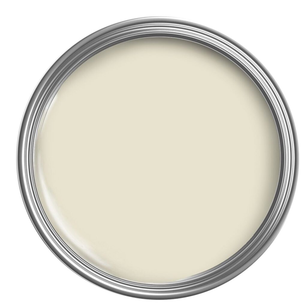
FUN FACTS ABOUT TAN PAINT COLORS
- Tans are more likely to have a yellow or yellow-green undertone and less likely to have orange or red (pink) undertones.
- The most popular tans are in the light range and won’t have an overly rich Tuscan appearance.
- Tans are MUCH closer to the greige world (via their green undertones) than beiges (which relate more to taupe via their pink undertones).
This is why some people hate beige and love tan – it’s all about the undertones! Even though they’re both warm colors, some people prefer the more grounded, neutral approach of tan paint colors over the more golden, early 2000s look of many beiges.
Are Beige & Tan The SAME THING?
IMPORTANT NOTE: Paint companies have made it hard for us to distinguish between tan and beige, often using the terms ‘tan and beige’ all willy-nilly. DON’T JUDGE A COLOR BY ITS NAME. Just because a color’s name includes the words tan, beige, white, gray, etc… doesn’t mean it actually IS that color!
Moving along!
Today, I’d like to share some of the Sherwin Williams best tan paint colors with you – colors that are more muted and subtle than some of their roasty-toasty beige cousins.
While tan paint colors (as a whole) aren’t as popular as beige, many homes and homeowners are begging for a perfect neutral shade of tan, and I’m here to give it to them.
So, without further ado, let’s find the hue for you…
1. SHERWIN WILLIAMS CANVAS TAN 7531
Canvas Tan is soft, fresh, and bright, giving it a typical tan look – it’s what many people think of (in terms of depth and undertones) when they’re looking for the perfect tan paint color.
I’m also looking for the perfect tan, but my pasty white arse ain’t goin’ anywhere.
FAQs ABOUT CANVAS TAN
- While Canvas Tan suits many wood tones, it’s not the best color to complement cherry or red wood stains.
- Canvas Tan isn’t one of the more muted tans, as it has a good life and energy. This said, it’s not remotely overpowering.
- Canvas Tan has an LRV of 64. If you have a dark room, its combination of depth and the fact that it’s a warm, earthy neutral could make it look a touch drab.
- As shown in the previous photo, partner Canvas Tan with a soft, warm white like Sherwin Williams Shell White for a more muted look. For a more crisp approach, try Greek Villa.
Sherwin Williams Canvas Tan: IMAGES, Info, & More

Never heard of LRV? It’s amazeballs: The Ultimate Guideline to Choosing Paint Colors with LRV
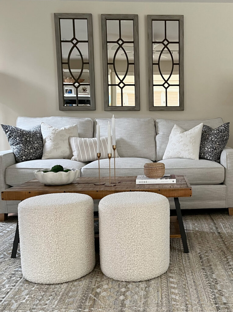
2. SHERWIN WILLIAMS NEUTRAL GROUND 7568
Neutral Ground is a soft, reasonably muted tan color, so it doesn’t have a golden Tuscan or a rich look. It’s like a lighter version of Canvas Tan, and because it’s lighter, it comes across as slightly creamier.
How to Update Your 2000s Home: 6 Part Series
Sherwin Williams Neutral Ground: IMAGES, Info, & More
FAQs ABOUT NEUTRAL GROUND
- Neutral Ground is great if your room has lower light, as it won’t look quite as heavy as Canvas Tan (even though neither is terribly heavy).
- Neutral Ground has an LRV of 70, making it lovely and light without being off-white or washed out.
- If you like Neutral Ground but wish it were a bit MORE neutral and lighter, check out some of my favorite, flexible, warm off-white paint colors.
Get the best color advice…

3. SHERWIN WILLIAMS WOOL SKEIN 6148
Wool Skein is a sneaky lil’ bugger with its undertone. At first glance, you might see a soft, simple tan, but it will be hard to miss the green that lies beneath once you see it on a larger scale. That’s right, green.
Sure, tan paint colors love to throw green undertones around, but Wool Skein is that bit more committed.
If you don’t like too much green, don’t pick this color; it’s not subtle. And while that doesn’t mean it’s overwhelming, it’s noticeable.
This is my client’s BEFORE photo (I’m still patiently waiting for the ‘after’)…

It’s easy to see the green hue on these walls!
As for depth, Wool Skein is light and fresh without becoming so light that it looks washed out (LRV 64).
While at first glance it looks pretty darned ‘tan,’ compare it to Sherwin Williams Canvas Tan (#1) to see the shift from a relatively neutral tan to a tan with green undertones.
Remember, comparison is the best tool for finding the undertones in a paint color. I’m the second best tool.
Paint Color Review: Sherwin Williams Wool Skein
FAQs ABOUT WOOL SKEIN
- It works well with many yellow-toned wood stains, as those with a more ‘brown’ look.
- Pairing Wool Skein with blue or cool tones can bring out the warm tones a bit more. In particular, Wool Skein looks great with mid-tone gray-blue-green blends.
- If you have warm-toned woods that have strong yellow, orange, or red tones, this could bring out the green undertone in Wool Skein.
- The LRV of 64 keeps this color fresh and bright, without being punchy.
Here’s your Peel & Stick sample of Wool Skein…

4. SHERWIN WILLIAMS SANDBAR 7547
Sandbar is a light-medium depth tan paint color, with an LRV of 53. And while it does have tan’s subtle undertones, they’re SUPER muted, and most of the time. Overall, Sandbar reads as a pretty simple neutral.
With non-white painted cabinets being trendy, colors like Sherwin Williams Sandbar, Balanced Beige, and Pashmina are showing up in my Instagram feed MUCH more often!
FAQs ABOUT SANDBAR
- Sandbar could be a bit muddy and heavy for a dark room and is best suited to a room with average or more natural light.
- If you like Sandbar, but want a lighter shade, check out Natural Tan (coming up next!)
- Sandbar looks stunning with darker greige tones like Sherwin Williams Urbane Bronze.
Sherwin Williams Sandbar: IMAGES, Info, & More
5. SHERWIN WILLIAMS NATURAL TAN 7567
To call Natural Tan a TRUE tan is an overstatement. In fact, its undertones are SO subtle; it can even pass as a beige (which can also grab a wee green undertone).
Another thing that sets Natural Tan apart from the rest is its gray undertone. Compared to other tan paint colors, Natural Tan is a considerably grayed-out neutral, which cuts back on its warmth quite a bit.
Natural Tan is popular for those wanting a muted shade of tan. It can be a great transition color between the worlds of cool gray and overly warm beiges.
With trends leaning warmer, this color could come in handy!
Take a look at how incredibly muted Natural Tan appears in the next photo…
FULL Paint Color Review of Sherwin Williams Natural Tan
However, remember that if you have a north-facing room or a space with low light, a color like Natural Tan can look a bit flat and dull (as shown above).
Paint colors need LIGHT to come to LIFE!
FAQs ABOUT NATURAL TAN
- If you need a neutral that doesn’t commit hard to yellow, orange, pink, or green, Natural Tan could be a great choice.
- Natural Tan can be a great paint color for a south-facing space if you love warm colors but don’t want TOO much gold.
- Natural Tan has an LRV of 63, putting it DARN CLOSE to my magical LRV number for almost any room! This depth makes Natural Tan a light shade.
6. SHERWIN WILLIAMS WHITE DUCK 7042
Sadly, there aren’t many ‘off-white, tan paint colors.’
Why?
Because once tan gets THIS light, it can look more like a cream paint color. Such is the case Sherwin Williams White Duck. This particular shade nods at the tan world, but being SO LIGHT, it can act more like a super muted, dirty (dirty being a good thing) cream-tan-greige blend.

White Duck rarely flashes its green underpants (only on St. Patrick’s Day); however, if it worries you, take a look at the very similar, Sherwin Williams Shoji White.
Sherwin Williams White Duck: IMAGES, Info, & More
FAQs ABOUT WHITE DUCK
- White Duck is the perfect hybrid – not cream, not tan, not greige.
- With its LRV of 74, White Duck is an off-white paint color, but on the lower, darker end.
- White Duck isn’t just popular on the walls of a room, it’s hawwwt on kitchen cabinets and exteriors, too!
The Best Blue-Green Blend Paint Colors
Sherwin Williams isn’t limited to the above shades; however, due to their popularity with my Online Color Consulting clients, they’re the ones I have photos of.
All the photos in my blog are from my Online Color Consulting clients, readers, talented photographers, & friends— because real homes deserve to be celebrated (dirty laundry & all!) While not magazine-perfect, they’re packed with ideas & proven color choices to help you create a home you’ll love.
This said, I’d love to share a few more tan paint colors with you, even though I don’t have images of them in action…
7. SHERWIN WILLIAMS GRECIAN IVORY 7541
Grecian Ivory is another hybrid of sorts. While it harbors an obvious green undertone, it has a decent amount of gray in it, making it hover between tan and greige (greige is in between gray and beige, with a green undertone).
In fact, your EXPOSURE could be the thing that has a color like Grecian Ivory leaning one way or another. For example, northern light might have Grecian Ivory favoring its greige side, whereas warmer southern sun could humor its creamy-tan base a bit more.
Grecian Ivory looks gorgeous partnered with a wide range of warm, soft, off-whites.
8. SHERWIN WILLIAMS RELAXED KHAKI 6149
While Relaxed Khaki might look neutral at first glance, don’t let it fool you. Relaxed Khaki is a strong tan paint color with its green-yellow undertones.
Relaxed Khaki is a slightly darker (LRV 50) and more rustic approach to tan, ideal for those who want more contrast with their white trim or a cozier look. Add a bit more depth, and you hit Universal Khaki, which has its own following, although it’s darker than what today’s warmer trends call for.
9. SHERWIN WILLIAMS OYSTER BAR 7565
If stronger shades of tan come back in style (doubtful), I can see Oyster Bar being a HUGE hit. However, its increased yellow-green hues can be a bit much for the average space. Why mention it? Because it might be just perfect for YOU!
Oyster Bar has an LRV of 64, making it a light-depth paint color. If you want to see how much yellow-green it has in it, compare it to a color like Benjamin Moore’s Manchester Tan, which looks DARN NEUTRAL in comparison!
10. SHERWIN WILLIAMS NATUREL 7542
If you love a paint color with a bit more meat on its bones, Naturel could be the tan for you.
With an LRV of 54, Naturel falls within the light-medium depth range. Picking up where Relaxed Khaki left off, Naturel is more subtle with its undertones, offering a more laid-back approach to a light-medium depth tan.
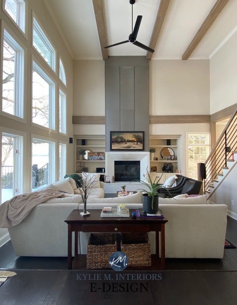
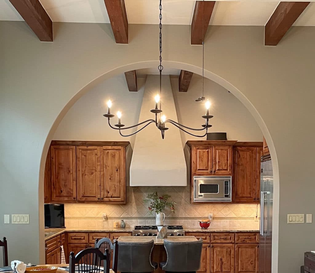
Sherwin Williams Urbane Bronze kitchen island
Natural goes well with the soft, subtle warmth of Sherwin Williams Alabaster or a wicked dark greige like Urbane Bronze.
11. SHERWIN WILLIAMS NATURAL CHOICE
Natural Choice is another interesting one, similar to White Duck in its approach to tan, cream, and greige.
While few tans dabble in the off-white world, Natural Choice’s LRV of 73 has it tiptoeing on the edge of this range, while still leaving a pinky-toe in the light world.
Here’s your Peel & Stick sample of Natural Choice…

Natural Choice isn’t one of my PERSONAL favorites, although others love it. At this depth, I don’t trust its super vague green undertone. I worry that in the right (or wrong) light, it could look almost murky or dingy. It’s not an obvious green hue, and again, some love it, but just sample and compare it carefully.

If you love Natural Choice, definitely compare it to Sherwin Williams Oyster White (shown above).
A FEW TAN-BEIGE HYBRIDS
While some paint colors are committed to their tan tendencies, others are color ninjas, not overly committed to beige or tan.
SHERWIN WILLIAMS SHIITAKE 9173
Sherwin Williams Shiitake is a popular beige-tan paint color. With an LRV of 51, it’s appearing more online, not just on walls, but also on cabinets and exteriors.
Here’s your Peel & Stick sample of Shiitake…

Whether you see Shiitake as a beige or tan could depend on your room’s exposure, its surrounding finishes, and your perception.
- Compare Shiitake to a traditional tan paint color like Sandbar, and it will seem more beige.
- On the other hand, compare Shiitake to a beige like Bungalow Beige, and what do you know – it almost looks a touch tannish!
Paint Color Review: Sherwin Williams Shiitake vs Loggia
SHERWIN WILLIAMS LOGGIA 7506
Loggia is another warm neutral that can’t decide which team it plays on.
With an LRV of 48, Loggia ain’t messin’ around – it’s a solid, light-medium depth paint color. While it’s not as popular as Shiitake for cabinets and whatnot, it’s a great option if you want a color with more depth.
- Compare Loggia to a color like Sherwin Williams Barcelona Beige (a tan, regardless of what its name suggests) and it will seem more beige-inclined.
- Or, grab a committed beige like Sherwin Williams Pavilion Beige and compare it to Loggia to see Loggia’s subtle wink towards tan!
WHAT COLORS GO WITH TAN PAINT COLORS?
If you want to create a palette with tan as your foundation, there’s a wide range of colors to choose from. Naturally, it depends on whether you need a color for an accent wall, cabinets, kitchen island, or an adjoining room; these will get you on the right path…
- Warm white paint colors, like Sherwin Williams Alabaster and Greek Villa are great for trims and cabinets.
- Medium and dark greiges with noticeable green undertones, similar to Sherwin Williams Porpoise & Anonymous & the previously mentioned, Urbane Bronze.
- Some darker, warmer green paint colors can be interesting with tan.
- A range of muted off-white paint colors.
- Some find darker, slightly (or more) muted shades of purple to be dynamic with tan paint colors. You do you, boo.
- You might even pull off a darker shade of blue like Sherwin Williams Cyberspace.
WHAT’S SHERWIN WILLIAMS MOST POPULAR TAN PAINT COLOR?
Sherwin Williams White Duck and Natural Choice are the most popular OFF-WHITE tan paint colors, but when it comes to the ones with more meat on their bones, Sherwin Williams Natural Tan is the most popular choice.
But (definitely a surgically enhanced one-yes, it’s that big), Sherwin Williams Shiitake, my favorite hybrid, beats Natural Tan!
READ MORE
Sherwin Williams Best (slightly darker) Beige & Tan Paint Colors
Benjamin Moore’s Best Beige & Tan Paint Colors (Mid-Tone)
The 11 Best Warm Neutral Paint Colors That AREN’T BEIGE!
Get the best color advice…
Check out my Online Paint Color Consulting!

Originally written in 2020, updated and overhauled in 2025


have you ever looked into Maria Killam’s website/blog/colour training? you’ve got the same eye for colour, but her ‘understanding undertones’ method is much easier to articulate and understand. combining your eye and online personality with her system would be an awesome combination.
I do LOVE Maria! And yes, we have similar thoughts on these things! She’s very good at what she does and thank you for the compliment!
You are an amazing teacher!
I love Balboa Mist. Is it a tan?
Maybe I’m a tan fan and not a person who loves beige. Now I know why!
Hi Erika, maybe you ARE a tan fan! But…Balboa Mist is more of a warm gray that wants to be a taupe. So, it’s like a gray with beige in it and a soft purple undertone. It’s a beauty!
so glad we have moved past the grays, ready for something NOT gray. Thank you
You are most welcome! It is refreshing, isn’t it? But you haven’t seen the last of grays yet ;).
OMG I love, love, love Canvas Tan. I have it in my office which is a west facing room, and the color is so beautiful! But I tried it in my great room (which has a northern exposure) and it lost its character! Darn! Now I am searching for another option. Thank you for another great post. Your posts are very informative!
I am glad to have a chance to respond to canvas tan. On your recommendation to what paint colors go well with the color of your wood trim, I used canvas tan with orange oak and southern light in our last house. I loved it! Not everyone can appreciate orange oak, but if you have to make do, canvas tan is a great way to accomplish that. Thanks Kylie! I am now reading up on what to do with our new house!
Wahoo, I’m so glad to hear you had success with it, thank you for sharing!
Thank you! Same problem here , with the orange/golden Oak in kitchen and all the trim. I have a canvas tan sample pot and I’m going to pay extra attention now . Trying to make Agreeable Gray work, but it keeps showing up blue. I already have Useful Gray , which is also blue/green. I’m trying to go opposite of the gray colors, as they aren’t working.
Thank you! Same problem here , with the orange/golden Oak in kitchen and all the trim. I have a canvas tan sample pot and I’m going to pay extra attention now . Trying to make Agreeable Gray work, but it keeps showing up blue. I already have Useful Gray , which is also blue/green. I’m trying to go opposite of the gray colors, as they aren’t working.
Thank you! Same problem here , with the orange/golden Oak in kitchen and all the trim. I have a canvas tan sample pot and I’m going to pay extra attention now .
I’m seriously thinking about using Ballet White on the walls of my family room – a large room with a double height ceiling with East facing skylights and a south facing large window as well – but I’m concerned that it will be too washed out on sunny days. I want the wall color to read as a lighter neutral, not as an off-white. Can you suggest another Benjamin Moore color that is similar to Ballet White but is a little darker/more intense?
Your posts are incredibly informative! I really feel I learn a lot by reading them. Thank you!
Hi Lois! You could easily take a look at White Sand! Now as it gets that bit darker it loses a touch of the creaminess and looks a bit more tan, but it could hold itself just a bit better for you :).
Thank you so much for this article! It really helped me to understand the difference between tan and beige. We have been looking to paint our kitchen/eating area which is west facing (has a small window over sink and a door wall with a window on each side) and has orange/yellow oak cabinets and floors. While canvas tan has caught my attention, I am not sure it is the one I want. I don’t want any green or grey in my paint color. (We back up to woods so it reflects the green in summer time in the kitchen.) What do you think of Sherwin Williams bungalow beige and dhurrie beige? Thanks!
We painted our entryway and main living area BM Manchester Tan. As you enter our house, we have a dining room to the right in BM Wythe Blue. I am stumped on what color to paint the traditional living room (to the left of the entryway, which by the way has a 1960s avocado tile). I would like to add a bit of color as we did with the dining room. We have a print from Guatemala (http://www.laantiguagaleria.com/store/Cornucopia-de-Color-p90548200) on the wall that I would love to draw from — with blues, rich yelows/golds and colors of red clay. Considering BM Moir Gold, Concord Ivory, Lenxox Tan and even SW Cavern Clay (perhaps as an accent wall). The room has nice light with two east-facing and one south-facing window. I would l welcome ideas!
I’m SO happy to see this post! Thank you for clarifying the difference between beige and tan.
Do either Neutral Ground or Ballet White have undertones that will lean pink? Everything seems to lean pink in my dark/north facing foyer as well as my master bedroom.
I like Manchester Tan but I think I need to stay in the 70 LRV range due to lighting (or lack thereof!) for a whole house color. Is there a lighter version of Manchester Tan?
I’m searching for that fresh color that is “light without being off white or washed out”.
Will Dover White trim and ceilings go with SW Canvas Tan or BM White Tan ?
I have a small living room with no natural light … I live in Sanjose . I want to try something with tan . I have pearl cabinets and white trim. Can you recommend me something too
I have a room with 35′ orangey pine ceiling, and ballet white trim already but want to go very light, not gray.
No one has been able to help with this one. Trying not to paint the ceiling or the trim. I love reading the blog because I am not the only person going crazy with colors
Oooo, Kathy, if you have Ballet White trim already, you might be best to do Ballet White walls! It can be really tough to mix and match with trim colors that aren’t the typical ‘white’. I suppose you coudl check out BM Clay Beige, or consider getting Ballet White darkened by 50% – see what that looks like!
If you want more help, I do have an Online Color Consulting service! https://www.kylieminteriors.ca/hire-kylie/
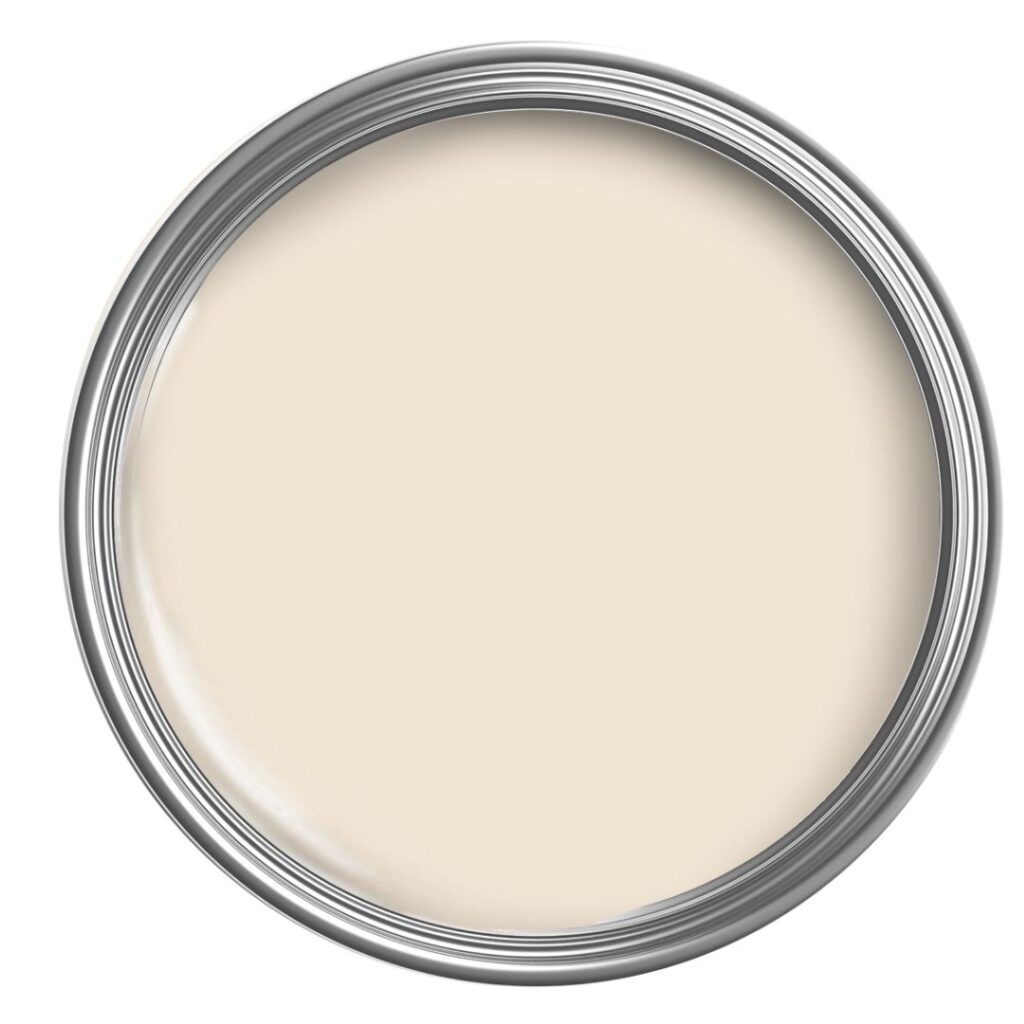
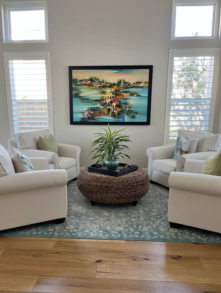
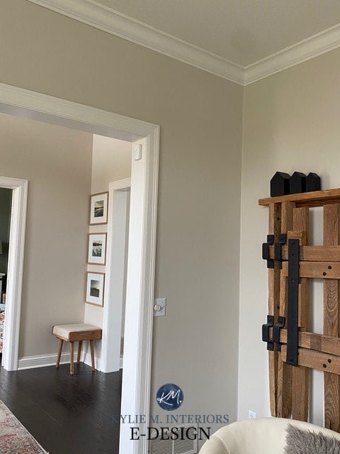
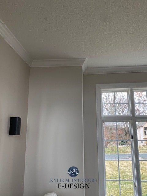
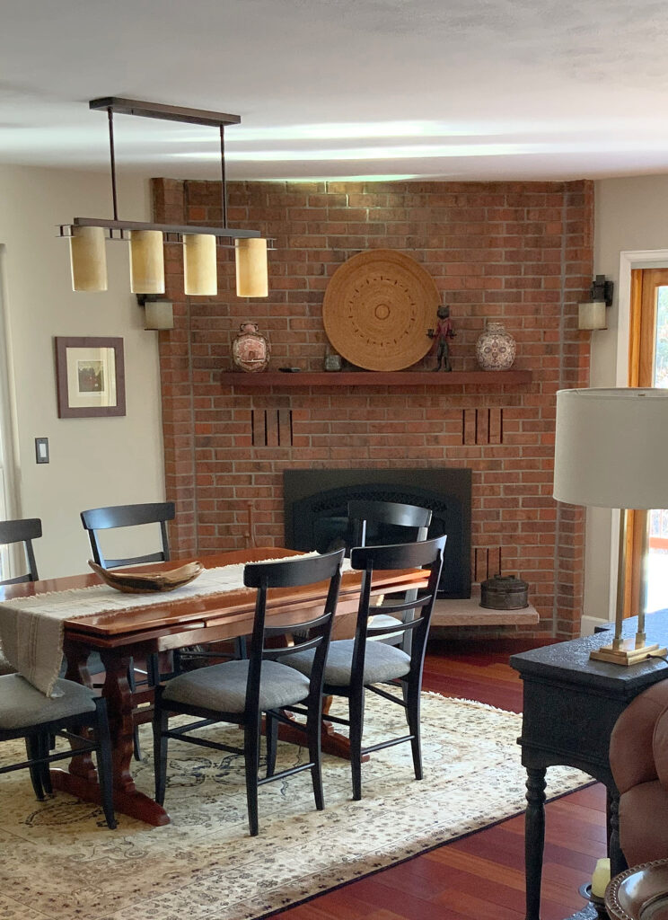
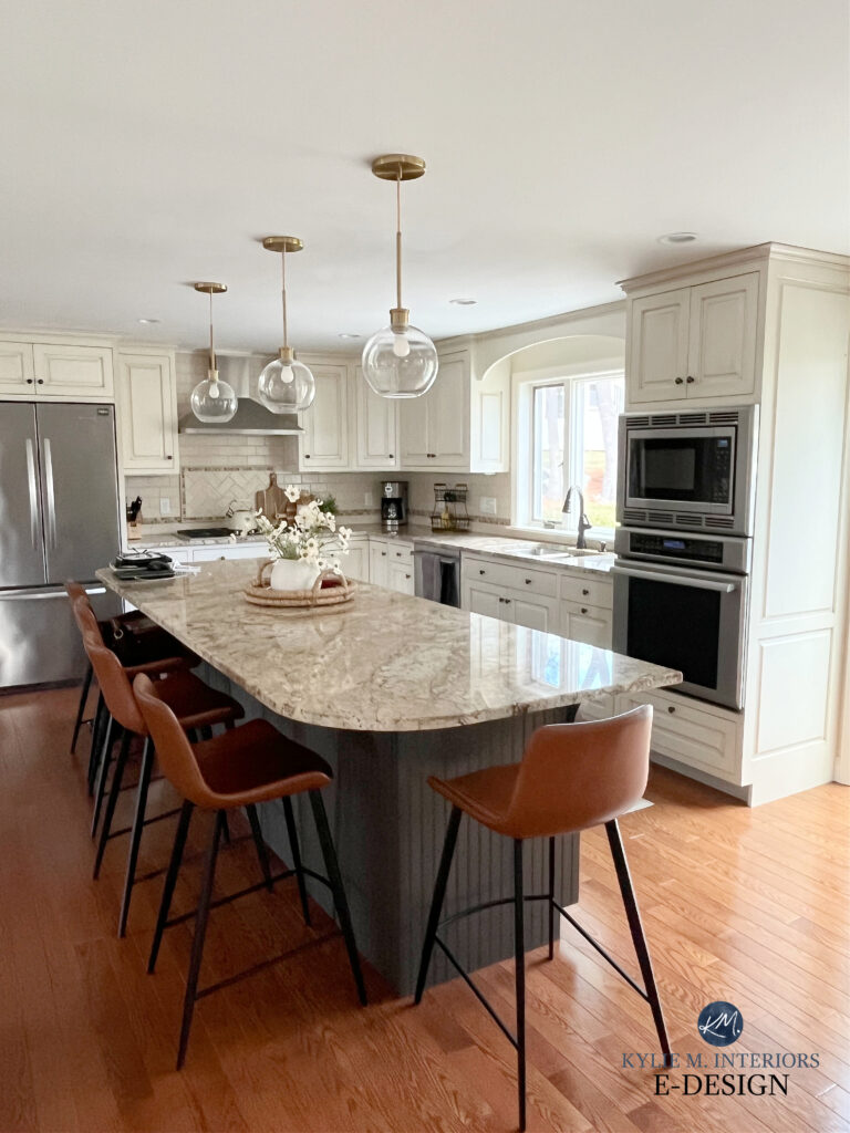
I follow your posts a lot. I enjoy the info from your expertise and study of paint colors…so the rest of us don’t have to do it! I was wondering what the tan colors are in your first two pics at the beginning in your introduction? They are beautiful!
Thanks, Gale! The pic of the living room is SW Neutral Ground. The bedroom pic is SW Canvas Tan :).
I have stumbed upon your posts as I am wanting to change out the wall color in our family/dining area. It has HIGH lighting with both west and south facing windows. I put a color on from BM and it is entirely too green for my tastes. I have very light oak floors and want to change out the color to a very neutral tan/gray/off white without going too yellow or too green. I can’t seem to find enough information on windows of both west and south to assist. Have any suggestions?