
Posted on April 7, 2018 by KylieMawdsley
The Top 4 Warm Neutral Paint Colours
With the gray trend on the downward slope, I’m not surprised to see many of my Online Paint Color Consulting clients asking for warm colors.
But warm neutrals can be tricky as the undertones aren’t always noticeable at first glance. Sometimes it’s not until you get your walls painted that you discover your neutral…ain’t so neutral!
WHAT ROOMS ARE WARM NEUTRALS GOOD FOR?
This post may contain affiliate links. If you make a purchase through links on our site, we may earn a commission.
While the right warm neutral can suit almost ANY room, some spaces benefit more from warm shades.
NORTH-FACING ROOMS
Warm neutrals can help balance out the visual temperature of a cool, north-facing room, and some can work well for particularly dark and heavy rooms.
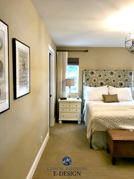
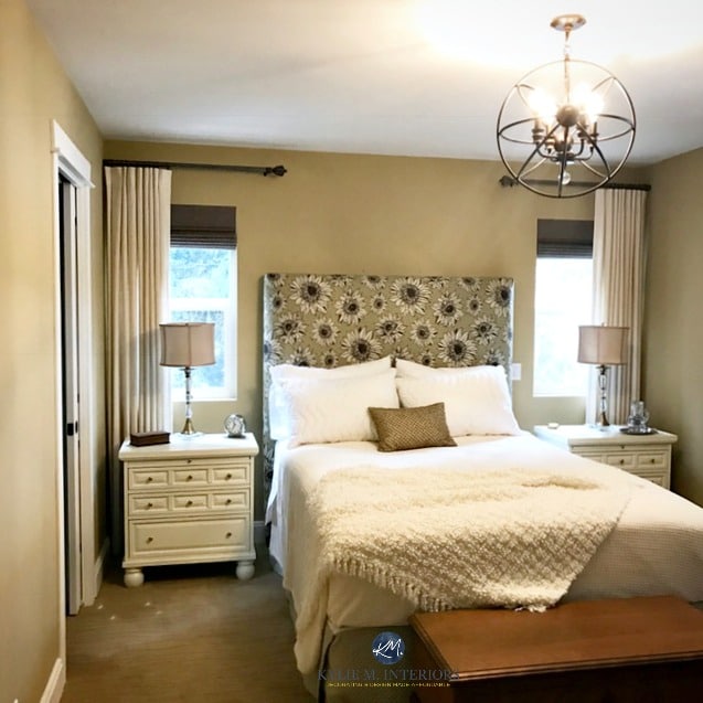
Shown above, BM Standish White
However, keep in mind that north-facing rooms have a cool, gray-blue natural light that can react with warm tones with a lot of yellow. When mixed, this can sometimes create a vague green (which is why your warm neutral should be well-balanced regarding its undertones).
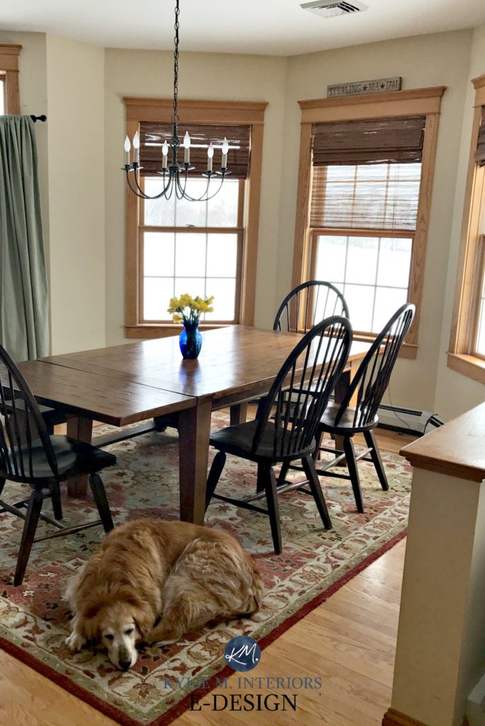
ROOMS WITH OAK CABINETS OR FLOORS (or really any warm-toned wood)
If you are looking to blend in your wood rather than accent it, warm neutrals can be a great choice. Cool colors will accent and highlight wood finishes.
ROOMS WITH TRAVERTINE TILE
Travertine tile was a popular finish in the early 2000s. And while some beiges are too heavy to be modern, there’s a whole new world of beiges that can update the look of travertine tile.
ROOMS WITH A LOT OF GREENERY OUTSIDE
If you have excessive greenery that reflects green into your space, warm neutrals can help to balance the visual temperature but keep in mind; your walls can reflect some of that green back!
And here they are…
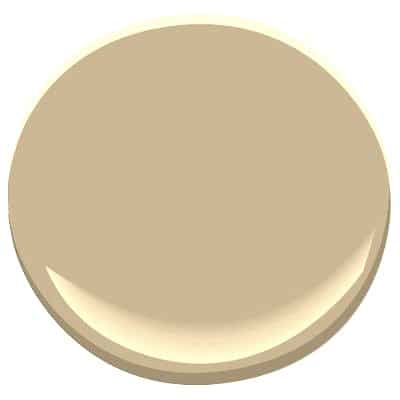
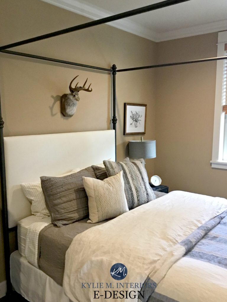
1. BENJAMIN MOORE LENOX TAN HC 44
Lenox Tan is a warm neutral that I refer to often in my Online Paint Colour Consulting. Its visual weight and warmth seem to work well in so many rooms – light, dark, big, and small; it just depends on the look you’re going for! 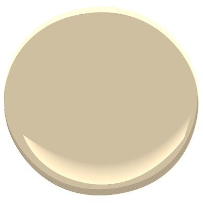

The lighting has enhanced the yellow in Lenox Tan, in most rooms, it will not be this yellow
A bit more about Lenox Tan
- It’s beautiful with most wood tones
- With an LRV of 43, it’s slightly heavier than the average paint colour
- It looks good with many travertine tiles (there are only a few exceptions)
- It doesn’t look good with primary colors, pastels, and pink undertones
- Compare it to Palm Desert Tan below to see the balanced look of Lenox Tan compared to the slightly more orange undertone of PDT
Read more: The Ultimate Guide to Choosing Paint Colours with LRV
2. BENJAMIN MOORE MONROE BISQUE HC 26
Monroe Bisque is a warm beige with a subtle yellow undertone. It is a pretty typical beige – or what people expect beige to look like with regard to overall colour and depth. 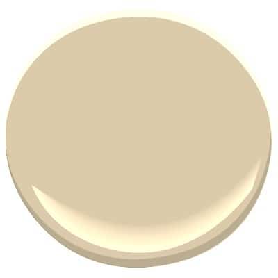
A bit more about Monroe Bisque
- If you are nervous about yellow undertones, this is NOT the neutral for you. While the yellow isn’t dominant, it is definitely there.
- If you place Monroe Bisque next to blue or green, the yellow undertone will show up a bit more. This can also happen in a north-facing room.
- Monroe Bisque is NOT happy when placed near orange or pink colors
- Monroe Bisque will EASILY pick up green from exterior landscaping/trees and can sometimes lean slightly into a green undertone all on its own
- With an LRV of 59, Monroe Bisque is a light depth colour but kind of a ‘heavy light.’
Let’s take a quick break to talk about paint samples…
Undoubtedly, you’ll be heading out in the near future to grab paint samples – stop right there! I want you to check out SAMPLIZE. Samplize offers peel-and-stick paint samples that are more AFFORDABLE, EASIER, and more ENVIRONMENTALLY FRIENDLY than traditional paint pots. Here are just a few reasons why I recommend Samplize to my clients…
- Samples arrive ON YOUR DOORSTEP in 1-3 business days, depending on the location.
- At $6.99, they’re more affordable than the sample pots/rollers/foam boards that are needed for traditional paint sampling.
- You can move the samples around the room if you keep them on their white paper.
Visit the SAMPLIZE website HERE
3. BENJAMIN MOORE PALM DESERT TAN 1123
Palm Desert Tan has a bit more depth than the others – and I LIKE it. It has a nice blend of warm undertones, leaning more into the orange than the yellow/red.

A bit more about Palm Desert Tan
- It’s a richer, denser beige compared to the others
- It will give you a cozier look, not a fresh warm one
- With an LRV of 43, it has depth, but not so much that it becomes brown
- Compare it to Lenox Tan to see what a golden undertone vs. an orange undertone looks like
4. BENJAMIN MOORE THOUSAND ISLAND CC 308
If you want a warmer beige WITHOUT yellow, then this one could do the trick!
Thousand Islands is a warm beige without the strong yellow you’ll find in Monroe Bisque. But keep in mind that means your undertone options are orange or red – and you’re looking at a preference for orange with this bad boy!
A bit more about Thousand Islands
- if you aren’t a fan of orange/peach, then you’ll want to avoid this colour
- if you want warm but not yellow – this could be a great option!
- Thousand Islands has an LRV of 61, so it’s right up there with Monroe Bisque as a very ‘liveable’ depth
Not sure which beige is best for you?
Check out my Online Color Consulting and Design Services!
Chat soon,

READ MORE
Comments
Leave a Reply
More Posts

The 5 Best Creamy White or Off-White Paint Colors
THE ELUSIVE ‘CREAMY WHITE NEUTRAL’ When it comes to light, warm neutrals, it’s all in the undertones. And other than pink and green, yellow is the undertone many of my
Read More

The 8 Best Warm Neutral Paint Colors With NO Yellow Undertones!
The Top Light Depth, Warm Colors That Aren’t Cream! When choosing the best warm neutral paint color for your home, whether creamy white, beige, taupe, or greige, your choices are
Read More

The 12 Best Farmhouse Sinks of 2024
FIND YOUR DREAM SINK HERE… While traditional farmhouse design was all the rage in previous years, the embers have definitely cooled. As for MODERN farmhouse, it’s still kickin’ its cowgirl
Read More


none of your paint colors for neutrals mention thousand island or moccasin. I was hoping these were mentioned as I am looking for a color to go with white pine wainscoting which has yellow/oranged over the years in a basement. Any comments on these 2 two colors. These are also bm paints which we only use . Thanks Lynda
Hi Lynda, I’m so glad you’ve mentioned these colours. I do love them and have used them numerous times.
In the world of warm neutrals, Thousand Island and Moccasin are into the peach end of things. The certainly aren’t peach, it’s just that the undertone in them (being more orange) sits in that range, compared to some of the more ‘yellow’ undertones – which seem to be the most popular these days.
Moccasin is a bit more ‘fresh’ than Thousand island, whereas thousand Island is more grounded (although they are both grounded colours). Moccasin might be better in a basement, just because of the freshness of it, whereas Thousand Island might fall a bit flat – depending on how your natural and artificial light is.
Pale Almond is also a good one for those who like the above colours, but would like something a bit lighter and it might nod slightly towards your wainscoting a bit more than the others…
Thanks for asking Lynda!
~Kylie
Hi Amy! I’ve been quite swamped lately with my day-to-day decorating and Online Consulting and have been referring most questions to my Online Consulting as an affordable way for my readers to get answers to their questions. I hope to deal with all questions at some point, but have to give priority to my Online Consulting clients at this time. Thank you for asking! https://www.kylieminteriors.ca/online-decorating-design-consultation/
~Kylie
Debbie, thank you SO Much! And hey, where do you live? I know Hawaii is a big place, but we are heading there in 3 weeks – to Kihei, wouldn’t that be something if you were close by????!!! As for warm beigey golden paint colour, BM Muslin is a nice one as it SW Wool Skein (which can pick up a subtle green) or Softer Tan which is lovely and warm.
Anyhoo, Aloha to you too!
~Kylie
I am struggling with picking the paint color for my living room. I have clay/grew brown new carpet, milk chocolate brown sofa, royal chestnut hallway laminate flooring, and most important I have 2 walks done with oak paneling (the whole walls). 99.9% of people say I should get rid of the pine. But it was my mother’s house, and although I’ve changed 90% of the house, there are a few sentimental things that I refuse to change and one of those is the 2 oak walls.
Many people call me slightly color blind. I know what I like but sometimes I go slightly off the track. I picked out paint for my bedroom once and I thought it was neutral but it turned out to be very ORANGE! YICKES!
I love the Monroe bisque. However, friends, family and store clerks at paint stores says its a no no. And that I should stick with more darker beige neutrals.
But I love paints with a hint of yellow and brighter. What should I do?
Author
Hi Judy, well I’m SO glad you aren’t getting rid of those walls, thank you. It is just so important that your home is your happy place. I have bits n’ pieces ALL over my home that don’t always fit in, but i don’t care because when I look at them I feel good, i feel my Grandpa or my Grandma or whoever it is that I’m missing.
Anyway, you’re going to make me tear up here.
So, I see (well I don’t see as I don’t have photos) but in my MINDS eye, I see ZERO problem with Monroe Bisque. Why? Well, if you go to a darker beige neutral, it will start to blend in with the panelling. Monroe ‘should’ be enough to sit off of it slightly. Also some beige’s start going more orange toned. If your pine is on the more yellow side, this can be a hot mess, which is another reason why Monroe Bisque could work – it IS more yellow base.
Here’s what I say. Friends opinions are important, but they are almost ALWAYS based on their personal preferences. Someone like me can step back and take my personal taste out and put what YOU need in. And what I’m saying is ‘YOU GO GIRL!’.
Hugs, Kylie
Help! I LOVE your blog and have learned so much from your articles, thank you. I bought pale emerald and old gold curtains and am really struggling to find paint colours to go with it. My room faces north with a dark dining ng room alcove at the end of the room. What colour can I use that picks up the old gold instead of the green and is warm? Have tried BM Waterbury cream but it looked too yellow in the light. Thanks Kylie.
Author
Hi Anne, thank you for your note! Now with personal questions I do need to refer to my e-design, so I can see photos of your space and the furnishings/floorings otherwise I’m just TOTALLY guessing! If that interests you, the link is here! https://www.kylieminteriors.ca/online-decorating-design-services/
Chat soon,
~Kylie
When going with the warmer shades of wall paint, what are some good options for the trim? I don’t like true white as I feel like it with my warm fabrics and accessories. Thank you.
Author
BM White Dove and SW Alabaster are both pretty, warm whites to start with!
You may never see this, but what do you think about Putnam Ivory in a North Facing room?
Its seems like its a slightly brighter version of Lennox tan. Even when you ask to make LT lighter by 25%
Author
Hi Jason, I like that idea! Actually I just posted a photo on my Instagram of Putnam Ivory in a client’s home and it MIGHT even be a north facing one, you should check it out!
Hi Kylie: What is your opinion of Benjamin Moore Timson Sand? I see that you have not done a review for this color nor is there a YouTube video. Actually, I cannot find one review on Timson Sand!
Thank you.
Leslie
Author
Ahhh, this is because Timson Sand isn’t well known as it’s in the Williamsburg Collection. We don’t have that up in Canada, and I’m sure many parts of the states don’t either. This means you can order it if you KNOW about it, but will be hard-pressed to find samples of it in store. SOOOOO, sadly, I don’t know much about it!