
Sherwin Williams Agreeable Gray (7029): Undertones, LRV, & Best Uses
Agreeable Gray is a light, warm greige-taupe paint color, and has been at the top of the ‘popular’ list for several years. And while its popularity has dropped a bit, it’s still one of the big boys in the color world.
But just because a color’s name is thrown around a lot doesn’t mean it works in every space and place. Learning about it (thanks for coming), sampling, and comparing it to similar shades are the best ways to see if it works for you.
So, let’s see what this color has up its colorless little sleeves…
Updated for fresh, relevant content and images for 2026
IS AGREEABLE GRAY MORE GRAY OR BEIGE?
Agreeable Gray isn’t warm enough to be beige or cold enough to be gray. Instead, it’s a greige-taupe, which sits between the 2. While it favors gray, it rarely loses its soft, muddiness.
It’s also super open to perception based on the room/surface it’s on, the room’s exposure, interior lighting conditions, and the person looking at it. Whether you call it greige or gray doesn’t matter, so long as it suits your home!

The next image shows how Agreeable Gray favors gray over beige. Notice how the walls appear more beige in comparison…
Notice how Agreeable Gray looks with this slightly darker red oak flooring – gorgeous!
However, given the right surroundings, it can tip its hat towards a subtle beige, but like me wearing pants while working, this is the exception, not the rule…

Overall, Agreeable Gray is one darn non-committal neutral paint color.
THE LRV OF AGREEABLE GRAY
According to Sherwin Williams, Agreeable Gray’s LRV (light reflectance value) comes in at 60, which is at the beginning of my magical LRV range for the average room.
If that whole ‘LRV business’ goes right over your head, that’s okay (but you do get 3 slaps with a wet noodle). If you’re curious, it’s super simple to learn. The gist is that every paint color has an LRV on a scale of 0-100. 0 is black, and 100 is white (although our usable range only goes up to 94).
A color’s LRV number lets you know how dark or light it is.

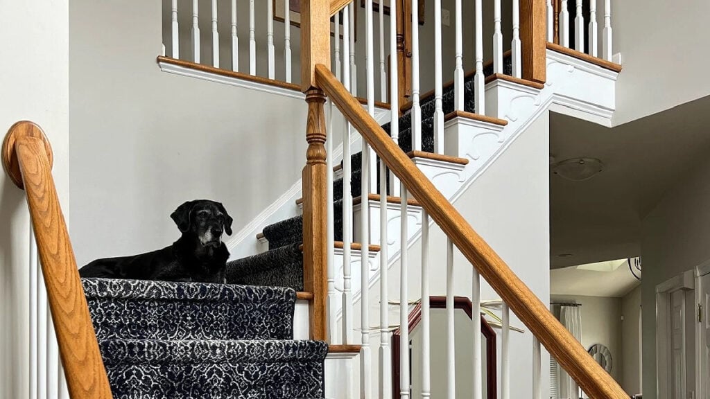
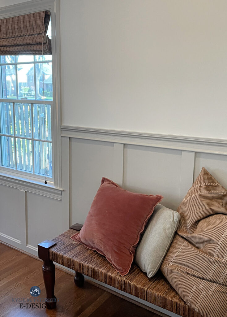
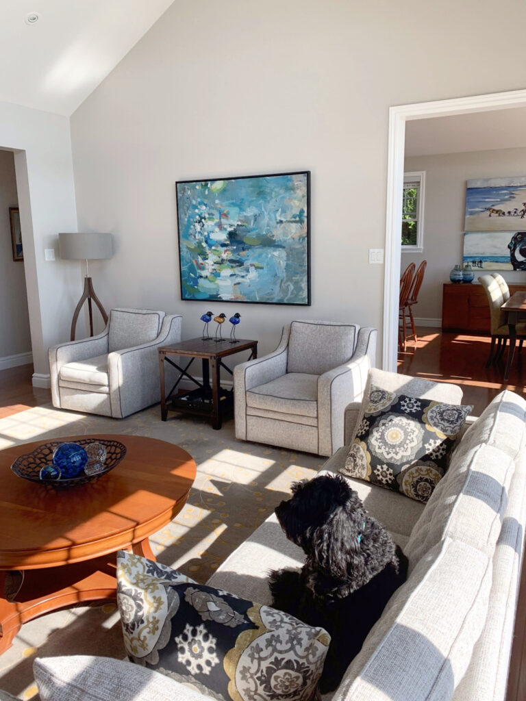
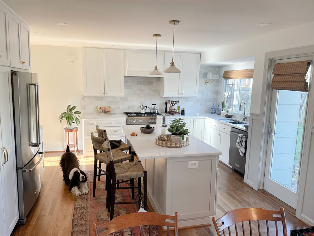
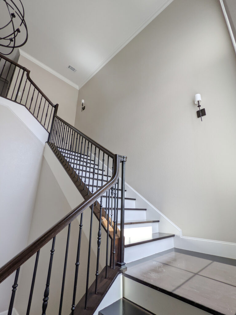
Ole Woofy loves how Agreeable Gray taps into the color in the stair runner.
Ideas to Update Your 1990s Staircase
With an LRV of 60, Agreeable Gray is light, but not a ‘washed-out bordering on off-white’ kinda light. I have a great article on LRV if you want to learn more (it’s saved MANY lives…and marriages).
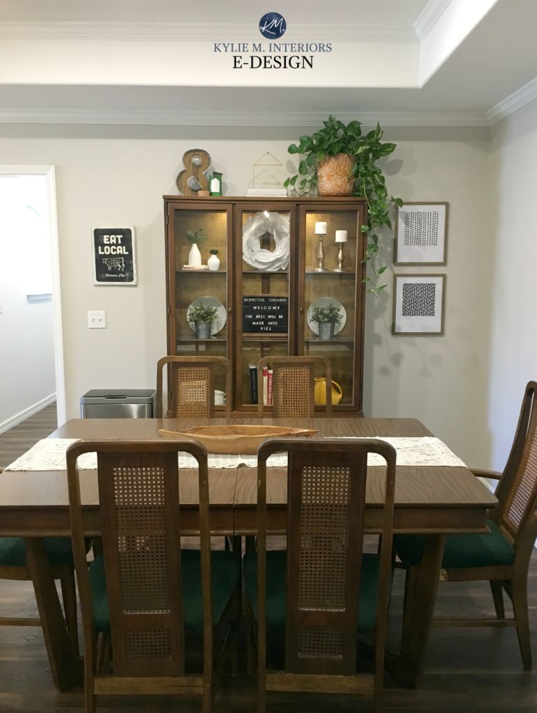
Agreeable Gray is a great complement to the vintage-style wood cabinet and dining set in this next dining room.
WHAT ARE AGREEABLE GRAY’S UNDERTONES
For those of you who are sensitive to the usual cool undertones, Agreeable Gray is one of the more neutral greige-taupe paint colors.
Why do I refer to Agreeable Gray as a greige-taupe/warm gray?
Agreeable Gray is flexible and not overly committed to a specific undertone. Greige tends to favor a green undertone; taupe loves a touch of violet. While Agreeable Gray doesn’t have green in its makeup, it’s not far off and can lean that way with a bit of encouragement.

If you aren’t really sure what undertones are, it’s a term that helps describe how a color may lean. Keep in mind that this will change in different lighting conditions.
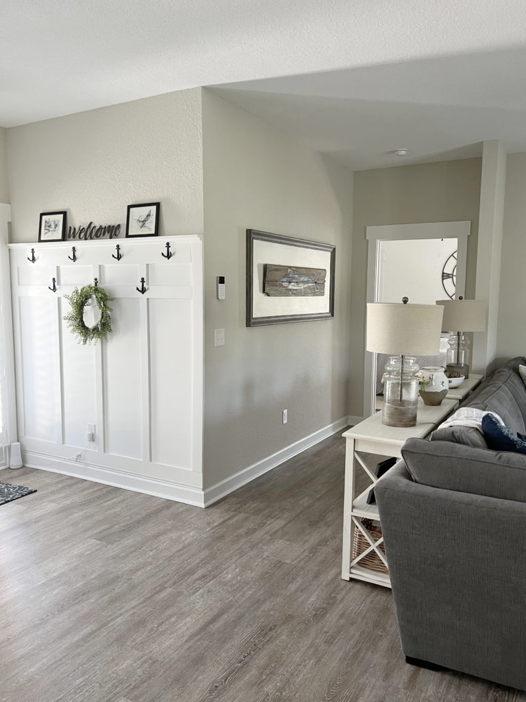
In this next photo, Agreeable Gray is the perfect choice for the board-and-batten and trim, with Benjamin Moore Chantilly Lace walls. Overall, it reads pretty darn neutral…
However, put Agreeable Gray in a room with violet-pink (taupe) undertones, and it can look a bit green in comparison…
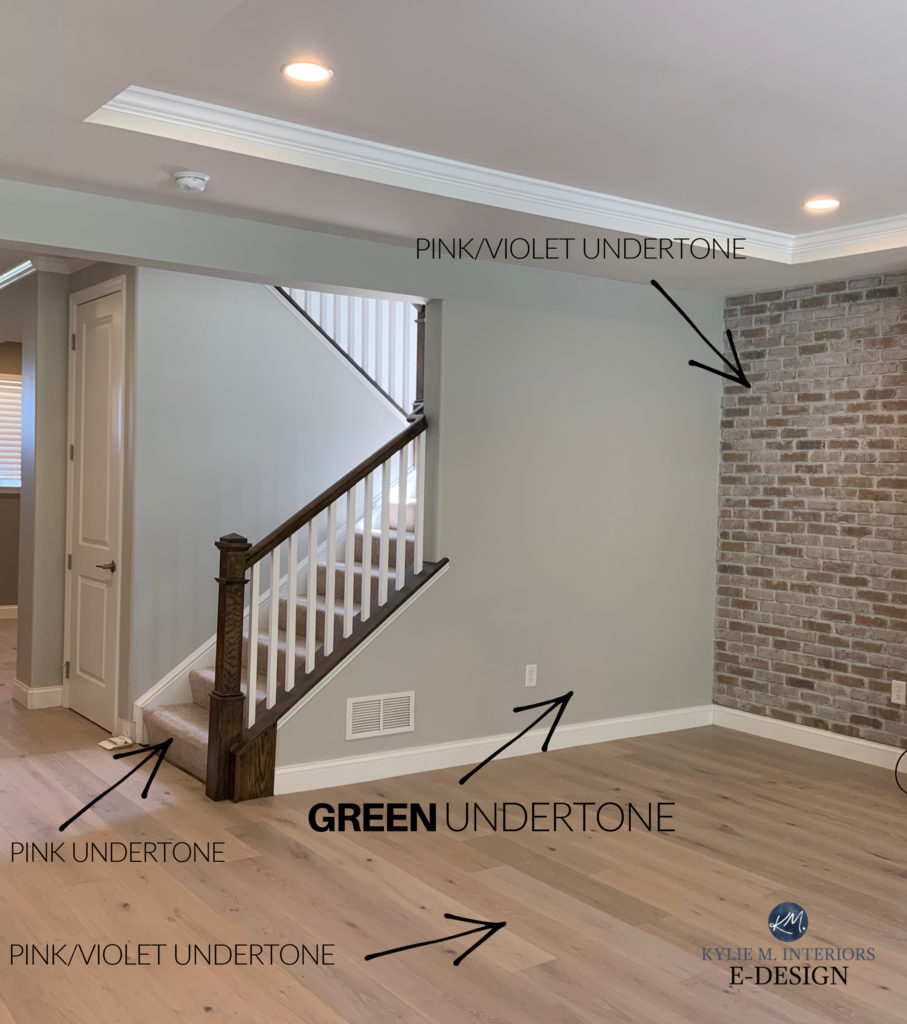
This said, Agreeable Gray is a bit of a ninja. Sure, it can pick up green (shown above), but because it’s not that committed to any undertone, it can flash into violet or blue under the right conditions.
Remember, every gray, taupe, or greige will grab undertones – you can’t run; they will find you.
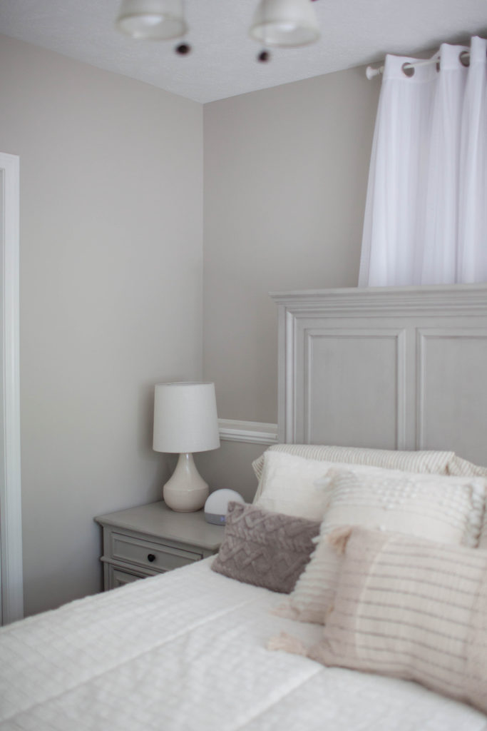
Natural light, a room’s exposure, and the temperature (Kelvins) of the light bulbs affect how a paint color looks – how could they not? And Agreeable Gray is definitely sensitive to its surroundings, as shown in this next photo…
North, East, South, West: Which Paint Color is the Best?
As for whether it’s a warm gray or greige-taupe depends on which camp you’re in and how you see things. I like to cover my bases, even though, in most situations, Agreeable Gray looks greige-taupe – not gray.
Remember that while I mention this variability, MOST of my clients love Agreeable Gray because it’s so darn neutral.
WILL AGREEABLE GRAY LOOK PINK?
Agreeable Gray doesn’t want to look pink, so if it starts winking that way at you, that’s more about its surroundings. Another way Agreeable Gray could appear pink is if it’s not mixed by a Sherwin Williams technician (try to avoid color-matching).
WILL AGREEABLE LOOK VIOLET-PURPLE?
I’ve seen Agreeable Gray go overly violet ONE TIME in my many experiences (coming up shortly). This is an exception as Agreeable Gray is more likely to read as a relatively neutral warm gray or greige-taupe paint color. Any undertone should be super subtle.
WILL AGREEABLE GRAY LOOK GREEN?
I occasionally see a green undertone emerge in Agreeable Gray, especially when paired with finishes that have a soft violet or violet-pink undertone.
This next space shows how Agreeable Gray has a slightly green hue compared to the violet in the flooring (she hired me to fix it)…
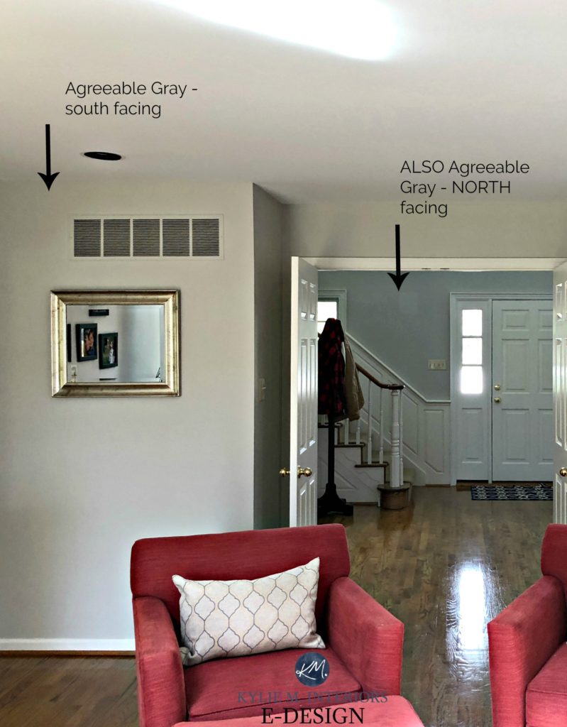
AGREEABLE GRAY IN A NORTH-FACING ROOM
You can expect Agreeable Gray to cool down slightly in a north-facing room. Northern light is a gray light that can further encourage the gray tucked in Agreeable Gray, which is probably why it isn’t called Agreeable Greige.
The Best Paint Colors for North-Facing Rooms
AGREEABLE GRAY IN A SOUTH-FACING ROOM
A south-facing room is where Agreeable Gray is at its best, or ‘most expected’ – as a soft, light greige-taupe with a minimal undertone.
This next photo makes me ALL kinds of happy, but so does thinking of Ryan Gosling in a Speedo, sooooo. Anyway. This is as warm as you can ever expect Agreeable Gray to look – you’d almost think it was Egret White!

And yes, I know there are east- and west-facing rooms as well. However, those buggers change their light so much throughout the day that it would take many paragraphs to explain (I have separate blog posts on them HERE).
The gist is that in an east-facing room, you can expect Agreeable Gray to act a bit more like a north-facing room, but perhaps a touch flatter in the afternoon.

In a west-facing room, it can fall a bit flat and dull in the morning. However, it will warm up in the afternoon, especially in the later hours.
The Best Paint Colors for a South-Facing Room
Here’s your Samplize Peel & Stick sample of Agreeable Gray
Delivered to your front door in 1 DAY!
THE BEST WHITE TRIM COLOR WITH AGREEABLE GRAY
Like me in my 20s, Agreeable Gray is wildly flexible. When it comes to the best white paint colors for cabinets or trims, Sherwin Williams Pure White is my favorite choice, but a few others are worth exploring.
- Sherwin Williams Alabaster is BORDERLINE too warm – I’d rather see…
- Sherwin Williams Extra White
- Benjamin Moore’s White Dove is about as warm as Agreeable Gray wants
On a side note, clients often ask if Agreeable Gray and Incredible White go together. That would be a hard no.
Incredible White loses too much of its neutral base because it’s so light and can flash a lot of purple-pink, making it too colorful for Agreeable Gray.
THE BEST LIGHT BULBS (KELVINS) FOR AGREEABLE GRAY
While it’s each to their own when it comes to the temperature and quality of light you like, with a color like Agreeable Gray, I stick around 3000K. Warm, but not golden.
How Light Bulb Kelvins Affect Paint Colors
You should also make sure your room has enough light, either natural or interior, as A.G. doesn’t thrive in darker rooms – low light makes it look drab and dingy.
WHERE AGREEABLE GRAY DOES (& DOESN’T) LOOK ITS BEST
While it’s a popular shade for pretty much any paintable surface (including toenails), it doesn’t work in every home. First, let’s do a large-scale look at where it works, then focus on some specifics…
- As a whole home paint color, it’s amazeballs
- Great for an open-concept space
- Beautiful on exterior siding or stucco
DOES IT GO WITH CREAM CABINETS OR TRIMS?
Generally speaking, no, Agreeable Gray won’t work with many cream cabinets or trim. However, this is open to opinion (isn’t everything, though?). My PERSONAL opinion is that it’s a very touchy combination that isn’t usually in either color’s or the surrounding finishes’ best interest.
The 16 Best Paint Colors for Cream Cabinets or Trim
As shown in the next photo, the warm cabinet color stretches Agreeable Gray’s (and my) comfort zone. If these cabinets and trims were any warmer, this combo would be a hard no from this color cowgirl. And it’s not the kinda hard that gets me excited; it’s the kind that turns me off.
The Best Wall Colors to Update Cream Cabinets & Trim
In the above image, notice how BLUE Agreeable Gray looks ‘in comparison’ to the creamy warmth of the cabinets. This is a great example of Agreeable Gray shifts its look and undertones based on its environment.
Here’s another example of Agreeable Gray not agreeing with its surroundings and creamy cabinets and trims – this does not float my canoe…
Agreeable Gray makes the cream cabinets and trims look more yellow. In return, AG looks flat and dingy.
DOES IT GO WITH WOOD TRIMS OR CABINETS?
Oh, it sure as heck can. However, there are probably other important finishes, along with your room’s exposure, so take it all in!
In general, I prefer Agreeable Gray with white trim. While I like it with a wide range of wood flooring, furniture, and some cabinets, it can often look a bit too dingy and noncommittal right against wood trims.

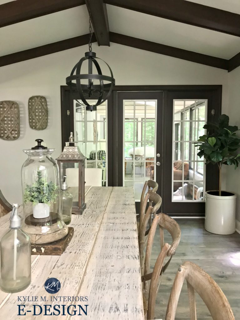
This next room shows Agreeable Gray with considerably dark wood trim and beams. Just make sure your room has enough natural light so the combo doesn’t look too heavy or dingy.
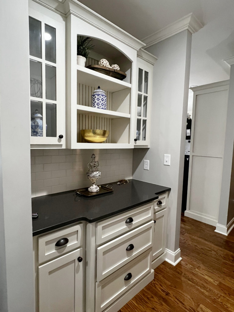
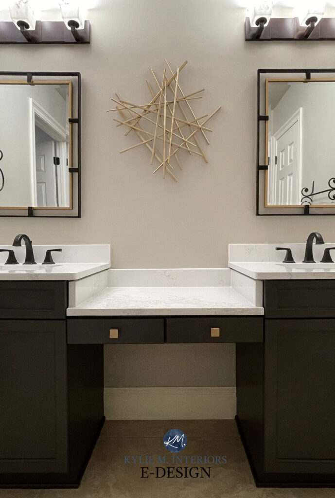
IS AGREEABLE GRAY A GOOD CABINET COLOR?
Heck yes! With cabinet trends favoring a non-white look, Agreeable Gray is a popular choice in the average home. It’s so popular that I wrote an entire blog post on it!
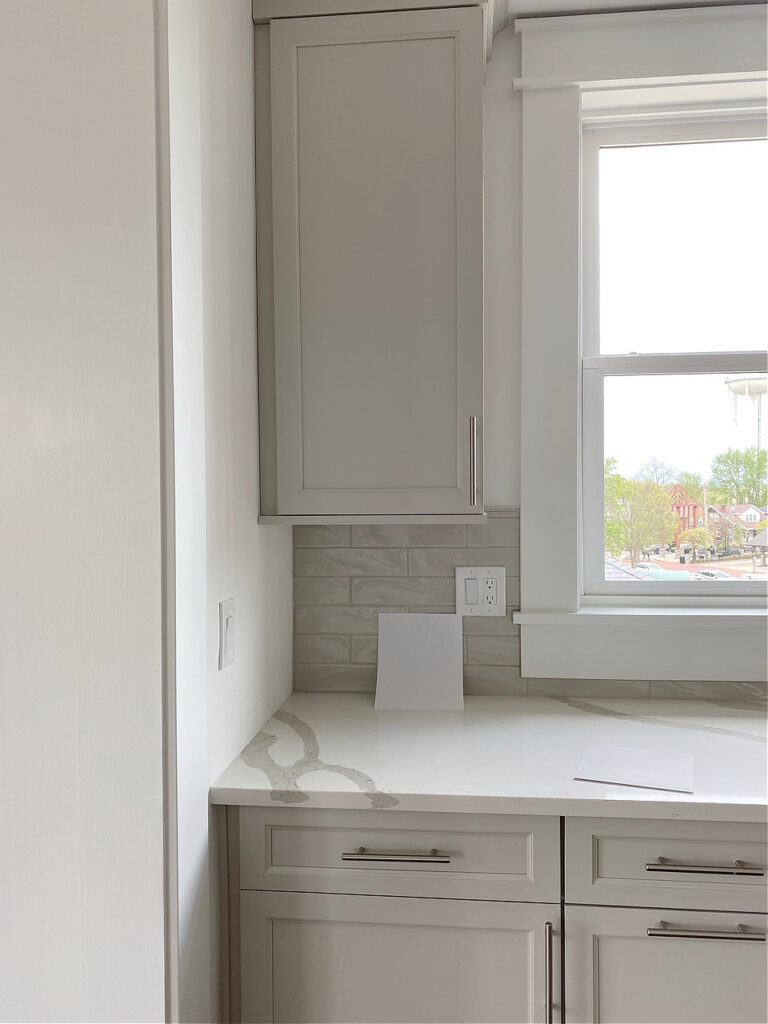
The gist is that this flexible, warm gray-greige-taupe complements a wide range of popular white quartz countertops. While finding a coordinating wall color isn’t always easy, it’s not impossible.
Agreeable Gray on the island and board and batten with Benjamin Moore Chantilly Lace
IS IT A GOOD COLOR FOR THE EXTERIOR OF A HOME?
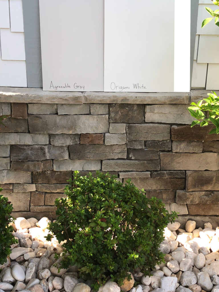
Agreeable Gray can be amazeballs on exteriors, either as siding or trim color. It’s well-suited to many popular stone and brick coverings. However, in reasonable natural light, it can look lighter than expected.
Kylie M’s Online Color Consulting
On this next exterior, look at HOW MUCH MORE MUTED Agreeable Gray looks…
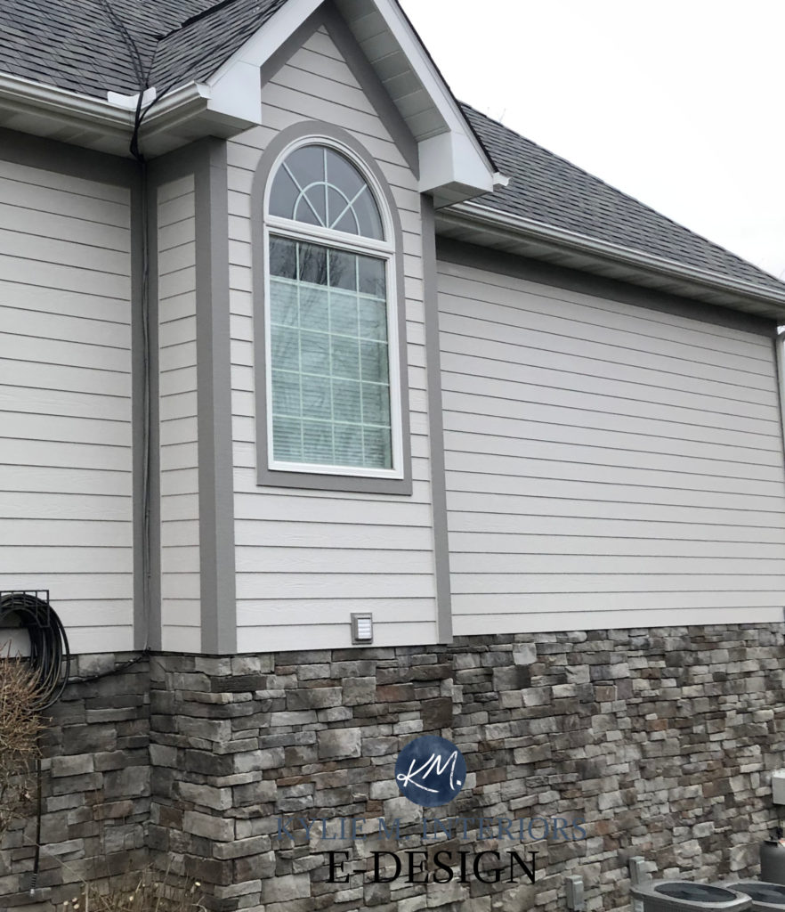
Why does it look muted?
Because it doesn’t have white trim to contrast with, white trim better shows off Agreeable’s depth.
The stone on the above exterior is pretty common. If your stone has more purple undertone than this one, be careful with Agreeable Gray. Instead, you might shift to Sherwin Williams Requisite Gray or Knitting Needles.
Why?
Surfaces with a stronger purple or purple-pink undertone may require more undertone than Agreeable Gray provides.
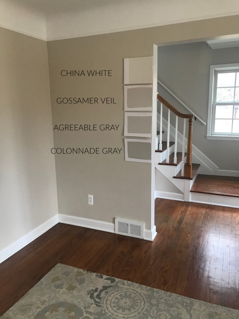
WHICH PAINT COLORS ARE SIMILAR?
Comparing similar colors is the best way to find your best color. And while I wrote a full blog post on some Agreeable Gray comparisons (linked later), here’s a summary of my favorites…
AGREEABLE GRAY vs. BENJAMIN MOORE REVERE PEWTER
These are two of the top-selling, popular colors for each brand.
- Agreeable Gray is lighter (LRV 60) than Revere Pewter (55), making it slightly better suited to the ‘average room’ or low-light space, although you still need to be careful.
- Between the 2, Revere Pewter’s more likely to pick up an earthy green hue.
- While both hold their own, Revere Pewter is the more popular color, overall, and has a more timeless appeal.
- Both are super popular for cabinets, walls, whole homes, and open-concept spaces.
FULL Paint Color Review of Benjamin Moore Revere Pewter
ANEW GRAY COMPARED TO AGREEABLE GRAY
This is a great comparison, as Anew Gray is kind of like a slightly darker version of Agreeable Gray.
- Anew Gray has an LRV of 47, which is darker than Agreeable Gray’s LRV of 60
- Anew Gray is also between gray and beige; however, Anew Gray leans just a wee willy wink warmer.
- Agreeable is much more popular for cabinets and whole homes. Anew Gray isn’t more popular for anything, as A.G. always wins, but that doesn’t mean it’s ALWAYS best.
This next image shows an example of Anew Gray and several colors that are just as hot…

REVIEWS: BM White Dove | SW Accessible Beige | SW Balanced Beige | SW Amazing Gray |SW Loggia
And while Anew Gray can lean a bit cooler in some lights, it doesn’t go as far as Agreeable Gray…
Paint Color Review of Sherwin Williams Anew Gray
Just like Agreeable Gray, Anew Gray isn’t very attached to a particular undertone and can flex its muscles on a per-room basis.
Subscribe to my Kylie M YOUTUBE channel for more great Kylie M. content!
AGREEABLE GRAY vs. REPOSE GRAY
While Repose Gray was popular a few years ago, it’s recently fallen out of favor for more predictable, warmer colors—colors like Agreeable Gray.
- Repose Gray is a touch darker (LRV 58) than Agreeable Gray (60).
- Repose Gray’s varying undertones are far more unpredictable. While it’s also warm, it’s cooler than A.G.
- It’s also far less popular on walls, cabinets, and exteriors, although it still shows up here and there. Personally, it makes me twitchy, but you do you, boo!
FULL Paint Color Review of Sherwin Williams Repose Gray
And as promised…Do You Love Agreeable Gray? Check out These Popular Colors!
WHAT COLORS GO WITH AGREEABLE GRAY?
Agreeable Gray will be fussy about warmer beige, tan, and cream paint colors. However, there’s still a wide range of other colors to explore, such as…
- WARM OFF-WHITES: Some soft and subtle off-whites like Sherwin Williams Aesthetic White
- GRAY-GREEN-BLUE BLENDS: Colors that are a thoughtful mix of gray, green, and blue can be stunning with Agreeable Gray, i.e., Sherwin Williams Argos and Comfort Gray
- DARKER GRAYS: Gray paint colors with a bit more depth than Agreeable Gray, i.e., Sherwin Williams Dovetail
- WHITE PAINT COLORS: A wide range of white paint colors, as long as they aren’t too warm.
- GREEN PAINT COLORS: Medium-depth or darker green-grays make gorgeous accents for Agreeable Gray, either as feature walls, kitchen islands, adjoining rooms, and more.
Want more? I’ve dedicated an entire blog post to this topic!
28 Best Paint Colors to Go With Agreeable Gray

IS AGREEABLE GRAY STILL POPULAR?
Agreeable Gray has held a top spot for several years. However, while it’s still reasonably popular, interest is definitely waning. Will it be hot next year? I’ll be surprised. While it will likely still show up, a range of warmer colors is scooping up first place.

In fact, Agreeable Gray is popular not only in the greige-taupe world but also in the GRAY world. It’s often called ‘the most popular light gray paint color.’ It’s not gray, but same shart, different pile.
Greige vs Taupe Paint Colors: What’s The Big Difference?
PROS & CONS: A SUMMARY OF AGREEABLE GRAY
While the full details are in this blog post, here’s a quick summary of why Agreeable Gray is among the most popular warm gray/greiges. But also, why it might not work for you, regardless of it being a top-selling shade!
- PRO: Agreeable Gray’s non-committal undertones make it flexible for a wide range of rooms and walls.
- PRO: Agreeable Gray is a great transition for those not ready for the warmer, beige trends.
- CON: While it’s still showing up, it will likely fall in the charts in the coming years. Warmer shades are increasingly more popular in newer homes/remodels.
- MID: Its undertones are relatively non-committal and can flex in their environment. However, if your finishes NEED a particular undertone, it might not be enough.
- PRO: It’s versatile enough to suit walls, cabinets, trims, and exteriors.
- CON: Agreeable Gray responds best to average (or reasonably bright) natural light. If your room is dark, it could look drab and dingy, and flatter than me in Grade 10.
- PRO: Agreeable Gray pairs well with a wide range of exterior finishes.
READ MORE
If You Love Agreeable Gray, Check out These TOP SHADES!
20 Years of Benjamin Moore Paint Color Trends
Agreeable Gray vs. Repose Gray, Revere Pewter, and More!
Paint Color Review: Sherwin Williams Taupe of the Morning
Sherwin Williams Touch of Grey – Paint Color Review
Get the best paint color advice with Kylie M’s Online Color Consulting!


This post has helped me a lot! I live in the PNW and would like a chalky/muddy greige and have been sampling many. My oldest childhood friend moved 1.5 hours away and when I visited her new (and stunning) home, I immediately loved the wall color. She JUST texted me a pic of the paint can tonight and it is Agreeable Gray! In our PNW light, things tend to read a little blue and sometimes even purple undertones show up, so it’s been difficult to make a choice. But now I am so excited to go to SW and pick up a sample of AG at full tint and 25% less. Thanks so much for this post!
I’m so torn between SW Agreeable Gray & Modern Gray!! The blue tone you referenced on a north facing wall scares me! I’d rather lean toward beige or taupe vs possible gray/blue.
And thank you for the alabaster tip! I’m afraid pure white will be “too white” for me….I’ll have to check out BM White Dove!
Wouod you recommend agreeable grey for the exterior? I assume it would lighten up but cant find any good photos. Thank you.
I used agreeable grey in my son’s east facing room that doesn’t get a lot of light. It was a rushed decision because we were getting new carpet in the next morning and I wanted to give the walls a fresh coat of paint. Turns out the carpet swatch named “not brown” should have its name changed to “definitely grey”. Now the walls look like a cold baby blue and I am not happy with the carpet or walls. Now I find my self in “shelter in place” and have nothing to do but research paint. I am thinking of painting his walls accessible beige instead. Do you think that will help to warm the room (and carpet) up some? He does have navy blue furniture (think pottery barn kids color).
Thanks for any advice –
ps going to try SW Sea Salt in my daughters room that shares the same east window low light situation and carpet as my son’ s room.
Hi Vicki, yes, from the sounds of it, Accessible could be a nice adjustment, without going overly warm/beige toned :), which sounds like was your original intentions with Agreeable!
Which white would you use for a ceiling in an agreeable grey living room?
Hi Katelyn, generally speaking, I like the look of Pure White as it has a bit of softness, but isn’t overly cream NOR overly stark!
Which gray would be better, Repose or agreeable gray, for a west facing living room with orangy oak floors and a gray sofa. There is low to medium light exposure..I do love both colors..but need help deciding.. trim is ulta-pure white. Thanks!
Do you recommend Agreeable Gray for a modern exterior? Or do you have a couple favorite colors for the exterior light modern house?
Thank you!!!
I think it could look striking! Just make sure it doesn’t flash at all purple on you. As for faves, it’s ALLLLL about the roof/stone/trim colour as I could go from SW Pure White to SW Big Chill or even to Aesthetic White! Repose Gray can also be stunning, but again, just make sure you love those undertones :).
If you’re not in love with agreeable gray with how much beige it ha or repose gray with how much gray it has but want something say in between…… or a tad lighter. What would you suggest?
What are your thoughts on Agreeable gray on both the walls and ceilings? Would that look ok, or would white be best on the ceiling
Hi Emily, depends on the room. If it’s a brighter room or has high ceilings you can get away with it. If you have a lower ceiling or not too much light, I’d probably stick with white :).
I’m having the exterior on my midcentury house painted before listing it. I’m planning to use Agreeable Gray on the siding, with Iron Ore on the posts, beams and windows (midcentury house). Do you think that’s a good pair? Are there any go to colors for exterior paints for selling?
The house also has lots of Japanese maple trees and camellias, and a horizontal redwood fencing that is stained semi-transparent Cabot Dark Slate. Ack, exteriors are hard!
Thank you so much for this post on agreeable gray and for also mentioning anew gray! These are the two i am considering and thank you for comparing them
Well, thank YOU! I do get SO many questions and sometimes it’s nice to just read a note like yours – thank you!
I have a cream color leather sectional and am torn between repainting my walls alabaster or agreeable gray. Will either of those look good with the cream couch? It’s a west facing living room.
Hi Mandy! It can depend on the amount of yellow in your cream, but I DEFINITELY lean more into Alabaster, as Agreeable Gray could look a bit dingy compared to cream and could make the leather look more yellow in comparison :).
Hi! I have a new build open floor plan with a couple big south on one side and big windows windows & French doors on the north side.. the kitchen is the only room with only north facing French doors and a transom window with no porch cover on the exterior and I’m wondering if I can pull off pure white for all my trim & agreeable gray for my cabinets with that northern light? I also want a blue green island if that changes anything at all! Thoughts ?
Hi Kalyn, I don’t see any problem with the sounds of that at all! And I saw your note re: meaning the WALLS would be Agreeable Gray ;).
Love the article! I’m wondering what is the name/color of the rug in the living room pic with the adorable doggie (Agreeable Gray in north facing room) and where can I purchase one?
Thank you!
Hello I’m thinking about painting our kitchen cabinets Agreeable Gray, kitchen island MH Silverado Sage, trim Chantilly Lace. What do you think about using 50% lighter Agreeable Gray for walls?
Hi Noel! The 25% change will be so subtle and you’ll really see no shift between walls/cabinets, especially with the way sheen can make cabinet paint look that bit lighter. To get contrast, you’ll need the HIGH end of the off-white range or go closer to the light-medium to medium depths!
What wall color should I use!?!? Builder only uses SW. Tried matching Edgecomb Gray but no bueno so we picked Agreeable Gray for cabinets. Not sure if we should use same color for walls. Not much wall exposure in kitchen because cabinets are to ceiling but it is an open floor plan. We color matched Chantilly Lace for trim and doors. We also matched MH Silverado Sage for kitchen island and dining built in. Almost just want to give up the search and do walls Chantilly Lace as well. Just was hoping to have contrast against trim and doors.
Hey there I am renovating an old farm house and so far my kitchen cabinets have been ordered. The bottom cabinets and island will be done in agreeable grey and the rope are white. Just wondering what colours would be best for walls and trim, it is open concept to the dining room and living room. I prefer warm tones and so far have thought about adding gold accents. The counter tops are Calcutta quartz.
Hi! I just found your blog and it is so helpful, thank you!!! I am debating between agreeable gray and Edgecomb Gray. Which is lighter? Wondering about going 50% strength of agreeable gray? Do you like to do this?
Hi Kylie! Thanks for this post! Our ‘90s northwest-facing 2 story brick home has a mix of vinyl and wood framed windows. The vinyl looks very close to agreeable grey! What color on the brick could offer a contrast to agreeable grey trim? I’m also considering just going one color and painting the whole thing with agreeable grey and save contrast for the front door and shutters!
Just wanted to say that, as expected, your articles are so informative! I don’t even have a follow-up question, because you helped convince me that this is not the color I’m looking for. Thank you for removing confusion and narrowing it down so definitively!! AND you pointed out colors that I realize are better suited to my room’s needs, so I’m not left still scrambling. Yours is hands-down the best paint blog out there. Thank you for all that you do!