
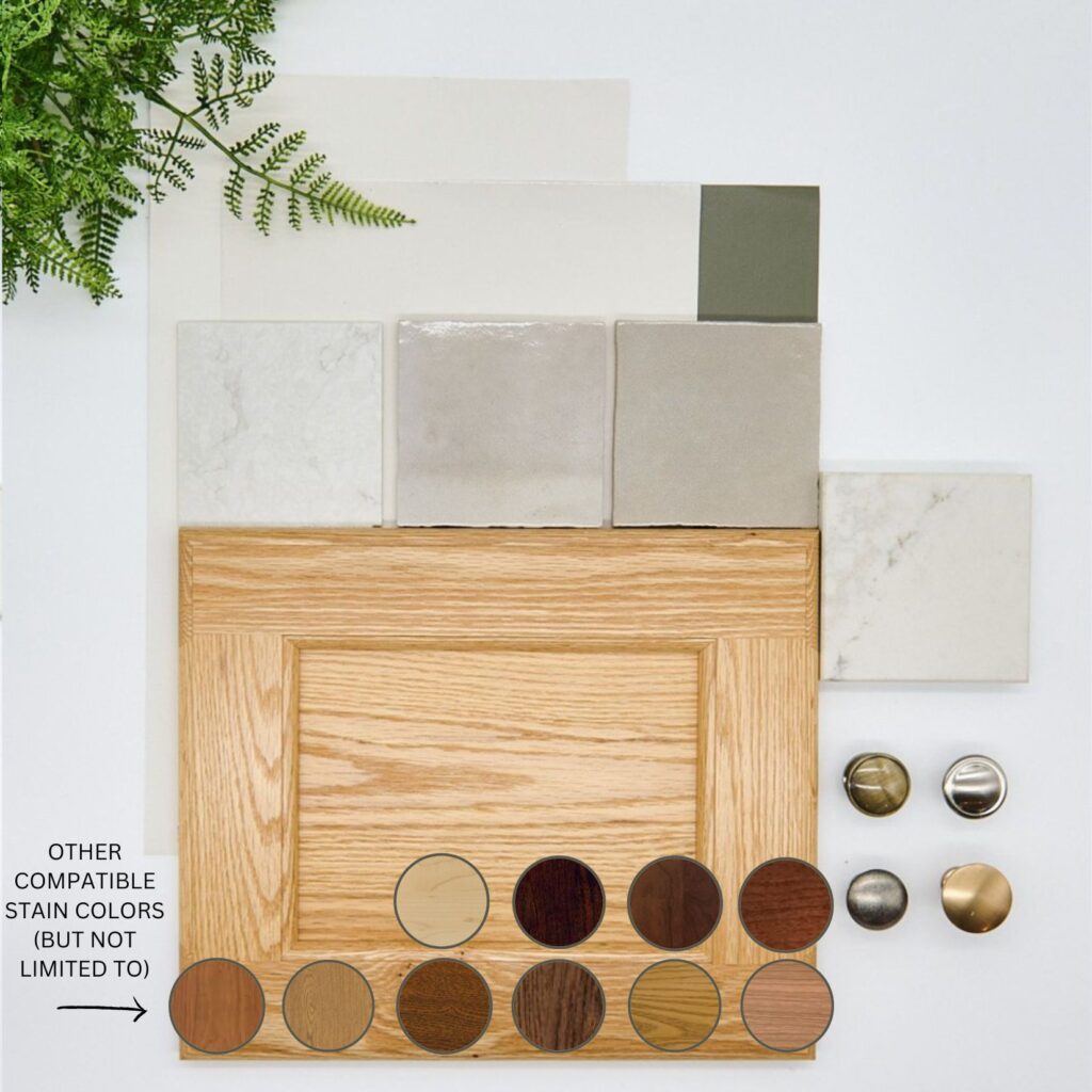
The 20 Best Neutral Paint Colors for Wood Cabinets, Trims, & Floors
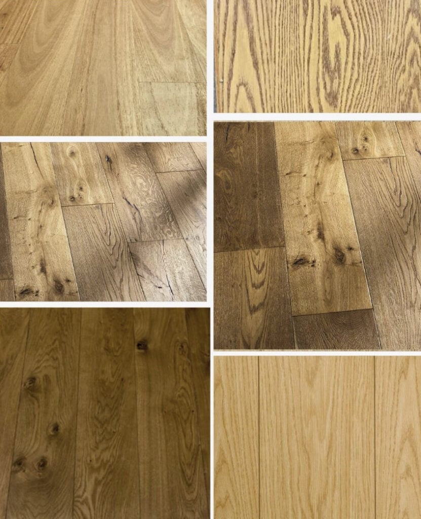
Choosing paint colors to coordinate with or tone down wood finishes (cabinets, doors, trims, & floors) can feel overwhelming. Whether you have golden oak, a red cherry stain, pine, or mahogany, the wrong color can create a clash of undertones and intentions. This color guide includes 20+ homeowner-proven paint colors that go with a wide range of wood stains.
But it’s not just your wood’s undertones or overall color you need to worry about – you’ve got your room’s exposure, interior lighting, and of course, your personal tastes. That’s why there’s a range of colors to explore – everything from gray and taupe to beige and white!
While reading, take note of your favorite colors – note the plural use of colors. Sampling a range of colors, rather than just one, is the best way to find your room’s perfect paint color. Place these alongside your wood finishes to see changes in depth (LRV), temperature, undertones, and more!

To start your color journey, ask yourself these questions…
- How much do you want to tone down or soften your wood finish? A little, a lot, or somewhere in the middle?
- Do you like lighter, more subtle colors (even though they’re often a bit higher contrast with the average wood finish)?
- Do you like colors with a bit more depth and body? Depending on the color or neutral you choose, these can be high or low-contrast.

Whatever you’re looking for, I bet I’ve got it (except for sanity, which is in short supply around here).
The idea behind this blog post is that you don’t want to paint your wood cabinets or wood trim. You want to keep ’em and find the best paint colors to go with them – sounds good to me.

IMPORTANT NOTE
These next sections cover wood stains and the most common undertones, along with some bullet-point tips and color groups. KEEP READING, as after all of that, we look at specific paint color ideas!
YELLOW-TONED WOOD STAINS
Strong, yellow-stained wood finishes were especially popular in the 90s, but are too strong for current trends, which favor a more muted, natural look.
As for undertones, yellow-toned woods often commit to yellow but can slide slightly into yellow-orange or, more rarely, yellow-pink or yellow-green.
TO TONE DOWN OR BLEND A YELLOW-STAINED WOOD FINISH
To make your yellow stain look less yellow, you might need to lean into it with the following colors…
- CREAM PAINT COLORS: The idea is that if you go with your wood a bit rather than directly contrasting it, you can soften its effect.
- TAN PAINT COLORS: Whereas beiges lean more on orange, tan paint colors are more likely to lean into a yellow undertone (often yellow-green). These can be subtle, soft partners to some yellow-stained woods.
- GREIGE PAINT COLORS: Many greiges can be gorgeous partners to yellow-stained woods without overly accenting them. The more green that’s in your greige, the more it can accent. Even some taupes can work.
You’ll see many of these colors shortly – keep reading!
The above colors are meant to ‘tone down’ or soften your wood finishes. If you want to contrast your wood finishes and make them come to life, read this instead: The Best Colors to ACCENT Wood Finishes.
ORANGE-TONED WOOD STAINS
Orange wood stains are super common in oak cabinets, especially golden oak and some honey oak. However, you can find orange in almost any wood species, as the stain applied to the wood can contain it!
Whereas yellow woods are usually pretty darned yellow, orange-toned woods easily lean into yellow or red, but the dominant undertone is still orange.

While stains aren’t always this strong, you get the idea.
WHAT COLORS TONE DOWN OR BLEND ORANGE WOOD STAINS?
The color you choose all comes down to what you want it to do…
- MUTED BEIGES: Orange wood stains can look gentler with passive beiges, especially in the off-white to light range (coming up shortly!)
- GREIGES & TAUPES. Some greiges and taupes can be quite pretty for a moderately balanced approach with mild, thoughtful contrast. However, beige is your BEST bet.
The above colors are most likely to ‘tone down’ or soften your wood. If you want to add contrast, read this instead: The Best Colors to ACCENT Wood Finishes.
Remember, nothing will make your wood stain lose its actual color – it is what it is. It’s more about not accidentally ENHANCING and ACCENTING your wood with the wrong color.
RED, PINK, OR CHERRY WOOD STAINS
Red or cherry-toned woods are often the strongest, adding depth and color to a room.
Depending on the combination of wood and stain choice, red-toned woods can also look slightly pinkish (pink being the light version of red) or give off a subtle purple cast.

Some red stains pick up a lot of orange, too…

WHAT COLORS TONE DOWN RED OR PINK WOOD STAINS?
While leaning into red (pink) can be scary, it can be the best way to soften a wood stain. Or, if you’re in love with your wood (as most men are, wink wink), you can choose to contrast it!
- TAUPE PAINT COLORS: Because taupes can share the same undertones, they can be an interesting way to soften a wood finish.
- WARM GRAY: There are even a few warmer grays with purple undertones that can be interesting with red-stained woods – not overly contrasting, but not blending either.
- BEIGE PAINT COLORS: Some of the best beiges lean into orange-pink, depending on the exact wood stain/strength.
The above colors are meant to ‘tone down’ or soften your wood. To contrast or ACCENT, read this instead: The Best Colors to ACCENT Wood Finishes.
Now that you’ve done your homework, it’s time to look at real colors! Remember…

MANY wood finishes will pick up more than one undertone – you might have a red-orange or a yellow-pink!
This means that not all of these paint colors will look good with all wood stains. On the other hand, some might surprise you, as they blend worlds!
1. BENJAMIN MOORE CLASSIC GRAY OC-23
Classic Gray is a warm gray that winks at the taupe world with a come-hither nod. This gentle off-white has vague purple-pink undertones that suit many wood finishes.
Paint Color Review of Benjamin Moore Classic Gray
While Classic Gray is more or less a warm shade of gray, some exposures and interior lighting conditions will swing it into taupe (which is equally as gorgeous).

Sample and compare Classic Gray with these similar shades…
- Sherwin Williams Egret White has a similar approach (and is a personal fave).
- Benjamin Moore Silver Satin isn’t quite as warm, but it’s reasonably popular (it’s not MY fave, but you do you, boo).
- Sherwin Williams City Loft is another favorite and a great one to compare with Classic Gray.
WOOD STAINS THAT WORK (& DON’T) WITH CLASSIC GRAY
- Classic Gray doesn’t always work well with yellow-green stains. However, it’s pretty darn happy with most others.
- In particular, red or pink stains can be pretty with Classic Gray walls.
2. SHERWIN WILLIAMS AESTHETIC WHITE SW 7035
Aesthetic White is amazeballs. This off-white beige (that leans gray) offers a dusting of neutral to your walls without a big undertone commitment.
While it’s harder to get a read on Aesthetic White with wood trim (since Aesthetic White is so light and subtle, whereas white trim shows it off more), it’s a wickedly pretty, modern approach to beige.

Aesthetic White is an off-white beige that’s more trendy than traditional beige shades, thanks to its depth and the touch of gray it carries. In fact, in some lights, it can lean surprisingly gray…

As shown with orange wood trim (below), Aesthetic White is a great partner to orange-red-toned woods but can also accommodate other stains (as long as they aren’t overly pink-red).
When comparing other colors with Aesthetic White, I look at alternatives like…
- Sherwin Williams White Duck and Shoji White, two massively popular warm off-white paint colors
- Sherwin Williams Accessible Beige and Natural Tan
Color Review: Sherwin Williams Aesthetic White
WOOD STAINS THAT DO (& DON’T) WORK WITH AESTHETIC WHITE
- While Aesthetic White is reasonably friendly to some wood stains, I’d be cautious with yellow and overly red stains.
- In particular, I love Aesthetic White with slightly more muted wood stains, but it can handle some strength.
3. SHERWIN WILLIAMS KILIM BEIGE SW 6106
Kilim Beige is a versatile shade of beige. While it has more color than the average muted shade, it’s not too wild and crazy (mind you, that can be open to perception).
While Kilim Beige has a main orange undertone, it can entertain various finishes and wood tones.
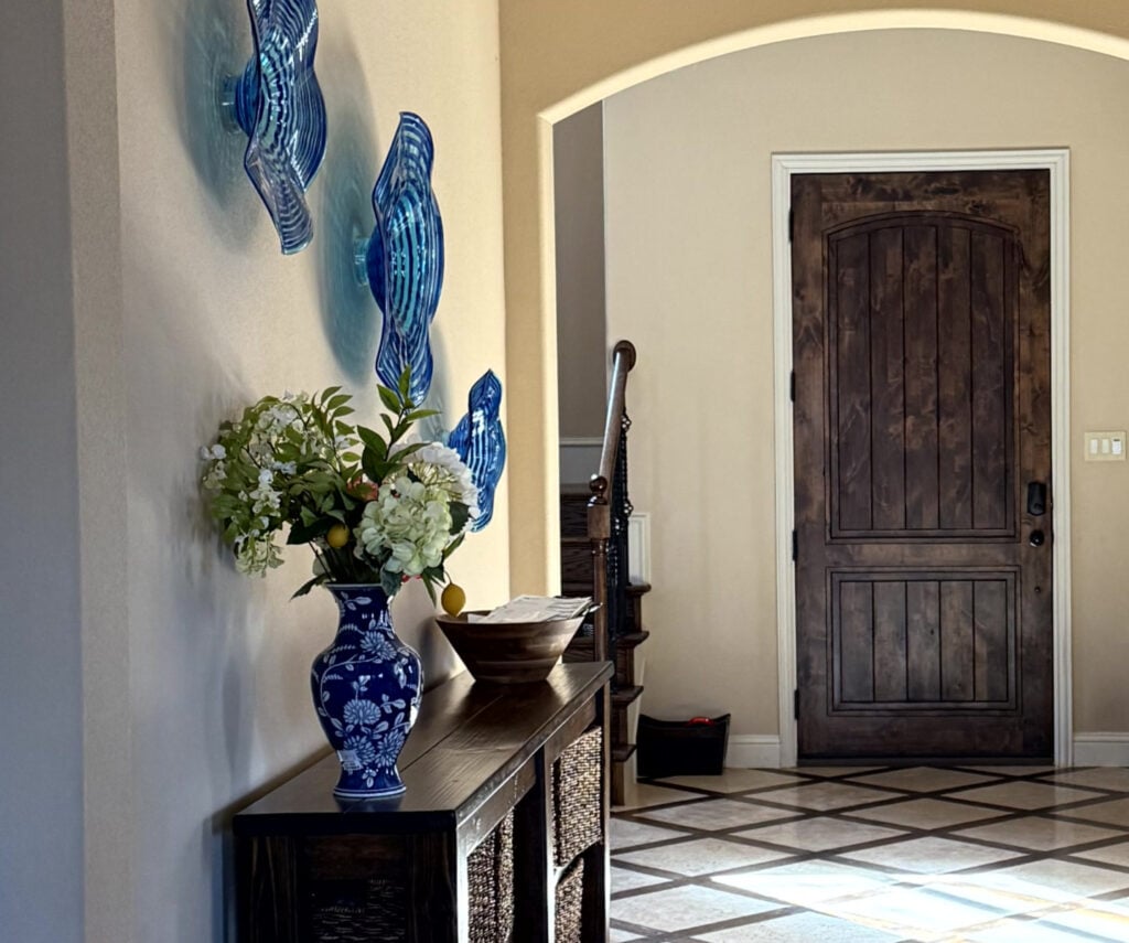
Kilim Beige is a soft complement to the red wood floor, stairs, and railings.
How to Mix and Match Wood Stains & Finishes
However, thanks to the Tuscan and beige-on-beige homes built in the early 2000s, colors like Kilim Beige have gotten a bad rap. And I’ll admit, some of them look pretty dated. However, some fabulous, modern shades of beige are available these days.
If Kilim Beige has what you’re looking for, don’t just jump in headfirst. Compare it to a few similar shades…
- Sherwin Williams Natural Linen (coming up shortly, and is my ONE TRUE LOVE)
- Benjamin Moore Muslin is an awesome alternative
Here’s Benjamin Moore Muslin with some red, orange, and pink-stained woods…

WOOD STAINS THAT DO (& DON’T) LOOK GOOD WITH KILIM BEIGE
- Kilim Beige doesn’t look as good with stains that have a lot of yellow. However, it’s especially lovely with orange-toned woods. It can be gorgeous with a wide range of oak stains.
- If you have red-stained wood (more so than a ton of pink), Kilim Beige could be a great option.
Paint Color Review of Sherwin Williams Kilim Beige
99.5% of the photos in my blog are of REAL HOMES from my Online Color Consulting clients, readers, and friends. While not always magazine-perfect (dirty dishes & all!), they’re packed with ideas and proven color choices to help you create a home you’ll love.
4. BENJAMIN MOORE ABALONE 2108-60
Mmmmm, Abalone. I’m not even a fan of purple, and I love Abalone. This gorgeous light gray-purple is a beautiful mix with a soft warmth. The purple is subtle but adds a decent dose of color to get things out of the gray range. Abalone is also light enough to help offset a bit of the visual weight of darker cherry cabinets while contrasting with white trim.
I love how the purple taps into the wood tones without being overpowering (shown below).
The 9 Best Purple Paint Colors
While Abalone is perfect for many rooms, you should sample and compare some similar shades to make sure you hit the perfect spot.
- Benjamin Moore Collingwood is a hugely popular warm gray (coming up next)
- Benjamin Moore Barren Plain offers similar intentions with a bit less warmth
- I also like Benjamin Moore Balboa Mist, as do a bajillion other people
- There are some other beauties HERE, too
WOOD STAINS THAT DO (& DON’T) WORK WITH ABALONE
- Abalone is so stinkin’ pretty with red hue woods, especially red or red-purple ones – I can’t even.
- Interestingly enough, it can be pretty with some yellow and orange wood stains, too
Paint Color Review of Benjamin Moore Abalone
Get the best paint color advice with Kylie M’s Online Color Consulting
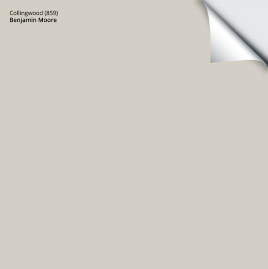
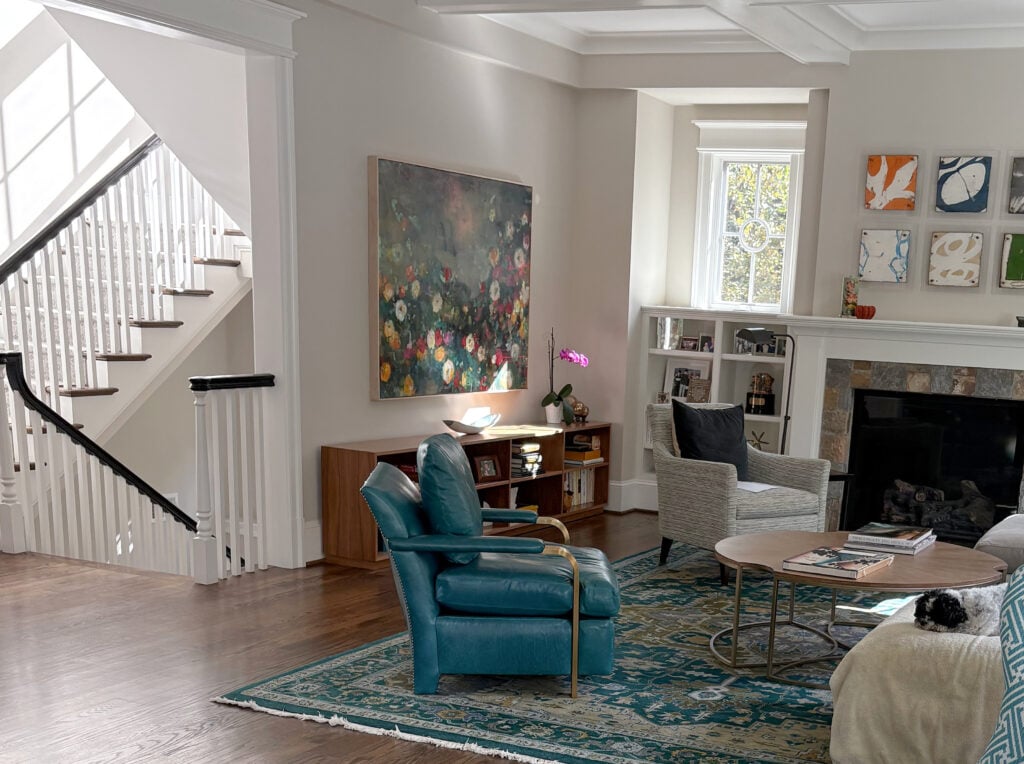
5. BENJAMIN MOORE COLLINGWOOD OC 28
Collingwood is a warm gray with a subtle purple undertone. The undertone is passive, so this is a ‘gray-centric’ color.
In this next image, Collingwood is the original wall color. While it’s not warm enough for the tile around the fireplace, it’s gorgeous with the dark red-purple stain of the wood mantel and surround…
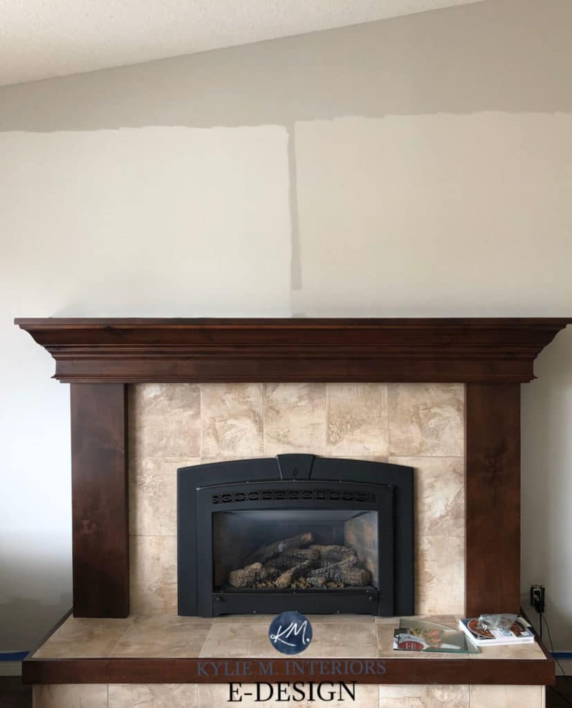
Left sample: BM Classic Gray | Right sample BM Pale Oak (coming up later)
Collingwood can look wicked pretty with red or purple-toned wood finishes. Many grays can lean into any of the three cool gray undertones with the right lighting or exposure, but it usually holds pretty steady with its commitment to violet. This is one of the many reasons I recommend it to many of my Online Color Consulting clients.

The Best Paint Colors with Red-Stained Woods
While Collingwood is the perfect warm gray for many spaces (and one of the most popular), your wood might need something a bit different. Do your due diligence by exploring…
- Benjamin Moore Nimbus, which is a bit cooler
- Benjamin Moore Balboa Mist is lighter, and the undertones can show up a wink more
- Sherwin Williams Alpaca – just a fabulous color, overall
Here’s your Peel & Stick sample of Collingwood…
WOOD STAINS THAT DO (& DON’T) WORK WITH COLLINGWOOD
- Collingwood is flexible toward most wood stains and undertones, depending on your intentions.
- While it can be a bit fussy with some yellow stains, it can work with softer yellow, orange, or pink undertones.
- My favorite combo is Collingwood with red-stained woods.
Paint Color Review of Benjamin Moore Collingwood
6. BENJAMIN MOORE GENTLE CREAM OC 96
Gentle Cream (also known as Barely Beige) is a great way to create a warm and inviting room without it looking overly golden. With its almost ‘butterscotch’ undertones, this color will sit pretty darn neutral with a range of oak stains and other woods.
Sample a few colors similar to Gentle Cream to make sure you land on your perfect shade…
- Benjamin Moore Navajo White if you find your wood needs a bit more cream-yellow
- Sherwin Williams Casa Blanca is just a gorgeous shade
- Benjamin Moore Muslin isn’t cream, it’s beige. However, if your wood needs a bit more orange than Gentle Cream offers, it can be the fix.

Benjamin Moore Navajo White
WOOD STAINS THAT DO (& DON’T) WORK WITH GENTLE CREAM
- Gentle Cream can be a gorgeous partner to wood stains with yellow-orange undertones.
- It can be fussy with red tones, so sample carefully
Paint Color Review of Benjamin Moore Gentle Cream
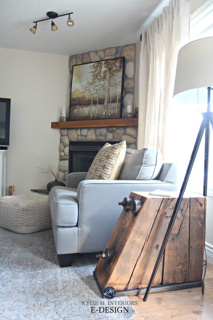
7. SHERWIN WILLIAMS CANVAS TAN SW 7531
Canvas Tan is a relatively neutral tan paint color that isn’t too flat or greige-toned for orange-toned woods or too golden warm, making it flexible for various wood stains, as shown below.

While Canvas Tan is one of the more popular warm neutrals, be sure to compare it with…
- Sherwin Williams Neutral Ground for a slightly lighter approach
- Sherwin Williams Natural Tan (which I personally think it is prettier, in general)
- Benjamin Moore Manchester Tan is a classic shade from BM – a fan fave of many
WOOD STAINS THAT DO (& DON’T) WORK WITH CANVAS TAN
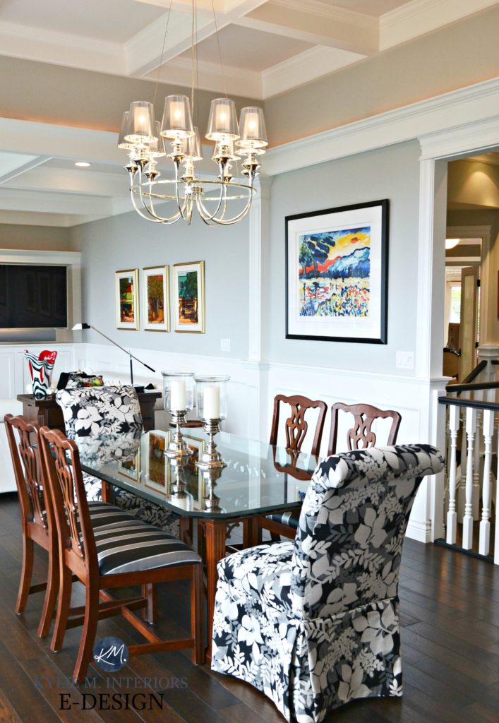
- Canvas Tan is a bit fussier than others and doesn’t love close partnership with overly red stains (the dining set above is as close as you want to get). Mind you, some love the play of opposing undertones – again, you do you, boo.
- It’s also hit-and-miss with some orange-hued woods.
- It best suits yellow woods, especially ones that might lean a wee tiny wink into green.
Paint Color Review of Sherwin Williams Canvas Tan
8. SHERWIN WILLIAMS WHITE DUCK
White Duck is pretty fabulous. While many prefer Shoji White (coming up shortly), White Duck’s undertones often win people over.

White Duck is a warm, off-white paint color with an LRV of 74. It has a super (duper) passive undertone; barely nodding at green (whereas Shoji White has its own undertone to contend with). It’s absolutely worth comparing these to each other, as the undertones can be pretty tame and well worth it.

BM Wind’s Breath | SW Modern Gray | BM Ballet White
WHICH WOOD STAINS GO WITH WHITE DUCK?
- If you have red-stained woods or those with a touch of pink, you might like Shoji White a bit more.
- If your wood stain leans a bit into yellow, White Duck might be the better option – sample and compare!
- As for orange wood stains, definitely try it out!
Sherwin Williams White Duck: IMAGES, Info, & More
If you think White Duck is for you, compare it to these similar shades – you never know what you might fall in love with…
- Benjamin Moore Ballet White offers a bit more depth and warmth
- Sherwin Williams Aesthetic White (previously mentioned), for sure
- Benjamin Moore Wind’s Breath is a beaut.
9. BENJAMIN MOORE STONINGTON GRAY HC 170
Stonington Gray is a stormy gray with a soft blue-green undertone; it’s a great subtle accent for your wood tones. While gray isn’t in style anymore, some classic shades, including grays like Stonington Gray and Benjamin Moore Revere Pewter, will be more timeless.
If you’re looking for a shade similar to Stonington Gray, check out…
- Sherwin Williams Tinsmith
- Sherwin Williams Silverplate and Big Chill
- Heck, I’d even look at Benjamin Moore Gray Owl
WOOD STAINS THAT DO (& DON’T) WORK WITH STONINGTON GRAY
- There’s not much Stonington Gray can’t do if you want to highlight your wood (without going over the top).
- Stonington Gray is friendly with most wood stains, including oak, maple, and cherry.
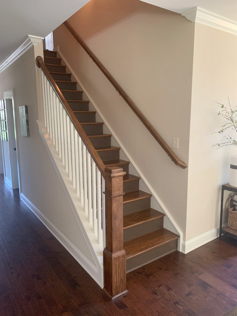
The staircase in this next photo has a wood stain with yellow-orange undertones, Benjamin Moore Stonington Gray is on the walls…
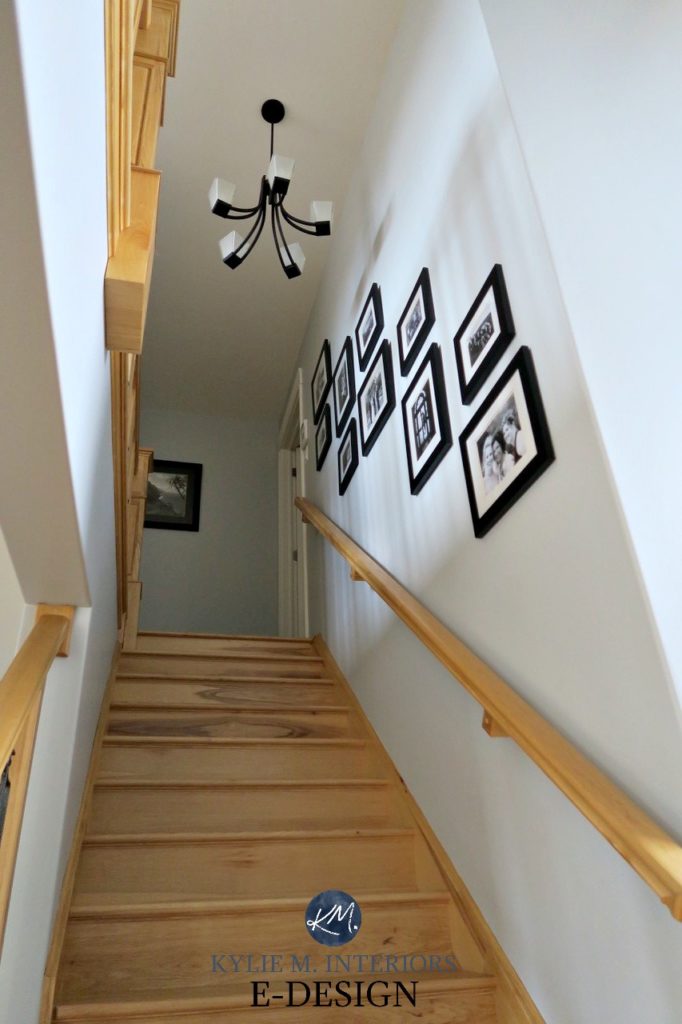
Not only does the blue-green undertone of Stonington Gray contrast with this wood, but its depth does as well. Notice the degree of contrast between the depth of the walls and the stairs/railings.
Paint Colour Review of Benjamin Moore Stonington Gray
10. BENJAMIN MOORE WHITE DOVE OC-17
While not everyone thinks of white when it comes to wood finishes, it can be a great way to offset wood cabinets, floors, and trims—it’s all about choosing the right white.

The Best Paint Colors With Dark Wood Finishes
Lucky for you, you have a little Ginger in your back pocket to let you know that White Dove is a great place to start.
White Dove is a soft, warm white, so it’s not stark or cold. However, it’s also not so warm and creamy that it’s overly yellow and obnoxious (that could be open to perception, but it’s generally pretty popular).
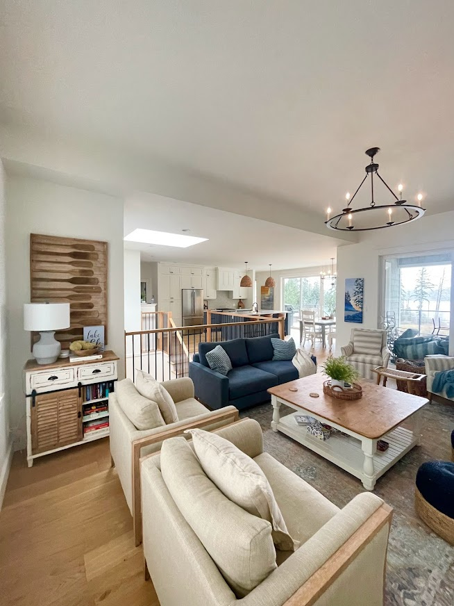
In the above photo, notice how the flooring, oar art, stair railings, and rattan pendants all have a chance to shine thanks to the simple foundation the White Dove walls offer. In particular, White Dove looks gorgeous with natural woods similar in depth and approach to the above finishes.
If White Dove is right up your alley, compare it to…
- Sherwin Williams Alabaster, which offers a bit more warmth
- Benjamin Moore Simply White has a brighter, cleaner warmth
- Benjamin Moore Cloud White is a classic shade of warm white

Sherwin Williams Alabaster
Or even BETTER, check out this curated bundle of my FAVORITE white paint colors for the average home! Hands down, these are the best shades of white to sample and compare – don’t both with any others!
FULL Paint Color Review of Benjamin Moore White Dove
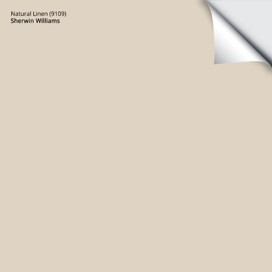
11. SHERWIN WILLIAMS NATURAL LINEN SW 9109
With trends leaning warmer, Natural Linen is on many homeowners’ hit list. With a light, more modern approach to beige, Natural Linen’s warm, flexible undertones are a soft, subtle partner to many types of wood stains, including most oaks.
As mentioned way earlier, Natural Linen is one of my favorite beiges.
Natural Linen is darn pretty, but that doesn’t mean it works everywhere. Sample and compare it to similar shades to find your perfect color.
- Sherwin Williams River’s Edge
- The previously mentioned Sherwin Williams Kilim Beige
- Benjamin Moore Muslin
The 15 Best Paint Colors to Update Golden or Honey Oak
Here’s your Peel & Stick sample of Natural Linen…
WOOD STAINS THAT DO (& DON’T) WORK WITH NATURAL LINEN
- Natural Linen is a versatile warm neutral that suits a wide range of wood stains, especially those with orange (orange-yellow, yellow-orange) undertones.
- It can also pair up with many red-stained woods.
Paint Color Review of Sherwin Williams Natural Linen
Are Older Wood Cabinets Trendy Again?
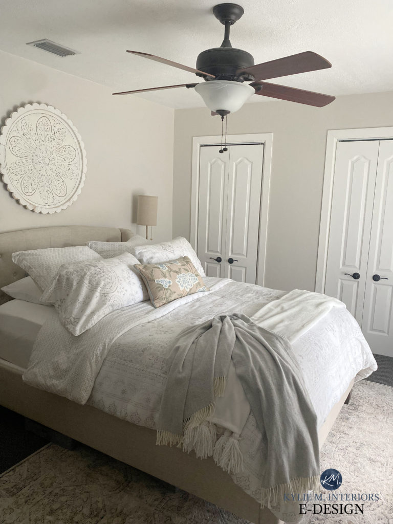
12. BENJAMIN MOORE REVERE PEWTER HC-172
If you’re open to a soft, subtle accent to your wood finishes, look no further than Benjamin Moore Revere Pewter.
Revere Pewter is the OG of the warm gray world and the most timeless, popular shade of gray. Here’s RP and the slightly darker, Sherwin Williams Amazing Gray, with two different ‘colors’ of wood…

Revere Pewter has an LRV of 55.05, putting it between the light and light-medium worlds. This slightly lower LRV can be nice with wood trims, if you find that lighter colors wash out against them.

Are Wood Trims Outdated or In Style?
If you love the look of Revere Pewter, check out a few alternatives, just to double-check…
- Benjamin Moore Rodeo, which is kind of like a lighter take on Revere Pewter
- Sherwin Williams Agreeable Gray
Benjamin Moore Revere Pewter: IMAGES, Info, & More
And don’t forget about LRV when choosing a paint color! How to Use LRV to Pick a Paint Color
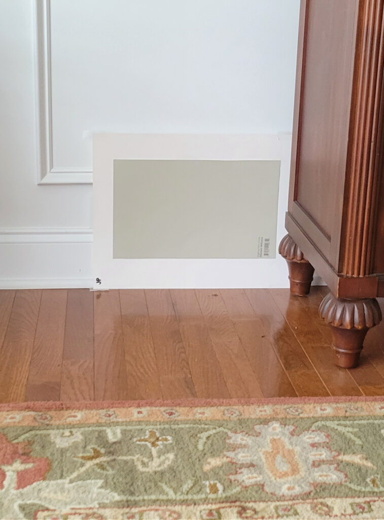
13. SHERWIN WILLIAMS BALANCED BEIGE 7037
Balanced Beige is one of the best beige paint colors when you want a little more meat on the ole beige bones.

With its LRV of 46, Balanced Beige is one of the darker colors on this list, but not so dark that it’s super limiting. In fact, it’s super popular in single rooms, as a whole home paint color, on cabinets, and exteriors.

Sherwin Williams Balanced Beige: IMAGES, Info, & More
Here’s your Peel & Stick sample of Balanced Beige…

If you like the look of Balanced Beige, be sure to compare it to…
- The slightly lighter approach of Sherwin Williams Accessible Beige
- Benjamin Moore Stone Hearth, which is quite similar (Smokey Taupe is great, too)
- If your wood stain demands a bit more pink undertone, River’s Edge is pretty
If you’re looking for more COLORFUL options, check out this blog post: The Best COLORS to Go With Wood Finishes
The Best Blue-Green Paint Colors
Thinking about updating your countertop and backsplash?
Check out my CURATED KITCHEN PALETTES for wood cabinets!
The Best Blue-Green Blend Paint Colors
14. SHERWIN WILLIAMS HERON PLUME SW 6070
Heron Plume is an interesting off-white stuck between gray and taupe. Because of this, it can shift a lot depending on your room’s exposure. While its undertones aren’t overpowering, they can flash through depending on the finishes you partner it with.

However, some find Heron Plume too taupe or subtle for their particular stain. Compare it to these colors to see which works best for you…
- Sherwin Williams City Loft
- Benjamin Moore Classic Gray
- Sherwin Williams Egret White
The Best Warm, Off-White Paint Colors
WOOD STAINS THAT DO (& DON’T) GO WITH HERON PLUME
- Heron Plume can be wickedly gorgeous with redwood stains, as its subtle violet undertones suit many red hues.
- It’s also pretty with orange-toned woods, but can be a bit fussy with some yellow woods.
15. BENJAMIN MOORE EDGECOMB GRAY HC 173
Edgecomb Gray is one of the most popular colors, sitting nicely between gray and beige, with no apparent preference for either. Its undertones are also passive, catering to neither greige (green) nor taupe (violet-pink).
Edgecomb Gray won’t highlight or blend into most woods unless you have DARK wood, which would be highlighted by the degree of contrast, not the color.

Edgecomb Gray is also JUST as pretty lightened 25% and 50%. While technically this makes a ‘new color’, you’ll find the roots of Edgecomb Gray running through them.
If you want to look at similar colors but a bit more ‘this or that,’ check out…
- Sherwin Williams Modern Gray (which is an up-and-comer in my brain)
- Sherwin Williams Egret White, which I’ve expressed my undying love for previously
- I’d also look at Sherwin Williams Accessible Beige. Its touch of warmth could be just what your wood needs!
WOOD STAINS THAT DO (& DON’T) GO WITH EDGECOMB GRAY
- Edgecomb Gray can handle both muted and strong wood stains, making it super versatile.
- However, be careful when pairing it with gray-wash woods, which can have too much of a purple undertone for Edgecomb Gray
- I’d also be cautious of woods that have a reasonable pink undertone
Remember to pay attention to your room’s exposure too!
Paint Color Review of Benjamin Moore Edgecomb Gray
16. SHERWIN WILLIAMS COLONNADE GRAY SW 7641
Colonnade Gray is a soft, light-medium warm gray that favors a slight green undertone. However, its lack of commitment means it can easily flash into the others, depending on your exposure and interior finishes.
WOOD STAINS THAT GO WITH COLONNADE GRAY
- Colonnade Gray looks gorgeous with slightly muted woods, especially those leaning into a kind of brownish gray (like below).
- It can also work with orange and red stains, but can enhance them, so watch for that.

Paint Color Review of Sherwin Williams Colonnade Gray
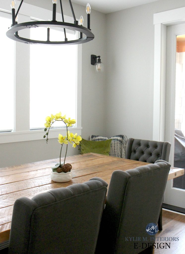
I also love greiges with a bit more commitment to green, if you’re open to accenting your wood a wink. In this next photo, Sherwin Williams Jogging Path provides a nice subtle highlight to the red furniture stain and red oak flooring…
The Best Neutrals to Go With Pink or Pickled Woods
16. SHERWIN WILLIAMS SHOJI WHITE
As mentioned previously in White Duck’s section, Shoji White is amazeballs.
While White Duck has a vague green undertone (which is an understatement – it rarely shows up at the party), Shoji White favors a subtle pink undertone. While it still has a creamy neutral backdrop, it’s something to be aware of.
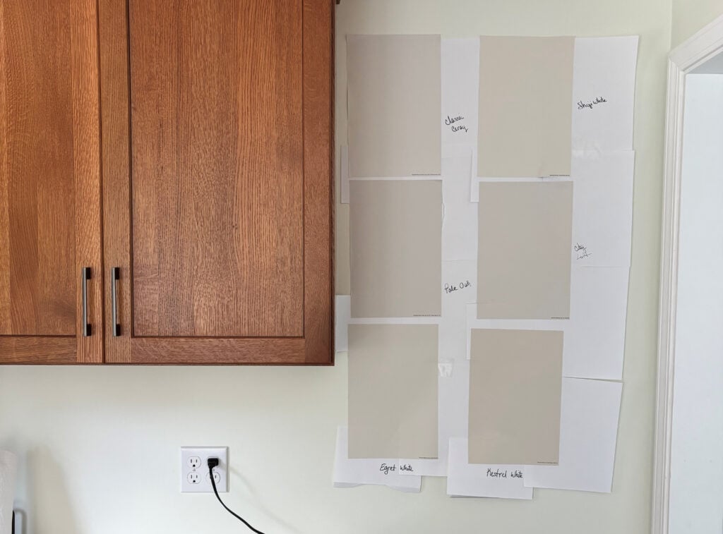
BM Classic Gray | BM Pale Oak | SW City Loft | SW Egret White | SW Kestrel White
Again, sampling and comparing similar colors recommended by a top Color Expert (ahem) is a great way to find your perfect shade. So, if you love Shoji White, compare it to any of the above samples that catch your eye, as well as…
- Sherwin Williams White Duck (fo sho)
- Benjamin Moore Sea Pearl
- Benjamin Moore Wind’s Breath
- Sherwin Williams Egret White
Color Review of Sherwin Williams Shoji White
19. SHERWIN WILLIAMS WHITE HERON 7627
White Heron might tiptoe in on its little webbed feet, but it makes an impact in the right space. And the impact doesn’t need to be all about the ‘wow’ factor; sometimes it’s just about…
The right color in the right space.

But don’t assume you know what you’re getting with White Heron! While it can politely nod to a touch of pink or taupe, it can also lean toward cream, making it HUGELY versatile with a wide range of wood finishes and stains.
Of course, you should never pick a color without comparing it to similar shades. I also recommend exploring…
- Sherwin Williams Heron Plume
- Sherwin Williams Egret White
- Sherwin Williams White Duck
- Benjamin Moore Classic Gray
Notice the ebb and flow between undertones and depths to see which one your particular wood responds to (we all know what Tim’s wood responds to…ME—wink, wink).
FULL Paint Color Review of Sherwin Williams White Heron
20. SHERWIN WILLIAMS MODERATE WHITE
Did I save the best for last? You tell me!
If you’re looking for an airy, soft, warm shade of beige, Moderate White could be the ticket. With its LRV of 74, Moderate White is an off-white paint color.

With an almost creamy backdrop, well-supported by a beige base, Moderate White is beautiful with a wide range of woods, but best with orange and orange-reds.
This next dining room shows red-stained wood furniture with (the previously mentioned) Sherwin Williams Natural Linen (mad love) on the upper walls, and a lightened Moderate White on the trim and wainscoting…

Benjamin Moore Moderate White: IMAGES, Info, & More
If you love Moderate White, take the time to compare it to these bad boys…
- Sherwin Williams Divine White
- Benjamin Moore Maritime White (amazeballs)
QUICK SUMMARY (TL;DR)
- Figuring out the undertones of your wood stain is an important step. The main ones are red, orange, yellow, and pink.
- Coordinate your wood stain’s undertones with your paint color.
- The best paint colors for toning down a wood stain’s intensity tend to be warm neutrals that lean into the wood’s undertones.
Want more?
5 Ideas to Update Oak Cabinets – (PART 1 in series)
MORE Ideas to Update Your Wood Cabinets – WITHOUT a Drop of Paint! (PART 2)
The Best Hardware to Update Wood Cabinets (PART 3)
The Best Paint COLORS to Update Wood Cabinets & Trim (PART 5)
Get the best color advice with Kylie M’s Online Paint Color Consulting & E-Design Services!

Updated with fresh content and ideas for 2026


Well thank you Regina (look at my, catching up with comments – wahoo!). I’m so glad my advice came in handy and I hope everything turned out well fo ryou!
~Kylie
Hi,
We moved into a 1992 4 level split home a year ago. The walls were all originally painted pink!? and the last owners painted white over this, which bled through and gave all the walls a muted pink color. This really clashed with all the light oak that is throughout the home. I was perplexed to what color would go with the oak, and found your website! My husband hated the pink everywhere to say the least!
THANKYOU! you were able to give us good ideas as to the color to choose. BTW, there are millions of colors out there, and can be so daunting as to which color and shade to pick. I stressed all last weekend, looking at colors and samples, and chips and spending hours and hours researching colors of paint.
(We have oak throughout the home, so changing the color of the oak was out of the question.)
I was very brave! and i choose Benjamin Moore Sharkskin. Scariest thing, worse than buying a house! Not for the faint of heart for sure! I was on pins and needles all day, and when i went home, i didnt know whether to cry or just say WOW!!! The color just pops with all our white baseboards and trim!
It turned out wonderful! It matches the oak beautifully, and we have bold walls, just like a new house! With all my dark brown/beige accents, it looks incredible!
I am a true fan and believer of your webpage !!! Thank you for sharing your thoughts with us!
I tell everyone about your site now! Finally someone who actually knows what they are talking about and is willing to share it too!
thank you! thank you! thank you!
Sincerely,
A Kylie M Interiors Fan!
Hi Kylie,
I am absolutely LOVING all the helpful information you are sharing on your blog!!! THANK-YOU!!!! I am currently deciding between SW Repose Gray or BM Edgecomb Gray to paint the majority of my bedrooms, entryway, and hallway. Which one do you prefer? Can I use them both in different areas?
Well if it were me I would lean toward Edgecomb as it’s softer and warmer, more of a greige, whereas REpose Gray is a warm gray, so it’s cooler toned…And you can use them in different areas, I wouldn’t say they are totally magical together, but they aren’t bad.
If you want any insights where I can actually see your home, you can check out my E-design, it’s affordable and fun and I can spend some quality time with your home (via photos) and with you (via the questionnaire) to come up with solutions that work!
If that interests you at all, here’s the link… https://www.kylieminteriors.ca/online-decorating-design-services/
Take care!
~Kylie
Hi Kylie, did you ever complete that post about colour to use NOT to highlight the oak? Can you post it if so? Thank you! Leah
Hi Leah! I haven’t done one specifically for that, but within this post I did refer to warmer neutrals being a better way of not highlighting oak whereas greens/blues and cool tones can accent the oak. But i SHOULD do one quite specifically for it, shouldn’t I!
HI Kylie, I am so confused. My house was built in 1989. I have a great room, kitchen, dining and family room. All Medium Oak ( not sure if orange or brown) cabinets and trim. I have dark teal (more green than blue) countertops and have always painted the walls beige or taupe. Beige ceramic tile on the floor. Boring! I want a drastic change. Changing the woodwork is out of the question. I would like to put in a grey barn wood floor, not sure if I can. I also want my house to pop! Please help me to decide what I need to do to change my boring decor.
Hi Diana! Wellll, the gray barnwood look makes me nervous. I think it could look a bit too busy and mismatched…and keep in mind that the gray barnwood is GORGEOUS, but also VERY trendy. It would be ideal if you could find a wood floor with a bit more of the warmth in it, the same warmth that you would find in your existing woodwork…
Hi Kylie! I love your website! What do you think about BM Revere Pewter with blond/orange parquet floors and wood work? Its a large room facing west with lots of windows.
Thanks!
Kelly
Hi Kelly, I think that sounds lovely! And I’d tell you if it didn’t 😉
Hi Kylie,
I recently ran across your video on accessible beige by SW. I have a bedroom, pretty good size that has some light ( plantation shutters sun never shines directly in facing north) therefore paint I have chose in the past appears dark green when in actuality it is a lighter taupe or tan.
I have recently purchased a tuffed linen headboard and want to lighten up the room with new paint. What are your thoughts in me choosing accessible beige? The rest of my home has warm earth tones with a rustic look.
Any help would be appreciated.
Susan
Hi Susan! I’m thinking it might go a touch too gray for you with your exposure, seeing as it is a beige with bit of a gray base. If you wanted me to come up with some suggestions, I do have an affordable e-design service so I can see photos of your room, otherwise I’m just guessing! https://www.kylieminteriors.ca/online-decorating-design-services/
~Kylie
Feel lucky to have found this. Your advice to the other readers has been wonderful. My problem is having a mixture of woods. I have a teak parquet floor, and a beautiful 1920s vanity in a similar color of wood. The rest of the furniture in the room is Golden Oak. An addition there are window shutters and closet doors made of yellow pine. Is there any way to pull this room together?
Hi Julie Ann – it can ALLL be in the wall colour and smart placement of accessories! It’s totally possible to unite your wood tones so that there’s some consistency that is provided by the paint colour on the walls! If you’d like me to take a look at your room via my Edesign, I do have some affordable packages! https://www.kylieminteriors.ca/online-decorating-design-services/
~Kylie
What color walls is the main picture I’m seeing on Pinterest? Bedroom with two chairs in the nook? Thanks!
Hi Catherine, I BELIEVE that was BM Sea Haze 🙂 It was someone else’s image, which I’ve since taken off. I hope that helps!
Loving your web site!!!! Painting my combo kitchen family room and learned a ton about paint colors from your site. We painted our orange trim decorators white but my Maple kitchen cabinets still have the orangish/yellow color. The room has windows on the north and west sides with the bigger windows being in the west. According to everything I have read colonnade gray seems perfect but wondering if it will look good against the cabinets. Im trying to minimize the orangeness of the cabinets. Would love your thoughts!! ~Robyn
Hi Robyn, I know, those wood cabinets can be tricky! Now, when it comes to personal questions, I do try to refer to my E-design, this way I can take a look at your room and come up with options based on your exposure, furnishings, floorings, etc…, otherwise I’m just guessing! I do have fun and affordable packages! https://www.kylieminteriors.ca/online-decorating-design-services/
~Kylie
Would Balanced beige with a white dove trim go with dark oak stained doors in a open floor plan ? If not what would suggest?
Hmmmm, I might look at SW Alabaster 🙂
What is the paint color used for the main photo for the blog post ? Looks like a pretty green grey. Love it!
Hi Melissa, the feature colour is BM Collingwood, which you can read more about here! https://www.kylieminteriors.ca/colour-review-benjamin-moore-collingwood-oc-28/
~Kylie
Hi Kylie,
First, I really enjoy your posts! So much good information.
What do you think about painting kitchen cabinets the same color as the walls? I have vaulted ceilings and semi open concept home; I’m contemplating painting both the walls and cabinets wool skein. Floors are medium oak.
Marty, Cincinnati
Hi Marty, yes it can look good! Because you will be changing sheen from walls/cabinets/ceiling, that can provide a subtle shift that can really play nicely with a colour!
~Kylie
Hi Kylie! Loving all of your posts – so much more than simple inspiration. You really help someone to understand how color works! I’ve been loving cream shades for my open kitchen-dining room (was painted a horrible dark green by previous owners and is North-facing), but I love the Kilim Beige above! Wondering how it will look in a room with northern light. I really want to brighten and warm it up, which shouldn’t be too difficult as I have cherry cabinets, cherry flooring and a large bay window. It looks great in the above photo, with high light, but I see that it has a lower LRV than the others I’ve been sampling. Do you think it will flatten too much in Northern light? I want to avoid a bland brown-beige kitchen and may go with Gentle Cream instead!
Also – I have several ideas of paint colors I love (most of which I discovered on your blog) and would like throughout the house, but I’m not sure how to make it flow as I like a few different decorating styles (romantic, french country, traditional). Which e-design package would be best if I already have several colors I’m considering?
Thanks so much!
Mandy
Hi Mandy! Hmmmm, Kilim might make me nervous and I do worry that it will flatten out a bit as well. On another note, I DOOOO love Gentle Cream. Now depending on ‘how cherry’ your cabinets are, it might just have a bit too much warmth on the golden/yellow end, but that being said, the northern light will slow it down. I hope that helps! If not, yes, I do have my E-design and it does depend on how many rooms you’ll be doing. You’ll just need to count up the rooms that will be different colours from each other and choose the 2-5 room I would think! https://www.kylieminteriors.ca/product-category/interior-paint-palettes/
~Kylie
Is there ever a deep red/wine color that could be paired with a darker orange toned wood trim? The previous color was a green color, however I tend to lean toward the darker, richer colors.
Hi Terri, thank you for your note! I actually have an Edesign business that I’ve created for questions like yours! I try to give as much complimentary info as I can on my blog posts and if that doesn’t work, it might be time for a closer look, this way I can see your furnishings, flooring, etc…otherwise I’m totally guessing!
https://www.kylieminteriors.ca/online-decorating-design-services/
~Kylie
Hi! I have red oak cabinets in my kitchen with browns/ blacks/tans in quartz counter. What color would go good with those colors and would another color trim look good? I want to change and update my trim in my house. I have a bay window in my living room and have the oak trim throughout my house. What would you suggest colorwise?
Hi Elisha, thank you for asking! I actually have an e-design business just for questions like yours – otherwise, I’m guessing as to what your home REALLY looks like, furnishings, floorings, exposures, etc… I do try to give as much complimentary, helpful info on my blog as possible, and if that doesn’t work, it just might be time for me to take a look! https://www.kylieminteriors.ca/online-decorating-design-services/
~Kylie
Totally on the struggle bus. We moved and all my previous furniture and wall colors seem to clash in the new northern lighting of the house! Your site has been so helpful! Based on this article would you say that a taupe (to be exact SW Taupe Tone) will tone down deep cherry/mahogany furniture? Or is that just too much?
Oh Brittney, I FEEL YOUR PAIN! We just moeved 2 months ago and our house is 100% north facing and DAMN it’s a cool gray/blue light. I knew that before we bought it, but arghh – I miss my southern light! And yes, getting into the taupe end of things, those with a slightly stronger red in them (or slightly pink/purple) can help to tone things down a bit, whereas if you did blue/green, it would enhance the cherry furniture…I might like to see a touch more of those undertones than Taupe Tone has, but it’s a good place to start!
Well after many samples and many trials and MANY errors… we decided on SW Perfect Greige. It makes the cherry wood look a little more chocolaty… I guess we’re going for cozy instead of fresh and bright lol I mean unless you have a suggestion. I think I’ve purchased half the paint ever made at this point. Your site is hands down the best educational site for paint! Thank you!! #50shadesofgray #50shadesfreed
I am finally removing the wallpaper from my kitchen! I planned to paint it SW Ivoire – the color on my family room which is open into the kitchen. Wow! It looks awful next to the medium oak cabinets!! Both rooms /one long room face south. Do you think SW Buff or BM Windham cream would work? I love a hint of yellow…
Thank you for any words of decorating wisdom you can pass along!
Oooo, I bet that is colourful with your oak cabinets! Windham is still quite warm, I wonder if you might want to calm things down, ie: BM Gentle Cream. Otherwise, you can check out my E-design and this way I can look at your countertops/flooring to come up with some suggestions that are not just a guess! I’d love to help! https://www.kylieminteriors.ca/online-decorating-design-services/
~Kylie
Thanks again for the helpful advice! Is there a Sherwin Williams color that is close to Classic Gray? I’d love to use it since our cabinets are similar, but Sherwin Williams is more convenient for me. Thanks!
That’s very helpful for my situation, thank you!!!