
Sherwin Williams 8 Best Beige & Tan Paint Colors (slightly darker)
The Top 8, Modestly Warm Neutrals For Your Home
Gone are the days of boring old builder’s beige! Beige and tan paint colors have reached new heights in the last few years as designers, painters, and homeowners have embraced the versatility of what was once considered a basic ‘builders’ color.
One of the front-runners in the Battle of the Beige is Sherwin Williams. They’ve created a range of slightly darker, warm neutral colors that will satisfy even the pickiest color connoisseur (like me…).

But how do you know which beige or tan is best for you and your home?
- Look at your finishes – do they have an orange undertone that’s orange-yellow or orange-pink? Or maybe your home suits TAN with a yellow-orange or yellow-green hue! If you’re unsure, get samples and see which one flows best.
- What LRV range are you looking for? The average home suits an LRV between 60-70. Do you prefer colors that are lighter or darker than this? Most of the colors listed here are a bit darker (-60)!
- If your tastes lean more rich and golden, you might like this: The Best Rich, Golden Beige & Tan Paint Colors. However, I’d start here first, as these shades can be a bit more livable and flexible.
QUICK REFRESHER ON LRV
Here are the approximate ranges of the suggested colors…
- Light-depth paint color: 55-72.
- Light-medium depth colors: 40-54.
- Medium-depth colors: 20-40
While lighter shades of beige are trending, if you want more depth and warmth, I’ve got you covered – literally and figuratively…in paint!
Most of the colors we’re looking at today fall in the light-medium range (40-55), but we’ll dabble loosely in the other two.
If you don’t know about LRV, it could save your color-lovin’ life…and your marriage.

1. SHERWIN WILLIAMS BALANCED BEIGE 7037
Balanced Beige is pants hands-down (it’s not that kind of party), one of the most popular, slightly darker beige paint colors. It has a nice, passive warmth that’s subdued by a subtle gray base, making it one of the more MODERN beige paint colors in this range.
As for depth, Balanced Beige has an LRV of 46, which plunks it firmly in the light-medium range – not too light, not too dark – juuuuust right.
As for beige vs. tan, Balanced Beige is definitely more of a beige, not just a traditionally golden warm one. While it can humor some finishes that need an orange-pink undertone, it doesn’t lean too far.

TIPS FOR USING BALANCED BEIGE IN YOUR HOME
- Make sure it’s warm enough if you have traditional beige finishes, especially those from the early to mid 2000s. Balanced Beige doesn’t always have the warmth (orange-pink) these finishes crave.
- If you want more depth, check out Tony Taupe (#7), which can pick up a wee willy wink of green in its travels, but has a similarly muted warmth.
- Balanced Beige can be a stunner on kitchen cabinets, nodding to current off-white and light-depth cabinet trends. Personally, I find this depth a bit easier to coordinate with compared to lighter shades.
- Balanced Beige is hawwwwt on exteriors as it suits a ton of stone and brick finishes, as well as asphalt roofs.

While it settles as a light-medium inside, look at how much it can lighten on an exterior!
Here’s your Peel & Stick sample of Balanced Beige…

Sherwin Williams Balanced Beige: IMAGES, Info, & More
2. SHERWIN WILLIAMS SANDBAR 7547
If you’re looking for the perfect shade of tan, look no further than Sandbar.
Whereas some shades of tan come in hot n’ heavy with their yellow-green undertones, Sandbar is a modest shade of tan that doesn’t commit hard to yellow-green. It’s pretty subtle and relatively toned-down (grayer/muted), making it an option for rooms, exteriors, and even the odd kitchen cabinet.
Sandbar has an LRV of 53, which means it falls in the light-medium range, but on the higher end, winking seductively at the light world.
Sherwin Williams Sandbar: FULL Paint Color Review
By the way, if you’re unsure which type of warm neutral suits your space, compare Sandbar (tan) with Bungalow Beige (#6). This will help you see the shift between types – your finishes should CLEARLY prefer one over the other.
The Best Paint Colors for Kitchen Islands & Bathroom Vanities
TIPS FOR USING SANDBAR
- Sandbar is a great moderate depth for a room with reasonable natural light.
- Sandbar is a contender for cabinets, based on kitchen cabinet trends, although it’s darker than the most popular cabinet paint colors.
- If your finishes lean more towards beige, rather than tan, be cautious with Sandbar.
- Sandbar looks great when partnered with some darker shades of greige.
3. SHERWIN WILLIAMS ACCESSIBLE BEIGE 7036
Accessible Beige is gorgeous with its soft and subtle gray undertone, making it look the least like a typical beige paint color.
FUN FACT: Accessible Beige is Sherwin Williams most popular beige paint color and the lightest on this page.

Many people get twitchy about their beige looking reminiscent of the early 2000s—and some do. If you’re in this group, you can unclench those bum cheeks, as Accessible Beige is a great way to get the warmth of beige without a heavy or dated look.
However, if you’re a traditional beige lover and want some serious warmth, Accessible Beige could be too gray and muted.
Ideas to Update Your 1990s Home
Sherwin Williams Accessible Beige: IMAGES, Info, & More
TIPS FOR USING ACCESSIBLE BEIGE
- Accessible Beige can be a bit fussy with wood stains that have a lot of red/pink in them, but humors many others.
- It’s a great color for a north or south-facing room; neither too warm nor too cold. Keep in mind that it can look a bit less warm in a northern room.
- Accessible Beige’s LRV is 58, so while it’s lighter, it’s not for the faint of heart.
- Being a bit grayer, it might feel a bit flat and drab if you have a dark room.
- Of the colors on this page, Accessible Beige and Balanced Beige are the most popular.
- Want something a bit lighter? Sherwin Williams Natural Tan has a ‘similar’ look but is more gentle with its higher LRV.
Never judge a color by its name. Just because it has the word ‘beige’ or ‘tan’ or ‘gray’ in it, doesn’t mean that’s what it is! Judge it by how it LOOKS with your finishes.
4. SHERWIN WILLIAMS LOGGIA 7506
Loggia is definitely an up-and-comer in the beige world. With a muted, slightly grayish backdrop (kind of like Balanced Beige), Loggia offers a more muted approach to warmth.
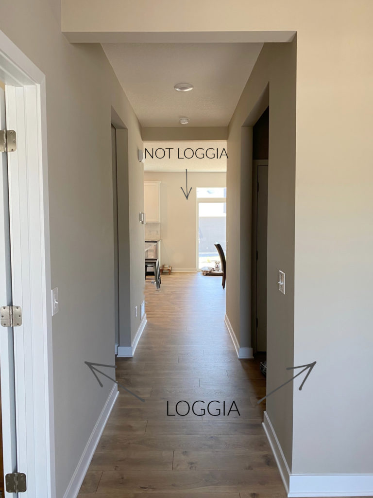
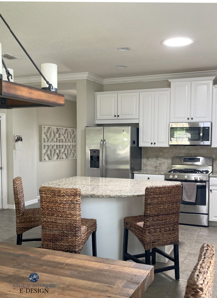
Loggia has an LRV of 48, which parks it smack dab in the middle of the light-medium range. While it’s a bit darker than most people are looking for on their kitchen cabinets, it’s a great option for rooms and exteriors. This said, if you want a cabinet color with a little cushion for the pushin’, it can be pretty!
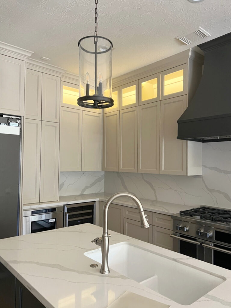
In this next kitchen, my clients are installing a more modern quartz countertop and want a new paint color to update their oak cabinets. These are the cabinet colors we sampled…

BM White Dove | SW Accessible Beige | SW Anew Gray | SW Balanced Beige | SW Amazing Gray
Notice how Loggia comes up a touch more tan looking compared to the bit of taupe in Balanced Beige – cool, eh?
This is why you should ALWAYS sample and compare several similar colors – you never know what you’ll fall in love with.
TIPS FOR USING LOGGIA
- While it can look a bit drab in low-light areas like dark rooms or hallways, it’s gorgeous in a room with moderate (or more) light.
- Loggia is a great alternative to Balanced Beige if you want a tiny touch more golden warmth (compared to the almost taupe in Balanced Beige).
- If you love beiges for any exposure, I love how Loggia’s slightly grayish backdrop makes it a bit more useful for warm, south-facing rooms (but it can look toasty!)
Sherwin Williams Loggia: IMAGES, Info, & More
5. SHERWIN WILLIAMS STONE LION 7507
Stone Lion is a beast of a beige. Darker than many of the other options on this page, Stone Lion grounds a room with a passive warmth, not a rich one. This gives it a more organic, natural vibe (this lion does NOT shave his armpits).

With an LRV of 38, Stone Lion falls in the lighter end of the medium range. This means it offers more depth than your traditional, muted beige paint colors without venturing into the wild world of brown.
TIPS FOR USING STONE LION
- Unlike some beiges and tans that can be iffy with cream cabinets and trims, Stone Lion can look gorgeous, as shown above.
- If you have a dark room, Stone Lion can definitely close it in. While this can make it look cozier, it can also look HEAVY.
Here’s your Peel & Stick sample of Stone Lion…

SW Accessible Beige | SW Mindful Gray | SW Amazing Gray | SW Tony Taupe | BM Pashmina | SW Network Gray
6. SHERWIN WILLIAMS BUNGALOW BEIGE 7511
If your home’s finishes suit beige with a commitment to dusky orange-pink, Bungalow Beige could hit the spot without going too far.
What is too far?
I wouldn’t know, I go too far all the time #nofilternoboundaries. Oh, we’re talking colors, right. Well, most people don’t want too much pink on their walls. So, while an undercurrent is okay, a commitment often isn’t.
Similar to Sherwin Williams Bungalow Beige, Dhurrie Beige, or Pavilion Beige
Bungalow Beige has an LRV of 53, making it a light-medium depth shade of beige. And while its approach can be SO well-suited to many interior finishes, make sure you’re okay with its blend.
TIPS FOR USING BUNGALOW BEIGE
- Bungalow Beige has an LRV of 53, parking its cute little toosh nicely in the higher end of the light-medium range.
- Pavilion Beige, which is very similar, has a lower LRV of 48 and is a great color to directly compare with Bungalow Beige. Heck, may as well check out Dhurrie Beige while you’re at it.
- For a lighter approach, check out Sherwin Williams River’s Edge.
- More so than many other popular beiges and tans, Bungalow Beige suits a whackload of finishes from the early to mid-2000s.
The Ultimate Guide to Update Your 2000s Home
7. SHERWIN WILLIAMS TONY TAUPE 7038
Who’s the boss? Like Tony Danza, Tony Taupe is when it comes to darker shades of beige and tan (I tooootally dated myself there. This said, I would never date myself, I’m way too weird).
Tony Taupe has some serious junk in its trunk. With an LRV of 37, this badass beige sits firmly in the medium depths.
With this kind of depth, not many would use it as a whole home paint color. Instead, it’s well-suited to single or multiple rooms, or an accent wall with a warm, soft shade of off-white.
Here’s your Samplize Peel & Stick sample of Tony Taupe…

BM Stone Hearth (mad love) | SW Tony Taupe | BM Indian River (Ranchwood)
TIPS FOR USING TONY TAUPE
- While Tony Taupe can be gorgeous on lower cabinets, kitchen islands, or bathroom vanities, it’s a bit too dark for the typical beige cabinet lover.
- If Tony’s muted warmth has you swiping left instead of right, shift to Stone Lion (#5) for a subtle tweak in personality.
- If you find it a bit too dark for your room, bump back to Sherwin Williams Balanced Beige (#1).
Sherwin Williams Tony Taupe: IMAGES, Info, & More
8. BARCELONA BEIGE 7530
Barcelona Beige is often overlooked in favor of lighter, more gentle shades of tan. But for those who want a commitment, hot damn, is it ever pretty.
Barcelona Beige isn’t, in fact, a beige. With its yellow-green undertone, it’s a tan paint color.
Benjamin Moore’s 12 Best Beige & Tan (Slightly Darker) Paint Colors
This said, not everyone breaks down beige and tan the way I do. Call me anal (or maybe don’t), but I find it helpful to define warm colors by their undertones.
Ideas to Update Older Granite Countertops
TIPS FOR USING BARCELONA BEIGE
- Don’t expect this beige to go with travertine, as, like most tan-inspired colors, it doesn’t have the right undertones. Instead, try a beige with a hint of orange.
- Barcelona Beige pairs well with wood stains that have a slight yellow undertone.
- If it’s a touch too dark, bump up to Sherwin Williams Urban Putty or the ever-popular Canvas Tan.
- If you want more depth and more of a khaki-type of paint color, check out Sherwin Williams Universal Khaki.
WHAT COLORS GO BEST WITH BEIGE & TAN?
While it can depend on the depth and exact undertones of your warm neutral, here are some color combos to consider…
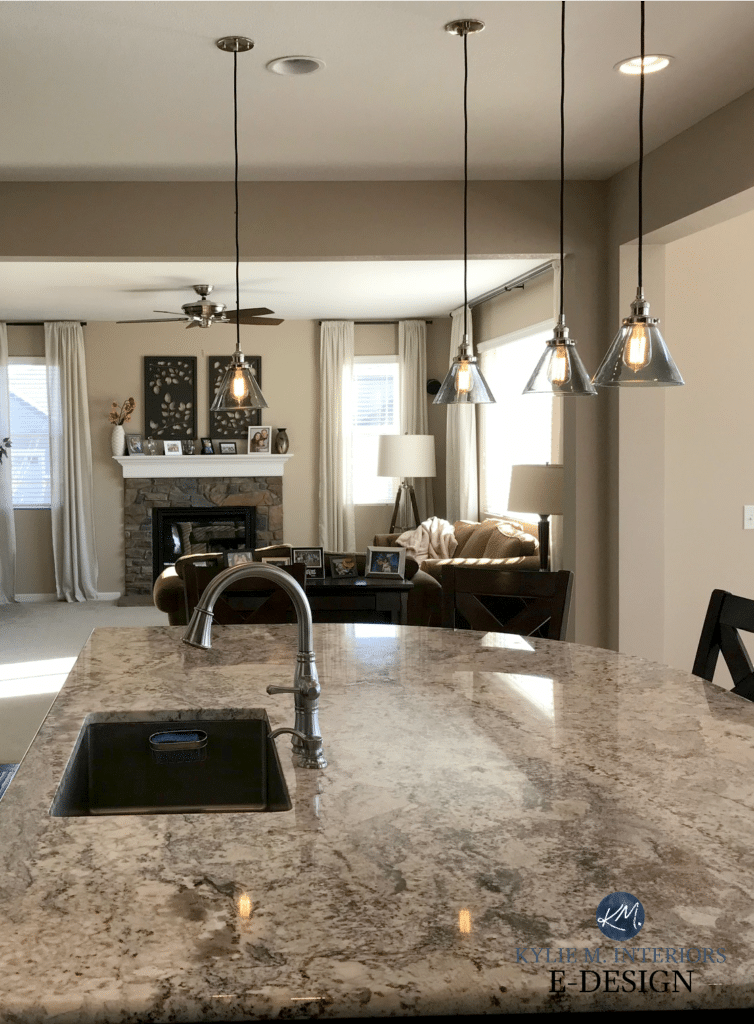
BEIGE, TAN & GREIGE: Some of the popular greige paint colors (green undertone) that are ideally darker than your beige/tan (a bit or a lot). For example, Sherwin Williams Porpoise can be a gorgeous accent wall color for a ton of warm neutrals.
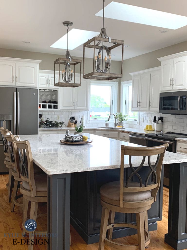
These kitchen cabinets (Sherwin Williams Balanced Beige) look gorgeous with Sherwin Williams Thunder Gray on the island…

BEIGE, TAN & GRAY: If you want to pair a warm neutral with gray, it’s best if the gray is a bit (or a lot) darker than your chosen beige/tan. In particular, some medium-toned or darker gray-blues can be interesting (check out Grays Harbor, it’s STUNNING).
BEIGE & BEIGE or TAN & TAN: Choose a lighter version of your warm neutral for a tone-on-tone look. Some of the popular off-white beiges and tan-inspired colors include Sherwin Williams Moderate White, Sherwin Williams Natural Choice, and Aesthetic White.

Balanced Beige with Aesthetic White
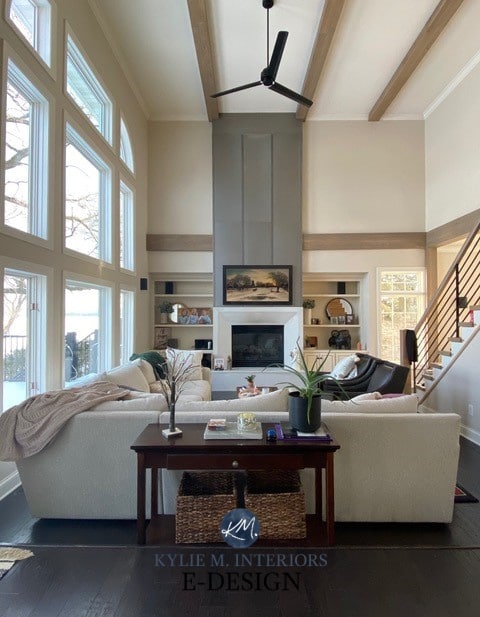
BEIGE, TAN & BLACK: Black paint colors on kitchen islands, stair railings, the inside of front doors, or home decor are a great way to add interest to neutral space. In particular, I love the softness and undertones of Sherwin Williams Iron Ore.

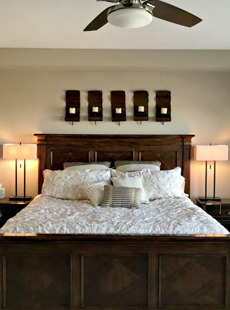
BEIGE, TAN, & BLUE: While beige and tan can be fussy about some of their blue partners, many darker shades of blue can look classic.
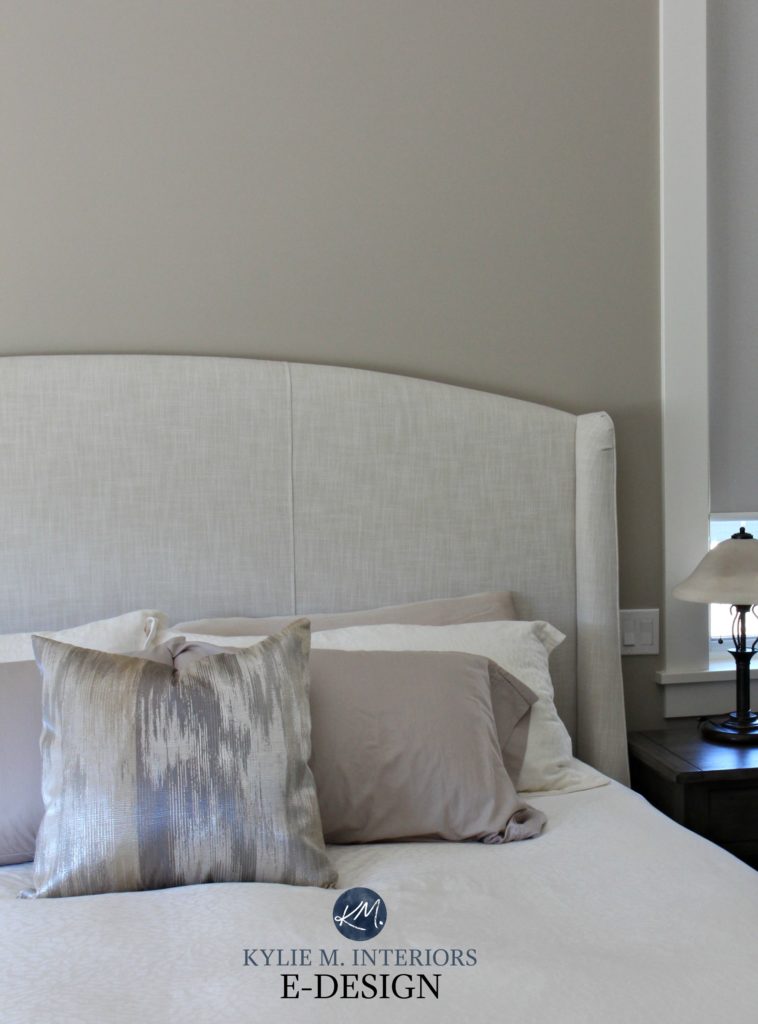
Check out how blue accents contrast and complement this beautiful beige bedroom…
BEIGE, TAN & GREEN: When it comes to actual ‘colors’, beige and tan are often happiest with shades of green, including….
-
- Light-medium to medium-depth green paint colors (that are the same depth or darker than your warm neutral.
- Darker green paint colors are great for accent walls, islands, and more.
- Green-grays can also be gorgeous with beiges and tans. I’m in love with Sherwin Williams Thunderous.
By the way, this doesn’t mean you need to PAINT anything green; just accenting with toss cushions, home decor, and plants can be a nice way to add some balance.
BEIGE, TAN, & PURPLE: While tan can be a bit fussy, many beige paint colors pair well with darker, muted purple paint colors and accents.
BEIGE, TAN, & RUST/RED/ORANGE: Beiges and some tans can look gorgeous accented with rustic, warm paint colors like rusty red and dark orange. Check out shades like Sherwin Williams Roycroft Copper Red as a place to start.
READ MORE
Benjamin Moore’s 12 Best Beige & Tan (Slightly Darker) Paint Colors
BEHR’S Best Beige & Tan Paint Colors
The Best Rich, Golden Beige & Tan Paint Colors (slightly darker)
Benjamin Moore Natural Wicker Paint Color Review
The Best WHOLE HOME Warm Neutral Paint Colors
Get the best color advice…
Check out my Online Color Consulting


ORIGINALLY WRITTEN IN 2019, FULLY UPDATED FOR YOU IN 2025!


This is a very helpful format. I like to know the undertones in colors and also woods, ect. that they work well with. Very well done.
I have come back to this article a lot! I am wondering if you’d ever recommend Canvas Tan to help neutralize forest green in a north facing room? We are in a new house and will be replacing all green surfaces eventually, but that whole time and money thing prevents it from happening until next year. Thanks for all of your helpful articles. Your website is like my design encyclopedia 🙂
Hi Kylie,
I love your vids. I need help choosing two additional colors for our flip properties. We typically work with Repose Gray in all the common areas and then switch things up in the bedrooms with Sea Salt (green) and Krypton (blue). Both are stunning colors that work well transitioning from the gray hallways. I need two more neutral SW colors for our rehab homes that have 3-4 bedrooms. We like to paint each bedroom a different color because it shows better in listing photos and identifies each room as separate. So……can you recommend a pale yellow and a beige/tan that would blend well with the other colors?
Hi Joanne, thank you for your note! When it comes to questions like this, if the info you’ve found on my site isn’t quite enough then I do need to refer to my Online Consulting. I get dozens of questions like this in a day and I do have to give priority to my e-design clients 🙂 It’s affordable and if it interests you at all, you can check out the packages here. You’d probably just need the Single Room package to cover what you need… https://www.kylieminteriors.ca/product-category/interior-paint-colors/
Hi there!
Thank you for this post! Quick question, I am painting my walls SW balanced beige, and was wondering if you thought wool skein could work as the kitchen cabinet color against this? If not, do you have recommendations for a color that will work well on the cabinets?
Thanks,
Amanda
Hi Amanda! When it comes to personal questions (as I get dozens in a day) I do need to refer to my E-design services. This way I can take a look at your home/countertops/backsplash/etc… and come up with the right solutions for you. Yours would fall under the ‘Random Questions’ package under Decorating and Design Ideas which is $65. If that interests you at all, here’s the link! And just a heads-up, I’m not a big fan of Balanced Beige and Wool Skein as WS can pick up a vague greenish undertone. https://www.kylieminteriors.ca/online-decorating-design-services/
~Kylie
Also, when you say 25% lighter in your video for accessible beige do you mean mixing 3 parts AB and 1 part white?
Hi! 25% lighter is basically ‘taking 25% of the recipe ingredients out’ 🙂
My Sherwin Williams rep suggested accessible beige for my living room kitchen area as I have dark brown furniture and sliding blinds and cherry kitchen cabinets , but Inthink it’s too drab. I want a light color with a tan/gray undertone but not sure if this is too light. thank you.
Hi Susan, if your gut says it isn’t right then I would say it probably isn’t right! I love SW Canvas Tan for a neutral soft look…Neutral Ground is also pretty with a bit of a creamy backdrop…
Will lightening accessible beige change the LRV?
My entire home is SW urban putty. Trying to lighten things up.
Hi Lori! Yes, lightening a colour by 25% WILL change the LRV. Now I don’t know the exact science, but as I’ve played around I’ve found that 25% usually is 3-4 ‘points’ higher. So with Accessible Beige being 58, I would say that lightening it by 25% would bring it up around 61-62. Did you read my latest blog post, it was actually about this colour range – check it out and it might help you in your paint travels! https://www.kylieminteriors.ca/the-best-paint-number-for-your-home-62/
~Kylie
Hi! Thanks for the pictures- we purchased a house that needs repainted to lighten the rooms- the baseboard trim is a dark wood so I was wondering if you think the Accesible Beige would go ok with darker trim?
Thanks, Heather
Hi Heather! There’s a lot more to consider, like furniture/countertops/exposure/lighting, but in general, yes, Accessible Beige can work with darker trim! If you’d like me to take a look, I do have an affordable and fun E-design Services so I can suggest 3 colours specifically for you and your home! https://www.kylieminteriors.ca/online-decorating-design-services/
~Kylie
Hello, I was wondering if you could tell me what your trim color was? I am considering using this color, but we are doing a dark knotty Alder woodwork. It seems to be so hard to find a picture of accessible beige with anything other than white. Thank you
Hi Rena! You could check out SW Alabaster which would look very pretty with Accessible Beige…
Yes!! Alabaster is the best trim color. I used it with agreeable grey in my kitchen even!!! Practically the best trim paint color EVER!!
This article is so helpful! I can’t decide between canvas tan and wool skein. We have dark, cherry wood trim in our living room, and it does not get much light. We want a neutral, warm color.
Hi Portia, I would lean a bit more toward Canvas Tan than Wool Skein, simply because WS can sometimes pull a wink of green 🙂
I have really enjoyed reading your site. Do you believe agreeable gray and accessible beige would both go good with medium wood color trim and floors? Do you believe they would look good in adjacent rooms? Thank you
Those are both nice with medium wood and generally speaking, they suit each other quite nicely. Each can change a bit depending on the exposure in each room though, but they compatible… 🙂
Hi again! I have another questions that you can hopefully help me with. My kitchen and dinning room face west so I tried using Wool Skein, however, I must be the rarity because it came out so darn yellow. Would canvas tan work better?
Hi Sarah! Wool Skein is tricky as it has those warm tones in it, but it can also pick up a wink o’ green! Yes, you might find Canvas Tan a bit better or even Natural Tan. That’s without seeing your home/finishing, but its at least a place to start!
I have Canvas Tan walls with stained oak cabinets and trim in my utility bathroom, and it looks great. I also painted Canvas Tan in a long bedroom hallway that receives minimal natural light. The hallway trim has 13 year old white oil-based paint that has yellowed considerably through the years and looks awful with the walls. I need to re-paint all the trim– which Sherwin Williams white do you suggest to pair with Canvas Tan (and Softer Tan because that’s what’s painted in other areas of my home)? Thank you.
Hi Donna, you could try SW Pure White which is a fresh, bright look (with a wink o’ warmth) or the soft, subtle look of SW Alabaster…
What would be the best accent wall color for canvas tan in a Den?
Hi Kim! When it comes to personal questions, unfortunately, I don’t have an answer! There’s a lot more to consider such as size, flooring, furnishings, personal tastes! If you’d like me to take a look I do have a FABULOUS E-design service for just this purpose! https://www.kylieminteriors.ca/online-decorating-design-services/
~Kylie
I have SW Navajo white woodwork (and a lot of it). I am looking for a neutral for the entry and main living area. The color sample of Wool Skein definitely changes every time I walk by and look at it . Would you put Wool Skein with SW Navajo white trim? The main window wall is west facing.
Thank you!
Hi Evonne! Wool Skein can pick up a slight green undertone (very slight) and I might worry about that a bit with Navajo White. You may need to warm things up a bit!
Thanks Kylie- I have learned a lot from your site.
I see that green undertone in some light.
What would be a warm option?
do you have anything written about white paint colors???? I only have east facing windows in a condo–plantation shutters cut some light–i have stark white cabinets i inherited from previous owner–she liked cool colors–how do i warm this up with a white???
If you have any ideas i would love it or have something already written
Hi Dee, you bet I do! If you go into the search area, which is in the right hand sidebar, and type in ‘white paint colours’ you’ll see that I have 3-4 blog posts about whites!
Hope that helps…
We’re building a home that has a large open concept great room with large windows on the South side. I’ve been leaning towards having it painted in the Wool Skein. I’ve tried the color and like it a lot on the sample board. I’m looking for a color that will coordinate well for a feature wall, (The wall with the large windows and fireplace) And I’ve been looking for a color that doesn’t pull as much of the green undertone, but more of a brown warm color. Do you think Accessible Beige would work well with Wool Skein? Your website has been great and I keep referring back to it.
Hi Carrie, I do try to refer most personal questions to my E-design, so I can spend some time with things, but I wouldn’t pair Accessible and Wool Skein – too similar, but different. I would also think twice about Wool Skein as it is lovely, but CAN pull a wee wink o’ green!
Thanks so much for taking the time to answering my question. What’s another Sherwin Williams color similar to Wool Skein that would look good throughout most of the home? I’ve also looked at Grecian Ivory and like it.
I am so confused on color. I have oak cabinets with yellow undertones. Medium honey color. The Sherwin willams paint specialist I had come to my house picked Modern Gray. I don’t think gray tone is good in my 1960’s traditional house.
Where should I go from here. I have wood floors, face south so no direct sunlight.
Hi Chris, well your instincts are right, I wouldn’t do Modern Gray with medium honed toned cabinets! If you would like some suggestions that make more sense, I do have an affordable E-design service, this way I can look at photos of your kitchen/countertops/flooring and come up with some options that are more up your alley. I also explain about the colours too, so you can understand more about what you need to do! If that interests you, the link is here.. If you’d like any other suggestions, I do have an E-design service created just for questions like yours, so I can actually take a look at your room and learn more about your tastes. If that interests you, the link is here… https://www.kylieminteriors.ca/online-decorating-design-services/
HOpe that helps!
~Kylie
I am redecorating my bedroom and deciding between worldy gray and accessible beige. My bedroom faces east and I do not get a lot of natural light. Which color do you think would be better and what undertones are they known to have or do you have any other neutral color suggestions?
Thanks
Hi Mary, of the 2, I would lean toward Accessible Beige! If you’d like any other suggestions, I do have an E-design service created just for questions like yours, so I can actually take a look at your room and learn more about your tastes. If that interests you, the link is here… https://www.kylieminteriors.ca/online-decorating-design-services/
~Kylie
Kylie,
I have a bedroom that will be my T.V room and it has light coming from the west window. The molding is painted a camo brown ( my son painted ) which I need to keep that color. Also, there is a roman shade that is dark brown. I would like to have burnt orange assessories in the room. I am having a hard time choose a paint color. I don’t want the room to look dark. I also would like to paint the ceiling either white ( which one ?? ) or the same color as the whole room. What color would I paint one wall a different color to compliment the other wall color
Hi Linda, thank you for your note! Unfortunately, I just can’t guess at it, not knowing the actual colour of your trim, decor, exposure, etc… And I try to give as much free info on my blog as possible and if that doesn’t help, you might want to check out my E-design which is affordable and fun!https://www.kylieminteriors.ca/online-decorating-design-services/
~Kylie