
Sherwin Williams 9 Best Rich Golden Beige Paint Colors
POPULAR MID-TONE BEIGES & TANS THAT AREN’T BORING…
While many choose light, muted shades of beige and tan, others yearn for deeper, darker, richer, and even more golden paint colors. Colors just like these ones from Sherwin Williams.
In fact, with trends leaning warmer, we might see more of these richer tan and golden beige paint colors pop up here and there – maybe not on kitchen cabinets, but definitely in rooms and on exteriors.
But what makes a warm color…warm?
Just as gray will have undertones of blue, green, or purple, beiges and tans will have yellow, orange, or pink (red) undertones, with a wink of green here and there.
Like taxes, death, and empty wine bottles, undertones are part of life. The key is to figure out which undertone looks best with your home’s finishes! And, believe it or not (I advise you to believe it; the slightly manic lil’ Ginger knows what she’s doing)…
Many interior finishes prefer beiges (orange undertone) rather than tans (yellow undertone), especially in homes from the early to mid-2000s.
Of course, it’s never that simple. And because this isn’t just a ‘tell you what to do blog‘ (although I can be very bossy), it’s a TEACH you how to do it one, let’s dive a little deeper.
BEIGE: Beige will have an orange undertone. From there, it can lean orange-yellow, orange-pink, and pick up the occasional flash of green. However, orange is the dominant undertone.

TAN: Tans will have a yellow undertone. That yellow can lean yellow-orange (yellow being the stronger of the two) or yellow-green. However, yellow is the boss.

Never judge a color by its name. Just because it has the word ‘beige, tan, gray, white, etc’ in its name doesn’t mean it’s that type of color. Judge it by how it LOOKS with your finishes.
Lastly, if these more rich tan and golden beige paint colors are a bit too deep or strong for you, I’ve written a sister blost post for those who love slightly darker beiges and tans, but prefer more muted shades, and dare I say…more modern options.

Lastly (again), if you’re looking for Benjamin Moore beiges and tans, check it out here:
Benjamin Moore’s Best Beige & Tan Paint Colors (slightly darker).
Now, let’s see what this color cowgirl has up her sleeves…
1. SHERWIN WILLIAMS NOMADIC DESERT 6107
Nomadic Desert is a slightly darker beige paint color with a bit more meat on its bones. With an LRV of 50, it adds decent visual weight to a room and a stronger contrast with white trim, especially compared to some of the more popular, lighter shades of beige.
Nomadic Desert is like a darker, deeper version of Kilim Beige (#3), having similar features (and an orange undertone).
When thinking of ‘beige,’ Nomadic Desert is likely a little bit darker than the average person traditionally thinks of, but for those craving bit more depth, it can hit the spot.

The Best Paint Colors with Golden Oak
While Nomadic Desert and Kilim Beige suit some beige carpets, tiles, and countertops, they don’t always have enough pink undertone for overly pink finishes. As shown in this next photo, both lack the degree of pink needed to satisfy this carpet..

Nomadic Desert was popular in the early 2000s. And while current beige trends don’t go this dark, this doesn’t mean you can’t love this badass and beautiful shade of beige.
TIPS FOR USING NOMADIC DESERT
- Nomadic Desert LOVES most wood tones, but looks particular gorgeous with darker wood stains.
- Nomadic Desert can work in north-facing rooms to balance cool light. Its scrumptious warmth can also bring a coziness to a flat eastern afternoon or morning western light…as long as they’re reasonably well-lit. Nomadic Desert won’t add or absorb light in a room, meaning it could feel a bit heavy in a low-light or dark room.
- If you want a stronger warmth, check out Sherwin Williams Row House Tan (#8).
If you want to go a little deeper (that’s what she said), check this bad boy out…
2. SHERWIN WILLIAMS LATTE 6108
Latte is a lovely, rich, earthy shade of beige with more depth and orange undertone than the average warm neutral.
While colors like this were popular in the early 2000s, many of my clients are still looking for these warmer shades when they want more personality and commitment.
The Best Paint Colors with Dark Wood Trim
Latte has an LRV of 38, making it a soft, medium-depth color. This depth means it can be used as an accent wall color when paired with lighter shades of beige.

TIPS FOR USING LATTE
- It’s even better when it’s made with oat milk (helloooo IBS) and you throw in a little vanilla syrup and Baileys.
- Latte suits many of the beige carpets and tiles from the early 2000s.
- Latte can be a beautiful exterior color, well-suited to various finishes.
- While some light beiges can be fussy with their trim colors, this depth can suit quite a few soft, warm whites and off-white beiges.
- If you’re craving a bit more warmth, check out Sherwin Williams Farro, which has more orange.
Ideas to Update Your 2000s Home: SERIES
3. SHERWIN WILLIAMS KILIM BEIGE 6106
Kilim Beige is warmer and darker than some of the most popular beige paint colors (LRV of 57), but not as dark as most of the others on this page. It’s a great option for those who want a COMMITTED warmth, without going buckwild.
If you don’t know about LRV, take the time to read about it (once you’re done this blog post).

This color is very…very similar to Kilim Beige
Among the undertones found in beige, Kilim Beige leans more towards the orange end of the spectrum, rather than the yellow end, without becoming obnoxiously peach-toned.
In this first photo, notice how hard Kilim Beige leans into orange (slightly orange-pink)…

Whereas in this next photo (which is less influenced by direct exterior light), it loses some of the pink and looks more balanced…
TIPS FOR USING KILIM BEIGE
- Kilim Beige loves cool, north-facing rooms as its warmth helps balance the cool light. On the other hand, it can look quite warm in southern or western afternoon sun. If it goes too far, you might need a more muted approach to beige and tan.
- It can be friendly to many of the beige finishes that were popular in the early to mid-2000s.
- Kilim Beige looks good with many wood tones, but avoid overly yellow ones.
- If this is too orange for your finishes, there’s a chance they need a bit more yellow in the mix. Compare it to Sherwin Williams Softer Tan to see the difference.
- Sherwin Williams Malabar is an interesting color to compare with Kilim Beige, offering a bit more depth and less orange-pink.
If the depth of Kilim Beige suits you more than the others on this page, you might want to read THIS BLOG POST for a buttload of lighter comparables.
Sherwin Williams Kilim Beige Paint Color Review
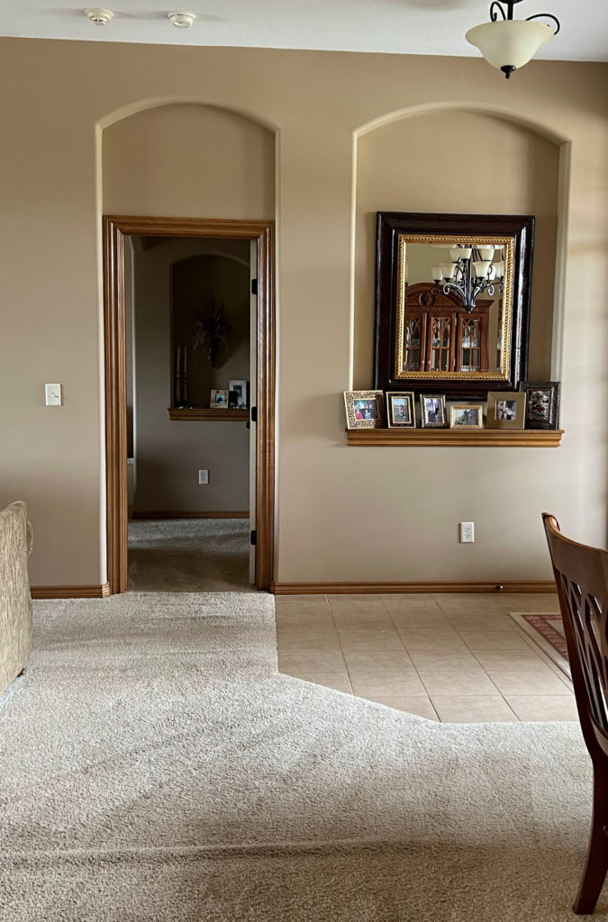
4. SHERWIN WILLIAMS MACADAMIA 6142
Macadamia is the kissin’ cousin of Nomadic Desert (that’s still legal in some States, right?). If you’re not sure which is best for your home, order these two and a few others. Compare them and you’ll see how committed to beige Nomadic Desert is, and how tan Macadamia is, with its yellow-green undertones.
Sure, there’s orange in there, but it’s not orange-pink, it’s orange-yellow, with a weee wink o’ green!
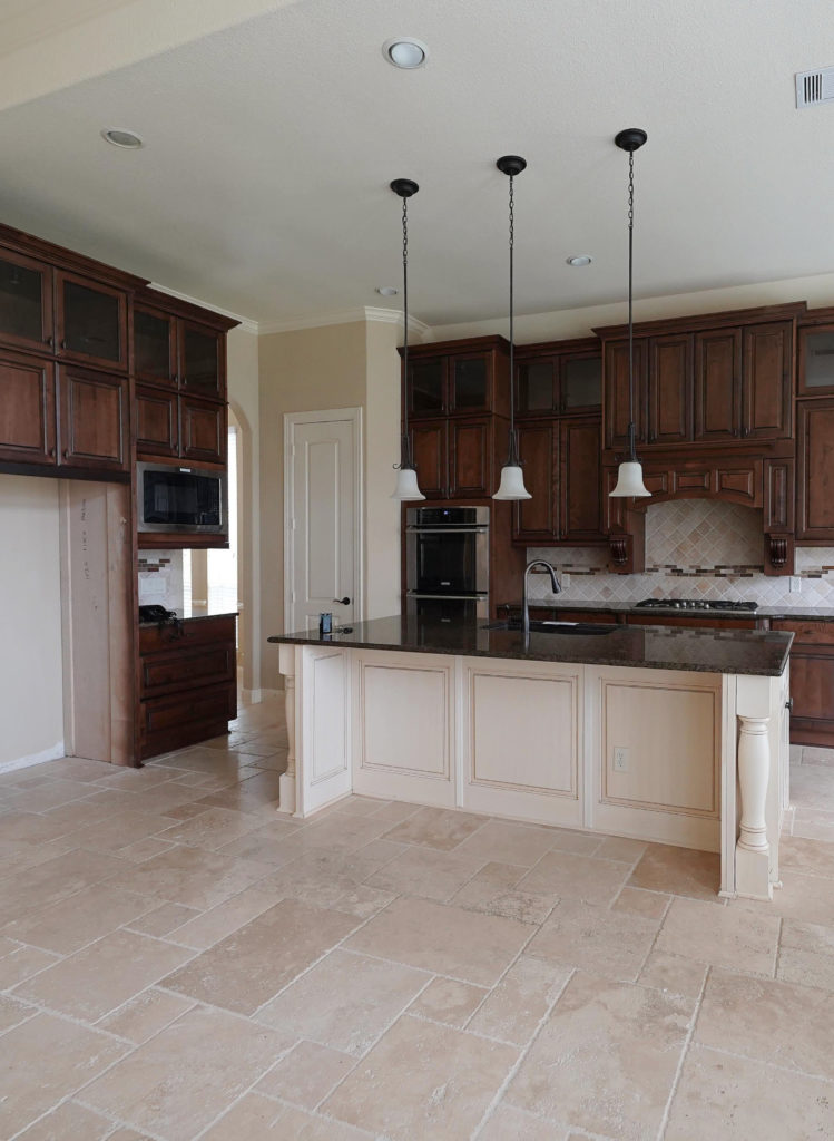
This is one reason why Macadamia isn’t the best color for this next home’s walls…
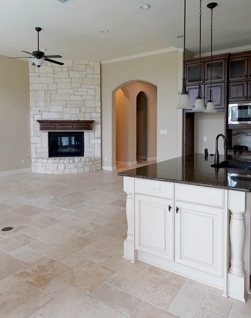
Why?
The travertine tile floor caters to beige, not tan. You see this best on the wall space above the arched doorway. Compare it to the floor and the fireplace, and you’ll see it’s that bit too yellow. Cool, eh?
Macadamia has an LRV of 49, making it a light-medium depth color and a bit lighter than Nomadic Desert.
Get the best expert color advice…

TIPS FOR USING MACADAMIA IN YOUR HOME
- Macadamia has a beautiful warmth and moderate depth. If your landscaping flashes a green light on your walls, you might want to lean into beige over tan – this color could pick up that green and RUN WITH IT!
- Macadamia is a cozy, warm color without being oppressively warm and rich (although that could be open to perception).
- The lighter version of Macadamia is Softer Tan which has similar tendencies.
- A darker shade similar to Macadamia is Basket Beige (#5), which we’re looking at shortly!
I also recommend sampling and comparing Sherwin Williams Lamb’s Wool 9536. This is in SW’s newer Emerald Designer Collection. It comes up a touch less yellow than Macadamia and very comparable.
Sherwin Williams Macadamia: IMAGES, Info, & More
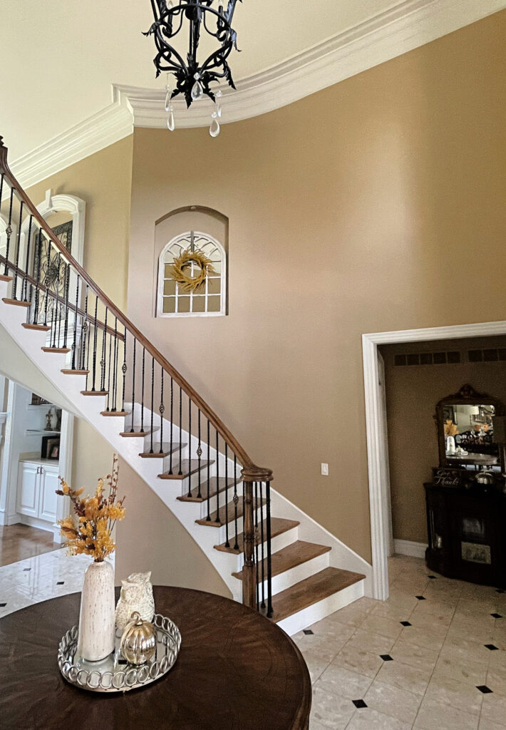
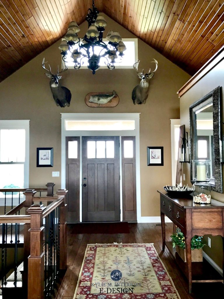
5. SHERWIN WILLIAMS BASKET BEIGE SW 6143
Seriously, if you want a warm neutral with some REAL warmth without turning brown, Basket Beige could hit the spot. This rich, slightly deeper shade of tan (LRV 42) has a yellow undertone and a reasonable but not overwhelming green hue in its backdrop.
This next photo shows Basket Beige in a two-story foyer with dark wood trim and stairs. Notice how the Kelvins of the light bulbs enhance the warmth of this wall color…
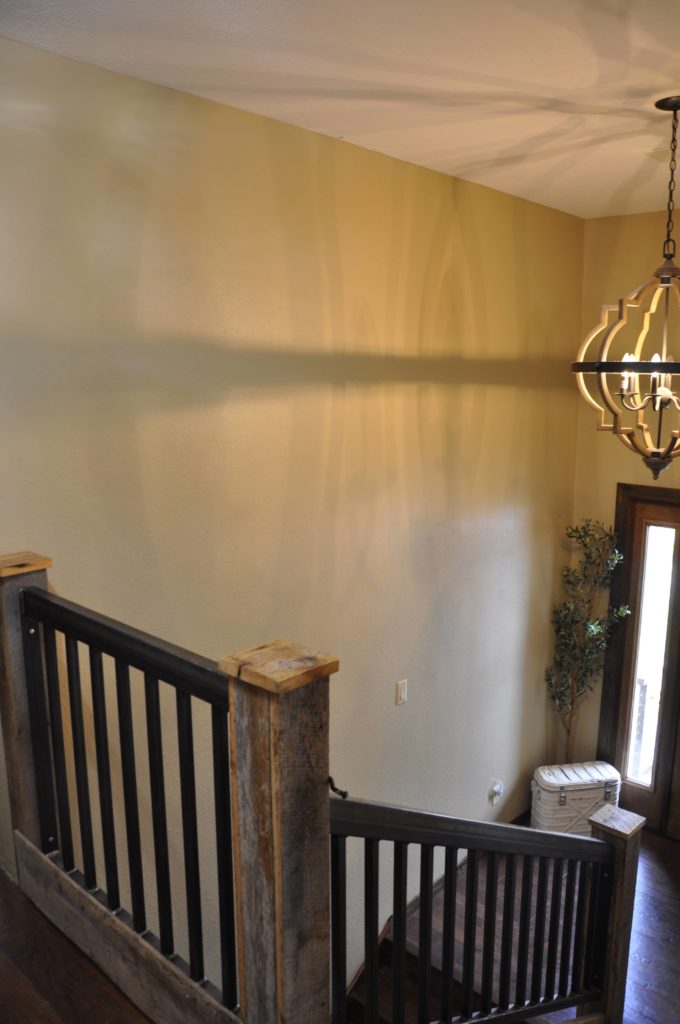
This is how Basket Beige most often looks.
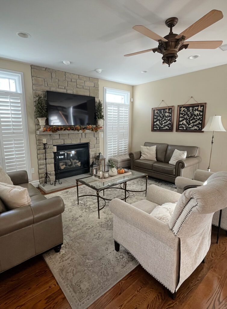
Check it out in this next hallway. Again, less yellow-green than expected, and I bet it’s because these bulbs don’t have very low Kelvin temperatures…
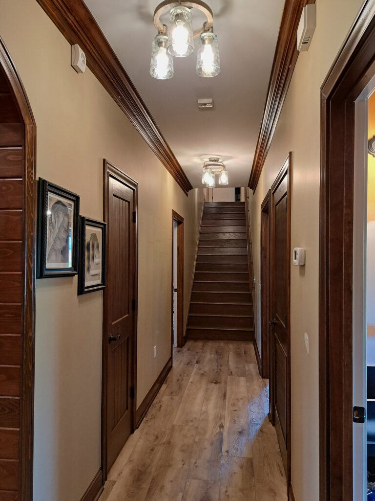
Notice a flash of the yellow-green in the top right corner of this photo.
The Best Paint Colors for Red-Stained Woods
If you want a bit more richness and commitment, Sherwin Williams Camelback is worth a hump…or two.
Subscribe to my Kylie M YOUTUBE channel for more great Kylie M. content!
USING BASKET BEIGE IN YOUR HOME
- You’ll be hard-pressed to get this color coordinating with many of the popular finishes from the 2000s, it’s not beige enough for that. However, for allllll the homes that don’t have those finishes, it can hit the spot.
- Basket Beige can be an interesting exterior color, with its LRV (42) and commitment to wamth without going over-the-top.
6. SHERWIN WILLIAMS QUINOA 9102
If you’re looking for a warm neutral committed to its golden, autumn-inspired hue, check out Quinoa. Quinoa has a beautiful orange base; however, compare it to the area rug in this entryway…

Notice how Quinoa seems a wink off (not pink enough) compared to the rug’s orange-pink tones. When choosing paint colors, it’s important to match the undertones of your interior finishes (or match your paint colors to what you already have!).
Here’s a Peel & Stick sample of Quinoa…
Quinoa has an LRV of 49, so it’s in the light-medium range.
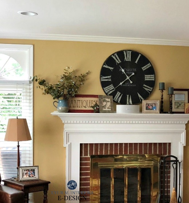
All the photos in my blog are from my Online Color Consulting clients, readers, & friends— because real homes deserve to be celebrated (dirty laundry & all!) While not magazine-perfect, they’re packed with ideas & proven color choices to help you create a home you’ll love.
7. SHERWIN WILLIAMS WHOLE WHEAT 6121
If you looked at colors like Quinoa and Nomadic Desert and worry about their degree of orange, Whole Wheat could be your all-natural alternative.
Here’s your Peel & Stick sample of Whole Wheat…

Whole Wheat is a golden shade of tan. With a yellow base, along with orange and green, this bad boy could be the perfect shade for finishes (and homeowners) that don’t enoy orange-pink undertones.
Here’s Whole Wheat on a wall that gets a ton of natural light – in other words, don’t expect it to look like this unless you also get a ton of light…

Look at the VERY TOP of this image to see how Whole Wheat can darken up nicely.
TIPS FOR USING WHOLE WHEAT IN YOUR HOME
- The above image shows my client’s BEFORE PHOTO, while it looks pretty, I wouldn’t usually put a tan with a wood that has such strong red tones. In other words, Whole Wheat LOVES woods that have more of a yellow undertone.
- If you’re unsure whether to go muted or colorful, Whole Wheat is a fabulous option; settling in between both worlds!
- If Macadamia (#4) seems a bit too tame for your tastes, Whole Wheat can be a great alternative.
- You’ll find few finishes from the 2000s that suit Whole Wheat. But then again, if you don’t have a ‘typical’ finish, it could hit the spot!
If you love these warmer shades, you might love: Benjamin Moore’s Best (Slightly Darker) Beige & Tan Paint Colors
8. SHERWIN WILLIAMS ROW HOUSE TAN 7689
Row House Tan offers a nice balance between the beige and tan worlds – not overly yellow-green, but also not inclined towards orange-pink.

Row House Tan has an LRV of 52, making it a light-medium depth paint color.

TIPS FOR USING ROW HOUSE TAN
- If Macadamia (#4) seems a bit too yellow-green for you, Row House Tan could be the perfect tweak. Also, be careful to not confuse ‘tweak’ with ‘twerk’, as if you ask the paint store employee to do a little twerk for you, they might be weirded-out.
- While some of these more golden colors are okay in south-facing rooms (knowing your room will look VERY VERY WARM), the richness of Row House Tan could push things a wink too far.
Here’s your Peel & Stick sample of Row House Tan…

9. SHERWIN WILLIAMS CARDBOARD 6124
I threw this last one in on a whim, as I might’ve gone too far with it (story of my life).
Cardboard (appealing name, for sure), is anything but ‘cardboard’ colored. This dark, warm paint color has an almost nutmeg vibe to it – less beige or tan and more…brown.
With its LRV of 22, I’ve really thrown Cardboard in for sharts n’ giggles as it’s much darker and closer to the beautiful brown world than beige or tan.
I’m sure it’s darker than you want, but hey, you never know what might strike your cute lil’ fancy (ya, I’m talking to you, too, Bob – you’ve got a great fancy).
WHAT ABOUT SHERWIN WILLIAMS RESTRAINED GOLD & BLONDE
Oooo, I do love these two. However, as suggested, Restrained Gold is restrained…barely. In fact, some could call it a ‘color’ vs a ‘neutral’ as it’s clearly being restrained with light-weight chains.
As for Sherwin Wiliams Blonde, this gal is tossing her hair around like it’s a Pantene commercial – she’s showy and glowy! Blonde’s LRV of 54 has it sitting in between the light and light-medium depths. That, combined with its stronger yellow-orange hue, can make it quite ‘color-forward’.
Could these be just what you’re looking for? Perhaps, but they didn’t make the cut as their degree of color sets them apart from the others. Sample and compare carefully!
But on that note…
STRONGER, YELLOW-GREEN TANS
There are even more, glorious, tantalizing, and titillating tans. While they aren’t always on the hot list, they’re worth the mention…
- If you want a much stronger yellow-green kinda tan, check out Sherwin Williams Sawgrass Basket 9121
- Sherwin Williams Tumblin’ Tumblweed 9120 is another beauty – lighter than Sawgrass Basket but similar intentions.
- Sherwin Williams Camelback is a gorgeous color. With its rich tan backdrop, it’s great for those who want more color commitment.
STRONGER, ORANGE-BASED BEIGES
Again, just because they aren’t popular doesn’t mean they aren’t beautiful!
- Sherwin Williams Beige Intenso. Well, the name says it all. This beige is more intense with its commited undertones. However, I wouldn’t say it goes over the top, but get ready for a good pink undercurrent…or overcurrent, more like it.
- Sherwin Williams Farro is a lovely, deep shade of beige. With its LRV of 40, it’s like the soft, medium-depth version of the previously mentioned Quinoa.
WHAT COLORS GO WITH SLIGHLTY DARKER, DEEPER BEIGES & TANS
Ooo, you are the teacher’s pet, aren’t you. I’m glad you’ve asked as there are some friggin’ gloooorious paint colors that work well in a color palette with many beiges and tans.
While this next image doesn’t show a paint color, it’s easy to see how pretty a greige looks with the beige tones of travertine tile…

Of course, it depends on what you’re doing with them: accent walls, cabinets, island, front doors, adjoining rooms, etc., but these links should get you going on your colorful journey…
- It’s hard to beat medium to dark shades of green, as they can be a natural, organic complement to beige and tan paint colors. Off the top, lean toward greens with seem neutral or slightly warm vs cool greens.
- Some medium to dark greige paint colors can be amazeballs with various shades of beige and tan.
- If you need a lighter touch, explore warm, flexible off-whites, as well as some off-white beiges like Sherwin Williams Moderate White and Divine White.
- A classic black like Sherwin Williams Tricorn Black can be a striking accent. You might also enjoy the softer black approach of Iron Ore.
- You could humor some interesting, darker muted shades of purple. I’ve got Sherwin Williams Chinchilla in my head right now. Here are some other purple paint colors.
- I might even humor a dark navy blue or two with the right shade of beige or tan.
- And don’t be afraid of brown – the right brown paint color (one that carries similar undertones to your beige or tan) can be beautiful!
Look at how gorgeous these dark greiges are against the beige-brown tones of these shutters and the pink-toned brick…

READ MORE
The Best Stone-Inspired Beiges, Greiges, Taupes, & Grays
The Best Slightly Darker Warm Neutrals from Sherwin Williams
Get the best color advice…


Kylie, I’m fixing to tease you. What century did you write this particular article on beiges? lol. I’ve been setting my hair on fire every other day for the last 3 weeks trying to find a light modern beige. I’m going for a more modern minimalist style. I have a SW fan and have ordered some samples. I’m still nowhere closer to making a decision on a warm, inviting, fresh, calming, not too yellow, not too orange, not gray, compatible with deep wood tones and an accent wall of urbane bronze. And I’m going from pewter tankard, the dark recesses of Natural Bridge Caverns, to I don’t know what yet but those pages that you showed above are too dark for me. I’m also leery of going to off-white cause I’ve had dark for so long and my other fear is something turning out too light, too yellow. Of course I will try samples, but I can’t even make up my mind which samples. You can’t believe what I’ve been going over and over on the fan and internet, full days and most nights, and notes page after page I’ve taken and still can’t make up my mind. I know about overtones and LRV and all that and I can see the undertones most of the time. I’m 81 and young for my age, not a decorator, but have good taste 🤭and not necessarily the Bankroll to go with it. So that’s about the condensed version of trying to find the right beige. Thank you for everything that you put out for everyone. I’ve been following you steadily for 3 weeks and appreciate all that you do.
Well, hellooooo Mollybea! SO true, right?
So, if I gather your words of ‘light, modern, beige, not too light, not to yellow or orange. Warm, inviting, fresh, calming, going with deep wood tones and an accent wall of Urbane Bronze (which i LOVE) – well, that SOUNDS a lot like SW Natural Linen or BM Muslin. These are beautiful, soft, warm neutrals. And since you find the colors in this article a bit dark, i FEEL like those two could be an interesting fit!!! If you prefer a more ‘tan’ look, Manchester Tan is super popular. Natural Linen and Muslin have a soft orange undertone (being beiges), whereas Manchester Tan is a wink more yellow (but not obnoxiously so). THIS SAID, more interior finishes suit ‘beige’ over tan ;).
I hope this helps!
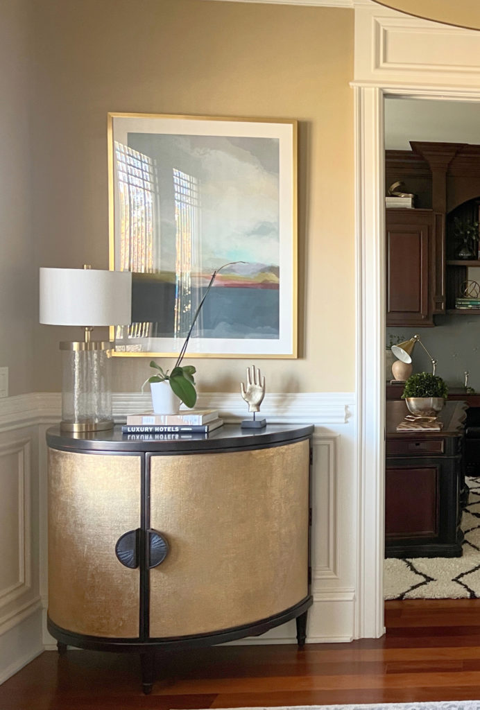
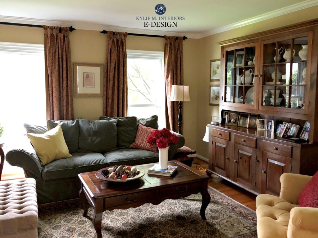
Which wall color is in the picture with the two blue lamps (sitting on the cherry red cabinet)? Thank you!
Ahhh, that’s SW Natural Linen 🙂