
The 4 Best Benjamin Moore Warm White Paint Colors
Are you looking for the best warm white for your walls, cabinets, or trim? Nervous about creamy undertones or dingy shades? Tired of sampling dozens of colors with no success? I’m glad you’re here.
More than any other paint color, white can be tricky because the undertones are subtle and often hard to see with the naked eye (or the nekkid anything). In fact, when looked at on their own, many whites just look like plain old white! This is why you’re darn lucky to have a little Ginger in your back pocket (I pinch upon request).
Updated with new content and images in 2026
But before we get into the Wild World of White, I’m answering a question I’m asked ALL the time in my Online Color Consulting…
SHOULD MY WALLS, CABINETS, & TRIM MATCH/BE THE SAME WHITE?
Generally speaking, yes. There is the odd good combo, but it’s like trying to find a wine that goes well with Kraft Dinner – it’s not easy. Whites are highly competitive. If they have different undertones, or if one is ‘white-white’ and the other has an undertone (which it will), they’ll go head-to-head and expose each other.
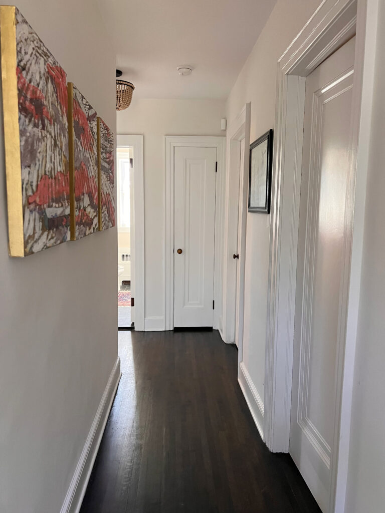
Now, if you really want one white to enhance the undertones in another (as shown above), then, by all means, choose different whites – it can look wickedly gorgeous. However, I don’t often recommend it. Most of my clients who want white walls and trim (and cabinets) want a more seamless look.
If you want to mix and match whites, do so at your own risk, but you’d better make sure those undertones are jibing!
White Paint Colors: Do Your Walls, Trims & Cabinets Need To Match?
IMPORTANT NOTES ON WHITE
Before we get this color party started, you should know that…
WHITE IS THE MOST REFLECTIVE COLOR
Because white paint colors have high LRVs, they reflect a lot of light. This means they can easily reflect colors from the environment and toss ’em back at you.
- That green grass or landscaping?
- Your northern exposure with its gray/blue light?
- The red brick wall directly outside your window?
These colors can all be reflected, so keep this in mind when looking at whites.
YOUR PAINT FINISH MATTERS
Your paint’s finish or sheen level greatly affects how a paint color looks. That’s right, even if you use the SAME white paint color on the walls, trims, ceilings, and cabinets, you could see a shift from surface to surface as the different paint finishes react to the light – very cool.
Check out this photo…
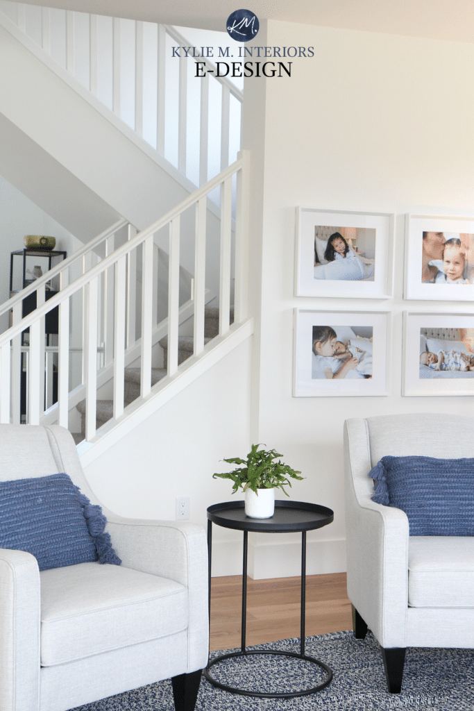
The walls, trim, and railings are all painted the SAME white (Sherwin Williams Pure White). The difference you see is due to a change in paint type:
- WALLS: Matte finish
- TRIM: Satin finish
- CEILING: Flat finish
WHEN CHOOSING WHITES, EXPOSURE MATTERS
Whether you’re choosing white paint for your exterior or interior walls, your exposure can play a bigger role than it might with darker shades. Those darn whites are so reflective!
BTW, not sure what reflectiveness/LRV even means? LRV & Paint Colors: A Homeowner’s Guide.
In the next image, the white appears warmer on the left and cooler on the right. There could be 2 things causing this…
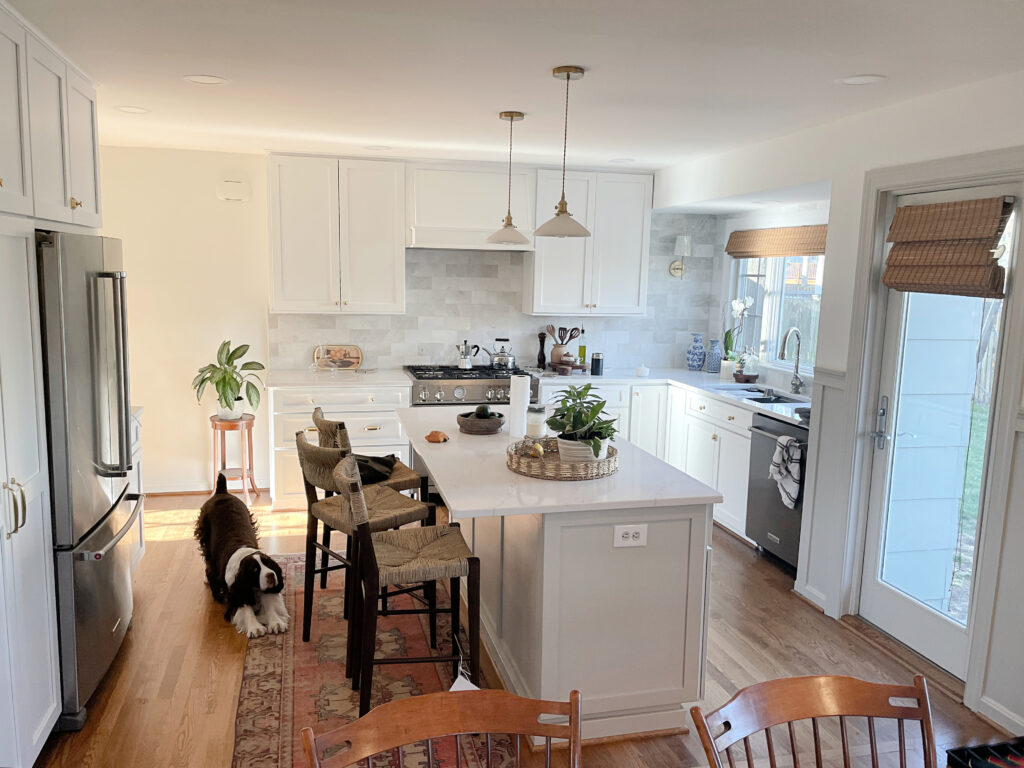
- The left side gets south-facing natural light; the right side gets north-facing light.
- They’re 2 different types of paint/finishes.
Want to learn more about exposure? Finish reading this blog post. Then check out these articles on north, south, east, and west-facing exposure.
Now that we have that out of the way, let’s get into the guts n’ the glory and look at Benjamin Moore’s 4 best warm white paint colors.
THE 4 MOST POPULAR SHADES OF WARM WHITE
Remember, just because they’re popular doesn’t mean they will work everywhere – they all have some serious considerations. Always sample and compare a range of whites to find the one that best suits your finishes and lighting.
1. BENJAMIN MOORE CLOUD WHITE CC-40 / 967
Cloud White is one of the most timeless warm white paint colors for a few reasons…
- Its warmth (yellow undertone) suits a reasonably wide range of warm and cool colors.
- Cloud White isn’t a very BRIGHT white (The 5 Types of White) relative to true whites. Instead, it’s closer to the soft end of things (LRV 85.05). This makes it a popular choice as it’s not stark.
- While it has a visible warmth, many of my clients don’t find it too creamy or yellow. However, that can be highly subjective.
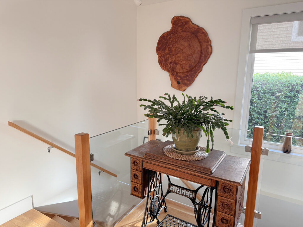
While I’d rather the trim be Cloud White, too, it’s not about me ALL the time.
Will Cloud White look like a TRUE white paint color?
Generally, no, as its LRV and warmth set it slightly apart from brighter whites. In the above image, compare it to the window trim to see how it can settle with a brighter shade.
CLOUD WHITE ON DOORS & TRIM
A warm white like Cloud White can be a great choice for trim, doors, and ceilings.
Here it is (below) with Sherwin Williams Quiver Tan on the walls. You’ll find it works well with richer, warmer earth tones, while still humoring some cooler shades, too…
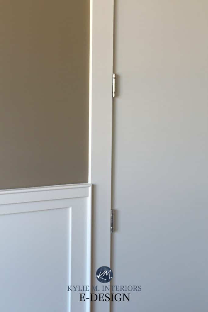
The Best Benjamin Moore DARK Greige & Taupe Paint Colors
CLOUD WHITE ON CABINETS & FURNITURE
Cloud White works well on cabinets and furniture, and often suits some older granite countertops and finishes in homes from the 1990s.
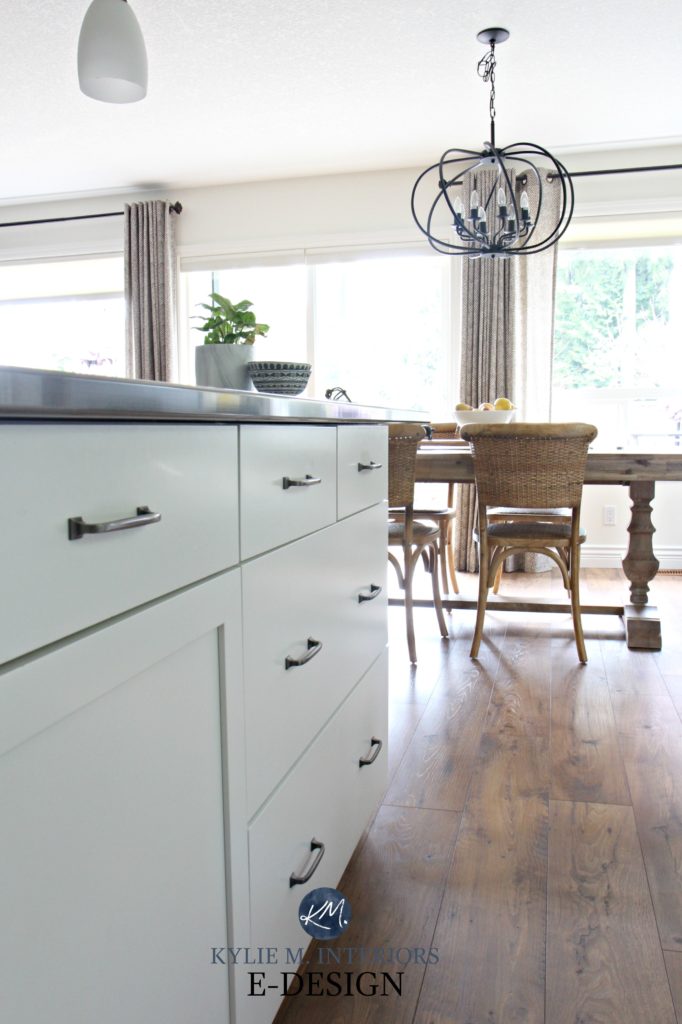
However, if you have white appliances (including GE Cafe White) or a bright white subway tile backsplash, I would stay WELL away from Cloud White as they will be too ‘clean and cool’ for its warmth. A brighter white color or finish could make Cloud White look more yellow in comparison. If you have cool or bright white finishes, you might consider whites like Benjamin Moore Super White or, at the very least, Benjamin Moore Chantilly Lace.
CLOUD WHITE ON WALLS
Cloud White can be gorgeous as a wall paint color as long as you’re comfortable with its approach to warmth, especially if you have a south-facing room or one with western afternoon sunshine. Even east-facing morning light can be touchy. That said, you can say that about pretty much any white, as they’re SO DARN REFLECTIVE.
Why do these exposures matter?
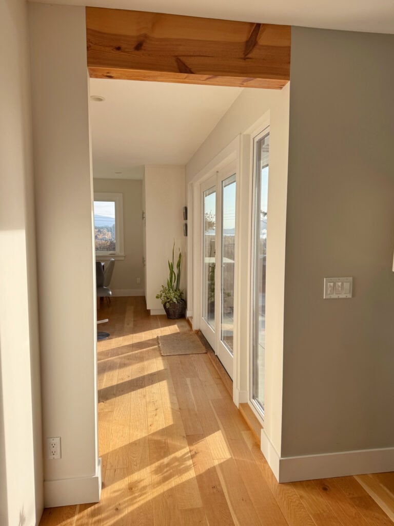
These exposures could enhance the warmth of Cloud White, making it look a bit creamier/more yellow.
When dealing with exposures, it’s more about how your room feels as a WHOLE rather than dissecting it wall by wall. And warm whites can make a room feel reeeeally warm.
FULL Paint Color Review: Benjamin Moore Cloud White
PROS & CONS OF CLOUD WHITE (CONSIDERATIONS)
- If you’re painting one white surface in Cloud White, you’ll probably want to paint ALL of the white surfaces the same, as there is usually a decent shift between Cloud White and traditional shades of white.
- If you have white appliances, you’ll notice the difference between your cabinets and your appliances as the yellowish hue in Cloud White will be brighter and warmer than the cooler tone of white appliances.
- Its warmth can offer a warm balance to a north-facing room.
- It best suits warm paint colors or stormy cool colors. It isn’t always as great with icy-cold colors.
- As much as I love Cloud White, when my Online Paint Color Consulting clients are looking for warm white or off-white walls but don’t like yellow (common), I’m more likely to suggest Benjamin Moore White Dove (coming up shortly).
- While Cloud White is a familiar name – it’s been around for a long time. However, there are ‘whiter whites’ out there and even more VERSATILE whites – but this isn’t to say that it isn’t YOUR home’s best white paint color.
Here it is with Benjamin Moore Manchester Tan in southeast-facing light…
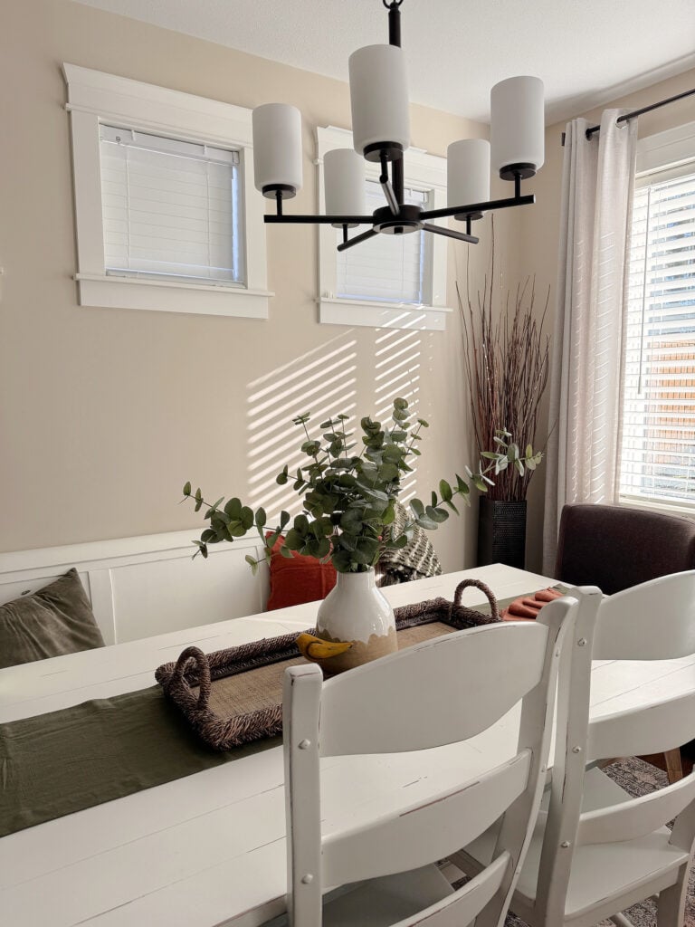
2. BENJAMIN MOORE SIMPLY WHITE OC-117 / 2143-70
Simply White is another popular shade for walls, cabinets, and trims – let’s find out why…
- It’s close to appearing genuinely white (of the first 3 warm whites on this page). This is due to its high LRV of almost 90.
- It’s warm, making it less stark than more traditional true whites.
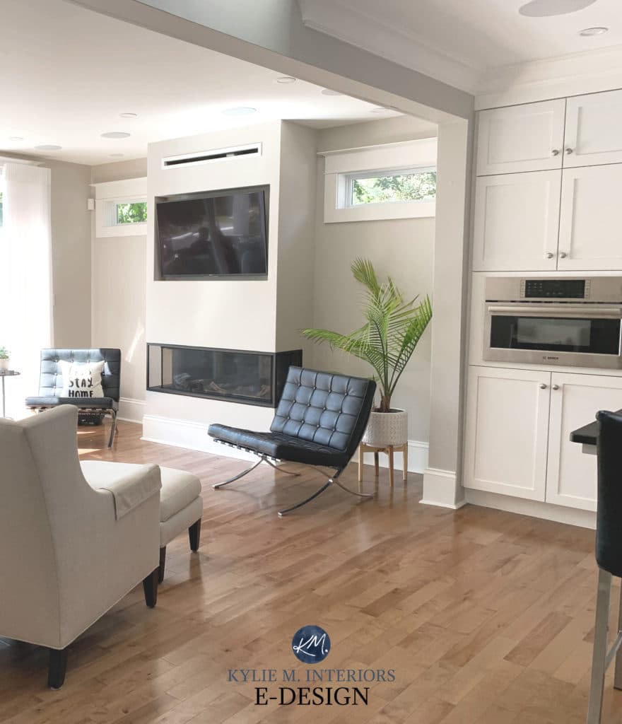
Simply White trim, ceiling, and cabinets with Benjamin Moore Collingwood walls
If you want a white that’s cleaner and fresher than White Dove (which is coming up next) and brighter than Cloud White, Simply White could do the trick. It will generally look white until it’s compared with stark white (like a solid white paper) – it’s via comparison that you’ll see its undertones rise, and those hues are YELLOW.
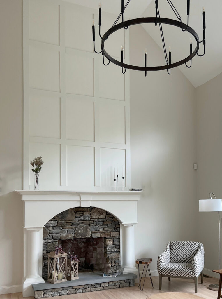
SIMPLY WHITE ON TRIMS & DOORS
Generally speaking, it’s a beautiful color for trims, doors, ceilings, and cabinets as long as you’re okay with that wink o’ yellow. If you’re trying to coordinate with an existing white in your home, be careful. If your current white isn’t a warm/yellow-white, it could look MUCH cooler up against the yellow of Simply White. Or if your white is more muted, it could look dingy or dirty compared to Simply White’s approach.
Here it is on the trim and door with the walls painted a popular beige-tan paint color (Benjamin Moore Manchester Tan)…

Here it is on the trim with a warm gray wall color (Benjamin Moore Collingwood), showing how versatile it can be…

SIMPLY WHITE ON KITCHEN CABINETS
Simply White looks great as a cabinet paint color, as it’s fresh and bright, and it looks white as long as you don’t have a cleaner white nearby.
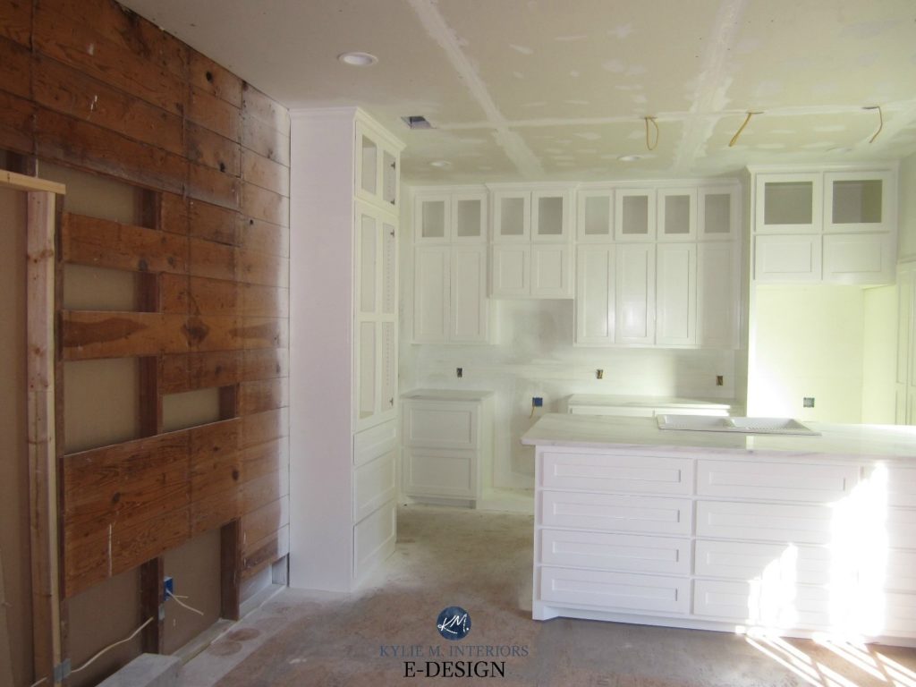
THE PROS & CONS OF SIMPLY WHITE (CONSIDERATIONS)
- If you have white appliances, you’ll definitely notice the difference as Simply White will look CONSIDERABLY more yellow against white appliances (standard white or GE Cafe White).
- Simply White will be a brighter white than Cloud White or White Dove (next up).
- If you want to enhance some cool paint colors, it’s a great choice, knowing that the cool paint colors can slightly enhance its warmth (yellow hue).
- It’s a pretty shade of white for various beige-tan paint colors, so long as they don’t lean too orange or orange-pink.
Here’s your Peel & Stick sample of Simply White…
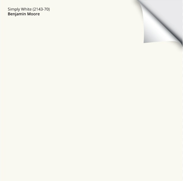
The Full Color Review of Benjamin Moore Simply White
3. BENJAMIN MOORE WHITE DOVE OC-17 / PM-19
White Dove is my favorite white as far as Benjamin Moore’s AND Sherwin Williams warm white paint colors go. So, let’s take a closer look at this bad boy…
- White Dove is a soft, warm white, not a bright one, giving it a gentler approach. It has an LRV of 83.05, telling us it’s a soft white, not a bright one.
- It has a creamy yellow undertone, but it’s muted by a neutral base – more so than Simply White.
- Regarding flexibility, White Dove is the most flexible of the 3 first whites, humoring a wide range of wall partners, including many shades of beige, greige, gray, and more colorful hues.
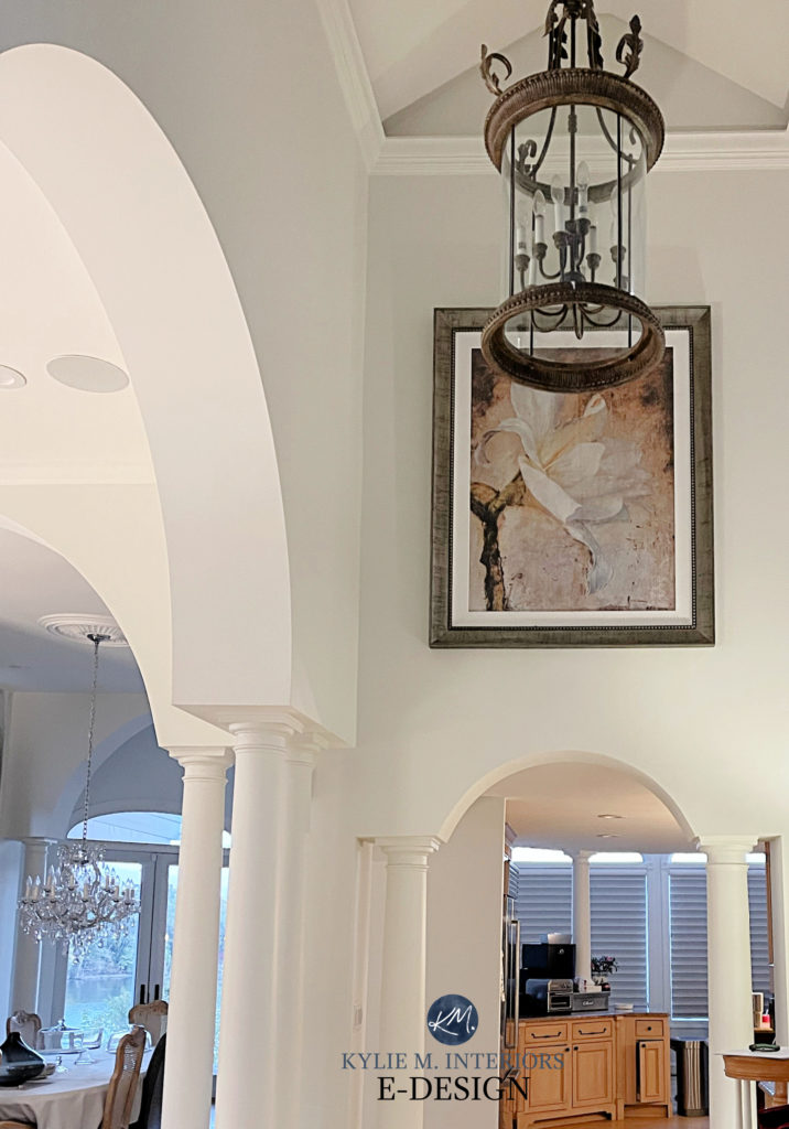
However, whereas Simply White has a higher LRV, putting it closer to the true white end of things, White Dove’s lower LRV (83) means it’s less likely to look ‘bright white’. So, rather than being more crisp and bright, it looks more delicate and subtle.
Paint Colors & LRV – The Ultimate Guide You Need to Read
Here’s your Peel & Stick sample of Benjamin Moore White Dove…
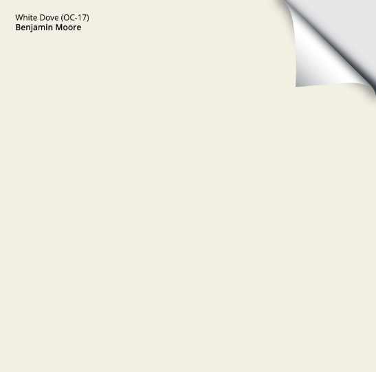
WHITE DOVE ON DOORS & TRIM
White Dove is softer-looking than the white that builders usually use on trim and doors. So, if you have an existing white surface that’s BRIGHTER, you’ll likely want to paint ALL surfaces the same for consistency and flow.
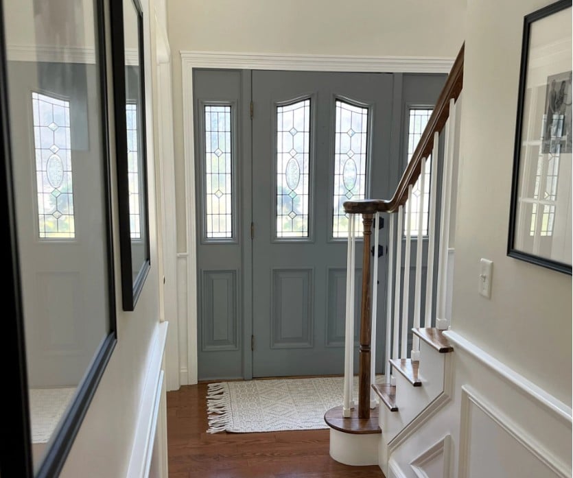
Here it is with Benjamin Moore Ballet White walls and a gorgeous gray-blue paint color on the door.
WHITE DOVE ON KITCHEN CABINETS
White Dove looks amazeballs on cabinets and furniture. But in kitchens, it presents the same challenges as Cloud White, as it rarely blends well with other whites (stock white subway tile/white appliances).
However, if, like my next client, you want a slightly more layered/less-blending approach, White Dove can be a great choice…
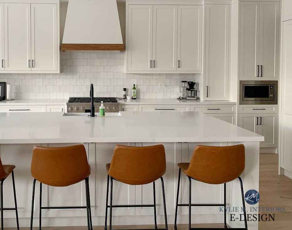
SHOULD You Paint Your Cabinets White? A Fun Questionnaire
WHITE DOVE ON WALLS
White Dove is my favorite shade of white for walls. Great for single rooms or entire homes, it has a lot to offer – not overly warm, not cool at all.
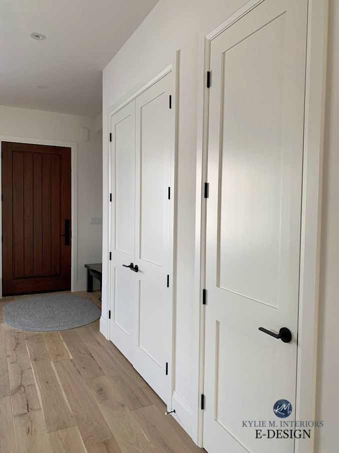
Comparing colors is one of the best ways to find your best shade. If you’re exploring White Dove, I recommend checking out Benjamin Moore Swiss Coffee (even though I personally prefer White Dove) and Sherwin Williams Alabaster (one of Sherwin Williams’ best warm whites), as well as Greek Villa.
If you have white quartz countertops, White Dove should be sampled, for sure, along with these other popular white paint colors.
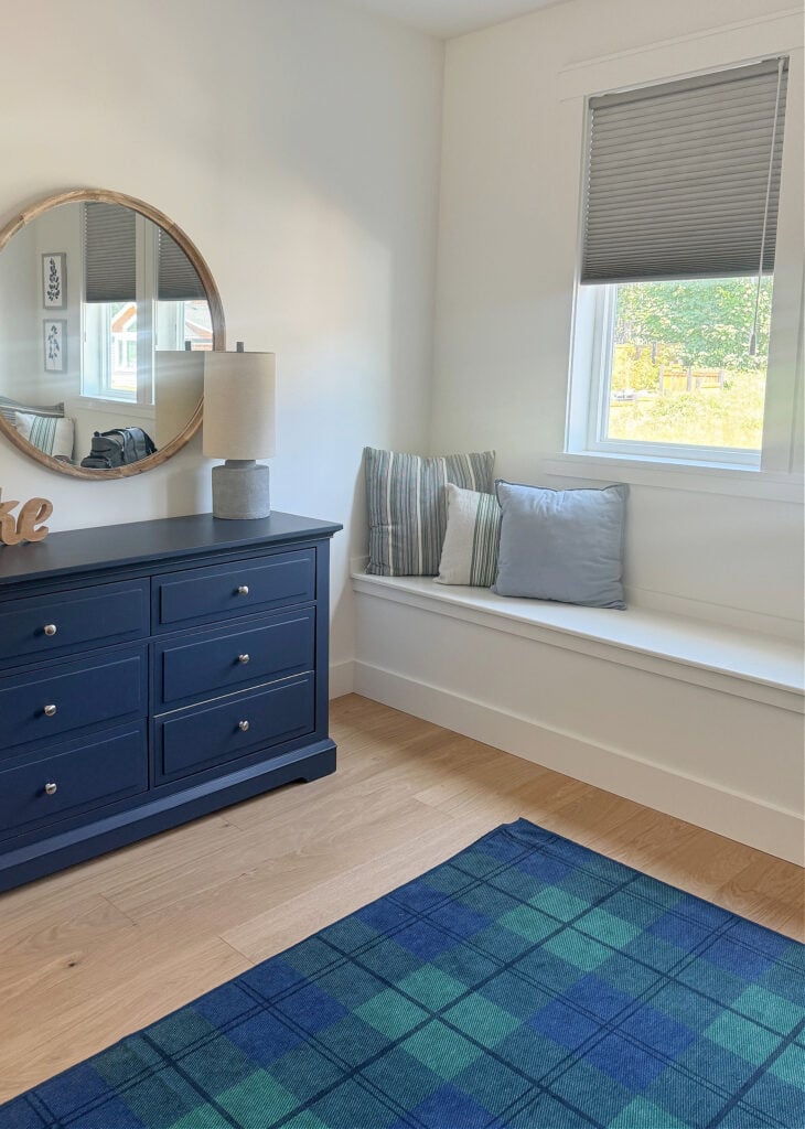
Here it is in a room with north-facing natural light (the dresser is painted Benjamin Moore Hale Navy)…
SOME PROS & CONS OF WHITE DOVE (CONSIDERATIONS)
- If you choose White Dove, you’ll want ALL of the white surfaces in the room to be White Dove.
- With white appliances, White Dove will look quite a bit warmer and softer – you may want to look at stainless steel appliances (or a different shade of white).
- It’s great for any room – north, south, east, or west as long as a) you understand how it can shift from space to space (losing some warmth in northern or eastern light and warming up in southern and afternoon western light), and b) have a decent amount of natural light.
- In my experience, White Dove is the most flexible, versatile of the first 3 whites, accommodating a wide range of paint colors for the walls.
- If you pair it with cool paint colors/finishes, this will slightly enhance its warmth.
- It really loves to be partnered with warm earth tones, including some of the popular beige/tan paint colors, as well as many warm gray, greige, and taupe paint colors.
In this next image, comparing White Dove to the cool white of the light switch cover is one way to get a general feel for its warmth (this shows mostly south-facing exposure)…
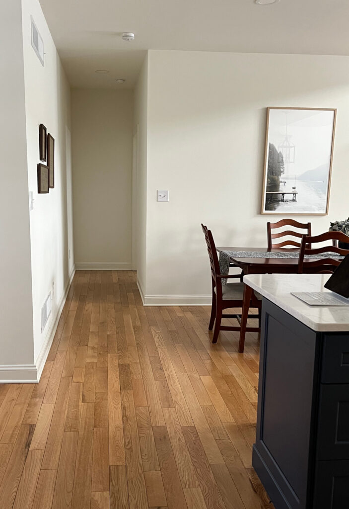
Between Cloud White, Simply White, and White Dove, White Dove is the white paint color I recommend the most, as well as this next wild shade of white…
4. BENJAMIN MOORE CHANTILLY LACE OC-65 / 2121-70
At first glance, Chantilly Lace doesn’t always look warm, which is part of its appeal. This popular shade of white has an LRV just over 90, making it a bright white (but not a true white). While it can lean towards a slight warmth, you’ll hardly know it unless you compare it to a true shade of white.
As shown in this gorgeous kitchen, the super subtle warm potential of Chantilly Lace shows up against the slightly cool tones of the marble backsplash and quartz countertop…
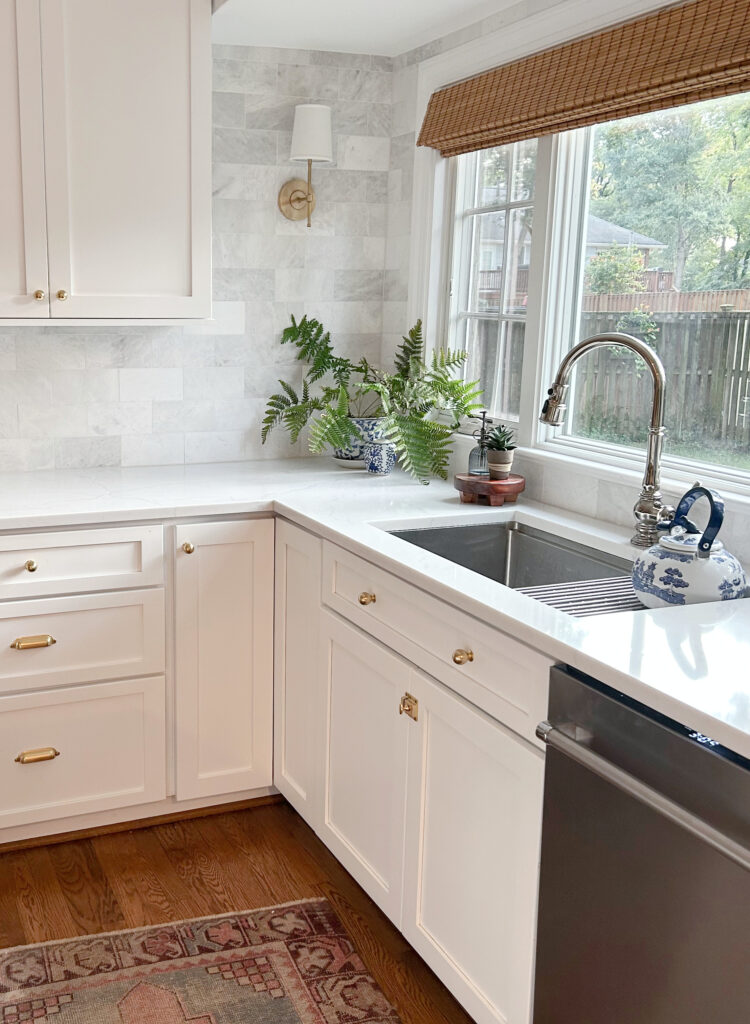
This might have you thinking it’s the PERFECT white for your home. Not so fast. Being a brighter white, it’s not what people think of when it comes to a typical ‘warm white.’
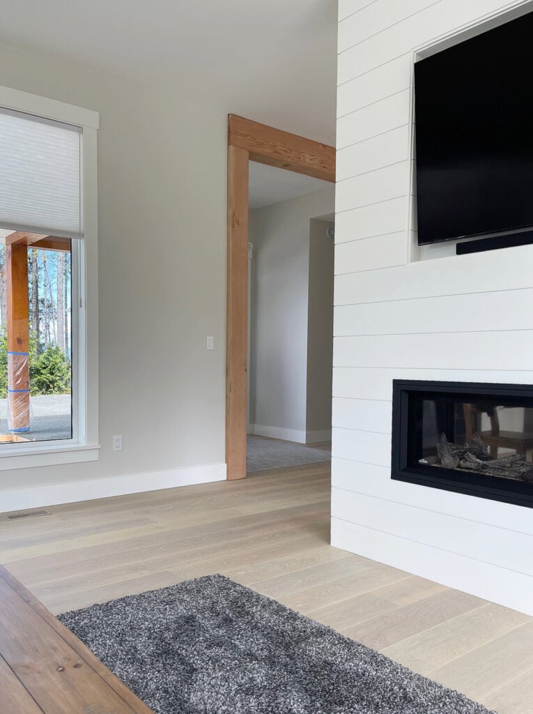
Benjamin Moore Classic Gray on the walls
Now, based on color science, it’s a yellow-green shade of white. You won’t know to look at it, so don’t worry (or you shouldn’t). It has such a low chroma that it more often shows no undertone at all. At most, it appears slightly warm, and in the right conditions, slightly cool…but not green.
Using the Kylie M Color System, you learn to focus more on how a color might appear on your walls rather than its scientific base. Both have their place, but I prefer real homes and real lighting.
In fact, knowing it’s in this color family is funny, given my extensive experience with it in every type of home. I don’t like green-yellow hues at all…ever, yet I wouldn’t hesitate to use this badass beauty in my home.
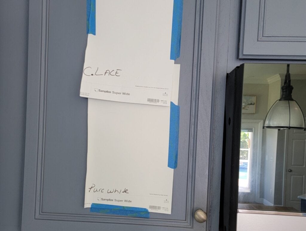
Here’s Chantilly Lace compared to the very (very) popular, Sherwin Williams Pure White.
Just remember, white reflects light thanks to its high LRV. And with Chantilly Lace being higher than many others, it reflects a LOT of light.
FULL Paint Color Review of Benjamin Moore Chantilly Lace
What’s the Best White Paint Color for a Room With North-Facing Light?
THE PROS & CONS OF CHANTILLY LACE (CONSIDERATIONS)
- Chantilly Lace is Benjamin Moore’s most versatile, brightest white paint color.
- Is it more versatile than White Dove? It’s close, but for a combination of versatility and the type of warm white my clients tend to love most, White Dove still wins.
- As far as warm whites go, it’s the best choice with the average white subway tile and white appliances.
- Chantilly Lace is a bit too white for some white quartz countertops and can easily make them look more off-white in comparison.
- Sherwin Williams closest alternative is White Snow.
- Chantilly Lace is a popular choice as a ‘whole home’ trim, ceiling, and door paint color.
- If you have a north-facing room with good natural light, I’m less likely to recommend Chantilly Lace than the other 2, as it likely won’t have the warmth you want. However, if your north-facing room is darker, a color like Simply White or Chantilly Lace could be the best choice (higher LRV).
Here’s a good comparison of Chantilly Lace with White Dove’s warmth, and White OC-151’s cooler approach, cool, eh?

Of course, we don’t know this room’s exposure (I can’t find it in my files), but you get the idea.
But how do you CHOOSE the best white for your home?
Compare, Compare, Compare.
Comparison is the BEST way to see the undertones in any color—end of story.
Make paint sampling easier with Kylie M’s Curated Peel & Stick White Collection.
Cloud White is missing from that, but a) I’ll be adding it, and b) you can add it separately.
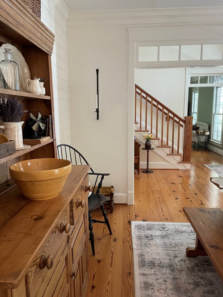
Benjamin Moore White Dove | The Best White Paint Colors with Wood Finishes
WHICH BENJAMIN MOORE WARM WHITE IS BEST FOR…
Here are the white paint colors I’ve found to be most consistently successful and likely to work in the average home. Having completed over 12,000+ online & in-home paint color consultations, I’ve seen a few things (including blow-up dolls and dog fur pelts as wall hangings).
Let’s run through the shortlist of most commonly painted white finishes…
- KITCHEN CABINETS: Benjamin Moore White Dove
- WALLS OF A SINGLE ROOM: Benjamin Moore White Dove
- OPEN-CONCEPT SPACES: White Dove (are you sensing a theme here?)
- A WHOLE HOME: Insert awkward silence HERE. Yes, White Dove. However, the ‘all-white’ home has fallen in popularity…drastically.
- EXTERIOR SIDING/STUCCO: White Dove; however, you have to be careful with white exteriors. Anyway.
- INTERIOR TRIM, DOORS, & CEILINGS: Oooo, White Dove, but Chantilly Lace made me think twice.
- EXTERIOR TRIM: Benjamin Moore Chantilly Lace
However, at the end of the day, there’s no universally ‘best white paint color’. The best white paint color for your walls, cabinets, trim, or exterior depends on many factors, including your interior finishes, natural light, etc.
FREQUENTLY ASKED QUESTIONS
For random quandaries, queries, and concerns.
WHAT’S BENJAMIN MOORE’S MOST POPULAR WARM WHITE PAINT COLOR?
Benjamin Moore White Dove is their most popular white paint color, followed closely by Chantilly Lace. Cloud White and Simply White show up at the party, but not with the same fanfare.
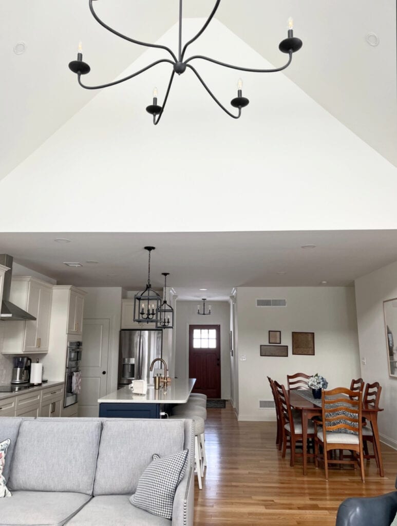
Here’s White Dove in an open-concept space with mostly south-facing natural light…
WHAT’S THE BEST WARM WHITE PAINT COLOR THAT DOESN’T LOOK YELLOW?
To get a warm shade of white, you need either yellow, pink (red) or orange (peachy) undertones. There aren’t any great warm whites that lean orange – yellow and pink are the typical hues.
So, if you’re looking for a warm white with no yellow, the only way to get warmth will be via pink. The best whites with pink undertones are Benjamin Moore Atrium White and Sherwin Williams Arcade White. Howeverrrr, most people don’t want a white-pink.
A better question is…
WHICH WARM WHITE HAS THE LEAST AMOUNT OF YELLOW UNDERTONE, BUT MIGHT STILL LOOK WARM
While it’s not Benjamin Moore, I’d definitely check out Sherwin Williams Pure White. It’s one of the most SLIGHT warm white paint colors and super popular.
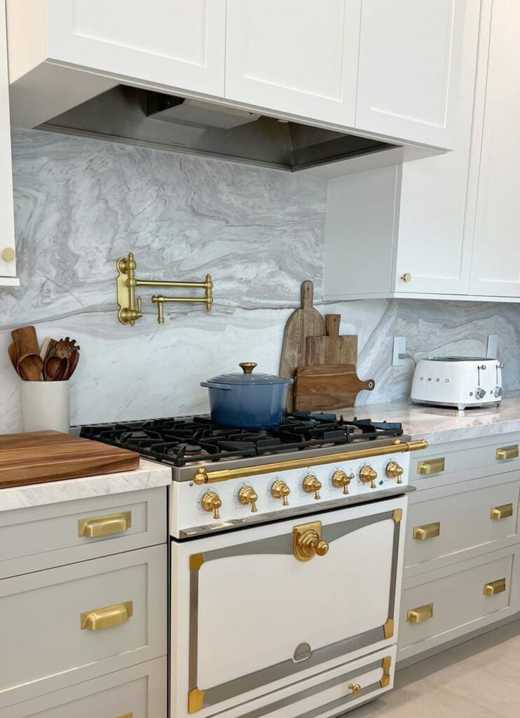
I’ve also had some success with Sherwin Williams Extra White…

Just remember, the less visible warmth you have, the more you risk your white not looking warm. This can change considerably depending on your room’s exposure, surrounding finishes, the amount of light it receives, etc. One of the best ways to make a white look warm, even if it’s not super warm at heart, is to use lower-Kelvin, high-CRI light bulbs.
With Benjamin Moore, your best shot at no yellow undertones (before you head into the cool whites) will be Benjamin Moore Chantilly Lace. It has the least yellow undertone while offering a passive warmth – I’d be surprised if you get what you actually WANT from it.
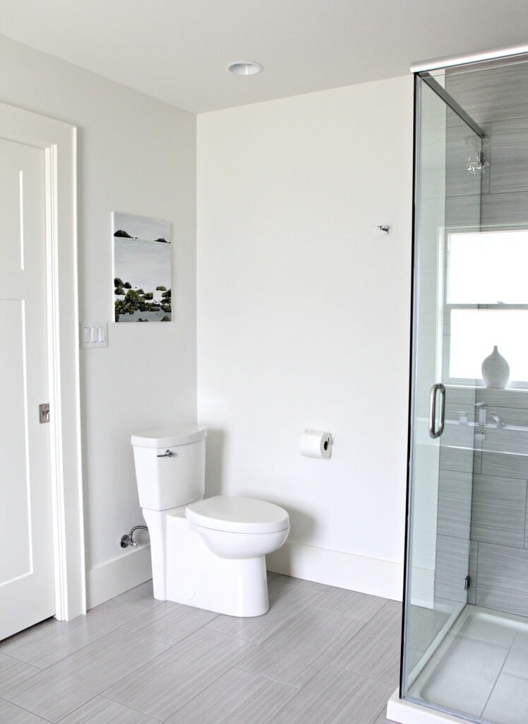
Benjamin Moore Oxford White also takes a reasonable shot at the title, but it’s not really warm enough, if you ask me.
If a white doesn’t have yellow, pink, or orange (peachy) hues, it’s not warm.
SUMMARY
- Benjamin Moore’s best warm white paint colors are White Dove, Cloud White, Simply White, and Chantilly Lace.
- The LRVs of these whites range from 83 to 90.
- The most popular white is Benjamin Moore White Dove.
- Of the warm whites listed, White Dove and Chantilly Lace are the best to sample with white quartz countertops. However, Sherwin Williams has contenders, too.
- If you have white subway tile or appliances, it’s more likely that Chantilly Lace will work, but you might need a cooler white.
READ MORE
The Ultimate Guide to White Paint Colors
Is White Still Trendy On Walls, Cabinets & Exteriors?
The 4 Best Sherwin Williams White Paint Colors
Get the best paint color advice with Kylie M’s Online Color Consulting






Great post! Very timely too as I currently have most of these paint chips sitting on my counter! We just bought our first house and are excited to redecorate. We’ve picked out Revere Peweter for the north facing rooms and Shoji White for the 2-story west facing foyer. Trim and doors have us a bit stumped which led me to this post. We were thinking Simply White or Pure White to go with both Shoji White and Revere Pewter which leads to my question: can you mix Sherwin and Benjamin on the same wall? Is that weird? Is there a BM equivalent to Shoji White? Another color you’d recommend that could complement both? Thanks so much for all you do!
Hi Sarah! I lean a bit more toward Pure White. I love the clean ‘white’ of it and less warmth than Simply White. And yes you can TOTALLY mix brands, I do it ALL the time 😉 The only time you can sometimes see a shift is in the sheen as different brands sheens can be slightly different. Even within a BRAND there’s a change in sheen in each ‘level’ of paint. But with changing depth of colour it won’t be as noticeable 🙂
~Kylie
Hi there
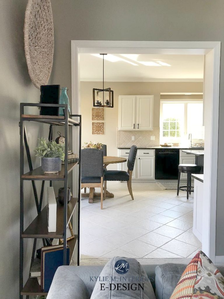
I am desperately trying to find your back splash in your cover photo.
I have matched all the rest, counters, cupboards and really love this imperfect subway mosaic natural stone tile and the color.
Could you please provide me with the details. Heathverin@gmail.com
Thank you!
Hi! While I’m not sure if it’s the exact same one (as that was an image that I’d used years ago that didn’t have a home link), this one is pretty darned close! https://www.statementstile.com/vetro
Hope that helps 🙂
~Kylie
I just found your site a couple days ago and am obsessed with it! I don’t have a great eye for color and your videos/articles are very helpful. I am considering painting the main part of my house (hallways, family room, kitchen) in a BM White Dove per someones suggestion. I am looking for a trim to stand out, in the Sherwin Williams family. I am not a fan of yellow so don’t want to bring that out. Will SW Pure White have enough of a contrast if I use it for all trim and doors?
Thanks in advance for your suggestion!
Hi Allyson, you can certainly look at SW Pure White, but truth be told it does have a wee wink of yellow in it. I wonder if you might prefer SW High Reflective White…
Thank you so very much Kylie! Just watched your video on SW High Reflective White:) I will go with that.
Hi Kylie,
I’ve been reading your blogs for some time and just love all the info you provide. Thank you for sharing your knowledge!
I have a question about paint for the fireplace in my family room. It is currently painted white down and I have cloud white trim in throughout the house. I’ve recently painted the walls revere pewter and I find the fireplace now looks more yellow. Would white dove be a good choice for the fireplace even though my trim is cloud white? The ceiling is white stucco and hasn’t been painted in years. I don’t want something so white that the ceilings look dingy. The room has northern exposure. Thank you in advance!
WEll, it’s tough to mix whites. If it were ME, I would stay consistent and do the fireplace in Cloud White for sure. If you did anything, you could ask them to add 4 ounces of white to it, which would clean it up a bit – but that’s all I’d do…
Didn’t realize my master bathroom vanitie were
“Off “ white (like on the verge of yellow…)
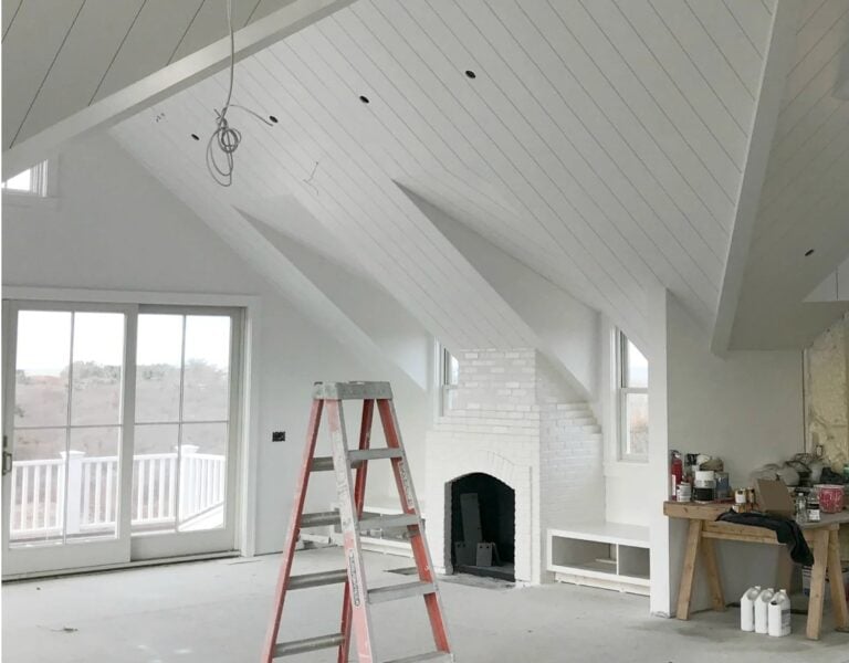
What white would be complimentary to shiplap that is behind cabinet?
What is your thought on mixing these together within a room? We have a large living room (northern facing big window) and are thinking of using Simply White for the trim/mantle with Cloud White or White Dove for the walls in a matte finish. Would that provide a nice slight contrast to highlight the trim and molding or would the differences in the white clash?
Hi Michale, when it comes to whites, I’m more inclined to use the SAME white and then let the change in sheens do the work for me! Walls are often matte/eggshell, whereas trims are satin or semi-gloss. Just this can set things off just slightly without having to mix n match undertones!
Hi!! I’m super late finding this article but would love some advice please. We are building a new home and the kitchen cabinets are going to be cloud white. The trim on top of the kitchen cabinets is going to continue as the moulding into dining room. I hope that makes sense. I would keep the same sheen as the cabinets then right? What colour should the walls be then if we’re keeping them “white”? The dining room may have some wainscoting and a wallpaper on top but for the rest of the house (living room is close) what should are white walls be?? Thank you thank you!!
Hi Jessie, thank you for your note! Yes, I would keep the trim/cabinets the same colour and sheen for sure! When it comes to personal paint questions, I generally have to guide readers to my E-design packages, so I can take a look at the home and it’s needs/exposures/finishes, otherwise I’m just guessing. Off the top of my head, I’d be inclined to keep the walls Cloud White and let the change in sheen do the work for you! https://www.kylieminteriors.ca/online-decorating-design-services/
~KYlie
Hi Kylie,
I have been reading your articles about whites (a bit too late for me) and have learned so much! We recently moved and I had all my trim, doors and built-ins painted cloud white and my walls painted Manchester Tan. We have lots of earth tones in our house (tan travertine tile, honey oak floors, medium toned cherry cabinets, and black and brown speckled granite) which is why I went with cloud white. I feel that it goes too creamy for my taste in a couple of different areas, especially in our northern lit room. I have tried to deal with it, but it still bothers me. I am considering repainting the trim and built-in in this room. Would you suggest a 50% mix of cloud white or adding 4 ounces of white to a gallon to get a less creamy look?
Thanks in advance!
Amy
Hi Amy! Without seeing it, it’s just a guess, but maybe switching to BM White Dove would be a smart move!
Hello,
This is a very helpful article -thank you! I am painting my walls in silver mist by Benjamin Moore. I was planning on doing dove white on all trim, but now I am not sure of I should use a crisper white. Is there a white you would suggest?
Thank you!!
Hi Lily, if you would like a cleaner look, check out BM Super White or White!
Hi Kylie. I am wanting to paint my home in Simply White. Of all the whites I sampled this one works. I have a heard that its eall difficult to use this white to cover other colours. So many people have told me to be prepared to do at least 3 coats. This is whats keeping me from starting to use this colour. This was said by a professional painter. Could you clear this up. Thanking you in advance.
Well Ann, I had the exact same issue – I wish I only had to do 3 coats (I went 6)…this colour just doesn’t have enough tint in it to cover well. Make sure that you prime, even 2 coats of primer. And ask the paint store to add 4 ounces of white to the gallon, this BARELY BARELY affects the colour, but it does help with the coverage, as it’s adding tint to the mix…i hope that helps!
Hello Kylie! This is one of the BEST articles I have read about paint color. I built my house 7 years ago and my
Kitchen cabinets are creamy white. And my walls are Benjamin Moore summer suede. Ugh! Now I wish my cabinets were Simply white. I would like to paint my kitchen walls white. Please help!! I LOVE the greys and Greiges. What paint Color goes best with Cream colored cabinets ???
Please HELP
Gail
What paint finish should I use if I paint my trim and walls white dove. It is an east facing room and is in our basement?
Hi Jayme, I’m a big fan of ulti-matte or eggshell for walls and satin for the trim 🙂
Hello, I would like to know if it will look ok if I paint my walls BM Cloud White and my trim, ceilings doors and crown molding chantilly lace. Will those colours looknok ?
Hi Lena, I don’t think I would. Chantilly is pretty darned white/crisp and can even flash a bit cool looking, whereas Cloud White is SO warm. I think they are too far apart…
Hi there! What a great piece this is!!!! I am
Using white dove on the cabinets,doors and trim
In a kitchen Reno. Do I also use it on the ceiling?
You bet, I would keep it consistent 🙂 you’ll find that the ceilings do shade themselves slightly though, which is only natural 🙂
We just painted our trim and doors cloud white and we are happy with it. I was thinking of painting walls white dove but now I am not so sure after reading your article. Thoughts?
Ooo Shelley, I wouldn’t. I would stick with Cloud White walls as well. I just find that Cloud White is a bit warmer and it could make White Dove just look dingy in comparison. Plus, the sheen shift from satin or semigloss trim to matte or eggshell walls will give you a bit of a shift 🙂
This is such great advice. I am taking your advice to paint walls/trim and ceiling with Simply White because I love the look. However I now need to choose a cabinet colour for the kitchen and I dont think its a good idea to paint the kitchen the same as everything else. Are there any whites you suggested that would work well with Simply White. Quick research showed me I like Classic Gray, Creamy White, White Dove and Swiss Coffee. My fixtures are gold. So excited for your opinion!
Hello- Did you ever find a color for your cabinets? We are going with Simply white for walls and trim but want to figure out best white for cabinets so there is no clashing or making the walls look more yellow.
Hi Kylie. Great information here. I painted my kitchen cabinets Simply White. I have a large open space… Family room/Kitchen/Dining. Two large columns separating area also painted Simply White. I painted the walls quickly when we moved in BM Cumulus Cloud which has too much blue in it. I have a Theatre Grayish Green Arhaus Sectional. Does not look good with paint color. SHould I continue the Simply WHite Matte on the walls in the entire space or bring it up a bit with Cloud White or White Dove?? I live in a cold climate with a West facing house.
Thanks Danylle
Hi Kylie,
You have the best design blog on the whole internet! So informative and generous. I have a question I haven’t seen answered after poring through countless pages and comments, though surely I’m not alone in having this quandary. I’m headed towards a warm white (north-facing) kitchen, but paralyzed by the fact that my windows are standard factory-issue white vinyl. Which is a cold white. Do people just ignore this and go ahead anyway with warmer white trim ( Cloud White/Simply White/White Dove)? The idea is making me twitchy, but I don’t see a way around it without going cold for the whole room, which I really don’t want to do.
Thank you for any expertise you could share to get me off the bench!
Karen
Well thank you! And yes, at some point we have to let our windows go and embrace what the rest of the space/home needs. If you’re still twitchy, SW Pure White can be a nice balance as it’s not QUITE as warm as the others, but still not stark white by any stretch. I call it ‘like White Dove with a bit less warmth’ :).
Hi Kylie,
I am building an open concept cottage with a cathedral shiplap ceiling with very large windows facing the sun all day. I love the white dove and went with that for my kitchen cabinets. I was hesitate to put it throughout that it might be too off white for trims, doors and ceilings so I went with simply white for ceilings (including vaulted ceiling), trim and doors. I am really questioning my decision now, especially where it is open concept so you will see the white dove cabinets against the high shiplap living room ceiling. Nothing has been painted yet. Please help me!!!
Hi Laura! Well, if it were me, I wouldn’t mix the two whites and would stick with White Dove. Also Simply White has more yellow in it, although it’s a ‘whiter white’. For a minor adjustment you COULD ask them to add some shots of white to the gallon of White Dove, which does clean it up a wink and improve the coverage. Some stores call them shots, others call them drops, but the idea is that it’s adding approx 4 to the gallon :).
Hi Kylie,
I did this and had them add 4 ounces to a gallon . Is that the same as “shots”? I hope iI did it right?!🤔😊
Yup! Its so weird, some stores call it ounces, others insist on ‘shots’!
I’m having trouble choosing a white to stain my exterior brick. We want a warmer white but are facing west. Lost of sunlight and I don’t want it to look too stark. We chose a very dark grey for the doors and windows – which will almost look black if there is no black elesewhere on the house….
I’m hesitating between oc17 and cc40.
Any thoughts? Once I stain it, it cannot be undone…