
Paint Colors & LRV Explained: A Homeowner’s Guide
Light Reflectance Value. What is it? How does it relate to paint colors? Why should we care? And WHY has it suddenly become a buzzword in the paint color world? Because someone realized it was kind of a big deal – that someone was me.
Seriously, I’m not tootin’ my own horn, or gassy in general; however, early in my paint studies, I realized how massively important LRV is to the paint color world, and wondered why NO ONE was really talking about it.
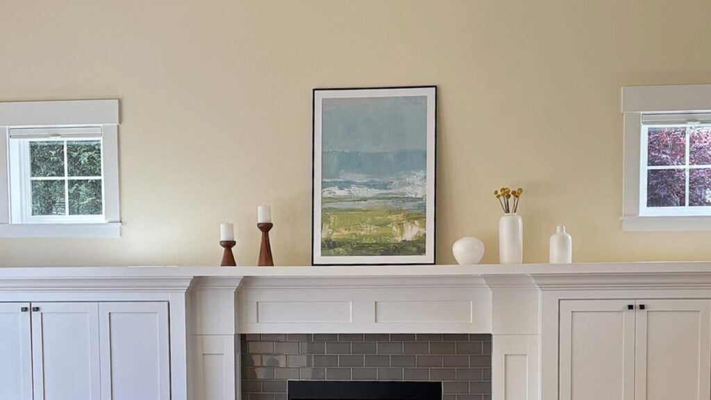
So now we are.
LRV stands for Light Reflectance Value.
And let me tell you, it took 14 hours, 3 bottles of wine, and 24+ years of experience to research and write this article. And I’m not even remotely scientifically inclined (more artsy-fartsy inclined). However, as an integral part of the Kylie M. Color System, which focuses on ‘user-friendly’ color advice and teachings, this stuff matters… a lot.
So, let’s grab a glass and settle down for a bit of a read – just because I’m keeping it simple doesn’t mean I’m keeping it SHORT!
WHAT DOES LIGHT REFLECTANCE VALUE (LRV) MEAN?
Light Reflectance Value (as it relates to paint colors) is a number that every paint color has. This number tells you (on a scale of 0-100) how much visible light a paint color reflects or absorbs when illuminated.
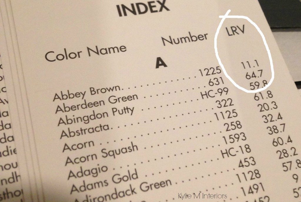
The higher a paint color’s LRV is, the more light it reflects. The lower a paint color’s LRV is, the less light it reflects and the more it absorbs.
However, sometimes facts don’t really ‘hit ye ole noggin’ in a way that makes sense. So, with the above in mind, and tweaking it to be a bit more usable for the average homeowner…
WHAT DOES LRV MEAN FOR PAINT COLORS?
The idea of ‘a paint color reflecting light or not’ doesn’t really TELL us a lot. Instead, let’s consider it a different way…
A paint color’s LRV indicates its potential DEPTH (i.e., white, light, medium, dark), based on how much light it reflects. From there, it’s on the room to PROVIDE the light.
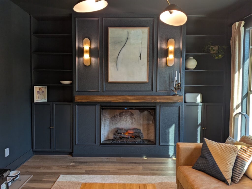
For example, the above paint color is Sherwin Williams Cyberspace, which has an LRV of 6. This means it’s a dark paint color, as this low LRV reflects very little light. Now, compare the left side of the fireplace to the right side.
A paint color can only reflect light if it’s GIVEN light.
On the other hand, this living room is painted Sherwin Williams Pure White, which has an LRV of 84, which means it’s a light paint color that reflects a lot of light…
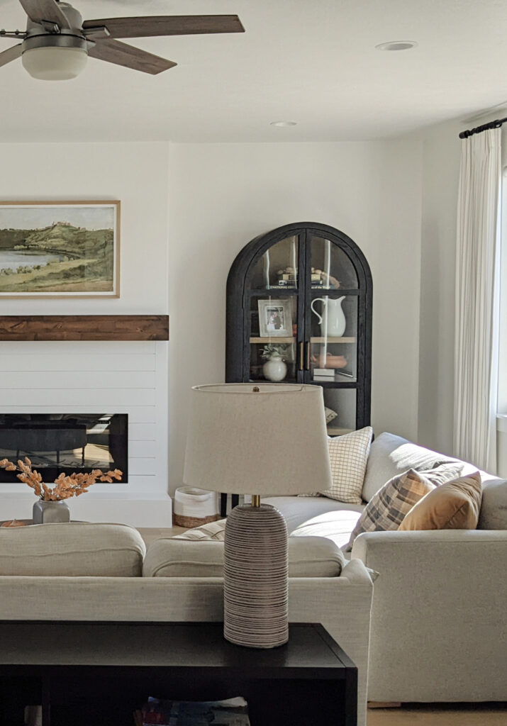
However, regardless of a paint color’s LRV, it can only reflect the light it receives.
THINK IN PERCENTAGES
Think of a paint color’s LRV as a percentage of light it reflects. For example, Sherwin Williams Redend Point (below) has an LRV of 30, which means it reflects approximately 30% of any light IT’S GIVEN…
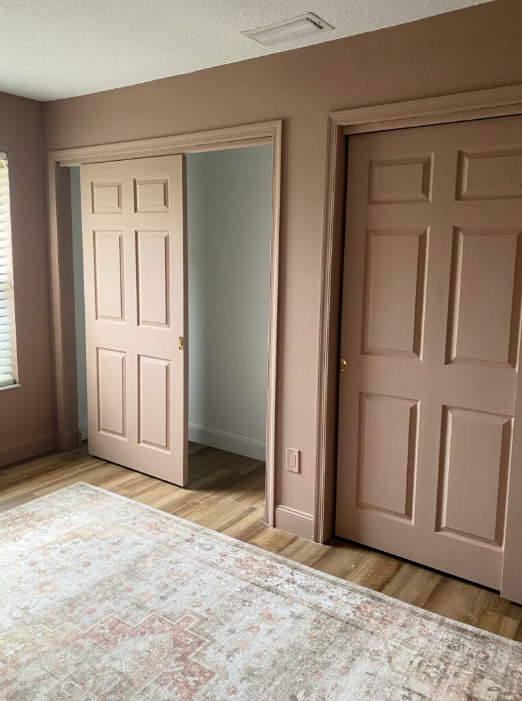
No matter how bright or dark your room is, a paint color’s LRV number never changes. Its APPEARANCE will only change based on how much light you GIVE your paint color to reflect.
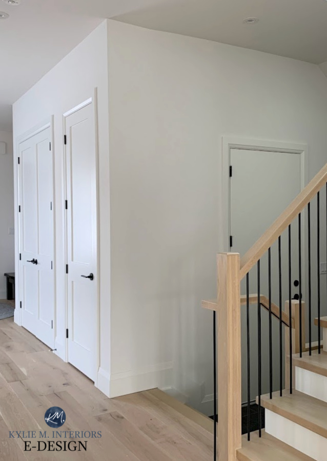
Benjamin Moore White Dove (below) is a white paint with an LRV of 83.16. This higher LRV reflects a lot of light, as shown on the left side of this photo, but it falls a bit flat in areas that don’t have enough light for it to reflect…
The Best Paint Colors for Light Wood Finishes
The above is a great example of a color with a reasonably high LRV (83) that uses the natural light it’s given and bounces it around (or not). It’s still in the white range, but without a light source, it won’t do its best work.
Colors need LIGHT to come to LIFE!
In other words, don’t expect a color to be a miracle worker if you don’t have enough natural light or interior lighting.
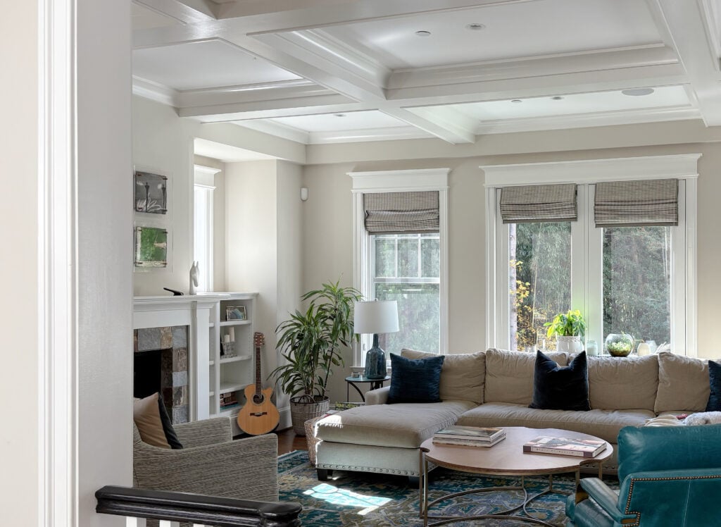
Now, those are the bare bones. Let’s get to how the Kylie M Color System groups colors. Remember, you can narrow down your color choices considerably by figuring out which RANGE you want your color to be in!
Before we get into some fun examples and more guts, you need to know where to find this magical lil’ number…
WHERE DO YOU FIND A PAINT COLOR’S LRV NUMBER?
Given how important LRV is to the average paint buyer, I’m surprised some paint companies haven’t made it easier to find.
Here’s where you’ll find the LRVs for a few popular paint brands (or ask a store employee)…
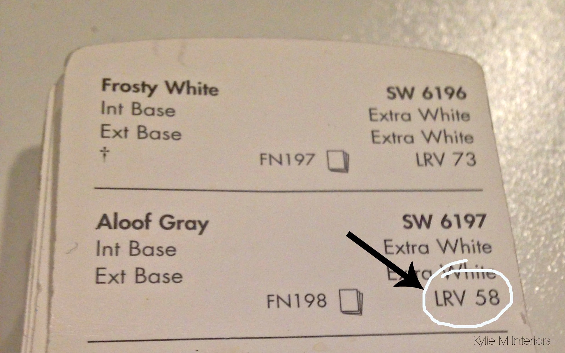
- SHERWIN WILLIAMS LRVs: On the back of each color in the fan deck or on the back of each independent color chip. They also have it listed in the fan deck index and online – thank you, Sherwin Williams!
- BENJAMIN MOORE’S LRVs: On the Benjamin Moore website (on that specific color’s page), as well as in the fan deck index.
- FARROW & BALL’S LRVs: They don’t make it easy; you’ll want to write customer service – and good luck with that – thanks for comin’ out F&B
- VALSPAR’S LRVs: Fan deck index
- BEHR’S LRVs: Fan deck index
Here’s what it looks like on the back of the Sherwin William’s color strip (the long row of colors in the fan deck OR on the small samples found in-store)…
And in the index of the Benjamin Moore fan deck…
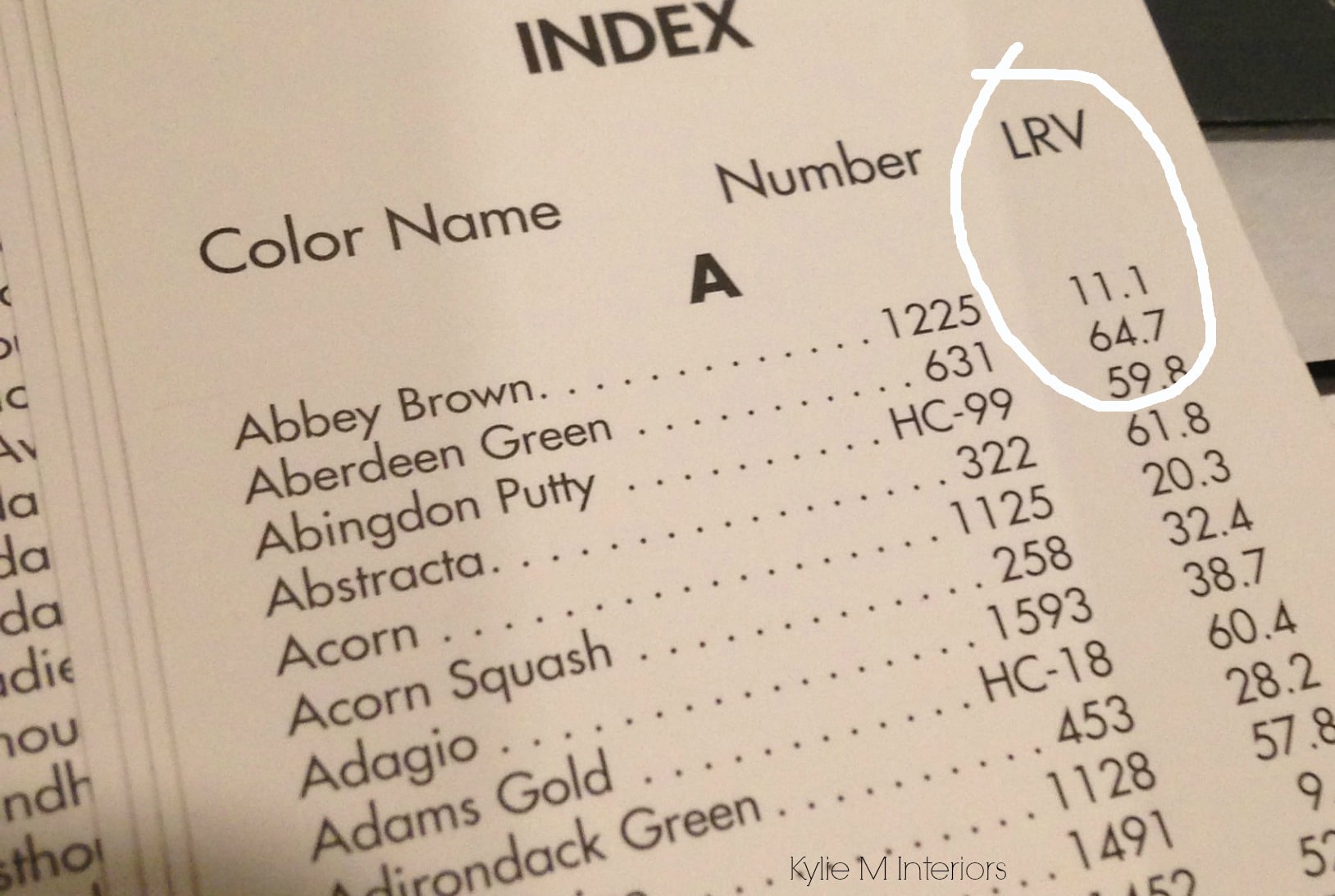
Wine break. Glug glug glug, I mean sip sip sip. And no, I don’t drink THAT much, it’s just a hobby.
Now, let’s discuss the actual LRV ranges. Again, this is not scientific – there IS no scientific break between paint color depths; it’s experience-based (being one of the leading color experts in North America, that carries some serious weight – a lot of it in my rear end, which is one of my redeeming features, along with my charm and extensive paint color knowledge).
THE ‘USABLE’ LRV SCALE (for real homes & real people)
While the scale technically goes to 100, in terms of the non-scientific (residential/commercial) paint world…
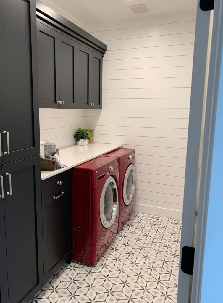
- White only goes as high as 94 – that’s the whitest white available.
- Black goes down to 2 – that’s the darkest color available.
My client’s laundry room (below) is a great example of these extremes…
Remember, you don’t need to memorize ALL of this (unless you’re a glutton for punishment). Use the info that applies to the color/color range(s) you’re exploring to find your best shade!
These numbers will give you a good idea of a color’s depth (how light or dark it is). The ranges below are approximate (two to three points or so) as the lines are blurry. Or maybe that’s because I’ve had two glasses of wine.
LRV vs. COLOR DEPTH
Others might group depths differently. However, 12,000+ consultations (in-home and online), 24+ years of research, plus 600+ blog posts have led me to conclude the following…
2-10 = DARK PAINT COLORS
10-20 = MEDIUM-DARK PAINT COLORS
20-40 = MEDIUM-DEPTH PAINT COLORS
40-55 = LIGHT-MEDIUM COLORS
55-72 = LIGHT COLORS
73-81 = OFF-WHITE COLORS
82-94 = WHITE PAINT COLORS OR VERY LIGHT, HIGHER CHROMA COLORS*
What’s with that last range? A paint color’s LRV doesn’t tell you how COLORFUL or how much CHROMA it has – it just tells you how much light it does/doesn’t reflect. Some colors have high LRVs and reflect a lot of light, but still have a lot of COLOR (chroma). For example, a super light yellow could have an LRV of 88, but not be white.
MOVING ALONG!
Check out this cute bathroom…
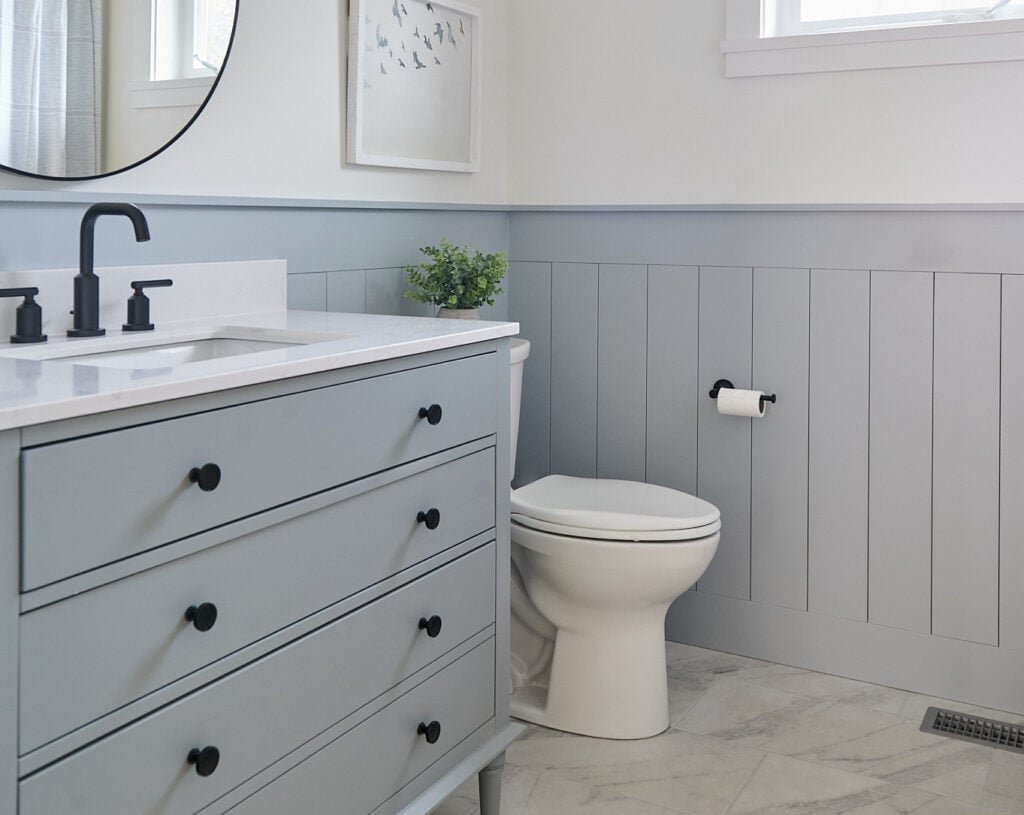
- Benjamin Moore White Dove is on the walls, trims, and ceiling. Its LRV is 83.16, which, along with its low degree of color (chroma), makes it a white.
- Sherwin Williams Network Gray is on the lower walls and vanity. Its LRV is 37, which means it falls in the medium range and reflects less light.
- The difference you see in depth between these two colors is represented by their higher vs. lower LRV numbers—cool, eh?
Now, check out Sherwin Williams Rock Bottom. It has an LRV of 7, meaning it’s a DARK paint color and reflects very little light.

The Best Medium to Dark Green Paint Colors
99.5% of the photos in my blog are of REAL HOMES from my Online Color Consulting clients, readers, and friends. While not always magazine-perfect, they’re packed with ideas and proven color choices to help you create a home you’ll love.
Now, let’s spend a little quality time with each range to see how it might work for you and your home.
WHITE PAINT COLORS & LRV
APPROX. 82+
White paint colors have the highest Light Reflectance Value (LRV) and reflect the most light. The range is from 82 to 94, knowing we don’t have access to whites above 94.
On a side note, just because a color has the word ‘WHITE’ in its name (or gray, or beige, or whatever), doesn’t mean it’s white #neverjudgeacolororawinebyitsname
For example, let’s say you’re trying to find the perfect white paint color for your trims, walls, or cabinets, but you’re comparing several and can’t tell which is lighter. Look at their LRVs, and you’ll know EXACTLY which is the brightest white. From there, compare undertones to see which settles best.

Sherwin Williams Pure White LRV 84, is a white paint color | Sherwin Williams Sensible Hue LRV 46, is in the light-medium range. The shift in depth you see represents the difference between these 2 numbers.
A FUN LITTLE EXAMPLE…
Look at these white paint color samples and decide which one is the WHITEST (do this before you keep reading)…

I mean, it doesn’t take a rocket scientist to see it ain’t the bottom one. However, the other 3 are all contenders.
Now, rather than eyeballin’ it, let’s look at their LRVs to see where they stand…
- TOP: Sherwin Williams High Reflective White LRV 93
- 2ND DOWN: Benjamin Moore Super White LRV 87.36
- 3RD DOWN: Benjamin Moore Chantilly Lace LRV 90.04
- BOTTOM: Benjamin Moore Decorator’s White LRV 82.68
Which color is the WHITEST based on LRV and lack of color/chroma? The top sample, Sherwin Williams High Reflective White.
Which color is the least bright? Benjamin Moore Decorator’s White.
Crazy, eh? The shift in these numbers might not seem huge, but on a large scale, you see these LRVs come into play – when there’s more wall space for the color to come to life.
Is White Still Trendy on Walls, Cabinets, & Exteriors?
WHY DOES WHITE OR OFF-WHITE LOOK DINGY IN MY ROOM?
If you choose a paint color with a higher LRV, hoping to make your room look lighter and brighter, but it contains too much gray, it may not fix your problem. Here are some reasons your white or off-white looks dirty…
- Your pairing it with a cleaner shade of white (e.g., a white subway tile/outlet cover/fridge/etc.) or a cleaner, more colorful paint color.
- It has too much gray in its blend and not enough color – that said, when it comes to warm whites, I’ve found many homeowners to be sensitive to too much color (in the form of yellow).
- You don’t have good natural light, interior lighting, or chose the wrong white for your room’s exposure. Make sure your room has enough lumens to be well-lit, and play with your bulb’s Kelvin to change the look of your white paint color.
At this point, it’s not about the LRV; you chose a grayish color that’s naturally a bit dingy.
In the next photo, you’ll see Benjamin Moore’s White Dove, one of the most popular shades of white (LRV 83). Notice how it appears on the upper part of the walls compared to the wee small areas that get natural light – some might call this effect dingy…

The cabinets are Benjamin Moore Chantilly Lace (LRV 90.04).
Personally, I think it has a pretty softness, but if you expect more from your white, you might want to add more color/less gray or look at a brighter white like Chantilly Lace (on the cabinet). That said, Chantilly Lace is receiving a more direct hit of light than White Dove, and its runnin’ with it.
Many of the most popular warm whites can look a bit dirty or dingy in a darkish space because their warmth is subtle and grounded by a gray base (lower chromaticity).

A SUMMARY OF WHITE PAINT COLORS
- The LRVs of white paint colors range from approximately 82 to 94.
- White paint colors don’t just reflect light; whites with less ‘color’ or undertone will reflect the color of the light they’re exposed to. For example, grass or trees outside your window can show up on your walls.
- Just because a color is in the white range doesn’t mean it won’t have undertones—learn about undertones. The most common undertone in white is yellow, since the most popular warm white paint colors are made with it.
OFF-WHITE PAINT COLORS & LRV
APPROX. 73-81
Off-white paint colors have LRVs between 73 and 81. The closer a paint color’s LRV gets to 82, the whiter it appears (with exceptions for colors with a lot of color/chroma, like a super bright, light yellow).
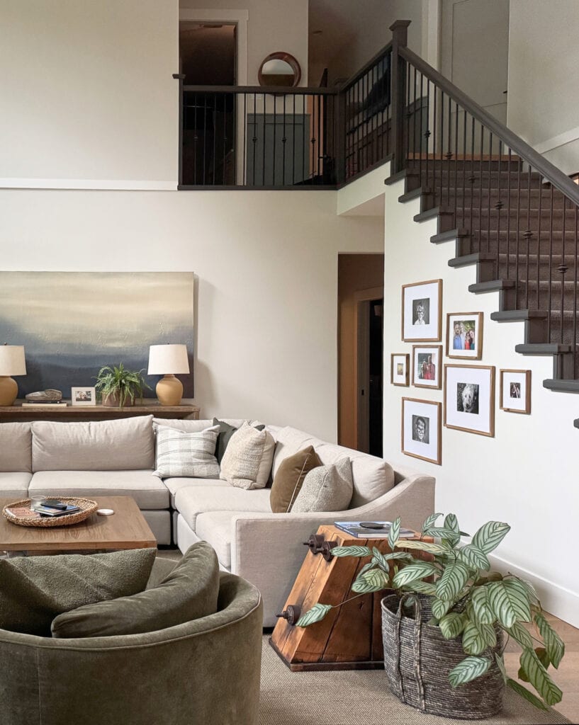
- Off-white paint colors are lower-contrast with white trim
- If you have wood trim, off-white paint colors offer a higher-contrast look
- Off-white paint colors can be neutral or more colorful
For example, Sherwin William’s Creamy has an LRV of 81—this LRV puts it on the edge of the white range, making it open to perception. In this staircase (below), Creamy looks warm and white, thanks to the natural light from the northeast-facing window.
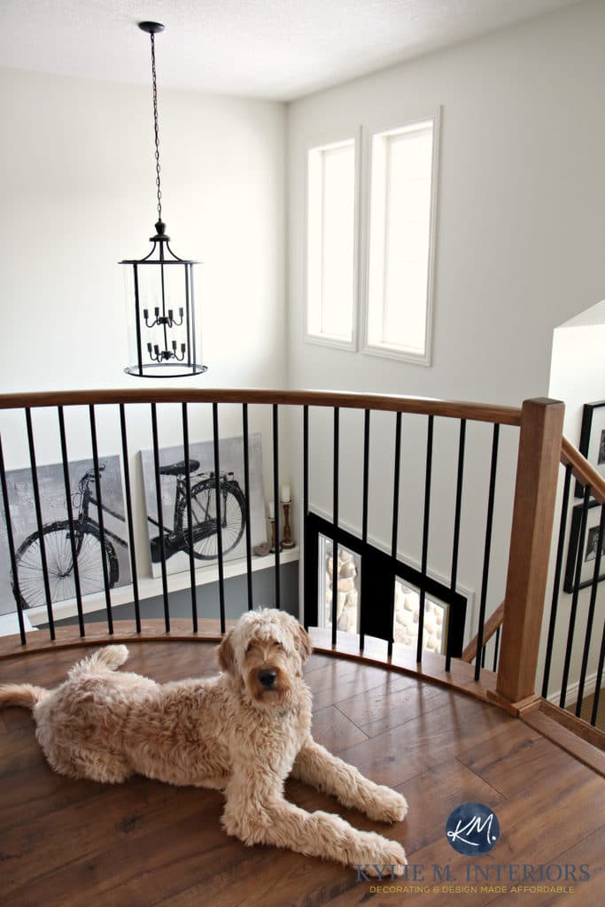
Say hi to Doug – a Golden Doodle/Muppet.
However, notice how different Creamy looks down near the carpet/landing on the same staircase.
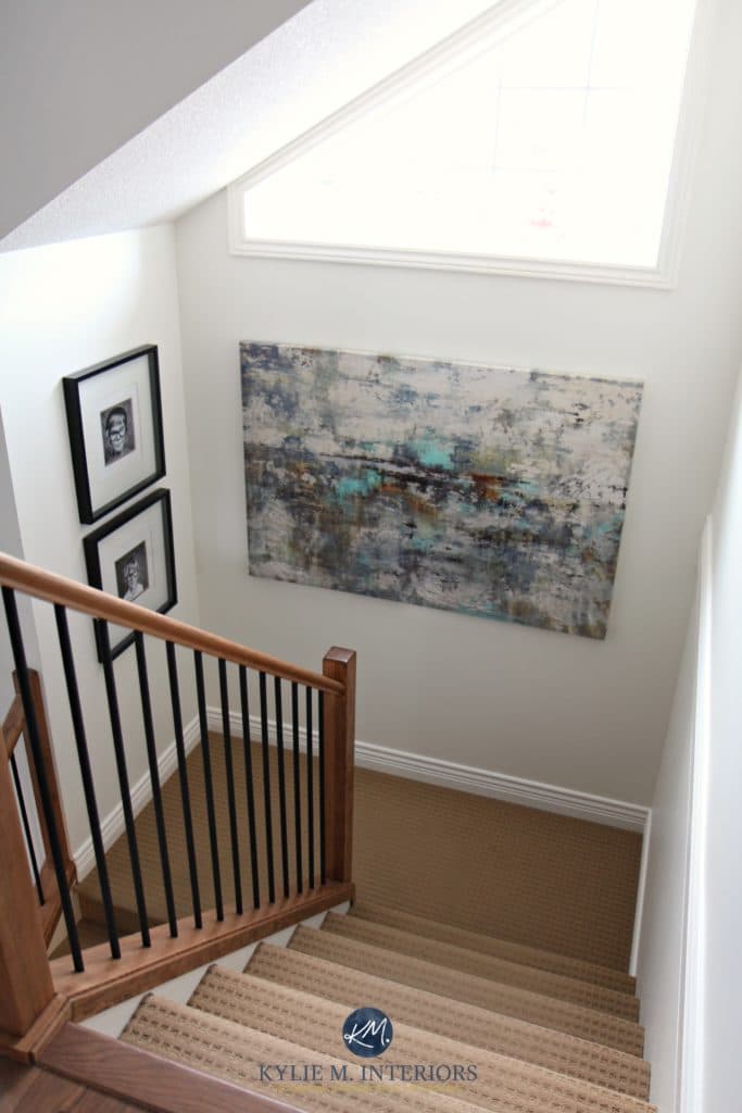
Paint Colors to Update a Beige Home
In the above photo, Creamy looks less like a warm white and more like an off-white (which it is). It also looks a bit dingy/dirtier.
Why?
- Because it doesn’t receive as much natural light to reflect, it looks a bit dingy. This is also because it doesn’t have a strong yellow hue.
- It’s depth is a bit more noticeable because has a brighter white trim to contrast with.
Another beautiful off-white is Sherwin Williams Aesthetic White. Aesthetic White has an LRV of 73, meaning it’s near the dark end of the off-white range and close to the light range (which runs approx. 55-72)…
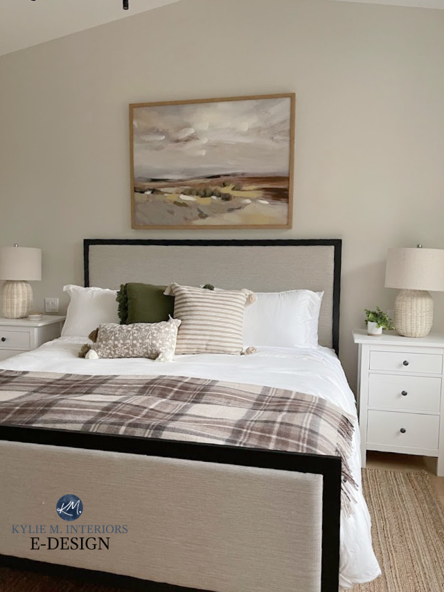
Color Review: Sherwin Williams Aesthetic White
Being a darker shade of off-white than Creamy, you’ll see the contrast between Aesthetic White and white trim or cabinets much more easily.
A SUMMARY OF OFF-WHITE PAINT COLORS
- Off-white paint colors have LRVs between 73 and 81 (approx).
- These depths offer more contrast with white trim
- Even though off-whites don’t reflect as much light as whites, they will still wash out in bright rooms.
- Off-white paint colors are great alternatives to the popular ‘white exterior paint color’. While some traditional or beachy/coastal homes suit white, many homes look better with a less stark off-white.
- Off-whites are popular for resale and as ‘whole home’ paint color options – not too dark, not too light – just right.
- Cool off-white paint colors aren’t remotely popular; only warm off-whites are. That said, if you don’t care about popularity, go ahead and fill your lil’ cool boots!
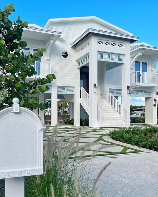
Will this home ALWAYS look good in white? You bet your cute lil’ booty it will. However, that can’t be said for the standard residential home.
The 11 Best Off-White Paint Colors
LIGHT DEPTH PAINT COLORS & LRV
APPROX. 55-72
Light-depth paint colors have an LRV (Light Reflectance Value) between 55 and 72. Many of today’s most popular paint colors sit between 60 and 74. Exactly HOW light or dark a color looks depends on how much light your room gets. For example, a room with tons of natural light could make an LRV of 65 look more like 75.

Sherwin Williams Natural Linen (LRV 66)
On the otherhand, if you have a dark room, the lack of light could make an LRV of 70 look more like 60.
Sherwin Williams Agreeable Gray has an LRV of 60; a great depth to start with if you’re unsure what you’re doing (you’ll likely want to go lighter from there rather than darker).

Sherwin Williams Agreeable Gray Color Review
TOP RIGHT: Notice how Agreeable Gray appears.
BOTTOM LEFT: Compared to the wall that gets good natural light for Agreeable Gray to reflect, this area gets less light, and the wall looks darker
Why does this matter?
You might want to adjust your LRV range to higher or lower depending on how light or dark your room is as a whole.
The light-depth range is popular and a great place to start for the average home, especially this specific LRV range.
A SUMMARY OF LIGHT-DEPTH PAINT COLORS
- Light-depth colors have LRVs between 55 and 72.
- Even though light-depth paint colors have lower LRVs (compared to whites and off-whites), they can still wash out with direct hits of natural light.
- Light paint colors show more contrast with white trim.
- In a poorly lit room, some light colors can look flat and drab and won’t come to life – lighten up, Buttercup (with light bulbs).
The next staircase is painted Benjamin Moore Collingwood, with an LRV of 62. Even with this LRV, it washes out in direct bright light…
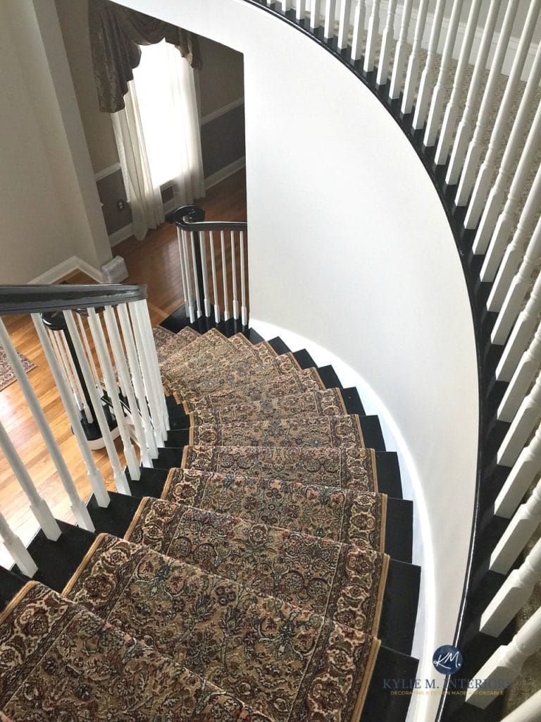
Paint Color Review: Benjamin Moore Collingwood
If you have a bright room and pair it with a lighter color (usually 55+ is where you’ll start really seeing the reflective effect), you’ll have a lot of light bouncing around, as shown in the curved part of the staircase wall above.
Why?
Not only are you giving your walls a lot of light to work with, but you’ve also chosen a paint color that reflects light, as it has a higher LRV.
Subscribe to my Kylie M YOUTUBE channel for more great Kylie M. content!
LIGHT-MEDIUM DEPTH PAINT COLORS & LRV
APPROX. 40-55
Many consultants jump from light to medium, but there’s a HUUUUGE gap in the middle of colors that don’t read as either!
As shown in the next photo, a light-medium-depth color like Sherwin Williams Anew Gray offers a nice contrast with the right white trim color.

REVIEWS: BM Stone Hearth (LRV 48) | SW Pavilion Beige (LRV 48) | SW Perfect Greige (LRV 42) | SW Versatile Gray (LRV 48) | BM Smokey Taupe (LRV 55)
Light-medium paint colors are also a great starting point when considering exterior colors.
Why?
Natural light can really wash out exterior colors, more so than in the average room. Choosing a paint color with a bit lower LRV can help it stand up to natural light a bit better (but it’ll still lighten considerably in good natural light).
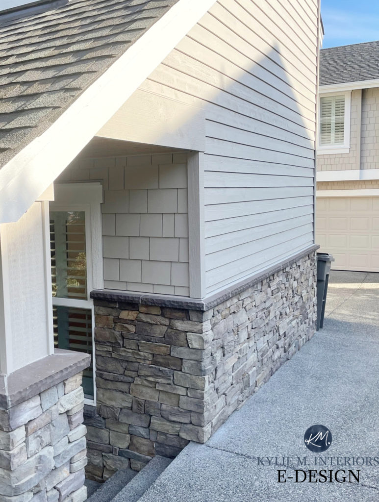
Sherwin Williams Anew Gray Color Review
Seriously, look at the difference between the lower half of the siding and the upper half.
A SUMMARY OF THE LIGHT-MEDIUM PAINT COLORS
- Light-medium paint colors have an LRV between 40 and 55.
- Paint colors in the light-medium range hold up a bit better in super bright rooms. They’ll look lighter where the light hits, but won’t wash out as much as whites, off-whites, and light-depth paint colors.
- The light-medium depth is ideal for those who want to showcase moldings or create more contrast between their walls and trim.
- This depth is reasonably common for ‘whole homes‘, but not as popular as off-white and light depths.
MEDIUM-DEPTH PAINT COLORS & LRV
APPROX. 20-40
Medium-depth paint colors have LRVs between 20 and 40. The lower the LRV, the darker the color.
Sherwin Williams Dovetail, which has an LRV of 26, is shown on this next kitchen island (LRV 26) with Agreeable Gray on the walls (LRV 60, so it’s a light color)…
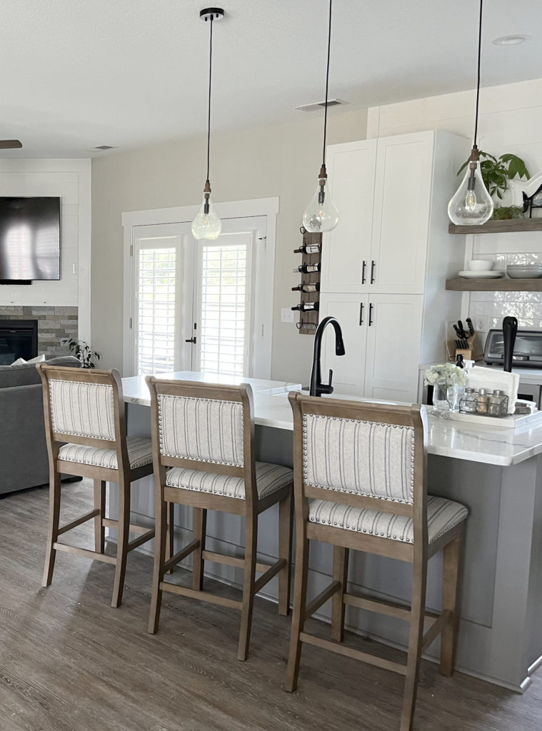
Even a medium-range paint color will lighten up when given some light to work with (as shown below). Remember, every paint color has light reflectance (even dark ones).
In this next image, notice how Sherwin Williams Foggy Day and its LRV of 20 looks lighter where the light hits and darkens down the hallway…

The LRV doesn’t change – the light you give it affects how it appears.
A SUMMARY OF MEDIUM-DEPTH PAINT COLORS
- Medium-depth colors fall within 20 to 40 (LRV, approx).
- Light-medium and medium-depth colors are great for super bright rooms. ANY paint color will look lighter when light hits it, but the darker a color is, the more it will stand up to an overly bright space.
- This range is popular for accent and feature walls and exteriors. That said, it can also look amazeballs on all the walls in a room.
- Paint colors with medium-range LRVs reflect a moderate amount of light, especially in the middle of the range.
- In a poorly lit room, medium-range neutral paint colors can look flat and drab.
- In a room with poor lighting, paint colors in the medium range will take ANY light they can and reflect it into the space, but don’t expect any screamin’ glory. If you don’t want to choose a lighter color, consider a paint color with more color/vibrancy/less neutral to help counteract the shade vs. going with a more standard neutral paint color.
This next room is painted with Sherwin Williams Retreat, which has an LRV of 21. This puts it between the medium and medium-dark range. If you like colors in this range, you might look for colors with LRVs between, say, 15 and 25 – you don’t have to stay in one set range.
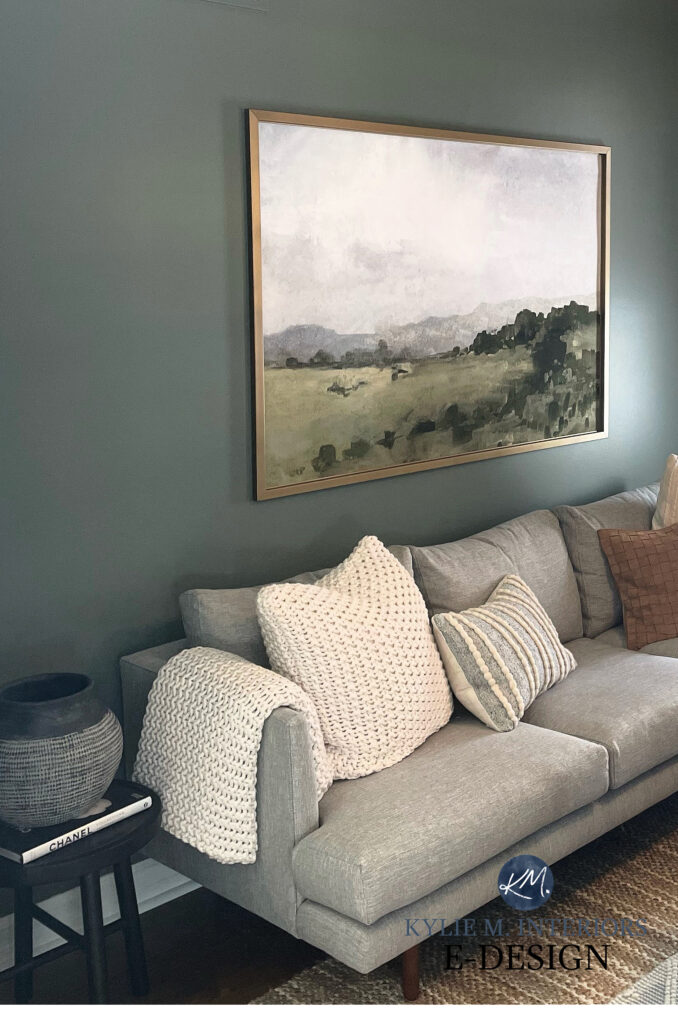
Sherwin Williams Retreat Color Review
MEDIUM-DARK PAINT COLORS & LRV
APPROX 10-20
Just as with light-medium depth paint colors, medium-dark paint colors are the ‘happy mediums’—literally, between the medium-depths and the dark range.
Sherwin Williams Gauntlet Gray (LRV 17) is popular medium-dark, warm gray paint color…

And yes, the art still needs to be hung – I’m sure it is by now.
Benjamin Moore Amherst Gray (shown below with one of the best warm white paint colors on the cabinets) is a medium-dark gray.
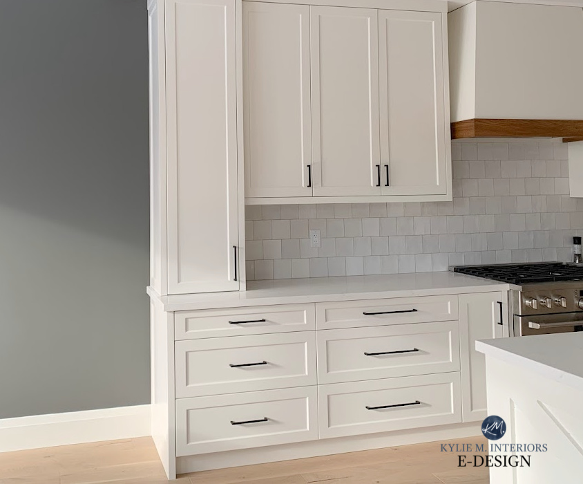
Notice how Amherst Gray appears darker at the top of the wall, but brightens where the light hits.
Why?
Although its LRV is lower, it still reflects some light. Even a color with a lower LRV reflects SOME light. In reflecting this light, it looks lighter than it does in an area with less light.
Remember, dark paint colors reflect light too!
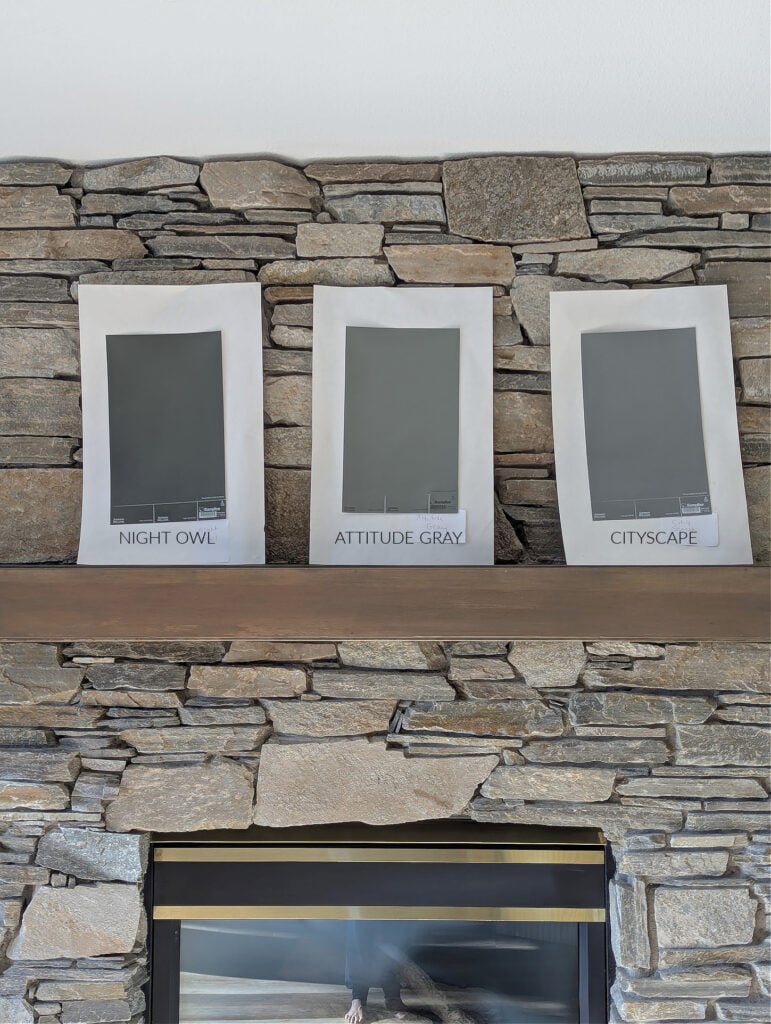
SW Night Owl (13) | SW Attitude Gray (20) | SW Cityscape (22)
Check out the above samples. Notice how Night Owl, with its LRV of 13, is visibly darker than the medium-depths of Attitude Gray (20) and Cityscape (22), though they definitely wink at the medium-dark range – they’re skookum.
A SUMMARY OF MEDIUM-DARK PAINT COLORS
- The medium-dark range runs from approx. 10-20 (LRV)
- Medium-depth colors don’t have the (sometimes intimidating) depth of traditional DARK paint colors.
- These darker shades are super popular on feature and accent walls.
- Medium-darks are also found on kitchen cabinets, but are far more popular on painted kitchen islands.
- Exteriors can look amazing in medium-dark shades, as many of the top shades complement the brick and stonework, as well as contrasting well with white trim.
- Exteriors with black windows are commonly painted medium-dark paint colors.
Benjamin Moore’s Best DARK Gray & Charcoal Paint Colors
DARK PAINT COLORS & LRV
APPROX 2-10
These are the heavy hitters. While not all of these are black, once you get under 6, be ready for a wickedly dark color.
Sherwin Williams Cyberspace (below) is wickedly gorgeous with its LRV of 6. In a well-lit space, this color can look stunning, lighter, and more colorful.
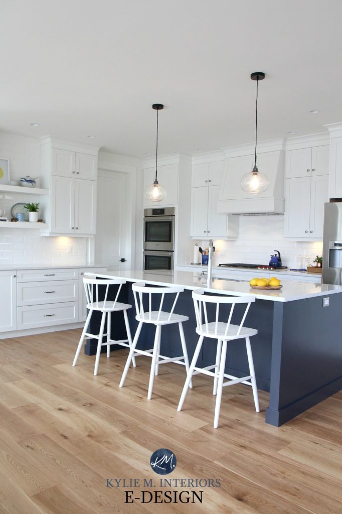
However, in a dark room, it can appear closer to black and lose some of its color/hue.
In fact, dark colors can almost look blackish in poorly lit rooms.
This next room shows Cyberspace again. Notice how it changes color and depth from left to right, depending on the amount of light it receives…
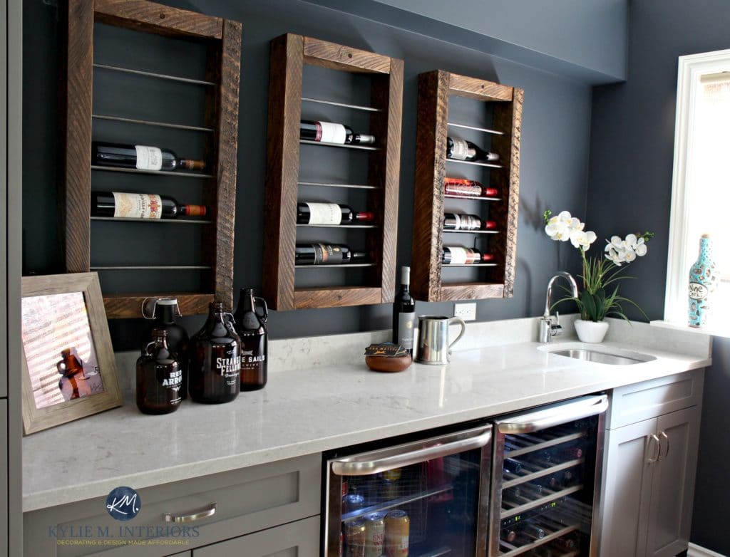
Compare the wall space on the far left with that on the far right. No light = no reflective value.
As for black, one of my favorite shades is soft black called Iron Ore, coming in hot with an LRV of 6. Check it out at the end of this kitchen island…
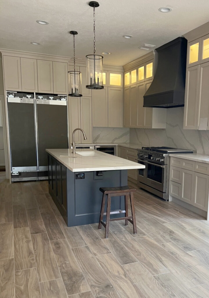
Compare the end of the island to the range hood: the island gets light and reflects it; the range hood doesn’t.
Cool, eh?
Here’s Iron Ore looking badass and beautiful again…

- The left side of the built-in cabinets gets direct light, making Iron Ore look lighter.
- The right side gets minimal light, making Iron Ore look more ‘black’ than soft black.
Now, let’s go big or go home with Sherwin Williams Tricorn Black, and it’s wickedly low LRV of 3…
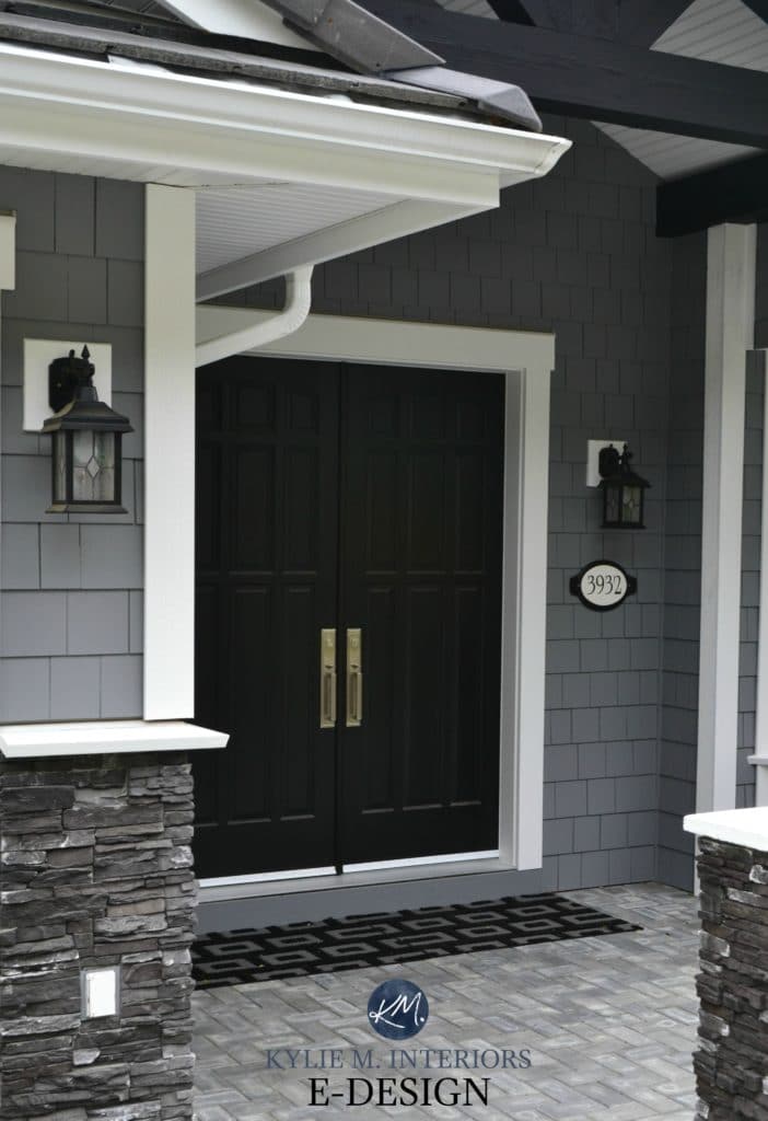
The Best Black Front Door Paint Colors
A SUMMARY OF DARK PAINT COLORS
- Paint colors with a lower LRV will reflect some light, but not tons. If a color’s LRV is 10, it will absorb a lot of light and reflect a smaller amount. If you want a dark color to look lighter, GIVE IT LIGHT!
- IN A DARK ROOM, a dark color won’t come to life and won’t reflect light (as it hasn’t been given any, and it has a low LRV to boot, double-whammy).
- Dark paint colors are super popular on accent walls.
- While some paint their kitchen cabinets a dark color, they’re far more popular on painted kitchen islands.
- The inside of your front doors can look striking in a well-chosen dark paint color, as can the outside of your door.
- While exteriors can be painted dark colors, remember that they absorb more light and can fade a lot faster.
Now, let’s consider some examples…
EXAMPLE 1: YOU HAVE A DARK ROOM
If you have a dark room and want it to look lighter and brighter, you might choose a paint color with a higher LRV, as it’ll reflect more light.
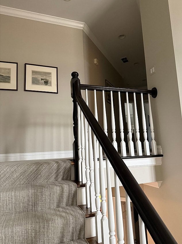
Look at how light this color looks beneath that upper stair railing.
Now, it can’t reflect what you don’t GIVE it, but it will take whatever it’s given and reflect it. On the other hand, a darker paint color won’t reflect as much – combine that with minimal light, and you’ve got one damn dark room.
- For a dark room, you might consider colors with LRVs of 72 or higher.
- From there, figure out how much COLOR you want on your walls, since 72+ only means it’s a lighter color, in general.
- Dark rooms often benefit from higher LRV colors with a bit more ‘color’ or ‘chroma’. Muted, dirty neutrals don’t do as well, regardless of their LRV.
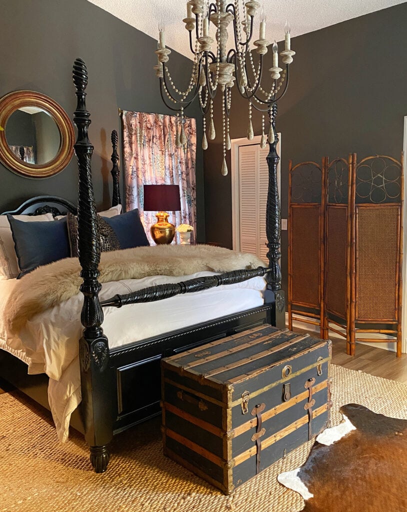
That said, many people prefer a dark, moody color for their dark room like Sherwin Williams Urbane Bronze (below). Remember, it’s your home – you do you, boo…
EXAMPLE 2: YOU HAVE A SUPER BRIGHT ROOM
A super bright room has a lot of light to give. If you paint your walls a high-LRV color, you’re compounding this room’s already bright look.
Consider these next samples (I’m rounding up their LRVs for everyone’s sanity)…
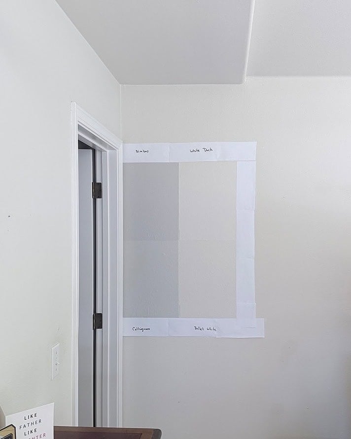
- LEFT SIDE TOP: Benjamin Moore Nimbus (LRV 60)
- LEFT SIDE BOTTOM: Benjamin Moore Collingwood (LRV 62)
These 2 colors are in the ‘light range’ of LRVs (55-71).
- RIGHT SIDE TOP: Sherwin Williams White Duck (LRV 74)
- RIGHT SIDE BOTTOM: Benjamin Moore Ballet White (LRV 72)
These 2 colors are in the ‘off-white range’ of LRVs (72-81).
If you have a bright room, which of the 4 will reflect less light, potentially creating a more ‘calming’ look? Benjamin Moore Nimbus and Collingwood.
That said, some people want bright on bright, so long as you’re prepared for it and know how your paint color could appear (or not – it could wash out a lot).
- When choosing colors for a bright room, many look at colors in the light range (55-71) and the light-medium range (40-54). Light to light-medium colors reflect a good amount of light, without going as far as the off-white and white range. They can help calm a bright room while still keeping things…well, bright.
- Of course, you can look at darker colors with lower LRVS, but the light-to-light-medium range is the most popular.
- From there, you get to decide how much COLOR you want on your walls, or whether you prefer the wild world of neutrals.
FREQUENTLY ASKED QUESTIONS
LRV isn’t an easy idea to wrap the ‘ole noggin’ around, and you probably have questions. If I don’t answer them below or in this other LRV blog post – leave a comment!
WHAT’S THE BEST LRV FOR A DARK ROOM?
Choosing a light paint color may be better for a dark room if you want to brighten it, but it won’t save the day—you need actual light for the paint color to play off and reflect.
One way to add brightness to a dark room, along with LRV, is to choose a color with more chroma/color vs. a more standard neutral paint color (and improve your lighting).
The next photo shows a room painted in one of the most timeless, neutral paint colors: Benjamin Moore Revere Pewter. Notice there isn’t much light, which affects how Revere Pewter looks—its LRV of 55 isn’t being used effectively.
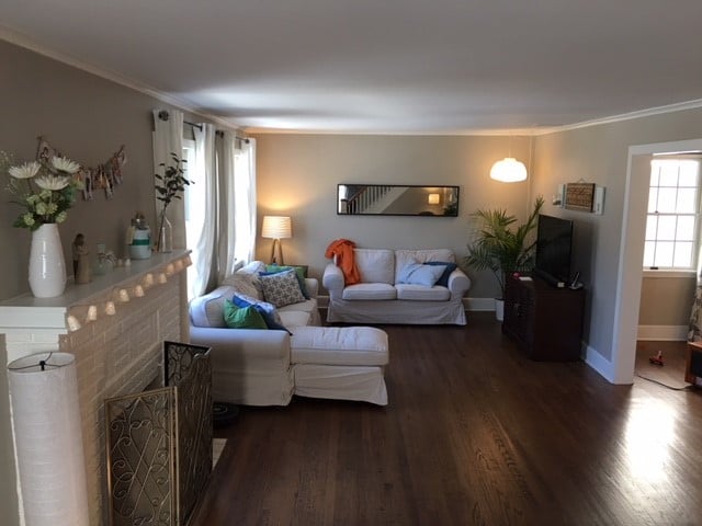
In this next photo, the bedroom is painted in Revere Pewter (not the bathroom)…

- The above bedroom has a good amount of natural light on the left side, making Revere Pewter look just right (the bathroom is Wickham Gray). Its LRV of 55 looks great in this light.
- On the right side of the photo (outside the bathroom entrance), there’s less natural light, and Revere Pewter looks darker.
This example shows how a neutral that appears perfect in a well-lit space can look drab and dingy in a low-light room, even with a moderate LRV of 55.51.
We need to lighten up, Buttercup!
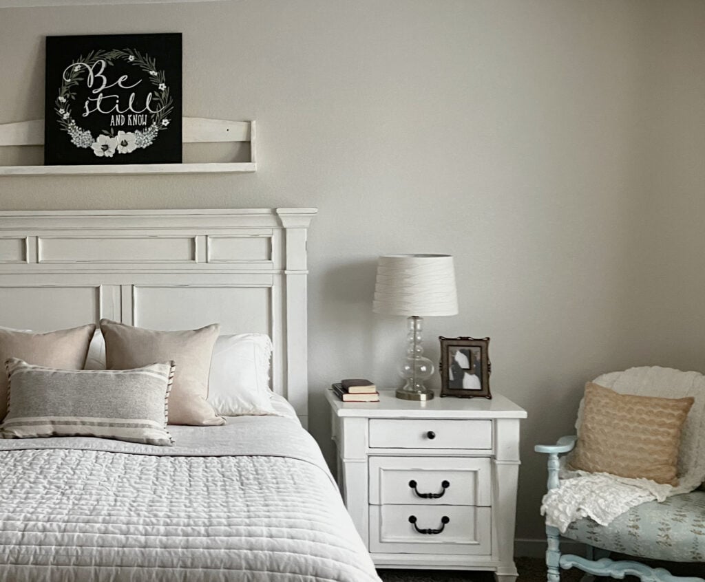
Here’s Sherwin Williams Egret White (LRV 70) looking balanced and beautiful in this room.
And to answer your question about the best LRV for a darker room…
- Generally speaking, paint colors with an LRV of 74 or higher.
- Consider how much gray vs how much color your chosen shade has. Even a high-LRV color with a decent gray or beige base can look dingy. Consider a bit more ‘color’ vs less.
WILL NATURAL LIGHT/MY ROOM’S EXPOSURE CHANGE MY PAINT COLOR’S LRV?
Natural light won’t affect your paint color’s LRV; it is what it is. However, the more light you give a color, the more light it will reflect, especially if it has a higher LRV.
In other words, your paint color’s LRV will never change; it’s static. However, how it APPEARS depends on how much light it’s given.
This dining room (below) is painted Sherwin Williams North Star, which has an LRV of 62. Because the room has a lot of natural light, North Star looks a bit brighter than expected; however…

The Best Creamy White & Off-White Paint Colors
What’s cool is that the walls in the staircase are painted Sherwin-Williams Pearly White (LRV of 77). Because the staircase doesn’t get as much natural light, the walls look darker than the dining room, even though Pearly White’s LRV is considerably higher!
Colors with higher LRVs reflect MORE light; colors with lower LRVs reflect LESS light. But if you don’t GIVE them light, it won’t matter.
So, even if you pick a light color with a high LRV, if you don’t give it light to reflect, it won’t rise to the occasion, which goes back to one of my favorite sayings (I have about 80)…
No paint color will save you if you don’t have enough natural or artificial light. And yes, I make this font big because it matters (I also talk in big font when explaining things in person).
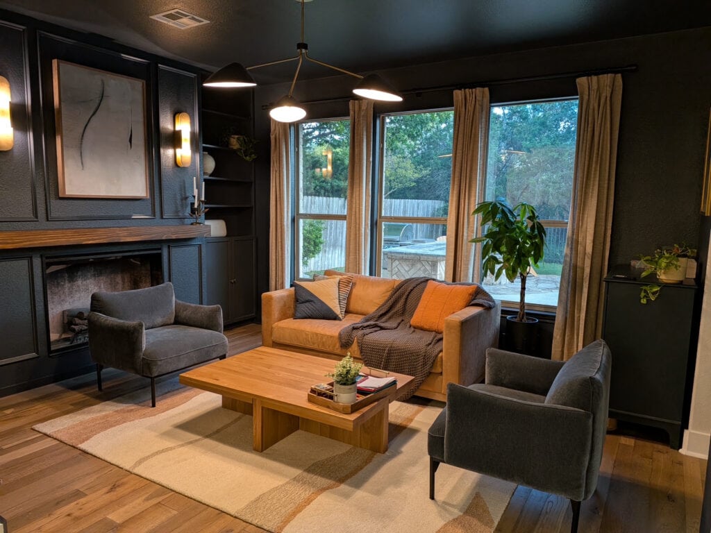
But, of course, there are those (like myself) who aren’t afraid of a dark color in a dark space – in which case, fill yer lil’ moody boots.
WHEN YOU LIGHTEN OR DARKEN A PAINT COLOR, DOES ITS LRV CHANGE?
HECK YES, it does. Any change you make to a paint color alters its DNA, and the LRV will increase or decrease depending on the extent of the change.

Read more right here… LRV, Paint Colors & YOU.
When you lighten or darken a color, you’re creating a new color. While it might have similar roots, its DNA has changed. MOST times, you get a ‘lighter version of what you started with,’ but sometimes, the undertones and temperature change more noticeably – it depends on which tints were used to make the original color.
I have several lightened and darkened paint colors in my home. I’m a big fan of tweaking colors to get the look I want.
WHAT’S A GOOD, IDEAL LRV?
Here are some basic guidelines to consider. Keep in mind that these are just starting points. If you want a different look, it might be outside of these ranges.
- THE AVERAGE SINGLE ROOM: LRV 62-75
- FOR EVERY ROOM IN AN ENTIRE HOME (PAINTED 1 COLOR): 65-75
- KITCHEN CABINETS: LRV 82-94 (or 45 and lower)
- FEATURE WALL: ANYWHERE FROM 2 (black) to 50, BUT 30 IS A GOOD AVERAGE
- EXTERIOR: 35-60, but really, it runs the full gamut…whatever a gamut is.
- FRONT DOOR: APPROX. LRV 10 – 20
Again, the above numbers can vary; these are just good baselines for your color journey.
In this home bar, my client wanted a moody atmosphere, as she called it her ‘bat cave’. But at the same time, we didn’t want it to look too heavy…

We settled on Sherwin Williams Still Water LRV 10 as the perfect dark blue-green blend. Also, notice how much I love it when my clients know my personal tastes, if you know what I’m sayin’…
On the other hand, this next hallway has a range of light, from no natural light to an adequate amount…

Paint Color Review of Sherwin Williams Antique White
For this home, I recommended Sherwin Williams Antique White (LRV 72) to add warmth and interest in the dark areas without making the lighter areas too yellow or overwhelming.
WHAT’S CONSIDERED A HIGH LRV?
The higher the LRV number, the lighter the paint color. Paint colors with LRVs of 74+ (off-white and white paint colors) are considered HIGH LRVs.
The Best Light Paint Colors for a Darker Room
SUMMARY OF LRV & PAINT COLORS
- LRV stands for Light Reflectance Value and refers to how much visible light a paint color (or surface) reflects.
- You can use LRV ranges to help choose paint colors. LRV can be broken up into depths including white, off-white, light, light-medium, medium, medium-dark, and dark/black.
- Generally speaking, dark rooms do well with higher LRV colors (however, there are other factors like choosing a ‘color’ over a neutral and improving interior lighting).
- Light rooms combined with a high LRV paint color can make for a VERY bright space. This is why many exteriors look too stark painted white.
So there you have it – LRV in a big, fat nutshell.
PARTNER POSTS…
How to Choose Paint Colors for Any Room
Create a Cabinet & Wall Color Palette Using LRV
Learn More About the Kylie M Color System
Get the best paint color advice with Kylie M’s Online Color Consulting Services!

Updated with fresh, new content and images for 2026




Hi Kylie –
I am glad I came across this blog article as it’s proving very helpful in selecting a wall paint color for our whole house remodel. I love the photos I’ve found online of interior walls painted Sherwin Williams Anew Gray. I intended to use this color for my walls and Eider White for the ceilings and kitchen cabinets. However, when we painted a sample on the wall, the Anew Gray seems a little too dark for the amount of light in the house.
I think this is in part because professional photographers have gotten really good at brightening up photos, which makes for a more beautiful photograph, but not necessarily for helping those of us trying to find the perfect color.
So, I’ve had SW make a custom blend of 75% Anew Gray (LRV 47) and 25% Eider White (LRV 73). Should I assume that the blend will produce a color with an LRV of about 53.5, or does the math not work quite like that? I think I like the blend, but I’m not sure that going from 47 to 53.5 is really that much different.
Thanks for the insight you’ve provided in this article and any you might be able to provide for my particular color concern.
Thank you Kylie! This is the single most helpful information I have ever read about paint! This explains why I’m not liking Accessible Beige (which I expected to love) in the rooms of my house with poor lighting. Even though it’s LRV is 58, I need a higher LRV! You just saved me a lot of stress and paint samples! Many thanks!!
Melissa
Well that’s the type of note I like to get – good news! I’m actually working on another one to talk about LRV a bit more as I’ve had several of the same questions come up, so there’s definitely more work to be done on that topic!
~Kylie
Hi Kylie! Have you ever used Benjamin Moore’s Silver Chain? If so I’m wondering what your opinion is on that color. 🙂 Like, dislike, keep it moving?
I’ve touched on it with clients, but no one’s jumped on it yet. In some rooms, my clients find it too cold blueish toned whereas in other rooms it gets some green mixed in there. There are just SO many beautiful grays that I find a lot of my clients want grays with less undertones than Silver Chain… 🙂 I love it though!
Wow, thank you so much for such a detailed post Kylie! I have been painting various rooms in my house for so many years and while I knew about undertones and depth, this clearly explains why I had so many “oops” colors!! I am redoing my master bed and bath and this will be so helpful as I could never understand why it always looked so dark with a beige color. I love, love, love Sherwin Williams paints! I love their colors, how they go on walls and trim, and how I can wipe the dirt off of them when my grandson gets his hands on them!! I know my husband will thank you when I don’t have to spend money on 5 different sample paints that don’t look right! I am bookmarking your site, I know I’ll be referencing it for many future projects!!
Wahoo, that’s what I like to hear! Once you KNOW better you DO better! And there is always SOOOOO much to learn with paint colours 🙂
~Kylie
Love your blog. I have made so many mistakes with wall paint over the years resulting in a lot of repainting. The information on your site explains why I made those mistakes. The biggest one though is falling in love with a magazine photo. Too many variables to get “the” look in my own home. With your help I’ve found choosing colors that I like as opposed to what’s trendy and the difference in how lighting affects the actual color has saved me a lot of repainting. Keep up the good work!
Wow, what a lovely note to get – thank you! I’m so glad you found the info helpful, and now going forward you have some knowledge in your back pocket! And I know, magazines are so deceiving. Everything is so tweaked and edited to PERFECTION that it’s hard to apply to those of us in the real world!
~Kylie
I was feeling homesick after our move with not much natural light in our living room. The room was painted in tan and dark brown colors. I was looking for a paint that would brighten up my space and add a little color The SW BIG CHILL was everything and more. Can’t thank you enough for this post and shedding light on the matter 🙂
Hi Kylie! I have learned so much from your articles!! I do have a couple of questions though. If I want to get H. Depot or Lowes to match BM Gray Owl, will the LRV remain the same?? And what paint finish do you recommend for walls? Flat, Matte, Eggshell, Pearl?? So many choices!
Thank you!!
Ashleigh
Hi Ashleigh – yup, if they do the colour match perfectly the LRV will be the same! For walls, I’m a fan of eggshell for the durability. there are some ‘okay’ mattes out there, but generally they aren’t as durable/washable 😉
HI KYLIE,
I WAS WONDERING WHAT THE WALL COLOR IN THE BEDROOM OF YOUR FIRST PHOTO?
YOUR ADVICE IS SO HELPFUL!
THANK YOU 🙂
NANCY
Hi Nancy! I believe that was Benjamin Moore Mountain Air CC 636
Kylie – I just found your old post about LRV and it’s timeless! Thank you for explaining LRV in terms anyone can understand. I can’t wait to put my new-found knowledge to work…and drive myself even further into the insanity of finding THE PERFECT white for every room! lol. Seriously, thank you. 😉
Oooo Mary, that’s what I like to hear – thank you!
So very glad I found this article ! Picking paint for new construction and soooooo many choices, this will help me select better but is still overwhelming – lol, saving article. Didn’t even know there was a thing called LRV. Do you have a favorite Sherwin Gray Blue in medium/light LRV?
I have trim and cabinets that are SW Neutral Tan throughout the house. I am trying to select a wall color that would compliment the trim and not blend in with it. I live in Florida, near the beach, so we would like to keep the color light. I am considering the Canvas Tan, but also thinking of the Accessible Beige…but afraid the Accessible Beige may be too dark for the rooms. I appreciate any advice and thank you in advance.
Hi Julie, I do try to give as much complimentary info on my blog as I can, and if that doesn’t work it might be time for me to check out your home via my E-design, this way I can look at your exposure/flooring/decor, etc…, otherwise I’m just guessing! It’s affordable and fun!~ https://www.kylieminteriors.ca/online-decorating-design-services/
~Kylie
Hi I left a question twice, In May 2018, just before you left for vacation and I think after your vacation. I was wondering what the colours are on the last picture you have posted on this page. thanks,
Hi Karen, thank you for your patience! In the last photo with my ad on it, that is Revere Pewter, but I will note that Revere Pewter rarely looks like that (gray-blue). In the one above it, which might be the one you’re referring to (before the images with the colour names on them, but no actual room photos), that is SW Repose Gray – the one with the beautiful accent chair and tile fireplace. You can see more of that room here…well hot damn, I just realized that while I’ve posted independent photos of this home, I didn’t do a blog post, wow! I’m going to do that…I’m also going to send you an email in the meantime with some photos, so you don’t have to wait!
~Kylie
Wait, I just realized that I do have a blog post on it! I have over 250 articles, so it’s easy for me to forget 😉 Here’s the link! https://www.kylieminteriors.ca/a-contemporary-and-comfortable-new-home-in-nanaimo/
I just moved into a manufactured home and of course, it’s full of dark wood paneling. Way too much wood, and too dark for me. One kitchen wall was a dark red, with all the dark cabinets and a dark brown and yellow floor that saw better days 20 years ago. After choosing a white marble with grey streaks for the floor, I chose Behr’s Marquis Sea Ice in a semi-gloss for the walls.. An 18″ square of Periwinkle chalkboard paint for quick notes and Hills of Ireland (also Behr and semi-gloss), for the mouldings, which are a very small yet effective contrast. After reading your article, I understand how the Sea Ice works, and why the green works as a trim, but would not work here as a wall. I like to understand things, so thank you very much for the information. Now I’m going to be checking every paint chip and can for LRV’s. Very nicely written and enjoyable to read.
Hi Gillian, I’m so glad you found the info helpful, come back anytime!
I have been laboring over a new paint color decision for our living room, which lacks natural light. Six sample paint swatches and two weeks later I find your blog and youtube videos…mind blown! I’m now looking at colors with a LRV of 60+ , no longer testing paint swatches on the actual wall itself, and don’t feel totally clueless. And if I don’t figure it out soon, I’ll be hiring you for color recommendations. Thanks so much for the great content!
I am still confused. North facing room, big windows but shaded light by pine trees. What’s the best Lrv for my rooms? Thanks
Thank you! This really helped us decide between a few colors that we were in between for some gray shades.
This is great information. I have been struggling to find a color for my staircase. It’s a three floor walk up with no windows. Do you have any advice on what colors can ai use. Is grey too dark.
This is great info! I have a question though. I have Light French Gray in my master. The LRV is 53. My thought is to have the same tone through the house, but a little lighter. If I went with LFG but at 85%, would that make its LRV 15% brighter? I’d love some advice! Thanks!
I realize this post is older but find it fascinating! I would love to know if you have a suggestion for a very light gray for a basement room ? There will be zero natural light unfortunately in this section. Thanks!
Love this article! I was trying to check out the new paint companies Clare Paint and Backdrop. Clare Paint readily displays their LRV values whereas I had to message Backdrop’s customer service to attempt to get this information. Backdrop stated that they “don’t disclose their color information” – can you believe it? ?
Anyways, have you considered reviewing colors from these companies? They are eco friendly, but are a little pricey.
Thanks!!
Interesting! I’ve never heard of them, but would be totally turned off using a company that wouldn’t disclose something as straightforward as LRV! Seems strange to me… 🙂
Great post, very informative and I’ve read it through at least three times but I cannot find out if the LRV will change with the quality of the paint that is the same color. For example does Behr Roman Plaster have the same LRV in Premium Plus as it does in Marquee?
Hi Lorri! Yes, you should get the SAME LRV – same colour same LRV, but you might notice a slight shift in sheen as this can shift in a brand between their different levels of paint. This shift in sheen can make a colour look slightly lighter/darker :).