
The 15 Best Paint Colors With Dark, Historic/Heritage Wood (trims, flooring, cabinets)
When it comes to updating medium and dark-wood trims, doors, and wainscoting in older heritage or historic homes, it’s less about updating and more about purposefully chosen paint color partners.
Why?
Because when it comes to the types of dark wood finishes found in historic homes, ‘updating’ isn’t the right word. To update something means that it’s currently outdated. However, these glorious dark wood finishes are often well-suited to the homes they’re in.
BTW, while these color ideas are directed at older, heritage woods, they can be used for any dark wood -even in a brand spankin’ new home!

WHAT ABOUT WOOD TRIMS FROM THE ’70s & ’80s?
While dark wood trims in older homes can be impressively thick and high-quality, those from the ’70s and ’80s are known for being narrow. So…
If you have thinner wood trim and think the STAIN COLOR is the main problem, think again.

But what exactly makes the dark wood trims in older homes more timeless than those found in 70s and 80s homes? Size. It matters in Starbucks drinks, wine glasses, and trim proportions (usually, the bigger the better for both).
WHAT DO YOU WANT YOUR PAINT COLOR TO DO?
When choosing a paint color, we’re often looking for a certain ‘effect,’ either on the room as a whole or on the finishes. Before you choose your best paint color, you should figure out what you want from it…

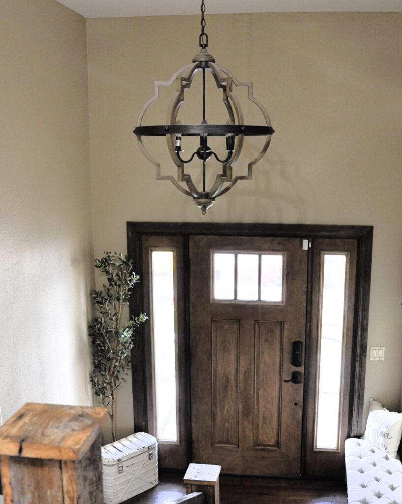
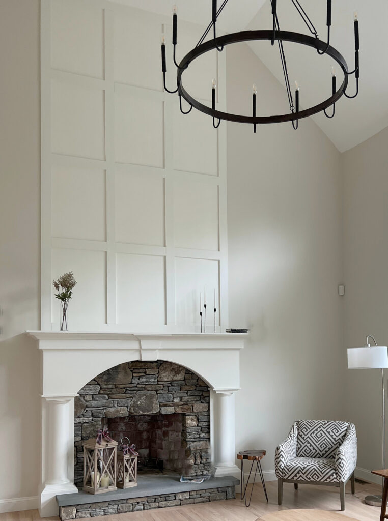
This wood has red undertones with a dash of purple!
1. PAINT COLORS TO CONTRAST WITH YOUR DARK WOOD FINISHES
If you love your wood finishes and want a more dynamic look, you might want to accent them with CONTRASTING colors.
There are two main ways to contrast with dark wood trims, cabinets, flooring, or furniture…
- Add contrast with a lighter paint color – the light vs. dark approach creates a high-contrast palette (depending on WHO light/dark your finishes are compared to each other.
- Add contrast with COLOR. For example, most dark wood finishes have either an orange, red, or purple undertone (usually a blend). To contrast with these, you would consider blue or green, although purple can be interesting, too.
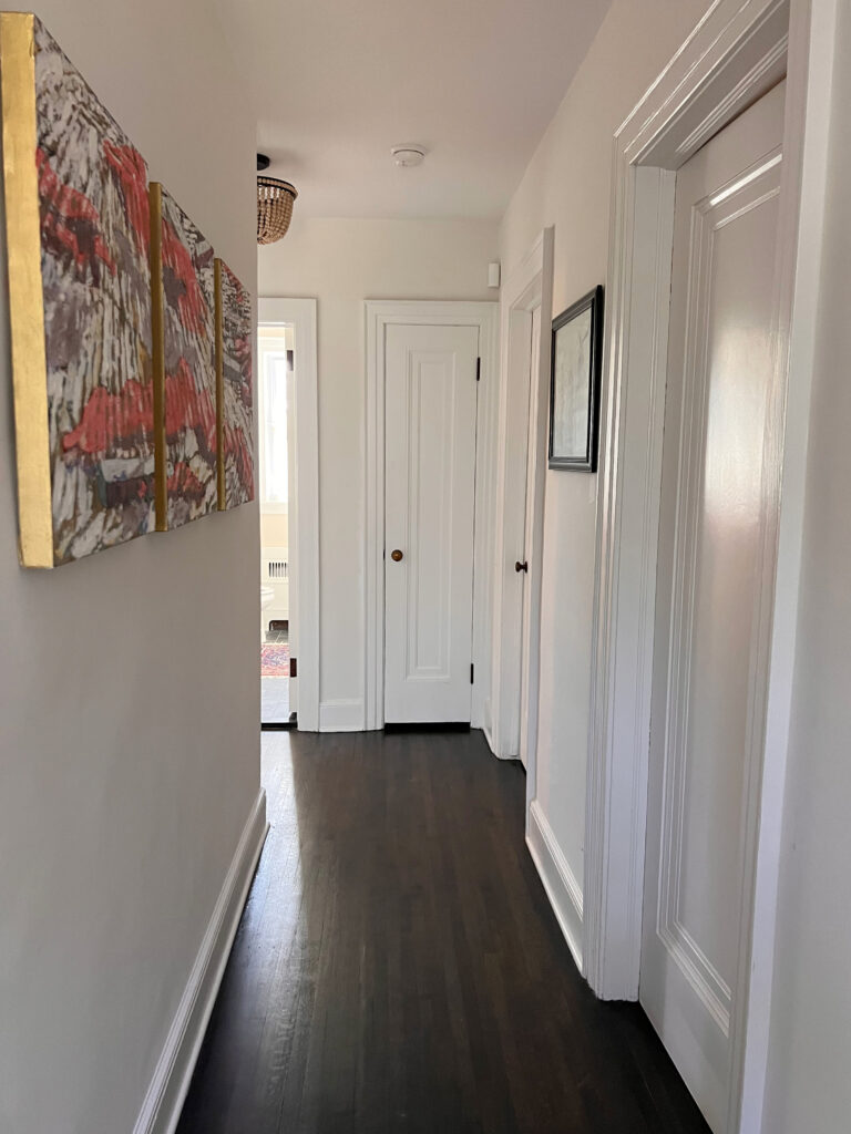
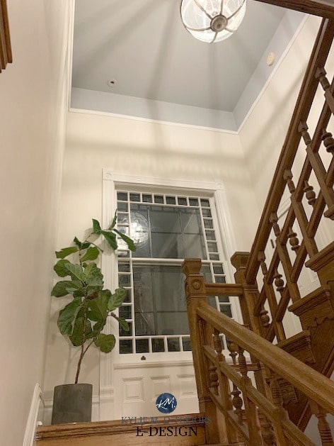
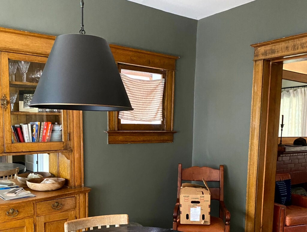
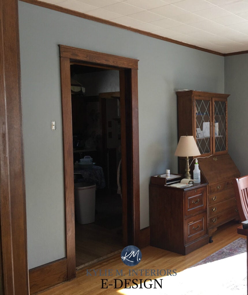
These beautiful wood trims have a red-range undertone and are LOW-CONTRAST with the walls.
2. PAINT COLORS TO BLEND OR SOFTEN YOUR HISTORIC DARK WOOD
Not everyone loves their dark wood finishes; in fact, some would love to paint them, but that would be against their partner’s religion. Others love their dark wood but don’t want a contrasting look; they prefer a softer, low-contrast approach.
- The best way to blend is to LEAN IN to your wood stain – not just in depth, but in color. This approach offers a soft, subtle look with minimal contrast. The goal is never to really ‘blend’, as that would be an epic fail in the looks department. It’s more about lowering the energy and play between the walls and trims.
- Some colors are ‘happy mediums’. They don’t offer tons of contrast, but they also don’t blend. These are most often medium to dark neutrals with a TON of undertone (or ‘colors’ with a whole whack of gray in them).
This is a lower-contrast ‘happy medium’ of sorts. This wood has red undertones. The wood on the stairs takes on more purple.
Lastly, before we jump into the actual color suggestions…
IF YOUR ROOM HAS DARK WOOD & LOW LIGHT
If your room lacks natural light and your interior lighting doesn’t compensate, be careful with many of these colors.
- Whites and off-whites reflect more light (having higher LRVs), but many of the colors listed below look best in rooms with adequate lighting.
- Some non-whites and off-whites neutrals can look muddy, heavy, or chalky when paired with wood trims. This is a gorgeous look, but if you want more LIFE in your room, consider ‘colors’ or look at lighter, brighter shades.
The thing is, if you have white trim, these colors have something to contrast with, and the color play can be a bit more interesting that way. When you have dark wood (trims, in particular), your paint color doesn’t have that degree of contrast, and you risk your room looking heavy and drab.
Notice how some colors below come to life against dark wood floors and cabinets but when there’s also WHITE trim rather than wood.
Now, without further ado…let’s hit some hues. These colors won’t suit every dark wood finish (I’m good, but I’m ONLY ONE WOMAN), but they’re the perfect place to start your color journey!

Because I use images from my clients and friends, I don’t always have the EXACT photos I need (some of these homes aren’t historic/heritage).
If your home has gorgeous old wood trims, I’d love to include them, which means you’ll get some bonus tips for your home along the way! Please send any photos to kylie@kylieMinteriors.ca
1. SHERWIN WILLIAMS BALANCED BEIGE 7037
If you’re looking for a ‘happy medium’ between contrasting and blending, Balanced Beige is a badass beauty.
Balanced Beige is in the light-medium range, so it offers more depth than the more popular off-white and light-depth colors. And while it’s beige, it leans slightly into gray and can look a touch taupe at times, especially in north-facing rooms.

Balanced Beige doesn’t have an overt undertone, so there’s no real commitment.
Colors like Balanced Beige offer a calm, organic approach. While they do best with decent light, they can be gorgeous if you’re okay with a slightly moodier, muddier vibe.
As shown below, Pavilion Beige is similar to the Balanced Beige but has a touch less gray…
Notice how red the ceiling beams and trim are – they LOVE the wee wink of pink undertone tucked in Pavilion Beige! Don’t let the ‘p’ word scare you; it’s a beige with an orange undertone. I’m just being my usual particular self and pointing out the subtle bits here and there.
ALTERNATIVES TO BALANCED BEIGE…
You CAN’T choose a paint color and run with it; you have to sample and compare similar shades. Often, you’ll find an even better option that suits your room’s specific needs.
- Benjamin Moore Stone Hearth is beige-gray with a gray backdrop to calm it down.
- Sherwin Williams Accessible Beige has similar intentions but a lighter approach (it’s amazeballs, and we’re looking at it shortly).
- Sherwin Williams Loggia is QUITE similar, with just a tiny shift in undertones—watch that it doesn’t look murky green against some woods.
- Ooooo, I just painted my guest bedroom Sherwin Williams Stone Lion, and it’s wicked pretty – check it out.
COLOR REVIEW of Sherwin Williams Balanced Beige
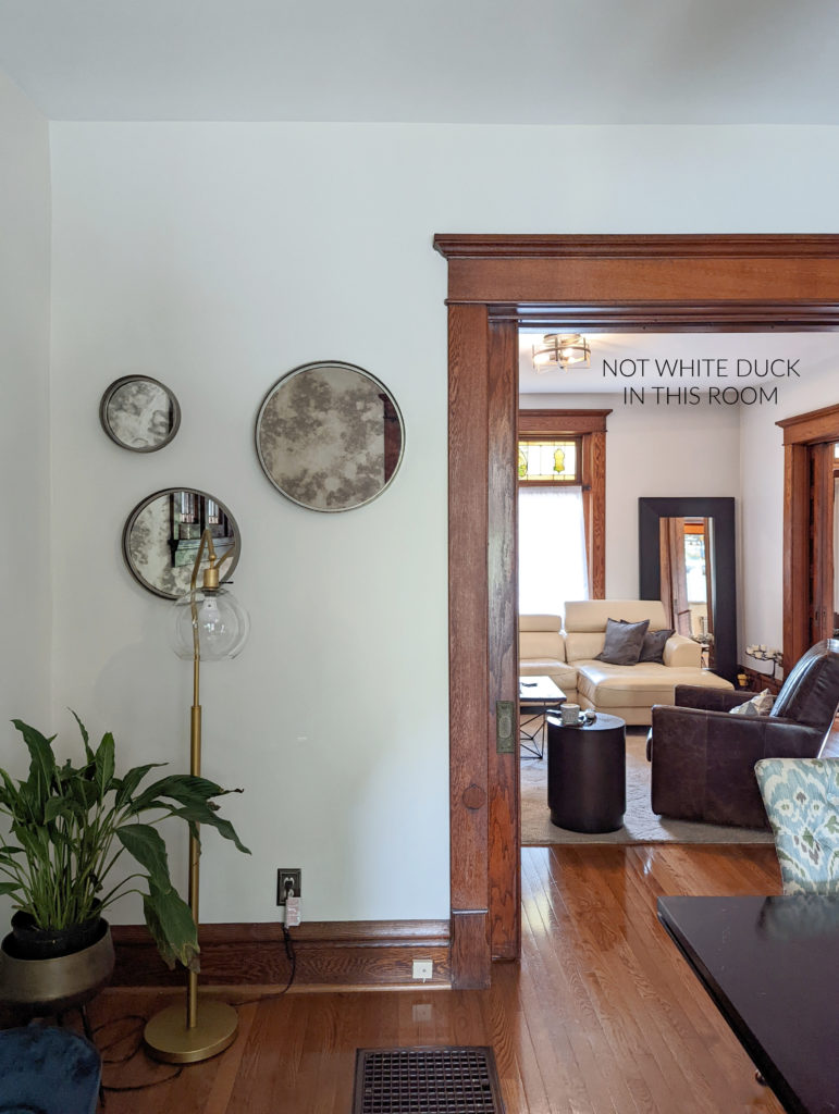
2. SHERWIN WILLIAMS WHITE DUCK 7010
White Duck is an off-white cream heavily sedated by a beige-gray base, which calms down the yellow. This color also belongs in my other dark wood blog post, but it’s worth hittin’ on both…
The Best Off-White Paint Colors
Now, let’s do something fun. I want you to look at the above image and consider how White Duck looks against the wood trim.
Now, check it out with white trim…
The above room is most likely north-facing, for how muted White Duck looks, but all the same…
- Against wood trim, White Duck looks more like a soft shade of white
- Against white trims, White Duck looks more like the off-white paint color it really is
Of course, how it reacts in YOUR home will depend on your exposure, amount of exterior light, and interior lighting, but it’s still a cool example!
Obviously not a heritage home, but the dark wood is great for our purposes
BY THE WAY, When using light and bright paint colors like creams and off-whites with dark wood finishes, make sure your home décor can visually support a high-contrast look. Without getting into too much detail, you need other high-contrast items in your room that mimic the contrast between your trim and walls.
While this next image isn’t super (I take what I can get sometimes), it shows the comparable, Benjamin Moore Ballet White…
ALTERNATIVES TO WHITE DUCK…
- Sherwin Williams Shoji White is White Duck’s kissin’ cousin
- Sherwin Williams Aesthetic White shifts out of yellow-cream and introduces a bit of beige-gray (mad love)
- Benjamin Moore Ballet White is a bit darker and warmer
- Sherwin Williams White Heron takes a slight departure with a brighter approach
Paint Color Review of Sherwin Williams White Duck
Remember to choose the best color for a north-facing or south-facing room!
3. SHERWIN WILLIAMS RETREAT 6207
If you love the idea of contrasting with your wood trims and doors, but don’t want to go TOO far, check out Retreat.

Retreat is a soft, medium-depth green-blue-gray blend. While the green is in the forefront, it’s not remotely overwhelming.
As for temperature, Retreat is a cool paint color, and this cool backdrop offers a nice accent and contrast to the warmth of dark wood…
 The Best Sage Green Paint Colors
ALTERNATIVES TO RETREAT…
Sample and compare these bad boys…
- Sherwin Williams Acacia Haze is great if you want a slightly lighter, but similar look.
- For a stronger green, Sherwin Williams Rosemary is super gorg.
- Find more gorgeous darker greens here: The Best Medium to Dark Greens from Sherwin Williams or Benjamin Moore’s Best Dark Greens.
4. BENJAMIN MOORE SILHOUETTE AF-655
If you’re looking for a color with a ton of mood, Silhouette is friggin’ stunning.
Silhouette is a deliciously dark shade of purple, brown, and gray. This offers a low-contrast, dramatic look with dark wood trims, cabinets, and flooring.
Here’s your peel-and-stick sample of Silhouette…

Benjamin Moore Silhouette Color Review
5. SHERWIN WILLIAMS BASKET BEIGE 6143
If you like the idea of Balanced Beige, but want a richer, even lower-contrast warmth, check out Basket Beige.
Basket Beige is a soft, medium-depth tan paint color with a gorgeously rich warmth…
This is a low-contrast, but not blending approach to dark wood finishes, as shown with the above trims, doors, and stairs.
A color like Basket Beige is an interesting choice because it’s a tan paint color with a subtle green undertone. While this doesn’t really react much with most darker wood stains (which are the opposite of green), it can be an interesting, but subtle complement.
ALTERNATIVES TO BASKET BEIGE
- Sherwin Williams Macadamia is interesting, as it’s a lighter, but similarly contrasting look.
- Sherwin Williams Latte is similarly rich, but has a bit more of a beige look.
- For a more passive warmth, Sherwin Williams Antler Velvet is more muted.
6. BENJAMIN MOORE CASTLE PEAK GRAY 1561
Castle Peak offers a more dynamic contrast with darker wood trims, without going buck wild and crazy…

Castle Peak Gray is a green paint color. But unlike the previously mentioned, Retreat, it’s much darker and has a warmer, more organic approach.
Don’t forget that the actual DEPTH & UNDERTONES of your wood play a big part in finding your best paint color!
Notice the change in warmth between the two photos – the first photo is closer to the natural light. Remember to move your samples around the room!
ALTERNATIVES TO CASTLE PEAK GRAY
I’m like a broken record…SAMPLE & COMPARE, you might surprise yourself with what you fall in love with!
- If you like this look but want something a bit lighter, check out Benjamin Moore Antique Pewter.
- Sherwin Williams Cast Iron is another favorite of mine in the darker green category.
7. SHERWIN WILLIAMS RIVERWAY 6222
If you’re ready for some gorgeous contrast, a blue-green blend can be a gorgeous choice.
One of my favorites for this approach is Sherwin Williams Riverway. While I don’t have it directly against dark wood, you can see how glorious it is in this image below…

Riverway is a solid, medium-depth blue-green with a good dose of gray, so it’s not overly teal.
This gorgeous earth-toned color offers a striking contrast to most dark wood trims, doors, flooring, and cabinets – mad love.
ALTERNATIVES TO RIVERWAY
- If you want a little more green in the mix, check out Sherwin Williams Rocky River
- I also love Benjamin Moore Caribbean Teal as a fun alternative.
- If you like to go big or go home, check out the skookum depth of Sherwin Williams Still Water.

Hey there, big boy…
8. BENJAMIN MOORE MARITIME WHITE 963
If you loved some of the images at the top of this blog post, you love Maritime White.

Maritime White is a soft off-white/light-depth beige with super flexible, well-balanced undertones.
While it offers contrast with darker wood trims via its light depth, its warmth is on par.
Benjamin Moore Maritime White Color Review
ALTERNATIVES TO MARITIME WHITE
Oh, there are some amazing colors to compare with Maritime White, including…
- Sherwin Williams Moderate White, which adds a bit more color/warmth, while having similar intentions.
- You might also explore Sherwin Williams Divine White (although I’m partial to Maritime White or Moderate White, personally).
- If you want to go a bit deeper (that’s what she said), Benjamin Moore Muslin is great.
9. BENJAMIN MOORE ABALONE 2108-60
While there’s no shortage of popular grays to choose from, when it comes to dark wood trims, cabinets, and flooring, I usually prefer light grays that lean into a purple undertone, more so than blue (learn all about gray undertones HERE).
In fact, with dark woods, I often pick up a bit more purple than usual, including colors like Abalone.
Abalone is one of my favorite warm gray paint colors with its reasonable purple undertone. Its depth (LRV of almost 62) suits the average room with ‘adequate’ lighting.
Dark woods with a purple or purple-red undertone can look especially gorgeous with gray-purple walls.
As for this next space, I don’t remember what color the walls are. Also, the Kelvin of the bulbs will skew how it looks. Regardless, it makes me THINK of Abalone…
ALTERNATIVES TO ABALONE
- Benjamin Moore Balboa Mist is similar to Abalone but a bit lighter and muted.
- Sherwin Williams Alpaca and Popular Gray are worth checking out as they have slightly stronger undertones.
- Here’s a blog post with the best warm grays with violet undertones
Benjamin Moore Abalone Color Review
If you’re looking for the BEST WHITE PAINT COLORS to go with your dark wood, I have a blog post dedicated to this topic. I’ve included a link at the end of this post for you (I’ve got one for OFF-WHITES, too).
10. BENJAMIN MOORE WILLOW
If you’re a Hot Momma who’s looking for some drama, Willow is ridiculously beautiful. This DARK shade of brown is grounded with a gray base, so it’s more ‘moody’ than chocolatey.
Here’s your peel-and-stick sample of Willow…
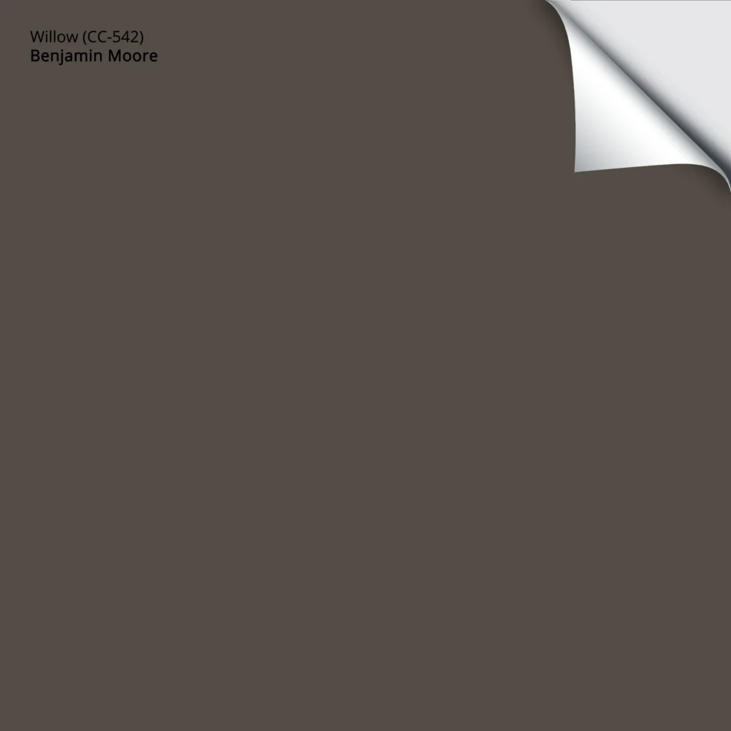
While it doesn’t go with every wood stain, it’s especially good with those with an orange backdrop.
The Best Moderate, Dark Brown Paint Colors
11. SHERWIN WILLIAMS AUSTERE GRAY 6184
Sherwin Williams Austere Gray is another beautiful gray-blue-green for dark wood finishes…

Austere Gray is a gorgeous green-gray blend. While it definitely contrasts with dark wood flooring and trims, it has a good green-gray blend (cool) that isn’t too overpowering or playful.
ALTERNATIVES TO AUSTERE GRAY
- Sherwin Williams Sensible Hue, for a bit more gray
- Sherwin Williams Comfort Gray (mad, mad love)
- Benjamin Moore Gray Wisp is a beautiful blend of green, blue, and gray
The 8 Best Blue-Green Blend Paint Colors
12. BENJAMIN MOORE NEWBURG GREEN HC-158
Newburg Green (also known as New Providence Navy) doesn’t get nearly enough attention, especially for dark wood trims, floors, and cabinets.
While the name Newburg Blue would make more sense given its dominant color, it also has a good dose of green.
The 4 Best Shades of White That Go With DARK WOOD
ALTERNATIVES TO NEWBURG GREEN
If you’ve got the feels for Newburg Green, make sure you sample and compare a few similar shades, including…
- Benjamin Moore Amazon Green, for a bit more green/less blue.
- Benjamin Moore Nocturnal Gray, for a bit less color, while still being ‘color-forward’ and not neutral.
- Sherwin Williams Tempe Star is interesting, as it’s a bit lighter and bluer.
The Best Teal-Inspired Paint Colors
13. SHERWIN WILLIAMS CADET 9143
If you’ve got the blues and want the perfect blue hue, Cadet is a great color to sample and compare.
Being a blue-gray with a reasonable amount of blue, Cadet contrasts with dark wood finishes, as shown with the trim above (left). However, in terms of depth, it’s not as high-contrast as a lighter shade of blue-gray would be.
If you love the color on the right, that’s Sherwin Williams Tin Lizzie (below) – same idea, but it has more gray-green!
ALTERNATIVES TO CADET
While it depends on the exact depth and undertones of your wood finish, here are a few to sample and compare…
- If you want a bit more blue, you might also add a bit more depth with a color like Sherwin Williams Blustery Sky.
- Sherwin Williams Uncertain Gray has a similar blue-gray blend but is a tone lighter.
The Best Blue-Gray Paint Colors
14. BENJAMIN MOORE SMOKEY TAUPE 983
If you’re craving a low-contrast, subtle partner to your dark wood trim or flooring, Smokey Taupe could hit the spot.

Smokey Taupe offers a balance between the warmer beige world and the gray world, with a soft, organic warmth.
Whether it’s more beige or taupe is open to interpretation, but either way, it can be a gorgeous, natural complement to medium and dark wood stains.
ALTERNATIVES TO SMOKEY TAUPE
- I’d definitely check out the slightly darker Benjamin Moore Stone Hearth
- For a bit more beige warmth, check out Sherwin Williams Bungalow Beige
- I also like the lighter, gentler (slightly more high-contrast) look of Benjamin Moore Cedar Key
- Actually, take a look at Sherwin Williams Accessible Beige, too (shown below).
15. SHERWIN WILLIAMS BLACK SWAN 6279
I thought I’d end on a super dramatic note with Black Swan.
Black Swan is not for the faint ‘o heart. With a wickedly dark, almost black base and a handsome purple, this color adds some serious drama to a room.

HOW DO YOU MAKE DATED DARK WOOD (TRIM or CABINETS) LOOK MODERN?
While painting your dark wood finish seems like the obvious update solution, many of these darker woods are way too stinkin’ gorgeous to cover up—they just need better friends. While this blog post is geared towards the best colors (shortly), there are a few other ways to update your dark wood.

This 2000s Tuscan-style entryway could look more updated with a new wall color and some tweaked decor!
UPDATE YOUR HARDWARE
Whether it’s on cabinets, doors, or light fixtures. The right finish depends on your home’s style.
- Older homes often suit a golden or antique brass (super trendy right now, if you choose the right style).
- While some older homes can pull off nickel, it’s more often found in modern homes. Although, chrome can be classic and timeless in a bathroom.
- Black can work on surrounding metal finishes, such as light fixtures, but disappear on dark wood cabinets and doors. Luckily, black is pretty universal, and if you choose black light fixtures, they’ll coordinate with your chosen cabinet/door hardware if you choose a similar style.

The Best Off-Whites With Dark Wood
CHANGE YOUR LIGHT FIXTURES
This isn’t just about the metal finish but also about the style. Edison bulbs are out of style, and dark wood finishes often benefit from light fixtures with white glass shades, as the white helps to reflect more light and brighten a dark space.
UPDATE YOUR BACKSPLASH
If you have dark wood cabinets, update your backsplash with a subway tile!
Update Dark Wood Cabinets with Modern Counters & Backsplashes
IMITATION IS THE BEST FORM OF FLATTERY
Whether on your Pinterest page or some of the photos in this blog post, pay attention to what you think makes a room beautiful, up-to-date, and well-coordinated. Take these cues and apply them to your own home!
I hope I’ve helped to enhance your wood (a girl can dream!) and lower your stress level!
READ MORE
The 4 Best Shades of White That Go With DARK WOOD
The Best Off-Whites with Dark Wood
Get the best paint color advice…
Check out my affordable Online Color Consulting Services!

Updated for new content and images for 2026


Oh my…this article may have literally convinced me to convince my husband to reconsider purchasing an old house we’ve been eyeing up! It would be an amazing space for our family with 4 kids, but the amount of updating it requires (and the attached price tag) has intimidated us. Your pictures show that the right paint/decor really can make an older home look lovely. Even with the modern paint colors and furniture, I think the rooms shown maintain a traditional feel, which I enjoy, because of the dark wood. If we do ever pull the trigger on that home, I will definitely use you for e-consultation. Thanks again for the great info!
Wahoo, now THAT is what I’d like to hear! I’d LOVE to help you with your home if you go ahead with the purchase – good luck Steph!
And you know, if you want a 2nd, unbiased opinion on the house, just to look at the scope of the projects I’d be happy to take a quick boo at it if you email me the link! kylie@kylieminteriors.ca I wouldn’t get into too much detail, but I can certainly say whether ‘I’d’ do it or not (I’m a bang for buck gal – nothing too major…)
~Kylie
Thank you for posting this with such eloquent explanations of why to use one color over another. Very enlightening. I’ve been searching for about 6 months now for colors for our Dutch Colonial built in 1929, with tons of medium colored natural wood, not sure what type of wood it is. But it goes along the side of our staircase and adds a lot of character, but is also distracting for me to settle on a color scheme for my home. Your examples helped me have a clearer idea of the route I should be going. Thanks!
I am updating a VERY 70’s house which has a lot of light and which I LOVE — but I am really struggling with how to update it inexpensively. Particularly since my furnishing tendencies are not modern, but Victorian antiques and hippie-chic hodgepodge.
I have vaulted ceilings upstairs, and a low ceiling down – and am getting new flooring put in next month (yay!!)
All the doors and that skinny trim are dark — but I’ve been anxious about using gray and cool colors for the walls b/c the trim/doors are reddish. Not super red, but if you put a cool color next to the brown, it looks… uncomfortable.
Also, ALL the cabinetry in my kitchen is the same dark color. They are good, solid wood cabinets and I can’t justify replacing them. Have thought about painting them, but then I’m still competing with all the doors/trim that are still brown. And yes – painting ALL that trim and the doors is daunting. Besides, the sliding glass doors are brown also and then they’d REALLY stick out. Ah, it’s a slippery slope… easier to embrace the dark trim, I think.
And if you really want pictures of 70’s houses with dark trim — I could overwhelm you! 😀
Oh I always always need photos – you can just fill yer boots and send them along if you’d like! kylie@kylieminteriors.ca As a thank you, I’d be happy to throw 1 or 2 colour options your way!
~Kylie
Hi! I love your blog! We just bought a home with dark to med wood trim on everything. Trying to convince my husband that we can have a balance like painting the trim white but leaving the exposed beams, floors and stairs wood. Trying to figure out wall color too! Need some advice!!!
Hi Sarah, YES, you can absolutely do a happy medium – no need to paint it all white! And I would LOVE to help. You can check out my E-design if you’d like – it’s fun and affordable. This way I can take a good look at photos of your home and your questionnaire and come up with some beautiful palette options. If that interests you, here’s the link https://www.kylieminteriors.ca/online-decorating-design-services/
Hope that helps!
~Kylie
I love your blog! Could Carrington Beige HC-93 work with dark wood paneling? I have paneling half way up the wall in my hallway (1930s) that is mahogany colour (with a red tone in it). It is currently painted Carrington Beige but I’m not sure if that look is too dark and dated. The hallway gets light from the north and the west. Let me know if you would like some paneling photos for your blog.
Hmmm, off the top of my head, i might say it could be a touch murky looking as it does have a wink of green in it…perhaps I could talk you into the slightly more neutral Manchester Tan????
And yes, I’m ALWAYS needing photos with dark wood panelling, absolutely!!!!
~Kylie
Thanks so much! Is there a page on your site where you talk about Carrington Beige or is that a colour you avoid? We have a lot of it (whole basement family room is covered in it!) and I prefer it over similar colours with pink undertones or colours that look peachy in some lights. I painted it 18 years ago though… maybe it’s time for a change. Thanks again.
Hi Christy! Carrington is lovely, but it does have a very vague green undertone, which happens to be a colour that some people want to avoid – they are often wanting a more clean neutral. But it IS a beauty!!
~Kylie
Your article has been not only an inspiration but a confirmation of what colors I plan to use for our new construction. With the design goal of modern mountain, we are considering Sherwin Williams Urbane Bronze for trim, with SW Mindful Gray, Dorian Gray or something else along those lines as the primary wall color for the great room, halls, kitchen, dining, loft and entry. Do you have any suggestions for a modern non-white trim color? Thank you again for posting this insightful article.
Hi! A modern non-white…hmmm…I’m hesitant to go into that without seeing the other products in the home. But I can tell you I wouldn’t do Urbane Bronze, it will be too warm for the walls. Check out Gauntlet Gray as it will give you a CONSIDERABLY more modern look – and it makes total sense as it’s the dark version of the wall colours!!! YOu can also look at the more clean gray look of BM Kendall Charcoal which is PRETTY wicked!
~Kylie
We have nice 90’s oak trim (not thin), except it has ambered over the years. I do not love the orange tint, but I also am not a paint it all white gal. I have toyed with the idea of painting it darker since I have been told that staining it darker (which is my first choice) would not be an option. I’d have to rip off all of the trim and stain new trim the walnut color I’d like. Finding pictures of painted trim that is not white or black is tricky. Have you ever had anyone restrain their existing wood trim without a HUGE expense or can it be even be done?!? Or can we keep out baseboards stained and paint the trim?? Trying my best to not get rid of perfectly fine oak wood trim…except for my issue with it’s orange tone 🙁
Thank you for any thoughts, ideas etc!
Hi Lauren! You know, I have seen quite a few people have luck with Gel Stain as you don’t have to sand the trim right down. Other stains tend to penetrate more, which is why you need to strip the wood down, whereas Gel Stain can act more like a paint in that it can still show the grain, but it sits more on the surface. In Pinterest, look up ‘Gel Stain cabinets’ and you’ll see what I’m talking about. And yes, while I’d have to look at your photos, you ‘could’ consider wood baseboards and painted trim, but I would be more inclined to keep them the same…hope that helps!
~Kylie
Hello looking for advice for my older home it has original woodwork built ins and hardwood floors all which I describe as having a cherry or red undertone. Not orangey oak and not espresso brown…? I have tried diverse beige but that looked purple. I tried a taupe and at certain times of the day it has mauve undertones. Would like a gray that complements but not sure what to try next? Was thinking Dorian gray, mega griege but need help.
Thanks!!
Hi Tracy! When it comes to personal questions where I need to see the space, I refer to my e-design (it’s affordable and fun!). This way I can take into account the size of the space/exposures/furnishings and all of that other good stuff that can play a BIG part in colour choice! Off the top of my head, Dorian it sounds like Dorian could be a pretty complement, but that’s really just a guess… https://www.kylieminteriors.ca/online-decorating-design-services/
~Kylie
Help please, I have a room with red/purple wood trim and wainscotting. I need to know how to update it without painting or restaining the wood. The floor is to be covered with broadloom – probably a grey fleck. I would like a light Benjamin Moore colour that cancels out the purple in the wood – it really looks like a stain gone wrong. I also want to paint the walls and ceiling all the same colour. I was going to attach a photo of the room so that you could see what I am dealing with but there is no means to do this. I can send a photo in a separate email if you tell me where to send it.
Thanks, Dorothy
Hi Dorothy! I actually have an E-design business for this exact purpose! I try to give as much complimentary info as I can online and if that doesn’t work, then that might be the next step! https://www.kylieminteriors.ca/online-decorating-design-services/
~Kylie
What light gray would look nice in a living room with dark wood trim? Agreeable gray?
My foyer that opens up to living room is Aloofgray gray.
Thanks!
Hi Grace! A lot depends on your exposure, flooring and furnishings, but i WILL say that Agreeable Gray is an awesome, flexible greige. It leans more to the gray side and will EVEN MORE if you have northern exposure, in which case some people can find it a touch too cool…
Hi! I have dark walnut floors and trim, beige carpet, and cream colored doors. Currently most of the rooms in our home are painted a dark beige and I am looking to modernize with a gray. Is there any you recommend? I was looking at sw anew gray. Thanks!
Hi Bethany! I do try to give as much helpful info on my blog, and if that doesn’t work, you might like to check out my E-design it is affordable and fun – this way I can look at photos of your space and spend some time with it! There’s more to consider, such as exposure, amount of natural light, furnishings, etc…and I don’t like to just guess! https://www.kylieminteriors.ca/online-decorating-design-services/
Wall color to blend in or soften yellowy oak cabinets…..looking at greige with warm undertones….but to blend or soften not sure which tones……looking for more modern greige color.
Hi Mary, there is much more for me to consider when suggesting a colour – exposure, flooring, exposure, backsplash, etc… otherwise I’m 100% guessing. I do try to give as much free info as I can on my blog posts and if that doesn’t work, it might be time for a closer look via my Edesign which is affordable and fun! https://www.kylieminteriors.ca/online-decorating-design-services/
Hello Kylie!
I had bookmarked one of your posts several months ago, and checking it today it seems to have changed. Yikes ! I am panicking !! It is a picture of entry way and walls appeared George, trim off-white and dark wood accents to include a dark exterior door and dark trimmed portal window. I thought it was posted in “what potassium goes with dark trim?” But when I went there today, it’s not there! I loved this look and wondered if you remember it or know how I could find again? Thanks Soo much, I love your ideas and style. Keep up the good work!
Carolyn
Hi Carolyn, i know JUST the George you’re speaking of 😉 Seriously though. I’ve been going through my site and deleted HUNDREDS of photos that aren’t mine. Generally, a lot of us refer to other designers with a link to their sites when we want to use a photo, but I’m trying to be more careful and use only images that are mine from my Edesign, so unfortunately, it’s been off-loaded!
Thanks Kylie for your follow up! I am going to enlist your help via with color scheme for my 1925 craftsman house. Working on filling out the info and need to decide what package to get!
See you soon!!!
Sweet! I just LOOOOVE the older homes- looking forward to it!
I just want to thank you for all of your articles. I was looking for a white for my northern exposure dining room that has dark wood trim (my house is an old Victorian). I read through a bunch of your posts including how to best choose white. I ended up going with SW West Highland White. It came out so beautifully. Thanks again for all of your tips and advice!
Allison
Well, thank you, Allison! With all of the questions I get, it is SO nice to get a note like this – thank YOU!
This was so helpful THANK YOU!
So, so glad I found this site. Yes, the 70’s home have that narrow trim and at times when I look at it I love it, and then when I look at all the painted trims out there they look just as good. Always seem to be stuck until I came across this site. I now have a direction I can go in with the color I want on the walls, that will enhance the home, open it up and change the look without breaking the bank.
Thanks for the info and explaining it in a concise manner.
Thank you so much for this post. I feel less alone with my dark trims. 🙂
Do you have a psychological limit of “LRV not to be exceeded” for the choice of ceiling paint? I have the feeling that 90 would be this limit in rooms with white trims. But with dark trims, is it better to play in the 80 to limit the contrast? Perhaps I have it all wrong!
Thanks a lot!
Manon
Thank you for such a detailed post on paint colors with dark trim. I just remolded my home and convinced my hubby to toss out the carpet and went with engineered hardwood. I picked a dark smokey brown and had my carpenter install farmhouse trim to match. I also went with what I liked for my paint color which happened to be sea salt from Sherman Williams. I was starting to think I made a mistake until I read your blog. However I’m stumped on how to decorate. Your right there isn’t many pictures on the internet. I have moderate natural lighting but lots of other light. What is your thoughts for furniture color? If you wouldn’t mind me picking your brain.
I love the high contrast white wall with dark trim look. But what do you do with the chair rail? I haven’t been able to find any examples that include one. Keep it dark, or paint it the same color as the wall?
I have an old house with low lighting, not many fixtures and plenty of windows but the light doesn’t come in. The house orientation doesn’t allow for that I guess. I have so much gumwood, staircase, doors, paneling, built ins. Can you suggest a white for the walls and a trim and ceiling color that will pair well throughout a house like this.
Any thoughts on SW Steamed Milk with 70s dark walnut trim? In my NE exposure living room, it seems to just read as a super light brown, not quite as yellowish as I’ve seen it look in pics. Would it end up being too much brown?
Mmmm, I think this could be VERY pretty. Steamed Milk is so light, soft and pretty without being OVERLY yellow, you know? If you do it, send pics, I’d love to see how it turns out!
Yeah, I’m trying to hit that spot where there’s juuust enough warmth so that it stays warm looking in cooler light without being overpoweringly yellow or orange or anything. For me and the light I’m working with, I think Casa Blanca and Choice Cream are a touch too much, and Moderate White and Divine White are not quite enough, but Steamed Milk looks just about right. Creamy hits that ‘just enough warmth’ spot, too, but I think I want something a little lower LRV like Steamed Milk, so it’s not quite so contrasty. I’ll send pics if I go with it!